Unlock a world of possibilities! Login now and discover the exclusive benefits awaiting you.
- Qlik Community
- :
- All Forums
- :
- QlikView App Dev
- :
- BarChart in Salesforce of QlikView Samplefiles
- Subscribe to RSS Feed
- Mark Topic as New
- Mark Topic as Read
- Float this Topic for Current User
- Bookmark
- Subscribe
- Mute
- Printer Friendly Page
- Mark as New
- Bookmark
- Subscribe
- Mute
- Subscribe to RSS Feed
- Permalink
- Report Inappropriate Content
BarChart in Salesforce of QlikView Samplefiles
Hi, ALL!
For Simulating the sample, I've curious about that chart.
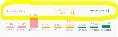
in Dashboard.
how to make that labels?
anyone know?
I think rather than Presentation but some Chart.
thanks your attention.
Accepted Solutions
- Mark as New
- Bookmark
- Subscribe
- Mute
- Subscribe to RSS Feed
- Permalink
- Report Inappropriate Content
- Mark as New
- Bookmark
- Subscribe
- Mute
- Subscribe to RSS Feed
- Permalink
- Report Inappropriate Content
You can download a local copy of the SalesForce QVW and look at the objects and properties used to create the labels: http://us.demo.qlik.com/detail.aspx?appName=Salesforce.qvw
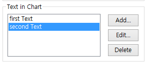
It looks like the labels you highlighted were just added through the Text in Chart property on the Presentation tab of the chart:
- Mark as New
- Bookmark
- Subscribe
- Mute
- Subscribe to RSS Feed
- Permalink
- Report Inappropriate Content
Hi Kim ,
I not seen Application as for my knowlegde
You might look into Presentation tab on there Text in chart Edit options . may be some experrsions and variables created follow that anything required please let me know.
- Mark as New
- Bookmark
- Subscribe
- Mute
- Subscribe to RSS Feed
- Permalink
- Report Inappropriate Content
Hi.
It's a legend.
Take a look at the example attached.
- Mark as New
- Bookmark
- Subscribe
- Mute
- Subscribe to RSS Feed
- Permalink
- Report Inappropriate Content
ah.... I got it
anyway, because of dimension structure.
I understand through your app.
thank you.
- Mark as New
- Bookmark
- Subscribe
- Mute
- Subscribe to RSS Feed
- Permalink
- Report Inappropriate Content
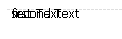
hi, wes elfman.
when I tried typing first, second like photo, there were overlap together.
do you know how make that ?
 ====>
====> 
(alignment is not difference much.)
- Mark as New
- Bookmark
- Subscribe
- Mute
- Subscribe to RSS Feed
- Permalink
- Report Inappropriate Content
Select Chart, press Crtl+Alt and move them with mouse.