Unlock a world of possibilities! Login now and discover the exclusive benefits awaiting you.
Announcements
FLASH SALE: Save $500! Use code FLASH2026 at checkout until Feb 14th at 11:59PM ET. Register Now!
- Qlik Community
- :
- All Forums
- :
- QlikView App Dev
- :
- Building Chart using two dimensions
Options
- Subscribe to RSS Feed
- Mark Topic as New
- Mark Topic as Read
- Float this Topic for Current User
- Bookmark
- Subscribe
- Mute
- Printer Friendly Page
Turn on suggestions
Auto-suggest helps you quickly narrow down your search results by suggesting possible matches as you type.
Showing results for
Anonymous
Not applicable
2017-08-29
10:23 AM
- Mark as New
- Bookmark
- Subscribe
- Mute
- Subscribe to RSS Feed
- Permalink
- Report Inappropriate Content
Building Chart using two dimensions
Dear Collegues,
I would like to create a chart which will show the real performance and its forecast.
I have a table in the following format:
| ID | Realized_Date | Forecast_Data | Quantity |
|---|---|---|---|
| 1 | 01/01/2017 | 10/01/2017 | 100 |
| 2 | 03/01/2017 | 01/01/2017 | 200 |
| 3 | 10/02/2017 | 300 |
Then the chart would look like this:
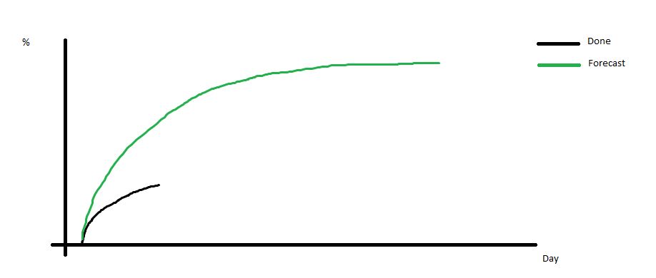
Is there anyway I can build this chart keeping the table´s structure?
Thanks in advance!
481 Views
1 Reply
MVP
2017-08-29
10:33 AM
- Mark as New
- Bookmark
- Subscribe
- Mute
- Subscribe to RSS Feed
- Permalink
- Report Inappropriate Content
You will need to make use of
437 Views