Unlock a world of possibilities! Login now and discover the exclusive benefits awaiting you.
- Qlik Community
- :
- All Forums
- :
- QlikView App Dev
- :
- Chart Display?
- Subscribe to RSS Feed
- Mark Topic as New
- Mark Topic as Read
- Float this Topic for Current User
- Bookmark
- Subscribe
- Mute
- Printer Friendly Page
- Mark as New
- Bookmark
- Subscribe
- Mute
- Subscribe to RSS Feed
- Permalink
- Report Inappropriate Content
Chart Display?
Hi All,
I have two queries with my chart I am trying to create.
1) Why is there a gap between the x-axis and where the bar chart starts? And how do I fix this?
2) Is there a way I can turn off the data point when no selections have been made and then when I make a selection the data points will show ?
Thanks in advance.
Stephen
- « Previous Replies
-
- 1
- 2
- Next Replies »
Accepted Solutions
- Mark as New
- Bookmark
- Subscribe
- Mute
- Subscribe to RSS Feed
- Permalink
- Report Inappropriate Content
1) Click on chart
now CTRL + SHIFT
you will see Red Boxes... Using your mouse, you can now set the width and height of Chart which will reduce the gap on x-axis
2) Create two same expressions
For 1st Expression :
SUM(Sales)
Select Bar and untick Values on Data Points
For 2nd Expression
IF(GetSelectedCount(Customer)<>0,SUM(Sales),'')
Untick Bar Chart and Tick Values on Data Points
Here is you select any Customer, then only data points will appear....
Of course, you need to change your expression according to your need..
- Mark as New
- Bookmark
- Subscribe
- Mute
- Subscribe to RSS Feed
- Permalink
- Report Inappropriate Content
Select your bar chart and then Click on CTRL + SHIFT and move the dimensions of your bar chart
- Mark as New
- Bookmark
- Subscribe
- Mute
- Subscribe to RSS Feed
- Permalink
- Report Inappropriate Content
1) i assume there are negative values if you scroll to the right which means the zero level will be pushed up, not sure why the axis doesent show values below zero though.
2) on the presentation tab of properties you can set "Max Values Shown" for Values on data points, so its only shown when the number of bars is less than what you enter.
- Mark as New
- Bookmark
- Subscribe
- Mute
- Subscribe to RSS Feed
- Permalink
- Report Inappropriate Content
1. Use plot value inside the segment.
2. As yoann suggest click on chart and then press Ctrl + Shift for adjustment of the chart display area.
- Mark as New
- Bookmark
- Subscribe
- Mute
- Subscribe to RSS Feed
- Permalink
- Report Inappropriate Content
1) Click on chart
now CTRL + SHIFT
you will see Red Boxes... Using your mouse, you can now set the width and height of Chart which will reduce the gap on x-axis
2) Create two same expressions
For 1st Expression :
SUM(Sales)
Select Bar and untick Values on Data Points
For 2nd Expression
IF(GetSelectedCount(Customer)<>0,SUM(Sales),'')
Untick Bar Chart and Tick Values on Data Points
Here is you select any Customer, then only data points will appear....
Of course, you need to change your expression according to your need..
- Mark as New
- Bookmark
- Subscribe
- Mute
- Subscribe to RSS Feed
- Permalink
- Report Inappropriate Content
Hi Stephen,
Try selecting Force Zero for issue 1.
For issue 2 you may need to use Alternate States so it shows all bar, but the number only appear when you have selected them.
If you share a reduced version of the App I will try and help
Regards
Alan
- Mark as New
- Bookmark
- Subscribe
- Mute
- Subscribe to RSS Feed
- Permalink
- Report Inappropriate Content
I think there are some negative values..!
- Mark as New
- Bookmark
- Subscribe
- Mute
- Subscribe to RSS Feed
- Permalink
- Report Inappropriate Content
first thing u may have negative value in ur bar ,it its not clik on the chart object and use ctrl+Shift to reduce the gap
- Mark as New
- Bookmark
- Subscribe
- Mute
- Subscribe to RSS Feed
- Permalink
- Report Inappropriate Content
you can ctrl + click and move the dimentions or try changing the chart into a horizontal graph though properties
- Mark as New
- Bookmark
- Subscribe
- Mute
- Subscribe to RSS Feed
- Permalink
- Report Inappropriate Content
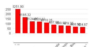
Hi Stephen,
Are you looking for something like this
- « Previous Replies
-
- 1
- 2
- Next Replies »