Unlock a world of possibilities! Login now and discover the exclusive benefits awaiting you.
- Qlik Community
- :
- All Forums
- :
- QlikView App Dev
- :
- Line chart formatting
- Subscribe to RSS Feed
- Mark Topic as New
- Mark Topic as Read
- Float this Topic for Current User
- Bookmark
- Subscribe
- Mute
- Printer Friendly Page
- Mark as New
- Bookmark
- Subscribe
- Mute
- Subscribe to RSS Feed
- Permalink
- Report Inappropriate Content
Line chart formatting
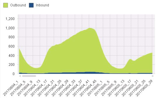
I have fields such as "date", "timeslot", "inbound", "outbound" in my data set.
I want to use this dataset to plot a daily trend but it should show the values at timeslot level without aggregating it to the daily level.
My graph should look something like the attached "Expected_Chart".
PS: I would be using 14 dates in my chart and for each date there are 48 timeslots.
I am currently concatenating the "date" and "timeslot" fields into a single field called "date_ts" and then using this as my dimension to plot the values. My challenge is to display specific "dates" in the x-axis rather than "date_ts".
If that is not possible, I would like to squeeze my chart to show alteast 7 days of data.
Please let me know if my approach is correct and how I can format my chart to get the desired results.
Accepted Solutions
- Mark as New
- Bookmark
- Subscribe
- Mute
- Subscribe to RSS Feed
- Permalink
- Report Inappropriate Content
Hi,
Maybe you can change the graph type to bars chart.
Like attached example.
Cheers,
- Mark as New
- Bookmark
- Subscribe
- Mute
- Subscribe to RSS Feed
- Permalink
- Report Inappropriate Content
Please share some sample app.
- Mark as New
- Bookmark
- Subscribe
- Mute
- Subscribe to RSS Feed
- Permalink
- Report Inappropriate Content
We have till this control only. And that if data is good then it may work 
- Mark as New
- Bookmark
- Subscribe
- Mute
- Subscribe to RSS Feed
- Permalink
- Report Inappropriate Content
You could Date(Floor(Timestamp)) AS Date_chart and use that as a dimension for your chart, right?
- Mark as New
- Bookmark
- Subscribe
- Mute
- Subscribe to RSS Feed
- Permalink
- Report Inappropriate Content
What do you mean by specific Date ? you other chart is showing according to days not the date !!
change the dates to common format that should resolve the issue
- Mark as New
- Bookmark
- Subscribe
- Mute
- Subscribe to RSS Feed
- Permalink
- Report Inappropriate Content
I do not have a Date Timestamp. Just Date (e.g. 20170101) and Timeslot (e.g. 1, 2, 3,.....48). For each Date there are 48 Timeslots.
I basically want to plot data for each Timeslot of every Date but want just "Date" values to be displayed on x-axis.
eg) Rather than displaying 20170101_1, 20170101_2, ...................20170101_48, ........ 20170114_1, .....20170114_48, I want to display just the dates i.e) 20170101, 20170102.....20170114.
- Mark as New
- Bookmark
- Subscribe
- Mute
- Subscribe to RSS Feed
- Permalink
- Report Inappropriate Content
Thats fine Avinash. I need not display the days necessarily. I am more interested in dates and I am not sure how formatting the date would resolve this.
Just to be clear, my "Date" and "Timeslot" are different fields.
- Mark as New
- Bookmark
- Subscribe
- Mute
- Subscribe to RSS Feed
- Permalink
- Report Inappropriate Content
Hi,
Maybe you can change the graph type to bars chart.
Like attached example.
Cheers,
- Mark as New
- Bookmark
- Subscribe
- Mute
- Subscribe to RSS Feed
- Permalink
- Report Inappropriate Content
Hi Federico,
I think you forgot to attach the file.
Thanks
- Mark as New
- Bookmark
- Subscribe
- Mute
- Subscribe to RSS Feed
- Permalink
- Report Inappropriate Content
Hi,
I can see the attached file...TEST_dates.qvw