Unlock a world of possibilities! Login now and discover the exclusive benefits awaiting you.
- Qlik Community
- :
- All Forums
- :
- QlikView App Dev
- :
- Show data for all months in selected graphic
- Subscribe to RSS Feed
- Mark Topic as New
- Mark Topic as Read
- Float this Topic for Current User
- Bookmark
- Subscribe
- Mute
- Printer Friendly Page
- Mark as New
- Bookmark
- Subscribe
- Mute
- Subscribe to RSS Feed
- Permalink
- Report Inappropriate Content
Show data for all months in selected graphic
Hello fellow Qlik users.
I have a report showing what items we bought for specific projects.
Dates range from 'A' to 'B' (date depends on task)
For example, we bought items for task001 from february 2016 to july 2016
I use these datas on 2 graphics:
Left graphic shows the total amount spent for this project (red bar is not relevant)
Right graphic shows the amount spent by months
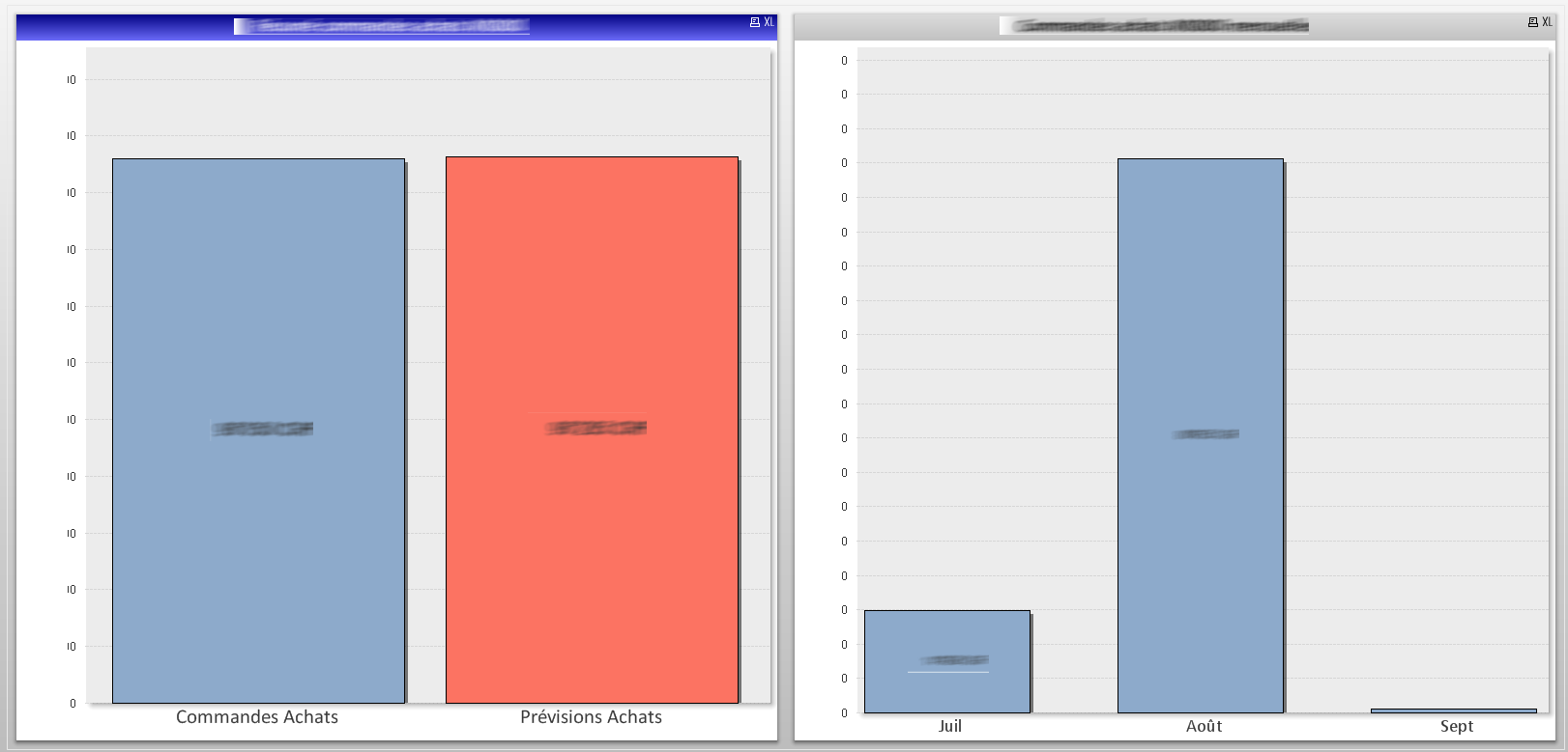
At the moment if I select a specific month, left graphic value adapts and shows the amount for this month as well
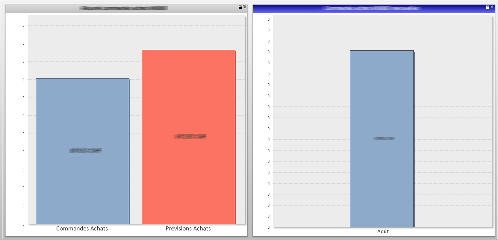
I would like to be able to select specific months (via calendar for example) but I don't want the total amount column to change (I want it to always show the total amount on the left)
Left graphic expression is:
=sum({<OP = {Spentamount}>}((TotalAmount)*(Change)))
No dimension
Right graphic expression is:
=sum({<OP = {Spentamount}>}((TotalAmount)*(Change)))
Dimension is "month_text"
Script for dates is:
SET TimeFormat='hh:mm:ss';
SET DateFormat='DD.MM.YYYY';
SET TimestampFormat='DD.MM.YYYY hh:mm:ss[.fff]';
SET MonthNames='Janv;Févr;Mars;Avril;Mai;Juin;Juil;Août;Sept;Oct;Nov;Déc';
SET DayNames='lun;mar;mer;jeu;ven;sam;dim';
Is there a simple way to make the left graphic always use the total amount ?
If I'm not clear, feel free to as more informations.
Thank you for your time 
FG