Unlock a world of possibilities! Login now and discover the exclusive benefits awaiting you.
- Qlik Community
- :
- All Forums
- :
- QlikView App Dev
- :
- Split Chart expressions into groups
- Subscribe to RSS Feed
- Mark Topic as New
- Mark Topic as Read
- Float this Topic for Current User
- Bookmark
- Subscribe
- Mute
- Printer Friendly Page
- Mark as New
- Bookmark
- Subscribe
- Mute
- Subscribe to RSS Feed
- Permalink
- Report Inappropriate Content
Split Chart expressions into groups
Hi Everyone,
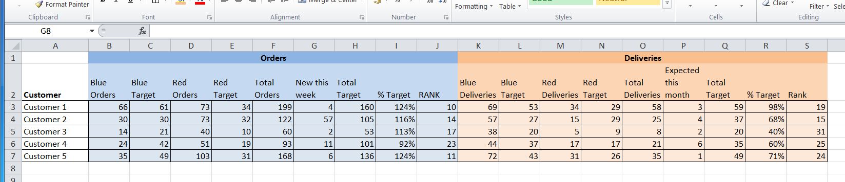
I am trying to recreate a user's report as a chart object. I'm not sure how to ask the question, or which keyword to search for, so apologies if the answer is already out there.
The attached image shows the problem - the expressions for Orders and the expressions for Deliveries are different, so if I include them in one chart, I will get redundant columns in each group.
Can anyone advise please?
Best regards,
Marty.
- Tags:
- expressions
- groups
- Mark as New
- Bookmark
- Subscribe
- Mute
- Subscribe to RSS Feed
- Permalink
- Report Inappropriate Content
Perhaps you could have two separate charts, and toggle between each based on Orders vs. Deliveries, using some kind of conditional show, or just keep them separate for display purposes. Perhaps I'm not understanding your request properly. Are you thinking about how to put expressions in group (like you can with dimensions), and then toggling the chart between the two groups?
- Mark as New
- Bookmark
- Subscribe
- Mute
- Subscribe to RSS Feed
- Permalink
- Report Inappropriate Content
Hi,
put each one of the expressions in separate objects and then put them appearing by conditional.
Regards
André Gomes