Unlock a world of possibilities! Login now and discover the exclusive benefits awaiting you.
- Qlik Community
- :
- All Forums
- :
- QlikView App Dev
- :
- Trellis Chart
- Subscribe to RSS Feed
- Mark Topic as New
- Mark Topic as Read
- Float this Topic for Current User
- Bookmark
- Subscribe
- Mute
- Printer Friendly Page
- Mark as New
- Bookmark
- Subscribe
- Mute
- Subscribe to RSS Feed
- Permalink
- Report Inappropriate Content
Trellis Chart
Hi
I have a requirement to show a table with Metric values on vertical side and Month values horizontally in a table which I can to with a simple straight table with existing structure of the data , but I also have an requirement to display individual chart for each metric having Month as Xaxis and sum(Data) as Y axis for each Metric value which I can do by doing a Cross Tab of the data , Can some one please suggest a better way to achieve both with the same data table.
Attached is my application , and also is there a way to dynamically change the Y axis values in trellis chart , I have read through some posts and looks like there is NOT , just wanted to make sure .... what is the best way to show different line charts for each metric other than creating chart for each one of them individually
Thank you!
- Mark as New
- Bookmark
- Subscribe
- Mute
- Subscribe to RSS Feed
- Permalink
- Report Inappropriate Content
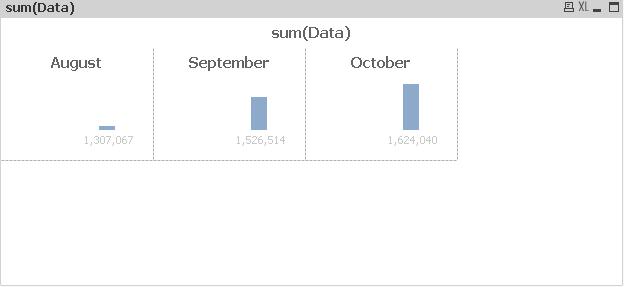
Please see the attached and hope it helps....
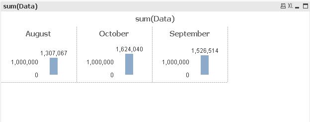
Or as below:
- Mark as New
- Bookmark
- Subscribe
- Mute
- Subscribe to RSS Feed
- Permalink
- Report Inappropriate Content
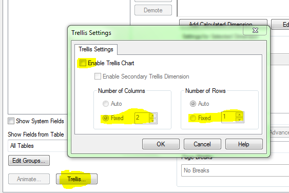
Check this from dimension Tab of your chart
- Mark as New
- Bookmark
- Subscribe
- Mute
- Subscribe to RSS Feed
- Permalink
- Report Inappropriate Content
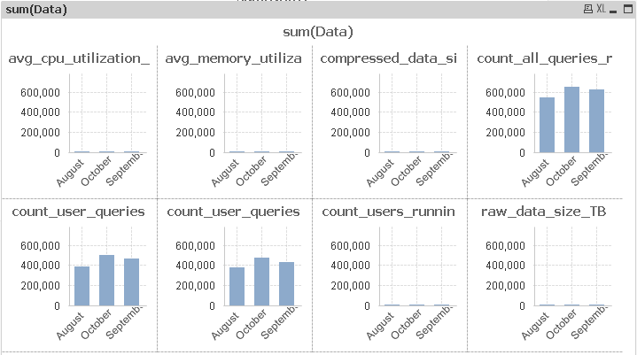
Actually I am looking for something like this with dynamic y axis to scale it properly .. is that possible?
- Mark as New
- Bookmark
- Subscribe
- Mute
- Subscribe to RSS Feed
- Permalink
- Report Inappropriate Content
Ok I have read the posts and looks like its not possible