Unlock a world of possibilities! Login now and discover the exclusive benefits awaiting you.
- Qlik Community
- :
- All Forums
- :
- QlikView App Dev
- :
- Would it be possible to create ribbon chart in Qli...
- Subscribe to RSS Feed
- Mark Topic as New
- Mark Topic as Read
- Float this Topic for Current User
- Bookmark
- Subscribe
- Mute
- Printer Friendly Page
- Mark as New
- Bookmark
- Subscribe
- Mute
- Subscribe to RSS Feed
- Permalink
- Report Inappropriate Content
Would it be possible to create ribbon chart in QlikSense
Hi,
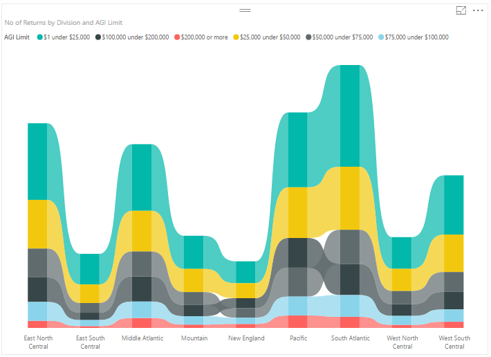
ribbon chart power bi - Bing images
a business group has asked me to explore ribbon chart capability in Qlik (particularly QlikSense) (extension, branch). I've an idea about Sankey which is not what they are looking for.
BR,
Vijay
- Mark as New
- Bookmark
- Subscribe
- Mute
- Subscribe to RSS Feed
- Permalink
- Report Inappropriate Content
IS this you are taking about https://dpspowerbi.blob.core.windows.net/powerbi-prod-media/powerbi.microsoft.com/en-us/documentatio...
- Mark as New
- Bookmark
- Subscribe
- Mute
- Subscribe to RSS Feed
- Permalink
- Report Inappropriate Content
Hi Anil,
Yes..
Thanks & Regards,
Vijay
- Mark as New
- Bookmark
- Subscribe
- Mute
- Subscribe to RSS Feed
- Permalink
- Report Inappropriate Content
For me that sounds based on data it will come automatic using style tab? Can you show the data or share the sample appication
- Mark as New
- Bookmark
- Subscribe
- Mute
- Subscribe to RSS Feed
- Permalink
- Report Inappropriate Content
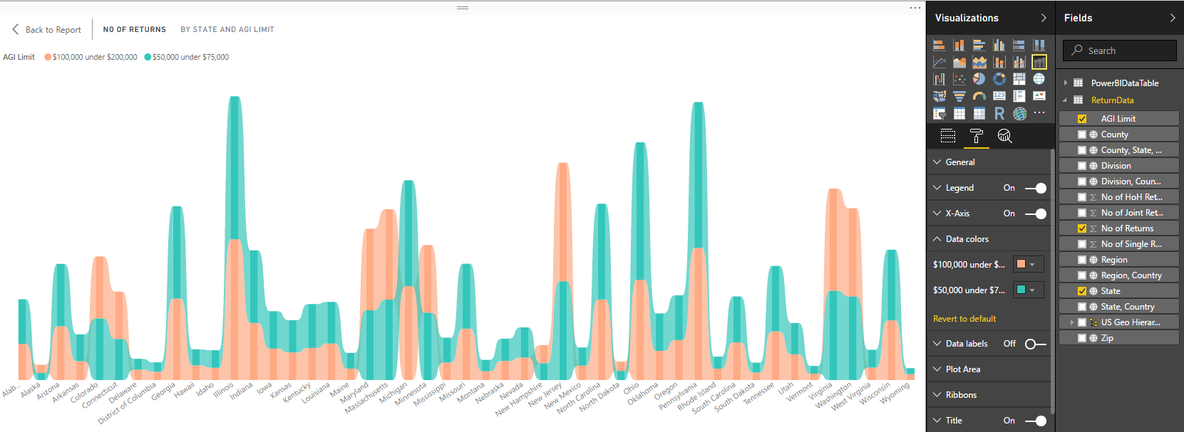
I'll look into providing sample data. Currently I don't have it handy but will look into it. I'm not sure if I get what you mean by it will come automatic using style tab. In Power BI the ribbon chart style is one of the chart option for user to select. I don't know if there is such a chart in Qlik (QV or QS).
- Mark as New
- Bookmark
- Subscribe
- Mute
- Subscribe to RSS Feed
- Permalink
- Report Inappropriate Content
In sense, We have area chart. And we can't go out of box.
- Mark as New
- Bookmark
- Subscribe
- Mute
- Subscribe to RSS Feed
- Permalink
- Report Inappropriate Content
We are aware of Area Chart but team don't see it fit for the purpose/use case. I'm not in a position to explain the use case scenario from team's perspective.
I've data that I've used in PowerBI to create ribbon chart. It is not from the business use case but to illustrate the ribbon chart.
two data categories in particular that provides ribbon chart behavior that team is interested in are data values for
$100,000 under $200,000 and $50,000 under $75,000 as bands in these two categories cross over for some Division (X-Axis) Dimension values