Unlock a world of possibilities! Login now and discover the exclusive benefits awaiting you.
- Qlik Community
- :
- All Forums
- :
- QlikView App Dev
- :
- how to display highest value on one color and lowe...
- Subscribe to RSS Feed
- Mark Topic as New
- Mark Topic as Read
- Float this Topic for Current User
- Bookmark
- Subscribe
- Mute
- Printer Friendly Page
- Mark as New
- Bookmark
- Subscribe
- Mute
- Subscribe to RSS Feed
- Permalink
- Report Inappropriate Content
how to display highest value on one color and lowest value on one color in bar chart ?
how to display highest value on one color and lowest value on one color in bar chart ?
- Tags:
- new_to_qlikview
- Mark as New
- Bookmark
- Subscribe
- Mute
- Subscribe to RSS Feed
- Permalink
- Report Inappropriate Content
Hi,
In the Bar chart expression click on the plus sign and in Background Color write expression
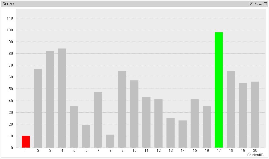
=if(sum(Metrics) = Min(total Metrics), Red(),
if(sum(Metrics) = Max(total Metrics), Green()))
Or
LOAD * Inline [
ID,Value
A,20
B,30
C,10
D,45
E,50 ];
Ex:-
if(sum(Value) = Min(total Value), Red(),
if(sum(Value) = Max(total Value), Green()))
Regards
Anand
- Mark as New
- Bookmark
- Subscribe
- Mute
- Subscribe to RSS Feed
- Permalink
- Report Inappropriate Content
@ Anand.... I think your one will not work.....I haven't tested but may be I could be wrong !!
Consider below script...
Sales:
Load * Inline
[
Customer, Sales
A, 100
B, 75
C, 50
D, 120
E, 150
F, 50
G, 200
I, 225
J, 175
];
Create a Bar Chart
Dimension
Customer
Expression
SUM(Sales)
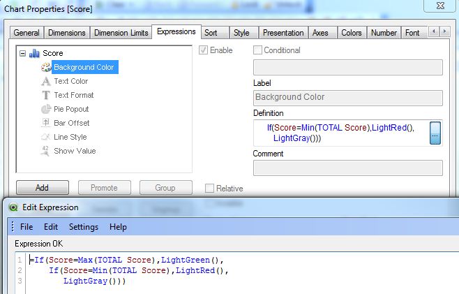
Now to differentiate SUM(Sales) based on Min and Max Sales, click on + sign of Expression Tab and write below expression in Background Color
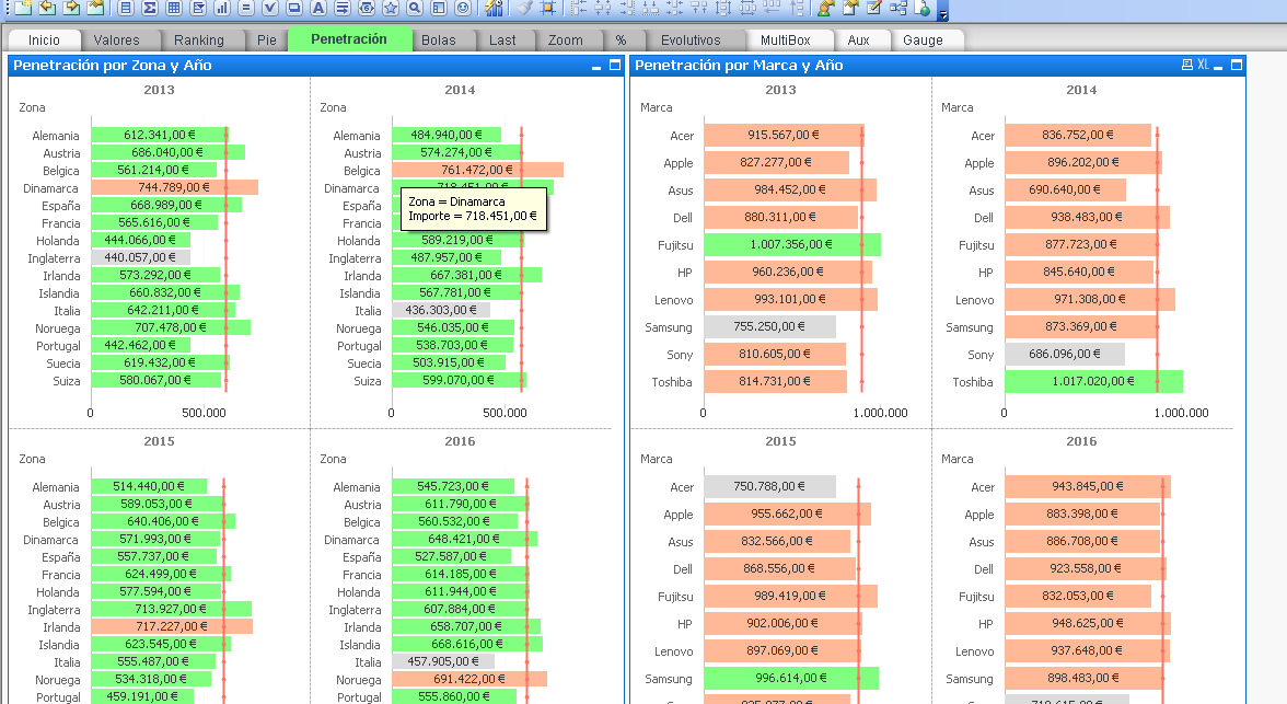
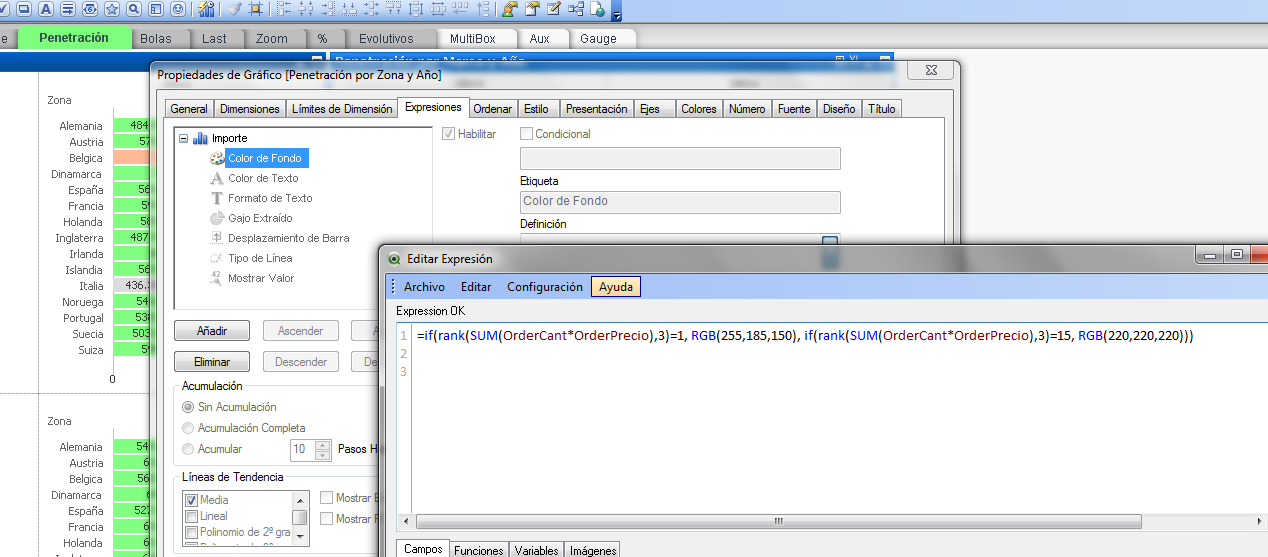
=IF(SUM(Sales) = Min(TOTAL Aggr(Sum(Sales),Customer)),Red(),
IF(SUM(Sales) = Max(TOTAL Aggr(SUM(Sales),Customer)), Green(),QlikTechGray()))
Hope this will help !
Happy Qliking...
- Mark as New
- Bookmark
- Subscribe
- Mute
- Subscribe to RSS Feed
- Permalink
- Report Inappropriate Content
Is this you need?
- Mark as New
- Bookmark
- Subscribe
- Mute
- Subscribe to RSS Feed
- Permalink
- Report Inappropriate Content
- Mark as New
- Bookmark
- Subscribe
- Mute
- Subscribe to RSS Feed
- Permalink
- Report Inappropriate Content
Hi,
one solution could be:
Barchart Colors based on Values
When using the Min/Max approach, you have to compare against the TOTAL min or max.
hope this helps
regards
Marco
- Mark as New
- Bookmark
- Subscribe
- Mute
- Subscribe to RSS Feed
- Permalink
- Report Inappropriate Content
@Manish,
No both are working with the expression in the Background Color
=if(sum(Sales) = Min( Total Sales), Red(),
if(sum(Sales) = Max( Total Sales), Green()))
With your given data and it gives
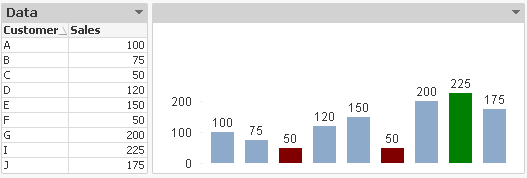
But i believe for this type of data use Rank to represent data but it display correctly.
Regards
Anand