Unlock a world of possibilities! Login now and discover the exclusive benefits awaiting you.
- Qlik Community
- :
- All Forums
- :
- QlikView
- :
- Help with moving legends
- Subscribe to RSS Feed
- Mark Topic as New
- Mark Topic as Read
- Float this Topic for Current User
- Bookmark
- Subscribe
- Mute
- Printer Friendly Page
- Mark as New
- Bookmark
- Subscribe
- Mute
- Subscribe to RSS Feed
- Permalink
- Report Inappropriate Content
Help with moving legends
Hi Guys
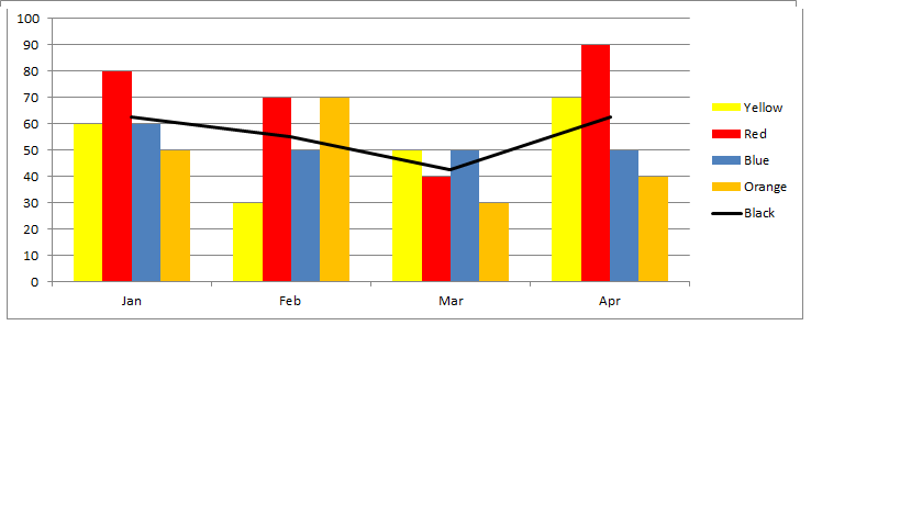
Need some help with a combo graphs. I'm trying to create a table similar to the image included. I have 2 dimensions, one for Months and one for color. I need to plot the average, but the average is not only based on the included colours. So I can't simply add an average line. So what I have done is to create 2 expressions. The first expression deals with the relevant colors that i want to include. The second expression deal only with the average. I then plot these two expressions using the same dimensions. The problem I have though is that I can’t get the legend as i have it here. Both the months and color are at the bottom of the graph and this is a bit messy is you consider that all the colors are repeated for each month.
Hope this is enough to go on. Look forward to your help
Accepted Solutions
- Mark as New
- Bookmark
- Subscribe
- Mute
- Subscribe to RSS Feed
- Permalink
- Report Inappropriate Content
You can make a straight table look like a legend. See attached example.
talk is cheap, supply exceeds demand
- Mark as New
- Bookmark
- Subscribe
- Mute
- Subscribe to RSS Feed
- Permalink
- Report Inappropriate Content
You can make a straight table look like a legend. See attached example.
talk is cheap, supply exceeds demand
- Mark as New
- Bookmark
- Subscribe
- Mute
- Subscribe to RSS Feed
- Permalink
- Report Inappropriate Content
Thanks. Looks like i'm heading in the right direction; but cureently the legend on the right top side of graph is refrecting the Label of the expression. So instead of Average / Jason / John ...... as in your example I have Avergae and Color. So just trying to figure out how to get it to display Yell / Red / blue ....
Any ideas, I imagine this is just a setting in properties that may need to be adjusted.
thanks again
Still struggling so inserted qlikview to show issues I'm having. Hope someone will be able to help