Unlock a world of possibilities! Login now and discover the exclusive benefits awaiting you.

Analytics & AI
Forums for Qlik Analytic solutions. Ask questions, join discussions, find solutions, and access documentation and resources.
Data Integration & Quality
Forums for Qlik Data Integration solutions. Ask questions, join discussions, find solutions, and access documentation and resources
Explore Qlik Gallery
Qlik Gallery is meant to encourage Qlikkies everywhere to share their progress – from a first Qlik app – to a favorite Qlik app – and everything in-between.
Qlik Community
Get started on Qlik Community, find How-To documents, and join general non-product related discussions.
Qlik Resources
Direct links to other resources within the Qlik ecosystem. We suggest you bookmark this page.
Qlik Academic Program
Qlik gives qualified university students, educators, and researchers free Qlik software and resources to prepare students for the data-driven workplace.
Recent Blog Posts
-
Qlik Partners IIM Bangalore for BAICONF
Qlik partnered Indian Institute of Management, Bangalore for its 3rd International Business Analytics event,BAICONF held on its campus from 17-19 Dec... Show MoreQlik partnered Indian Institute of Management, Bangalore for its 3rd International Business Analytics event,BAICONF held on its campus from 17-19 December 2015. Around 350 participants registered for this event which included corporates, research institutes and members of the academic community from across the country. The conference was successful in creating a platform and facilitate knowledge sharing on advanced data analysis, business analytics, big data and business intelligence for academicians, practitioners and researchers.
Qlik India MD, Souma Das presented on Data Visualisation in Business Analytics during this event. The academic community showed keen interest on the Academic Program offered by Qlik which gives free licenses to accredited educational institutions. IIM Bangalore has also signed for this program. Along with this, there was a good amount of interest around Qlik's products and their capabilities.
This event also generated a good amount of buzz in the press:
Qlik clicks with IIM Bangalore for BAICONF 2015 - Analytics India Magazine
Qlik partners Indian Institute of Management Bangalore for BAICONF 2015
-
Qlik Continuous Classroom Data Architect user role is now available!
The Qlik Continuous Classroom is expanding to serve another user role, the Qlik Sense Data Architect. Data architects manage and consolidate data fro... Show More
The Qlik Continuous Classroom is expanding to serve another user role, the Qlik Sense Data Architect. Data architects manage and consolidate data from different tables and sources to be integrated into clean dashboard interfaces.
This new user pathway for the Qlik Sense Data Architect provides an introduction to the Qlik Sense data model structures, connections, data loading, data management, and data modeling capabilities within a Qlik Sense app. Other modules cover acquiring data, associating tables, transforming data, resolving data model issues, debugging the script, validating the model, and much, much more.
This launch represents the foundation upon which future modules covering more advanced data modeling techniques will be built. For more information and to try the new Data Architect Modules for free, please visit http://qcc.qlik.com

-
Solving the Challenge of Unused Software
How custom application training can help increase user adoption of unused software within your organizationIt’s an all too frequent tale. You invest ... Show More
How custom application training can help increase user adoption of unused software within your organization
It’s an all too frequent tale. You invest in great software to drive progress and innovation within your business. But fast forward to a few months later, and you’re faced with lack of user adoption within your organization. The product is up and running. You may have even invested in training for your technical users, to make sure they got the knowledge they needed to keep their system up and running and to build out their analytic applications. But what about the employees who were to be the actual users of these applications? They have been forgotten....
It’s not human nature for most people to simply change course and adopt a new way of doing things. They need to see what is in it for them, and how it will make their jobs easier or more effective. So, how do you make sure that the users of the applications embrace change? The best way is to provide the user with application specific training. This type of training does not focus on the product, but how to use the application that is powered by the product. That’s because these users do not need to learn features and functions in a generic way. They need to learn exactly what they need to do with the application when it becomes part of their standard toolbox.
To read the full article visit Solving the Challenge of Unused Software | Qlik
-
Qlik Community Missions and Badges Updates
Hello Qlik Community Members, We have just launched updates to our existing Missions and Badges which include: Redesigned Mission Badges updated with ... Show MoreHello Qlik Community Members,
We have just launched updates to our existing Missions and Badges which include:
- Redesigned Mission Badges updated with the Qlik look and feel
- Additional descriptions for more complicated missions
- Qlik Community Tip document outlining Navigation, Mission details, Available Missions, and Difficulty Ratings
- New Missions: Document Rater and Personable
We will be launching additional missions in the coming months to encourage more complicated activities and recognize special contributors. New missions will be applied on a going forward basis to encourage and reward associated actions. So if you completed the required actions before the Mission was created, you will need to complete them again to receive the badge. As new missions launch we will announce them here and also update the associated Qlik Community Missions and Badges Resource Document.
-The Qlik Community Team

-
My Personal Use of QlikView
Most people who create a QlikView application do so to help analyze their business data. And while business is the main focus when analyzing data, the... Show MoreMost people who create a QlikView application do so to help analyze their business data. And while business is the main focus when analyzing data, there is an equally important segment of data that gets overlooked and that is personal or recreational data. Many times this data is captured in an Excel spreadsheet and beginner QlikView users might need to know how to load their spreadsheets into QlikView. In this blog I want to run through two scenarios of how I used QlikView to help me analyze some recreational data.
Scenario 1 - In my personal life I am a coach. I coach youth football, basketball and baseball. This past spring, while coaching my son’s 9-10yr old baseball team, I had the grand idea to analyze the team’s game data in QlikView. So, after each game, I took the data that I captured on our scorebook and entered it into an Excel spreadsheet. Each game had its own tab within the spreadsheet. After entering the data in to Excel, I would then load it into QlikView. Once the data was in QlikView, I created calculations that analyzed the productivity of my hitters. I tracked On-Base %, Batting Average, In-Play% and K/AB%.
As the season progressed, and I had more game data to analyze, I started using QlikView to create my batting order. My mindset was that my top on-base hitters batted 1-3, my top in-play hitters batted 4-7, and my weaker hitters batted 8-11. It was a youth version of Moneyball and I was the team’s Billy Beane. So what did all of the data crunching get us? Well, while we averaged over 9 runs per game during the season, we did not win the championship. My next order of business is to see how QlikView can help my team improve our fielding.

Scenario 2 – As I mentioned previously, I volunteer my time with youth sports organizations. Many of you know that youth organizations are administered by volunteers, many of whom have full-time jobs and families. So any amount of added help is greatly appreciated. Many of these organizations use Excel spreadsheets to keep track of the finances. Trying to analyze that data takes lots of time and energy from volunteers who are already stretched too thin. This is where QlikView can help. QlikView allows the administrators to visualize expenses and revenues to get a better understanding of the money flow within the organization. I helped one youth organization complete this task and it was a real eye-opener to see just how much money was brought into the organization and where it was all spent.
Those are just two ways that I have utilized QlikView to help me analyze recreational data. And for those of you wondering how I loaded my Excel spreadsheets into QlikView, I wrote a technical paper that will explain the process.

-
When the going gets Flat, the Flat gets going…
When Microsoft unveiled its Windows 8 UI, which they called the ‘Metro’ style, there were whispers of a new underlying design concoction which was hap... Show MoreWhen Microsoft unveiled its Windows 8 UI, which they called the ‘Metro’ style, there were whispers of a new underlying design concoction which was happening in an effort to set a trend. The whispers quickly turned into a buzz when Google switched their visual design and UI for all its platforms to bold and contemporary. Then came Apple with its iOS 7 designed flat as paper which turned the big buzz into what was being called a design revolution which was the antithesis of faux bevels, shadows and the real world lookalikes.
“There is a profound and enduring beauty in simplicity, in clarity, in efficiency, true simplicity is derived from so much more than just the absence of clutter and ornamentation. It’s about bringing order to complexity” these are words from Sir Jony Ive, the chief designer of all the beautiful Apple products we own. It was just déjà vu for some of us who thought it was like the return of the BAUHAUS.
So what exactly are we talking about?
It is about a Design style, an approach to UI that has become a mainstream and what everyone seems to be following these days. It can be seen in websites, mobile apps, print, branding, logos, icons and even in dashboards. It is called Flat design.
So what exactly is a Flat design and what is not a Flat design?
Flat design is essential visual elements that are literally flat, they are without any shadows, bevels and gradients. Apart from its elements Flat is minimalistic in its style and places greater emphasis on colors, typography and imagery as core design principles. Basically it is striping off the ornamentation which doesn’t support the UI and doesn’t mimic real-life objects. Something like this...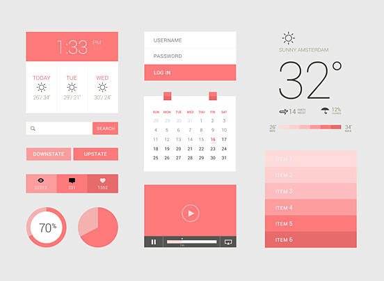
And this..
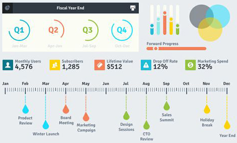
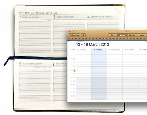
What is not flat design is obviously completely the opposite, and the word for it is “Skeuomorphism”. Skeuomorphism is something that mimics a real-life object, just like the previous Apple UIs before iOS7. Something like this
…As opposed to this.

It is obviously a design language of the present times but there are certain pitfalls that come along with it that are hard to ignore. They tend to blur the line between navigational elements and aesthetic elements within a design. This means certain UI elements like buttons and toggles merge into the background and cannot be recognized quickly as action items. But again, it depends on how they are designed.
Design is a combination of science and aesthetics; however, visual design is also a lot of personal aesthetic choices we make to support the user interface in becoming seamless. My style choice may not be someone else’s. As a designer, I like following the trends to avoid looking like a pair of bell bottom pants in the age of skinny jeans.
Another argument for moving away from the age old Skeuomorphism is that we have come such a long way in the digital world that the need to relate to real-life objects in the digital sense seems redundant.
So, what should one follow? You can follow your own style of design as long as it justifies the purpose. And if you are the fashionable type then just remember to do a contextual based design, which means do it where necessary and strip off where unnecessary. Just like how Google gets it right, a little shadow where needed but mostly flat.
-
Using RGB() and ARGB() to define colors
There are many different areas in QlikView where the developer can define a specific color to be used. Most times developers will simply navigate to t... Show MoreThere are many different areas in QlikView where the developer can define a specific color to be used. Most times developers will simply navigate to the color picker and select the color that is closest to the color that they are looking for.
QlikView also offers the user ways to define what the color should be based on the result of an expression. This gives the developer the ability to change the color at will. QlikView also gives the developer the ability to define the opaqueness of a specified color as well. This is particularly useful when scatter chart coordinates fall within the same intersection. The two functions that I want to talk about are RGB() and ARGB().
To show the RGB() and ARGB() functions in action I will run through a couple of examples from the Pharma Sales Demo on demo.qlik.com.
Scenario 1 – Coloring the background in a table based on an expression result using RGB()
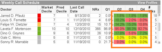
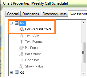
On the Expressions tab within the Object Properties, we are going to create the expression in the Background Color area that will prompt QlikView to set the background color of the Quarter cells.
We need to fill the background color with green if the quarter is greater than the previous quarter, to fill the background with yellow if the quarter is equal to the previous quarter and fill the background with red if the quarter is lower than the previous quarter.
The expression looks like this:
If([Q2]>[Q1], rgb(108,179,63),
If([Q2]=[Q1], yellow(),
If([Q2]<[Q1], rgb(255,110,110))))
Because we are filling the background with a specific color based solely on the result of the calculation, we used the RGB() function.
Scenario 2 – Specify the colors of data points on a scatter chart based on an expression using ARGB()
In this chart we will use ARGB() to show multiple plot points on a scatter chart that are placed on top of each other.
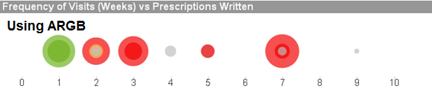
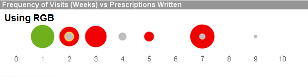
If we used RGB() in this chart, we would not be able to see the different levels of the same color on one plot point.
The requirement is to fill the background and the text color as follows:
Must Call = Red
Need To Call = Yellow
Recent Call = Green
Not Targeted = Grey
The expression looks like this:
if([Call Priority]='Must Call', argb(175,242,0,0),
if([Call Priority]='Need To Call',argb(175,254,197,80),
if([Call Priority]='Recent Call', argb(175,111,176,29),
if([Call Priority]='Not Targeted',argb(175,190,190,190) ))))
The expression result shows how the opaqueness allows the user to see multiple intersecting plot points, helping the user to get a clearer picture of all of the data points. As is shown above, without the opaqueness, the green plots on the plot of 1 would look like a solid green dot instead of showing that there is more than one plot point.
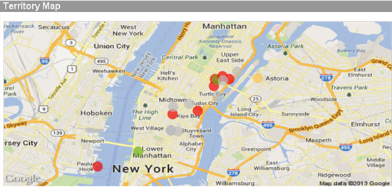
We can also use the ARGB() function with maps as well. Using the same expression as above we can see how the opaqueness allows the user to see multiple intersecting plot points as well as original map data such as city names, street names, etc.
In conclusion, if you want to specify the color of your backgrounds, text colors, data points, etc, you can with QlikView. The take away from this should be to think before you color. If you are coloring a background or text, use RGB(). If you are coloring data points on a scatter chart and some or many of the data points will overlap, you may want to consider ARGB(). I wrote a technical paper about this that goes into a little more detail. You can find it here.
Happy Qliking!!
-
The True Value of Education
"It is not about what you know, it is about what you can do".For a person using an analytics application as their tool, they too should not have to wo... Show More
"It is not about what you know, it is about what you can do".
For a person using an analytics application as their tool, they too should not have to worry about how to use the tool. For example, we do not want a user to worry about how to display bars side-by-side to show a reference line with the average value. We want them to focus on the important part: the analytical question. In this case it could be "What resources do we need to complete this project on time, and where do we need them?”. The "How do I do this in Qlik?" becomes "muscle memory"…it is just like tying your shoes.
People can learn things on their own, but they won’t connect the dots when they don’t know what they don’t know. There are features which may be better for them to use that they are not aware of. By using education, we teach them all of these and it becomes just like tying their shoe, so they free up their mind and are equipped to handle any question that comes at them.
To read the full article visit The True Value of Education | Qlik
-
Accessing user information
For any BI tool to work it needs to understand who is using the tool. If we know who is using the tool (authentication) we also need to understand thi... Show MoreFor any BI tool to work it needs to understand who is using the tool. If we know who is using the tool (authentication) we also need to understand things about them such as where they work, e-mail address etc. If we know who the user is and what describes him/here we can do things like giving them access to the right information and tailor their experience. We therefore have methods in both QlikView and Qlik Sense to access information describing the users in user directories. Even though we have this capability in both QlikView and Qlik Sense, their approach to doing it is very different.
The most common user directory used by our customers is LDAP. LDAP is a distributed database that is suitable for maintaining user information. It exists in both open solutions developed by the open source community (such as OpenLDAP) and in closed solutions (such as Microsoft Active Directory).
So what are the differences between QlikView and Qlik Sense?
QlikView is based on the concept with a directory service connector that fetch user information as it is needed. It doesn't replicate any data stored in the LDAP database, but instead asks a question every time it needs access to user information including groups.
Qlik Sense uses a sync approach, which means that it replicates the user information including groups from LDAP into a database and then keeps this in sync. This can be done in different ways (sync all users, sync with a filter, sync only users that access Qlik Sense) depending on your needs and size of directory.
There are two major usages of the user information, each with different needs: for management and for access control/authorization.
For management it is good if the information is current but not absolutely critical, so here the Qlik Sense scheduler is used to update the data.
For security however, it is critical that information is current. Therefore individual user records are updated as the user connects to the Qlik Sense environment.
So, are there any similarities in how you configure Qlik Sense and QlikView?
Yes
In the picture below I describe the relations between QlikView LDAP configuration and Qlik Sense LDAP Configuration.
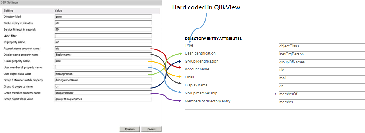
I hope that you found these tips on how we access user information helpful. If you have questions on this blog post or have ideas of what you want to read about in the future, please don’t hesitate to add comments to post.
-
Contextualize your KPIs
Raw data is useful but data with additional contextual information is better because it helps us do what we already do naturally: compare, contrast, a... Show MoreRaw data is useful but data with additional contextual information is better because it helps us do what we already do naturally: compare, contrast, and weigh our options as part of the bigger picture. Contextual data is the supporting information that helps the reader more fully understand the primary data.
Key performance indicators (KPIs) at the top of a Dashboard page are a great way to give the general summary of how something is functioning, but the very next thought in any reader's mind is about context. Only people who are very familiar with the data can look at a number and place it in the context of the full story. The rest of us need additional information to contextualize this data. There are a variety of simple ways to give readers additional context so they can make smarter decisions.
Traffic light
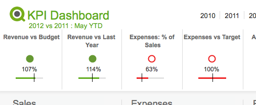
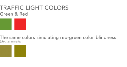
One way most people in BI are familiar with providing additional context is color coding information with traffic light colors. Green is good, yellow is a warning, red is bad. This visual metaphor is so common that most people understand it without any additional information. You might not know why a number is red, but at least you know there is a problem. Something to consider however is using an additional visual cue along with this metaphor for color blind users. Red-green color blindness is the most common form of color blindness which is where red & green colors shift to being shades of yellow and brown. You can use shapes / symbols along with your colors to improve the accessibility of this system. Perhaps you use up or down triangles in addition to coloring them green or red. Perhaps a fully colored circle can be green for good where an empty circle with just a red border can be bad. The shape is an additional indicator to users who have difficulty seeing the differences in your colors as to the context of your data.
Lines & Bars
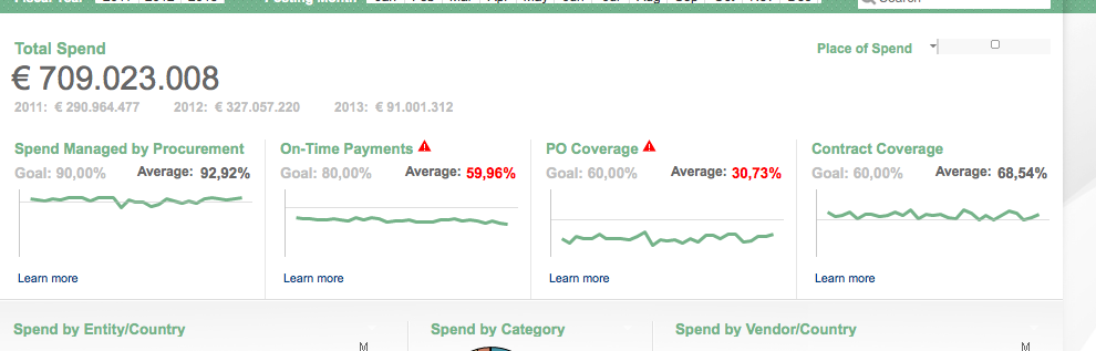
Having a simple line or bar chart below a KPI can quickly place a KPI in the context of a larger whole. These are charts with no axes or written values. They are simply there to give context - drilling into the details is done elsewhere.
- A line chart helps show the overall trend. To see a KPI number in green is useful, but more useful is to see that perhaps the overall trend in sales is going down and pretty soon that number might be red.
- A bar/bullet chart is useful for showing, among other things, the completion of goals. Show a goal/reference line and show how well you met or exceeded that goal. This is essentially a more streamlined, quieter, more aesthetically pleasing version of a gauge chart.
This time last …
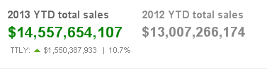
An additional piece of context you can add is some variation of "This Time Last …" year, quarter, month etc. You communicate to the reader that at some previous point in time the value of this field was something else and you are helping them compare the two values and judge if progress is being made.
You can employ any/all of these in your designs to help bring context to the data and enable users to make smarter decisions.
-
Counters in the Load
Often when you create scripts, you need to create new fields, based on counters. There are several ways to do this. Some are simple, others not so… ... Show MoreOften when you create scripts, you need to create new fields, based on counters. There are several ways to do this. Some are simple, others not so…
Using RecNo()
The RecNo() function simply counts the input records and returns the number of the current record. Simple, and very useful if you want to create a record ID. However, if you concatenate several input files, or use a While clause, the numbers will not be unique.
Using RowNo()
The RowNo() function is very similar to the RecNo(), but this instead counts the output records and returns the number of the current record. Also simple and useful, especially if you concatenate several input tables. In such a case, the function will return consecutive numbers for the output table.
Using AutoNumber()
The AutoNumber() function is useful if you want to put a number on a specific field value, or on an attribute that is a combination of field values. The attributes will be numbered and their numbers re-used appropriately.
AutoNumber( Product & '|' & Date ) as ID
Using inline Peek() and RangeSum()
This is the mother of all record counters. Anything can be numbered; it can be done conditionally and anything can be used as condition. The idea is to fetch the counter value from the previous record and increase it only if some condition is fulfilled. Or reset it.
An example: For production quality control, some process indicator is measured and the Quality Manager wants to track trends and trend shifts. Then it is important to see the number of consecutive days that this indicator has increased or decreased. It is also good if the series of consecutive days can get a unique ID that can be used for selections and charts.
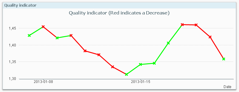
The following script creates these two fields; TrendID and DaysWithTrend.
Load *,
If( Change * Peek( Change ) > 0,
Peek( TrendID ),
RangeSum( 1, Peek( TrendID ))
) as TrendID,
If( Change * Peek( Change ) > 0,
RangeSum( 1, Peek( DaysWithTrend )),
0
) as DaysWithTrend;
Load
Indicator,
Indicator - Peek( Indicator ) as Change
Resident Daily_TQM_Measurement
Order By Date;First of all, the change of the indicator value is calculated in the bottom Load using the Peek() function. In the preceding Load, the change is used as condition in the If() function. The condition compares current record with the previous record using the last change and the second last change. If the product of the two is greater than zero, the trend has been the same two days in a row, so the TrendID of the previous record is used (the Peek() function) and DaysWithTrend is increased by one.
But if the condition is false, the TrendID is increased by one and the DaysWithTrend is reset to zero.
When a counter is increased, normal addition cannot be used since the Peek() will return NULL for the very first record. Instead the addition is made using the RangeSum() function.
Summary: You can create any auto-incrementing counter in a QlikView script. Just choose your counter function…

-
Qlik Dev Hub replaces Qlik Sense Workbench in Qlik Sense 2.1
For Qlik Sense 2.1, the Qlik Dev Hub, accessible at https://<ServerName>/dev-hub/ , replaces the Qlik Sense Workbench, formerly accessed by https://<... Show MoreFor Qlik Sense 2.1, the Qlik Dev Hub, accessible at https://<ServerName>/dev-hub/ , replaces the Qlik Sense Workbench, formerly accessed by https://<ServerName>/workbench/ (this will now redirect you to the Dev Hub). In addition to a brand new user interface layout, the Dev Hub has a couple of new features worth mentioning.
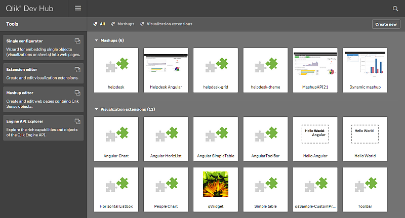
The new user interface has a sleek dark color design, and its layout more closely resembles the Qlik Sense client than its predecessor. The top nav bar has a drop-down menu that provides access to an “About” link, which displays information regarding the Qlik Dev Hub, and a “Help” link, which brings up helpful documentation in a new browser window. There’s an added search functionality also included on the top nav bar which lets you search through your mashups and extensions, which is really useful as your number of them grows. A second nav bar allows filter by “Mashups” or “Visualization extensions.” There is also a “Create new” button that lets you jump right into creating a mashup or extension.
A left-aligned nav bar allows you to choose from “Single configurator,” “Extension editor,” “Mashup editor,” or “Engine API Explorer.” The “Single Configurator” was previously not accessible from the Qlik Sense Workbench, and its inclusion in the Qlik Dev Hub is very convenient. The “Engine API Explorer” was previously known as the “Protocol tester” and has a new look to match the Dev Hub.
The “Mashup editor” has a couple new features. There are now menus on the left and right of the main work area which can be toggled to make the main work area larger. An added feature I’m very fond of is the ability to create new files for your mashup right from the top nav bar. The “Preview” tab has been improved, and you can now interact with your mashup in addition to dragging and dropping charts, which is a nice improvement because formerly if you had off-canvas chart areas, there was no way to access them to drag and drop charts.
The Qlik Dev Hub comes with quite a few new templates for both mashups and visualization extensions. I highly suggest you try some of these out, I think you’ll be amazed at how quickly you can put together a decent mashup, even with little to no web development skills. Steps below -
1) Navigate to the Qlik Dev Hub, click on the “Create new” button, give your mashup a name, and select either “Basic single page mashup” or “Slideshow mashup” from the dropdown menu.
2) Click the “Create and edit” button and this will open up your mashup in the “Mashup editor” for you.
3) Select an app from the dropdown menu in the left nav, and start dragging and dropping charts into the chart areas.
4) Customize as much as you want by modifying the auto-generated HTML and JS files
I’m going to include a few links to documentation below. If you haven’t tried the new Qlik Dev Hub yet, you should definitely check it out.
-
A Myth about the Number of Hops
In the QlikCommunity forum I have often seen people claim that you should minimize the number of hops in your Qlik data model in order to get the be... Show MoreIn the QlikCommunity forum I have often seen people claim that you should minimize the number of hops in your Qlik data model in order to get the best performance.
I claim that this recommendation is not (always) correct.
In most cases, you do not need to minimize the number of hops since it affects performance only marginally. This post will try to explain when an additional table significantly will affect performance and when it will not.
The problem is which data model to choose:
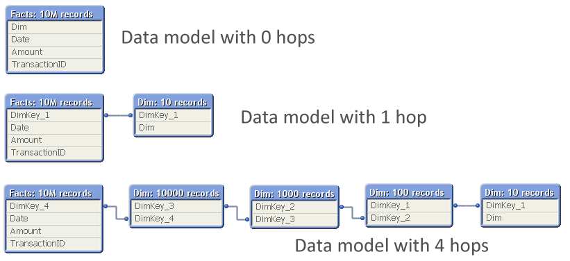
The question is: Should you normalize and have many tables, with several hops between the dimension table and the fact table? Or should you join the tables to remove hops?
So, I ran a test where I measured the calculation time of a pivot table calculating a simple sum in a large fact table and using a low-cardinality dimension, while varying the number of hops between the two. The graph below shows the result. I ran two series of tests, one where the cardinality of the dimensional tables changed with a factor 10 for each table; and one where it changed with a factor 2.
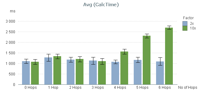
You can clearly see that the performance is not affected at all by the number of hops – at least not between 0 and 3 hops.
By 4 hops, the calculation time in the 10x series however starts to increase slightly and by 5 hops it has increased a lot. But this is not due to the number of hops. Instead, it is the result of the primary dimension table (the dim table closest to the fact table) getting large: By 5 hops it has 100.000 records and can no longer be regarded as a small table.
To show this, I made a second test: I measured the calculation time of the same pivot table using a fix 3-table data model, varying the number of records in the intermediate table, but keeping the sizes of the other tables.
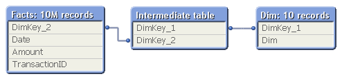
In real life, this structure would correspond to a part of a more complex data model, e.g.
- Facts - Products - Product Groups
- Order Lines - Order Headers - Customers
The result of my measurement can be seen in the red bars below:
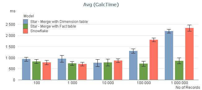
The graph confirms that the size of the intermediate table is a sensitive point: If it has 10.000 records or less, its existence hardly affects performance. But if it is larger, you get a performance hit.
I also measured the calculation times after joining the intermediate table, first to the left with the fact table, and then to the right with the dimension table, to see if the calculation times decreased (blue and green bars). You can see that joining tables with 10.000 records or less, does not change the performance. But if you have larger tables, a join with the fact table may be a good idea.
Conclusions:
- The number of hops does not always cause significant performance problems in the chart calculation. But a large intermediate table will.
- If you have both a primary and a secondary dimension (e.g. Products and Product Groups), you should probably not join them. Leave the data model as a snowflake.
- If you have the facts in two large tables (e.g. Order Lines and Order Headers), you should probably join them into one common transaction table.
PS. A couple of disclaimers:
- The above study only concerns the chart calculation time - which usually is the main part of the response time.
- If the expression inside your aggregation function contains fields from different tables, none of the above is true.
- Your data is different than mine. You may get slightly different results.
Further reading related to this topic:
-
Logical Inference and Aggregations
Every time you click, the Qlik engine recalculates everything. Everything. A new selection implies a new situation: Other field values than befo... Show MoreEvery time you click, the Qlik engine recalculates everything.
Everything.
A new selection implies a new situation: Other field values than before are possible; other summations need to be made; the charts and the KPIs get other values than before. The state vectors and the objects are invalidated. Everything needs to be recalculated since this is what the user demands.
Well, there is of course a cache also – so that the Qlik engine doesn’t have to recalculate something which has been calculated before. So it isn’t quite true that everything is recalculated: If a calculation has been made before, the result is simply fetched from the cache. But it is true that nothing is pre-calculated. There is no need for that. Everything can be done in real-time.
The Qlik engine is an on-demand calculation engine.
From a principal point, there are two steps in the recalculation of data: The logical inference in the data model, and the calculations of all objects, including sheet labels and alerts.
The logical inference is done first. The goal is to figure out which field values in the symbol tables are possible and which records in the data tables are possible, given the new selection. There is no number crunching involved - it is a purely logical process. The result is stored in the state vectors.
Think of it as if the selection propagates from one table in the data model to all other tables. Table after table is evaluated and the Qlik engine figures out which values and records are possible, and which are excluded.
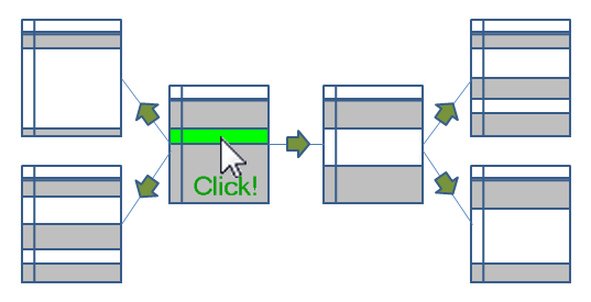
When the logical inference is done, the Qlik engine starts to evaluate all exposed objects. List boxes and dimensions in charts must be populated and sorted. All expressions – in charts, in text boxes, in labels, in alerts – must be calculated. Objects that are on other sheets, minimized or hidden, are however not calculated.
The calculations are always aggregations based on the data records that have been marked as possible by the logical inference engine. I.e., the objects do not persist any data on their own.
The calculation phase is usually the phase that takes time – often over 90% of the response time is due to calculations. The calculations are asynchronous and multi-threaded on several levels: First of all, every object is calculated in its own thread. Secondly, in the 64-bit version, many aggregations e.g. Sum() are calculated using several threads, so that a sum in one single object can be calculated quickly using several CPUs.
Finally, when an object has been calculated, it is rendered. Since the calculation is asynchronous and multi-threaded, some objects are rendered long before other objects are ready.
And when an object has been rendered, you can click again. And everything is repeated.
PS. All of the above is of course true for both QlikView and Qlik Sense. Both use the same engine.
If you want to read more about the Qlik engine internals, see
Symbol Tables and Bit-Stuffed Pointers
-
Qlik Continuous Classroom is now available!
The Qlik Continuous Classroom is a new 24/7 self-service distance learning platform for Qlik Sense!Innovative customized role-based curriculum, course... Show MoreThe Qlik Continuous Classroom is a new 24/7 self-service distance learning platform for Qlik Sense!
Innovative customized role-based curriculum, courses, and delivery accelerates the power of Qlik to customers around the world!
Qlik now provides users with a new way to learn that allows them to completely customize their learning journey based on their individual needs. Users can choose from dozens of modules equivalent to approximately 25 hours of work, with topics ranging from “Foundations of Building Visualizations” to ”Build and Play Stories”.
Learner-centric Distance Training Boosts Productivity with Qlik
The Qlik Continuous Classroom education package includes innovative offerings, such as:
- Videos with interactive exercises and quizzes – users decide when to start, stop, and resume as often as needed;
- The ability to interact directly with instructors and peer students, leveraging web conferencing tools and forums to quickly get answers as well as share best practices;
- Virtual office hours for immediate support; and
- One-to-many instructor-led virtual training, allowing whole teams to arrange an instructor-led live Webinar course customized to their needs.
More Information and Availability
Qlik Continuous Classroom is a subscription-based, self-service learning platform for Qlik Sense that can either be used on its own or supplemented by instructor-led courses. Users will have the option to preview videos prior to purchase. Today, customers and partners can purchase the Qlik Sense Business Analyst role, with additional roles to be added in the future. For more information and to try the platform for free, please visit http://qcc.qlik.com.
Check out the Qlik Continuous Classroom Video
-
It’s all Aggregations
I often see incorrect expressions being used in the QlikCommunity forum. Expressions that seem to work correctly – but really don’t… So, let me make... Show MoreI often see incorrect expressions being used in the QlikCommunity forum. Expressions that seem to work correctly – but really don’t…
So, let me make this clear: Calculations in QlikView are aggregations.
It doesn’t matter if it is a measure in a chart, or a calculated object label, or a show condition for an object, or a calculated color, or an expression search – all expressions in the user interface are evaluated as aggregations. (Except calculated dimensions, and some search strings.)
This means that it is correct to use the Sum() function in an expression, since this is an aggregation function - a function that uses several records as input. But if you omit the aggregation function or use a scalar function only, e.g. RangeSum(), you can get an unexpected behavior.
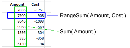
Basically, all field references should be wrapped in an aggregation function. The Aggr() function and some constructions using the total qualifier can even have several layers of aggregations.
But if the created expression does not contain an aggregation function, the expression is ill-formed and potentially incorrect.
Examples:
=Sum(Amount)
=Count(OrderID)
These are both correct aggregations. Amount is wrapped in the Sum() function which will sum several records of the field Amount. OrderID is wrapped in the Count() function, which will count the records where OrderID has a value.=Only(OrderID)
This is also a correct aggregation. OrderID is wrapped in the Only() function, which will return the OrderID if there is only one value, otherwise NULL.=OrderID
A single field reference is not an aggregation, so this is an ill-formed expression. But QlikView will not throw an error. Instead it will use the Only() function to interpret the field reference. I.e., if there is only one value, this value will be used. But if there are several possible values, NULL will be used. So, it depends on the circumstances whether an expression without aggregation function is correct or not.=If(Year=Year(Today()), Sum(Amount1), Sum(Amount2))
Here, both the amounts are correctly wrapped in the Sum() function. But the first parameter of the if() function, the condition, is not. Hence, this is an ill-formed expression. If it is used in a place where there are several possible Years, the field reference will evaluate to NULL and the condition will be evaluated as FALSE, which is not what you want. Instead, you probably want to wrap the Year in the Min() or Max() function.=ProductGroup= 'Shoes'
=IsNull(ProductGroup)
These expressions can both be used as show conditions or as advanced searches. However, since there are no aggregation functions, the expressions are ill-formed. If you want to test whether there exists Shoes or NULL values among the field values, you probably want to use the following instead:
=Count(If(ProductGroup= 'Shoes', ProductGroup))>0
=NullCount(ProductGroup)>0Conclusions:
- An aggregation function is a function that returns a single value describing some property of several records in the data.
- All UI expressions, except calculated dimensions, are evaluated as aggregations.
- All field references in expressions must be wrapped in an aggregation function. If they aren’t, QlikView will use the Only() function.
Further reading related to this topic:
-
Introducing Qlik Sense 2.1
Hello Qlik Community! - I am pleased to announce the availability of Qlik Sense 2.1. Our third and final release in the Qlik Sense product family this... Show MoreHello Qlik Community! - I am pleased to announce the availability of Qlik Sense 2.1. Our third and final release in the Qlik Sense product family this year. With this release, Qlik is continuing its commitment to helping organizations use analytics to see the whole story that lives within their data. Version 2.1 provides the most complete Qlik Sense experience to date and allows customers to explore, create and collaborate with greater simplicity by taking advantage of Qlik’s unique associative model.
Allow me to summarize some of the new feature highlights in this release:
- Individuals will benefit from a new visual exploration capability that allows users to explore analytics by changing properties, such as sorting and coloring, without having to enter edit mode or directly change the underlying content
- Groups will benefit from new storytelling features that allow data stories to be directly published to PowerPoint presentations to facilitate sharing and collaboration
- Organizations can take advantage of new variables that empower content creators and developers to build more sophisticated analytics
- Developers will be able empowered with a new development hub to more easily take full advantage of the Qlik Analytics Platform for web mashups, custom apps, and extensions
There is of course much more including additional user experience features and even new Qlik DataMarket Topical Packages. These premium subscription packages include 180 currencies and weather data for 2600 cities.
Now....enough reading and get to watching! The below New Feature video summarizes these highlights and then will link you to other videos to demonstrate and briefly show you how to use these new features.
Note:
- Qlik Sense Desktop is available right now http://www.qlik.com/us/explore/products/sense/desktop
- Qlik Sense Enterprise Server and other associated files for our customers and partners will be available via on our download site (customer and partner access only) later today.
- You can experience these features immediately by visiting and registering on the Qlik Sense Cloud.
Regards,
Michael Tarallo
Senior Product Marketing Manager
Qlik
@mtarallo
Qlik Sense 2.1 New Features Presentation
Other videos worth watching:

-
Smart Search
One of the great features in Qlik Sense is the Smart Search capabilities. Smart Search allows you to search the data in your app when you are on a sh... Show MoreOne of the great features in Qlik Sense is the Smart Search capabilities. Smart Search allows you to search the data in your app when you are on a sheet. All you have to do is select the Smart Search icon on the selection bar and type what you want to search for. In the image below I start typing “fresh vegetables” and data that matches “fresh” or “ve” (the start of the word “vegetables”) is displayed. From here, I can select one of the items found if it is what I am looking for. I will select “Fresh Vegetables” in the Product Sub Group Desc field and this selection will be added to the selection bar.
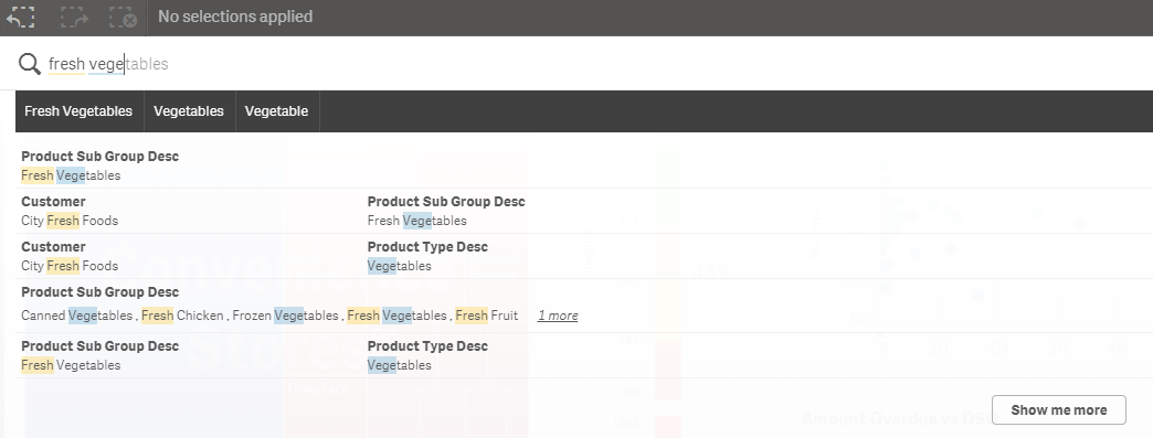
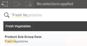
One thing I should note is that I did not use quotes when I searched for “Fresh Vegetables” so “fresh” and “vegetables” were interpreted as separate search terms. If I use quotes, my search returns less results (seen in the image below) because my search term was more specific and considered one search term versus two.
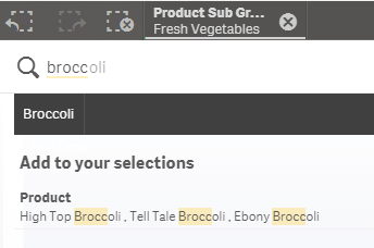
Now if I want to perform another search, I can do so and it will automatically search within my selections which is Fresh Vegetables. If I search for broccoli, all possible data will be displayed within my Fresh Vegetables selection.
Now say I search for something that is not within my Fresh Vegetable selection like apple. I will be given a message indicating that no matches were found and will be prompted to start a new search for only apple if I chose. If I select the “Start a new search …” button, then my Fresh Vegetables selection will be de-selected before the search begins.

By default, Smart Search searches all fields in the data model but you have the option to set what fields you would like to include or exclude in the Smart Search. This can be done in the script by using the Search Include or Search Exclude statements:
Search Include * fieldlist
Search Exclude * fieldlist
Fieldlist is a comma separated list of the fields that should be included or excluded in the search. The Search Include statement is used to indicate which field(s) should be searched when performing a search. In some apps, there may be several fields that the user may not need to search. In that case, it is smart to use the Search Include to narrow down the list of fields to search. This can help with the performance of the search as well. The Search Exclude statement is used to indicate which field(s) should not be used in the search. This may be used to exclude ID or key fields that were used to build the data model but that the user does not need to search. In both statements, wildcard characters * and ? can be used. Just to show you how this works, if I add the Search Exclude statement below to my script and reload, it will exclude all values in the “Line Desc 1” field when a search is being performed.

In the Master Items, the “Line Desc 1” field is added as a Dimension named Product. When I performed the search earlier, broccoli results were found in the Product dimension. Now watch what happens when I do another search for Broccoli within my Fresh Vegetables selection. Broccoli does not come up in my search results because the exclude statement does not allow a search in the “Line Desc 1” field/Product dimension.

Smart Search provides an easy way for users to find the data they are looking for to filter their data. The Search Include and Search Exclude statements offer the developer a way to control the fields that can be searched. This can improve performance and it can make it easier for the user to focus on the fields that are most relevant. Keep these statements in mind the next time you are developing an app. It will improve the users search experience.
Thanks,
Jennell
-
A Historical Odyssey: The Early Days of QlikView Publisher
With QlikView 4 and QlikView 5 we reached a much larger audience than before. We now had large enterprise customers that had demands on the product th... Show MoreWith QlikView 4 and QlikView 5 we reached a much larger audience than before. We now had large enterprise customers that had demands on the product that we didn’t quite satisfactory fulfill: The demands were around Security, Distribution and Workflow.
As a result, one large Swedish customer developed their own system to administrate QlikView: They developed software that used the QlikView COM Automation interface to update and distribute QlikView documents. They showed it to us and we were impressed – so impressed that we bought the code to develop it further.
As a result, we could in 2001 release the QlikView Administrator.

The Administrator had three basic components:
- The Factory – which later became The Distribution service
- The User Access Portal – which later became The Access Point
- The Administration Panel – which later became The Management Console
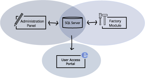
The Factory’s tasks were to update the QlikView documents and distribute them in a secure way. On the portal, the users could either download the documents for off-line use or connect to the documents using QlikWeb – which was the name of our server at the time. Finally, the administration panel was used to set the rules for how and when the updates should be made and to whom the documents should be distributed.
The Administrator was the basic workflow tool that our enterprise customers demanded. It contained tasks, scheduling, data reduction, document categorization, document distribution and it also set the user rights per document. So it covered all the basic needs.
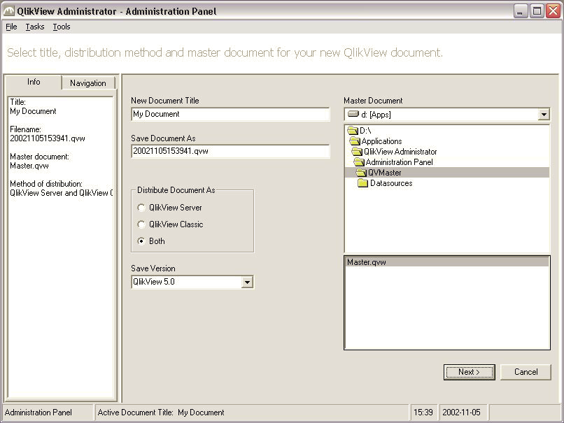
The administration panel for Administrator version 1
The name was not quite good, so we renamed it “QlikView Publisher”. We also improved the UI and the functionality and when we released version 2 a few years later, it was much richer in features and much more usable.
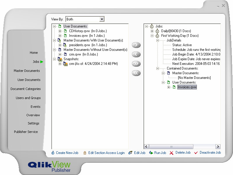
The administration panel for Publisher version 2
Initially, it was developed in Visual basic 6, but we soon were looking for a more modern development tool and today it is developed in C#.
The version numbers were not in sync with QlikView until QlikView 8. Before that, the Publisher had its own numbering. For QlikView 9 the QlikView Server and the QlikView Publisher were completely merged, with a common management console and a common installation. This also means that some of the original Publisher features became available also without a Publisher license, e.g. the reload of a document.
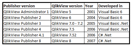
Although very much has changed since the first Publisher version, the basic concepts for the Publisher remain the same: Security, Distribution and Workflow.
Today, the Publisher is a mature workflow tool that allows our customers to manage the distribution of information both to off-line and on-line users. It can connect to a large number of directory services; it can be integrated with almost any authentication system and it can use either Windows integrated authorization or the QlikView internal authorization. It can take a master document, refresh it, reduce it so that the user only gets its own data and finally distribute it in any way the administrator wants it. It is an absolute necessity for a company with enterprise demands on security and data governance.
-
Qlik Sense Workbench. The visualization and Mash-Up Editor
What’s Qlik Sense Workbench and what’s for?Qlik Sense Workbench is a development toolbox used for building solutions with Qlik Sense. It includes Java... Show MoreWhat’s Qlik Sense Workbench and what’s for?
Qlik Sense Workbench is a development toolbox used for building solutions with Qlik Sense. It includes JavaScript API libraries used for building Qlik Sense visualizations or for building mashup websites with Qlik Sense content.
Qlik Sense Workbench provides developers with a quick start for creating custom visualizations and mashup websites, including code samples and templates for creating different types of visualizations as well as templates for creating basic mashup websites. Those templates constitute in fact the perfect starting point for your next mashup project.
Qlik Sense Workbench provides three JavaScript APIs for building extensions and mashups. The Extensions API for building visualizations, the Mashups API for building mashups websites, and the Backend API for communicating with the Qlik Sense engine.
How can I access to Workbench?
The good news is Workbench doesn't have a separate installation package, so if you already have Qlik Sense Server or Desktop you have Workbench working.
To launch Qlik Sense Workbench open a web browser and type in the URL https://ServerName/workbench/ . If you are a Qlik Sense Desktop user, make sure it is running and do the following, open a web browser and type in the URL http://localhost:4848/workbench/ et voila!
How does Workbench work?
To reply to that question I leave you with a 5 min video that will walk you through the mashup creation process.
Enjoy!
AMZ
PS: Remember you can find lots of useful videos, howtos and tutorials at the Qlik Youtube channel
Check out a step by step tutorial here: Creating a webpage based on the Qlik Sense Desktop Mashup API




