Unlock a world of possibilities! Login now and discover the exclusive benefits awaiting you.
Analytics & AI
Forums for Qlik Analytic solutions. Ask questions, join discussions, find solutions, and access documentation and resources.
Data Integration & Quality
Forums for Qlik Data Integration solutions. Ask questions, join discussions, find solutions, and access documentation and resources
Explore Qlik Gallery
Qlik Gallery is meant to encourage Qlikkies everywhere to share their progress – from a first Qlik app – to a favorite Qlik app – and everything in-between.
Qlik Community
Get started on Qlik Community, find How-To documents, and join general non-product related discussions.
Qlik Resources
Direct links to other resources within the Qlik ecosystem. We suggest you bookmark this page.
Qlik Academic Program
Qlik gives qualified university students, educators, and researchers free Qlik software and resources to prepare students for the data-driven workplace.
Recent Blog Posts
-
Is it a string or a number?
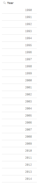
I am sure that I am not the only one who has added a filter pane to their Qlik Sense app and found a combination of strings and numbers when you were ... Show MoreI am sure that I am not the only one who has added a filter pane to their Qlik Sense app and found a combination of strings and numbers when you were expecting all numeric data. This happened to me recently when I was building an app that had many data sources. I was loading a year field from each of the data sources but I soon realized that the data I was loading was not always numeric. So when I added a filter pane to my app and added the dimension year, I ended up with a list like the image below (on the left). Some of the years were left-aligned and some were right-aligned.
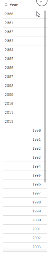
One of my data sources had years from 2000 to 2012 which were loading as strings (left-aligned) while my other data source had years from 1990 to 2014 that were right-aligned. My obvious problem is I want each year listed once and to be consistent across all my data sources so that when a user wants to select 2010, they do not have to select both the string and numeric representation of the year.
Part of the script that loaded these files looked like this:
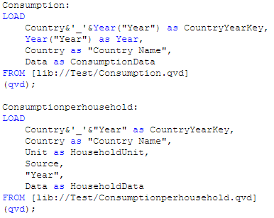
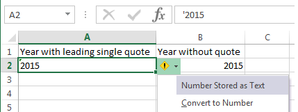
After some testing I realized that the second table shown above, Consumptionhousehold, was where the string year values were coming from. I did not generate the QVD being used for this app but I have found that sometimes numeric values are loaded as strings if there are additional characters in the original field. For instance, in Excel, a year column may be stored as text if there is a leading single quote. If you look at the image below, you can see that the year in column A is stored as text because it starts with a single quote (‘2015). In column B, the year is numeric because it is just numbers. When both these values are loaded into Qlik Sense, they are evaluated differently and can lead to problems.
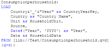
To resolve this issue I modified my script to evaluate the string year as a date by using the Date# function and then I added the format parameter (‘YYYY’) to indicate how the year is formatted (see image below). Going forward, I added this modification to my script every time I loaded year just to be on the safe side. You can read more about the Date function in blog titled The Date Function.
Once this modification was made I ended up with a list of years from 1990 to 2014 and they were all right-aligned and listed only once.
While this is a small problem, it can cause confusion when you are building an app especially if you do not realize it has happened. I noticed the issue because I added a filter pane to my app but had I not done that and tried to use the year field in a chart or in set analysis, my results would have been incorrect. The lesson I took from this is to always check to make sure that the data I am loading is loading as expected. I can easily test this by adding filter panes to my app or looking at the data model viewer to ensure that everything is loaded as planned. Good luck scripting.
Thanks,
Jennell
-
Qlik Community Home Page Revision
Hello Qlik Community Members,We have just completed some updates we think you will find useful.The categories on our Qlik Community Index page have be... Show MoreHello Qlik Community Members,
We have just completed some updates we think you will find useful.
The categories on our Qlik Community Index page have been revised to provide easier navigation. The new categories are:
- Qlik Sense
- QlikView
- General
Under General you can find areas which are not product specific - such as Community Information, Education Services, Technical Blogs and Groups.
We have also added two resource areas on the top right of the home page highlighting:
- Benefits of joining Qlik Community
- Links to popular getting started resources
We will adding more getting started resources over the coming weeks to help new members learn best practices like where and how to post their questions. We hope you like the updates.
If you have a recommendation for resource materials, please contact sara.leslie@qlik.com.
-The Qlik Community Team

-
Engine API - Displaying Time of the created QVF on different regions
As I was working on an app that displays live data, I was called to display the time when the QVF was created. In Qlik Sense we have the function Relo... Show MoreAs I was working on an app that displays live data, I was called to display the time when the QVF was created. In Qlik Sense we have the function ReloadTime(), but how do we call that in our script from the API and how do we display that based on our region since, our server may very well be in another one?
In an earlier post, I showed how do connect to our app with qsocks and the Engine API Engine API and qSocks - Connecting and getting a list of available apps
After we establish our connection and create the session, we will create our HyperQube of a simple ListObject.
var obj = {
     "qInfo": {
          "qId": "LB02",
          "qType": "ListObject"
     },
     "qListObjectDef": {
          "qStateName": "$",
          "qDef": {
               "qFieldDefs": [
                    "Round"
                ],
          "qFieldLabels": [
               "Round"
          ],
          "qSortCriterias": [{
               "qSortByExpression": -1,
               "qExpression": {
                    "qv": ""
               }
          }]
      },
      "qInitialDataFetch": [{
          "qTop": 0,
           "qLeft": 0,
          "qHeight": 100,
          "qWidth": 2
     }]
  }
This only returns one field, in this case the "Round". In order to get the time we will need to create an expression and get it as a second field. So we add right after "qInitialDataFetch"
,
  "qExpressions": [{
  "qExpr": "=ReloadTime()"
  }]
So now we can create our session and grab all of the fields. For now, we will just focus on the time so here we will take it from the array returned and store it in a global variable reloadTime.
qsocks.Connect(app.config).then(function(global) {
     global.openDoc(id).then(function(app) {
          app.createSessionObject(obj).then(function(list) {
               list.getLayout().then(function(layout) {
                    reloadTime = layout.qListObject.qDataPages[0].qMatrix[0][1].qText;
               });
          });
     });
});
Now we need to display this on our page but based on the timezone of the user.
First we need to create the returned date as a javascript date so we can work with it,
var lastReloadTime = new Date(reloadTime);
Get the time server/user time difference in hours.
var timeDiff = lastReloadTime.getTimezoneOffset() / 60;
Now set the time to the users time.
lastReloadTime.setHours(lastReloadTime.getHours() - timeDiff);
Finally Display it.
$('#lastReloadTime').html('LAST UPDATE: ' + lastReloadTime.toLocaleTimeString());
-
Do you Qualify?
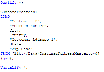
I was recently working on a project where I had several files that I needed to load in order to determine what data I needed and what data I did not n... Show MoreI was recently working on a project where I had several files that I needed to load in order to determine what data I needed and what data I did not need. I started by adding the files that I knew had data that I needed. Then I started to add the additional files to my data model one by one. Occasionally, I came across a file that had the same fields as a file I had already loaded. When I ran into this, I used the Qualify statement to load the new table so that I could compare the data to the data I already loaded. Using the Qualify statement adds the table name as a prefix to the field name. For me this was helpful because I did not want to create synthetic tables in my data model. I simply wanted to compare the data in the two tables to see if they were the same before I added it to my data model.
I used Qualify * to turn on the qualification of the field names. I used the wildcard to qualify all fields loaded after the Qualify statement.
I could have also listed the fields that I wanted to Qualify instead of using the wildcard by doing something like this:

Whenever the qualify statement is used, it will qualify all of the fields loaded after the qualify statement until the end of the script is reached or until the script reaches an Unqualify statement. The Unqualify statement turns the field qualification off. The syntax is similar to the Qualify statement. I can use a wildcard or a list of field names.
Once the fields are qualified, the field names will look like the image below and it will not be associated to the other tables in the data model since there are no matching field names.
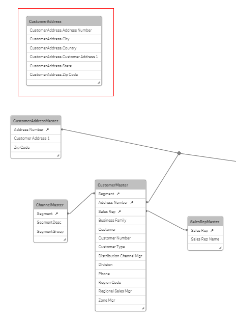
Notice that CustomerAddress which is the table name is the prefix for all the fields in that table. Now that I have this table loaded, I can take a look at the data in this table and the previously loaded customer table to determine if this is the same data set and if I need to load the CustomerAddress table at all. It is a quick way to spot check the data before connecting it to the data model.
Now if I did not use the Qualify statement, my data model would have looked like the image below with a synthetic table because of the three field names that match (Address Number, Customer Address 1 and Zip Code) in the CustomerAddressMaster and CustomerAddress tables. Using Qualify prevented the synthetic table from being created.

The Qualify and Unqualify statements can be used when building your data model and exploring your data sources. The qualification of the field names eliminates matching field names therefore loading each table as an island unassociated to the other tables in the data model. This provides an easy way to view the data sources before actually building the data model – utilizing Qlik Sense or QlikView to explore the data first. Hopefully, you will find these statements useful.
Thanks,
Jennell
-
Data Literacy
A skill set rarely discussed in the BI narrative is that of data literacy. Much is made of newer & more advanced visualizations, but the ability to un... Show MoreA skill set rarely discussed in the BI narrative is that of data literacy. Much is made of newer & more advanced visualizations, but the ability to understand what you are seeing and make smart decisions from that is incredibly valuable. Only a person with a great degree of data literacy can successfully both read & manipulate complex data to arrive at meaningful insights.
Reading & Writing
Data literacy comes in two parts: the front-end and the back-end. On the front-end a dashboard page requires the lowest degree of data literacy. Most people can read a well designed dashboard page and understand the general status of things. It is when the user advances to pages intended for critical analysis that the bar rises and users begin to drop out. Real analysis requires a data literate audience to get to the root cause of a KPI's status.
Marching hand-in-hand with front-end literacy is back-end literacy. While a great dashboard may not require much data literacy from the users it required a greater degree of data literacy from the person(s) who built it. What is the data being measured? Where does it come from? Are there compatibility issues between the data sets in an application? Building new visualizations or manipulating existing ones require familiarity with the data as well as how complex that data source is. Working with a simple data set requires relatively little data literacy but the more complex the data the greater the need for a data literate developer. Creating new objects is more than just technical development knowledge - it is understanding what you are measuring and why you want to measure it. Data literacy is often overlooked when it comes to the skill set of a great developer.
Increasing the data literacy of your organization, and yourself, is the key to spreading BI to the masses.
-
Creating a webpage based on the Qlik Sense Desktop Mashup API
Required: Qlik Sense Desktop, Helpdesk Management.qvfFiles Created: Index.html, index.jsOk, we created a beautiful visualization that everyone in the ... Show MoreRequired: Qlik Sense Desktop, Helpdesk Management.qvf
Files Created: Index.html, index.js
Ok, we created a beautiful visualization that everyone in the company is excited about. One day we are asked to publish this onto our website and we are thinking… is this possible? Yes it is! Qlik Sense comes with a built in API that we can get any object that we have created in our app and put it on our website. In this article I will give you step by step directions on how to do that.
- Make sure that you have your Qlik Sense Desktop open. This will start a local server on port 4848 that you will be able to access your apps from. Name your App "Helpdesk" and from the template drop down select "Basic Mashup ..." and hit "Create"
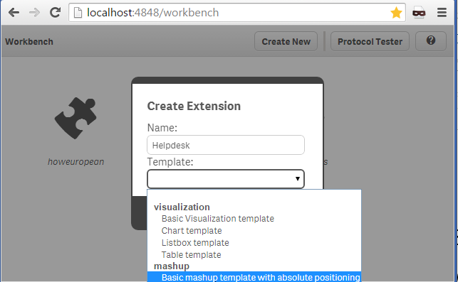
- Now we need to enter into the app, so click on "Helpdesk" that was just created and from the popup window click on "Edit".
- There are 4 panels. The far left is where we choose our app and the objects that we will use in our webpage. On the right you will see the "Layout" tab. This is the place the we will drag our objects to and the 2 pages that automatically are created for us, "Helpdesk.html" and "Helpdesk.js". The workbench will create the basic code for us to get the objects from the Qlik Sense Desktop and html that will display these objects.
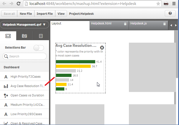
- Now, lets select our app from the left. Click on "Please choose an app" and select the "Helpdesk Management.qvf". All of the objects will be displayed for us to use. Lets select one bar graph to use in our webpage. Click on "Avg Case Resolution Time (Days)" and drag it to the "Layout" panel, onto the first grayed rectangle.
If you click on the "Helpdesk.html", you will see the included libraries. The css is needed for proper visualization and require.js to connect to the Qlik Sense Desktop and get the app.
our js file<link rel="stylesheet" href="https://community.qlik.com/resources/autogenerated/qlikui.css">
<link rel="stylesheet" href="https://community.qlik.com/resources/assets/client/client.css" media="all">
<script src="/resources/assets/external/requirejs/require.js"></script><script src="Helpdesk.js"></script>
and our placeholder for our objects<div id="QV01" style="position: absolute; top: 50px; left: 20px; width: 200px; height: 200px;" class="qvobject"></div>
- Now, moving on to the JavaScript file generated. This is composed of two parts. The fist, is the configuration.
var config = {
  host: window.location.hostname,
  prefix: "/",
  port: window.location.port,
  isSecure: window.location.protocol === "https:"
};
require.config( {
  baseUrl: ( config.isSecure ? "https://" : "http://" ) + config.host + (config.port ? ":" + config.port: "") + config.prefix + "resources"
} ); - and then we have the actual connection code where we get the app and the specific object.
require( ["js/qlik"], function ( qlik ) {The getObject method gets the specified object and displays it in the div with id="QV01"
var app = qlik.openApp('Helpdesk Management.qvf', config);
app.getObject('QV01','a5e0f12c-38f5-4da9-8f3f-0e4566b28398');
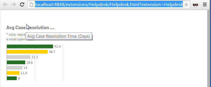
} );<div id="QV01" style="position: absolute; top: 50px; left: 20px; width: 200px; height: 200px;" class="qvobject"></div - That's it! We created our first Mashup. Make sure to click on "Save All" and preview by clicking on the "View" button.
- The files are located under:
C:\Users\<username>\Documents\Qlik\Sense\Extensions\Helpdesk
I hope this was helpful enough to get you started with displaying your visualizations on a webpage. If you have this app published on your QMC, change in the JavaScript the host (step#6) of your server and the id of the app (step#7) to something like
var app = qlik.openApp('bb4a797c-b483-462b-84d4-53238ce1eeb1', config);---
More Info regarding the Qlik Desktop Workbench
- Make sure that you have your Qlik Sense Desktop open. This will start a local server on port 4848 that you will be able to access your apps from. Name your App "Helpdesk" and from the template drop down select "Basic Mashup ..." and hit "Create"
-
Ensure Correct Positioning of Selection Toolbar in a Mashup
A small quirk I have experienced while working with the Qlik Mashup API is that the selection toolbar “floats away” from its corresponding chart the f... Show MoreA small quirk I have experienced while working with the Qlik Mashup API is that the selection toolbar “floats away” from its corresponding chart the further the page is scrolled down.
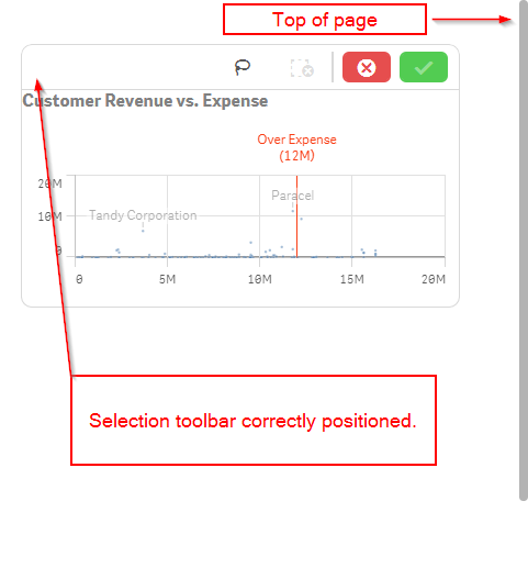
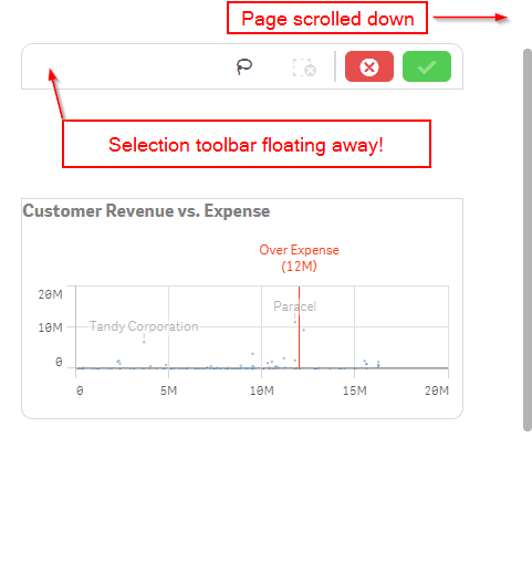
This isn’t a problem if your page does not scroll, or if you position all of the charts with absolute positioning, the default positioning if you use the default mashup template, but if your page scrolls and you are not using absolute positioning on the charts, then you will likely run into this problem too when creating a mashup.
An easy fix for this is to create a container div for all of the page content, set its height equal to the body height, and move the overflow property from the body tag to the container div tag. Let’s walk through this.
First, let's wrap our content in a container div, remove any overflow styling that's on the body, and add overflow styling to the container div.
<body>
     <div id="scroll-container" style="overflow:auto;">
          <!-- YOUR CONTENT HERE -->
     </div>
</body>
Then, we'll need to add some scripting so that the height of the container div is set correctly.
<body>
     <div id="scroll-container" style="overflow:auto;">
          <!-- YOUR CONTENT HERE -->
     </div>

     <script>
          $(document).ready(function() {
               // Sets the container div height correctly on page load
               $("#scroll-container").height($("body").height());

               // Will reset the container div height correctly if window size changes
               $(window).resize(function() {
                    $("#scroll-container").height($("body").height());
               });
          });
     </script>

</body>
And that should do it! Now when you scroll your page, if you click on a chart, the selection toolbar should be correctly positioned atop the chart.
-
Introducing Qlik Sense 2.0!
"Innovation - distinguishes between a leader and a follower." - Steve Jobs Steve Jobs said it best. Since April, #TeamQlik has been hard at work deliv... Show More"Innovation - distinguishes between a leader and a follower." - Steve Jobs

Steve Jobs said it best. Since April, #TeamQlik has been hard at work delivering innovative capabilities in our products and today we get to share it with the world. I am pleased to announce the general availability of Qlik Sense Enterprise 2.0, Qlik DataMarket and the Qlik Analytics Platform. (applause)

By taking these solutions to market, we continue to meet our commitments to our customers and partners,and STILL challenge the norm by disrupting the business intelligence space. It should be no surprise that Qlik is in a unique position in this saturated BI pool. Between outdated BI stacks, and data visualization tools that don't tell the whole story, Qlik delivers a visual analytics platform that puts insight and data at the point where it adds most value, the point of decision. Our associative data indexing engine empowers users to see the whole story that lives in their data, unlike other, shall I say, tools. And it’s only Qlik that is proven in its ability to deliver true agility for the business user, along with governance, trust and scale for IT. Now enough tooting our horn, let me summarize what's new in Qlik Sense 2.0 by not just telling you but showing you with the power of video. (below videos requires YouTube access)
To learn more about these great innovations and experience them for yourself, download Qlik Sense Desktop for free and visit our New to Qlik Sense Videos page on the Qlik Community forum, where you can learn how to use these new features, create apps, build visualizations and much more.
Enjoy!
Michael Tarallo
Senior Product Marketing Manager
Qlik
Follow me: @mtarallo
-------------------------------------------------------------------------------------------------------------------------------------------------
(NOTE: To increase resolution or size of the video, select the YouTube logo in the bottom right of the player. You will be brought directly to YouTube where you can increase the resolution and size of the player window. Look for the 'settings' gears icon in the lower right of the player once at YouTube.)
Qlik Sense 2.0 - What's New in 90 seconds
(Turn your speakers up and get pumped!)Qlik Sense 2.0 - What's New Presentation (3 min)
Introduction to Qlik DataMarket (90 secs)
Getting Started with Qlik Sense Webinar (50 mins)
Additional How To Videos:

-
New Qlik Sense Courses Now Available!
Qlik Education has released three new exciting Qlik Sense training courses for customers, partners and Qlik team members to increase skills in creatin... Show MoreQlik Education has released three new exciting Qlik Sense training courses for customers, partners and Qlik team members to increase skills in creating powerful visualizations.
The three new exciting courses are:
1- Create Mashups with Qlik Sense

2- Qlik Sense Server Architecture
3- Qlik Sense for QlikView Experts
The new course, Create Mashups with Qlik Sense was developed for business analysts and web developers using Qlik Sense. This One day introductory course provides the foundation skills required to create web page mashups using Qlik Sense Workbench.
The new 1 day course, Qlik Sense Server Architecture is designed for enterprise architects who wish to learn the techniques to advance their skills in Qlik Sense server components, architecture configurations, managing services, load balancing, and single sign-on methods.
Qlik Sense for QlikView Experts is a 1 day course designed to enable Qlik Sense skills in those already familiar with QlikView. This technical course teaches the basics of Qlik Sense visualizations and data modeling.
For more information and to register, please visit our website. If you have questions related to these courses or others please contact us at education@qlik.com

-
Dynamically Selecting Timeframes
How can a button be used in a QlikView app to dynamically select the last 3 months? I was asked that question a few weeks ago and thought it would ma... Show MoreHow can a button be used in a QlikView app to dynamically select the last 3 months? I was asked that question a few weeks ago and thought it would make a good blog topic. It can easily be done and can provide the user with a quick way to filter data by a timeframe. Now there are other ways of doing this besides using a button for instance List Boxes can be used to select the desired dates. In this example, I have used a Text Object to do this.
In a Text Object, I add actions that clear certain fields and then make some selection(s). But before I do that I create variables that will be used in the actions. For example, if I wanted two Text Objects that select the last 7 days and the past 3 months, I would first create a variable that stores the current date (let’s assume the current date is July 1, 2014) and then add additional variables for the two timeframes: past 7 days and past 3 months. I added the following to my script and reloaded it.
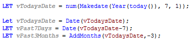
The script creates a variable, vTodaysDate, that stores the current date (July 1, 2014) in the appropriate date format (as set in the SET DateFormat=’M/D/YYYY’ line in the beginning of the script) and then creates variables for the past 7 days and past 3 months. The value of the variables once the app is reloaded is as follows:
vTodaysDate = 7/1/2014
vPast7Days = 6/24/2014
vPast3Months = 4/1/2014
These variables are then used in the action of the Text Object to select the specified timeframe. So to see how this will work, let’s review the actions that are used for the Past 7 days and the Past 3 months Text Objects seen in the image below.
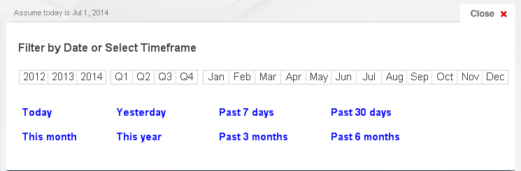
The Past 7 days Text Object would have the following actions:
Action Sort Order Action Field Search String 1 Clear Field OrderDate 2 Clear Field Year 3 Clear Field Month 4 Clear Field Quarter 5 Select in Field OrderDate =’>=$(vPast7Days)’ The OrderDate, Year, Month and Quarter fields are cleared and then order dates that are greater than or equal to 6/24/2014 are selected.
The Past 3 months Text Object would have the following actions:
Action Sort Order Action Field Search String 1 Clear Field OrderDate 2 Clear Field Year 3 Clear Field Month 4 Clear Field Quarter 5 Select in Field OrderDate =’>=$(vPast3Months)’ The OrderDate, Year, Month and Quarter fields are cleared and then order dates that are greater than or equal to 4/1/2014 are selected.
Making these selections by clicking a Text Objects with actions can be easier than selecting multiple dates from an OrderDate List Box. When the user has the need to view the data based on predefined timeframes, Text Objects or Buttons can be used to simplify the process. You can find an example of how to create timeframe links in my technical brief that adds timeframe selections to the Dashboard sheet of the Sales Management and Customer Analysis demo.
Thanks,
Jennell
-
The right chart for your data set (and for your device)
Patrik Lundblad wrote an interesting article in this blog called “Dissecting How to Choose the Right Chart”. It explains which chart best communicates... Show MorePatrik Lundblad wrote an interesting article in this blog called “Dissecting How to Choose the Right Chart”. It explains which chart best communicates what we want to convey with the data set we have. Taking this concept one step further, there are additional variables when considering what chart works best. What other variables? Things like screen size and type of interaction model are important factors that affect the suitability of a chart.
Let’s pick a classic example: Sales by region by quarter. We should start by asking ourselves, “What would I like to show?” I want to compare between regions and dates. Secondly, ask “What data do I have?” I have one variable per item, Sales, and have a few categories. This will prompt me to choose a bar chart. A grouped bar chart will help me see exactly the information I need.
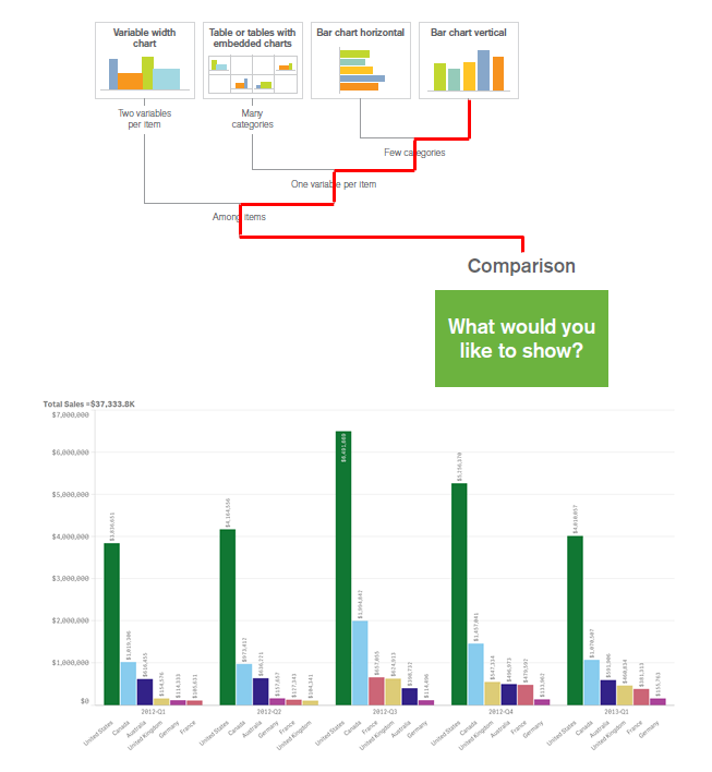
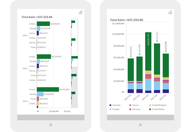
Even if the grouped bar chart is a perfect legible data visualization in a desktop or laptop computer, would it be my first choice if the chart is going to be consumed on the screen of a 4” mobile device? The answer will probably be no. Instead, I might want to create a horizontal bar chart, or even perhaps change the chart type to a stacked bar chart in order to simplify the user experience.
CPU, memory, and network connectivity responsive model
Since each device’s CPU and memory are two factors that may limit the amount of data a device can handle, it would be good to aggregate large data sets prior to sending it over to the device. This will minimize the in-device processing time but also generate a new dataset that might require a whole new visual representation. Ideally we should be able to display different levels of data aggregation and therefore different chart types based on the device’s processing power.
The same rationale applies to mobile data connectivity. In order to optimize the user experience, we should be able to detect when a device is in a poor reception area or belongs to a slow network. This would allow us to dynamically choose the chart type that best fits the particular conditions.
Responsive data visualization is still a challenge for developers and designers and in the years to come we need to develop new responsive data visualization principles similar to the “How to choose the right chart.” These principles would set guidelines on how to present data considering factors such as device screen dimensions, computational power, or wireless data connectivity. This new model will guide us through the decision making process on what chart type to choose but also on how the chart will morph and transform to effectively communicate data insights on different devices, from desktops and mobiles phones to tiny wearables screens.

-
Qlik Community Version Upgrade
Hello Qlik Community Members,I'm sure you noticed our scheduled maintenance window last week and again yesterday. Apologies for the extended outages w... Show MoreHello Qlik Community Members,
I'm sure you noticed our scheduled maintenance window last week and again yesterday. Apologies for the extended outages which we know impact your collaboration and research schedule. These outages were part of a large platform version upgrade project and we did our best to minimize them as much as possible. Qlik Community is now on a newer version of the platform which has some great enhancements to improve user experience as well as fixes for some minor bugs.
Post Upgrade Tips
Please be sure to clear your browser cache and cookies to refresh the community interface. You may want to also log out and log back in. We have tested in all of the primary browsers (Chrome™, Firefox®, Safari® and Internet Explorer®) to ensure the updates are rendering correctly.
For the best experience you should always use the most recent version of your browser which contains extensions, updates, and plugins to help ensure you have the proper experience with loading time, content posting, and video display.
Profile Page
The profile page has been redesigned to be more engaging with larger images, centralized editing, and access to different types of content.
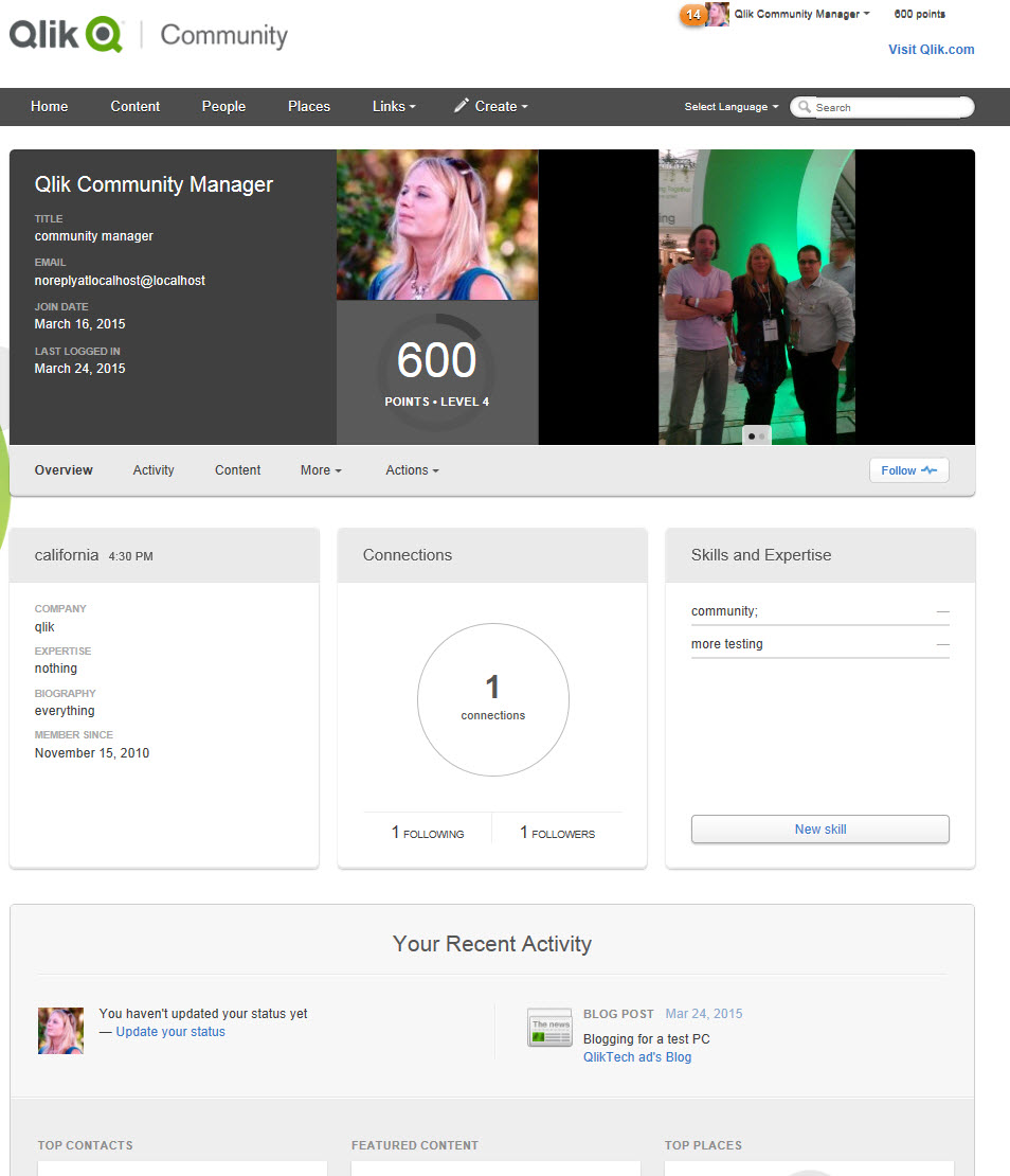
Profile image and details are next to an enhanced image carousel. The Profile Biography, Connections, and Self Assigned Skills (NEW) are easy to see and update.
Recent Activity displays your Status Update (NEW), Contacts, Featured Content, Recent Places, and different types of content streams.
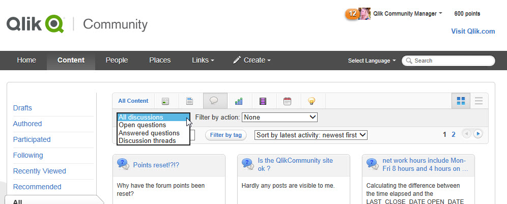
Filtering
People and Content Filtering has been improved and now allows dual filtering for a more refined search. You can search for content status, assignment, and activity level in specific areas or across the whole Community.
You can also change the display from 'pane' to 'list' style depending on your preference.
We will be posting additional tips in the coming weeks to help you utilize more of the updated features.
Be sure to check your profile information, bookmarks, and content to ensure everything is correct.
If you have questions, issues, or feedback please email sara.leslie@qlik.com
Best Regards,
Qlik Community Management Team
-
Be sure to check out our Fika Learning Series event this week: Aiming for the mi...
This Wednesday we will be hosting our 2nd Fika Learning Series event with Qlik experts online to answer questions pertaining to this engaging and very... Show MoreThis Wednesday we will be hosting our 2nd Fika Learning Series event with Qlik experts online to answer questions pertaining to this engaging and very relevant topic:
The benefits of blending data and experience
Intuition and analytics are two poles of the decision-making spectrum. If you’re like most people, you naturally gravitate to one or the other. But no person or data set is perfect, and making decisions based solely on intuition or analytics won’t generate the best outcomes. Join our live event to learn how you can move to the middle and become a “data-informed” decision maker. During our Fika events, we’ll share educational videos and have our experts available to answer your questions in live discussion forums.
Take a sneak peek at the pre-event video intro.
Its not too late to RSVP for the event.
Best Regards,
Qlik Community Management Team
-
Make a Selection
I was recently working on a Qlik Sense app where the developer wanted to show some profile data based on the user’s selection. The user was prompted ... Show MoreI was recently working on a Qlik Sense app where the developer wanted to show some profile data based on the user’s selection. The user was prompted to make a single selection in a field and once they did specific data for that selection would be displayed. When I first looked at the image below, I thought that it may be confusing to the user if there is data in the profile before they have made a vendor selection. As you can see in the image below, no selections have been made yet but there is data in most of the objects.
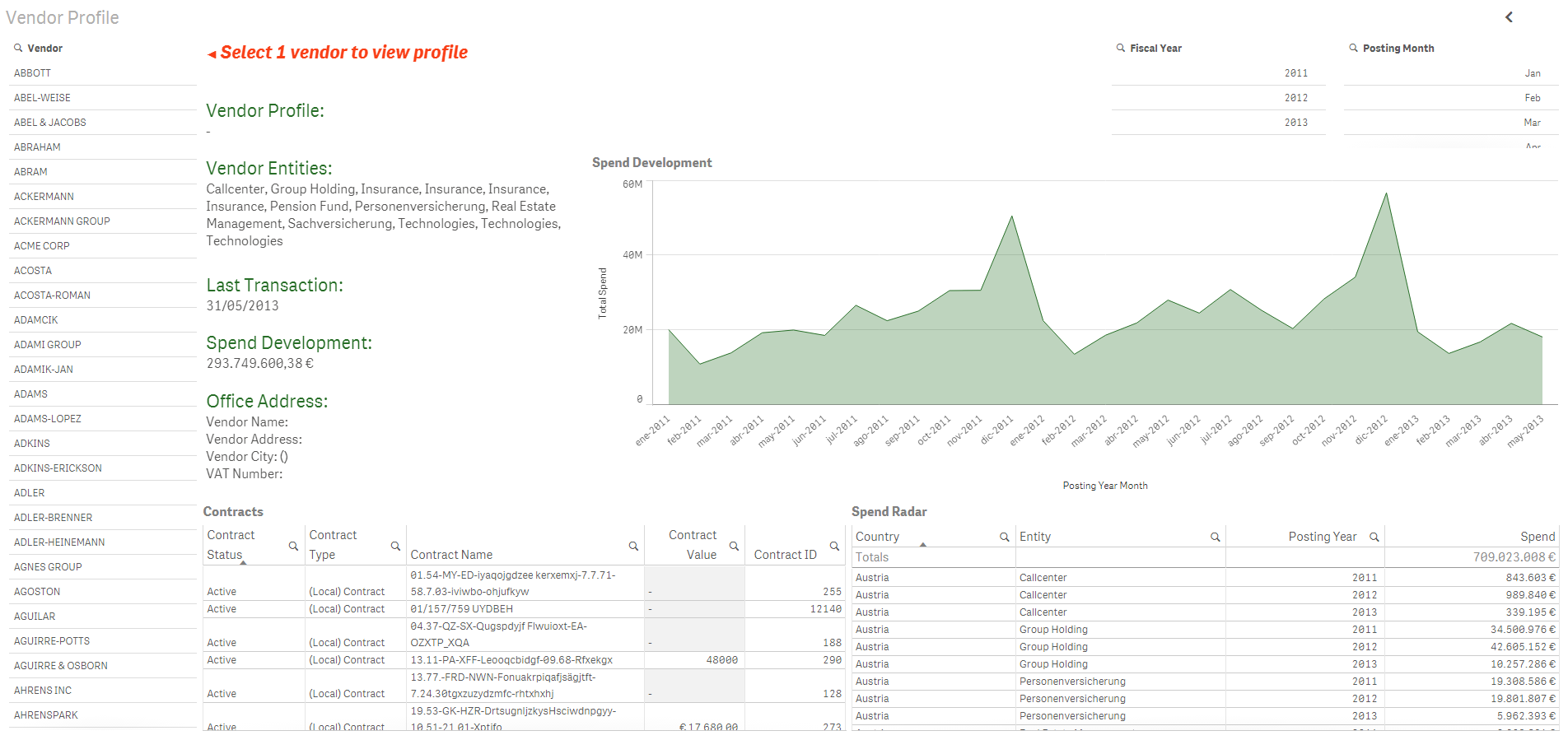
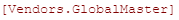
In some objects like the Spend Development line chart and the Contracts and Spend Radar tables, the data makes sense without a vendor selection – we are viewing the spend and contracts for all vendors. But in some objects like the Last Transaction field, this does not make sense. The last transaction date being displayed is across all vendors so it is just the latest transaction date among all the vendors. You can also see that the Vendor Profile is null since one has not been selected yet. So my thought to get around this was to modify the expressions being used for some of the objects. For instance, for the Vendor Profile, instead of simply having the field name for the vendor name:
I modified the expression to use the GetSelectedCount() function to first determine if one selection has been made from the Vendor filter pane. If one vendor has been selected, then I display the vendor name. Otherwise, I display an empty string. GetSelectedCount() is a chart function that returns the number of selected (green) values in a field.

So here is what the sheet looks like now without any selections. The vendor fields like profile, entities, last transaction, spend development and office address are all blank since a single vendor has not been selected. If multiple vendors were selected, these fields will remain blank since we only want to display that data for one vendor at a time.
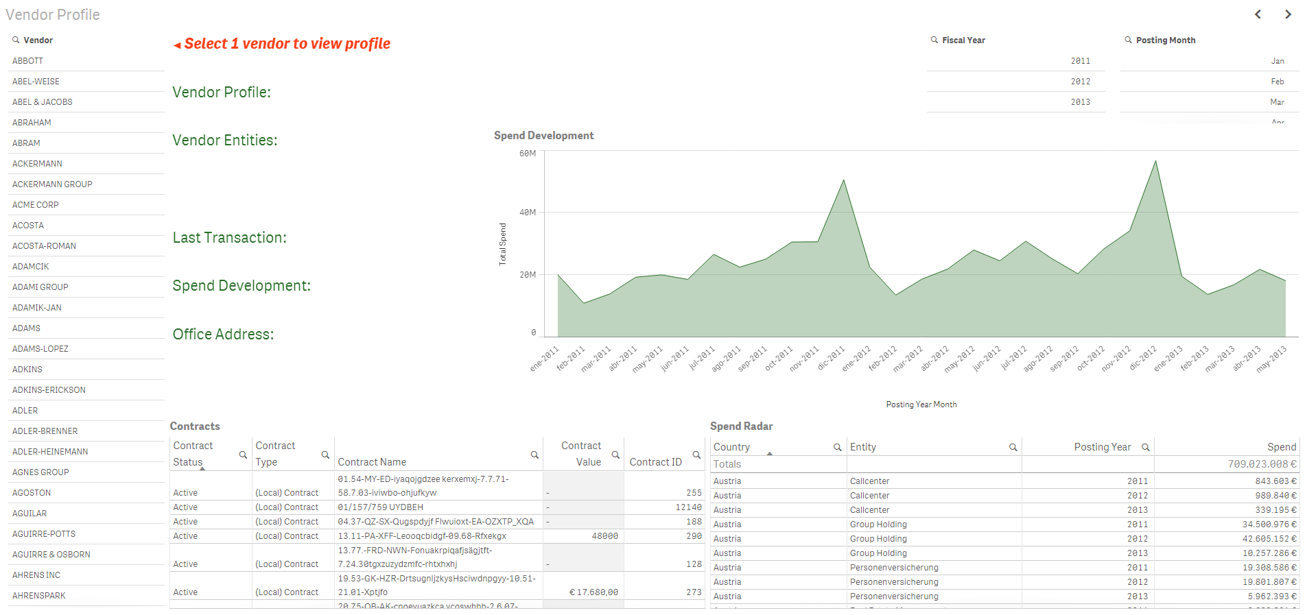
Once a vendor is selected, the sheet looks like this:
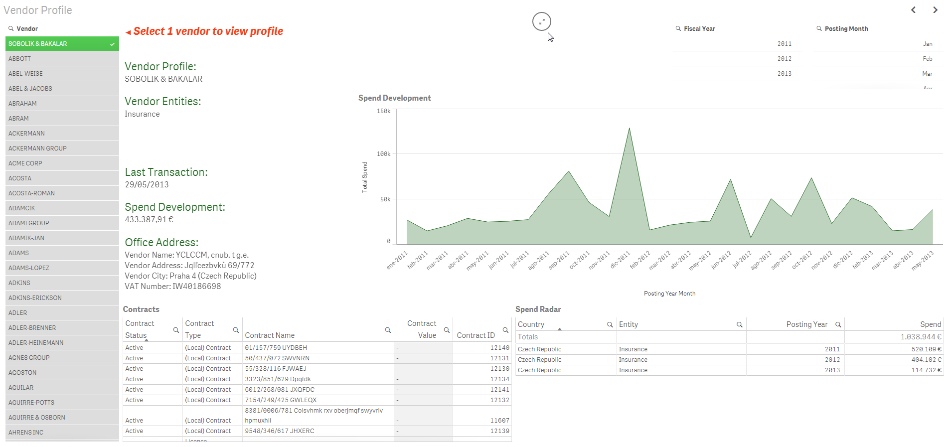
The related data is displayed and it is clear to the user that they are viewing data for the selected vendor. To me, it made more sense to show no data in these fields when a vendor had not been selected versus showing misleading or confusing data.
In this example, GetSelectedCount() was one way I could help prompt the user to make a selection. Even though we have text on the page asking the user to select 1 vendor, we all know that sometimes users do not read the text on a page. By removing the data that is displayed in some of the fields, it brings to the user’s attention that something is missing and that they may need to do something to view the data. The GetSelectedCount() function works with the red text to prompt the user to do something. There may be other ways of handling this in Qlik Sense – I would be curious to hear what techniques you have used.
Thanks,
Jennell
-
Designing for the new Resolution
Deciding what resolution to design for is a common question. For the last several years the general recommendation had been to design for 1024 x 768, ... Show MoreDeciding what resolution to design for is a common question. For the last several years the general recommendation had been to design for 1024 x 768, which had been the dominant resolution on the web. Now things have shifted. The dominant resolution for the past few years has been (and is) 1366 x 768. This is largely because more and more people are using laptops. So the simple answer is to just say "design for 1366 x 768." That said it's a bit more complicated than that.
Go wide
The trend over the past few years has definitely been to take advantage of the larger resolutions and to start designing wider going beyond the pixel dimensions of the 960 grid system used to design for 1024 x 768. As an example of this trend we can examine the web traffic coming to Qlik.com. I know that the top 8 resolutions are all wider than 1024 which accounted for 78.01 % of our traffic last year. Of those resolutions 1366 x 768 was number 1 with 25.92% of traffic and the narrowest resolution of the top 8 was 1280 x 800. Now there could be certain biases in these numbers, that the people interested in a BI product might be more technologically savvy so they may have higher resolutions than the average internet user, but if you are looking to design apps for BI users then it's a good measurement of your potential user base.
So why consider 1024 x 768
While 1024 is going away it's aspect ratio is still valuable. 1024 x 768 is the same aspect ratio as 2048 x 1536, the resolution of the ipad. The ipad is by far the dominant device in the tablet market. So designing for 1024 means you are going to produce something that the majority of your users can see (since most people are on even wider desktop computers) but also you will have a good idea of what your users will experience when using your design on an ipad in landscape orientation. Designing for 1024 means you can create something once and deploy it on desktops as well as tablets knowing it will be accessible on the devices most people want to explore BI on. This saves you time & resources from having to build things twice, once for wider desktops and again for tablets.
Responsive Design & Dynamic Grids
If you are creating a mashup app, using HTML & Qlik together, then the best approach is in using a dynamic grid that is responsive to the available resolution. It can still be a 12 column grid system but it will adapt based on the device you are using. This approach takes more work but it is the best recommendation for designing for today's web and the realities of people using multiple devices to access the same content. In addition, Google recently announced that "mobile-friendliness" will be used as a ranking signal when they deliver search results. In other words, if your content isn't optimized for mobile devices you may be further down the search results than before. Something to consider if you want your content to be found online.
Listen to your users
Ultimately you are designing for your users. If you are creating an app for an environment where most users are at a certain resolution size, then design for that size. If you are designing an app where tablet usage is likely, consider designing for 1024 or using a dynamic grid if the app is a mashup. If not start thinking about going wide.
-
NEW! Qlik Sense Skills Assessment
Are you a Qlik Sense power user? How well do you think you know Qlik Sense? Do you want to challenge yourself to see how well-rounded you are with the... Show MoreAre you a Qlik Sense power user? How well do you think you know Qlik Sense? Do you want to challenge yourself to see how well-rounded you are with the product? We have the tool for you! We've updated the Skills Assessment tool to incorporate Qlik Sense and have three new assessments live on our website! Please check them out at http://www.qlik.com/us/services/training/skills-assessment and encourage your peers to do the same! You can take Qlik Sense assessments as a Visualization Author, Data Architect or Qlik Administrator. So, what are the benefits of taking this Skills Assessment?
- Understand where you are at on your Qlik Sense learning journey for FREE!
- Unlimited attempts to take assessments
- Measure your progress before and after training
-
An Experience Using Extensions
Recently, I was asked to create an application in which a user would be able to search for videos for the demos on demo.qlik.com. After reviewing the ... Show MoreRecently, I was asked to create an application in which a user would be able to search for videos for the demos on demo.qlik.com
 . After reviewing the task at hand, I decided that I would need to incorporate a QlikView extension in order to have the videos play inside the QlikView application. The extension that I chose was the webpageviewer.qar. My dataset included the URLs for the videos. The videos were previously uploaded to YouTube. By uploading the videos to YouTube, it allowed me to embed the videos in the webpage viewer so that only the video would show up in the webpage viewer instead of the entire webpage.
 Another aspect of the application was to give the user the ability to select tags in order to filter the data and find the desired video to play. As a team we decided that, because there were so many tags to display, it would be better to show them as a popup over the other objects on the page. The user could invoke this popup by selecting the “View all video tags” button. The user also had the ability to remove the popup from the screen by selecting the close button. Easy enough, right? All it entailed was creating a couple of variables, a text box and a list box for tags and layer them all accordingly. This was standard QlikView show/hide. Not so fast my friend! Did you know that the webpage viewer takes layer precedence over all other objects on the screen? That’s right; you cannot layer over top of the webpageviewer because of the flash used for the videos. The webpageviewer always comes to the top. OK, so now what?
I decided that I needed to somehow put a show/hide condition on the webpageviewer and hide it when the popup was selected. Only one problem, the original webpageviewer did not have an area to write a conditional show expression. ARGH! Well since I sit next to the extension guru, I asked him if he could tweak the extension and give me the ability to show/hide the extension. After a couple of minutes of tweaking, I was in business. I was able to hide the video player when the “View all video tags” button was selected by creating a variable named vShowTags. When the “View all video tags” button is selected, there is an action that sets the vShowTags variable to YES. When that happens, the webpageviewer extension is hidden. And when the user selects to close the popup another action is triggered that sets the vShowTags variable to NO which allows the webpageviewer extension to show on the page.
There are many ways to accomplish desired tasks in QlikView. The challenge is sorting through all of your options until you find the best solution. Click here for the zip file that contains the QVW, Technical Brief and the extension object used in the creation of the Video Player demo. You can also see the Video Player demo on demo.qlik.com Happy Qliking!

-
Recipe for a Scatter Chart
A scatter chart or a bubble chart is easy to make in QlikView – if you know how to… There are however a couple of things that may be confusing when yo... Show MoreA scatter chart or a bubble chart is easy to make in QlikView – if you know how to… There are however a couple of things that may be confusing when you make the chart.
The first thing is the Dimension. Many think that this is identical to one of the axes of the chart, and for most chart types it is. But not for a scatter chart. Here, the logical dimension is not the same as the graphical.
Instead, you should visualize your graph and ask yourself: “What should each dot or bubble represent?”
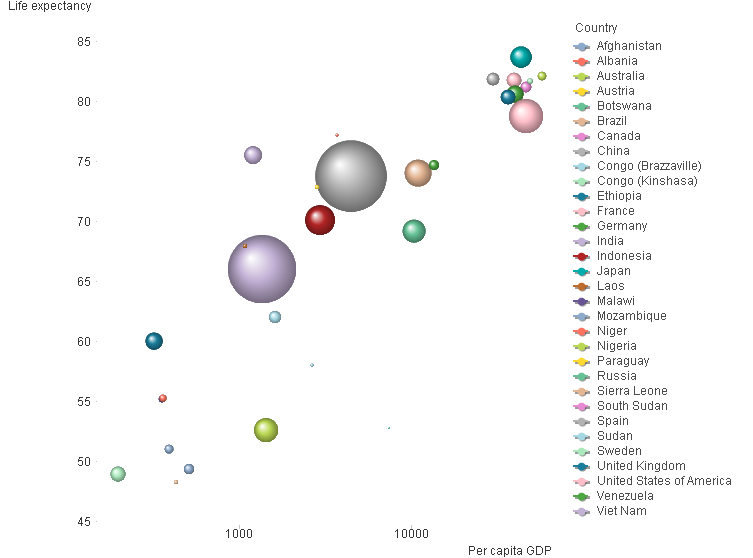
In the graph above, each bubble represents a country. In your case, it could perhaps be one bubble per customer, supplier or product. This is your dimension.
The next question is: “Where should the bubble be positioned?” In the graph above, the x-coordinate is per capita GDP and the y-coordinate is the life expectancy. You may want to use e.g. the total order value, gross margin, net cost or some other numbers. These are your measures. These are used for the axes in the graph.
You need at least two expressions. Optionally, you can have a third expression that will be used for the size of the bubbles. In the chart above, the country population is used as third expression.
When defining the measures, you encounter the next confusing thing: A country has only one GDP, but QlikView still wants you to use an aggregation function, e.g. Sum() or Avg(). The reason is that QlikView cannot “know” if your data has one or several records for each dimensional value. So, you need to use an aggregation function to tell QlikView what to do, should there be more than one record. If there really is only one record per dimensional value, then it doesn’t matter if you use Sum() or Avg(). Both will work fine.
But if you have several records per dimensional value, then you need to stop and think. Do you want to sum the records? Or do you want the average?
Once you know which dimension and expressions to use, it is straightforward:
- Create a chart and choose Scatter Chart. Click Next.
- Add your dimension. Click Next.
- Add the fields that you want to use for your two expressions in the “X” and “Y” controls.
- If you want a bubble chart, you need to add the third expression that determines the size of the bubbles.
- Check “Advanced mode” to the lower left. QlikView 11 unfortunately jumps to the “Sort” page here, so you need to click “Back” to verify that the right aggregation functions for your expressions are used. You may need to change the functions.
- Click Finish.
Now you will have made a scatter chart. To make it more beautiful, you should also consider the following:
- Choose a style [Style – Look]
- Increase the Bubble size [Presentation – Max bubble Size]
- Change the scale of one or both axes. [Axes]
- Remove the “Force 0” option.
- Use a logarithmic scale.
If you want to try to make a scatter chart using some good sample data, look at the document Creating a Scatter Chart.

-
Get certified at the Qlik World Conference in Orlando!
Are you interested in QlikView Certifications? Now is your chance! Certification exams will be held at the 2014 Qlik World Conference in Orlando, FL... Show More
Are you interested in QlikView Certifications? Now is your chance! Certification exams will be held at the 2014 Qlik World Conference in Orlando, FL on November 18th and 19th.
If you are planing on taking the QlikView Designer or QlikView Developer exams and would like FREE TUTORING prior to the exam, please read the attached document provided by IPC Global.
If you are interesting in attending the conference visit, Qlik World Conference 2014 for details and registration.

-
String Functions
QlikView is full of functions that can be used in expressions and/or the script to manipulate and parse the data. I decided to write about some commo... Show MoreQlikView is full of functions that can be used in expressions and/or the script to manipulate and parse the data. I decided to write about some common string functions that can be very helpful:
- Subfield()
- Len()
- Index()
- MinString()
- MaxString()
- Substringcount()
Subfield()
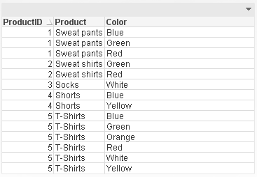
One of the most useful functions is the Subfield() function. From within the script, this function returns a specific substring from a larger delimited substring. This function allows you to transform a table like this:
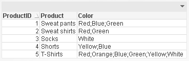
To a table like this parsing the Color field so that each product and color combination has its own row. This makes it easier to filter the data by color using list boxes.
Len()
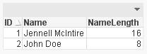
The Len() function returns the length of a string in either an expression (Len(Name)) or in the script providing the number of characters in in string like this:
Index()
The Index() function returns the position of a substring within another string. This function may be overlooked but it can be very handy when parsing a string field like a phone number. Using the Index() function, I can determine where the ‘-‘ are in the phone number therefore capturing the parts correctly.
Phone:
NoConcatenate LOAD
ID,
Phone,
Left(Phone, Index(Phone, '-')-1) as Phone1,
Mid(Phone, Index(Phone, '-')+1, 3) as Phone2,
Right(Phone, Len(Phone)-Index(Phone, '-', 2)) as Phone3
Resident PhoneTemp;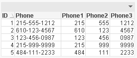
MinString() and MaxString()
Next are the MinString() and MaxString() functions. I think everyone has used these functions at least once in QlikView. They return the first or last value over a dimension (in an expression) or over a group by clause (in a script). I find these functions most helpful in chart expressions when I need to see the first or last value across a dimension.
Substringcount()
The last function is the Substringcount() function. I think this is a hidden treasure – not many people know about it but once you do, you use it all the time. The Substringcount() function returns the number of times a substring is in a string. So, if the field String is “abcdefabcdef” then the expression Substringcount(String, ‘def’) will return 2. I find this helpful with a show condition when I want to determine is a value has been selected or is possible.
There are so many string functions in QlikView that can make your life easier. Browse through them the next time you are in the Help section to see what shortcuts you can use to manipulate your data.
I wrote a technical brief about these string functions with more detail.


