Unlock a world of possibilities! Login now and discover the exclusive benefits awaiting you.

Analytics & AI
Forums for Qlik Analytic solutions. Ask questions, join discussions, find solutions, and access documentation and resources.
Data Integration & Quality
Forums for Qlik Data Integration solutions. Ask questions, join discussions, find solutions, and access documentation and resources
Explore Qlik Gallery
Qlik Gallery is meant to encourage Qlikkies everywhere to share their progress – from a first Qlik app – to a favorite Qlik app – and everything in-between.
Qlik Community
Get started on Qlik Community, find How-To documents, and join general non-product related discussions.
Qlik Resources
Direct links to other resources within the Qlik ecosystem. We suggest you bookmark this page.
Qlik Academic Program
Qlik gives qualified university students, educators, and researchers free Qlik software and resources to prepare students for the data-driven workplace.
Recent Blog Posts
-
Scaling Visual Analytics with Qlik Sense
Hello Qlik Community, in this post our resident guest blogger and Principal Enterprise Architect, Marcus Spitzmiller, introduces us to visual analyitc... Show More
Hello Qlik Community, in this post our resident guest blogger and Principal Enterprise Architect, Marcus Spitzmiller, introduces us to visual analyitcs scaling. Marcus is a member of the Qlik Enterprise Architecture team focusing on enterprise deployments and best practices. His areas of expertise include scalability and performance, deployment best practices, integration, and security.Scaling Visual Analytics
When we talk about scalability, it is often centered around data volumes, users, and the technology behind a given product. However, one should also consider the capabilities that a product provides which enable broad deployment and governance within an organization. It is within this context that we will look at Qlik Sense. Of course, data volumes and users matter too, so if you have a few moments, check out the Qlik Sense Performance Benchmark for that.
Instead of detailing everything in this blog I created a video presentation on this topic. In this video, we will look at Qlik Sense from the standpoint of four main topics that allow you to scale your visual analytics initiatives:
- Delivery – Qlik Sense’s platform approach to visual analytics enables authoring, self-service, and consumption with the patterns that fit to your organization, not the other way around.
- Security - Qlik Sense’s “attribute based access control” (ABAC) security model enables role and attribute based administration of the resources and content within Qlik Sense.
- Administration – Qlik Sense’s default, customizable, and delegated roles and out of the box monitoring enable simple and scalable administration.
- Infrastructure – Qlik Sense’s powerful In-Memory, Associative Data Indexing Engine and distributed architecture enables physical, virtual, and cloud based deployments with best in class performance.
Organizations are continually faced with market pressures to make decisions more quickly. The Qlik Sense platform enables visual analytics to be widely deployed within an organization so people have access to their data, with security and governance, and at scale.
Watch or download (.mp4) this video to learn more:

-
Why PowerPoint is Killing Corporate Education!
Save corporate education from death by PowerPoint!"PowerPoint should be used to aid the learning with visualizing key topics that are hard to depict i... Show MoreSave corporate education from death by PowerPoint!
"PowerPoint should be used to aid the learning with visualizing key topics that are hard to depict in other ways. A PowerPoint deck would make a good instructor manual, but let the instructor manage the class and tell the story and keep it interactive. Keep everything tied to the learning objectives, but do not script out the entire course" Kevin Hanegan, Qlik Vice President of Knowledge and Learning.
To read more and learn what top six things to AVOID in PowerPoint, visit Why PowerPoint is Killing Corporate Education | Qlik


-
AND and OR
In the Qlik engine, the logic of the selections is always an OR between selections in the same field, and an AND between selections in different fi... Show MoreIn the Qlik engine, the logic of the selections is always an OR between selections in the same field, and an AND between selections in different fields. Selecting e.g. two products and one customer is very much like the WHERE clause in the following SELECT statement:
SELECT … WHERE (Product='Cap' OR Product ='Tracksuit') AND Customer='ACME' ;
Under some special circumstances, you can however use something called AND-mode. Read more about it in Jennell’s excellent blog post: AND-Mode. With AND-mode you can select two different products and find the customers that bought both.
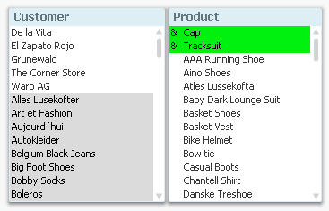
However, the AND-mode logic is quite different from a standard AND operator in a WHERE clause: And it does not work at all the same way as OR-logic. There are theoretical implications that do not exist for OR logic.
For example: If you select two products and demand an OR between them, the possible values of all other fields are immediately determined: Any field value implied by either of the products is marked as “possible”.
But if you instead demand an AND between them, it is not clear what you mean: Do you mean “Customers” that have bought both products, or do you mean “Months” when both products have been sold? Or do you mean “Countries” where both products have been sold? Just specifying the two products is not enough to determine a result. You also need to specify the field that the AND-mode refers to.
The example shows that the AND-mode demands an intermediate iterator: The AND-mode always infers a second field for which the AND-logic is relevant. This is a theoretical problem that has nothing to do with how the logic is implemented in the software.
Let’s look at SQL: In a standard SELECT statement, the conditions on either side of the AND operator almost always concern two different fields. It would not make sense to demand
SELECT … WHERE Product='Cap' AND Product ='Tracksuit' ;
since there are no individual records that fulfill that requirement: "Product" can only have one value at the time. But this is exactly the type of requirement that you have in AND-mode - but operating on a group of records instead of on a single record.
If you would implement something similar to AND-mode in SQL, you would need to join a table with a copy of itself. The following will pick out customers that have bought both a Cap and a Tracksuit:
SELECT DISTINCT Customer FROM Orders AS Orders1
INNER JOIN Orders AS Orders2 ON Orders1.Customer=Orders2.Customer
WHERE Orders1.Product='Cap' AND Orders2.Product='Tracksuit'
Again, an intermediate iterator is needed: Here it is "Customer" - the field used to join the two tables.
In QlikView we have chosen to solve this problem by demanding a two-column table for AND-mode, where the first column defines the iterator (e.g. Customer), and the second is the field where the user makes the AND selection (e.g. Product).
So, the two-column table is not just an arbitrary limitation; it is instead a framework implied by the theoretical problem.

-
How To Improve Your Design Process Working With Qlikview
I've been a designer for about 10 years, 8 of which I've been designing web sites. The fancy buzz-word way of saying you work on websites is to say th... Show MoreI've been a designer for about 10 years, 8 of which I've been designing web sites. The fancy buzz-word way of saying you work on websites is to say that you work in "User Experience Design." The user experience is how someone (a user) might interact with something (a website, an ATM, or in this case QlikView). You consider what troubles a user might encounter, what might be helpful, how they will accomplish certain tasks, etc. From Amazon to Zappos, User Experience Design is the (not so) secret ingredient that separates the bad experiences from great experiences with loyal customers.
So what makes User Experience Design work? One of the keys is to be empathetic, to put yourself in the shoes of the user and design for them and not yourself. You design for and with others, that is you don't do it alone. Designers are just one group of people who take a website from conception to completion. Information Architects, Writers, Designers, Developers, and Usability Engineers all contribute to the process. People with specialized disciplines doing what they do best to make great experiences. If you aren't lucky enough to have a team of bright UX professionals, it probably means you will have to become a "jack of all trades" and take on all of these roles yourself.
Never fear. As a guide I've written the attached Technical Paper that walks you through how you can apply the iterative UX waterfall design process to developing QlikView applications. There is a lot of overlap between designing a website and designing a QlikView application because at the heart of both is the user experience. Designing for what is best for the user is key no matter what the final product.
Next Steps? Start small. I would recommend trying these ideas on a smaller, easier project first and then apply what works for you to larger projects over time.

-
Capabilities API error on exporting data
Working on one of our projects, the requirement was to export the object data. It seems though, 2.1 does not let you do that. I used both: app.getObje... Show MoreWorking on one of our projects, the requirement was to export the object data. It seems though, 2.1 does not let you do that. I used both:
app.getObject(value, value).then(function(model){
model.exportData()
and
qlik.table(model).exportData({download: true})
Both of them returned error
Object {code: 403, parameter: "REST HTTP error", message: "Forbidden"}
Until this bug is fixed, I have created a workaround. A new directive that will handle the export by accepting Dimensions and Measures, passing them to the api service. This is for every Hypercube we want to create which is also for the objects like stacked bar chart that 2.1 does not have the ability to export yet. I believe this is fixed in 2.2 though!
We will use the template from Creating a website with Angular and the Capabilities API.
In controllers/dashboard.js add the Dimensions and Measures for export
  $scope.export = [
  {
     headers:['Case Owner Group', 'Avg Case Duration'],
     data:[['Case Owner Group'], ["Avg([Case Duration Time])"]]
  }
  ];
In the views/dashboard.html add a button that will use the new directive
<button class="btn btn-default pull-right" export-to-csv data="export[0].data" headers="export[0].headers" title="'myFileName'">Export</button>
git: https://github.com/yianni-ververis/capabilities-api-angular-template
Branch: Qlik Branch
-
Qlik Sense 2.2 - It just keeps getting better and better
What?!?! Another release? Come on! I thought this year's Superbowl ads were creative, but Puppy, Monkey, Baby was definitely something to see, but...t... Show MoreWhat?!?! Another release? Come on!
I thought this year's Superbowl ads were creative, but Puppy, Monkey, Baby was definitely something to see, but...this is even better.

Seriously, welcome to the Qlik Community and thank you for taking a brief moment to learn what's new in Qlik Sense 2.2.We’ve done it again! Qlik Sense 2.2
Powerful enhancements for both business users and developersIn the past year and a half, we have continued to deliver product innovation at an impressive cadence. Delivering true decision support system and business intelligence software with our platform approach...yep, it's more than just a tool.
By keeping our promise to deliver three new releases every year, Qlik has proven it’s ability to deliver as an organization thereby ensuring that our customers have continuous access to an ever increasing set of capabilities. It is important to recognize however that these new capabilities extend well beyond what most people see in the product. At Qlik, we are just as committed to delivering value to the developer community as we are to business users.
Delivering capability for both the end user and the developer is critical to support our platform approach. This is because enabling one shared common platform that supports all business intelligence and analytics use cases (click to watch) is the key to seeing the whole story that lives in your data. Not only are we innovating faster than ever but our extensive open APIs ensure that others can innovate right along with us thereby multiplying the power of the platform approach.
Qlik Sense 2.2 enables business users to more freely prepare and explore data, and provides developers new, powerful tools for building custom applications and extending Qlik Sense.
Here are some of the highlights:
- Advanced data preparation
- automatic date handling, calculated fields, and a newly redesigned data manager
- automatic date handling, calculated fields, and a newly redesigned data manager
- Alternate dimensions and measures
- user can swap measures and dimensions int he same chart to answer many questions
- user can swap measures and dimensions int he same chart to answer many questions
- Powerful new developer APIs and capabilities
- new app integration API
- visualization API for programmatic creation of analytics
- new integrated developer environment (IDE) plugin for Visual Studio
- Expanded printing and exporting capabilities for stories and charts to PowerPoint, .PDF, and Excel
- Numerous user experience and enterprise management improvements
You can learn more and see these features in action here:
Then learn how to use some of these great new features on the Qlik Help Channel Playlist: What's new in Qlik Sense 2.2 - YouTube
Enjoy guys - please feel free to leave me your comments and questions, we love to hear from you.
Regards,
Mike Tarallo
Senior Product Marketing Manager
Qlik
Follow Me: @mtarallo
- Advanced data preparation
-
Full Accumulation example
During the last days we have been working in a new visualization piece that will be live soon in The Telegraph website. We got some data with daily re... Show MoreDuring the last days we have been working in a new visualization piece that will be live soon in The Telegraph website. We got some data with daily refugees arrivals to different countries, the goal was to visualize how many people have moved across Europe during the last few months in a map, but we also wanted to plot a line/area chart with the cumulative number of arrivals per country and per day so you can see trends and evolution over time. Our data set included daily data but it didn't contain cumulative numbers so we had to calculate them.
The calculation should be something like this:
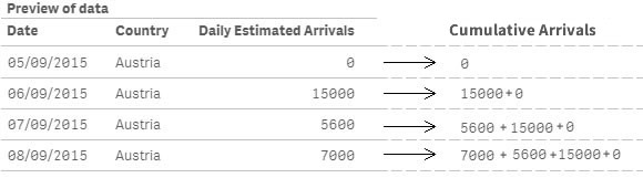
If is the first row or country is different than previous row country, then load the field value, else load the field value plus same field previous row value. Step 1 Data Load
Start by loading our data table with the daily arrival values by country.
//Load the main table
DataLoad:
LOAD
    "Date",
    Country,
    "Daily Estimated Arrivals"
FROM [lib://LibraryName/Data.qvd] (qvd);
The generated table will look like the picture below:
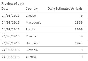
As you can notice the data is not sorted in a way that will let me successfully calculate the new field as I designed it because it will mix data from different countries, so my next move will be to sort the table by country and date.
Step 2 Sorting the table
//Sorting the table
SortLoad:
NoConcatenate Load
  "Date",
    Country,
    "Daily Estimated Arrivals"
Resident DataLoad
Order by Country, Date;

Drop table DataLoad; //Deletes the previous table no longer needed
Because I’m using a Resident Load statement to load and sort the values from the previous table, and both tables have identical field sets, I need to specify NoConcatenate before the load, otherwise both tables will be automatically concatenated. Using ‘Order By’ clause will sort the table by Country and then by Date. Finally, because the first table DataLoad will be no longer needed I’ll delete it using Drop Table.
My new table will be as in the picture below
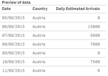
Step 3 Adding the calculated new field
Now that we have the data table ready we can finally calculate the new field to the table containing the cumulative daily estimated arrivals. To do so we will use the peek and previous script functions. Both functions are similar but they have some key differences that you should learn, please don’t miss this blog post: Peek vs Previous: when to use each
//Add cumulative data to the table
CummulativeLoad:
NoConcatenate Load
    "Date",
    Country,
    "Daily Estimated Arrivals",
    If(RowNo()=1 Or Country<>Previous(Country),
          "Daily Estimated Arrivals",
          "Daily Estimated Arrivals" +  Peek("Cumulative Daily Estimated Arrivals", RowNo()-2))
    as "Cumulative Daily Estimated Arrivals"
Resident SortLoad;

Drop table SortLoad; //Deletes the previous table no longer needed
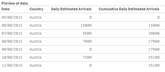
Click on the image below to see how we created the new field to match with our calculation statement.

The final result will be a data table containing the fields to support both daily and cumulative charts.
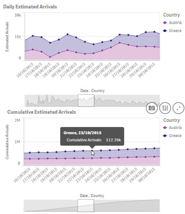
Enjoy Qliking!
AMZ
(Note: I divided this example in 3 steps so hopefully it is clearer, but step 2 and 3 can be merged in one single step)

-
Alternate States and Capability APIs
Here are some useful topics related to alternate states and the Capability APIsCreating Alternate StatesCreating an alternate state with the Capabilit... Show MoreHere are some useful topics related to alternate states and the Capability APIs
Creating Alternate States
Creating an alternate state with the Capability APIs is easy. Just do the following
app.addAlternateState('StateName');
Alternate states created through the Capability APIs can be saved in the app or created every session. If you try to add an alternate state that already exists though, you may get some unexpected behavior. That's why I would recommend using something like the following when adding an alternate state:
app.getAppLayout(function(layout) {
     if(layout.qStateNames.indexOf('StateName') === -1) {
          app.addAlternateState('StateName');
     }
});
This will check to make sure the alternate state doesn't already exist before adding it to the app.
Alternate States and Session Objects
For session objects, such as lists and hypercubes, it's super easy to assign them to an alternate state. All you need to do is include the 'qStateName' parameter in your object definition. Below is an example of a list object that fetches 10 rows from the field 'SomeField', and is assigned to the state 'StateName'.
app.createList({
    'qDef': {
        'qFieldDefs': ['SomeField'],
    },
    'qInitialDataFetch': [
        {
            'qHeight': 10
        }
    ],
    'qStateName': 'StateName'
}, function(reply){});
Alternate States and Qlik Sense Objects
You can't assign a Qlik Sense object directly to an alternate state, but with a bit of set analysis, you can make an object respond to selections on an alternate state. Let's take, for example, a measure that is simply the sum of some field name, and add the set analysis needed to make it respond to selections on an alternate state.
Sum( {$< FieldName = P( {StateName} FieldName ) >} FieldName)
Making Selections on Alternate States
Making selections on alternate states is as simple as passing an extra parameter to the Field API methods. Example below
app.field('FieldName', 'StateName').select([0], false, false);
The above example would select the first row in the "FieldName" field, on state "StateName". The important part of the above is the second parameter to the app.field() method. Utilizing that second paramter, you can apply just about any method in the Field API to an alternate state.
-
How I used Aggr() and Above() in a KPI Object
I ran into an interesting dilemma last week when trying to create a measure for a KPI object in Qlik Sense. Let me set the scene. I was working on a... Show MoreI ran into an interesting dilemma last week when trying to create a measure for a KPI object in Qlik Sense. Let me set the scene. I was working on an app that tracks organization members and activities. The requirement was to look at the number of members in the organization over time and identify the largest and lowest monthly gain and loss. I was able to build the table below to see how the number of members varied over time and where the largest gain and loss were. The largest gain was from Nov 2015 to Dec 2015 with a 15.91% member increase. The largest loss was Sept 2015 to Oct 2015 with -48.88% member decrease.
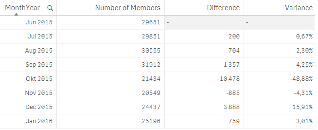
The measures for this table looked like this:
Number of Members – count the number of distinct members

Difference – count the difference between this month and the previous month using the Above() function to capture the previous month’s number of members

Variance – show the difference as a percentage

Now here is where my dilemma began. I needed to capture the percentage and number of the gains and losses in a KPI object and I was not sure how to do that. I knew there had to be a way to do it in Qlik Sense so I turned to my colleague Arturo Munoz who enlightened me to the fact that when I use the Aggr() function, it creates a temporary staged result set, like a table, similar to what I was doing in the table above. So I tried this out in a KPI object using the Variance expressions above and aggregating the results by MonthYear. Since I wanted the largest gain and loss, I also used the Max() and Min() functions. Here is what my KPI measures looked like when I was done:
Largest Gain %

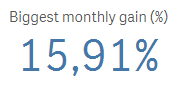
Largest Loss %

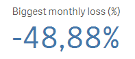
I was able to use the Above() function in my KPI measure to get the variance and then I aggregated the result by MonthYear and captured the maximum and minimum variance. I was able to apply this to my app for other KPIs as well. It was brilliant. I never thought that I could use the Above() function outside of a Table object but I was very happy to find out I was wrong. In order for the Aggr() function to work as I expected, I needed to make sure the MonthYear field was sorted properly in ascending order so I handled this in my script. Note that if the MonthYear field was not in ascending order, the Above() function may not always return the previous month thus returning the wrong results.
Henric Cronstrom has blogged about the Aggr() function in his blog Aggregations and Function Classes as has Adam Bellerby in his AGGR... blog. The Aggr() function can be quite helpful and while I have gotten use to using it, I realized that there are still so many other ways it can be used. I hope you find this way of using it as helpful as I did.
Thanks,
Jennell
-
New Course Available: Reporting with QlikView® NPrinting
The Reporting with QlikView NPrinting course is based on QlikView NPrinting v17. This course is intended for business users and business analysts who ... Show More
The Reporting with QlikView NPrinting course is based on QlikView NPrinting v17. This course is intended for business users and business analysts who need to be able to build and distribute static reports from QlikView. The course will cover the generation of reports based on (multiple) QlikView applications, options for distribution to users and groups, and scheduling options.
Please note that this course is only suitable for those wishing to learn specifically about the features of QlikView NPrinting v17. This course is not compatible with earlier versions QlikView NPrinting.
How Can You Learn NPrinting?
Visit http://inter.viewcentral.com/reg/qlik/ReportQVNPrinting to register today!
-
Training That Cuts To The Chase
For most of us, information that is not put to action quickly is simply forgotten. If the information is not practical or relevant immediately to you... Show More
For most of us, information that is not put to action quickly is simply forgotten. If the information is not practical or relevant immediately to your job, chances are, you won’t remember it. The solution to this is what is known as “just-in-time” learning. Just-in-time learning can provide you with all the training you need, right at your fingertips, through a self-service learning platform.
Here are a few situations where the learner would benefit from just-in-time learning.
- Keeping up with new product features
- Spacing out your learning
- Refreshing your knowledge
- Learning task-based solutions
To read the full blog visit Training That Cuts To The Chase | Qlik and don't forget to check out the our self-service learning platform Qlik Continuous Classroom.
-
Enhancing the User Experience Using Conditional Expressions
As QlikView developers, one of our main focuses is on the user experience. There are many instances where objects only need to be shown upon the user’... Show MoreAs QlikView developers, one of our main focuses is on the user experience. There are many instances where objects only need to be shown upon the user’s request. An example of this is list boxes (filters). With the use of conditional expressions, a QlikView developer can make the list boxes available when the user needs them.
I have seen too many applications where list boxes take up most of the design area available to the developer. Invariably you get the same response, “It is what the users want”. And while I am sure they “need” all of the list boxes, they just do not need them on the screen the entire time. So how do you get around this demand for list boxes? Create a “Filters” button and have the user show and hide the list boxes whenever they want.
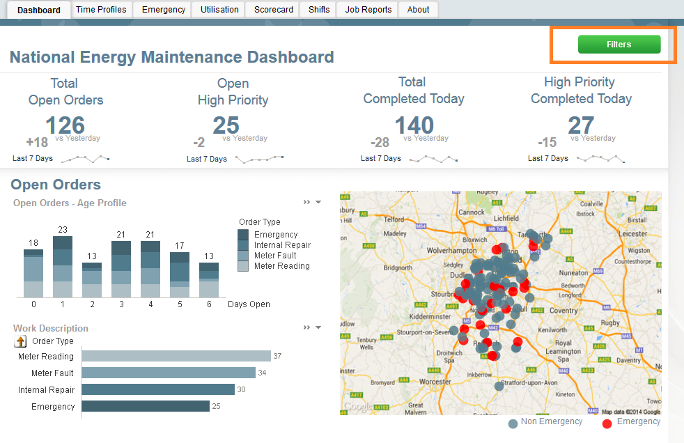
For this first example, I will reference the Workforce Management demo. On the dashboard below there are no visible list boxes. The lack of list boxes opens up more space to the developer. Instead of making the list boxes available at all times, we have a Filters button which, when invoked, will display the filters over top of the visualizations. Once the user makes the appropriate selections, he/she can close the filter panel and continue with his/her discovery. This is done by setting a variable and conditionally showing the objects based on the current value of the variable. The beauty of this approach is that the user gets to have the filters that he/she needs and the developer does not lose any display area.
Here you can see the filter button with a conditional show. When invoked, there is an action to change the variable to 1 which makes the filters button disappear and makes the filter objects appear.
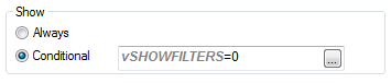
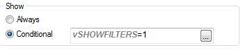
All of the filter objects have the same show conditional. When the user selects the close button, the variable is changed back to 0 which makes the filter objects disappear and the Filters button reappear.
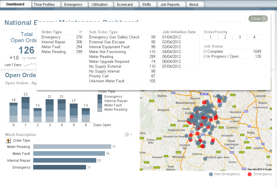
This approach can also be used if you need to show/hide help/information pop-ups as shown here in the IT Asset Management demo.
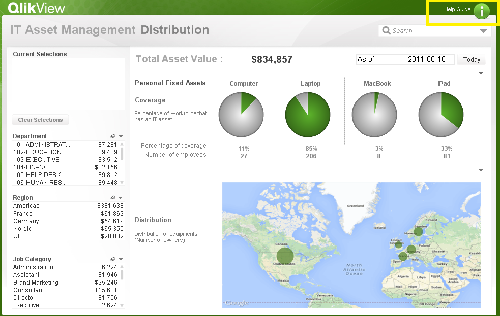
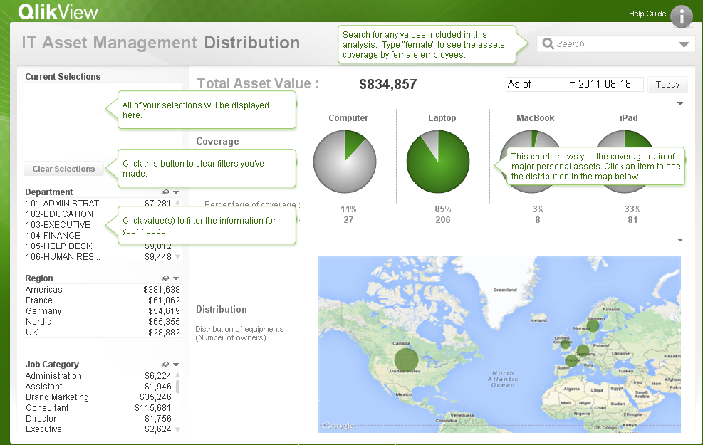
If you would like to see how the filter and the help/information buttons were developed, the QVWs can be downloaded from the demo site. As was stated earlier, the filter example referenced the Workforce Management demo and the Help/Info button referenced the IT Asset Management demo. Happy Qliking!

-
Accumulations
When building analytical applications you very often encounter cases where you want to accumulate numbers inside a chart. It could be that you want ... Show MoreWhen building analytical applications you very often encounter cases where you want to accumulate numbers inside a chart. It could be that you want to calculate a Year-to-date number, or a rolling 6 month average, or a moving annual total.
When creating an accumulation, there are two fundamental challenges. First, there is the question on how to treat dimensional values with no data. The tables below illustrate the problem:
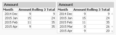
In this example, there is no data for the month of March. The default behaviour is that this row then is omitted, see left table. This leads to an incorrect accumulation – the rolling 3 total for April includes January, which it shouldn’t. The table to the right however treats missing months correctly.
Secondly, there is the question on how to treat the first dimension when there are several dimensions. The tables below illustrate the problem:
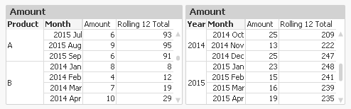
In the left table, you want the accumulation to re-start for each new product. You do not want the accumulation to continue from the previous product. Note that for ‘2014 Jan’ the accumulation is reset.
But in the right table, it is the other way around: A moving annual total should span over two calendar years, so you want the accumulation to continue over into a new value of the first dimension.
In QlikView and Qlik Sense there are several ways to create accumulations, each with its own pros and cons.
1. Using the control in QlikView charts
In a QlikView chart, you can easily create an accumulation just by selecting the right chart setting:
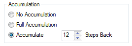
This method will however fail both the above challenges. Also, an accumulation can only be made over the first dimension, and the accumulation will always be reset for a new value in the second dimension.
Further, you cannot use it to calculate moving averages. It only works for calculations of sums.
2. Using the Above() function
If you use the Above() function in a chart table like
RangeSum(Above(total Sum(Amount) , 0, 12))
or in an Aggr() table like
Only(Aggr(RangeSum(Above(total Sum({Amount),0,12)), YearMonth))
you will get a 12-month moving total. It will pass the “multiple dimensions” challenge: By using – or not using – the total specifier in the Above() function you can decide which behaviour you want.
But it will fail the “no data” challenge. There is a however a way to make an accumulation in an Aggr() table work also for this problem: Trick the QIX engine to show all rows by adding a zero term for all dimensional values:
Only(Aggr(RangeSum(Above(totalSum(Amount) + Sum({1} 0),0,12)), YearMonth))
and enable the display of zero values. Then you will get the right numbers also when some dimensional values are excluded.
3. Using an As-Of table in the data model
The As-Of table, is an excellent solution that will pass both challenges. Here you must set the condition using Set Analysis:
Sum({$<MonthDiff={"<12"}>} Amount)
However, it has one drawback: When a user clicks in the chart, a selection will be made in the AsOfMonth. But you don’t want the user to make selections here: You want month selections to be made in the real month field. So I usually make my charts read-only if they use the AsOfMonth as dimension.
With this, I hope that you understand accumulations better.
Further reading related to this topic:
Calculating rolling n-period totals, averages or other aggregations
-
RecNo or RowNo?
Do you know the difference between the RecNo() and the RowNo() functions? You may think that you can use these interchangeably to count the records o... Show MoreDo you know the difference between the RecNo() and the RowNo() functions? You may think that you can use these interchangeably to count the records or rows in a table but these functions differ slightly. The RecNo() function will return an integer for the record currently being read from the source table starting with number one. The RowNo() function also returns an integer but it represents the position of the row in the resulting QlikView internal table. So while RecNo() counts from the source table, RowNo() counts from the resulting table.
In the script below the fields from the Temp table are loaded along with fields to represent the RecNo and the RowNo. A Where clause is used to load all records where Number does not equal 3.
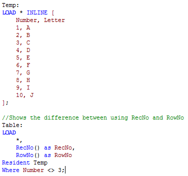
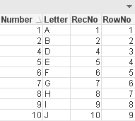
The resulting table below shows the results of this script. In the RecNo field we see values 1 through 10 excluding 3. This is because the script excluded records where Number = 3 so while that record was read, it was excluded from the results. In the RowNo field we see values 1 through 9 for the position of each row in the results table. The fact that some rows were excluded does not affect the RowNo field because we are only looking at the internal table that is created. The RecNo field indicated the order in which the records were read from the source table and the RowNo field indicates the positon of the record in the internal table.
To see an example, check out my technical brief that includes the QVW and detailed descriptions of these functions. In the technical brief, I also discuss the IterNo() function and the FieldValueCount() functions.
Jennell
-
Text searches
One of the strengths of QlikView is its search engine. With it, you can find pieces of information in a fraction of a second and select the found fiel... Show MoreOne of the strengths of QlikView is its search engine. With it, you can find pieces of information in a fraction of a second and select the found field values. The response is immediate, which is necessary for the user experience. Without it, you would easily get an empty result set without understanding why.
Search strings can be made in many different ways, and QlikView will respond differently depending on how the search string is defined. Normally you just enter a text, and QlikView will match this against the beginning of the words in the field values. If several strings are entered, QlikView will return the union of the matches of each of the strings.
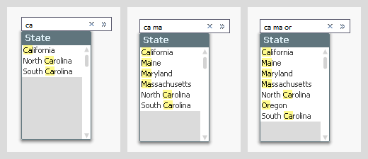
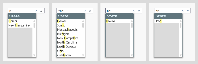
But if you instead use a wildcard in your search string, the evaluation of the search string will be made in a different way: the entire search string with the wild card will be matched against the entire field value, sometimes yielding more matches, sometimes fewer.
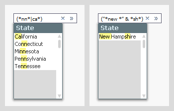
If you want to create more complex search strings (and e.g. store them in actions or bookmarks) you can do this too. Just use (, |, & and double quotes to define the syntax.
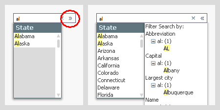
In all the above cases, the search and the selection are made in one and the same field. But sometimes you want to make the selection in one field, but make the search in another. This can be done using the associated search, which is an indirect search method. Start with the field where you want to make the selection, enter the search string, and click on the small chevron to the right. You will then get a list of other fields containing this search string. By clicking the desired match, you will narrow down the number of matches in the primary list to show just the relevant values. You can then make your selection by hitting Enter.
Further, did you know that
- In the user preferences and in the list box properties, you can define how a default search string should be created, but this does not affect how it is evaluated – only how it is created. Once created, you can add or remove wild cards as you please.
- When you make a search and save the resulting selection in a bookmark, the bookmark will contain the search string and not the list of selected values. When the bookmark is applied, it will perform the search and select the found values. If data has changed, this may imply a different search result than before.
- You can use the same search string in many places: In list boxes, in Set analysis, in the Advanced search dialog, in actions and in bookmarks.
Bottom line: The search string is a powerful tool that helps you find the values you want. Use it.
Further reading related to this topic:
-
A few templates
Recently, I put together three simple templates for use in the dev hub. Check out where to find them and more below.Blank Bootstrap TemplateThe "Blank... Show MoreRecently, I put together three simple templates for use in the dev hub. Check out where to find them and more below.
Blank Bootstrap Template
The "Blank Bootstrap Template" download and installation instructions can be found at Qlik Branch - Blank Bootstrap Template. This template is simply a blank template, with boilerplate html, css, and javascript for creating a webapp or mashup using the Qlik Capability APIs. The template loads Bootstrap for you, and takes care of some conflicting css issues between bootstrap and the css used for the Capability API. If you'd like to build your own web app or mashup and use bootstrap, this is a good place to start.
Bootstrap Tabs Template
The "Bootstrap Tabs Template" download and installation instructions can be found at Qlik Branch - Bootstrap Tabs Template. This template builds on the blank bootstrap template, and includes bootstrap tabs and qvplaceholders so you can easily drag and drop objects and create a mashup or web app from an existing Qlik Sense app within minutes. A demo can be found here, and a video demo is below.
Bootstrap Off-canvas Menu Template
The "Bootstrap off-canvas menu template" download and installation instructions can be found at Qlik Branch - Bootstrap off-canvas menu template. This template also builds on the blank bootstrap template, and includes a very simple off-canvas menu so you can stash a filter pane or anything else you'd like in an off-canvas menu, as well as qvplaceholders, allowing you to quickly create a web app or mashup from an existing Qlik Sense app within minutes. A demo can be found here.
-
Merging Data from Multiple Sources
A common situation in Business Intelligence is that you have data in different data sources. It could e.g. be that you have several data systems withi... Show MoreA common situation in Business Intelligence is that you have data in different data sources. It could e.g. be that you have several data systems within your company or that you have some data in an Excel spreadsheet in addition to the data in your database.
In any case, you want to load data from several sources and view them in a coherent way. This is sometimes referred to as merging data or blending data.
Not all BI tools can do this – you sometimes have to rely on external tools or SQL to do this prior to loading the data into your BI tool. QlikView, however, can do this easily.
If you have two different database systems, you need two different connect strings in the script:
ODBC CONNECT TO <Database 1>;
SQL SELECT * FROM TableA;
ODBC CONNECT TO <Database 2>;
SQL SELECT * FROM TableB;
At any place in the script, a SELECT statement will use the latest CONNECT string. In addition, LOAD statements will load data from files, disregarding the CONNECT statement. This way you can merge data from any number of databases and any number of files. Simple!
The next question is how to merge the two tables. In principle there are two ways to do this: Concatenating them (a union) or linking them (joining). Which one to use, depends on the situation.
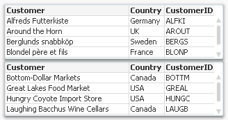
Concatenation should be used, if you have two tables with basically the same type of entity, but different data sets; for example “Customers in Europe” and “Customers in North America”. In this case, you want both tables to be merged into one. See picture above. The script then becomes:
ODBC CONNECT TO <Database 1>;
SQL SELECT * FROM Customers;
ODBC CONNECT TO <Database 2>;
Concatenate SQL SELECT * FROM Customers;
But if you instead have a situation where the tables contain different entities, and a selection of an entity in one of the tables should imply one or several entities in the other table, then you should usually link the tables.
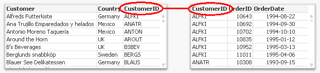
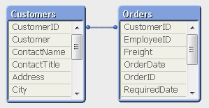
The script then becomes:
ODBC CONNECT TO <Database 1>;
SQL SELECT * FROM Customers;
ODBC CONNECT TO <Database 2>;
SQL SELECT * FROM Orders;
Linking tables is from a logical-mathematical perspective identical to an outer join, but QlikView keeps the two tables separate. Keeping them separate has the advantage that calculations are made in the “right table”.
Not all BI tools can perform an outer join as easily as this. I recently read an article about how to join an “Opportunities” table with a “Leads” table using a competing tool, and it was all but simple. But with QlikView, it is straightforward: Just make sure that the linking key field is named the same in both tables (and that no other fields are) and it will work right away.
The ability of QlikView to load data from any number of sources and merge it any way you want is one of the major strengths of QlikView and its script. Use it.
See also Wizards vs. Scripts
-
New Year: Time to Get Your Organization in Shape
How social learning environments can help maximize your ROI in 2016!The new year is upon us and many of you may have selected your personal new years ... Show MoreHow social learning environments can help maximize your ROI in 2016!

The new year is upon us and many of you may have selected your personal new years resolutions but have you stopped to think about your professional resolutions?
Education Services would like you to consider another type of resolution: adopting the right learning approach for you and your organization – and making your business more successful as a result. To do this you must first focus on social learning, and how it can have a dramatic impact on your ROI!
To learn more visit the Qlik Blog at New Year: Time to Get Your Organization in Shape | Qlik
-
Mode Function
Have you ever heard of the Mode function? Until recently, I was not aware of this function. The Mode function can be used in the script or in a char... Show MoreHave you ever heard of the Mode function? Until recently, I was not aware of this function. The Mode function can be used in the script or in a chart to find the most commonly-occurring value in aggregated data. I will show you how it works by loading the small data set below.
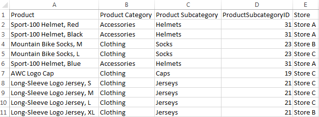
Now that I have loaded this data, I may want to see which Product Category or Product Subcategory occurs the most. To do this in Qlik Sense, I can add a Text & image object to a sheet and add the measure Mode([Product Category]) or Mode([Product Subcategory]).
- Mode([Product Category]) returns Clothing because it is the most common value in the Product Category field.
- Mode([Product Subcategory]) returns Jerseys because it is the most common value in the Product Subcategory field.
Making selections can affect the data returned by the Mode function. For instance, if I selection Store A, Accessories will be the most common product category and Helmets will be the most common product subcategory. If I want to avoid these values changing when I make selections, I can simply use the set analysis expression {1} which will evaluate all records and ignore any selections I have made.
- Mode({1} [Product Category])
- Mode({1} [Product Subcategory])
The Mode function can also be used in the script to determine the most commonly-occurring value. The key to remember when using the Mode function in the script is to use the Group By clause. By using the Group By clause, you are indicating what field the values should be aggregated by. In the script below, I am loading the products in the first load script and then in the second load script, I am using the Mode function to determine the most commonly-occurring store by Product Category.
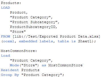
The results will look like this:

For the Accessories product category, Store A is the most common and for Clothing, Store C is most common. If there is not one single value that occurs more than the others, then the Mode function will return NULL.
The Mode function provides a quick way to see which value occurs the most in aggregated data. It can be used with text data, as done in the examples show here, or with numeric data. Hopefully, you learned something new as I did about one of the many functions offered in Qlik Sense and QlikView.
Thanks,
Jennell
-
Year in review. 2015 top posts
By today an ordinary human being would had been exposed to probably dozens of lists about several and arbitrary topics. For sure we all have read clas... Show MoreBy today an ordinary human being would had been exposed to probably dozens of lists about several and arbitrary topics. For sure we all have read classics lists such as the best movies of 2015, the 25 books of the year, or top 10 songs of 2015, but on the internet, we can go much further than that and even have a list of lists.
I don’t want this year to end without sharing with you a list of the best posts of the year. But let me give you some numbers first.
This year 2015, 10 authors wrote 72 posts (not including this one) and a total of 36.756 words were written. We wrote the word "Qlik" 323 times during 2015 making an impressive average of 4.5 times per post! You, on the other hand, participated by commenting 619 times (8.6 comments per post of average), thanks a lot for that, we really appreciate your comments.
Most popular posts in 2015
Most read/visited posts
- A Primer on Set Analysis. Set analysis, the most powerful and sometimes complex thing in Qlik, in this post, HIC brilliantly explains what Set Analysis is and walks us through it with simple examples.
- Using Qlik Sense Analytics to Get in Shape. Jason Yeung reveals how he used Qlik Sense to track and better understand his fitness activity.
- Qlik Sense – Date & Time. Jennell describes what is and how to work with the new Date and Time fields in Qlik Sense.
- The search string. QlikView search capabilities illustrated with detail, I bet you didn't know a bunch of the available search modifiers.
- How to embed a Qlik Sense Chart on your website. When I wrote this post it was the best way to share a chart, now it's still a good way to share it internally within your company or integrate it in a web page, but since the introduction of Qlik Cloud, we have better sharing options available.
Most commented posts of the year
Something interesting is going on in these posts.
- The search string.
- A Myth about the Number of Hops. HIC tears down a false myth once again, really interesting lecture.
- Excluding values in Set Analysis. Including values in Set Analysis conditions is easy but what about excluding values?
- Evaluate() Function. Discover what's Evaluate(), how to use it, explore examples, and more.
- The As-Of Table. Are you trapped in calculating rolling averages and other accumulations? Then, don't miss this post.
Most liked and bookmarked content
Both strongly correlated.
- A Primer on Set Analysis.
- The As-Of Table.
- The search string.
- Dates in Set Analysis. Yet another post on Set Analysis, this time, HIC gets inside out with dates.
- Excluding values in Set Analysis.
The underdogs 2015
I can't finish the last post of the year without a selection of not-so-popular posts (yet), that deserve some more attention.
- Mode Function. Do you know what Mode() does? well, it's simple but might be an interesting addition for your next project.
- Qlik Sense Search Cheat Sheet Some of the information needs we face every day don't require complex expressions or customized charts, sometimes a good use of search can help you to visualize what you was looking for.
- Qlik Dev Hub replaces Qlik Sense Workbench in Qlik Sense 2.1 Maybe a small step but a very important one in Developers' world.
- Mashup Editor - Toggle charts with jquery Do you miss the good old QlikView container object? Well, Yiannis have created a tutorial to bring it back to life in Qlik Sense.
- Qlik Sense SAML - A standardized approach to authentication Learn what SAML is and how to implement it with Qlik Sense
Hope you all have a great end of the year!
AMZ