Unlock a world of possibilities! Login now and discover the exclusive benefits awaiting you.
Analytics & AI
Forums for Qlik Analytic solutions. Ask questions, join discussions, find solutions, and access documentation and resources.
Data Integration & Quality
Forums for Qlik Data Integration solutions. Ask questions, join discussions, find solutions, and access documentation and resources
Explore Qlik Gallery
Qlik Gallery is meant to encourage Qlikkies everywhere to share their progress – from a first Qlik app – to a favorite Qlik app – and everything in-between.
Qlik Community
Get started on Qlik Community, find How-To documents, and join general non-product related discussions.
Qlik Resources
Direct links to other resources within the Qlik ecosystem. We suggest you bookmark this page.
Qlik Academic Program
Qlik gives qualified university students, educators, and researchers free Qlik software and resources to prepare students for the data-driven workplace.
Recent Blog Posts
-
What's New in Qlik Sense February 2018
Hi guys - in this edition of the Qlik Design Blog, I have a short video that briefly introduces you to some of the new features available in Qlik Sens... Show MoreHi guys - in this edition of the Qlik Design Blog, I have a short video that briefly introduces you to some of the new features available in Qlik Sense February 2018. Some of the related features are already available in Qlik Sense Cloud and can be used immediately. (note: themes is not available in Qlik Sense Cloud). The software download is currently available to customers and partners who have signed up for the Technical Preview and will be made available for download in our customer downloads area this month.
Qlik Sense February 2018
- Custom Themes: Getting started creating custom theme - Qlik Sense - YouTube
- Preview Associations in Visual Data Preparation
- iPhone Support for Qlik Sense Mobile
- SSO for MSQL ODBC Data Connections
- Anonymous Usage Support for ODAG (On Demand App Generation)
- Support for Dynamic Web File Connector URLs
- Minor user interface and accessibility improvements
Available shortly on the Qlik Help Channel - see more of these new features in action with our how-to tutorials.
Please let us know what you think by posting comments below.
What's New - Qlik Sense February 2018
Enjoy!
Michael Tarallo (@mtarallo) | Twitter
Qlik
Can't see the video? YouTube blocked by your Region or Company? Download the .mp4 to watch on your computer or mobile device.

-
Knowledge Alone is Not Power
Knowledge alone isn't power... it's mastering skills that open the door to success. In his latest post, our head of Education Kevin Hanegan provides ... Show More
Knowledge alone isn't power... it's mastering skills that open the door to success. In his latest post, our head of Education Kevin Hanegan provides 5 key steps to get on the right path: Knowledge Alone Is Not Power | Qlik Blog

-
Which conditional functions do you use?
What does Class, Alt, Pick, If, Match, Mixmatch and Wildmatch all have in common? They are all conditional functions that can be used in the QlikView... Show MoreWhat does Class, Alt, Pick, If, Match, Mixmatch and Wildmatch all have in common? They are all conditional functions that can be used in the QlikView script or in the user interface. Personally, I have only used two of them – Class and If which is why I thought it would be interesting to learn a little more about them and their capabilities. These functions return a value based on a comparison or a condition. Let’s take a quick look at each of these.
Class
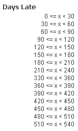
Class allows you to create buckets/groupings of data. For example, assume you have a data model with order data and there is a field with the number of days an order is late. Using class, the number of days can be grouped based on an interval we select. The expression below will create buckets with 30 day intervals:

The buckets will look like the image below.
Alt
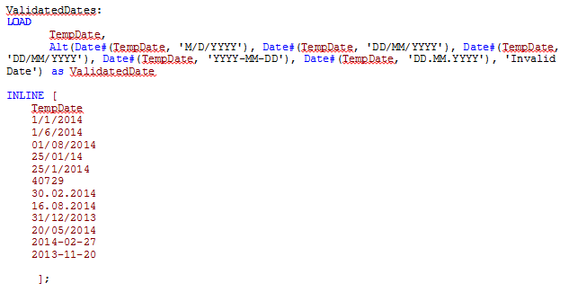
The Alt function will return the first parameter that has a valid number representation (including dates). So in the script below, I can use Alt to check the format of the dates in the TempDate field. If the format matches one of the parameters, then it is returned otherwise the last parameter in the Alt function is returned. The order of the parameters indicates the priority order so that can be used to determine how the dates should be interpreted. For example, should 7/4/2014 be interpreted as the 4th of July in the US or the 7th of April in the UK?
Here are the results:
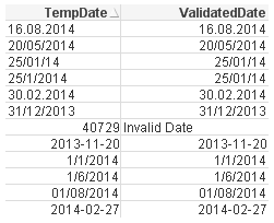
The TempDate is the original date and the ValidatedDate is the value returned by the Alt function.
Pick
The Pick function will return the expression/value corresponding to the expression that matches the first parameter. For example, Pick(2, ‘A’, ‘B’, ‘C”) will return B because B is the second expression and Pick(Number, Sum(1+1), Sum(2+2), Sum(3+3), Sum(4+4), Sum(5+5)) will return 6 if Number = 3. This function is excellent when you want to generate a random field value, e.g.

If
Everyone has used an If statement at some point whether in QlikView or some other programming language.
If(condition, then , else)
The If statement check a condition (the first parameter) and if the condition is true, it returns the “then” parameter otherwise it returns the “else” parameter.
For example, if(1+1=2, ‘Woo hoo, I can add’, ‘Need more practice’).
Match, Mixmatch & Wildmatch
These functions are very similar in that they all perform a comparison.
- The Match function does a case sensitive comparison between the first parameter and the expressions
match( str, expr1 [ , expr2,...exprN ] )
Match(X, ‘Jan’, ‘Feb’, ‘Mar’, ‘Apr’)
If X=Jan, 1 is returned
If X=’Feb’, 2 is returned
- The Mixmatch function does a case insensitive comparison between the first parameter and the expressions
mixmatch( str, expr1 [ , expr2,...exprN ] )
Mixmatch(X, ‘Jan’, ‘Feb’, ‘Mar’, ‘Apr’)
If X=Jan, 1 is returned
If X=’feb’, 2 is returned
- The Wildmatch function also does a case insensitive comparison between the first parameter and the expressions and allows the use of wildcards
wildmatch( str, expr1 [ , expr2,...exprN ] )
Wildmatch(X, ‘Ja*’, ‘F?b’, ‘mar’, ‘Apr’)
If X=jan, 1 is returned
If X=Feb, 2 is returned
If X=Mar, 3 is returned
Now that I know a little more about some of the other conditional functions available in QlikView maybe I will find the need to use them in my apps when I need to compare data or check a condition. There are numerous ways these functions can be used besides what I discussed here so I am sure they will be useful in many of my future apps. For more details and an example QVW of these conditional functions in action, check out my technical brief.
Thanks,
Jennell
-
Qlik joins the University of Ottawa's Center for Business Analytics and Performa...
The Qlik Academic Program is excited to announce it has officially joined the Ottawa University Center for Business Analytics and Performance provided... Show More
The Qlik Academic Program is excited to announce it has officially joined the Ottawa University Center for Business Analytics and Performance provided by Telfers School of Management.
Analytic Software – Centre for Business Analytics and Performance
Ottawa University joined the program in 2017 through Professor Steve Smith who uses Qlik in his Data Supply Chain class.
If you would like feature Qlik on your university's website email academicprogram@qlik.com

-
Using QlikView’s Report Editor
The visualizations and charts in QlikView are dynamic and always changing based on the user’s selections and interactions with the data. That being s... Show MoreThe visualizations and charts in QlikView are dynamic and always changing based on the user’s selections and interactions with the data. That being said I rarely find the need to print the visualizations and take them with me because I know that the data may be refreshed thus changing the visualizations and charts. But sometimes there is a need for the user to be able to print a static report of what they see in QlikView to share with someone or refer to at a later time. QlikView’s Report Editor provides users with an easy way to capture the QlikView objects in a formatted report that can printed. Reports can be created by simply dragging objects from the user interface to the report sheet.

User Interface Report sheet Simply drag the object from the user interface and place them anywhere on the report. Objects can be moved and resized in the report and arranged as you see fit. When I need to add objects to the report that are not a part of the user interface such as an image for the cover sheet or a logo, I will add the object to a hidden sheet in QlikView and format it as I would like it to appear in the report. Then I can drag it to the report. There is also the ability to add an image, text object or current selection box directly from the Report Editor if you prefer. In either case, static reports that are nicely formatted can be created in QlikView for users who prefer to have a printout of their visual QlikView experience.
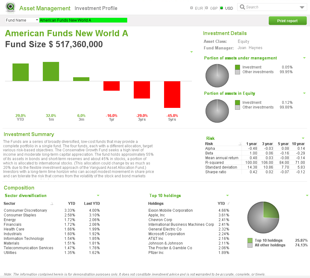
Check out this technical brief for step-by-step details of how the reports were added to the Asset Management demo using the Report Editor.
Jennell
-
QlikView November 2017 now available
We are happy to announce that QlikView November 2017 (version 12.2) is now available on our customer download site. It includes a number of new featu... Show MoreWe are happy to announce that QlikView November 2017 (version 12.2) is now available on our customer download site. It includes a number of new features and enhancements for analytics, usability, and management / administration.
Advanced Analytics Integration
Many organizations are making significant investments in data science and advanced analytics, in areas such as sales forecasting, fraud detection, inventory optimization, market basket analysis, pricing optimization, and more. However, a large percentage of these companies are not seeing the value of these investments realized widely across their organizations.
Advanced analytics integration, now available in QlikView, allows users to interact with and explore advanced calculations from third-party engines such as R, Python, Matlab, etc. As users make selections, data is sent from the Qlik engine to third party tools, calculations are made in realtime, and the results are returned and immediately visualized for the user. This allows people to ask their own questions and spot insights that would have been missed with query-based or batch approaches, greatly broadening the reach and value of advanced analytics investments.
 Qlik offers open, server-side extension APIs that allow connectors to be built for any external engines, supporting many types of business specific use cases. For R and Python, Qlik has also delivered open-source connectors, which are now supported by the community. This aligns with how R and Python themselves are supported (these are both open source tools). We expect the community to enhance these and contribute other connectors for additional integrations.
For more information, check out our community site on advanced analytics integration.
Web client improvements
Qlik has made significant investments in the QlikView web (AJAX) client, to ensure feature parity between it and the Internet Explorer Plugin (which is not being developed further). In this release, many new usability improvements have been added to the web client, including:
- Detach – A Detach option is now found in the right-click menu for any chart object. When a chart is detached, subsequent selections will not be applied to the object until it is re-attached, allowing users to exclude and compare charts against the overall selection state.
- Set reference – A Set Reference option is now found in the right-click menu for Bar, Line, Combo, Gauge and Scatter charts. When Set Reference is selected for a chart object, the current data display of that chart is permanently shown as a dimmed view alongside the subset of data visualized after a selection is made, enhancing comparative analysis capabilities.
- Switch language - Users can now choose the UI language they prefer in the profile settings in AccessPoint.
- The copy single column selection option is now available for List Boxes.
- Copy Cell functionality is now available in the List box, Straight Table, and Pivot Table.
Management and other improvements
A number of additional improvements have been made to QlikView, around management and functionality, including:
On-Demand App Generation enhancements – New capabilities have been added such as an option for developers to include the app navigation link UI into a web mash-up, and the ability to ensure that generated apps utilize the same SSO for authentication back to the data system.
- Shared File Management improvements – A new structure and transaction handling for shared files has been implemented, significantly reducing the risk of corrupted files in high-traffic scenarios. Additionally, a new method of cleaning shared files to remove inactive users has been implemented, which can greatly improve server performance.
- KML support - QlikView can now read KML files for use in a map visualizations. The KML file can represent either area data, such as countries or regions, or point data such as cities or places.
- Export to XLSX (vs. XLS) – XLSX is now the default export format for Excel files, replacing XLS.
- Update to quote interpretation in set analysis – An update has been made to the Qlik engine which changes the way that quotes are interpreted in set analysis expressions. Single-quotes are now utilized for literal interpretation of the items enclosed within them, and double quotes are evaluated and allow for the use of such things as wildcards.
- This change ensures that set analysis interprets quotes in the same way as other areas of the engine, and is consistent with our documentation and best practices.
- Apps created in prior versions will not need to be updated, as the system will respect the old method for these apps. However, customers may opt to force all apps to respect the new rules.
- This change allows for the ability to support case sensitive search strings in set analysis.
- A new BNF script reload mode has been introduced, which uses the same syntax checks as those in the script editor.
Value Added Products
In addition to core QlikView capabilities, there are several new improvements in this release to value added products that work with QlikView, including:
- Qlik NPrinting reports can now be directly embedded in emails, eliminating the requirement for an attachment, which provides a greatly improved experience on mobile devices.
- Qlik NPrinting reports now have configurable output resolution, allowing fore more granular control and helping with file size.
- Map Animations in Qlik GeoAnalytics now work in QlikView allowing visualization of changes over time.
- Four new healthcare data packages are available in Qlik DataMarket.

-
Data Literacy: Start at the Top
Data literacy is vital to organizations, and starting at the top is vital to implementation. In his latest post on the Qlik Blog, our in-house expert... Show More
Data literacy is vital to organizations, and starting at the top is vital to implementation. In his latest post on the Qlik Blog, our in-house expert Jordan Morrow explains why that is the case, and shares best practices to get started: Data Literacy – Start at the Top | Qlik Blog
Check out our free online Data Literacy courses and more here.
-
DataFest 2018 with Qlik
The Qlik Academic Program attended as mentors in the American Statistical Association (ASA) DataFest hosted at Stonehill College this month where stud... Show More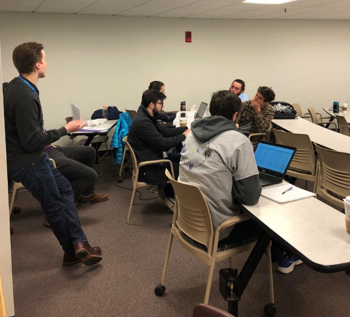
The Qlik Academic Program attended as mentors in the American Statistical Association (ASA) DataFest hosted at Stonehill College this month where students participated in a hackathon using a variety of tools including Qlik Sense!. Students participated from Bryant University, Bridgewater State, Stonehill College and UMass-Dartmouth.
What is the ASA DataFest?
The American Statistical Association (ASA) DataFest is a celebration of data in which teams of undergraduates work around the clock to find and share meaning in a large, rich, and complex data set. To learn more about the ASA DataFest visit https://ww2.amstat.org/education/datafest/
If you would like Qlik to visit your universities events email academicprogram@qlik.com
-
Winning The Employee Retention Race
Leveraging a knowledge and learning ecosystem to keep employees engagedIt is true, that the average person changes jobs ten to fifteen times during th... Show MoreLeveraging a knowledge and learning ecosystem to keep employees engaged

It is true, that the average person changes jobs ten to fifteen times during their career. However, would it surprise you to know that in the United States, according to the Bureau of Labor Statistics, the average tenure of employees went up from 3.5 years back in 1983 to 4.2 in 2016? Similar stats are available for other countries as well.
So why all the panic among companies looking to provide better learning programs as a means to keep employees? It is not so much because the employees are leaving. It is because, with the digital transformation and the fourth industrial revolution, the knowledge and skills required keep changing.With all those changes, the cost of replacing employees is believed to range from tens of thousands of dollars to 1.5 – 2.0 xthe employees annual salary.
Visit the full story written by Qlik's Knowledge and Learning VP Kevin Hanegan https://blog.qlik.com/dont-leave
-
Data-Driven Success through the Qlik Academic Program!
According to a 2017 survey by the Graduate Management Admission Counsel, 69% of employers are seeking business graduates to fill data analytics roles ... Show More
According to a 2017 survey by the Graduate Management Admission Counsel, 69% of employers are seeking business graduates to fill data analytics roles within their companies. That's up from 51% in 2015. As a result, students now see the importance of being prepared to fill these roles and universities are jumping on the bandwagon to keep up. According to GMAC'S 2017 Prospective Student Survey, just under half of business school candidates say data analytics is a must-have in an ideal graduate business program.
The Academic Program has long seen the importance of educating our students in analytics and ensuring that our professors have the resources they need to properly teach these students! To receive everything the program has to offer, visit https://www.qlik.com/us/company/academic-program to reapply!
To learn more about the demand for data analytics and learn how universities are taking the call to action visit the full article written by Sarah Aspolson here https://view.imirus.com/209/document/12853/page/82
-
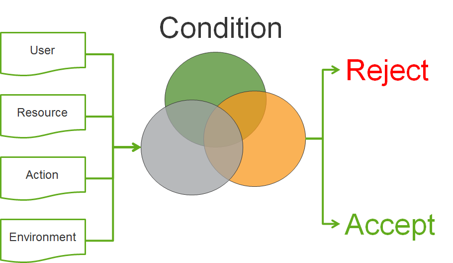
Why security rules in Qlik Sense?
Qlik Sense uses Attribute Based Access Control (ABAC) as a basis for its security. In this post I will explain why we decided to implement this, and g... Show MoreQlik Sense uses Attribute Based Access Control (ABAC) as a basis for its security. In this post I will explain why we decided to implement this, and give you an understanding of the future of access control.
Is it only Qlik that thinks that ABAC is the future of access control? No
When Gartner predicts the future of access control, they say
“By 2020, the majority of enterprises will use attribute-based access control (ABAC) as the dominant mechanism to protect critical assets, up from less than five percent today.” (http://www.issa.org/resource/resmgr/JournalPDFs/feature0614.pdf)
And the National Institute of Standard and Technology (NIST) has released a special publication to raise awareness and help with making effective implementations of ABAC (NIST SP 800-162 http://nvlpubs.nist.gov/nistpubs/specialpublications/NIST.sp.800-162.pdf)
If this is the future, what is then ABAC? I have taken the liberty of changing the NIST definition of ABAC to be consistent with the syntax (marked in bold green) that is used in Qlik Sense.
An access control method where user requests to perform actions on resources are granted or denied based on assigned attributes of the user, assigned attributes of the resource, environment conditions, and a set of security rules that are specified in terms of those attributes and conditions.
This sounds pretty generic. So why is ABAC seen as an important step into the future of access control?
The first major benefit is that with ABAC you can implement other well-known access control methods such as mandatory access control (MAC), identity based access control (IBAC) and role-based access control (RBAC). This makes it very flexible and therefore suitable to solve most company’s security needs.
But are there other benefits? Yes.
You can develop an access control policy independent of users
We have a language that can be used to describe security policies that Qlik Sense understands and be used to enforce the security controls needed.
Accommodating the unanticipated/external user
We can describe the security controls using attributes of resources and users. With this approach new users accessing the system will be in compliance with defined policies, and access will be granted based on the assigned attributes. No additional configuration is needed in Qlik Sense.
Avoid role/group explosion
Using logic conditions in our rules, we no longer need to create new roles/groups to grant new subsets of user access.
Easier management
The administrators of the system don't need to understand or change the security policy; they only have to ensure that resources and users are correctly described by their attributes for them to be in compliance with the security policy.
Cater for taking more things into consideration for security decisions such as dynamic attributes (environment)
With ABAC we can start using the environment (the context in which the security decision is made, e.g. if the connection to the system is encrypted or not) to describe our security policy.
Hopefully this has provided you insights to why ABAC is the future of access control and the benefits this will bring to your Qlik Sense deployments. If you have questions on this blog post or have ideas of what you want to read in the future please don’t hesitate to comment this post.
-
Follow the money: visualizing what the politicians may not want you to see
Sometimes the secret sauce of a successful data visualization project lies in the correct choice of the visual object(s) that represents the data. Fac... Show MoreSometimes the secret sauce of a successful data visualization project lies in the correct choice of the visual object(s) that represents the data. Factors like picking the right chart, placing it in the right spot, and user interaction are key to make a data piece memorable, insightful, and truthful. However, on other occasions, the key to success is to “simply” make data available, this is particularly true for data that was previously inaccessible to most of us.
An example of this is our latest project. We partnered with Canadian National Post to, for the first time, make available over 6 million donations made on a national scale during the last 25 years.
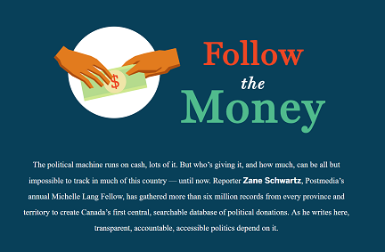
In the last decade, open data has been a hot topic for governments all over the world, but open or public data isn't necessarily easy to access. That’s especially true when it's data that can help citizens to understand and track how our politicians’ campaigns are funded.
There are no consistent rules — or penalties — for political financing across Canada. Spending limits, out-of-province and foreign gifts, money from unions and corporations, donations from numbered companies: in some places anything goes, in other regulations are rarely enforced.
For Qlik one of the project main challenges was the data cleaning and normalization process. The project contains more than 25 different data sources. We fixed some of the most obvious issues with data, please read the methodology page (http://special.nationalpost.com/follow-the-money/methodology), but we also wanted the data to show how it was originally recorded without any makeover. It’s common to find small variations in names across the app, for example chances are that the donor names ‘Justin Trudeau’ and ‘Justin P.J. Trudeau’ belong to the same person also known as Justin Pierre James Trudeau.
We ended up having a large app holding around 6.5 million rows of data (at the time of writing) and a clear goal, make the data searchable. Anyone should be able to find individual donations and get some information about the shape of the data.
We used enigma.js to interface our Qlik Engine API and React to build the user interface. We created a powerful piece that displays millions of rows of data in the blink of an eye. React.js is designed to work with simply reacting to changes in data, and its super-efficient diffing algorithm makes DOM updates super-fast resulting in a blasting fast experience.
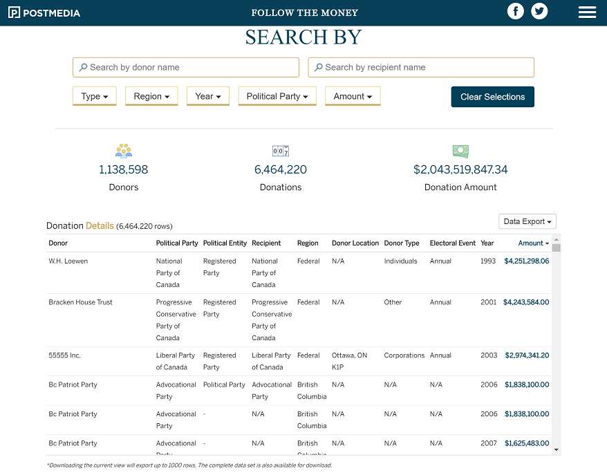
The main table displays the more granular level of data including individual donations and all the relevant details. To show the complete 6.5 millions of rows we use virtual scrolling and paging. The table is getting new data from the server as users scrolls the table.
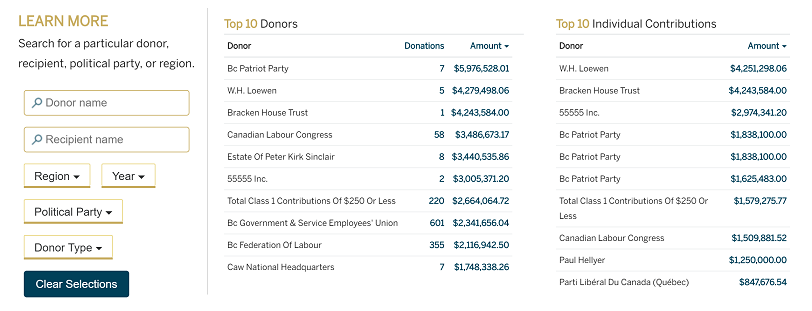
We also included two bar charts to ease the data profiling task, compressing down millions of rows to a few bars. Lastly we use two small tables to illustrate the top donors and donations so the readers who are interested only in the super donors have a quick way of finding the information in the table.
Check the online version here Follow the Money - Political Donations Database | National Post
AMZ

-
Qlik Community Update - March 2018
Hi Guys - do you have 4 minutes? Good, then let's forego my normal formalities this morning and jump right into it!Here are some recent product and re... Show MoreHi Guys - do you have 4 minutes? Good, then let's forego my normal formalities this morning and jump right into it!
Here are some recent product and resource updates s well as an informal list of features for the next release of Qlik Sense - April 2018.
Let us know what you think in the comments below.
Enjoy,
Michael Tarallo (@mtarallo) | Twitter
Qlik
Links mentioned in the video are:
- https://www.qlikqonnections.com/ - Qlik Qonnections
- http://qlik.com/cloud - Qlik Sense Cloud
- Follow our Technical Bulletin - to be alerted where the April 2018 Technical Preview is available
- Qlik Sense Mobile
- Qlik Product Innovation
- Qlik Design Blog
- Getting Started Webinar registration
- Can't see the video?
- YouTube blocked by your organization or region?
Download the attached .mp4 to view on your computer or mobile device.
-
London School of Economics - Healthcare Analytics with David Bolton
I was honoured to be joined by David Bolton, VP Industry Solutions & Business Value for Qlik, he was recently promoted to this new position from his r... Show MoreI was honoured to be joined by David Bolton, VP Industry Solutions & Business Value for Qlik, he was recently promoted to this new position from his role focusing on Healthcare value, however was still as sharp as ever to speak around the key areas that Qlik helps improve efficiencies within healthcare organisations.
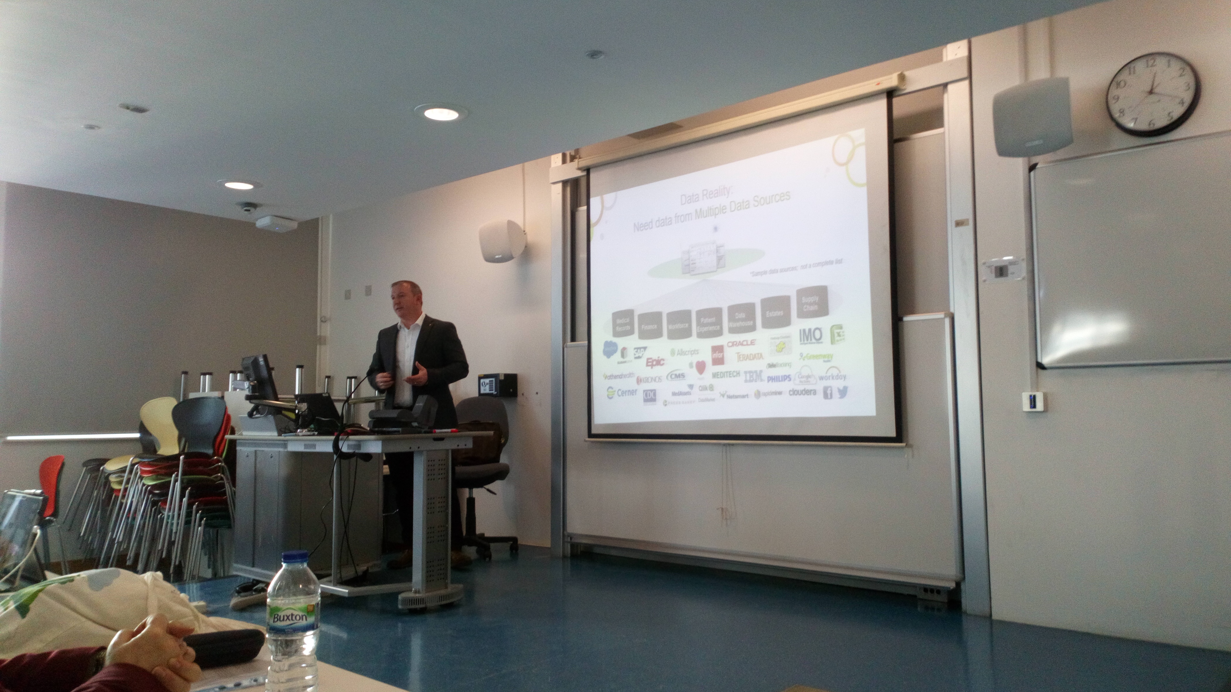
This is the second year that David has provided the lecture for LSE and each time it is greeted with great interest from the students. Areas that David spoke around was the value of the Qlik engine to disparate data sources, examples of efficiencies in the NHS waiting times, A great example of how the Australia Government are using data to better treat patients and even discover possible issues with patients early using our software to pull multiple sources of information together on patient history.
Finally, David finished the session discussing open data and how he has used it do develop applications around prescription trends in UK NHS trusts, which was very relevant to some students as some will be embarking on their thesis topics.
I once again thank David and Professor Ela Klecun for the session and I look forward to the workshop in on June 21st.

-
Villanova University Faculty Workshop!
The Academic Program was back onsite at Villanova University in PA (USA) this week to host a training workshop where members of the faculty from Finan... Show More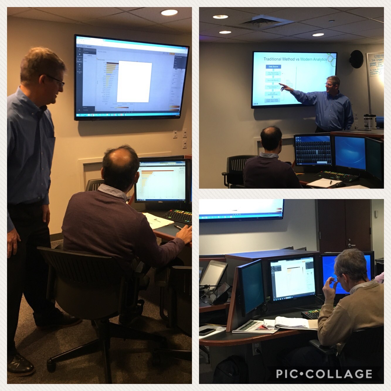
The Academic Program was back onsite at Villanova University in PA (USA) this week to host a training workshop where members of the faculty from Finance, Business, and Marketing were in attendance. Qlik's very own Paul van Siclen and Jeremy Benza did a wonderful job showing Qlik's features and functionalities while guiding the professors on how to get started and begin creating their own visualizations.
These professors are in the beginning stages of incorporating analytics and visualizations into their courses and there is no better place to begin than with joining the Qlik Sense Acacemic Program where they will receive free software, training, qualification exams and teaching materials to help them teach the methodologies of analytics and visualizations!
If you are teaching a new course and would like to incorporate these concepts, we recommend reapplying to the program to get access to all of our amazing resources!
If you are interested in a Qlik presentation or workshop please email academicprogram@qlik.com
-
Self-service: Controlling Visibility of Fields in Published Apps
Hi guys - when working with a customer requirement, I recently discovered some additional controls one can implement in a published Qlik Sense app. Th... Show MoreHi guys - when working with a customer requirement, I recently discovered some additional controls one can implement in a published Qlik Sense app. There may be times, when you want to hide additional fields that are displayed in the Qlik Sense design interface. Now these fields are commonly ID and KEY fields which may not be necessary to one's analysis and the requirement might not always be for any specific security...as in our example they simply just want to control the visibility in the interface to reduce clutter and confusion.
Under default conditions, these fields will be displayed in the data visualization's field selector, the data properties drop down and in the expression editor. During this discovery, I was under the impression that when a user (consumer / viewer / non ContentAdmin role) - who can create their own analysis from a approved base app, they would only see the measures and dimensions populated in the Master Items panel on the left. While this is true, I discovered that the aforementioned user interface components, still display ALL the fields.
Here is how you can control that: Use system variable HidePrefix
Example:
set HidePrefix='_' ;
Watch this video to learn more:Note: The data model fields are STILL accessible - however one would need to know what the prefix character is in order to use it in the expression editor or to be able to access it.
If you need an extra layer of security - where access to certain fields and data are restricted per user, group, or role then you would use section access to control the available fields and data from displaying.
One of our community members has also made mention you can use:
..
..
Tag Fields
[Hidden Field 1],
[Hidden Field 2],
[Hidden Field 3]
with $hidden;
..
..
Thank you!
Can't see the video? YouTube is blocked by your organization or region? Download the .mp4 to view on your computer or mobile device?
Regards,
Michael Tarallo
Qlik
-
Qlik and Accenture Netflix Data challenge
Everyone knows Netflix, it is usually the first choice for a Saturday night in or a mid-week film to break up the week. The platform currently offers ... Show MoreEveryone knows Netflix, it is usually the first choice for a Saturday night in or a mid-week film to break up the week. The platform currently offers somewhere around 5,000 movies (https://www.allflicks.net/uk/) for UK viewers, spanning a host of genres depending on your mood and taste.
However, in an increasingly competitive market Netflix is finding it is losing ground to its rivals!
The Market Place
For instance, Amazon Prime pumped in the region of $5 billion into content bids and original content production in 2017 and alongside the Prime subscription model, viewers also can make the most of online renting or buying of content on Amazon, mainly when certain titles aren't available on their Prime service, a feature which Netflix doesn't have the luxury of offering (http://fortune.com/2017/03/10/netflix-video-streaming-market/). Even the likes of Facebook and YouTube are investing considerable sums of money into their video content to get a slice of the action.
All of this got me thinking, how could Qlik be used to demonstrate a real-world business issue like Netflix, in one of my University engagements? Maybe a hackathon?
The question I got asked most - What is a hackathon?
From Google's dictionary, it describes a hackathon as "An event, typically lasting several days, in which many people meet to engage in collaborative computer programming."
This isn't a new concept, hackathons occur every day but are largely for the programmers and computer scientists among us and they aim to answer a real-world problem, whether with data or development of an application.
Accenture and the University of Bath
I took this idea to Dr Güneş Erdoğan, Director of Studies MSc in Business Analytics at the University of Bath, who Qlik's Academic Program has a long-standing relationship of working alongside in teaching students about data analytics. Güneş jumped at the opportunity to offer this kind of session to his students and right away got to work on the specifics of the session.
Further to the engaging with Bath, I reached out to Accenture, who has supported hackathons alongside Qlik in the past. Accenture hire a significant number of students from Bath, with engagement through career services, societies and events. Accenture hire students with all different strengths, one area they may look for is students who have a mindset geared towards data and business. A hackathon is a great way for them to increase their presence amongst the student base and maybe find those students who might not have considered careers in analytics.
Hackathon or Data Challenge? That is the question.
The students in Business Analytics' classes aren't computer scientists, these are our future analysts, consultants and business leaders with knowledge in various areas of data analytics, statistics and commercial business and we opened the session up further by reaching out to courses in Information Systems and the MBA degrees. This expanded the knowledge and experience of the students in the session and matches closer to a real-world business team.
However, calling this a hackathon might have scared some students away that weren't adept at computer science topics, so we decided to call this a Data Challenge and the students would be using Qlik Sense and other tools if they wished, to answer;
A. "What Netflix's 2018 release library should look like?"
and
B. "What original content should they produce?"
Quick stats!
Some quick information about what we provided
- Two sessions; an introduction to Qlik Sense in a 3-hour workshop to learn data loading, modelling and visualisation in Qlik Sense and a 6 hour data challenge where the students would build their applications around the Netflix brief.
- Student signed up the Qlik Academic Program and were set tasks to complete certain Qlik Continuous Classroom modules to assist in their application build.
- Student numbers; Around 40 students attended both sessions and were split in groups of 3/4.
- Administrators; Not including myself there were 3 Accenture analysts and 2 enterprise architects from Qlik supporting across the 2 sessions.
- Data; We provided the students data on movies, actors, box office stats, viewership of movies and more from the last 30 years. They were strongly advised to find further information online to add context to their applications.
- Presentation; Each student had 5 minutes to present their findings all of which must be backed up with data.
- Judging; The panel of judges made up from a mixture of attendees Accenture and Qlik. Criteria was based on; Quality of dashboard, data model, presentation structure, how closely the question was answered and reasoning of original Netflix content idea.
Conclusion
The teams of student came up with a wide variety of ideas from looking at trends like super hero films to line up next to big releases next year. Others looked at box office revenue as an indication to popularity and advised on original content around those figures, some threw out our idea and decided to use a simplified algorithm that Netflix use to decide their listings, to varying degrees of success.
The winners, the nicely titled 'Powerful 3 C's' choose to look at movie selections not in the top 3 choices, with actors who were well known but maybe under rated in their performances but would require a smaller salary in production. They also discovered that despite being the coldest month and everyone spending all their money through Christmas, January historically has very little new releases...who knew? So, based their findings on a January release.
-
From Academic Program Professors to Qlik Luminaries!
The Qlik Academic Program is excited to announce that 2 of our Professors have been inducted into the Qlik Luminaries Class of 2018!What is the Qlik L... Show MoreThe Qlik Academic Program is excited to announce that 2 of our Professors have been inducted into the Qlik Luminaries Class of 2018!
What is the Qlik Luminary Program?
The Qlik Luminary Program brings together the best and brightest customers, partners and enthusiasts in the Qlik ecosystem. With deep drive, passion and expertise, Qlik Luminaries champion the vision of turning data into insights that lead to transformative discoveries. To learn more visit https://www.qlik.com/us/solutions/customers/qlik-luminaries

Professor Ghosh joined the Academic Program in 2017 from Vidya Jyothi Institute of Technology where he and his students use Qlik Sense for Artificial Intelligence, Machine Learning, E-Governance, Web Technologies and Mobile computing.
Professor Carter joined the Academic Program in 2013 from National University of Singapore where he and his students use Qlik Sense for his Purchasing and Materials Management course.
Together these professors and many of their students have benefited from all the amazing resources the Academic Program has to offer which has led them to a very successful journey with Qlik!. We are excited and honored that they have been selected to represent Qlik as luminaries and we congratulate their work and dedication to both their teaching and to Qlik!
-
Disable selections in charts using Capability APIs
UPDATE - There is no longer any reason to do it this way. Beginning with Qlik Sense 3.0, we now have the noSelections option - App API and Viz API no... Show MoreUPDATE - There is no longer any reason to do it this way. Beginning with Qlik Sense 3.0, we now have the noSelections option - App API and Viz API noSelections option.
I've come across the need a few times now to embed a chart or two into a website with selections disabled. This is the default behavior when embedding Qlik Sense Cloud charts, but what about if you want to do it using charts from a Qlik Sense app using the Capability APIs? Let's take a look at two different methods for achieving this.
Method 1: Using the noInteraction option in the
getObject()methodThe
getObject()method takes an optional options parameter which allows you to setnoInteractiontotrue.app.getObject("QV01", "objID", {"noInteraction": true});
This will disable selections on the chart, however, it will also disable tooltips and scrolling, which is often undesired. Take a look at an example here http://webapps.qlik.com/no-interaction-chart-example/method1.html and notice how you are unable to scroll to see the whole chart, and the chart's tooltips do not work.
Method 2: Select all and lock field
So what I do to disable selections in a chart embedded with the Capability APIs is to use the
selectAll()andlock()methods from the Field API on the field of the dimension in the chart. For instance, if the chart's dimension is the Date field, I would do the followingapp.getObject("QV01", "hRZaKk");
app.field("Date").selectAll();
app.field("Date").lock();
This effectively disables selections on the chart by not allowing any selections on the field this chart is using as a dimension. Scrolling and tooltips still work, as you can see in the example http://webapps.qlik.com/no-interaction-chart-example/method2.html
There is a drawback to this method. If, for example, you wanted to embed 2 objects on a page that both used the same dimension, but disable selections in only one of them, this method would disable selections on both. But for many cases, this method will work just fine.
-
Themes in Qlik Sense 3 and the use in extensions
Qlik Sense is headed to a more flexible and customizable environment regarding the interface. With Qlik Sense 3 and above, we can manually change the ... Show MoreQlik Sense is headed to a more flexible and customizable environment regarding the interface. With Qlik Sense 3 and above, we can manually change the default Theme or create a custom one and use it on our apps by just adding /theme/<themename> at the end of the url.
First of all, for those that do not know, once Qlik Sense desktop is running, we can access the hub from a regular browser like http://localhost:4848/hub/my/work. Now if we add our theme at the end of the url, every app that we open, will use that theme. So, if we go to http://localhost:4848/hub/my/work/theme/yianni, this will open the hub. Every app like the "helpdesk Management" that is opened, will use that theme.
I have created a simple theme and I only changed the background color of the sheet container and it looks like this

In Qlik Sense 3.1.2 and above, the theme templates have been moved to C:\Users\<username>\AppData\Local\Programs\Qlik\Sense\Client\themes\old. So we can place our files there.
Some of us, including myself, have used the Theme.palette in our extensions like
define([
"qlik",
"jquery",
"core.utils/theme"
], function (qlik, $, Theme) {
The above would have to change to
define([
"qlik",
"jquery",
"text!themes/old/sense/theme.json"
], function (qlik, $, Theme) {
Theme = JSON.parse(Theme);


