Unlock a world of possibilities! Login now and discover the exclusive benefits awaiting you.
Analytics & AI
Forums for Qlik Analytic solutions. Ask questions, join discussions, find solutions, and access documentation and resources.
Data Integration & Quality
Forums for Qlik Data Integration solutions. Ask questions, join discussions, find solutions, and access documentation and resources
Explore Qlik Gallery
Qlik Gallery is meant to encourage Qlikkies everywhere to share their progress – from a first Qlik app – to a favorite Qlik app – and everything in-between.
Qlik Community
Get started on Qlik Community, find How-To documents, and join general non-product related discussions.
Qlik Resources
Direct links to other resources within the Qlik ecosystem. We suggest you bookmark this page.
Qlik Academic Program
Qlik gives qualified university students, educators, and researchers free Qlik software and resources to prepare students for the data-driven workplace.
Recent Blog Posts
-
Are you Data Literate?!
What is Data Literacy?Everyone is empowered and has the right to:Access education and tools that enable data literacy. This means having full confide... Show More
What is Data Literacy?
Everyone is empowered and has the right to:
- Access education and tools that enable data literacy. This means having full confidence to read, work with, analyze and argue data.
- Access quality data - full source disclosure and accountability
- Combine, cross-pollinate and interrogate data, algorithms and findings
Recent Data Literacy Stats
In a study done in Asia Pacific, Qlik found that overall 80% found they were data illiterate! Also in the Americas, only 33% of decision business makers are data literate! As a result, work performance suffers and the success of the business is impacted.
To watch the full interview with Julian Quinn, Qlik's Regional Vice President of Asia Pacific visit
Videos on Demand - Channel NewsAsia - Channel NewsAsia
How can you become Data Literate?
- Renew your membership to the Academic Program which provides free software, course materials, training, and Qualification exams to prove basic Qlik skills and applied knowledge. To renew visit https://www.qlik.com/us/company/academic-program
- Learn more about data literacy and test your data literacy knowledge by visiting http://dataliteracy.info/
- Visit the Qlik Continuous Classroom to view the data literacy program resources http://qcc.qlik.com/course/view.php?id=811

-
Are you Data Literate?!
What is Data Literacy?Everyone is empowered and has the right to:Access education and tools that enable data literacy. This means having full confide... Show More
What is Data Literacy?
Everyone is empowered and has the right to:
- Access education and tools that enable data literacy. This means having full confidence to read, work with, analyze and argue data.
- Access quality data - full source disclosure and accountability
- Combine, cross-pollinate and interrogate data, algorithms and findings
Recent Data Literacy StatsIn a study done in Asia Pacific, Qlik found that that overall 80% found they were data illiterate! Also in the Americas, only 33% of decision business makers are data literate! As a result, work performance suffers and the success of the business is impacted. To watch the full interview with Julian Quinn, Qlik's Regional Vice President of Asia Pacific visit Videos on Demand - Channel NewsAsia - Channel NewsAsia
How can you become Data Literate?
- Learn more about data literacy and test your data literacy knowledge by visiting http://dataliteracy.info/
- Visit the Qlik Continuous Classroom to view the data literacy program resources http://qcc.qlik.com/course/view.php?id=811
- Are you a professor or a student? If so you can join the Qlik Academic Program which provides free software, course materials, training, and Qualification exams to prove basic Qlik skills and applied knowledge. To apply visit http://www.qlik.com/us/company/academic-program
-
The Only Function
There is a little known function in QlikView that hardly anyone uses and that doesn’t do very much, but still has a tremendous impact on many of the c... Show MoreThere is a little known function in QlikView that hardly anyone uses and that doesn’t do very much, but still has a tremendous impact on many of the calculations made in QlikView.
It is the Only() function.
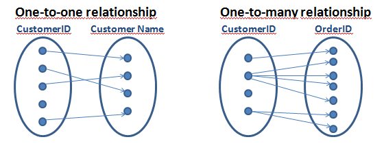
It returns the value of a parameter – but only if there is just one possible value. Hence, if you have a one-to-one relationship between the chart dimension and the parameter, the Only() function returns the only possible value back. But if there are several values, it returns NULL.
The Only() function is an aggregation function, which means that it uses many records as input and returns one value only. The Sum() and Count() functions are examples of other aggregation functions. Aggregations are used whenever you have a group of records and need to show only one value representing all records.
When you think about it, QlikView uses aggregations in virtually all calculations: The expression in a chart, in a sort expression, in a text box, in an advanced search and in a calculated label are all aggregations and cannot be calculated without involving an aggregation function.
But what if the user enters an expression that lacks an explicit aggregation function? What does QlikView do then? For example, if the sort expression is set to “Date”? Or if there is an advanced search for customers using the expression “=Product='Shoe' ” (the intent is to find customers that have bought this product)?
This is where the Only() function affects the calculation without the user knowing it; if there is no explicit aggregation function in the expression, QlikView uses the Only() function implicitly. Hence, in the above cases, “Only(Date)” is used as sort expression and “=Only(Product)='Shoe' ” is used as search criterion.
Sometimes the new expression returns a result that the user does not expect. Both the above examples will work fine for cases when there is only one possible value of Date or Product, but neither of them will work for cases when there is more than one value.
Therefore, when you write expressions you should always ask yourself which aggregation you want to use, or: Which value do you want to use if there are several values? If the answer is that you want to use NULL to represent several values, then you indeed want to use the Only() function and you can leave the expression as it is.
But if you do not know the answer, then you should probably think again. For numbers, you probably want to use Sum(), Avg() or Min() instead and for strings you may want to use Only() or MinString(). For debugging you can always use something like, “Concat(distinct <Field>, ',')” and analyze the result.
But you should not leave your expression without an aggregation function.
Further reading related to this topic:

-
Creating a website with Angular and the Capabilities API
For all of my large projects I use angular to handle the pages, content, variables, navigation etc. I have setup a template that everyone can access a... Show MoreFor all of my large projects I use angular to handle the pages, content, variables, navigation etc. I have setup a template that everyone can access and download from git and branch.qlik.com. In this tutorial, I will show you how to install and use it.
- Go to Git or Branch and download the project on your server or if you do not have one, in your desktop Qlik\Sense\Extensions.
- Assuming that you are running git and you are familiar with the console, type bower install to get all of the necessary libraries.
- Config files below to point to your paths
Index.html
<link rel="stylesheet" href="http://localhost:4848/resources/autogenerated/qlikui.css">
<link rel="stylesheet" href="http://localhost:4848/resources/assets/client/client.css" media="all">
<script src="http://localhost:4848/resources/assets/external/requirejs/require.js" data-main="js/lib/main.js"></script>
js/lib/main.js
path to local script and libraries, L1
var scriptsUrl = 'http://localhost:4848/extensions/angularTemplate/';
path to Sense scripts like "js/qlik", L4
baseUrl: "http://localhost:4848/resources",
Now lets go over the anatomy of the template.Index.html is our container. It has the navigation and 2 controllers, header and main.The header is for the any persistent toolbar you may want to use, plus it holds the global bindings like navigation and clearAll() for our sense object selections. The next one is the current page and holds all the objects specific to this page.
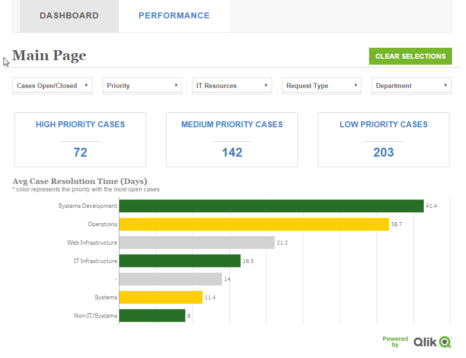
For this tutorial I used the helpdesk that is bundled with any Sense installation. In this template, I have two ways of displaying Sense objects. One is by getting the object as is from the app and the other one is by calling a HyperQube and displaying the desired results. For the first, we need to put the object ids into an array that can be accessed from our html template.
In js/controllers/dashboard.js we define our variable with the objects as (L23)
$scope.objects = ['a5e0f12c-38f5-4da9-8f3f-0e4566b28398'];
and in view/dashboard.html we display it with a height of 300px as :
<get-object object="objects[0]" height="300"></get-object>The other way is a little more complicated since it requires a service, api.getHyperCube. In this, we can pass an array of dimensions, measures, or both and a limit, if we want to limit our results.
js/controllers/dashboard.html
me.measures = [
["Count( {$<Priority={'High'}, Status -={'Closed'} >} Distinct %CaseId )", false],
["Count( {$<Priority={'Medium'}, Status -={'Closed'} >} Distinct %CaseId )", false],
["Count( {$<Priority={'Low'}, Status -={'Closed'} >} Distinct %CaseId )", false],
];
$scope.kapi = [];
   angular.forEach(me.measures, function(value, key) {
   api.getHyperCube([], [value[0]], function(data){
      $scope.kapi[key] = (value[1])?utility.string2thousands(data[0][0].qText):data[0][0].qText;
   });
});
and in the view/dashboard.html
<h2>{{ kapi[2] }}</h2>I am also using a utility to display numbers as per Sense KPI format.
Now, say that you want to add another page named "performance" as the Sense sheet, you will need to define it in js/lib/main.js.
- Copy and rename js/controllers/dashboard.js to performance.js
- Copy and rename views/dashboard.html to performance.html
- Add in L5 paths your new controller path, "controller.performance': scriptsUrl + 'js/controllers/performance'".
- In L35 add your new route (state)
 .state('dashboard', {
    url: "/dashboard",
      views: {
        'header': {
           templateUrl: "views/header.html",
           controller: 'controller.header'
        },
        'main': {
           templateUrl: "views/performance.html",
           controller: 'controller.performance'
        },
    }
})
- In L49 'Require' add the controller again
'controller.dashboard',- And make sure your controller is defined properly, L10 of js/controllers/performance.js
app.obj.angularApp
  .controller('controller.performance', function ($scope, $rootScope, $location, $injector, api, utility) {
  var me = {};
  me.init = function () {
  $rootScope.page = 2;
  $rootScope.title = 'Performance';
- Also, we do not need the measures for this one so delete L17 and $scope.kapi
- For this tutorial we will only add the Resurce Details table. So change the object id to 'uETyGUP' and remove from views/performance.html all the kpis
- Last, add the in the index.html the navigation in L39
<li ng-class="(page==2) ? 'active' : ''"><a ng-click="goTo('performance')">Performance</a></li>Your final webpage should look like this:
For any further explanation and feature requests please let me know.
Coming up: setting a similar template for the Engine API and qSocks.
Git: https://github.com/yianni-ververis/capabilities-api-angular-template
Qlik Branch: http://branch.qlik.com/#/project/56b4a40140a985c431a64b08
Yianni
-
Search - But what shall you find?
The search functionality is central to QlikView. You enter a string, and QlikView immediately searches in the active list box and displays the matches... Show MoreThe search functionality is central to QlikView. You enter a string, and QlikView immediately searches in the active list box and displays the matches. But what really defines a match? For example, should you find strings containing ‘Š’ when your search string contains an ‘S’? Or ‘Ä’ when you search for ‘A’?
These may be odd questions for people with English as first language, but for the rest of us who use “strange” characters daily, these questions are important as the answers affect not just search results, but also sort orders.
It is called Collation.
A collation algorithm defines a process of how to compare two given character strings and decide if they match and also which string should come before the other. So, the collation affects everything from which search result you get in a query, to how the phone directory is sorted.
Basically the collation is defined differently in different languages. Examples:
- The English collation considers A, Å and Ä to be variants of the same letter (matching in searches and sorted together), but the Swedish collation does the opposite: it considers them to be different letters.
- The English collation considers V and W to be different letters (not matching, and not sorted together), but the Swedish collation does the opposite: it considers them to be variants of the same letter.
- Most Slavic languages consider S and Š to be different letters, whereas most other languages consider them to be variants of the same letter.
- In German, Ö is considered to be a variant of O, but in Nordic and Turkish languages it is considered a separate letter.
- In most western languages I is the upper case version of i, but in Turkish languages, I is the upper case of dotless ı, and İ (dotted) is the upper case of dotted i.
An example of how these differences affect sort orders and search results can be seen in the pictures below:
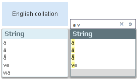
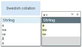
The search string is the same in both cases, and should match all field values that have words beginning with ‘a’ or ‘v’. Note that sort orders as well as search results differ.
Hence: A number of differences exist between languages that have special characters or characters with diacritic marks, e.g. Å, Ä Ö, Æ, Ø, Þ, Ś, Ł, Î, Č. Sometimes these characters are considered as separate letters, sometimes not. Some languages even have collation rules for letter combinations and for where in the word an accent is found. An overview can be found on Wikipedia.
So, how does QlikView handle this?
When QlikView is started, the collation information is fetched from the regional settings of the operating system. This information is then stored into the qvw file when the script is run.
Usually you don’t need to think about this, but should you want to test it yourself, just change the regional settings in the control panel (the Formats tab – not the Location tab), restart QlikView, and run the script of your application.
Bottom line – should you need to change the collation, you should do it on the computer where the script is run.
Further reading related to this topic:
-
ICYMI: Gartner BI Bake Off Qlik Highlights - Analyzing the Opioid Epidemic
Hey Guys - if you have been following Qlik, then you know that once again Gartner has placed us as a leader in the Magic Quadrant for Analytics and Bu... Show MoreHey Guys - if you have been following Qlik, then you know that once again Gartner has placed us as a leader in the Magic Quadrant for Analytics and Business Intelligence Platforms for the 8th year in a row ... AND.... you know that every year around this time we participate in a friendly, live, on-stage Business Intelligence competition know as the BI Bake Off. This informative and exciting session is held during Gartner's Data Analytics Summit and hosted by BI research VP Cindi Howson, previously of (@BIScorecard) fame. It's a time and place for Qlik and its competition (Tableau, Microsoft, MicroStrategy) to showcase their greatest strengths...and possibly expose a few weaknesses
 - in front of many organizations' data analytics leaders. Overall, despite our competitive spirit, it is an awesome experience and a fun time to be had by all. Our presenter Josh Good (@joshdotbad) - led an entertaining and interesting session, showcasing Qlik's solution.
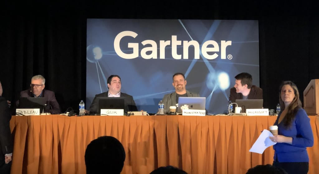
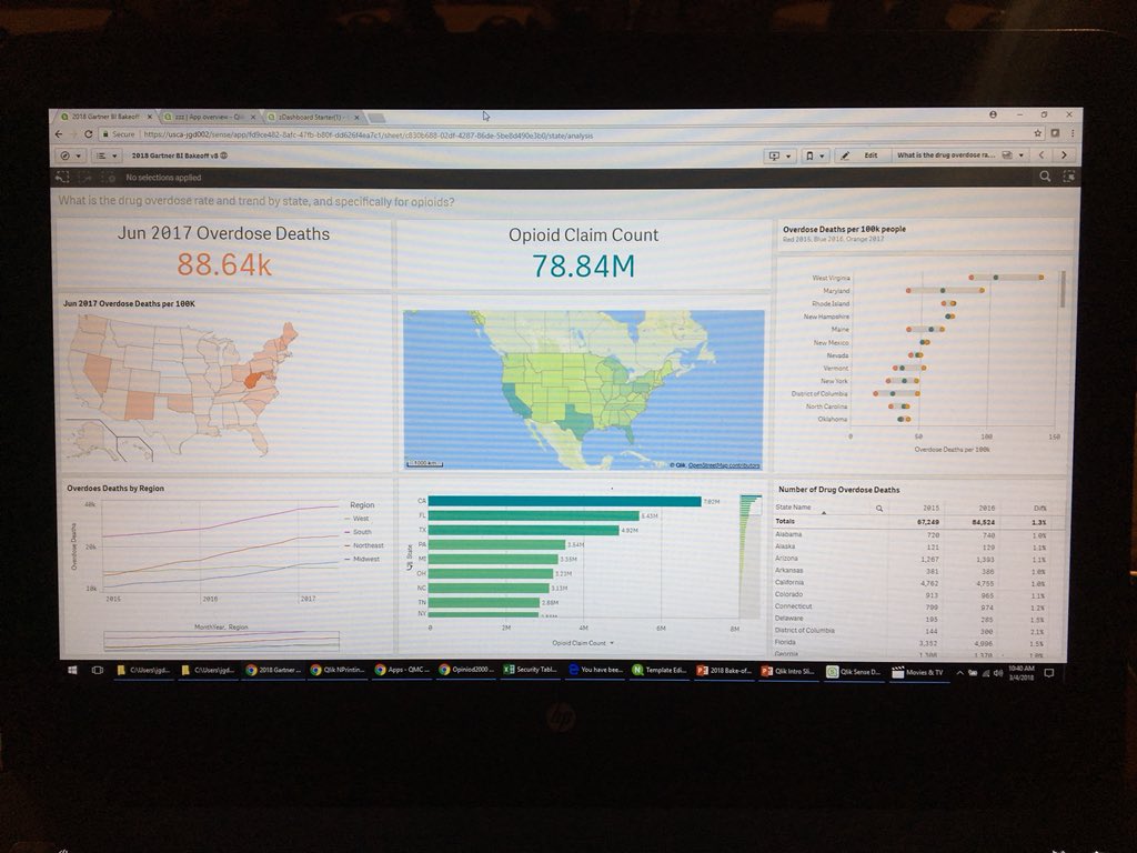
Prior to the event, the Qlik team prepares a solution following a provided script based off of a public data set given to them by Cindi. Data usually centers around a topic in which each vendor can show how they can "do good" with the data, which is consistent enough to facilitate a side-by-side comparison. In the past we have analyzed traffic fatalities, homelessness and college debt, but this year the data centered around the deeply emotional opioid epidemic plaguing this great nation.During the session, each vendor takes turns using their software to present their analytics while showcasing the capabilities of their software within a few different categories.
Qlik on stage - on the big screen - BI Bake Off Gartner Data Analytics Summit
Take a brief look at Qlik's solution highlights reel presented for each topic and let us know what you think by leaving a comment, question below - the timecode links for the section categories are listed below:
Gartner BI Bake Off Qlik Highlights Reel
- Look and Feel: https://youtu.be/l0nplDrToMU?t=12s
- Data Preparation: https://youtu.be/l0nplDrToMU?t=1m54s
- Dashboard Building: https://youtu.be/l0nplDrToMU?t=3m37s
- Reporting and Mash-ups: https://youtu.be/l0nplDrToMU?t=4m30s
- Governed Self-Service: https://youtu.be/l0nplDrToMU?t=5m2s
- Cool Innovation: https://youtu.be/l0nplDrToMU?t=5m43s
To see an actual Qlik Sense product demonstration analyzing the Opiod Crisis check out this webinar presented by the Qlik Healthcare team: Analyzing the Opioid Crisis with Qlik - Webinar - YouTube
Analyzing the Opioid Crisis with Qlik - Webinar
We'd like to thank the entire Qlik team for a job well done as well as Gartner and Cindi for hosting another great event. Stay tuned to learn more about our future capabilities and be on the look for Cindi's take on the Bake Off on her blog space at Gartner.
Enjoy!
Michael Tarallo (@mtarallo) | Twitter
Qlik
Can't see the video? Access to YouTube restricted? Download the .mp4 attached to this post.

-
The Oscars
The 90th Academy Award show also known as the Oscars aired this past Sunday and critics and movie fanatics are a buzz with the list of winners and los... Show More
The 90th Academy Award show also known as the Oscars aired this past Sunday and critics and movie fanatics are a buzz with the list of winners and losers! Who were the first time winners, who were returning winners? Visit Qlik's Oscars app using Qlik Sense Mashup to analyze past winners and losers and have some fun reliving the last 90 years in film!
-
The $(Include) which you $(Must_Include) into your toolkit
As your QlikView deployment grows in size it can quickly get unwieldy unless you start imposing some sort of structure and standards to it. In Compute... Show MoreAs your QlikView deployment grows in size it can quickly get unwieldy unless you start imposing some sort of structure and standards to it.
In Computer Science we sometimes talk about Separation of concerns, http://en.wikipedia.org/wiki/Separation_of_concerns, although it is not 100% applicable for QlikView it does make sense to try to split the different pieces of a QlikView document apart into re-usable components.To help you with that QlikView has the functions Include and Must_Include.
Essentially what this allows you to do is to create reusable snippets of load script that you can then re-use across your deployment. All of those connection strings to databases are prime candidates for a include statement, 1 statement that can be referenced from multiple documents and 1 place to change it when your connection string changes.
Connection strings are just one example, I've used it in the past to store the corporate graphical profile as variables that I can then include in all my documents or why not a standard calendar and date formats?Our own Qlik Deployment Framework also heavily relies on Include statements to allow apps to be portable between different servers and to promote code re-use. You can join the QDF group here, QlikView Deployment Framework
So how do I use it?
To quote the help file,$(Include =filename )
$(Must_Include =filename )The include and must_include variables specify a file that contains text that should be included in the script. The entire script can thus be put in a file. This is a a user-defined variable.
The difference between include and must_include is that include will fail silently if the file is not found during script reload, while must_include will throw an error if the file is not found.
Examples:
$(Include=abc.txt);
$(Must_Include=def.txt);We make use of dollar sign expansion to expand the contents of an external file into our load script.
The file path supports both absolute and relative paths making it ideal for portability between test and production servers.If you ever were a fan of Inception then you could start structuring your Include statements with nested dollar sign expansions to manage where to load the Include files from,
let env = '<A absolute or relative file path, for example ..\Config\Test\>';
$(Include=$(env)\ConnectionString.txt)This will also be my last post for the Design Blog, unless I make a guest appearance
 , so I hope you have enjoyed reading my posts as much as I have enjoyed writing them.
-
Don't get aggr()avated using aggr()
Hi guys, in this video edition of the Qlik Design Blog, I cover a well known but often misunderstood chart function known as Aggr(). Aggr() is used in... Show MoreHi guys, in this video edition of the Qlik Design Blog, I cover a well known but often misunderstood chart function known as Aggr(). Aggr() is used in advanced calculations when you need to make a second aggregation based on the result of the first. Such as which customer in which country had the most orders. Note that in combination with AGGR you can also use the FirstSortedValue() function with your aggregated measure as an argument, in order to display the dimension along with the aggregated measure. I provided examples below. Enjoy!
Let's Break It Down
Spotting the difference and piecing it all together so you can see how it works is a great way to internalize the function. This can be done with either Qlik Sense or QlikView. I put this together in a manner that allows you to see the breakdown of how aggr() works in conjunction with the video.
Which customers had the most orders?
- Use a table object
- Add Customer as dimension
- Add Count(OrderID) as measure
- In the table click the header column to sort - Descending - Customer on top had the most orders
Which countries had the most orders?
- Use a table object
- Add Country as dimension
- Add Count(OrderID) as measure
- In the table click the header column to sort - Descending - Country on top had the most orders
Which customers, in what countries has the most orders?
- Create a table object
- Add Country as dimension
- Add Customer as dimension
- Add Count(OrderID) as measure
- Hmmmm.... that's not right - it shows me the number of orders within each customer for each country, not the most.
- Ah - if I use Aggr() with my expression - I can use the Max() aggregation to get the most of the order count for each customer as in:
- max(aggr(Count(OrderID),Country,CustomerName)
BONUS Feature: FirstSortedValue()
- But how do I display the corresponding customer value in that country?
If I just use Country in the table, the results are similar to my previous example and are not correct.- Ah - if I create a measure using the FirstSortedValue() function along with my aggr() expression I can display the Max customer in that country in my table.
- FirstSortedValue(CustomerName,-Aggr(Count(DISTINCT OrderID),Country, CustomerName))
- Ah - if I create a measure using the FirstSortedValue() function along with my aggr() expression I can display the Max customer in that country in my table.
FirstSortedValue( value, sort_weight, rank 😞
FirstSortedValue() returns the value from the expression specified in value that corresponds to the result of sorting the sort_weight argument. So CustomerName is the value I want to display or return in the table and -aggr(Count(Distinct OrderID),Country,CustomerName) is the sort_weight argument...where " - " is used to denote the highest (or most) - the number of orders. This returns the value of the customer corresponding to the most orders for that customer.
The result - a single consolidated table showing you the customers with the most orders in their corresponding countries.
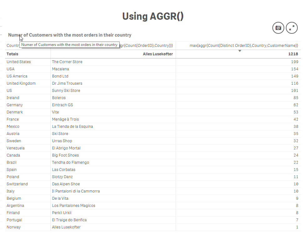
Which Customer in what Country had the most orders
Regards,
Michael Tarallo (@mtarallo) | Twitter
Qlik
Resources:
- Qlik Help
- QlikView Technical Brief - AGGR.docx
- Aggr()
- FirstSortedValue
- Sample attached (copy.qvf to your C:\Users\<user>\Documents\Qlik\Sense\Apps if you using Qlik Sense Desktop or import to Qlik Sense Enterprise using the QMC, or upload to Qlik Sense Cloud.
-
Qlik NPrinting Year-in-Review
2017 was a very busy year for Qlik NPrinting, from the standpoint of improving stability and performance, filling gaps from NPrinting 16, and extendin... Show More2017 was a very busy year for Qlik NPrinting, from the standpoint of improving stability and performance, filling gaps from NPrinting 16, and extending the product with a platform-based approach in mind.
Let’s start in April with Qlik NPrinting 17.3.1. This service release contained a significant amount of bug fixes, and on top of the improvements made in version 17.3 in February, represented the first truly stable version of NPrinting. We received positive feedback from the field and at Qonnections shortly after this version was released. During an open discussion at a customer presentation at Qonnections, several customers who were unsuccessful with previous versions voiced that they had just upgraded to this version and were able to get their environments running without issue.
While we continue to focus on product stability and quality, crossing this proverbial tipping point allowed us to turn our attention to highly requested gap features and functionality, and building out enterprise reporting APIs.
The June 2017 release included a task execution monitoring page where from within the Qlik NPrinting web console, task status, percentage completion, and a snippet of the log file can be viewed. There are plans to increase the amount of data available in the monitoring view in future releases.
We also introduced APIs aimed at three types of reporting activities: task chaining, user management, and On-Demand reporting for Qlik Sense (including user selections as report filters). In 2018, we will continue to enhance our APIs to be more robust.
Additional highlights included support for Qlik Sense third party extensions, a connection verification button and making metadata reload a schedulable task.
In September, we filled the long-requested gap of report cycling, which allows for an easy way to loop through dimension(s) values and produce unique report files for them.
Another highly requested capability that was part of this release is the ability to migrate reports between Qlik NPrinting environments. The import/export process includes a check on the connection(s) used for the report template, as well as any filters that are applied to the report. It is on our roadmap to support migration of more Qlik NPrinting entities. Note that you can effectively “clone” a report by exporting it and then re-importing it into the same environment.
And in our final release of the year (November 2017), another key gap was filled with embedded reports. HTML reports or reports rendered in image formats can be embedded directly in the body of an email message.
Last but not least, we added new image quality settings for reports. There are now three options to choose from when adding a report to a publish task: normal (96 dpi), high (192 dpi), and very high (384 dpi). While these settings impact both QlikView and Qlik Sense images, the overall quality improvement is much more evident with Sense.
At this time, we also have a technical preview of our February 2018 release available on Qlik Community. This release includes support for JWT authentication, as well as DMS authorization for QlikView. Please see the technical preview help site for more information.
We are looking forward to 2018 being a great year for Qlik NPrinting and its users!

-
How universities should prepare grads for the future of work
The Csuit recently published an article outlining the importance of data literacy with advice and experience from Qlik's Academic Program. http://www.... Show MoreThe Csuit recently published an article outlining the importance of data literacy with advice and experience from Qlik's Academic Program. http://www.thecsuite.co.uk/cfo/human-resources-cfo/how-universities-should-prepare-grads-for-the-future-of-work/

The job market has changed – from speaking with professors and industry professionals as part of the Qlik Academic Programme, we’re seeing more and more businesses needing to recruit staff who are data literate, with the ability to read, work, analyse and argue with data. No matter what role an employee has when they enter the working world, there will be some element of data analysis required, and – in a post-fact world full of fake news and data manipulations – these skills are becoming even more integral.

-
Careers in 2018: Tips from a Top Analytics Recruiter
The demand for data scientists and other data and analytics professionals continues to grow in the job marketplace as enterprise organizations look to... Show More
The demand for data scientists and other data and analytics professionals continues to grow in the job marketplace as enterprise organizations look to build out their business infrastructures for a new era. But even data scientists need to stay on top of new trends and technologies to stay relevant.
- "keep learning" technology as we all know it changes so quickly
- Attend classes on new techniques
- Determine your skills gaps
- Change positions every 2-4 years in the first 10 years of your career
To read the full article visit Careers in 2018: Tips from a Top Analytics Recruiter - InformationWeek
The Academic Program offers the opportunity for graduates to touch upon the exact points mentioned in the article. Using the resources the program provides such as Qlik Sense software, training, and an opportunity to earn a Qlik Sense Qualification certificate, students can ensure they have the analytical skills to set them apart from their fellow graduates and appeal to many recruiters!
-
Do More in Qlik Sense Cloud Business…For Less
If you recently noticed the ability to add extra streams and larger apps to Qlik Sense Cloud Business – don’t worry, you didn’t buy more by accident. ... Show MoreIf you recently noticed the ability to add extra streams and larger apps to Qlik Sense Cloud Business – don’t worry, you didn’t buy more by accident. The changes are part of our ongoing effort to pass more value on to you.
Here’s what you need to know about the three newest updates to Qlik Sense Cloud Business:
Price change: As of February 19, we’ve reduced the price of Qlik Sense Cloud Business from $25/user per month to $15/user per month, billed annually.* If you haven’t tried Qlik Sense Cloud Business yet, take advantage of the reduced price today and get started with a 30-day free trial.
Increase in Maximum App Size: the maximum app size in Qlik Sense Cloud Business is now 250 MB, up from 150 MB. Build larger apps, and leverage the growing list of data connectors (including Dropbox, Amazon Redshift, and soon, PostgreSQL and Oracle) available in Qlik Sense Cloud Business. Ultimately, bring even more of your data and analytics to your workspace.
Increase in Content Streams: Qlik Sense Cloud Business subscriptions now include five content sharing streams instead of three. Add more team members - and/or more content - and create and maintain additional governed content areas
You may be wondering, “Why is the price Qlik Sense Cloud Business significantly reduced, while at the same time it keeps getting better, with more connectivity, streams, storage, and other features?”
Simply put, Qlik has become much more efficient at running Qlik Sense Cloud. Qlik invested heavily in a micro-services architecture as the backbone of Qlik Sense Cloud and the hybrid cloud features available soon for Qlik Sense Enterprise. Our unique approach enables Qlik Sense Cloud to scale efficiently and we felt it was only right to pass the savings onto you.
We’re always working to ensure groups and teams from any-sized enterprise gain immense value from Qlik. We’ve already had a lot of updates to Qlik Sense Cloud this year – stay tuned for Qlik Sense Cloud’s exciting new look!
*$18/user per month on a month-to-month contract.
-
Qlik DataMarket Topical Packages: Healthcare Provider Performance and Remunerati...
Qlik DataMarket now offers 2 new topical data packages. The CMS Cost Reports and the Consumer Assessment of Healthcare Providers and Systems. These la... Show MoreQlik DataMarket now offers 2 new topical data packages. The CMS Cost Reports and the Consumer Assessment of Healthcare Providers and Systems.
These latest additions to the Qlik DataMarket product offering allow customers to analyze and understand how payments for the same procedure can vary across specialties and regions. They also provide insights into how consumers view their experiences while undergoing various procedures.The two new products are based off the wealth of data that the Center for Medicare and Medicaid Services (CMS) makes available about healthcare providers in the United States.
CMS Cost Reports
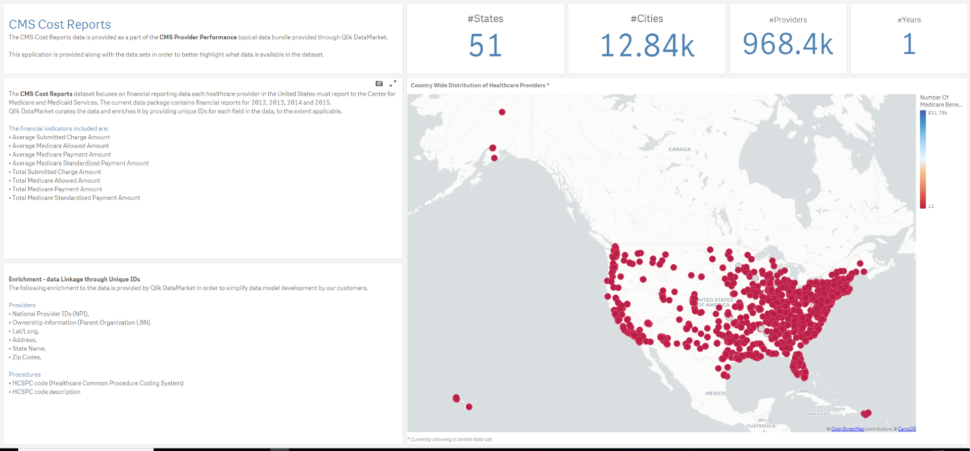
Healthcare providers participating in the Medicare program are obligated to report on various parts of their operation; facility characteristics, utilization, costs and charges by cost center and so on. Qlik DataMarket now wraps these Hospital Cost Reports up in data models, and alongside these models, our customers get a sample application that highlights some of the data available. This allows the users to better understand the various potential uses of the data.
Among the various questions that can be teased out of the CMS Cost Reports data are:
- What are the total submitted charges for any given procedure in the US, and what is the average submitted charge per state or city?
- If the same kind of procedure is performed by different specialties, then how does the average payment amount from Medicare differ by specialty?
- How much does a standardized visit to a doctor cost, based on location? How big a part of that does the Medicare/Medicaid program cover?
- How much does the healthcare provider need to write off from his charges to remain in the Medicare program? What is the reduction in the number of procedures needed to remain at the same level of revenue?
- What is the number of beneficiaries per procedure or volume of procedures by specialty and location?
This is just a sample of the questions and insights delivered by CMS Cost Reports package.
Consumer Assessment of Healthcare Providers and Systems
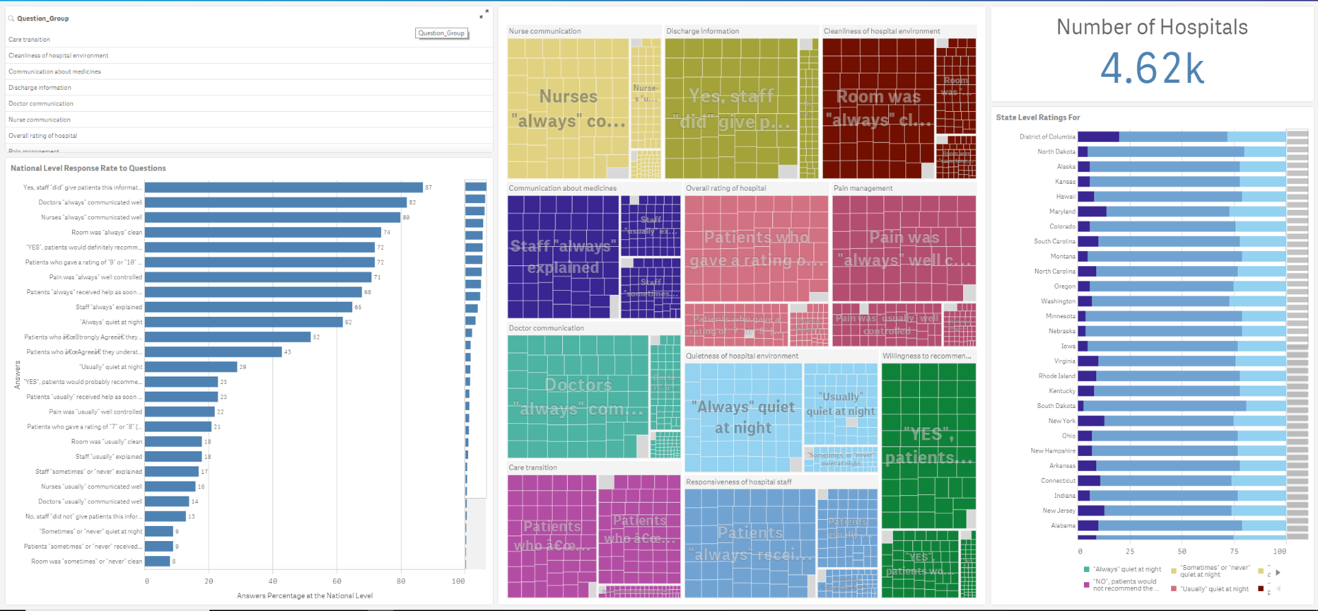
The Consumer Assessment of Healthcare Providers and Systems (CAHPS) is a series of patient surveys where consumers of healthcare services rate the quality of service provided. The Agency for Healthcare Research and Quality governs CAHPS.
Among the topics covered in CAHPS are Hospitalization are: star ratings, communication ratings, environment, effectiveness of care, willingness to recommend, and other quality metrics that impact the experience from admission to discharge.
The data applies to:
- Nearly 7,000 Dialysis facilities with about 119,000 dialysis stations.
- Over 10,000 Home Healthcare Agencies
- 4,600 Hospitals
All in all, the data comes packaged up in 13 data files and 3 sample applications that provide insights into what questions and answers can be teased out of the data.
Typically this data is hard to find and difficult to integrate into existing data models. However, we curate the data for you and make sure that all diseases and treatments, geo-dimensions and healthcare providers have been identified and that the appropriate unique identifiers have been associated with each. For example, each type of procedure is coded with the HCSPC code (Healthcare Common Procedure Coding System).
To get you started quickly, reach out to your account manager for a demonstration of the applications. You will be able to rapidly integrate your own data with these applications for unique insights.
-
Saint Joseph's University
The Academic Program was onsite at Saint Joseph's University presenting to students attending an undergraduate course in Performance Management & Anal... Show MoreThe Academic Program was onsite at Saint Joseph's University presenting to students attending an undergraduate course in Performance Management & Analysis. In the course students learn how to augment the Enterprise Performance Management framework with data visualizations using Qlik Sense! The presentation was hosted by Asim Lilani who covered Qlik Sense capabilities and features, what makes it unique compared to other software, how they can use it in the real world, and all the amazing resources the Academic Program provides in order to ensure they are enabled and have the data analytical skills needed for today's data driven environment.
-
....and the winner is.....
Hey guys - it has been a little over a month since I introduced you to our first Qlik Community Twitter Contest within my 2017 year in review blog. I ... Show More Hey guys - it has been a little over a month since I introduced you to our first Qlik Community Twitter Contest within my 2017 year in review blog. I want to thank you for your contributions and was very pleased to see the number of awesome examples demonstrating Qlik in action. That being said, all contest submissions come to end and well, it's time to announce the winner...watch this brief video to learn who it is and what the winner's 2017 Qlik Highlight was!
Can't see the video? Access to YouTube blocked by your organization or region? Download the attached .mp4 file to view on your computer or mobile device.
-
When do you post to Facebook?
What days of the week, or hours of the day do you most often post to Facebook? Is it different depending on what month it is? Has it changed over the ... Show MoreWhat days of the week, or hours of the day do you most often post to Facebook? Is it different depending on what month it is? Has it changed over the years? Find out by trying out this demo Qlik Facebook Session App Demo.
I built it to try out halyard.js, which is a new open source library that simplifies the Qlik Sense data load experience as it abstracts away the need to write a load script, and which includes a mixin for enigma.js for loading your halyard representation into the QIX engine. halyard.js and enigma.js makes grabbing some data, generating a Qlik load script, and create an app on the fly pretty simple.
The app I built uses Facebook’s API to grab user’s posts, halyard.js to generate a load script, enigma.js to create a session app and objects, and then displays a few filters and a visualization just to test out the whole flow, and it was awesome. Check out the video below, or try it out for yourself.
You can grab the source code below and try it out on your own machine if you'd like. There’s a few steps to do that. First, download the source code and run npm install. Then go to the qapp.js file and enter session info for your Qlik Sense server in the config variable on line 8. Next, you’ll have to go to https://developers.facebook.com/ and create an app. Once your Facebook app is created, grab the App ID and enter it in the fb.js file, on line 26.
For your Facebook App to be able to authorize users, you’ll need to add a platform and app domain in the “Settings” page of the Facebook app.
It’s up to you how to host this. I’ve included a .qext file if you just want to use Qlik Sense Desktop.
Once you’ve done that, run npm run webpack to build the project, and it should be good to give it a go!
-
Salesforce and CIO dashboard mashups available to the public
A while ago I blogged about 2 of our most beautiful mashups in the Demo Team, Salesforce and CIO dashboard. Case study: Salesforce mashupJazzing up yo... Show MoreA while ago I blogged about 2 of our most beautiful mashups in the Demo Team, Salesforce and CIO dashboard.
After I was asked by many for the source files, here are the 2 github pages
GitHub - yianni-ververis/CIO: CIO mashup created by the Demo Team
GitHub - yianni-ververis/Salesforce: Salesforce Mashup created by the Demo Team
Upload the qvfs on your server and put the ids into the project.json file. Then in the command line type "npm install" to install all the required libraries and "gulp" to build and run the project.
Depending of the version of Qlik Sense you are running, most likely you will get CORS errors and some fonts may not load up. If you have valid certificates for localhost then under ./gulp-tasks/server.js comment out lines 15-18
Mashups:
https://webapps.qlik.com/salesforce/index.html
Best,
Yianni
-
Export to Excel, New Connectors, and February Qlik Sense Release
Be sure to follow along Qlik Sense Cloud updates through March. We will roll out a lot of new updates to Qlik Sense Cloud Business that you’ve been wa... Show MoreBe sure to follow along Qlik Sense Cloud updates through March. We will roll out a lot of new updates to Qlik Sense Cloud Business that you’ve been waiting for (and some surprises, which we’re pretty sure you’ll enjoy!). Here is what’s new today:
Export to Excel
Qlik Sense Cloud Business group members with view-only access to apps now have the ability to export visualization data to Excel. This creates more flexibility for group owners who want to grant group members access to some data, but all of the content in the workspace.


Additional Connectors
New web connectors are now available via the data load editor:
- AYLIEN News and AYLIEN Text Analysis
- MeaningCloud
- Mailboxes using IMAP or POP3 protocols (Gmail, Microsoft Exchange, etc.)
Additional web connectors and on-premise connectivity (PostgreSQL and Oracle) will be available soon. You’ll also notice that we’ve updated the layout the data load editor screen, to make it easier to sort through the expanding list of connectivity options.
Qlik Sense February Release Features
Use Qlik Sense Cloud to get a preview of some of the new Qlik Sense February release features that will be available in Qlik Sense Enterprise this month:
- Visual Data Prep Improvements: these enhancements provide the ability to gain visual guidance by hovering over fields. An association recommendation panel guides users through the possible associations between tables and facilitates experimentation before committing to data model changes.
- New Built-in Theme: check out "Sense Breeze", a colorful new out-of-the-box style choice in the app options menu.
- Web connector updates: the web file connector now includes a secure way for scripts to dynamically generate URLs before retrieving data using the web file connector, opening up a range of new possibilities for querying web-hosted files.
To learn more about the Qlik Sense February release, check out this video.
-
Ohio State University
Qlik was onsite at the Ohio State University last week presenting a capstone project between the University and the Sustainable Resilient Tanzania Com... Show More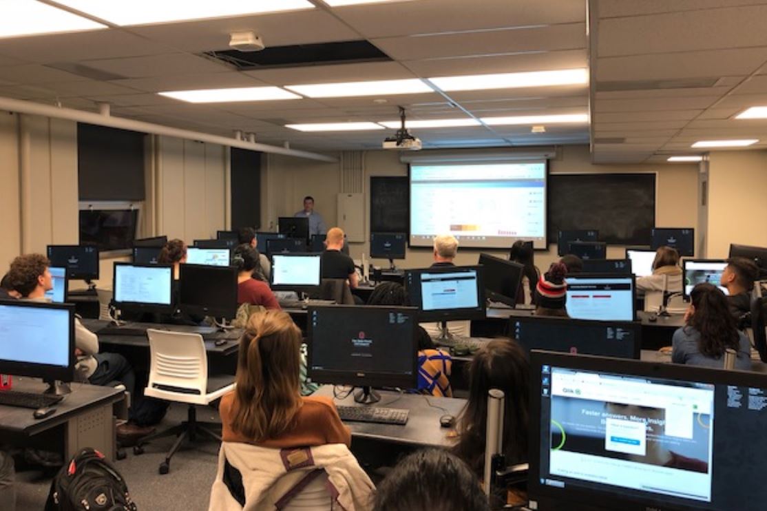

Qlik was onsite at the Ohio State University last week presenting a capstone project between the University and the Sustainable Resilient Tanzania Community (SRTC). The University and SRTC have developed a capstone program where students from the university work with the village of Marwa in Tanzania to holistically solve a real community challenge. The project will grow over time, starting with rainwater harvesting system (2017), to water pipeline design, to introducing technology (Qlik) to students at University of Dodoma to community economic programs to assist with cultural transformation that follows the availability of clean water supply.
Through the help of the Academic Program the Ohio State University Capstone professor and students have received free software, training, and much more! These resources ensure the students are well equipped to use Qlik Sense for their visit to Tanzania to help solve the communities challenges.


