Unlock a world of possibilities! Login now and discover the exclusive benefits awaiting you.
Analytics & AI
Forums for Qlik Analytic solutions. Ask questions, join discussions, find solutions, and access documentation and resources.
Data Integration & Quality
Forums for Qlik Data Integration solutions. Ask questions, join discussions, find solutions, and access documentation and resources
Explore Qlik Gallery
Qlik Gallery is meant to encourage Qlikkies everywhere to share their progress – from a first Qlik app – to a favorite Qlik app – and everything in-between.
Qlik Community
Get started on Qlik Community, find How-To documents, and join general non-product related discussions.
Qlik Resources
Direct links to other resources within the Qlik ecosystem. We suggest you bookmark this page.
Qlik Academic Program
Qlik gives qualified university students, educators, and researchers free Qlik software and resources to prepare students for the data-driven workplace.
Recent Blog Posts
-
Data Analyst, the most in-demand job of the coming years!
According to the forecasts of the World Economic Forum, by 2020 data analysts will be in high demand in companies around the world. The LinkedIn Workf... Show More
According to the forecasts of the World Economic Forum, by 2020 data analysts will be in high demand in companies around the world. The LinkedIn Workforce Report maintains that, in the USA, demand for these professional figures has grown sixfold compared to five years ago, and data analysts will continue to be the most sought after profiles over the next five years. This is further confirmed by IBM, which claims that the annual demand for data scientists, data developers and data engineers will lead to 700,000 new recruitment by 2020. For the full article visit https://www.morningfuture.com/en/article/2018/02/21/data-analyst-data-scientist-big-data-work/235/
As a student, its critical to ensure you are preparing yourself for this in-demand job market! As a professor its important you are keeping up with whats being taught in other universities! The Academic Program can help! Be sure to renew your subscription on a yearly basis because as long as you are still actively teaching or attending university, you can get access to Qlik Sense Desktop, a year of free training, the opportunity to get Qlik Sense qualified, and more!
To reapply visit https://www.qlik.com/us/company/academic-program

-
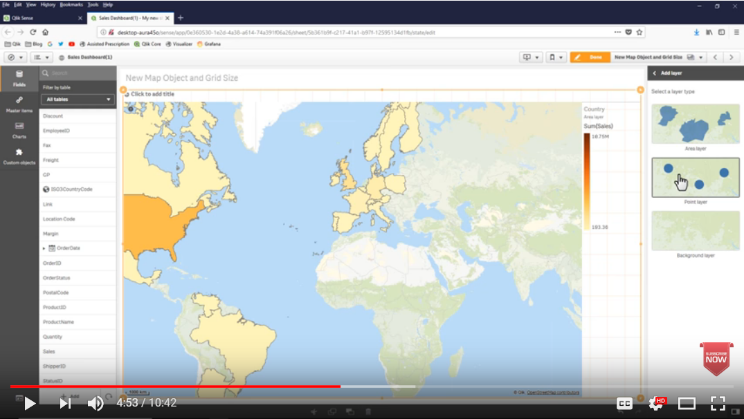
Qlik GeoAnalytics mapping capabilities are now part of Qlik Sense
Since we launched Qlik GeoAnalytics about a year ago, there has been great interest among both Qlik Sense and QlikView users in adding mapping and geo... Show MoreSince we launched Qlik GeoAnalytics about a year ago, there has been great interest among both Qlik Sense and QlikView users in adding mapping and geo-analysis capabilities to their Qlik environment. Now we are making it even easier. Starting with Qlik Sense April 2018, we updated the mapping capabilities within Qlik Sense to be based on Qlik GeoAnalytics technology.
This new map chart object makes it easy to add maps to your app. Location related names such as countries, counties, provinces, regions, cities, airports, and zip codes now utilize a dynamic location name lookup service to automatically define and visualize geo data.
This new capability is available to all Qlik Sense users, whether they are using Desktop, Enterprise or Cloud. Additional Qlik GeoAnalytics features such as multiple layers, layer control, zoom levels, labels, and multiple point symbols are also included. And if you have maps in your existing apps, they will be seamlessly migrated to the new map object.
Points and area layers are available in this initial release. Additional layers and more capabilities are planned for future releases. Note that all geo-analysis calculations, such as drive-times, travel areas, binning, clustering or intersections, still require a different license.
If you haven’t seen it yet, some of these new mapping capabilities can be found in the video - What’s New in Qlik Sense April 2018. Click on the image below to watch the video.

-
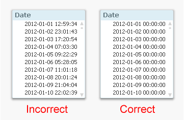
Why don’t my dates work?
1. Incorrect Date Interpretation When data is loaded into QlikView, dates are often read as strings. QlikView then tries to recognize a pattern in th... Show More1. Incorrect Date Interpretation
When data is loaded into QlikView, dates are often read as strings. QlikView then tries to recognize a pattern in the string that looks like the date format specified in the DateFormat environment variable. This sometimes fails and then you need to use the Date#() function to help QlikView understand that it is a date.
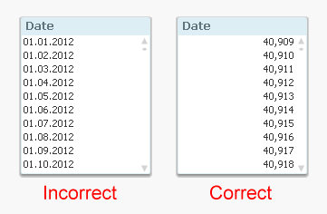
How do I know that a date is correctly interpreted? That’s easy. Just format it as a number and see what you get. (List box properties – Number – Integer)
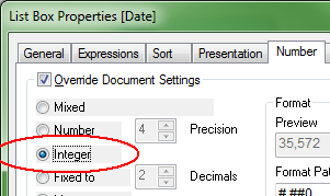
The question is now what your list box looks like. If you have a number which is roughly 40000 (usually right-aligned), then you are all set. But if you still have a date stamp (usually left-aligned), then you need to use the Date#() function in the script. See QlikView Date fields.
2. Linking integer dates with fractional dates
You have a date in two different tables, and you want to use this date as a key, but it doesn’t seem to work. Then you should suspect that you have true dates (integers) in one table and timestamps (fractional numbers) in the other, but the formatting of the dates hides this fact.
How do I know whether this is the case? That’s easy. Just format it as a timestamp and see what you get. (List box properties – Number – TimeStamp)
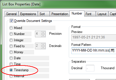
The question is now what your list box looks like. If you have timestamps where hours, minutes and seconds are all zero, then you are all set. But if you have numbers in these places, then you need to use the Floor() function in the script to get integer dates. See QlikView Date fields.
3. Incorrect date comparisons
The most subtle error is however the one with timestamps in comparisons, e.g.
… Where Date = '2011-12-31';
Will this work? Yes, provided that the date format inside the string is recognized by QlikView, i.e. that it corresponds to the date format specified in the environment variable DateFormat in the beginning of the script.
It becomes even more complex if you use variables. Then it is important to use quotes correctly. The following will work:
Let vToday = Today();
… Where Date = '$(vToday)';… but the following will not:
… Where Date = $(vToday);
The reason is that the $(vToday) will expand to a string containing the date, and then the comparison will be e.g.
… Where Date = 2/19/2013;
So the date (which is approximately 40000) will be compared to 2 divided by 19 divided by 2013, which of course is not what you want.
My recommendation is to always use numeric variables for dates. They always work - quotes or no quotes:
Let vToday = Num(Today());
… Where Date = $(vToday);See more on QlikView Date fields.

-
Learn Slower to Learn Faster
In his latest post, Kevin Hanegan explains why your should take your time to help your brain learn faster and make better connections, and shares best... Show More
In his latest post, Kevin Hanegan explains why your should take your time to help your brain learn faster and make better connections, and shares best practices you can start applying today: Learn Slower to Learn Faster | Qlik Blog

-
qdt-components - Horizontal Barchart by Picasso.js & Selection Toolbar
Continuing our blog series on the qdt-components (qdt-components - A Components Library that can be used in simple Html, Angular 5 and React & qdt-co... Show More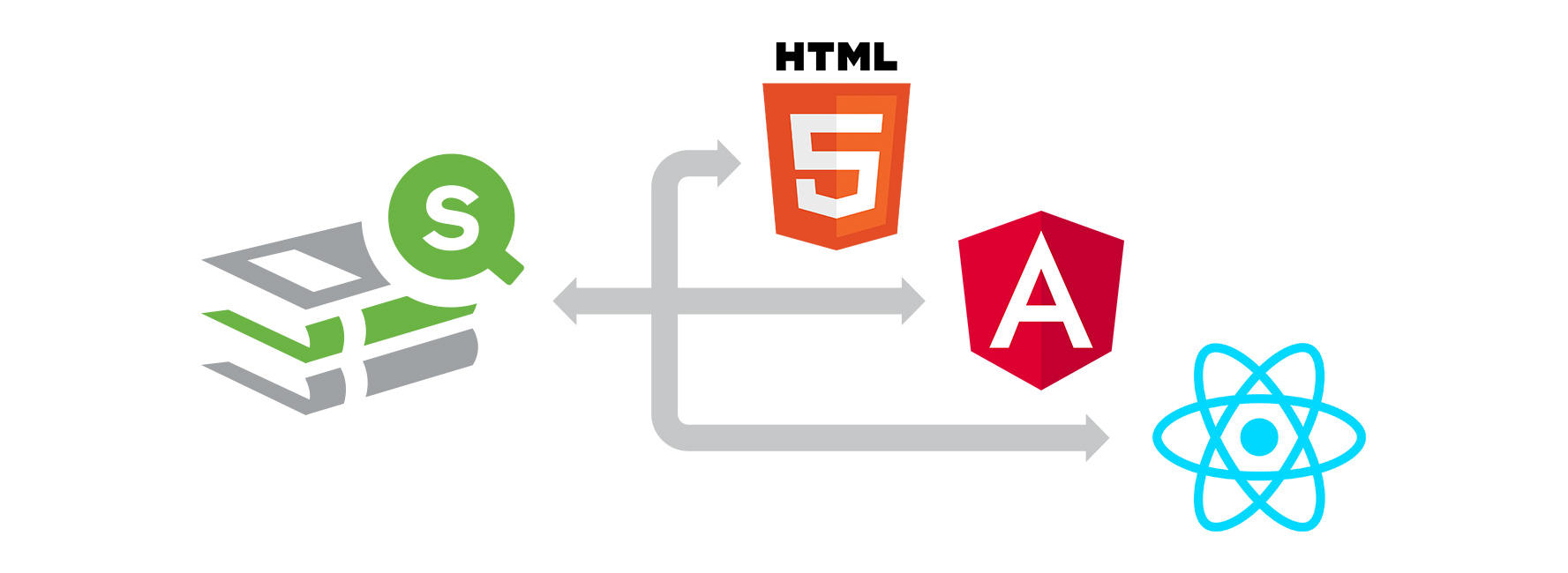
Continuing our blog series on the qdt-components (qdt-components - A Components Library that can be used in simple Html, Angular 5 and React & qdt-components - React template by fka), today, I will talk about two new components, the Horizontal Barchart, created with Enigma.js and Picasso.js and the Selection Toolbar that we usually use in our mashups (demos.qlik.com & webapps.qlik.com).
The Selection Toolbar is a simple component that listens to selections and displays the selected items either as simple buttons or if there are more than one items selected for the same field, as a dropdowns with buttons.
The Horizontal Barchart is using the latest Qlik Open Source, Picasso.js. It has a Tooltip with Dimension and Measure and multiple selections.
Also, we use Leonardo UI (https://qlik-oss.github.io/leonardo-ui/index.html) for icons, buttons etc..
Live: Simple html with qdt-components
qtd-components: https://github.com/qlik-demo-team/qdt-components
Enjoy
 ,
,Yianni
-
Qlik Sense Histogram
What is a histogram? A histogram is a chart that allows you to visualize the distribution of data over a continuous interval or certain period. It i... Show MoreWhat is a histogram? A histogram is a chart that allows you to visualize the distribution of data over a continuous interval or certain period. It is made up of bars like a bar chart but instead of displaying actual counts against a dimension, a histogram displays the frequency at each interval or bin allowing you to see where the values are concentrated and where there are gaps or odd values. A histogram is also different from a bar chart in that it does not need measures. Only a single numeric dimension is needed to create a histogram. Once the dimension is added to the Qlik Sense histogram chart, the frequency is automatically calculated.
Let’s look at an example, in the histogram below, the dimension BMI (body mass index) is used to view the frequency. After BMI was added to the chart, Qlik Sense automatically created the BMI bins based on the frequency distribution. This chart shows that BMI is concentrated in the range 21 <= x < 22.75 (21 to 22.75, but not including 22.75).
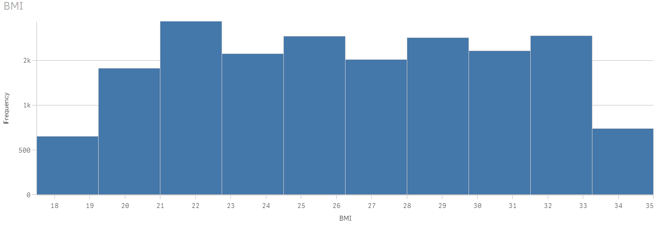
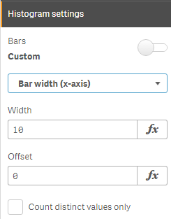
The Qlik Sense histogram chart has some properties that can be used to customize the histogram. There is the ability to set the number of bars to a maximum number or set the width of the bars if you would like the bars to be even intervals. Qlik Sense Help has an example of a histogram using even intervals to show temperature.
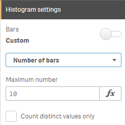
In the histogram above, the number of bars is set to 10. When the bars are set to Auto, Sturges’ formula is used to determine the bins and this may change based on selections.
A histogram chart is ideal for a large amount of data when you need a quick visualization of frequency. It is easy to create since only one dimension is required. The key to remember is that the dimension field must be numeric. Try it out with your numeric dimensions in your next Qlik Sense app. If you are using QlikView, you may be interested in Henric Cronström’s blog Recipe for a Histogram on how to create a histogram in QlikView. Also, check out Arturo Munoz’s blogs on the Distribution Plot chart and the Box Plot chart. You may also find these helpful in your next Qlik Sense app.
Thanks,
Jennell
-
What's is your Data Literacy Personality?
Do you bury your head in the sand when it comes to data, or is no stone left unturned? Find out what your data personality is and how data literate yo... Show More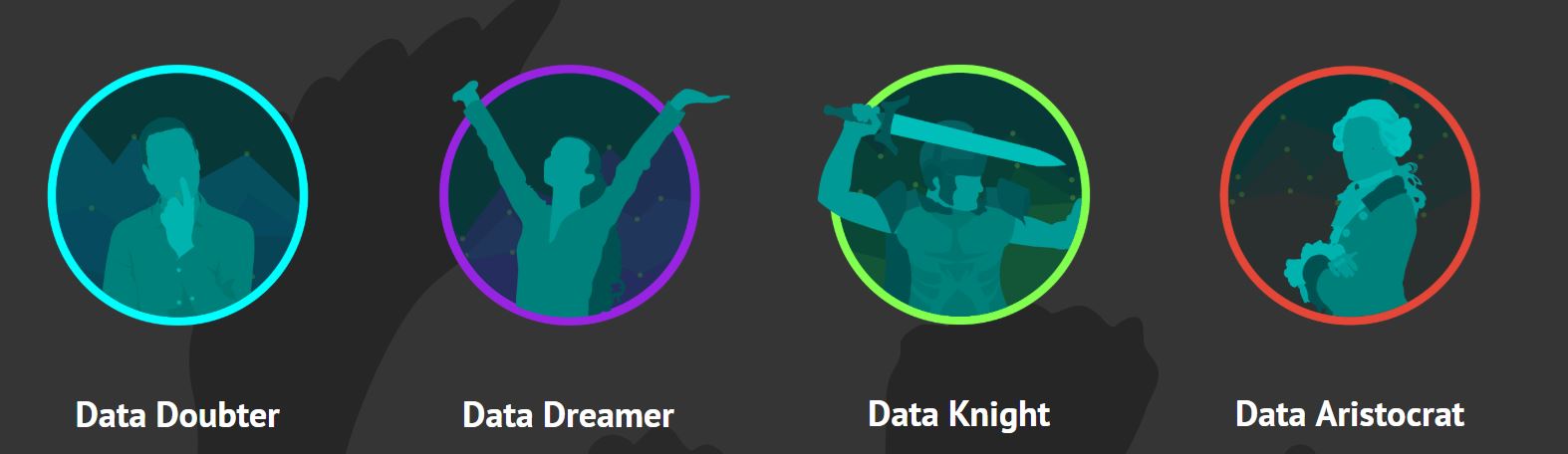
Do you bury your head in the sand when it comes to data, or is no stone left unturned? Find out what your data personality is and how data literate you are. Now a days its so important to be data literate! Becoming data literate will improve both your chances for employment upon graduation and throughout your career. Wherever you are in your journey, it's never too late for growth!
I took the quiz and found out that I am a Data Knight! What are you?! Visit to access yourself http://dataliteracy.info/quiz.
After taking the quiz, you can get started to your data literacy journey by attending the classes available in the Qlik Continuous Classroom Course: Data Literacy Courses. That's not all, the Academic Program has its own data literacy materials so if you are interested in learning about Analytics or Visualizations, visit http://qcc.qlik.com/course/view.php?id=562 to access these courses and download the lecture slides if you are a professor or the handouts and activities if you are a student. Don't forget to participate in the Use Cases either! If you do not have access to this page, please reapply to the program by visiting The Qlik Academic Program
For questions email academicprogram@qlik.com
-
Nested Loops
There are various loops/control statements that can be used in a script to control script execution. Some common ones include:If…thenDo…loopFor…nextF... Show MoreThere are various loops/control statements that can be used in a script to control script execution. Some common ones include:
- If…then
- Do…loop
- For…next
- For each…next
It is also possible to use one loop/control statement within another loop. In the script I am going to review in this blog, I used all of these control statements except the do…loop to generate the rank of a company, by region, over 8 years. Let me begin by setting the scene and explaining what I am trying to do. I had 8 years’ worth of company data that included the company's overall rank (in a Data table). Let’s say the overall rank is the company’s rank based on sales across all regions for a given year. My goal is to get a company’s rank for their specific region, each year, based on the overall rank. For example, in the example data table below Company C may have an overall rank of 3 in 2017 but in its region, North America, it is the top company so it has a regional rank of 1.
Example Data
Year Company Overall Rank Region Regional Rank
2017 Company A 1 Europe 1 2017 Company B 2 Europe 2 2017 Company C 3 North America 1 2017 Company D 4 Central America 1 2017 Company E 5 North America 2 2017 Company F 6 Europe 3 2017 Company G 7 Europe 4 What I would like to do via the script is determine the regional rank for each company, each year, so I can use it in a KPI object in an app. Here is the script that I am using to accomplish this:
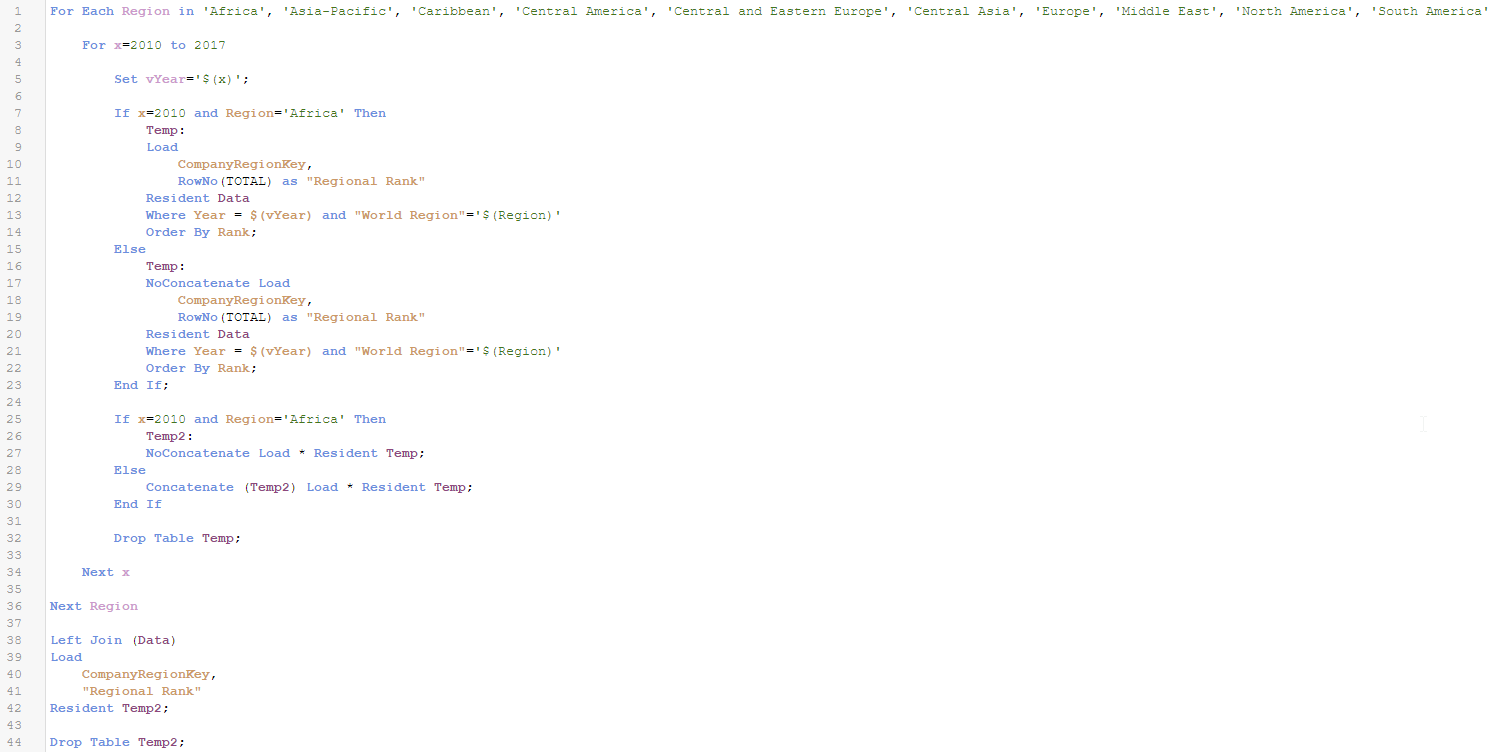
Let’s step through the script step by step.
- First, I use a For each…next loop to loop through each region (line 1).
- Then I use a For…next loop to loop through the years (line 3). Since I knew what years of data I had, I hard-coded the years but you can also use variables for the years which is a good idea if the years may vary.
- My next step is to use an If…then statement (line7) to determine if this is my first time through the loop. If it is the first time, year will be 2010 and the region will be Africa so this is what I check for in the If...then statement. If this is the first time through the loop, I create a Temp table that has the key field, CompanyRegionKey, and the field, Regional Rank, which I calculate using the RowNo() function. The RowNo() function returns the position of the current row in the resulting table starting at 1. Since I am sorting the table by Rank, the rows will be added to the table in the regional rank order. You can learn more about the RowNo() function in my RecNo or RowNo? blog. If this is not the first time through the loop, then I create the Temp table and I use the noconcatenate prefix so that the data is not concatenated to the already existing Temp2 table (which has the same fields).
- My next step is to create (line 26) or concatenate to (line 29) the Temp2 table which will store the key field and the new Regional Rank field.
- After this step, I Drop the Temp table (line 32). I remove the Temp table from the data model and recreate it every time I loop through the script so that RowNo() always starts at 1. If I did not delete the Temp table and concatenated the data to it, the RowNo() function will pick up where it left off instead of starting over at 1.
- For each region, I loop through all the years and create and save the Regional Rank. Once all the years are complete for a region, the script will go to the next region in the For each…next loop.
- Once all regions and years are complete, I Left Join the Regional Rank field to my Data table and then Drop the Temp2 table from the data model. I now have a Regional Rank value for each company in my Data table.
Save yourself time and lines of script by using loops when you need to repeat one or a series of statements in your script. Loops can be nested, as I did in the script above, or used one at a time. Instead of repeating the same statements for each year and each region, use nested loops so the statements in the script only need to be written once. This also makes maintenance easier. In the future, if a change needs to be made to the script, it only needs to be done once. Check out other blogs about loops with Henric Cronstrom’s blog on Loops in the Script and my blog on the Do…Loop.
Thanks,
Jennell
-
Trello and Qlik Sense Part 2
While ago I wrote a simple tutorial on how to connect to Trello API and get the lists and cards into Qlik SenseTrello and Qlik Sense. Today I will go... Show MoreWhile ago I wrote a simple tutorial on how to connect to Trello API and get the lists and cards into Qlik SenseTrello and Qlik Sense.
Today I will go one step further and add more fields into Trello so we can import them into sense and use them as filters. I will use the labels and due dates.
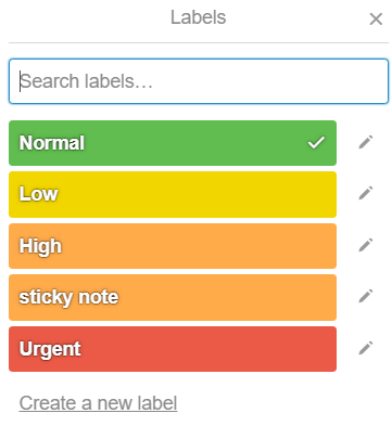
I like to use labels to highlight the importance or urgency of each project. So I named all of the labels as:
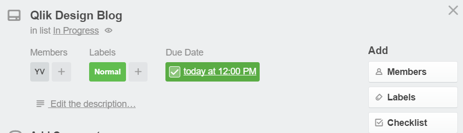
So in one of my cards, I have given it a label of normal and I have added a due date for today which I also marked it as complete. So, this is how my card should like
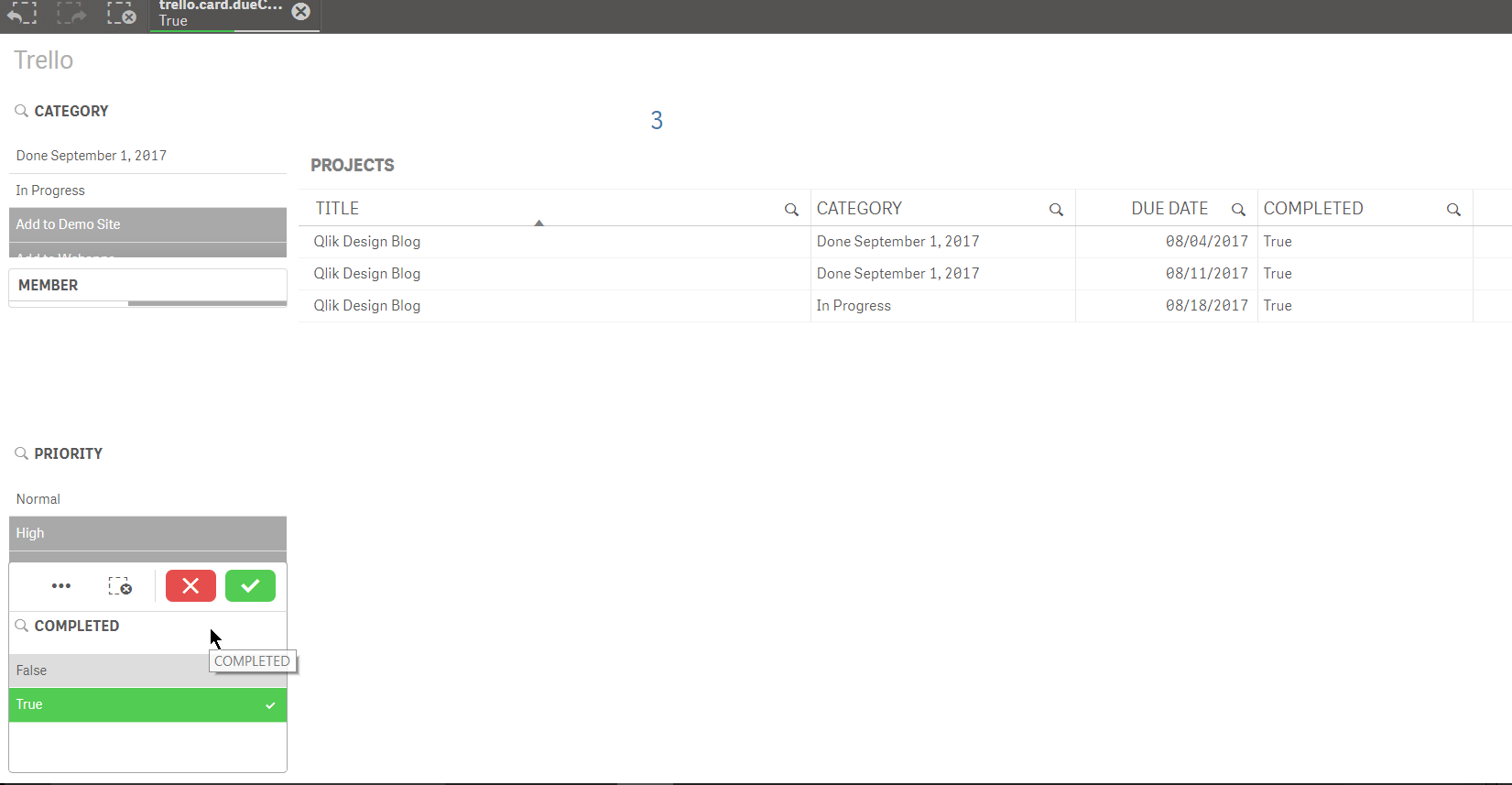
Now lets go to my Qlik Sense and try to re import the cards.
I have changed the api path from last time to :
Here is my load script
LIB CONNECT TO 'Demos - Trello-cards';
RestConnectorMasterTable:
SQL SELECT
"id" AS "id_u1",
"name" AS "name_u0",
"idList",
"url",
"due",
"dueComplete",
"__KEY_root",
(SELECT
"id",
"idBoard",
"name",
"color",
"uses",
"__FK_labels"
FROM "labels" FK "__FK_labels"),
(SELECT
"id" AS "id_u0",
"avatarHash",
"fullName",
"initials",
"username",
"__FK_members"
FROM "members" FK "__FK_members")
FROM JSON (wrap on) "root" PK "__KEY_root";
[labels]:
LOAD [id] AS [trello.label.id],
[idBoard] AS [trello.board.id],
[name] AS [trello.label.name],
[color] AS [trello.label.color],
[uses] AS [trello.label.uses],
[__FK_labels] AS [__KEY_root]
RESIDENT RestConnectorMasterTable
WHERE NOT IsNull([__FK_labels]);
[members]:
LOAD [id_u0] AS [trello.member.id],
[avatarHash] AS [trello.member.avatarHash],
[fullName] AS [trello.member.fullName],
[initials] AS [trello.member.initials],
[username] AS [trello.member.username],
[__FK_members] AS [__KEY_root]
RESIDENT RestConnectorMasterTable
WHERE NOT IsNull([__FK_members]);
[root]:
LOAD [id_u1] AS [trello.card.id],
[name_u0] AS [trello.card.name],
[idList] AS [trello.list.id],
[url] AS [trello.card.url],
//[due] AS [trello.card.due],
Date([due],'MM/DD/YYYY') as [trello.card.due],
[dueComplete] AS [trello.card.dueComplete],
[__KEY_root] AS [__KEY_root]
RESIDENT RestConnectorMasterTable
WHERE NOT IsNull([__KEY_root]);
DROP TABLE RestConnectorMasterTable;
If everything works well you should be able to get all of your cards in the QVF. Now, lets add the filters for priority and completed
That's it!
Yianni
-
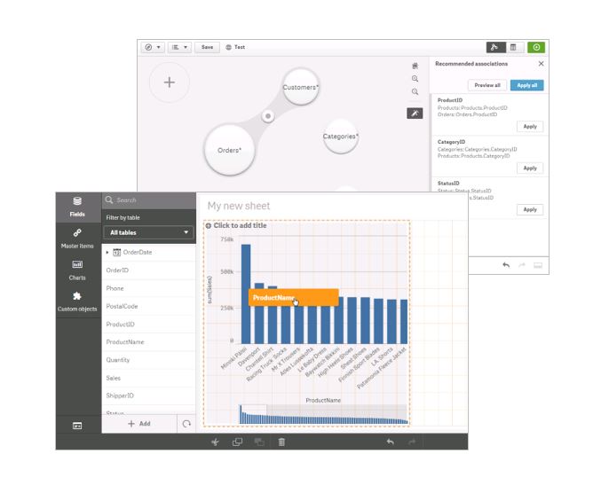
What's new in the April Release...
As seen in the Product Keynote during Qonnections, the Qlik Sense April 2018 release has exciting new improvements to Qlik Sense Enterprise, Qlik Se... Show MoreAs seen in the Product Keynote during Qonnections, the Qlik Sense April 2018 release has exciting new improvements to Qlik Sense Enterprise, Qlik Sense Cloud, Qlik DataMarket, and Qlik Nprinting!
As part of these improvements, the release offers Accelerated Self-Service, which is a collection of features powered by the new Qlik Cognitive Engine, aimed at streamlining and enhancing the creation experience from data to insights. Now providing a new augmented experience in the first few minutes of analysis, including cognitive AI suggestions and redesigned workflows that facilitate and automate the data loading and visualization process. This includes smart capabilities around chart recommendations, and simplified workflows for loading data and building analytics. Qlik now automatically understands what type of fields are being dragged onto the screen. For example, if you drag on a measure, the values will be summed and displayed as a KPI; and if you add a dimension the visualization will automatically change to a recommended optimal chart based on the data within the added fields. These new features allow users to quickly gain insights rather than building charts. The release also includes improvements to accessibility, along with the new capability for self-service publishing in the Qlik Sense Hub – all of which support our commitment to Accelerated Self-Service!
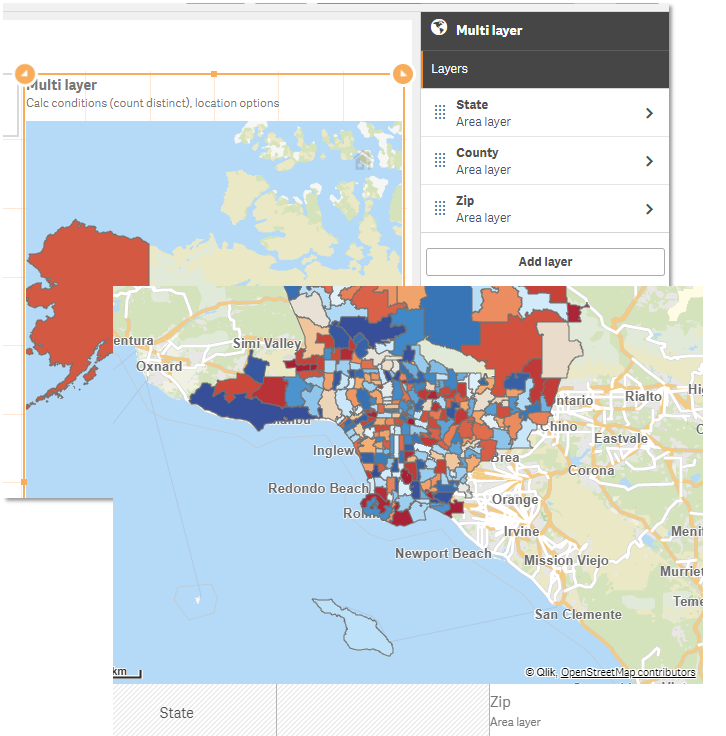
The April 2018 release also provides more customizations, like improvements to theming, layout options, along with grid size control and custom abbreviations. Several other enhancements have been made including a new add on product for geocoding and a new multi-layer map object based on the Qlik GeoAnalytics technology. This supports dynamic lookups and shapes, and includes more background maps and projections.
For the Qlik Sense Mobile app for iOS, we are expanding Enterprise Mobility Management (EMM) support, with AirWatch per-app VPN support. This allows enterprise administrators to manage Qlik Sense Mobile deployments and secure network traffic through corporate firewalls.
In the Qlik NPrinting April 2018 release we have added SAML authentication, and have made improvements to the stability of Qlik Sense chart rendering. Further improvements have been made to the Qlik NPrinting filtering system for enhanced error monitoring capabilities.
For Qlik Sense Cloud, we have added the same capabilities as detailed above around accelerated self-service, improved customizations and multi-layer map objects. Additionally, we have made UI and navigation enhancements to the Cloud hub which makes it even easier to collaborate and share, as well as adding the ability to download charts as images or PDFs and export data from charts. We have expanded our data connectivity capabilities, including connectors for Oracle and PostgreSQL and a variety of new web/cloud connectors bringing us to over 31 Qlik Web Connectors!
Lastly, in Qlik DataMarket, we have delivered two additional healthcare data packages, including Accountable Care Organizations (ACO’s) and Social Determinants of Health.
For more information on the April 2018 release, head to Qlik’s “What’s new” page!
-
Qualification Exams: Customers can prove their Qlik Sense skills for FREE!
Qlik Education is pleased to announce a new feature in Qlik Continuous Classroom (QCC): FREE Qualification Exams for Qlik Sense Business Analyst and ... Show MoreQlik Education is pleased to announce a new feature in Qlik Continuous Classroom (QCC): FREE Qualification Exams for Qlik Sense Business Analyst and Qlik Sense Data Architect.
What is a Qualification Exam?The Qualification Exams enable customers to prove they have a fundamental level of Qlik Sense skills. To earn a qualification, you will develop a Qlik Sense application, then use the app to answer questions in a multiple-choice exam. The content of the Qualification Exams is based on the QCC and instructor-led course materials.
What's the difference between Qualification and Certification?
- Qualifications are fundamental-level exams – Certifications are expert-level exams
- Qualifications are optional – Certifications are part of the requirements of the Qlik Partner Program
- Qualifications are designed for Qlik Sense users – Certifications are designed for experienced Qlik Sense experts
- Qualifications are FREE (for customers and employees) – Certifications cost $250 USD
- Qualifications are for Qlik Sense Business Analysts and Data Architects ONLY – Certifications are available for QlikView and Qlik Sense Business Analysts, Data Architects, and System Administrators
- Qualifications are exams delivered in QCC skills – Certifications are legally-defensible exams delivered in a proctored environment by Pearson VUE
What do you receive once you pass?
After you pass the exam, you will be awarded a printable certificate and digital badge for sharing on social media sites. Plus, bragging rights!
Who can take a Qualification Exam?
QCC subscribers and customers who attend Create Visualizations with Qlik Sense or Data Modeling with Qlik Sense (February 2018 or later) instructor-led courses.
For more information
Visit the Qlik Sense Business Analyst or Qlik Sense Data Architect Learning Plans in Qlik Continuous Classroom

-
Qlik visits Swinburne University
Swinburne University in Australia is one of the Academic Programs newest universities to join and they have already begun to utilize the programs offe... Show More
Swinburne University in Australia is one of the Academic Programs newest universities to join and they have already begun to utilize the programs offering for onsite presentations. James Belsey a Qlik Sales Director supports the universities in Australia and presented to students in a Database Analysis and Design class. Since joining the program Swinburne has had more than 50 students join the program and that number is rising!
-
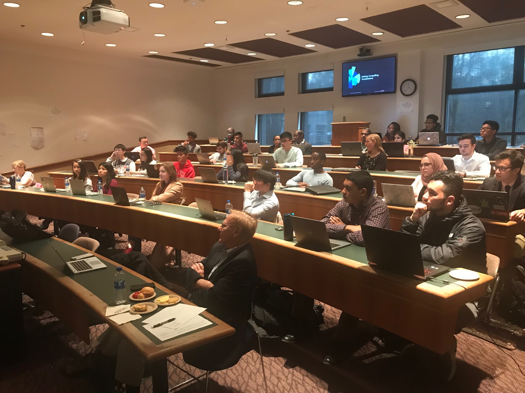
The University of Maryland
This month the Academic Program was onsite at the University of Maryland presenting Qlik Sense to students from the school’s Business Analytics Consor... Show MoreThis month the Academic Program was onsite at the University of Maryland presenting Qlik Sense to students from the school’s Business Analytics Consortium Program. The University of Maryland is considered a recruiting university for Deloitte so they have asked Qlik to join them in their efforts to educate the students on Qlik Sense! They are eager to ensure students from the university graduate with Qlik Sense skills so they can become potential new hires!

-
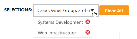
Angularjs & Capabilities API - DropDown Directive
In a lot of my projects I had to create a drop down menu for selections instead of the build in filter object from Qlik Sense. This is for several rea... Show MoreIn a lot of my projects I had to create a drop down menu for selections instead of the build in filter object from Qlik Sense. This is for several reasons like ui experience, feel and look but most importantly, for giving the user the option of making only one selection. This is important if we want to guide the users on what and how to display our data in the mashups.
For all of my projects I use the Angular Template that I have blogged about in the past, GitHub - yianni-ververis/capabilities-api-angular-template: A simple mvc template for building webpages with Qlik Sense …
I created a simple directive that uses template's api service to get the data for the menu and boostrap to display these results into the form below
All we have to do is add this code into our html
<drop-down data-dimension="'Case Owner Group'" data-title="'Department'" data-id="'department'"></drop-down>
- data-dimension: is the dimension to populate the drop down list from
- data-title: is for the text that will be displayed in the button
- data-id: a unique id/name that the app will use to change the contents like text, colors etc
- data-showselected="true" : if you want the button text to change to the seleted text
This is it. Lets try and re-make the filter toolbar that we had in our template.
So, in views/dashboard.html after L7 add the following:
<div class="col-md-12">
  <drop-down data-dimension="'Cases Open/Closed'" data-title="'Cases Open/Closed'" data-id="'cases'" data-showselected="true"></drop-down>
    <drop-down data-dimension="'Priority'" data-title="'Priority'" data-id="'priority'"></drop-down>
    <drop-down data-dimension="'Case Owner'" data-title="'IT Resources'" data-id="'resources'" data-showselected="true"></drop-down>
    <drop-down data-dimension="'Case Record Type'" data-title="'Request Type'" data-id="'type'"></drop-down>
    <drop-down data-dimension="'Case Owner Group'" data-title="'Department'" data-id="'department'"></drop-down>
</div>
Here is how the new filter bar should look like
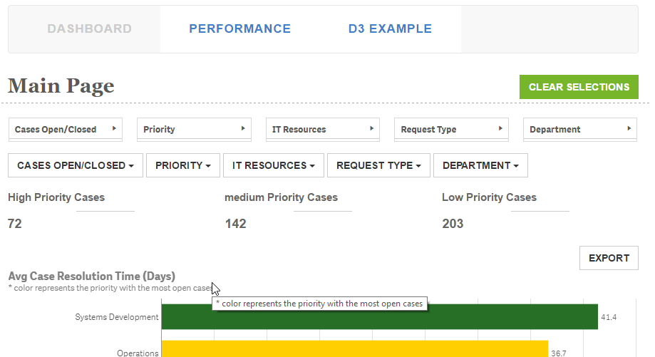
Branch: http://branch.qlik.com/#!/project/56b4a40140a985c431a64b08
Yianni
-
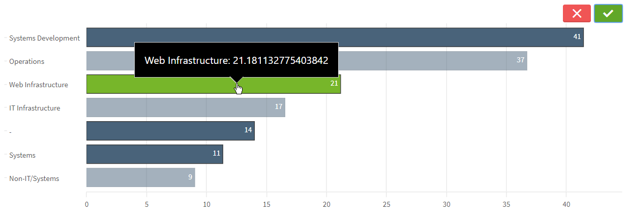
Use of a Silent Legend
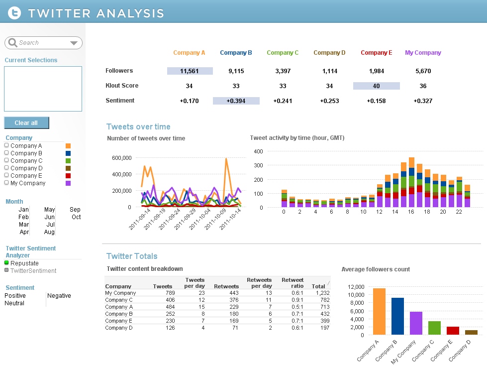
When creating a chart in QlikView that has multiple expressions, a legend is created for each expression. Sometimes, I find that the legend takes up ... Show MoreWhen creating a chart in QlikView that has multiple expressions, a legend is created for each expression. Sometimes, I find that the legend takes up too much space and I spend time trying to move it or adjust the wording in my expression labels so that they are not too long just so I can show my chart and gain as much real estate on my sheet as possible. Now I have the option to turn the expression legends off but without them you will have no idea what the chart is showing. So I explored other ways to show a legend without cluttering my sheet. In the Social Media Data Analysis demo, I had several visualizations that compared six companies. If I used the expression legend in the line chart and the bar chart (Tweets over time section), it would have taken up a lot of space and been a little redundant as seen in the image below.
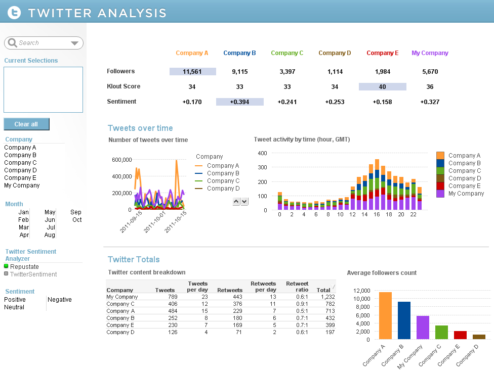
So instead, I added a silent legend to the Company List Box by adding Text Objects that corresponded to each company. I set the style of the List Box to LED so that the companies were always listed in the same order and I added actions to the Text Objects so that users could make selections using either the company name or color. This allowed me to remove the expression legends in my line and bar chart enabling me to show more of the data and it gave the charts a cleaner appearance.
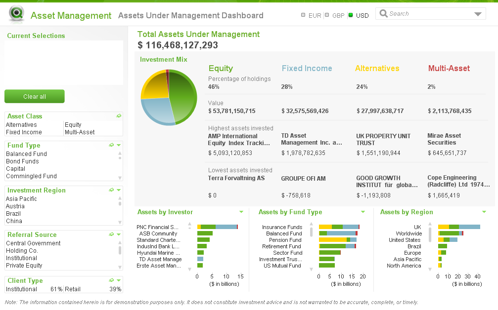
There are other examples of silent legends in the Asset Management and Help Desk Management demos. In the Asset Management demo, the legend is defined in the asset class headings and coloring is reflected in the pie and bar charts.
The Help Desk Management demo uses the List Box as the legend and the respective colors in a straight table versus using the text. This makes the various priorities easier to identify in the list.
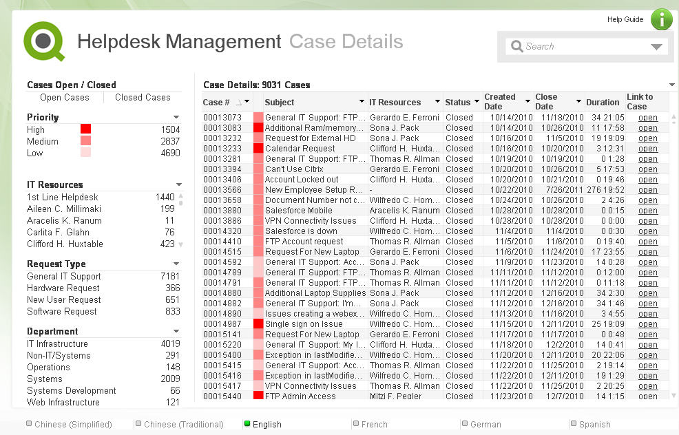
I have written a technical brief on how a silent legend was created in these three demos. Check it out.
-
UK Government investing in Data Literacy
Across government, departments are building data capability by recruiting analysts and data scientists to support decision making, operational deliver... Show More
Across government, departments are building data capability by recruiting analysts and data scientists to support decision making, operational delivery and help deliver Government transformation. The Government Data Science Partnership has supported this activity by developing training, capability programmes and an active data science community of interest.
As well as increasing the number of data specialists in government, it’s also important that other communities understand the opportunity that better use of data presents.
Qlik is a big partner in many Uk government organisations and it's great to see they are taking the education on data analytics and sciences seriously with the civil service and wider groups.
Full article available here; Data literacy - improving conversations about data - Data in government
-
Become Certified at the 2018 Qonnections!
If you are joining us at Qonnections this year we recommend becoming certified! All Qlik Certification Exams are discounted to $100 USD each. Seats a... Show More
If you are joining us at Qonnections this year we recommend becoming certified! All Qlik Certification Exams are discounted to $100 USD each. Seats are limited and pre-registration is recommended. Put your Qlik knowledge to the test. Get certified in Qlik Sense or QlikView and leave with your chest puffed out a bit more!
-
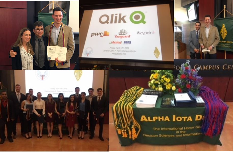
Saint Joseph's Honors Society Awards Night and More!
Last week the Qlik Academic Program attended the induction of the undergraduate and graduate students to the Alpha Iota Delta national honors society ... Show MoreLast week the Qlik Academic Program attended the induction of the undergraduate and graduate students to the Alpha Iota Delta national honors society for the Decision Sciences & Information Systems at Saint Joseph's University!
The 2018 class included 64 inductions from students across the United States. To learn more about the honors society at SJU visit
Alpha Iota Delta | Department of Decision & System Sciences | Saint Joseph's University
The Academic Program is thrilled to announce that it will fund the undergraduates one-time membership fee into the honors society and host a scholarship contest for those in the society who are in excellent academic standing and who join the Academic Program and successfully pass the Business Analyst Exam. The contest will run until the beginning of May and the winning students will receive a scholarship towards their 2018/2019 school year. Stay tuned as we will announce a winner or winners in the following months!
Included in the inducted student group was Paul Franzonia who is an SJU alumni and a Qlik employee! Paul was granted a membership as a result of his passion for continuing to support the university and encourage the students to pursue careers in Analytics just as he did!
-
Introducing qdt-lui
If you follow our blog posts regularly, you'll know we've been working on a library called qdt-components which includes a bunch of custom components ... Show MoreIf you follow our blog posts regularly, you'll know we've been working on a library called qdt-components which includes a bunch of custom components we're using in our Qlik-powered apps. We've been using Bootstrap 4 with reactstrap, which is a collection of React components that use Bootstrap 4. The thing is that made Bootstrap 4 a dependency, and many of its styles are global, and that was a problem. We also wanted to be able to use Qlik's own Leonardo UI as a general style guide, but we needed the functionality of things like Bootstraps dropdowns. So we've been working on a new library called qdt-lui, which is a collection of React components that use Leonardo UI, Just today we finally finished replacing all of the reactstrap components in qdt-components with qdt-lui components! There's still a bit of styling to touch up on because of this transition, but for the most part it's looking and working great.
So the general idea is very similar to reactstrap, but instead of creating React components that use Bootstrap for styles, we use Leonardo UI. So far, we have 6 components, and they are - LuiButton, LuiDropdown, LuiIcon, LuiList, LuiListItem, and LuiSearch. If you're familiar with Leonardo UI, you may be aware that Leonardo UI doesn't have a dropdown component at all, it's actually a select component that just reskins an actual html select element. But for our use cases, select elements are generally not very useful, so we borrowed the styles from the Leonardo UI select component and built something very similar to a bootstrap dropdown.
The LuiSearch component uses the Leonardo UI search component styles, but makes it a controlled react component which accepts as props a value and a clear method, so you can control the value from the parent component, and we can call the passed down clear method to clear the value in the parent component when you click on the clear symbol that's in the component. Again, this pattern is very similar to reactstrap, and what we've been using as a reference when building these components.
So check it out here - https://github.com/qlik-demo-team/qdt-lui and hopefully you find it useful. You'll be seeing it used a lot from us now in most of our projects on the demo team, and we'll have a lot of examples soon. Documentation is non-existent at the moment, but checking the source of each component and taking a look at the prop-types it should be pretty clear for now, but documentation will be coming. It's still marked as alpha, but we'll be moving it to beta soon. Let us know what you guys think, if you find this useful, and any features that you would like to see. Oh, and any pull requests submitted would have us spinning in our chairs excited, so if you're so inclined to contribute, that would be very, very cool.
-
Non-Gregorian calendars
The Gregorian calendar was introduced by pope Gregorius XIII in 1582. It is by far the most common calendar in the world today. Before this, the Julia... Show MoreThe Gregorian calendar was introduced by pope Gregorius XIII in 1582. It is by far the most common calendar in the world today. Before this, the Julian calendar was used.
The Julian calendar with the Anno Domini era was used from around 500 AD, and is still today used by the Christian orthodox churches. The basic rules are well known: 365 days in a year, and a leap year with an additional day every fourth year.
But this results in too many leap years, so the calendar year slowly drifts off from the tropical year. Eventually we will have midsummer in May or even April. By 1582 the difference between the tropical year and the calendar year was 10 days. This problem was fixed by the introduction of the Gregorian calendar.
The Gregorian calendar has leap years every fourth year, just as the Julian, but it doesn’t have leap years every change of a century, even though these years fulfil the rule of "every 4th year". Only every 4th century change is a leap year, the other ones are not. Hence, the year 1900 was not a leap year in the Gregorian calendar, but it was in the Julian.
The Julian calendar is easy to recreate in a master calendar in a Qlik app. All you need to do is to generate all days in a four-year cycle and assign the appropriate months and day numbers.

But there are also other calendars, and to create these you need help tables; tables that list when the month or year starts, and tables with the names of the months or the week days.
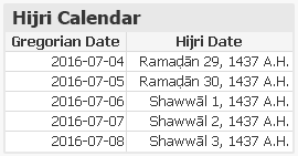
The Hijri calendar – or Islamic calendar – is used by Muslims all over the world to determine the proper days for the annual fasting and to celebrate other Islamic holidays and festivals. The first year in the calendar was 622 AD during which the emigration of Muhammad from Mecca to Medina took place. This journey is known as the Hijra.
It is a purely lunar calendar, containing 12 months based on the motion of the moon. This means that the Hijri year is always shorter than the tropical year, and therefore it shifts with respect to the Gregorian calendar.
To create a Hijri calendar, you need a table containing the month starts expressed as Gregorian dates. From this, you can generate a Hijri master calendar for your data model. It is however important to understand that this calendar, like any other Hijri calendar based on calculation, only gives estimated dates. The calendar is not based on the actual sighting of the moon, which is required for the beginning of some of the months. To get a proper calendar for religious purposes you should contact your local Muslim scholar.
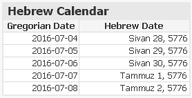
The Hebrew calendar is used today predominantly for Jewish religious observances. It is a lunisolar calendar with 12 months based on the motion of the moon. However, to prevent it from shifting with respect to the seasons, a leap month is inserted approximately every third year.
To create a Hebrew calendar, you need a table containing the month starts expressed as Gregorian dates. From this, you can generate a Hebrew master calendar for your data model.
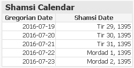
The Shamsi calendar, also known as Persian calendar or the Jalaali Calendar, is the official calendar in Iran. It is a purely solar calendar, containing 12 months originally based on the zodiac constellations. The year always starts at the vernal equinox as seen from the Tehran horizon. This means that the Shamsi calendar never shifts with respect to the tropical year. Further, no rules for leap years are needed: Depending on when the vernal equinoxes occur, some years automatically become leap years, others not.
To create a Shamsi calendar, you need a table containing the vernal equinoxes expressed as Gregorian dates. From this, you can generate a Shamsi master calendar for your data model.
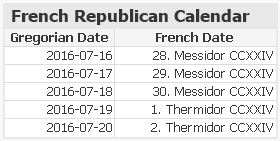
The French Republican calendar is a purely solar calendar, containing 12 months, each with 30 days. At the end of the year, there are 5 or 6 additional days. It originally started at the autumnal equinox as seen from the Paris horizon, but it is not clear whether the intent was to have the year always start at the autumnal equinox, and thereby solving the leap year question, or the intent was to use Gregorian-like leap year rules. However, it is possible to use the autumnal equinox to recreate this calendar also for our time.
So, to create a French Republican calendar, you need a table containing the autumnal equinoxes expressed as Gregorian dates. From this, you can generate a French Republican master calendar for your data model. Its practical use can be questioned, perhaps, but the poetic month names can make it worthwhile.
Scripts for all the above calendars can be found on Non-Gregorian calendars. The scripts all generate non-Gregorian dates and assign these to existing Gregorian dates.
You should see these scripts as templates and examples of how to include a non-Gregorian calendar in your app, but don't trust the content too much - there may still be errors. Change the input data, if needed, and use scripts as models for yet additional calendars.
Further reading related to this topic:


