Unlock a world of possibilities! Login now and discover the exclusive benefits awaiting you.
Analytics & AI
Forums for Qlik Analytic solutions. Ask questions, join discussions, find solutions, and access documentation and resources.
Data Integration & Quality
Forums for Qlik Data Integration solutions. Ask questions, join discussions, find solutions, and access documentation and resources
Explore Qlik Gallery
Qlik Gallery is meant to encourage Qlikkies everywhere to share their progress – from a first Qlik app – to a favorite Qlik app – and everything in-between.
Qlik Community
Get started on Qlik Community, find How-To documents, and join general non-product related discussions.
Qlik Resources
Direct links to other resources within the Qlik ecosystem. We suggest you bookmark this page.
Qlik Academic Program
Qlik gives qualified university students, educators, and researchers free Qlik software and resources to prepare students for the data-driven workplace.
Recent Blog Posts
-
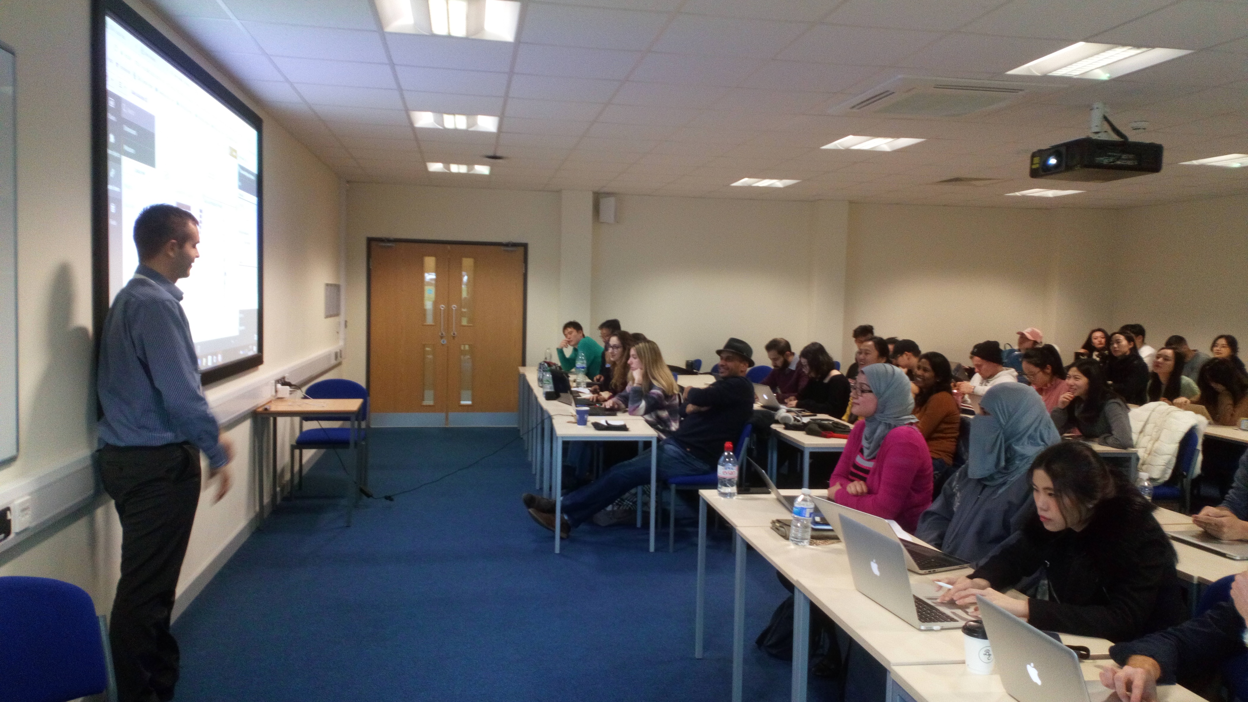
Henley Business School embraces Qlik Sense
Yesterday my self and two of my colleagues Paul Styles and Jamie Lowe presented content on the current digital economy, Qlik's role in this expanding ... Show MoreYesterday my self and two of my colleagues Paul Styles and Jamie Lowe presented content on the current digital economy, Qlik's role in this expanding Data Analytics industry and a product workshop with a group of student from Henley Business School in Reading.
Most of these students were preparing for their final projects which would look at a data project from design to implementation and thus products like Qlik offer great insights for their learning, not only for the projects they were looking to undertake, but also as potential career paths.
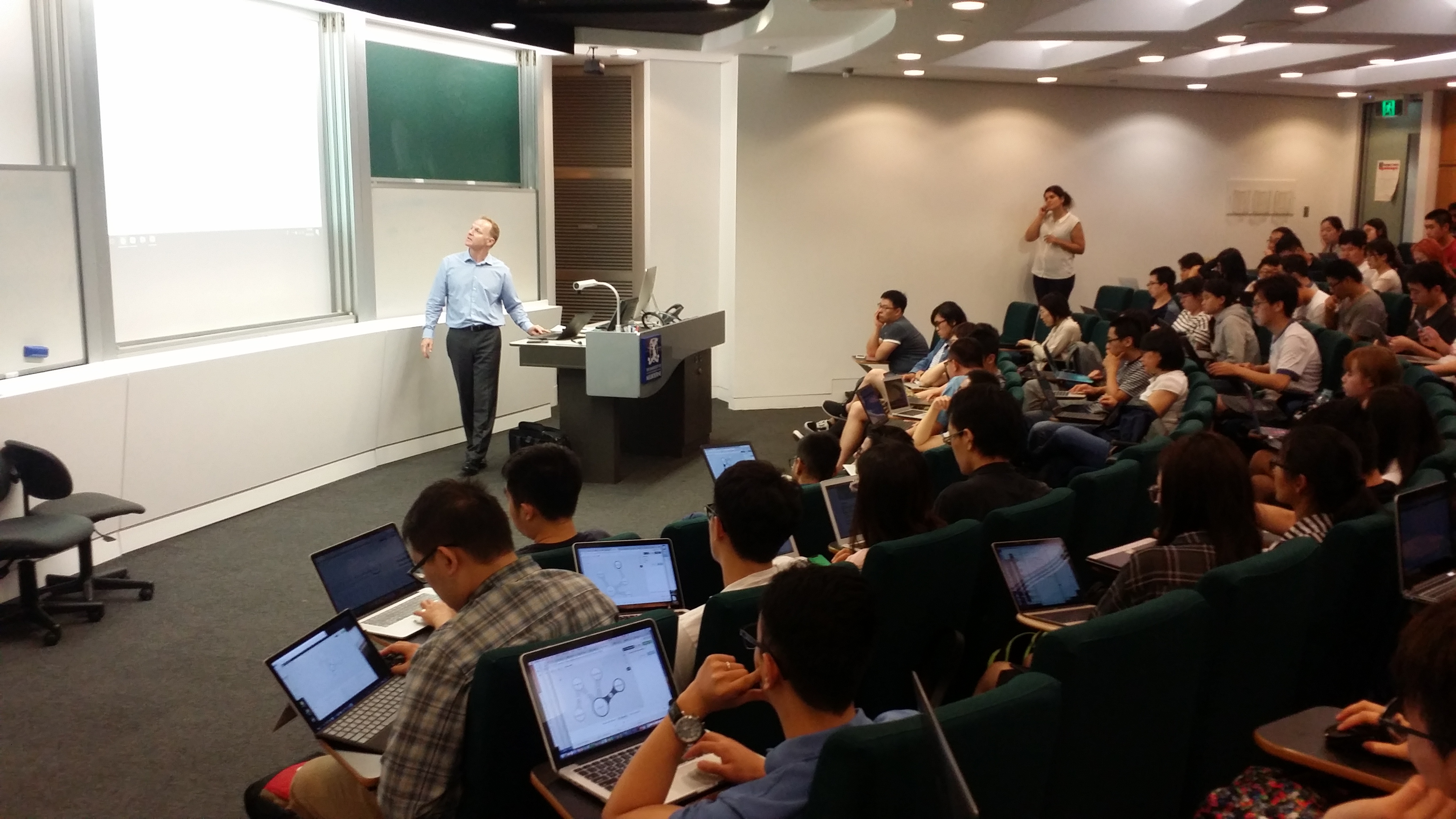
I'd also like to make a shout out to my colleague Jamie Lowe, who has been at the company for only 3 months but explained the concepts of Qlik's associate model very effectively despite his short time with the company. A great learning experience all round and here is a picture of him presenting the product message.

-
ICYMI: Not Another 2017 Year-In-Review Post
Well guys - where do I begin? – Ah I got it, Happy New Year! <sigh> It feels like only yesterday that I was writing my first blog for 2017. However, a... Show More Well guys - where do I begin? – Ah I got it, Happy New Year! <sigh> It feels like only yesterday that I was writing my first blog for 2017. However, after a long break, I’m excited to get back to work and contribute towards another prosperous year at Qlik! I didn’t want this to be another one of those “Year-in-review-type” posts…..so…I cleverly disguised it to highlight some of our product achievements during 2017.
  Think about it as a sitcom clip-show. So much Qlik goodness has transpired over the past year not only is it difficult to cover everything that has happened with the product, but as a consumer, I know it's difficult to keep track of it all, so I ‘ll do my best to summarize and consolidate where I can. This post is a bit long - so for some of you, I expect you to bookmark it and use it for later reference if needed.
ENTER TO WIN $50 Amazon Gift Card - Rules Below
So, let’s begin.
For those of you who want the short, short version:
- Qlik GeoAnalytics
- Qlik Sense 3.2
- QlikView Converter
- Qlik Sense Chat Bot
- Data Connectivity
- Qlik Sense June 2017
- Advanced Analytics Integration
- Qlik Sense September 2017
- Qlik Sense November 2017
- Qlik Sense Mobile
- Qlik's Associative Difference
Qlik GeoAnalytics
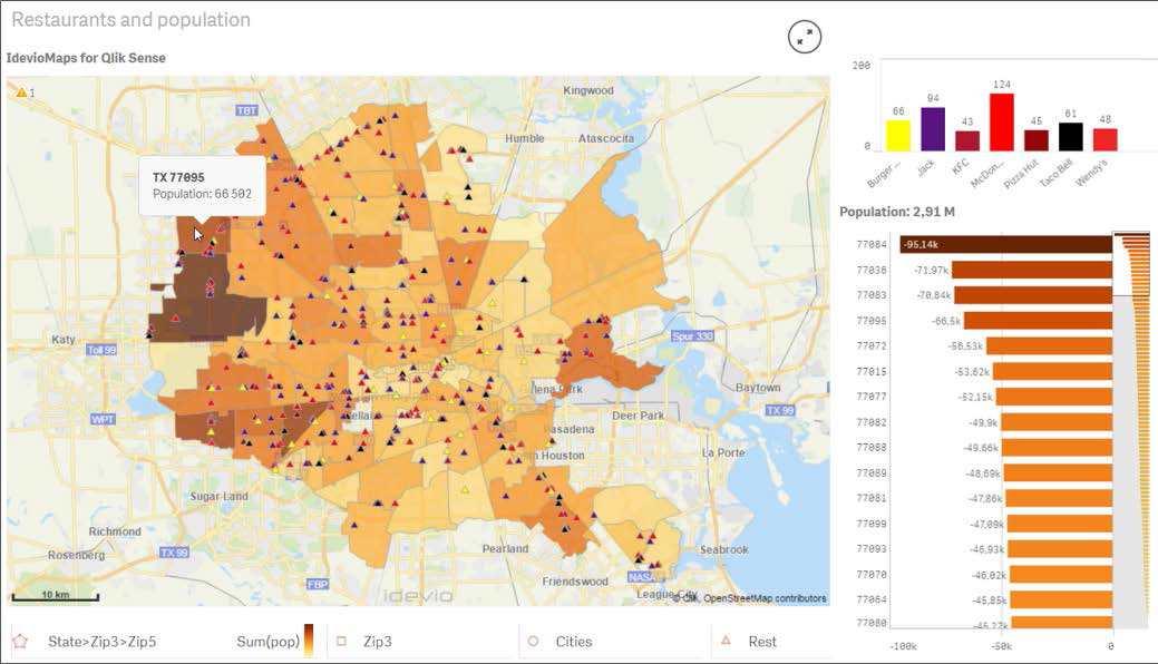 In January of 2017 – we kicked off the then new year with an acquisition of our Sweden-based partner, Idevio, creator of Idevio Maps. We introduced the recently acquired product as Qlik GeoAnalytics. Currently available as an extension for both Qlik Sense and QlikView, Qlik GeoAnalytics goes beyond traditional “points on a map” and adds a broader range of capabilities to support advanced geoanalytic use cases. During 2018 (no specific time-frame yet) we plan on integrating Qlik GeoAnalytics directly into Qlik Sense, so stay tuned.
ICYMI: Introducing Qlik GeoAnalytics
Qlik Sense 3.2
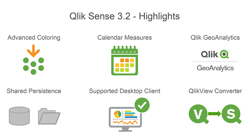
Soon after, in March 2017 - we announced our first release of Qlik Sense for the year, version 3.2. 3.2 added the ability to easily create time-based measures (Calendar Measures), included additional chart options to support custom colors and color assignments, introduced the QlikView Converter and added a new configuration to improve the performance and stability of multi-node deployments (Shared Persistence)
ICYMI: Introducing Qlik Sense 3.2The QlikView Converter
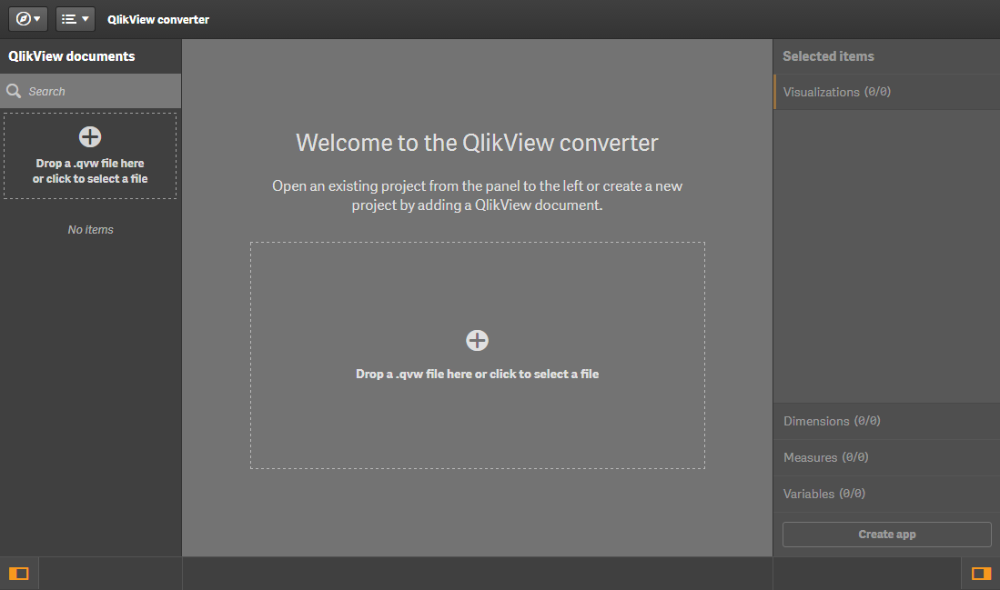 With version 3.2 we included a utility found in the Dev Hub that simplifies converting a QlikView document (.qvw) over to a Qlik Sense app (.qvf). You simply upload your .qvw to the converter to be analyzed, and it will extract the data model, script, measures, dimensions, expressions, variables and even compatible visualizations. The user can then choose what they want to convert to create a starter Qlik Sense app. Next they can create new or modify existing visualizations using the assets that were already available in QlikView.
ICYMI: QlikView converter - Qlik Sense - YouTube
Qlik Sense Chat Bot
 April 2017 set a new milestone for Qlik by pushing the boundaries of analytics. We demonstrated the art of the possible using the Qlik platform, its awesome APIs, and various 3rd party technologies - to create the first ever Qlik analytics chat bot. Simply stated, imagine getting your answers to your business questions by asking your digital assistant. Since the original bot debuted at the Gartner BI Bake-off and Qonnections there has been tremendous interest in this concept, which has evolved rapidly over the 2nd half of 2017. There is now a new community group: https://community.qlik.com/groups/qlik-chatbots with many supporting resources and our own Todd Margolis is leading the charge to help enable our community to take advantage of our two open-source Qlik Bots. Whether you’re a business user and want quick and easy access to your KPIs on the go or you’re a developer and want to extend them with new capabilities or integrate Qlik into your existing bots, we’ve got you covered.
ICYMI:
- Original Concept and video
- It's a Qlik Bot invasion
- Qlik Sense Bot with Node.js and Enigma.js
- Ask the Experts: Qlik Bot webinar presentation
Data Connectivity
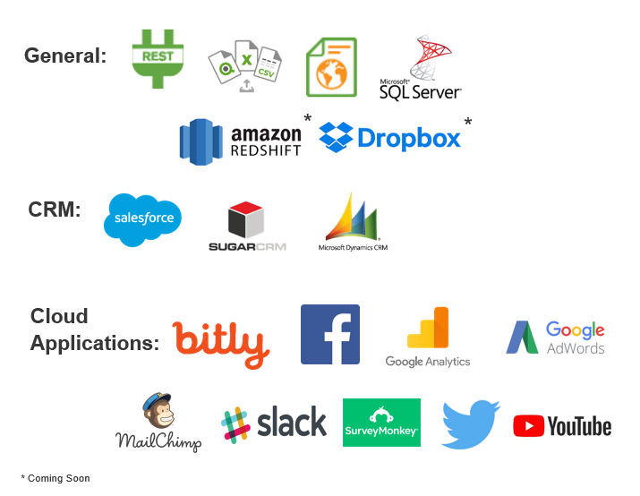 Over the course of 2017 Qlik Sense and Qlik Sense Cloud had many improvements, especially in the area of connectivity. In May we introduced the first integration of our Web Connectors package to Qlik Sense Cloud – starting with access to Twitter, Facebook and Google Analytics. Then in July we introduced on premise connections from Qlik Sense Cloud starting with MS SQL as well as the Web file connector. During 2017 we delivered over 20+ connectors to Qlik Sense and Qlik Sense Cloud Business including Dropbox, REST, Amazon Redshift, YouTube and many more.
ICYMI:
- Qlik Sense Cloud Business and the Web Connectors
- Qlik Web Connectors for Qlik Sense, QlikView and Cloud
- Qlik Sense Cloud Business Update - MS SQL, Web File and more!
Qlik Sense June 2017
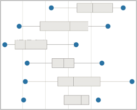
In addition to the aforementioned connectivity we also debuted our new release schedule and product naming convention when delivering Qlik Sense June 2017. No more dot releases for us – new releases are now identified by the month they are delivered in. June 2017 brought us new visualizations (Histogram, Distribution and Box plots), enhanced visual data preparation features that support data profiling and data quality and a new Advanced Analytics integration framework – allowing you integrate with advanced analytics engines such as R and Python.
ICYMI:Take a look at Qlik Sense June 2017
Advanced Analytics Integration
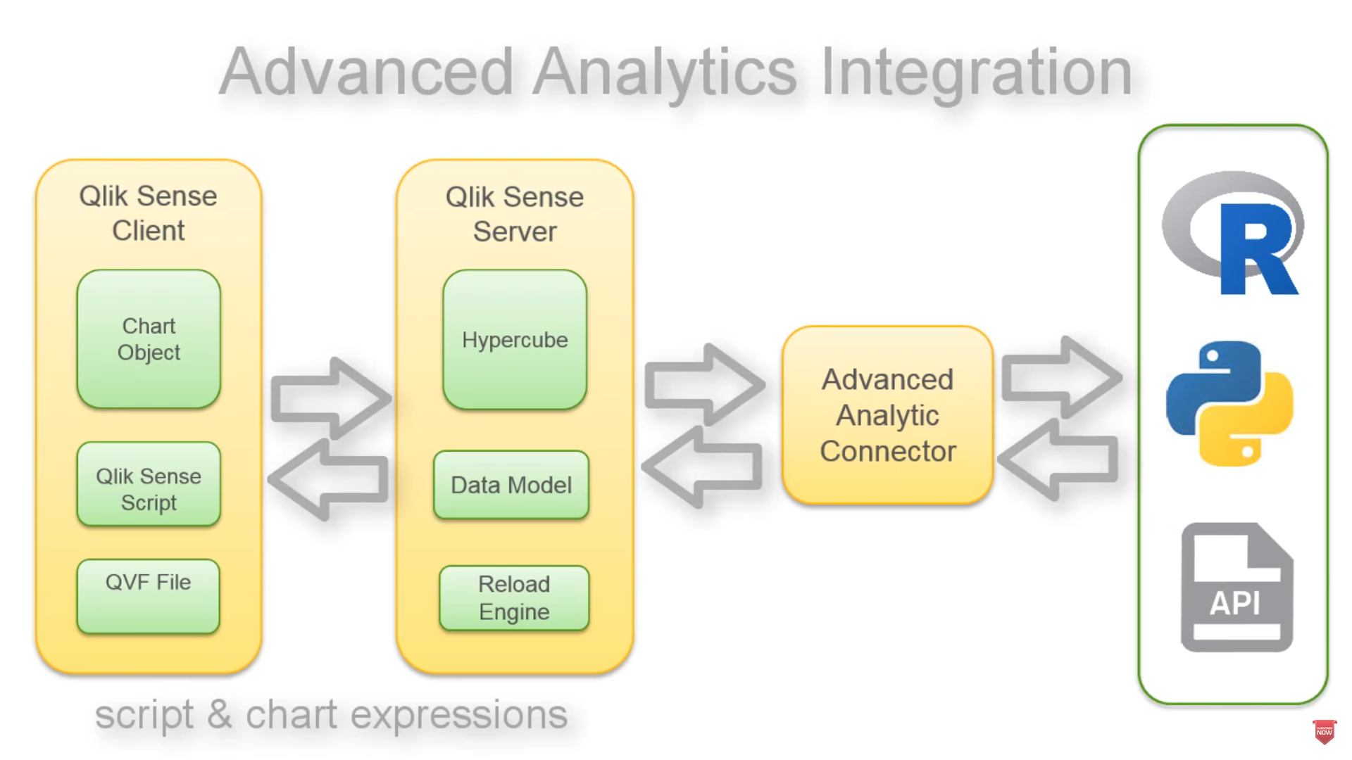
Qlik Advanced Analytics Integration (AAI) enables direct server to server data exchange between Qlik Sense and 3rd party calculation / analysis engines via a connector or what we also call a plugin. So for example, a specific forecasting function that is part of an R library can now be called from within Qlik script and chart expressions and calculated on the fly. Passing the results back to the Qlik analysis engine and subsequent visualizations. With this capability we now support the APIs that provide connectivity to such engines and provide starter connector projects for R and Python.ICYMI: Introducing Qlik Advanced Analytics Integration
Qlik Sense September and November 2017
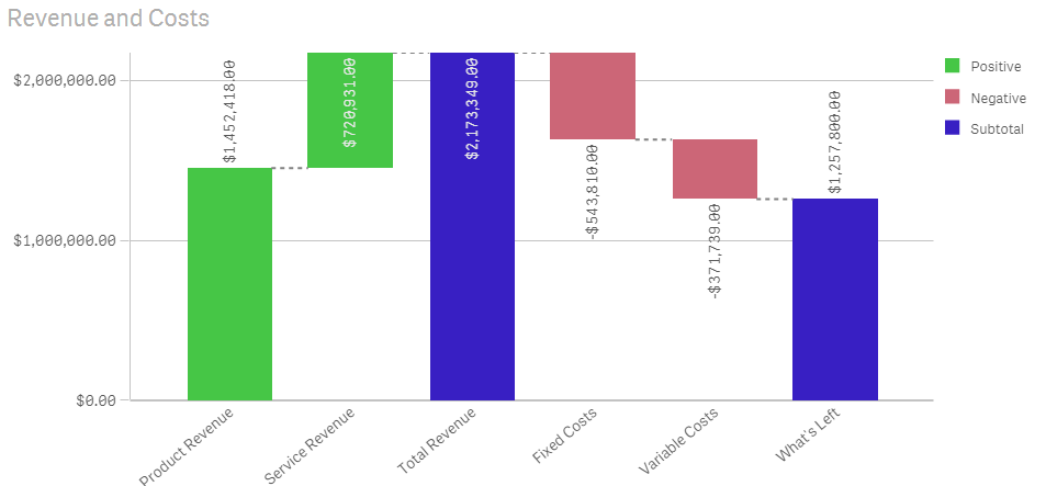
Continuing our commitment to deliver iterative improvements and features every 10 weeks, we released our September and November 2017 releases, which introduced our new Waterfall chart, continuous transformations using visual data preparation, our Qlik Sense Mobile app, visualization and navigation improvements and the introduction of our extension certification pilot.
ICYMI:
- Qlik Sense September 2017 - What's New
- What's New in Qlik Sense November 2017Qlik Sense September 2017 - What's New
- Certified Extensions - Coming to a Cloud Near You!
Qlik Sense Mobile (offline)
Originally released to select participants in June, the Qlik Sense Mobile app for iOS became available to customers and partners in the Apple App Store later in the year. This iOS app enables its users to connect to their Qlik Sense Enterprise Server and download a local copy of their Qlik Sense app directly to their iOS device where they can analyze data on the device just as if they were connected to the server, allowing them to take Qlik Sense with them on the go in a disconnected state. (at this time Qlik Sense Mobile is for iPad only – a version for the iPhone is expected to be release early this this year.)ICYMI:
Qlik’s Associative Difference
 Finally, analytics is more than just creating charts, it’s about finding answers. Therefore, I’d like to give an honorable mention to our team, who has created resources to help our prospects, customers and partners clearly understand the benefits of Qlik’s Associative Difference, powered by our patented associative technology. Sometimes referred to by many different names (Associative Experience, Associative Model, Green-White-Grey), Qlik’s Associative Difference separates us from those traditional query-based visualization tools. Qlik’s Associative Difference allows you to explore data freely in any direction, automatically associating every dimension in the data model which visually reveals how the data are related using the colors green, white and grey - AND - without leaving any data behind.
ICYMI:
- My Pleasant Surprises - Qlik's Associative Difference
- Try it for yourself: Associative-Difference - Demo
Well guys – that’s it – your Qlik 2017 Year In Review – oh wait.
 - I said I wasn't doing a "year-in-review" post, ah @#$%&!.
Personal Giveaway Rules:
Do you have some interesting Qlik highlights or discoveries during 2017 that you would like to share? We want to know. Post them in the comments below OR if you would like to participate in my personal giveaway with a chance to win a $50 Amazon Gift Card (claim code) post a tweet using twitter http://twitter.com/ with your 2017 Qlik highlight or discovery and tag me using @mtarallo along with the hashtag:
#Qlik2017Highlights
...you will then be entered into a reviewed, random drawing to receive $50 Amazon Gift Card(claim code). Winner will be selected using Qlik's Twitter Connector and Qlik Sense app which will draw a random tweet using the hashtag: #Qlik2017Highlights. Winner will be announced on Twitter by @mtarallo on February 6th 2018 [UPDATE: Feb 13th 2018] and in the Tuesday edition of the Qlik Design Blog. Entry must be an interesting or valid Qlik highlight or discovery - if not it will be discarded and the next entry will be selected at random.
Contest starts Tuesday Jan 9 2018 and ends on Tuesday Jan 30 2018. We want to hear from you!
Enjoy!
Regards,

-
Data Literacy – Tell me a Story
Data literacy is not only about understanding data, but it's also about telling the right story within the data.Nowadays, one can scarcely do research... Show MoreData literacy is not only about understanding data, but it's also about telling the right story within the data.

Nowadays, one can scarcely do research in business without hearing about the need to use data, the need to digitally transform their business, and the need to increase data literacy skills. We know that the need for the four data literacy skills is paramount in today’s economy and working environment.
Those skills include the ability to read, work with, analyze, and argue with data. We also know that organizations need to have a culture where the data literacy DNA flows and weaves itself through to bring data and insight to the forefront of decisions. One key piece that may seem like it goes under the radar but is starting to come to the forefront: data storytelling skills. What is data storytelling and how does it fit in with data literacy? Why does it matter? And how can one improve their skills within data storytelling? Throughout this blog post, we will illuminate this skill, and discuss why everyone should learn the art of data storytelling and how it is a key to driving data insight correctly.
To read more visit https://blog.qlik.com/data-literacy-tell-me-a-story

-
The University of Melbourne
The Qlik Academic Program hosted a workshop for a class of students learning Data Warehousing at the University of Melbourne!. The workshop was facil... Show MoreThe Qlik Academic Program hosted a workshop for a class of students learning Data Warehousing at the University of Melbourne!. The workshop was facilitated by Lee Mathews a Solution Architect for Qlik! Lee hosted the workshop in the Cloud and 100 students were in attendance!
If you would like a Qlik presentation, email academicprogram@qlik.com
-
Paginating data with Qlik Sense
One of the most useful features of Qlik Sense for me when developing a front-end is how easy it is to paginate data. Any front-end developer knows tha... Show MoreOne of the most useful features of Qlik Sense for me when developing a front-end is how easy it is to paginate data. Any front-end developer knows that updating thousands of dom elements is not exactly ideal, because dom updates are slow. But Qlik Sense makes it so easy to avoid ever having to do that.
For instance, take a look at the location dropdown for the Solar Eclipse demo at https://webapps.qlik.com/solar-eclipse/index.html. There’s over 29,000 rows there! But, here’s the trick – there’s only ever 10 rows in the dom at any time, and when a user scrolls what’s actually happening is the dropdown is receiving new data from Qlik Sense.
To paginate data with Qlik Sense is pretty simple. With enigma.js you’ll just create your object, either a hypercube or a list object, like usual, but you don’t need to pass it any qInitialDataFetch attribute. Then anytime you need some data, you just call a method to get data. Which method you call depends on your object. For a straight hypercube, you’d just call getHyperCubeData method like below -
doc.createSessionObject({
qInfo: {
qType: "visualization"
},
qHyperCubeDef: {
qDimensions: [
// qDimensions
],
qMeasures: [
// qMeasures
]
}).then((object) => {
object.getHyperCubeData('/qHyperCubeDef', [
// this will fetch 1 page of data, but you could request multiple pages by adding more qPages here
{
qTop: 0,
qLeft: 1,
qHeight: 2,
qWidth: 10
}
]).then((data) => {
// do stuff with data
});
});
If your hypercube is in pivot, stack, or tree mode, or if your object is a list object, you’ll have to use the corresponding method in place of getHyperCubeData, which you can find here https://help.qlik.com/en-US/sense-developer/September2017/Subsystems/EngineAPI/Content/Classes/GenericObjectClass/GenericObject-class.htm.
If you’re using the Capability APIs, while not technically supported, the same methods work with the object that is returned from the promise (not the layout returned in the callback).
-
Super Bowl LII
2018 Super Bowl LII happens this Sunday, February 4. Check out this demo app to get ready for some football! Access wealth of historical stats and fac... Show More
2018 Super Bowl LII happens this Sunday, February 4. Check out this demo app to get ready for some football! Access wealth of historical stats and facts, such as:
- The Patriots with their record 10th appearance have a chance to tie the Steelers for most wins with six.
- While Nick Foles will be making his first appearance in the Big Game, Eagles’ quarterbacks have totaled four touchdowns in their two appearances.
- The Big Game on Sunday will be the 19th game played indoors and only the 5th on field turf. The Patriots are 4-4 indoors while the Eagles are 0-1 in the Big Game.
- Tom Brady and Danny Amendola have a chance to tie the record for most touchdowns by a quarterback/wide receiver combo on Sunday. Jerry Rice and Joe Montana hold the record combining for four touchdowns.
- NBC will tie CBS with the most broadcasts of the Big Game on Sunday with 19 each. Al Michaels will extend his record to 10 appearances as an announcer for the Big Game.
-
Villanova University
The Qlik Academic Program presented to the Finance Faculty members at Villanova University this week! Qlik Sense can solve all your financial analysis... Show MoreThe Qlik Academic Program presented to the Finance Faculty members at Villanova University this week! Qlik Sense can solve all your financial analysis needs! The professors were very impressed with the course materials they can use to build their curriculum and the NEW QUALIFICATION exam where students can test their product knowledge to earn an Academic Program Qlik Sense Qualification! Villanova University has been a program member for many years and we are excited to begin working with their Finance professors!

If you would like a Qlik presentation, email academicprogram@qlik.com
-
The Little Equals Sign
In QlikView, as well as in Qlik Sense, there are numerous places where you can enter texts or expressions: In text objects, as measures in charts, as ... Show MoreIn QlikView, as well as in Qlik Sense, there are numerous places where you can enter texts or expressions: In text objects, as measures in charts, as labels of objects, in variables, etc. If you start the text with an equals sign, this tells QlikView that “here comes a formula”. So, QlikView evaluates the string and calculates the expression instead of just treating it as a text constant.
Sometimes you must to use an equals sign, and sometimes not. But how can you know whether you must use an equals sign or not?
Basically, QlikView can interpret the text in two ways; either as a text (i.e. as a value) or as an expression. And what QlikView does by default varies from place to place.
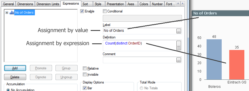
In a chart measure (the expression), the text is interpreted as an expression. This means that you do not need an initial equals sign. It is OK to enter one anyway – it will not change the interpretation. This is an assignment by expression. This means that the value will be recalculated every time the user clicks. If you instead want to show the text as text, and not evaluate it, you need to enclose it in single quotes. There are many places in QlikView that behave this way: Measures, background colors, show conditions, calculation conditions, etc.
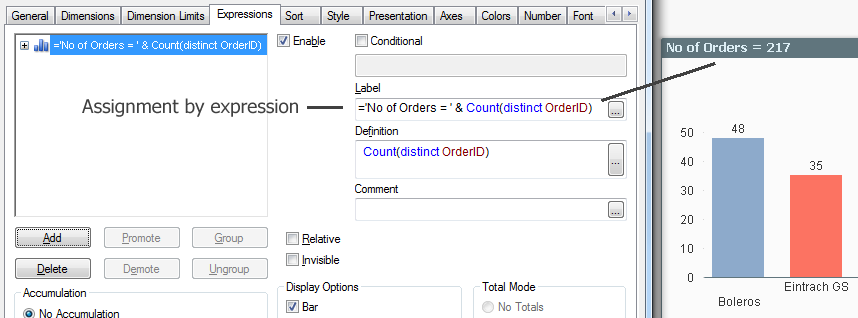
This is very different from e.g. QlikView Text boxes. Here, the text is interpreted as text. This is an assignment by value. This means that if you write an expression, it will not be evaluated unless it starts with an equals sign. Many places in QlikView behave this way: Text boxes, labels, Set statements, dollar expansions, etc. All places where it makes sense to use a plain text or a simple value behave this way.
Variables need a couple of extra words. Normally, you assign a variable by value; either in the script using a Set or Let statement, or in the user interface through an Input box or in document properties (Variables sheet).
An alternative is to use an assignment by expression. Then the value of the variable will be recalculated every time the user clicks, before it is used in other formulas. Just make sure that the little equals sign is there, and it will work.
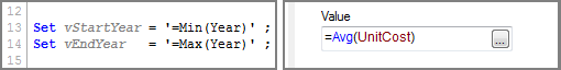
Dollar expansions use exactly the same logic. If you have a dollar expansion without an equals sign, the enclosed text will be read as-is and used as a variable name. But if you instead use an equals sign, the enclosed text will be evaluated before it is expanded.
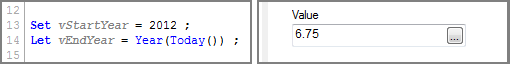
For example, assume that the variable vEndYear has the value of ‘2014’. Then
$(vEndYear) will be expanded as ‘2014’
whereas
$(=vEndYear-1) will be expanded as ‘2013’
Finally, a small word of warning: The initial equals sign means an extra calculation every time the user clicks. And every small calculation uses some CPU time and carries a small performance penalty. Hence, you should not use too many calculated expressions. Use them only in the cases where you really need them.
The little equals sign is your friend. Use it wisely.
Further reading related to this topic:

-
When Not to Average
During a recent conversation with colleagues the topic of chart types that should be avoided when Average is used was discussed. Do you know which ch... Show MoreDuring a recent conversation with colleagues the topic of chart types that should be avoided when Average is used was discussed. Do you know which charts you should avoid using if you want to show the Average? In both Qlik Sense and QlikView there are 3 chart types:
- Stacked Bar chart
- Pie chart
- Treemap (Qlik Sense) and Block chart (QlikView)
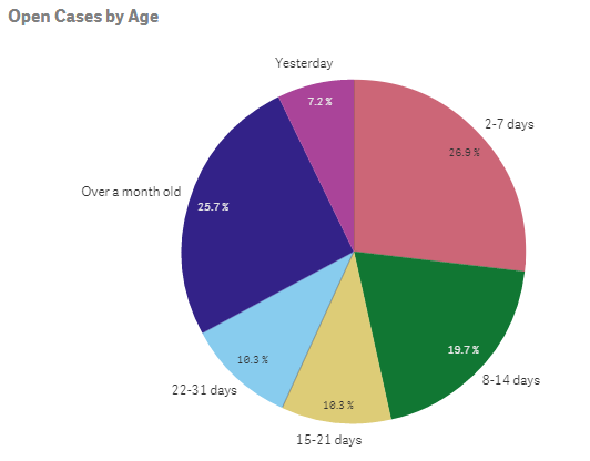
In these charts, the sum of the different parts should equal the total (100%). When Average is used in the expression of these charts that is not the case – the sum of the parts does not equal the total. (Note that this does not include a Grouped Bar chart only a Stacked Bar chart). For example, in the Helpdesk Management demo, the pie chart below is used to show the number of open cases by age. If the number of open cases (or percentages as displayed in the chart) were totaled they would equal all of the open cases and 100%.
Let’s take a look at another example in a stacked bar chart. In the Human Capital Management demo, the Demographics sheet has several visualizations that display demographics of employees based on their gender (red = unknown gender, yellow = female, blue = male).
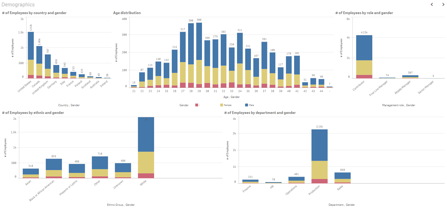
Each bar represents the total number of employees for the specified dimension but it is further broken down by the gender dimension so you can see how the parts add up to the whole.
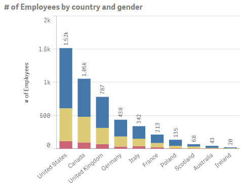
In the chart above there are 1.52K employees in the United States (904 are male, 494 are female and 114 are unknown). The gender totals add up to the total number of employees in the respective country.
Now there may be exceptions to this rule depending on the story that you are telling with your data but in most cases, it is fair to say that you should not use Average in the expression of a Stacked Bar chart, Pie chart, Treemap or Block chart. So this does not mean you should shy away from the Average (Avg) function because there are many instances when it can and should be used but when you want to display the ratio to the total, avoid using Average.
Thanks,
Jennell
-
Teaching the load script new tricks
QlikView has extremely powerful load script syntax which in 99% of the cases will solve every problem you have or might encounter. But sometimes you r... Show MoreQlikView has extremely powerful load script syntax which in 99% of the cases will solve every problem you have or might encounter. But sometimes you run into one of those edge cases where the standard load script syntax is not enough or the end result would be un-maintainable.
I recently ran into one of those cases when I was analyzing first names in the US. Typically with both first and last names you have many different variations of the same name.Take Susanna for example, in Sweden it’s probably Susanne or in Russia Syuzanna. Although spelled differently they do belong to the same family. But how should I group them together in QlikView?
An unlikely hero to the rescueI settled on implementing a SoundEx algorithm, http://en.wikipedia.org/wiki/Soundex, which is commonplace in most database software nowadays. However, being somewhat lazy I quickly realized that replicating the algorithm using load script syntax would take me forever so I settled on something different.
A Google search later I had discovered the SoundEx algorithm implemented in JavaScript, http://creativyst.com/Doc/Articles/SoundEx1/SoundEx1.htm#JavaScriptCode.
Perfect, just what I needed!
The QlikView macro module supports both VB and JScript (Microsoft’s variant of JavaScript) so I could easily copy and paste the algorithm as a new macro module in QlikView. Now from my load script I can call that module during reload as such,Load
Name,
//Call macro module SoundEx() – returns soundex code.
SoundEx(Name) as SoundEx
From …
Great! Now all the loaded names have a SoundEx code attached to them which would allow me to count the names within those groups instead of only basing my analysis around the count of a single name.
This was just one use-case for how you could leverage macro modules during reload.
Seeing as JavaScript also has implemented regex you could also leverage macro modules to do phone number or address validation. With the recent explosion of open source JavaScript code on the web, chances are someone before you already built a module of what you are looking for.A final word or warning, do exercise caution and don’t push all your logic into macro modules just because you can.
Also before you consider using macros for the front end, read this excellent post by HIC http://community.qlik.com/blogs/qlikviewdesignblog/2014/04/28/macros-are-bad
-
Data Literacy Survey Reveals Skills Gap
Just how data literate is the US? Well, not nearly as literate as it needs to be.As the world continues to play catch up with its data literacy skills... Show MoreJust how data literate is the US? Well, not nearly as literate as it needs to be.

As the world continues to play catch up with its data literacy skills, we here at Qlik have been trying to gather as much information as we can to understand where individuals and organizations feel they are with their data literacy skills. Remember, data literacy is defined as the ability to read, work with, analyze, and argue with data. The need to develop skills within data literacy is imperative and vital for organizations to stay at the top of their game. In a Forbes article from 2017, it was said: “Increasingly, this data literacy divide will impeded organizations of all shapes and sizes from reaping higher rewards from their data investments.”
The Academic Program is here to ensure that our students do not see the affects of this skills gap. By joining the program, students get free software, free training, free data literacy materials, and the opportunity to take a free Qualification exam which can be used to show future employers their Qlik skills.
To read the full article visit Data Literacy Survey Reveals Skills Gap | Qlik Blog
Visit The Qlik Academic Program and reapply to get all of these amazing resources!
-
Data Literacy Survey Reveals Skills Gap
Just how data literate is the US? Well, not nearly as literate as it needs to be.As the world continues to play catch up with its data literacy skills... Show MoreJust how data literate is the US? Well, not nearly as literate as it needs to be.

As the world continues to play catch up with its data literacy skills, we here at Qlik have been trying to gather as much information as we can to understand where individuals and organizations feel they are with their data literacy skills. Remember, data literacy is defined as the ability to read, work with, analyze, and argue with data. The need to develop skills within data literacy is imperative and vital for organizations to stay at the top of their game. In a Forbes article from 2017, it was said: “Increasingly, this data literacy divide will impeded organizations of all shapes and sizes from reaping higher rewards from their data investments.”
To read the full article visit Data Literacy Survey Reveals Skills Gap | Qlik Blog
To learn more about Qlik's Data Literacy program visit Course: Data Literacy Program
-
Coloring a Scatter Plot
It is known as the Skittles effect. It happens when a developer creates a scatter plot and decides to color the plotted values by the dimension. This... Show More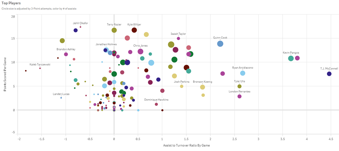
It is known as the Skittles effect. It happens when a developer creates a scatter plot and decides to color the plotted values by the dimension. This practice not only does nothing to tell the data story, it actually distracts the user from understanding what the data is actually saying. Have no fear; there are a couple of solutions to this problem. In this blog, I will discuss one: coloring the dimension by an expression.
Using an expression to color your plotted values
Both QlikView and Qlik Sense allow users to color the plotted values using an expression. In Qlik View, this is achieved by going to the expressions tab. Under the expression simply select Background color and enter the color expression.
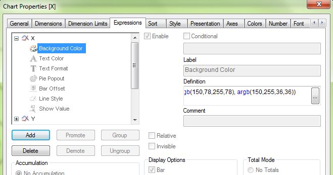
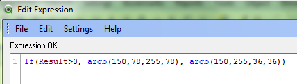
This expression is telling QlikView to color all plotted values greater than zero as green, else color them red.
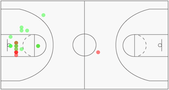
By coloring the plotted values using green and red, I can now identify which shots were made vs missed.
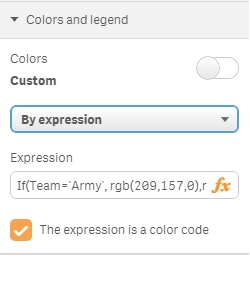
In Qlik Sense, this is accomplished by navigating to the properties panel on the right and selecting Colors and Legends. Switch the radio button off of the default setting of single color. Then select By expression, enter the color expression and make sure to check the box for This expression is a color code.
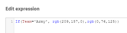
The expression defined here tells Qlik Sense to color all players from Army as gold, else color the players as blue.
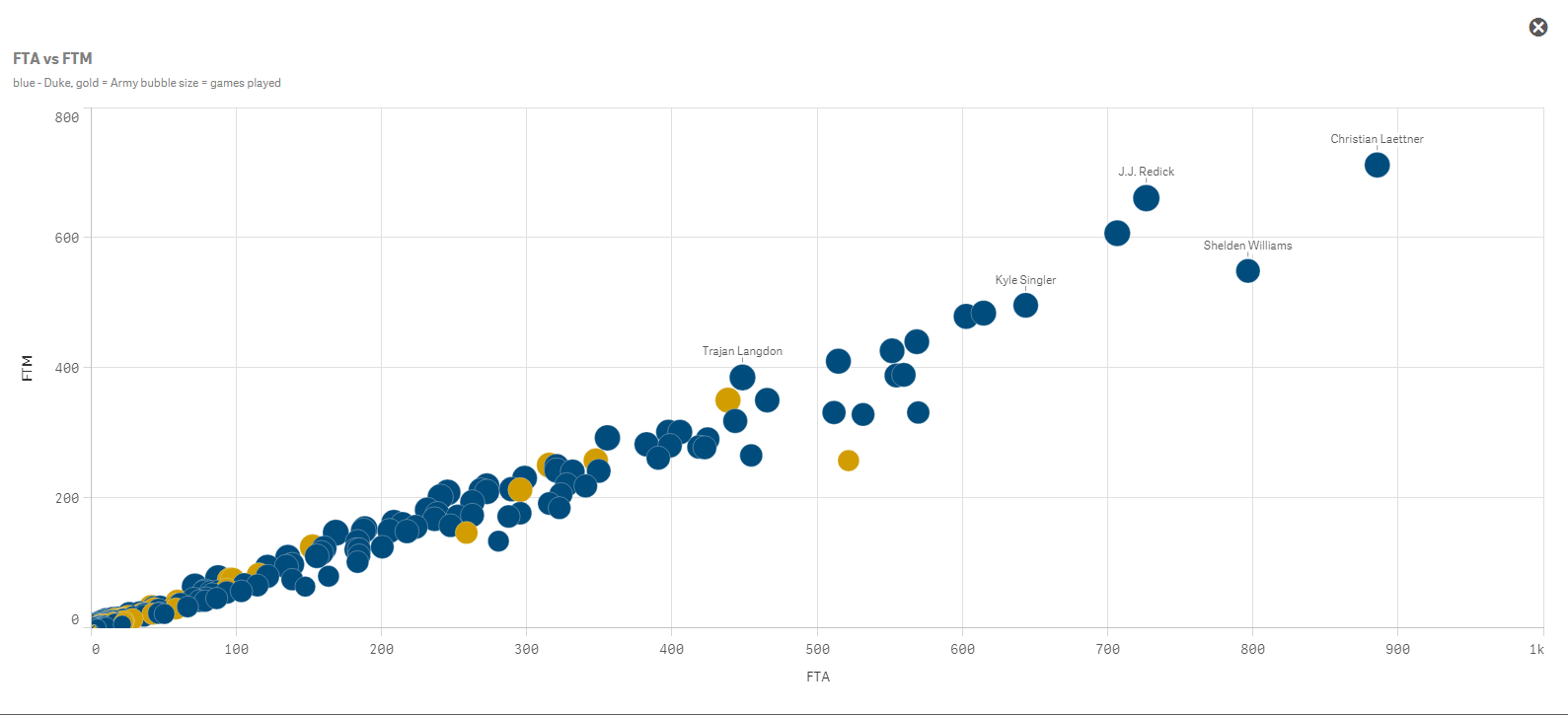
Here is how Qlik Sense will render the chart once the color expression has been defined. I can easily identify the players from Army versus the players from Duke.
One word of caution, coloring by expression is best suited for small groups of colors. I would say 3-4 colors maximum. Otherwise you start to create your own controlled Skittles effect. It is also best practice to let the user know what the colors represent. Here I utilized Qlik Sense’s subtitle field to define the colors for the users.
Happy Qliking!

-
String functions: searching from the end of the string
Qlik String functions are an extremely handy set of functions to clean, manipulate, and ultimately normalize data before (or after) loading it into an... Show MoreQlik String functions are an extremely handy set of functions to clean, manipulate, and ultimately normalize data before (or after) loading it into an app. String functions ‒ Qlik Sense
I was working with a new data set recently, among other fields the data set contains addresses, something like this:
Abbey Road, London
Since the data set doesn’t have a dedicated city field I decided to apply Subfield() to extract the City as a separate field. Easy task, right? I use the comma as a separator to split the string.
…
Subfield (address, ',', 2) as City,
…
Shortly after we decided to expand the data universe of the app to include other countries in our analysis, we ended up having multiple sources with slightly different address formats:
Abbey Road, London
Paseo del Prado, s/n , Madrid
91, Rue de Rivoli, 75001, Paris
Not great news, right? Due to the variable number of commas in the address field I can no longer use subfield to manipulate the string, or maybe I still can use it.
Searching from the end of the string
Subfield function not only takes positive values for the third parameter, it also accepts negatives values. A negative value searches from the end of the string. This will help us to extract the City while keeping my script highly readable. The new function will be something like:
Subfield (address, ',', -1)
The function above will return the first portion of the string separated by the delimiter comma (',') searching from the end of the string, right to left. The newly created "City" field contains:
London
Madrid
Paris
Right to left search in String functions
The use of negative values, or right to left search (remember the read will still be performed from the start of the string) also apply to other string functions:
- Subfield
Subfield('Abbey Road, London', 'o',-2)
Returns 'nd' (the second occurrence of 'o' starting from the end) - Index
Index('Abbey Road, London', 'o',-2)
Returns 14 (the second occurrence of 'o' starting from the end) - FindOneOf
FindOneOf('Abbey Road, London', 'oes',-3)
Returns ‘8’ because the search is for any of the characters: o, e or s, and "o" is the third occurrence starting from the right, and is in position 8 starting from the left.
I hope you find it as useful as I do.
AMZ @arturoqv

- Subfield
-
Qlik Sense Mashup - Changing Chart Dimension on the fly
There are cases where we need to switch among charts in a mashup. The easiest way is with jQuery show/hide or if you are using Angular then show the c... Show MoreThere are cases where we need to switch among charts in a mashup. The easiest way is with jQuery show/hide or if you are using Angular then show the chart based on the model value.
But what about if we have many charts, with the same measures but only the dimensions change? What if we could just change the dimension in the engine and let the engine take care of all the changes and animations?
This is possible through the Visualization API and the applyPatches() method.
Here I will explain how to create a simple dropdown that changes based on the dimension selected. Since I am using Angularjs 1.5.8 like Qlik Sense September 2017, I have created a component that
a) gets first object,
b) populates a dropdown with titles and
c) upon change, the chart is changing based on the dimension provided
First, we get the first object as usual and display it in our mashup. This is what the html looks like
<sense-object-multi-dropdownqvid="'BRjnYJ'"
height="300"
data="[
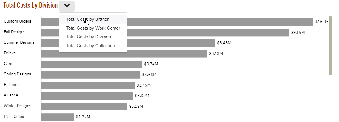
{title:'Total Costs by Branch', dimension:'Branch'},
{title:'Total Costs by Work Center', dimension:'Work Center Name'},
{title:'Total Costs by Division', dimension:'Division'},
{title:'Total Costs by Collection', dimension:'Collection'}
]"
></sense-object-multi-dropdown>
Here, in the "qvid" is the id (BRjnYJ) of the first object. In the "data" we add the title as we want it to display in our dropdown and the actual dimension.
In our components's Javascript code, we get and then show the object as usual
qlik.app.visualization.get($ctrl.qvid).then(function (viz) {$ctrl.viz = viz;
$ctrl.viz.show($element.find('#obj'))
$element.find('.qv-object-header').remove();
});
Here is the html code for the component
<div class="sense-object-multi-dropdown"><div class="v title-1">{{ $ctrl.currentData.title }}</div>
<div class="dropdown">
<a class="btn btn-secondary dropdown-toggle" type="button" id="dropdownMenuButton" data-toggle="dropdown" aria-haspopup="true" aria-expanded="false">
<i class="fa fa-chevron-down" aria-hidden="true"></i>
</a>
<div class="dropdown-menu" aria-labelledby="dropdownMenuButton">
<a class="dropdown-item" href ng-repeat="item in $ctrl.data" ng-click="$ctrl.change(item)">{{item.title}}</a>
</div>
</div>
<div class="qvobject" id="obj" height="{{$ctrl.height}}"></div>
</div>
Now, by just this, the page should have a chart and a dropdown populated.
Now, let's add the code that will change the dimension
$ctrl.change = function(item) {$ctrl.currentData = item;
$ctrl.viz.model.applyPatches([{
qOp: "replace",
qPath: "/qHyperCubeDef/qDimensions/0/qDef/qFieldDefs/0",
qValue: `\"${$ctrl.currentData.dimension}\"`
}], true);
}
Here we are telling the engine that, hey for this object (model), replace the first field (qFieldDefs) of the first dimension (qDimensions) to the one I am giving you.
That's it. Once the engine receives the new change via websocket, it will redraw automatically, without any flickering and it will animate from one chart to the next.
Attached is my entire component if you want to use it in your Angular apps. Feel free to remove all the unnecessary libraries to make it work.
Live example: Plant Operations "Total Costs by Division"
Yianni
-
Virtual Scrolling - Improving Performance of Mashups and Extensions
The problem, the solutionRecently, while making a mashup in Angular.js using the Capability APIs I noticed that my UI was performing very poorly. In p... Show MoreThe problem, the solution
Recently, while making a mashup in Angular.js using the Capability APIs I noticed that my UI was performing very poorly. In particular, making a selection in one of my custom selection boxes was basically freezing the up the entire UI for up to a few seconds! After poking around a bit, I discovered the problem: there was just too many dom elements being watched for changes.
You may have seen this problem yourself if you've ever tried to use Angular.js to create a mashup. And this problem isn't inherent to only mashups; the same problem applies to extensions. So how do we deal with it? We can use virtual scrolling.
Virtual scrolling is a way to render and watch only the dom elements that are currently in view, and changing those elements to other elements as we scroll, as opposed to actually rendering and watching all of the elements. The Qlik Sense client already does this, which, in a minute, you'll see we're going to use to our advantage.
Here's two examples to show you just what I mean. You can see that the render time is much faster on the page that implements virtual scrolling, and that the UI responsiveness when making selections on the Case IDs is drastically better.
Virtual Scrolling Example No Virtual Scrolling Example
So how can you implement virtual scrolling in your mashup or extension? I'm going to walk through an example implementing virtual scrolling in a custom listbox for a mashup, but the same idea can be applied to extensions as well.
Using what's already there
Remember I said that the Qlik Sense client already implements virtual scrolling, and that we can use that to our advantage? We're simply going to make use of the same library that Qlik Sense objects already use to implement virtual scrolling. When building mashups or extensions, it's possible to use any library the client is already using. To see the full list, you can go to the "Menu" in the Qlik Sense client and click "About," then "Third-party Software."

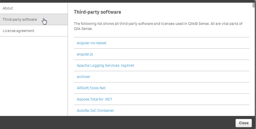
We can see in the images above that something called "angular-vs-repeat" is used by Qlik Sense, and, in this case, that's what we're after. The angular-vs-repeat library is an angular directive for virtual scrolling.
It's super easy to include this in your Angular.js based mashup.
var app = angular.module('app', ['vs-repeat']);
That's all you need to include it, since it's already loaded with the Capability APIs.
Implementing virtual scroll
Using it is pretty simple, too. In the most simple of cases, all you need to do is include the vs-repeat directive on the direct parent of an element with ng-repeat. In our example, that looks like this:
<ul vs-repeat class="cases-container">
     <li ng-repeat="case in cases" ng-click="selectCase(case)" class="{{case.qState}} case">{{case.qText}}</li>
</ul>
Resources and wrap-up
And that's basically the idea. The entire code for the example mashup is attached, and the link to the angular-vs-repeat repository on github is below. Hope this helps you improve the performance of your mashups and extensions

-
Updated Qlik Sense Certification Exams (June 2017 Release)
Qlik recently released an updated Qlik Sense Business Analyst Certification Exam, which completes the annual update of these exams. One exam is availa... Show MoreQlik recently released an updated Qlik Sense Business Analyst Certification Exam, which completes the annual update of these exams. One exam is available for each of these roles:
- System Administrator
- Data Architect
- Business Analyst
All of these exams are 50 questions to complete in 2 hours. To prepare, study the "Exam Domain Areas" and download the new PDF Study Guide from the Qlik Sense Certification web page.
A note about exam releases
The new Qlik Sense Certification Exams are based on the June 2017 Release of Qlik Sense. Our exams lag behind the product release, because they take 6 to 8 months to develop. We will only release new exams once per year, so the next exams are planned to be based on the June 2018 Release of Qlik Sense.
Previous exam versions are retired
All previous versions of the Qlik Sense Certification Exams have been retired, including the translated versions. Candidates who have difficulty because English is a second language may request an accommodation for extra time on the exam by emailing certification@qlik.com at least 10 days before they want to take their exam. Each individual must make a request for this exception.Questions? Contact certification@qlik.com

-
The Table Viewer
The table viewer is a gem.I use it for many things: to get an overview; to debug what I have done in the script; to check that all tables are linked; ... Show MoreThe table viewer is a gem.
I use it for many things: to get an overview; to debug what I have done in the script; to check that all tables are linked; to check that I don’t have any unwanted synthetic keys; to preview data. I can hardly remember what I did before QlikView had it¹.
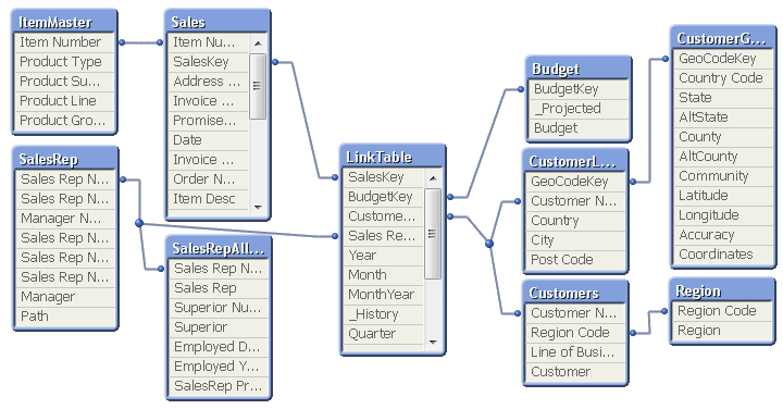
Just hit <ctrl>-T and you will see it.
I move around the tables until the structure corresponds to the picture I have in my head of the data. I tell new users developing applications to draw the wanted data model on a piece of paper so they know what the goal is. If they can't draw it on a piece of paper, they need to sit down and think. Or play around with data in QlikView until they can draw the data model. The structure seen in the table viewer then becomes an acknowledgement that the data model is correctly implemented. Or a warning that it isn't.
There are two modes of the table viewer: The Internal table view and the Source table view. The only difference is how the synthetic keys are displayed. During the script development, I always use the source table view, since it shows me exactly what I have done in the script.

If you hover above the table headers, you can see the number of records and number of fields. If you hover above an individual field, you will get the data for this specific field: Whether it is a key, the information density, the subset ratio and – if applicable – the tags.
Many, when they see the table viewer, start thinking about a graphical tool to define which source data to load. But this is not what the table viewer is – it is a viewer only. Unfortunately or luckily, whichever way you look at it…
“Unfortunately” since a graphical tool no doubt would help many people, especially in the initial phase, when they want to load data quickly just to get a look at it. “Luckily”, since you never will get the same versatility using a graphical tool as you will with a script editor. For instance, almost all advanced data transformations I have shown in previous blog posts (e.g. How to populate a sparsely populated field) would be almost impossible to describe with a graphical tool. They would at least be very complex to depict, and most likely less user-friendly than having to write the actual code.
So, if we get a graphical script generator some day in the future, it should be some kind of hybrid where scripting still is allowed and we have the best of both worlds.
Until then, I will happily use the table viewer as it is: As the best available tool to get an overview of the data model. And as one of the best debugging tools in the application development process.
And that is not bad.
¹In fact, I do remember what we did before the table viewer existed: We used a cross table (a pivot table) with the system fields $Field and $Table as dimensions and Only([$Field]) as expression. It worked, but it did not give the same overview.
-
Card style web component w/ fullscreen capability for mashups
Recently I've been working on building a mashup template that will work in the dev-hub that will have a few more advanced features than many of the av... Show MoreRecently I've been working on building a mashup template that will work in the dev-hub that will have a few more advanced features than many of the available dev-hub templates. One of these features that I thought was important was a card container for Qlik Sense objects that has fullscreen capability built in. I'd like to share that with you today.
Here's an example of a really simple mashup with just the selection toolbar, and 2 Qlik Sense objects that use the qliksense-card web component I've built - Qlik Sense Mashup.
To use the qliksense-card web component yourself, you have a couple of options. You can either install the dev-hub template and create a new mashup from the dev-hub using the template, or you can just grab the necessary files and load them into your project.
Installing dev-hub template
You can download the dev-hub template here - GitHub - qliksense-card-template. After downloading, install the template as you would install any extension in Qlik Sense. After the template is installed, you can go to the dev-hub, create a new mashup, and select "Card template" from the dropdown list of templates.
The template is really kind of bare. There's not much going on besides the qliksense-card web component and a bit of bootstrap, but it's a good way to check out how the qliksense-card web component works.
Including the files in your own project
You don't have to use the dev-hub template to make use of the qliksense-card web component. What you will need is the qliksense-card.html file and the webcomponents-lite.min.js file. The easiest way to include them is to use the RawGit CDN, example below.
<script src="https://cdn.rawgit.com/download/polymer-cdn/1.7.0.2/lib/webcomponentsjs/webcomponents-lite.min.js"></script>
<link rel="import" href="https://cdn.rawgit.com/fkabinoff/qliksense-card-template/master/qliksense-card.html">
Using the qliksense-card component
After you're all setup, whether you've generated a new project using the dev-hub template, or included the necessary files in your own project, using the qliksense-card web component is easy. All you want to do is wrap your Qlik Sense object container with the qliksense-card tag, and set the height of the Qlik Sense object with the content-height attribute of the qliksense-card tag. You'll also want to set the width and height of your Qlik Sense object container to 100%. If you've generated a project using the template, this stuff has already been done, and you can check it out and just reuse as you'd like. If you've just included the necessary files in your own project, you can still check out the template files to see how it's done. Generally, it'll look something like below
<qliksense-card content-height="300px">
<div class="qvobject" id="QV01"></div>
</qliksense-card>
-
Qlik GeoAnalytics: An example of binning
A few weeks ago, we got into a new project to create an interactive piece with the Canadian media, National Post. The goal was to illustrate the donat... Show MoreA few weeks ago, we got into a new project to create an interactive piece with the Canadian media, National Post. The goal was to illustrate the donations candidates of the Conservative Leadership Race received from the start of the race through March 2017. Qlik Sense was integrated with Qlik GeoAnalytics to visualize where the donations were coming from and which candidates received the most donations in each area.
The map below was one of our first tries, we decided to use color to illustrate the top candidate by amount collected, and by postal code.
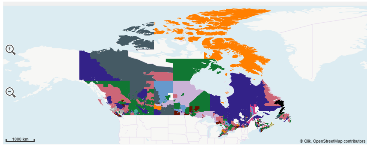
Problem with this approach appeared obvious at a first glance, postal codes areas have an insane size variance, regions such as the northern and barely populated province of Nunavut extents thousands of square miles in just one postal code while postal areas in urban zones, such as in Toronto, span a few city blocks and are hidden in the map.
So, how to make Nunavut and Toronto visible and comparable?
We decided to apply a binning operation to our data to solve most of the issues described. Qlik GeoAnalytics has a wizard that lets you chose operation, making the process seamless. The result is a new table containing squares (or hexagons) geo-polygons.
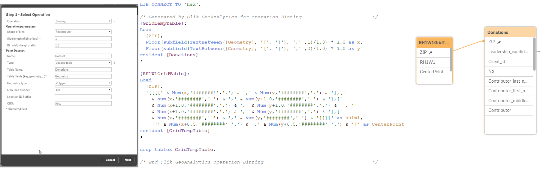
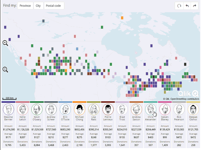
In this new map version, readers can compare areas easily without the distortion introduced by the different postal code sizes, letting us to see what’s going on in Toronto and in Nunavut at the same time.
We've added some extra cool features to the resulting Qlik Mashup. I recommend you to visit it and explore it at http://news.nationalpost.com/news/qlik
Enjoy,
AMZ


