Unlock a world of possibilities! Login now and discover the exclusive benefits awaiting you.
- Qlik Community
- :
- Discover
- :
- About
- :
- Water Cooler
- :
- Re: Chart to display success job over 24 hours
- Subscribe to RSS Feed
- Mark Topic as New
- Mark Topic as Read
- Float this Topic for Current User
- Bookmark
- Subscribe
- Mute
- Printer Friendly Page
- Mark as New
- Bookmark
- Subscribe
- Mute
- Subscribe to RSS Feed
- Permalink
- Report Inappropriate Content
Chart to display success job over 24 hours
Dear Qlikview Experts,
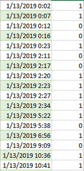
This is my table. Column A is the date and Time. Column B, '1' is success job and '0' is failure job. I was wondering how can i display the the success/failure job over 24 hours? So i can see among which period does the failure job occurs the most. However, I realized if I put time as the dimension, it would be very crowded. Is there any type of charts that can display the data in a better way?
I have also attached the sample excel file for your reference.
Best Regards
QianNing
- Mark as New
- Bookmark
- Subscribe
- Mute
- Subscribe to RSS Feed
- Permalink
- Report Inappropriate Content
hi,
may be with the function interval and relaodtime or Now
interval (now() - DATE ,'hh')
and after conditional expression in the script :
if(interval (now() - DATE ,'hh')>24,'good','bad')
bye
- Mark as New
- Bookmark
- Subscribe
- Mute
- Subscribe to RSS Feed
- Permalink
- Report Inappropriate Content
Dear Jsaintmaxent,
Thank you for your suggestion, are you able to give me a detailed explanation or could you send me the modified qvw file to easy my reference?
Thank you so much!
Best Regards
QianNing
- Mark as New
- Bookmark
- Subscribe
- Mute
- Subscribe to RSS Feed
- Permalink
- Report Inappropriate Content
hi,
in attachment, you have got an example.
Open script editor to view the function interval
Have a nice day
Do not hesitate to contact me
