Unlock a world of possibilities! Login now and discover the exclusive benefits awaiting you.
- Qlik Community
- :
- Forums
- :
- Archive
- :
- Archived Groups
- :
- Bar Chart Legend and Colors
- Subscribe to RSS Feed
- Mark Topic as New
- Mark Topic as Read
- Float this Topic for Current User
- Bookmark
- Subscribe
- Mute
- Printer Friendly Page
- Mark as New
- Bookmark
- Subscribe
- Mute
- Subscribe to RSS Feed
- Permalink
- Report Inappropriate Content
Bar Chart Legend and Colors
Hi from France
I'm using Qlik Sense Desktop June 2017.
The problem I have is that the disposition of colors in bars and in legend is not good in theis property:
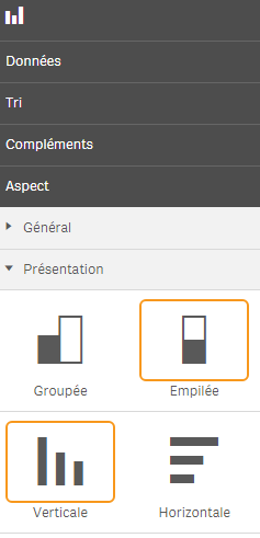
Presentation : "Stack" and "Vertical"
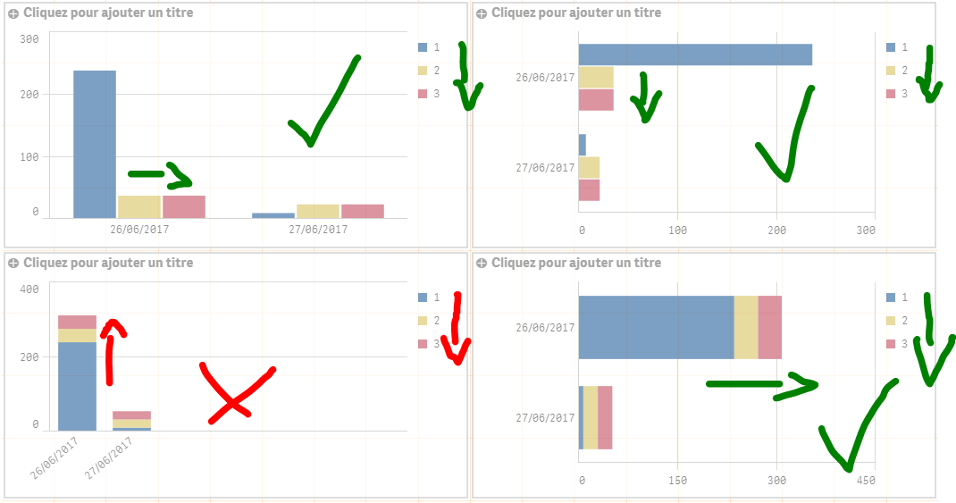
I join you the four different disposition of the barchart.
Datas are 1 dimension Day and 3 Measure 1 (blue) 2 (yellow) 3 (red)
The order of dimension in legend is always : 1 (blue) 2 (yellow) 3 (red)
But in the low left graph, the order of fields is reversed... The reading direction is not respected.
I think it is a bug! Do you agree??
Regards
Martin
- Tags:
- Group_Discussions
- Mark as New
- Bookmark
- Subscribe
- Mute
- Subscribe to RSS Feed
- Permalink
- Report Inappropriate Content
Yes and no,
the stacked bar chart (the lower one that you have an issue with) logical sequence of the three measures are bottom up.
It gets confusing when the legend uses the sequence top down which is logical for legend.
With a horisontal legend it would have been less of an issue.
Problem with Sense is the flexibility with colors for developers are very limited.
With each release they make some more tweaking available but only through master items.
The possibility to tweak colors directly in graphs are extremely limited compared to QlikView.
- Mark as New
- Bookmark
- Subscribe
- Mute
- Subscribe to RSS Feed
- Permalink
- Report Inappropriate Content
Have you tried the June 2017 release yet? More options for colors
- Mark as New
- Bookmark
- Subscribe
- Mute
- Subscribe to RSS Feed
- Permalink
- Report Inappropriate Content
I've seen it and the only thing added concerning colors is when adding a dimension as a master item.
Sense is still lacking much compared to QlikView.