Unlock a world of possibilities! Login now and discover the exclusive benefits awaiting you.
Product Innovation
By reading the Product Innovation blog, you will learn about what's new across all of the products in our growing Qlik product portfolio.
Support Updates
The Support Updates blog delivers important and useful Qlik Support information about end-of-product support, new service releases, and general support topics.
Qlik Academic Program
This blog was created for professors and students using Qlik within academia.
Community News
Hear it from your Community Managers! The Community News blog provides updates about the Qlik Community Platform and other news and important announcements.
Qlik Digest
The Qlik Digest is your essential monthly low-down of the need-to-know product updates, events, and resources from Qlik.
Qlik Learning
The Qlik Learning blog offers information about the latest updates to our courses and programs, as well as insights from the Qlik Learning team.
Recent Blog Posts
-
Cloud Application Sources for Qlik Cloud Data Integration - A Connector Factory ...
Connector Factory is Qlik’s strategy to continually expand access to and delivery of data from hundreds of SaaS applications and data sources to fuel ever-evolving enterprise cloud analytics and data integration needs. Since we introduced Connector Factory earlier this year, we’ve launched new and upgraded Qlik Application Automation and Qlik Cloud Analytic connectors every month since then (March, April, May and June). -
Chart Label Enhancements
There have been many chart label enhancements made in Qlik Sense. In this blog, I will cover some of the new options available such as:All labels visibleLayered labelsLine layer for labelsIn the Appearance section of the Properties panel, if the “Show data point” checkbox is checked, there will be a drop down for Value labels as seen below. Selecting “All” will show all the data point labels in your charts.In the chart above, all the data point l... Show MoreThere have been many chart label enhancements made in Qlik Sense. In this blog, I will cover some of the new options available such as:
- All labels visible
- Layered labels
- Line layer for labels
In the Appearance section of the Properties panel, if the “Show data point” checkbox is checked, there will be a drop down for Value labels as seen below. Selecting “All” will show all the data point labels in your charts.
In the chart above, all the data point labels are visible. This is a nice option when there are not too many data points or if the data points are spaced out. But if you find the labels overlapping as seen above, you may want to consider the “Auto” option. You always want the data to be readable, so if there are many data points that are close together to the point where the labels are not readable, switch to “Auto”. The “Auto” option has always been an available setting, but it is even better now. “Auto” displays labels based on the space available but it has been improved to display more labels. In the chart below, the Value labels is set to “Auto” and there is no overlap, and the labels are readable.
Another label enhancement is the ability to layer the labels on the x-axis. This property can be changed in the x axis section of the Properties panel as seen below (if the x-axis labels are set to be displayed in the chart).
We often see layers “Horizontal” or “Tilted” but now there is the “Layered” option which staggers the labels between two lines providing more space for the label text. I really like this option because it is clean, and most labels are fully visible.
The last label enhancement I will cover today is the line layer for labels. This makes use of the Dual function to create a white line layer along the x-axis which can be used as a label for a visualization. The chart below shows an example of two line layer labels – one for the month and one for the percent change.
Let’s take a closer look at how these labels were created. Since we are creating the labels for the x-axis, Labels and title for the x and y axis is set to “None.”
And the measure for the month and percent label is presented as a white line (which will not be visible since the background is also white).
The measure below is used to create the month label.
In this expression, the Dual function takes the month field and gives it a numeric value of -50. By using the Dual function, it allows the field to have a string representation that is displayed as the month and a numeric representation of -50 which we cannot see since the white line blends with the white background. The percent change label works the same way except in this expression, some additional formatting is added to show an indicator for an increase or decrease in sales since the previous month.
This is a cool trick that adds more value to your chart labels. You can learn more about the Dual function in Qlik Help and in one of my previous blogs.
Hopefully, you find these new label enhancements useful. All the examples shown here are available in the What’s New app which can be viewed and downloaded from the Demo Site.
Thanks,
Jennell
-
Creating Reference Dates for Intervals
Last week I wrote about how to create reference dates for exchange rates and warehouse balances: How to populate a sparsely populated field. There is however also a second case where you want to create reference dates, but the data model is quite different. It is when you have a list of contracts with validity periods: Rental contracts, Insurances policies, Healthcare commitments, etc. Each contract has a begin day and an end day. The analyst... Show MoreLast week I wrote about how to create reference dates for exchange rates and warehouse balances: How to populate a sparsely populated field.
There is however also a second case where you want to create reference dates, but the data model is quite different. It is when you have a list of contracts with validity periods: Rental contracts, Insurances policies, Healthcare commitments, etc.
Each contract has a begin day and an end day. The analysts of an insurance company would probably want to ask the question: “How many valid insurance policies did we have on this specific day?” In other words, he wants to click on a reference date to see the count of policies that are associated with this date – even though this date doesn't exist in the source data.
The solution is to first load all policies in one table. Then load a second table that has one record per policy and date (Policies_x_Dates). This second table can in turn link to a master calendar.
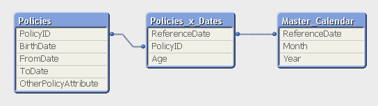
But the middle table does not exist in the source database. Instead, you must generate it using a While loop that loops over each record in the Policies table, i.e. each source record will be loaded several times. This way, you can load not only the “From” date and the “To” date, but also all dates in between:
Policies:
Load PolicyID, BirthDate, PolicyAmount, FromDate, ToDate, OtherPolicyAttribute
From Policies;Policies_x_Dates:
Load PolicyID,
Age( FromDate + IterNo() – 1, BirthDate ) as Age,
PolicyAmount / (ToDate - FromDate + 1) as DailyAmount,
Date( FromDate + IterNo() – 1 ) as ReferenceDate
Resident Policies
While IterNo() <= ToDate - FromDate + 1 ;Note that the Policies table has exactly one record per insurance policy, and the newly created Policies_x_Dates table has exactly one record per combination of policy and date. Note also that there are other fields that should be put in the Policies_x_Dates table, e.g., the age of the insured person, since this depends on the reference date. Further, it is possible to break up a cost or an income into daily amounts, which is useful when you want to show the correct amount distributed over the year.
The While loop is a very useful tool whenever you need to create additional tables in the data model. It is often a better option than the IntervalMatch.
Read more in Generating Missing Data In QlikView.

-
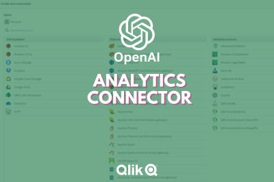
A look at the new OpenAI Analytics Connector
In today's data-driven world, where every byte of information matters, integrating artificial intelligence with analytical tools opens up a new realm of possibilities. Following Qlik’s annoucement of its new OpenAI Connector, we will be trying it out in this post and seeing different ways it can be used to seamlessly bring generative AI content to augment your Qlik data. The OpenAI connector serves as a bridge between your Qlik Sense apps and Ope... Show MoreIn today's data-driven world, where every byte of information matters, integrating artificial intelligence with analytical tools opens up a new realm of possibilities. Following Qlik’s annoucement of its new OpenAI Connector, we will be trying it out in this post and seeing different ways it can be used to seamlessly bring generative AI content to augment your Qlik data.
The OpenAI connector serves as a bridge between your Qlik Sense apps and OpenAI's robust generative AI models, such as the ones powering ChatGPT.
With it, you can bring a new level of contextual understanding and analytical depth to your applications, enhancing the way you comprehend and utilize your data.
In the upcoming sections of this post, we will start by taking a look at how you can directly tap into OpenAI’s completion API using the simple REST connector, then we will jump into how to do the same in a much simpler way using the new OpenAI Analytics connector.
Before you start, you need to:
- Sign up for an OpenAI account: https://platform.openai.com/
- Create a new API key
- In Qlik Cloud Managment console, make sure to enable “Learning endpoints” under “Feature control” in the Settings section:
1/ Using the REST connector to call OpenAI’s completion API:
First, let’s prepare our data. After loading our customer reviews table, we need to prepare both our data and prompt so that we can send it as part of the request body to the completion API endpoint.
You can view all the details on the documentation: https://platform.openai.com/docs/api-reference/completions/create
But we basically need to first convert our data into JSON format, concatenate it with our prompt sentence, then inject it into the request body.
[Reviews]:
First 25
LOAD
    review_id,
    product_id,
    product_name,
    customer_id,
    customer_name,
    review_title,
    review_text,
    review_date,
    verified_purchase,
    recommend_product
FROM [lib://DataFiles/reviews-data.csv]
(txt, codepage is 28591, embedded labels, delimiter is ',', msq);

// turn data into json:
[InputField_JSON]:
Load
 'Reviews: [' & Concat( '{review_date: ' & review_date & ', review_title: ' & review_title & ', review_text: ' & review_text & ', product_name: ' & product_name & ', customer_name: ' & customer_name & ', recommend_product: ' & recommend_product & ' }', ',') & ']' as json
RESIDENT Reviews;
LET vDataInput = Peek('json');

// construct prompt
LET prompt = 'You are a data analyst, you will summarize the following data into the top products based on reviews and give the names of customers who made negative comments.';

TRACE vprompt = '$(prompt)';

// construct request body for openAI request
LET requestBody = '{
  "model": "text-davinci-003",
  "prompt": "$(prompt) Source: $(vDataInput)",
  "max_tokens": 2048,
  "temperature": 0
}';

LET requestBody = Replace(requestBody, '"', Chr(34)&Chr(34));

TRACE vRequestBody = '$(requestBody)';
In the above script, we turned the Reviews data into a JSON-formatted string and stored it in the “vDataInput” variable, we then created the prompt phrase asking the model to summarize the data and return top products based on the reviews as well as the names of customers who gave bad reviews.
Finally, we constructed the request body for the POST request that will be used in the REST API call below.
Notice that the model chosen is text-davinci-003, the prompt is the combination of our 2 variables, and max_tokens is set to a higher number to allow for a bigger response.
Next, we create the REST API connection and make sure to to check “Allow With Connection”:
Finally, Save the newly created connection, then click on “Select Data” under the connection name, choose Root and insert Script to get the following:
(P.S: I have edited the generated script to add the “WITH CONNECTION statement injecting the requestBody variable as the Body of the request”):LIB CONNECT TO 'REST OpenAI'; RestConnectorMasterTable: SQL SELECT "id", "object", "created", "model", "__KEY_root", (SELECT "text", "index", "logprobs", "finish_reason", "__FK_choices" FROM "choices" FK "__FK_choices"), (SELECT "prompt_tokens", "completion_tokens", "total_tokens", "__FK_usage" FROM "usage" FK "__FK_usage") FROM JSON (wrap on) "root" PK "__KEY_root" WITH CONNECTION (BODY "$(requestBody)" ); [OpenAI Response]: LOAD [text] AS response_openai, [finish_reason], [__FK_choices] AS [__KEY_root] RESIDENT RestConnectorMasterTable WHERE NOT IsNull([__FK_choices]); JOIN([OpenAI Response]) LOAD [prompt_tokens], [completion_tokens], [total_tokens], [__FK_usage] AS [__KEY_root] RESIDENT RestConnectorMasterTable WHERE NOT IsNull([__FK_usage]); DROP TABLE RestConnectorMasterTable;Once we hit “Load Data”, we can jump to a sheet to view the response:
Great, after inserting the “response_openai” field into a Text & Image object, we can see that the model returned the answers accuretly!
Keep in mind that you can use this method in Qlik Enterprise as well.
2/ Using the new OpenAI Connector:
There are 2 different configurations of this connector to send data to the endpoint service:
-
OpenAI Completions (GPT-3) and OpenAI Chat Completions (GPT-3.5, GPT-4) – Rows:
This will send each row of data as a question to the completion api and each response will be stored as text in a table with the same number of rows as the input.
-
OpenAI Completions (GPT-3) – JSON Tables: This will send a request on each row, where the response is expected to be a JSON list of data. The connector will convert the JSON table into a table of data in the Qlik Data Model.
2.1/ Rows:
First, we load the Reviews table into Qlik and include a new field for the prompt, where we ask the model to suggest actions to be taken in order to improve sales based on the reviews customers have left for each product.
[Reviews]:
First 25
LOAD
    review_id,
    product_id,
    product_name,
    customer_id,
    customer_name,
    review_title,
    review_text,
    review_date,
    verified_purchase,
    recommend_product,
    'Based on the review with title: '& review_title & ' about product ' & product_name & ' customer "' & customer_name & '" said ' & review_text & ', what action would you suggest based on this feedback to improve sales?' as prompt
FROM [lib://DataFiles/reviews-data.csv]
(txt, codepage is 28591, embedded labels, delimiter is ',', msq);
Then, we create a new OpenAI Data Connection:
Select OpenAI Completions (GPT-3) - Rows, insert your API Key, and make sure to increase the Max Tokens to a higher number to allow for a bigger response from the API.
We set the association field to “review_id” to connect the OpenAI generated data with our Reviews table.
We then use the Select Data wizard and enter “Reviews” as the Resident Table.
The Data Field is the prompt field we previously added to our table.
With that inserted, this is how the complete load script should look like:
[Reviews]:
First 25
LOAD
    review_id,
    product_id,
    product_name,
    customer_id,
    customer_name,
    review_title,
    review_text,
    review_date,
    verified_purchase,
    recommend_product,
    'Based on the review with title: '& review_title & ' about product ' & product_name & ' customer "' & customer_name & '" said ' & review_text & ', what action would you suggest based on this feedback to improve sales?' as prompt
FROM [lib://DataFiles/reviews-data.csv]
(txt, codepage is 28591, embedded labels, delimiter is ',', msq);

[openai]:
LOAD
	[id],
	[object],
	[created],
	[model],
	[prompt_tokens],
	[completion_tokens],
	[total_tokens],
	[choices.text],
	[choices.index],
	[choices.logprobs],
	[choices.finish_reason],
	[review_id]
EXTENSION endpoints.ScriptEval('{"RequestType":"endpoint", "endpoint":{"connectionname":"OpenAI"}}', Reviews{review_id,prompt});
Once the data is loaded, we can now inspect the data model and see the relation between the newly generated openai table and our Reviews table:
Finally, we create a sheet with our Reviews table fields in a table, and a Text & Image object where we put the [choices.text] field which contains the OpenAI response.
For instance:
when selecting a good Review:
when electing a bad Review:
Alternatively, you can call the connection directly from a chart and pass in the prompt.
For instance, here we add a Text & Image object, and add the ScriptAggrStr expression to ask the model to give a general sentiment on a product regarding its price and performance.
If(GetSelectedCount(product_name)>0,
endpoints.ScriptAggrStr('{"RequestType":"endpoint", "endpoint":{"connectionname":"OpenAI","column": "choices.text"}}', 'How do customers feel about ' & product_name & 'in regards to its price and performance')
,'Please select a product to see results')
2.2/ Rows with a JSON prompt
What if instead of sending each row data as a prompt to the completion API, we want to send the whole Reviews dataset and get a general insight based on that.
In this case we can re-use our data to JSON transformation we did in Section 1 of the post, and create and inline table with one row that contains our prompt along with this JSON formatted data, then simply use the “OpenAI Completions - Rows” config to get our response:
Here is how the load script looks like:
// Open AI - Rows call - JSON
[Reviews]:
First 25
LOAD
    review_id,
    product_id,
    product_name,
    customer_id,
    customer_name,
    review_title,
    review_text,
    review_date,
    verified_purchase,
    recommend_product
FROM [lib://DataFiles/reviews-data.csv]
(txt, codepage is 28591, embedded labels, delimiter is ',', msq);

// Turn Reviews Table into JSON

[InputField_JSON]:
Load
 '" {"Reviews" : [' & Concat( '{"review_date": "' & review_date & '", "review_title": "' & review_title & '", "review_text": "' & review_text & '", "product_name": "' & product_name & '", "customer_name": "' & customer_name & '", "recommend_product": "' & recommend_product & '" }', ',') & '] }"' as json
RESIDENT Reviews;

LET vDataInput = Peek('json');

// Build Prompt text

SET vPrompt = 'Based on the following dataset, what insights can you retrieve, what strategies could I implement to improve customer satisfaction, and which products should I focus on to improve their sales. Dataset: ';
SET vText = $(vPrompt) $(vDataInput);
TRACE vdata = $(vText);

// Load into table

[TableWithData]:
LOAD
	RowNo() as RowId,
  '$(vText)' as Text
AUTOGENERATE 1;


[openai]:
LOAD * EXTENSION endpoints.ScriptEval('{"RequestType":"endpoint", "endpoint":{"connectionname":"OpenAIJSONTables"}}', TableWithData{RowId,Text});
Notice once the data is loaded that all our dataset is sent as part of the prompt.
Once we load the data, we add a Text & Image object and insert the [choices.text] field to view the AI generated response:
2.3/ JSON Tables
Lastly, let’s explore how the JSON Tables config of the OpenAI Connector works to return a table of data:
First, we create the connection and choose the appropriate configuration (make sure to increase the Max Tokens)
The laod script is simple, we have an inline table with a Text field containing our prompt, followed by the OpenAI load statement generated through the Select Data wizard.
SourceTable:
NoConcatenate
LOAD
RowNo() as RowId,
Text
Inline
[Text
top 10 Countries by Population. Extract as JSON list];

[openai]:
LOAD * EXTENSION endpoints.ScriptEval('{"RequestType":"endpoint", "endpoint":{"connectionname":"OpenAI TABLES"}}', SourceTable{RowId,Text});
Once the data is loaded, we can check the Data model and preview the openai table.
Notice that we now have a table with the top 10 countries by population. This data can be used to generate analytics content without refering again to openai.
Attached, you will find the QVF of the example app. Within the Data Load Editor, each example is broken into its own section that ends with an EXIT SCRIPT. You can drag the section to the top to only load that specific example.
More things to consider:
- Using OpenAI connector inside Qlik Application Automation: https://community.qlik.com/t5/Official-Support-Articles/How-to-Getting-started-with-the-OpenAI-Connector-in-Qlik/ta-p/2077315
Useful Resources:
- https://www.youtube.com/watch?v=R9ScDzEU9DQ
- https://www.youtube.com/watch?v=XCaaRenozb8&t=502s
- https://www.youtube.com/watch?v=qfGWKXAAKNI
- https://help.qlik.com/en-US/cloud-services/Subsystems/Hub/Content/Sense_Hub/LoadData/ac-openai-use.htm
I hope you found this post useful and you were able to get a better understanding on how the new OpenAI Connector works to bring generative AI content to augment your existing Qlik Sense applications.
Thank you for reading.
-
Qlik Data Integration Newsletter - July 2023
This is our second monthly Qlik Data Integration newsletter. Each month, we cover one endpoint and share our top resources, best practices, release updates and upcoming webinars. Subscribe to the Qlik Data Integration topic to be notified of future editions! Index Resource HighlightsWebinarsKnowledgebase ArticlesRetiring Qlik Replicate EndpointsAnalyze Qlik Replicate LogsEndpoint Spotlight: SQL ServerNew Issues ReportedTips!Release UpdatesFixes... Show MoreThis is our second monthly Qlik Data Integration newsletter. Each month, we cover one endpoint and share our top resources, best practices, release updates and upcoming webinars.
Subscribe to the Qlik Data Integration topic to be notified of future editions!
Index
- Resource Highlights
- Webinars
- Knowledgebase Articles
- Retiring Qlik Replicate Endpoints
- Analyze Qlik Replicate Logs
- Endpoint Spotlight: SQL Server
- New Issues Reported
- Tips!
- Release Updates
- Fixes
- Enhancements
- New Releases
- Qlik Data Integration Product End of Life Versions
Resource Highlights
Webinars
(Update) Book your calendar for the upcoming Q&A with Qlik: New to Qlik Cloud Q&A session scheduled for August 15th at 10:00 AM EDT. It is a live Q&A session with a panel of Qlik experts. Bring your questions, and we do our best to answer them.
Explore Qlik Support's recorded Techspert webinar series on-demand or visit our YouTube Channel to discover more!
Knowledgebase Articles
Retiring Qlik Replicate Endpoints
As of July 31st, 2023, the following endpoints will be retired:
Source Endpoints:
- HP Non-Stop Source
- Open VMS RMS Source
- Hadoop Source
Target Endpoints:
- MapR Target
- MapR Streams Target
- MS APS PDW Target
- SAP Sybase IQ Target
- HP Vertica Target
- Actian Vector Target
- Netezza Target
- Pivotal Greenplum Target
See Retirement for Specific Qlik Replicate Endpoints for details.
Analyze Qlik Replicate Logs
An evergreen pair of articles helps you read and analyze Qlik Replicate log files:
How to analyze a Qlik Replicate log
List of the error types in Qlik Replicate
Endpoint Spotlight: SQL Server
Find our latest knowledge base articles for SQL Server endpoints.
New Issues Reported
- Qlik Replicate Task logs a warning: ]W: MS-REPLICATION is not enabled for table
- Find the resolution in Qlik Replicate Task logs a warning: ]W: MS-REPLICATION is not enabled for table.
- Qlik Replicate: [SQL Server]Login failed
- The behavior began after an upgrade to Qlik Replicate version 2022.11 or later. Find the resolution in Qlik Replicate: [SQL Server]Login failed after an upgrade to Qlik Replicate 2022.11 or later.
Tips!
- Qlik Replicate Red Hat 8 SQL Server Source fails TCP Provider: Error code 0x2746
- Qlik Replicate 2022.5 fails to connect to SQL Server Source Endpoint when connecting from Red Had Linux 8 using the libmsodbcsql-17.10.so.1.1 or libmsodbcsql-17.6.so.1.1. Qlik Replicate Red Hat 8 SQL Server Source fails TCP Provider: Error code 0x2746 for details.
- Qlik Replicate: SQL Server idle connections closed
- Inactive TCP/IP connections to SQL Server can sometimes be closed by your router or firewall. This will give your task a recoverable environmental error. Parameters in the Windows Registry can be set to send transmissions for the connection to keep it active. For more information, see Qlik Replicate: SQL Server idle connections force closed.
- Best Practice: Qlik Replicate: SQL replication jobs
- If you use a non-sysadmin account to replicate data from SQL Source, then the DBA must update the owner of all SQL Server jobs belonging to ‘REPL%’ category to the SA account.Qlik Replicate will not create or manage any of the SQL Agent jobs.
- Best Practice: SQL Server Source - Rebuild Index Best Practices and Recommendations
Release Updates
Fixes
Qlik Replicate May 2023 SP1
Type: Issue
Component/Process: Microsoft Azure SQL (MS-CDC) and Microsoft SQL Server (MS-CDC) targets
Description: The task would fail when DB_ID() returned a different value than database_id in sys.databases. The issue was resolved using an internal parameter.
Type: Issue
Component/Process: Microsoft SQL Server Source
Description: An online transaction log is read sometimes slow, add an internal property to control the number of rows being read in one request.
Type: Issue
Component/Process: SQL Server Source
Description: sp_repldone truncation prevention does not work with specific collation
Type: Issue
Component/Process: Transformation
Description: A transformation expression that separates keywords by a new line, cannot be executed causing SQLite errors.
Type: Issue
Component/Process: MySql Source
Description: When NOT NULL column is defined as AUTOINCREMENTED, it is exposes as NULLABLE.
Type: Issue
Component/Process: MySQL Source
Description: When replicating a high volume of data, starting the task or retrieving the table list would take an excessively long time or get stuck. The issue was resolved using an internal parameter.
Enhancements
Qlik Replicate August 2023 SR
- New Confluence Endpoint (based on Kafka)
Qlik Replicate November 2023 IR
- Expose stream buffer tuning parameters in task settings as per ideation request: Replicate & QEM - Expose stream buffer tuning parameters in task settings
- Confluent Schema Register using BOTH authentication methods (Public Key + Username & password)
- MariaDB new version certifications
New Releases
(Updated) Available on the Download Page
- Qlik Replicate 2022.11 SP06
- Qlik Enterprise Manager 2022.11 SP06
Qlik Data Integration Product End of Life Versions
Qlik Release Qlik Replicate / Enterprise Manager End of Support Date Qlik Compose End of Support Date February 2021 November 2020 SR1 November 2022 February 2021 February 2023 May 2021 May 2021 May 2023 May 2021 May 2023 August 2021 May 2021 SR1 May 2023 August 2021 August 2023 November 2021 November 2021 November 2023 November 2021 November 2023 For more information, see Qlik Product Lifecycles.
-
Qlik Academic Program and MIT ADT- A case study
Pune based MIT ADT University and the Qlik Academic Program have collaborated very well to bring value to students in data analytics. More than 2000 students from MIT ADT stand to benefit from this engagement. Many students have been trained using the academic program resources and also are qualified to build their careers. Prof Sumitra Mandlik who leads these initiatives at MIT ADT shares her thoughts on this partnership and how students are ben... Show MorePune based MIT ADT University and the Qlik Academic Program have collaborated very well to bring value to students in data analytics. More than 2000 students from MIT ADT stand to benefit from this engagement. Many students have been trained using the academic program resources and also are qualified to build their careers. Prof Sumitra Mandlik who leads these initiatives at MIT ADT shares her thoughts on this partnership and how students are benefitting from the Qlik Academic Program. Sumitra is also the Educator Ambassador of the Academic Program for 2023.
To read more on this, visit: https://www.qlik.com/us/resource-library?searchResources=MIT+ADT&Customer+Story=on#searchResults
For free resources in data analytics including training, qualifications and certifications, visit: qlik.com/academicprogram
-
Thank You Sarah Miller - We Will Miss You - We Wish You All The Best!!!!
We are sad to announce that our Sarah Miller is resigning from Qlik, but we are also so very excited for her next adventure. Join us in saying farewell! -
【9/12(火)13:30 開催】QlikWorld Tokyo:データ愛好家が集結するビッグイベント!
データ・分析・AI の最新トレンドを一挙ご紹介! 来たる 9/12(火)、Qlik はデータ・分析・AI に関する新たな視野が広がるイベント「QlikWorld Tokyo」を開催します。 本イベントでは、データ・分析・AI の最新トレンドや成功例に関するインサイトをご紹介します。基調講演をはじめ、ビジネス向けや技術向けの講演、Qlik およびパートナー企業の展示ブースなど、データの可能性を最大化するヒントが満載のイベントに、ぜひご参加ください。 貴社の成長と優位性を確保するデータ活用法 データを管理 / 統合 / 分析し、データをアクションにつなげる Qlik ポートフォリオの最新イノベーション Qlik の顧客による注目の成功事例と成果 ※ 内容は予告なく変更になる可能性があります。予めご了承ください。※ 定員に達し次第、お申し込みを締め切らせていただきます。 【開催概要】日時:2023年 9月 12日(火)13:30(12:30 受付開始)会場:東京ポートシティ竹芝 ポートホ... Show Moreデータ・分析・AI の最新トレンドを一挙ご紹介!
来たる 9/12(火)、Qlik はデータ・分析・AI に関する新たな視野が広がるイベント「QlikWorld Tokyo」を開催します。
本イベントでは、データ・分析・AI の最新トレンドや成功例に関するインサイトをご紹介します。基調講演をはじめ、ビジネス向けや技術向けの講演、Qlik およびパートナー企業の展示ブースなど、データの可能性を最大化するヒントが満載のイベントに、ぜひご参加ください。
- 貴社の成長と優位性を確保するデータ活用法
- データを管理 / 統合 / 分析し、データをアクションにつなげる Qlik ポートフォリオの最新イノベーション
- Qlik の顧客による注目の成功事例と成果
※ 内容は予告なく変更になる可能性があります。予めご了承ください。
※ 定員に達し次第、お申し込みを締め切らせていただきます。【開催概要】
日時:2023年 9月 12日(火)13:30(12:30 受付開始)
会場:東京ポートシティ竹芝 ポートホール / ポートスタジオ
〒105-7501 東京都港区海岸 1-7-1
会場地図はこちら参加費:無料
お問い合わせ:Marketingjp@qlik.com までお問い合わせください。 -
Qlik’s Response to Apache Log4j Vulnerabilities: CVE-2021-44228 / CVE-2021-45046...
Latest update as of Feb. 15, 2022. All current threats have been addressed. Further updates will be made as new information becomes available. -
Introducing Cloud Application Sources for Qlik Cloud Data Integration
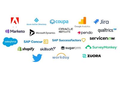
We are pleased to introduce the first major launch of over 20 connectors for Qlik Cloud Data Integration enabling you to leverage both full and incremental data load from these popular Cloud Application sources. For this release you will find below connectors made available to you: Adobe Analytics Oracle Netsuite Shopify Coupa Pendo SuccessFactors Google 360 Analytics V4 Percipio (Skillsoft) Sugar CRM Jira... Show MoreWe are pleased to introduce the first major launch of over 20 connectors for Qlik Cloud Data Integration enabling you to leverage both full and incremental data load from these popular Cloud Application sources.
For this release you will find below connectors made available to you:
Adobe Analytics
Oracle Netsuite
Shopify
Coupa
Pendo
SuccessFactors
Google 360 Analytics V4
Percipio (Skillsoft)
Sugar CRM
Jira
Qualtrics
SurveyMonkey
Marketo
Salesforce
Twitter
Microsoft Dynamic 365 CRM
SAP Concur
WorkDay
Microsoft Azure Active Directory
ServiceNow
Zuora
How to start using the feature:
These connectors will be tagged as Preview and access will need to be requested via your Qlik Customer Success Manager or Qlik Support providing your tenant details and the connectors you are interested in using.
A requirement is to have set-up Data Gateway - Data Movement. For more information, see Qlik Data Gateway - Data Movement overview.
Once this is done you will need to:
- Connect to a SaaS application.
- Select your processing (Reload and Compare vs Change Data Capture).
- Scan the data for metadata generation.
- Add datasets to the metadata.
- Reload metadata
More detailed instructions are available on our help site.
Additional resources:
SaaS in 60 - New Cloud Application Sources in Qlik Cloud Data Integration (Video)
Walkthrough: Cloud Application Sources - Qlik Cloud Data Integration (Video)
Thanks for choosing Qlik!
Qlik Global Support
-
Qlik Sense May 2023 (Client-Managed) now available!
Coming off Qlik World, we are happy to announce the next version of Qlik Sense May 2023 - our Client-Managed analytics offering. This version is primarily focused on visualization improvements including a new filter pane object, a variety of new styling options, and enhancements to navigation and design. We also have included a new Google Analytics 4 connector and improved authentication for several other connectors. -
Qlik Digest - July 2023
Welcome to the July edition of Qlik Digest. This month we explore the exciting realm of Artificial Intelligence. Discover our new OpenAI connectors and read our blog on conquering the fear of the unknown with Generative AI. This captivating intro? Written by AI itself! -
The Path Forward (Series) – Fully Integrated AI and ML
Video 4 – Machine Learning Services for Augmented Analytics Welcome to the fourth video in our AI and ML blog series. In this video, we demonstrate integrated AI and ML services built into our platform at a foundational level, designed to support augmented analytics in a seamless and transparent way. -
How to add minicharts to Qlik Sense tables
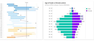
A few days ago I stumbled upon one of those little tricks that we all love. Roland Vecera came up with a nice solution to bring minicharts to Qlik Sense. It can help us to increase app data density and make our Qlik Sense tables sexy and informative again. Don't forget to add this to your bookmarks! In Roland's blog post you will find instructions about how to build a linear gauge, a traffic light gauge, and even whiskers minicharts (right tabl... Show MoreA few days ago I stumbled upon one of those little tricks that we all love. Roland Vecera came up with a nice solution to bring minicharts to Qlik Sense. It can help us to increase app data density and make our Qlik Sense tables sexy and informative again. Don't forget to add this to your bookmarks!
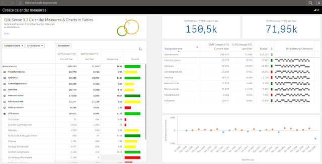
In Roland's blog post you will find instructions about how to build a linear gauge, a traffic light gauge, and even whiskers minicharts (right table in the image above),
I particularly like the linear gauge, with this technique we can now simulate small bars that goes along with each one of the table dimension items. The expression used to create the linear gauge 'bar chart' is actually reusable and very simple, looks like this:
repeat('█', rangemax(rangemin( ceil(((column(1)/column(2))-1)*10),10),1) )
The expression will paint a variable number of solid blocks █ based on a given calculation that is evaluated by row. By now you should have a nice grey bar from 1 to 10 blocks.
Next (optional) step is to apply color to it. You could add color based on any criteria you want, in the chosen example Roland is using color in the same way as he use size, both display Growth.
The text color expression looks like this in the example:
if(expression>2, argb(255,0,150,0),
if(expression>1, argb(255,0,200,0),
if(expression>0.5, yellow(),lightred())))
Where expression will be the same expression as in Growth column (Steigerung).
You can read more about minichars in tables trick at QlikView + Qlik Sense Blog von Heldendaten: Qlik Sense Calendar Measures & "Minicharts" in Tabellen
Hope you like it.
AMZ
PS: For those of you who can't read German and/or use Google translator, please check out this community doc Creating Mini Chart in Qlik Sense tables (it also contains some hacks to make this trick even more complete)

-
How cities can use data to track their climate goals
We are often asked by educators in our Academic Program for use cases around how data is used in the real world. This story, about our collaboration with C40 cities, can be used in the classroom to help educate students on how we can counteract climate change with data. -
Expanded Business Glossary Capabilities
Earlier this year, we introduced business glossary capabilities to all of our Qlik Cloud Analytic customers. Built upon the Qlik Cloud Catalog framework, users have been able to access a single, easily-accessible repository of business terms and descriptions. This ensures that everyone in the organization has the same understanding of key business terms. -
Your Friendly Master Items Library - What you Should Know!
Check out the Do More with Qlik - Tips and Tricks Edition Playlist for all the things you should know about the Qlik Cloud Platform. New content added on a regular basis!Do More with Qlik - Tips & Tricks Edition
-
Qlik Data Visualization Tip-a-Day Recap
In December 2021, we set out to deliver a Data Visualization tip-a-day on LinkedIn leading up to the Christmas holiday. We received such overwhelmingly positive feedback on this effort that we decided to provide you with a synopsis of all the amazing Qlik Sense visualization capabilities we highlighted. Each capability links to the post on LinkedIn, which provides you with additional details. -
Buttons, Tables and KPIs
An exploration into Buttons, Tables, and KPIs along with how to use them in your apps. -
A career in data analytics is in demand!
In the increasingly digitalized era in which we live, technology and data are everywhere. Due to technology advancements, one of the important markets nowadays is data analytics. According to the India Brand Equity Foundation, the nation’s data analytics market would grow to $118.7 billion by 2026. As a result, it is true that Data Analytics is now a crucial component of enterprises across all industries. It provides in-depth market data together... Show MoreIn the increasingly digitalized era in which we live, technology and data are everywhere. Due to technology advancements, one of the important markets nowadays is data analytics. According to the India Brand Equity Foundation, the nation’s data analytics market would grow to $118.7 billion by 2026. As a result, it is true that Data Analytics is now a crucial component of enterprises across all industries. It provides in-depth market data together with useful insights into customer behaviour, offering companies a competitive edge. And because of this, data analytics is one of the modern-day courses that is steadily growing in popularity.
To read more about this article, visit: https://timesofindia.indiatimes.com/blogs/voices/who-should-do-the-data-analytics-course-and-how-it-may-help-in-your-career/
To learn about the Qlik Academic Program to get access to free training, certifications, qualifications and prepare yourself for a career in data analytics, visit: qlik.com/academicprogram