Unlock a world of possibilities! Login now and discover the exclusive benefits awaiting you.
Product Innovation
By reading the Product Innovation blog, you will learn about what's new across all of the products in our growing Qlik product portfolio.
Support Updates
The Support Updates blog delivers important and useful Qlik Support information about end-of-product support, new service releases, and general support topics.
Qlik Academic Program
This blog was created for professors and students using Qlik within academia.
Community News
Hear it from your Community Managers! The Community News blog provides updates about the Qlik Community Platform and other news and important announcements.
Qlik Digest
The Qlik Digest is your essential monthly low-down of the need-to-know product updates, events, and resources from Qlik.
Qlik Learning
The Qlik Learning blog offers information about the latest updates to our courses and programs, as well as insights from the Qlik Learning team.
Recent Blog Posts
-
Focusing on Scatter Plots
An overview of scatter plots and how users can take apply them within their own apps. -
【オンデマンド配信】Honda における “データドリブン型” 課題解決の進め方
企業のビジネス活動において、データはこれまで以上に必要不可欠な資産となっています。増え続けるデータを管理・統合・分析し、データでアクションを起こす必要性が増している現在、成功している企業はどのようなデータ戦略を実行しているのか?本 Web セミナーシリーズでは、Qlik でデータからアクションを起こすデータ主導のビジネスで成功しているお客様より、課題から導入の経緯、デモンストレーション、活用例などをご紹介します。 ※ 参加費無料。パソコン・タブレット・スマートフォンで、どこからでもご視聴いただけます。 オンデマンド配信:Honda における “データドリブン型” 課題解決の進め方 本田技研工業株式会社では、全社共通データ分析ツールとして Qlik sense を導入し 7,000 超のユーザーが日々利用しています。 本セッションでは、データ駆動型のビジネスを実行するための体制と、その考えに基づき実践した Qlik データソンでの取り組み事例を紹介いたします。 第 3 回 Qlik データ... Show More企業のビジネス活動において、データはこれまで以上に必要不可欠な資産となっています。増え続けるデータを管理・統合・分析し、データでアクションを起こす必要性が増している現在、成功している企業はどのようなデータ戦略を実行しているのか?
本 Web セミナーシリーズでは、Qlik でデータからアクションを起こすデータ主導のビジネスで成功しているお客様より、課題から導入の経緯、デモンストレーション、活用例などをご紹介します。※ 参加費無料。パソコン・タブレット・スマートフォンで、どこからでもご視聴いただけます。
オンデマンド配信:
Honda における “データドリブン型” 課題解決の進め方本田技研工業株式会社では、全社共通データ分析ツールとして Qlik sense を導入し 7,000 超のユーザーが日々利用しています。 本セッションでは、データ駆動型のビジネスを実行するための体制と、その考えに基づき実践した Qlik データソンでの取り組み事例を紹介いたします。 第 3 回 Qlik データソンにおいては、ユーザー部門で最優秀賞を受賞。5 時間という限られた時間の中でいかにして成果を出したのか、ビジネス課題を解決するためのデータ分析の取り組みと Qlik の活用についてお話しします。
-
Increase user adoption of your Qlik Apps with Custom Application Training
Increase user adoption and your Qlik ROI with targeted Custom Application Training, specially designed for your users to learn your Qlik application.
-
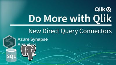
Using Direct Query with MS Azure SQL - New Connectors for MS SQL, Azure SQL, Pos...
We just added the ability to use Direct Query with PostgreSQL, Azure Synapse Analytics, Azure SQL and MS SQL.
-
Qlik Cloud Analytics will no longer function with outdated version of Microsoft ...
Starting from the week of August 14th 2023, Qlik Cloud Analytics will no longer be able to utilize non-supported Microsoft SQL data sources. This affects Microsoft SQL Server 2012 and earlier. Microsoft SQL Server 2012 and earlier are not supported by Microsoft (see SQL Server lifecycle dates). If you are unclear which version of SQL Server you have, use one of the methods described in this Microsoft article. Upcoming Changes Qlik Cloud Analytics... Show MoreStarting from the week of August 14th 2023, Qlik Cloud Analytics will no longer be able to utilize non-supported Microsoft SQL data sources. This affects Microsoft SQL Server 2012 and earlier.
Microsoft SQL Server 2012 and earlier are not supported by Microsoft (see SQL Server lifecycle dates). If you are unclear which version of SQL Server you have, use one of the methods described in this Microsoft article.
Upcoming Changes
Qlik Cloud Analytics is performing a required security update in August 2023, resulting in no access to Microsoft SQL Server 2012 or earlier. This update will also result in no support for TLS version 1.1 and earlier as well as any deprecated cryptographic functions.
Additional Information
While client-managed and standalone web connectors are not directly affected by this change, they do not support outdated versions of Microsoft SQL Server, such as MS SQL 2012. See Supported Microsoft SQL Server versions.
For additional information, see Outdated, out of support versions of Microsoft SQL Server and Qlik Cloud Analytics.
Thanks for choosing Qlik!
Qlik Global Support
-
Head Back to School with Qlik Continuous Classroom
What better time to get started or refresh your Qlik skills, earn a qualification badge and more! Start today with our New User Learning Plans for free.
-
Decomposition Tree Features
Decomposition Tree Features AnyChart — Extensions for QS Discover the Decomposition Tree chart in Qlik! Explore all major features of the unique Decomposition Tree Extension for Qlik Sense in this Qlik demo app. Discoveries Efficiently visualizing data across multiple dimensions, a decomposition tree lets you easily disaggregate it and drill down into the dimensions in any order to find out what makes up a value. Impact Explore a... Show MoreDecomposition Tree FeaturesAnyChart — Extensions for QS Discover the Decomposition Tree chart in Qlik! Explore all major features of the unique Decomposition Tree Extension for Qlik Sense in this Qlik demo app.
Discoveries
Efficiently visualizing data across multiple dimensions, a decomposition tree lets you easily disaggregate it and drill down into the dimensions in any order to find out what makes up a value.
Impact
Explore all major features of the Decomposition Tree Extension for Qlik Sense as you look into fictional business data. See working with negative values, different view modes, and more demonstrated in action.
Audience
Business analysts and all levels of management. Also, all who want to see how a decomposition tree works in Qlik Sense.
Data and advanced analytics
This application was built with the Decomposition Tree extension for Qlik Sense. The dataset is fictional.
-
Bullseye Chart Features
Bullseye Chart Features AnyChart — QS Extensions Bullseye charts are helpful in exploring product (drug) pipelines. Discover all major features of the Bullseye Chart extension for Qlik Sense in this Qlik demo app. Discoveries Explore all major features of the Bullseye Chart extension for Qlik Sense as you look at a fictional drug pipeline that graphically represents how clinical trials progress through phases. See flexible axes and gr... Show MoreBullseye Chart FeaturesAnyChart — QS ExtensionsBullseye charts are helpful in exploring product (drug) pipelines. Discover all major features of the Bullseye Chart extension for Qlik Sense in this Qlik demo app.Discoveries
Explore all major features of the Bullseye Chart extension for Qlik Sense as you look at a fictional drug pipeline that graphically represents how clinical trials progress through phases. See flexible axes and grids, customizable labels and markers, conditional coloring, HTML tooltips, and much more demonstrated in action.
Impact
A bullseye chart, resembling a target, serves as a concise visual aid for tracking progress across multiple categories. Its intuitive design enables efficient data comparison, simplifying complex information presentation and facilitating quicker decision-making.
Audience
Business analysts, project managers, executives, and other stakeholders who need to track and understand progress across various factors in a clear and concise visual format. Anyone interested in exploring the capabilities of bullseye charts within Qlik Sense.
Data and advanced analytics
This application features a bullseye chart built with AnyChart's Bullseye Chart extension for Qlik Sense, utilizing fictional data to illustrate its capabilities.
🔗 >> VIEW IT LIVE OR DOWNLOAD (.QVF) <<
-
Now you can share Collaborative Notes with Control!
Collaborative Notes authors will now experience full control over who views their notes within a space. When you create a note in a Shared or Managed space, the note will only be visible to you the author. -
Calling all Admins who are new to Qlik Sense SaaS!
Welcome to Qlik, we’re excited to have you onboard and can’t wait to see how our solutions will help achieve your data and analytics goals. Ready to take the first step? Start Here! We’ve gathered the essential resources for you to follow and set up your own tenant along the way. With comprehensive implementation steps, a Go Live Checklist, and training recommendations for your end users, we’ll guide you through getting your environment up and ... Show MoreWelcome to Qlik, we’re excited to have you onboard and can’t wait to see how our solutions will help achieve your data and analytics goals.
Ready to take the first step? Start Here!
We’ve gathered the essential resources for you to follow and set up your own tenant along the way. With comprehensive implementation steps, a Go Live Checklist, and training recommendations for your end users, we’ll guide you through getting your environment up and running for your organization.
Log into Qlik Continuous Classroom with your Qlik Account to access this free, curated onboarding content for Qlik Cloud Admins.
If you need help as you get started, chat with our Support Engineers 24/5.
Happy learning!
Qlik Customer Success
-
Using Mapbox GL with Nebula.js
Today I will show you how to create a simple custom Mapbox GL extension for Nebula.js. -
Reload all Apps
Admins can reload all their apps in Qlik Sense SaaS with a single button click. Setup: 1. create a new automation and import reload-all-apps.json file 2. create a new app and import Reload-all-Apps.qvf 3. Assign buttons action to execute the automation Discoveries It saves you a lot of time if your DWH failed last night and you need to reload all your apps in Qlik Sense. Impact Saving time and effort Audience Admins... Show MoreAdmins can reload all their apps in Qlik Sense SaaS with a single button click.Setup:1. create a new automation and import reload-all-apps.json file2. create a new app and import Reload-all-Apps.qvf3. Assign buttons action to execute the automation
Discoveries
It saves you a lot of time if your DWH failed last night and you need to reload all your apps in Qlik Sense.
Impact
Saving time and effort
Audience
Admins
Data and advanced analytics
It enables us to faster recover after data loading has failed.
-
Distilling Qlik Cloud Analytics Data Visualization Updates
Make an impression with the top recent data visualization enhancements. We’ve been releasing improvements to Qlik Data Visualizations on Qlik Cloud Analytics (Qlik Sense SaaS) at a furious pace – more than 200 in the past two years. We understand it might be difficult to keep up with all the updates. So, we’re here to provide a quick recap of some recent impactful enhancements to help you get up-to-speed so you can introduce new use cases and l... Show MoreMake an impression with the top recent data visualization enhancements.
We’ve been releasing improvements to Qlik Data Visualizations on Qlik Cloud Analytics (Qlik Sense SaaS) at a furious pace – more than 200 in the past two years. We understand it might be difficult to keep up with all the updates. So, we’re here to provide a quick recap of some recent impactful enhancements to help you get up-to-speed so you can introduce new use cases and leverage all the beautiful and powerful visualizations Qlik has to offer.
-
Applications to study computing up by 10%
School-leavers are choosing computing courses in record numbers, according to the Universities and Colleges Admissions Service (UCAS). -
Qlik もくもく会開催報告
Qlik ではこのたび新しい試みとして「もくもく会」を開催しました。もくもく会とは、特定のトピックについて、みんなで一緒に「もくもく」と自習する会です。今回はその様子をご報告します。 -
Simplify and Accelerate Your QlikView to Qlik Cloud Transition with Updated Migr...
New free Migration Center tools and worksheets are now available. We are excited to announce the availability of the Migrating from QlikView section of the Qlik Help Migration Center. Here you will find all the necessary information on strategy, best practices, and tools to monitor, manage, and execute your transition from QlikView to Qlik Cloud Analytics. It even includes new scripts and planning worksheets, which are all free to use. -
Qlik Digest - August 2023
Welcome to the August Qlik Digest! No doubt you will have seen reports on the intense heatwaves hitting many countries recently. This month, as well as key updates, we share Qlik’s major contribution to the fight against climate change. -
The Path Forward (Series) – Fully Integrated AI and ML
Deeper insights and data-driven decisions for all Welcome to the final blog post in our AI and ML video series, which contains videos 5 and 6 focused on Machine Learning and Qlik AutoML. -
Introducing Qlik’s OpenAI Connectors - Delivering the power of Generative AI fo...
Today we released an exciting new suite of connectors for OpenAI, including automation connectors and real-time analytics integration, enabling users to request and embed generative AI content directly in their analytics experience. -
How to read and use the new Qlik Sense Box Plot
Continuing with the description of the new charts available in the Qlik Sense June 2017 release, today is the Box plot’s turn. The American mathematician John W. Tukey introduced the box-and-whisker plot (called simply a box plot) in his 1977 book, "Exploratory Data Analysis". Like the Distribution plot, the Box plot is a histogram-like method of displaying data and is appropriate to represent the degree of dispersion, skewness, and whether there... Show MoreContinuing with the description of the new charts available in the Qlik Sense June 2017 release, today is the Box plot’s turn.
The American mathematician John W. Tukey introduced the box-and-whisker plot (called simply a box plot) in his 1977 book, "Exploratory Data Analysis".
Like the Distribution plot, the Box plot is a histogram-like method of displaying data and is appropriate to represent the degree of dispersion, skewness, and whether there are potential unusual observations in the data set. It’s particularly useful for comparing distributions between several sets of data, short of having several histograms close to each other so you can compare across them. The data center, spread and overall range are immediately apparent for each data set.
In my previous post about the distribution plot, I used an example data set containing data for 3 salespersons recording their monthly sales data. I'll reuse that data to illustrate how the box plot works.
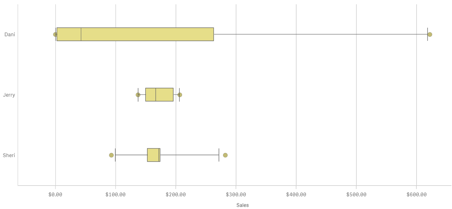
A Box plot will typically help us to visualize 5 numbers, the statistical median represented as a horizontal line inside the box, the box ends show the first and third quartiles values. The whiskers indicate the range of the data and they are represented as horizontal lines ending in a small vertical line. Whiskers extend to the farthest points that are not outliers. Depending on the box plot configuration you choose, a provision is made for the representation of extreme values, typically upper/bottom quartile range +/- 1 x interquartile range or IQR. Additionally, outliers or extreme values are represented with dots.
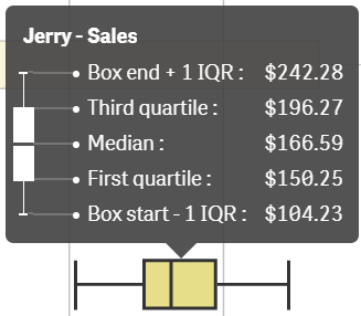
Some general observations about our salespersons’ box plots:
- The box plot is comparatively short – see Sheri. This suggests that overall monthly sales have a high level of similarity with each other.
- The box plot is comparatively tall – see Dani. This indicates Dani’s monthly sales are quite different across the year.
- The box plot is skewed – see Dani. There are more data points on the left/bottom (toward lower values), most of Dani's sales are small amount of sales.
To get the chart working in your Qlik Sense app it only requires one dimension (add a second dimension to compare across it) and one expression. Qlik Sense's new Box plot offers three standard presets, standard (Tukey), percentile-based, and standard deviation. For those of you with special needs or for those interested in learning more about fine tuning your chart, there’s a manual mode that give us full control over each one of the chart elements.

Enjoy it.
Arturo (@arturoqv)