Unlock a world of possibilities! Login now and discover the exclusive benefits awaiting you.
Product Innovation
By reading the Product Innovation blog, you will learn about what's new across all of the products in our growing Qlik product portfolio.
Support Updates
The Support Updates blog delivers important and useful Qlik Support information about end-of-product support, new service releases, and general support topics.
Qlik Academic Program
This blog was created for professors and students using Qlik within academia.
Community News
Hear it from your Community Managers! The Community News blog provides updates about the Qlik Community Platform and other news and important announcements.
Qlik Digest
The Qlik Digest is your essential monthly low-down of the need-to-know product updates, events, and resources from Qlik.
Qlik Learning
The Qlik Learning blog offers information about the latest updates to our courses and programs, as well as insights from the Qlik Learning team.
Recent Blog Posts
-
From Data to Wisdom. Unleashing the Power of Data
Data is often misunderstood, so understanding data literacy requires clarity on its true meaning. Oxford defines data as facts and statistics for analysis, but this definition doesn't capture its full potential. To comprehend data's essence, we must explore its journey from raw data to wisdom.Read more about interesting insights shared by Qlik's Chief Learning Officer, Kevin Hanegan on: https://www.turningdataintowisdom.com/from-data-to-wisdom/ F... Show MoreData is often misunderstood, so understanding data literacy requires clarity on its true meaning. Oxford defines data as facts and statistics for analysis, but this definition doesn't capture its full potential. To comprehend data's essence, we must explore its journey from raw data to wisdom.
Read more about interesting insights shared by Qlik's Chief Learning Officer, Kevin Hanegan on: https://www.turningdataintowisdom.com/from-data-to-wisdom/For information on the Qlik Academic Program, visit: qlik.com/academicprogram and know about the free resources including training, qualifications and certifications.
-
Creating charts with enigma.js and Vega
If you don't already know, enigma.js is an open source library for communicating with Qlik Sense backend services. The QIX Service of enigma.js provides an API to communicate with a QIX Engine, giving you the ability to build applications powered by Qlik. Vega calls itself a visualization grammar. It is a declarative language for creating visualizations. You just describe the appearance and behavior of the visualization you want to create, and Ve... Show MoreIf you don't already know, enigma.js is an open source library for communicating with Qlik Sense backend services. The QIX Service of enigma.js provides an API to communicate with a QIX Engine, giving you the ability to build applications powered by Qlik.
Vega calls itself a visualization grammar. It is a declarative language for creating visualizations. You just describe the appearance and behavior of the visualization you want to create, and Vega does the rest. And it can render with canvas, avoiding costly dom manipulations.
I'm going to demonstrate using enigma.js and Vega to create a simple bar chart. I'll be reusing the qApp.js module and qSessionObject class I introduced in Getting started with enigma.js, so check that out first if you haven't already.
Getting Setup
You can review Getting started with enigma.js, and follow the "Setup", "Connecting to an app", and "Creating Session Objects" sections. You'll also want to load jQuery and Vega (https://cdnjs.cloudflare.com/ajax/libs/vega/3.0.0-beta.25/vega.min.js).
Alternatively, you can download the getting-started.zip file below. The getting-started.zip file includes package.json and webpack.config.js files, the qApp.js and qSessionObject.js files, as well as an index.html file, and a main.js file. There's also a .qext file, in case you want to use Qlik Sense as your server for your static files.
For this demonstration, I'm using fields from the Helpdesk Management app, so make sure your qApp.js file is connecting to a copy of the Helpdesk Management app.
The Project
Now that you're setup, we can start the project. We'll do everything in main.js for this demonstration. So open up main.js. We'll need to import qSessionObject.js and create our session object.
import qSessionObject from "./qSessionObject";
let chartCube = new qSessionObject({
qInfo: {
qType: "visualization"
},
qHyperCubeDef: {
qDimensions: [{
qDef: {
qFieldDefs: ["[Case Owner Group]"]
},
qNullSuppression: true
}],
qMeasures: [{
qDef: {
qDef: "Avg([Case Duration Time])"
}
}],
qInitialDataFetch: [{
qWidth: 2,
qHeight: 1000
}]
}
});
Now that our qSessionObject has been created, let's define the Vega spec for our bar chart. The spec is roughly based on the spec from Vega's tutorial Vega: Let's Make A Bar Chart Tutorial, so feel free to check that out if you like. I simplified it a bit, and removed the data values so that we can stream the values in using data returned from enigma.js. It looks like this:
let barchartSpec = {
"$schema": "https://vega.github.io/schema/vega/v3.0.json",
"width": 400,
"height": 200,
"padding": 5,
"data": [
{
"name": "table"
}
],
"scales": [
{
"name": "xscale",
"type": "band",
"domain": {"data": "table", "field": "category"},
"range": "width"
},
{
"name": "yscale",
"domain": {"data": "table", "field": "amount"},
"nice": true,
"range": "height"
}
],
"axes": [
{
"orient": "bottom",
"scale": "xscale",
"encode": {
"labels": {
"update": {
"angle": {"value": -50},
"align": {"value": "right"},
"baseline": {"value": "middle"},
"radius": {"value": -2}
}
}
}
},
{
"orient": "left",
"scale": "yscale"
}
],
"marks": [
{
"type": "rect",
"from": {"data":"table"},
"encode": {
"enter": {
"x": {"scale": "xscale", "field": "category", "offset": 1},
"width": {"scale": "xscale", "band": 1, "offset": -1},
"y": {"scale": "yscale", "field": "amount"},
"y2": {"scale": "yscale", "value": 0}
},
"update": {
"fill": {"value": "steelblue"}
},
"hover": {
"fill": {"value": "red"}
}
}
}
]
}
With our qSessionObject and our bar chart spec created, we can create the bar chart. After the dom is ready, we'll initialize the Vega view (Vega: View API), open the qSessionObject, get the layout of the qSessionObject, reformat the matrix to work with Vega, insert the values into our Vega view, setup updating the Vega view when the qSessionObject changes, and add an event listener to the Vega view to enable selections. It all looks like this:
$(() => {
//initialize vega view
let view = new vega.View(vega.parse(barchartSpec))
.renderer('canvas')
.initialize('#view')
.hover();
//open cube
chartCube.open().then(() => {
//get object layout and insert data into vega view
chartCube.object.getLayout().then((layout) => {
let values = layout.qHyperCube.qDataPages[0].qMatrix.map((row) => {
return {"category": row[0].qText, "qElemNumber": row[0].qElemNumber, "amount": row[1].qNum}
});
view.insert('table', values).run();
});
//when object data changes, update data in vega view
chartCube.object.on("changed", function() {
chartCube.object.getLayout().then((layout) => {
let values = layout.qHyperCube.qDataPages[0].qMatrix.map((row) => {
return {"category": row[0].qText, "qElemNumber": row[0].qElemNumber, "amount": row[1].qNum}
});
view.remove('table', (d) => { return true; }).run();
view.insert('table', values).run();
});
});
//add event listener to make selections on hypercube when a bar is clicked
view.addEventListener('click', function(event, item) {
if(item){
chartCube.object.selectHyperCubeValues("/qHyperCubeDef", 0, [item.datum.qElemNumber], true);
}
});
});
});
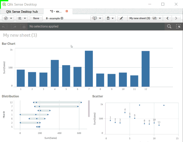
And that's it. Don't forget npm run webpack, and check out the results. Here's what it should look like - Vega bar chart.
I've attached the full project in case you'd prefer to just download that and play around too.
-
Automating deployments of Qlik Sense with Terraform
Welcome to Tuesday's edition of the Qlik Design Blog. In this entry I have the pleasure of introducing some fine work created by Clint Carr, Principal Enterprise Architect at Qlik based in Melbourne Victoria Australia. Clint has shared a document he created that outlines the procedures to automating a Qlik Sense Enterprise deployment in the cloud. Using hosted services such as Microsoft Azure or Amazon Web Services. Qlik Sense Enterprise is a sup... Show MoreWelcome to Tuesday's edition of the Qlik Design Blog. In this entry I have the pleasure of introducing some fine work created by Clint Carr, Principal Enterprise Architect at Qlik based in Melbourne Victoria Australia. Clint has shared a document he created that outlines the procedures to automating a Qlik Sense Enterprise deployment in the cloud. Using hosted services such as Microsoft Azure or Amazon Web Services.
Qlik Sense Enterprise is a superbly thorough and versatile analytics platform. So much so, that it is even possible to create automated
deployment scenarios using software such as HashiCorp Terraform and our Qlik Sense Enterprise software available from cloud marketplaces such as Microsoft Azure and Amazon Web Services. Terraform is an open source tool that enables you to create infrastructure (machines and applications) based on configuration files in a safe and predictable fashion. This approach ensures the same deployment is performed each time it is executed.
For an in depth look, see the attached PDF document for prerequisites and a step by step approach to setting up this type of configuration.
Some benefits of this approach include:
- Consistency and repeat-ability
- Reduce risk
- Knowledge is shared - the process is not owned by one individual
- Documented approach with source code to deploying Qlik Sense
- Quick and efficient installations - saving time and money
We'd like to thank Clint for this most valuable contribution. I will field comments questions and direct them to Clint where applicable, so please post them as you see fit. We'd love to hear from you.
About Clint Carr:
 Clint is an Enterprise Architect in the Global Enablement, Architecture and Research (GEAR) team at Qlik. GEAR is considered a pre-sales swat team of sorts, tasked with working on the largest of Qlik's prospective customers, performing enablement for the field (pre-sales and consulting) and creating tools and products that enable the field to be better equipped to deal with their day to day tasks. His current focus is on DevOps, integration and cloud native technologies. In the five years he has worked at Qlik Clint has held various roles. Starting as a presales architect then moving into a consulting role as a Technical Architect before joining the GEAR team. Clint has been involved in some of the largest of Qlik's customers both in Australia and internationally helping them to realize the value in the platform.
-
Introducing TKB Helpfulness
Hello Qlik Community! We are halfway through the year! In the States, kids are officially on summer break, and temperatures are rising. We are gearing up for a long weekend to celebrate the 4th of July! This week we added TKB Helpfulness to our Support Articles. TKB Helpfulness allows you to let us know if the article solved the issue or not with a simple ‘Yes’ or ‘No’. Selecting ‘Yes’ will display a ‘Thank you for your feedback!’ message. Selec... Show MoreHello Qlik Community!
We are halfway through the year! In the States, kids are officially on summer break, and temperatures are rising. We are gearing up for a long weekend to celebrate the 4th of July!
This week we added TKB Helpfulness to our Support Articles. TKB Helpfulness allows you to let us know if the article solved the issue or not with a simple ‘Yes’ or ‘No’.
Selecting ‘Yes’ will display a ‘Thank you for your feedback!’ message. Selecting ‘No’ will allow you to submit feedback on improving the article. The Qlik Support team will review the feedback.
The responses are also compiled into a rating displayed in the upper right-hand corner (above version history). You can use this information to see if the article helped your peers.
Until responses are collected, ‘No Rating’ will display.
The 5-star rating is still available and can now be found on the right side of the article. This area should be used to provide general feedback on the content, not limited to whether it solved your visit’s intent.
If you’re celebrating a holiday this weekend, enjoy and stay safe! We will see you soon with another Qlik Community update.
Your Admins,
Melissa, Sue, Jamie, and Nicole
-
New Qlik Cloud Admin Qlik Continuous Classroom Modules Launched!
And they are Free. Access System Administrator Course Library and sort by Newest first!
-
Connector Factory – June 2023 releases
This month, Connector Factory has released more Qlik Application Automation and Qlik Cloud Analytics connectors. Connector Factory is Qlik’s strategy to continually expand access to and delivery of data from hundreds of SaaS applications and data sources to fuel ever-evolving enterprise cloud analytics and data integration needs. -
Data skills crucial to future of EU market success
At a recent event in Brussels, expert highlighted the importance of skills to boost the data industry and encourage data-driven innovation. -
Don't join - use Applymap instead
My latest blog post was on joins in QlikView (see To Join or not to Join). In it I claimed that you should avoid making joins in the QlikView script, if possible. This blog post is about a function that can help you avoid joins. It is about the function Applymap().
-
How to create a custom theme in Qlik Sense
Custom Themes is one of the new features shipped with February release so make sure you are updated before trying to come up with your own. To create a new theme, first we need to understand what exactly is a theme and what it can do for us. A custom theme is a collection of files stored in a folder, it must contain a definition (QEXT) file, a main JSON file, and optionally any other assets you might need to support the custom theme such as CSS f... Show MoreCustom Themes is one of the new features shipped with February release so make sure you are updated before trying to come up with your own.
To create a new theme, first we need to understand what exactly is a theme and what it can do for us. A custom theme is a collection of files stored in a folder, it must contain a definition (QEXT) file, a main JSON file, and optionally any other assets you might need to support the custom theme such as CSS files, custom font files, images, etc.
Custom themes let users to quickly apply different levels of customization to their apps, some of you might be interested in having your custom color palletes, while someone else might just need bigger font size, both can be achieved with Custom Themes. Theme authors can target individual visualization objects via JSON and/or use a custom CSS to modify the sheet styles.
From Qlik Help
The custom styles can be defined in two ways:
- In the JSON file you define the style for the individual visualization types, for example bar charts and line charts.
- CSS styling is more general and flexible. You can, for example, style sheets, visualizations and extensions.
Creating a simple custom theme
I'll be using Qlik Sense Desktop for this example, please check the help page for instructions on how to install a Custom Theme in Qlik Sense Server.
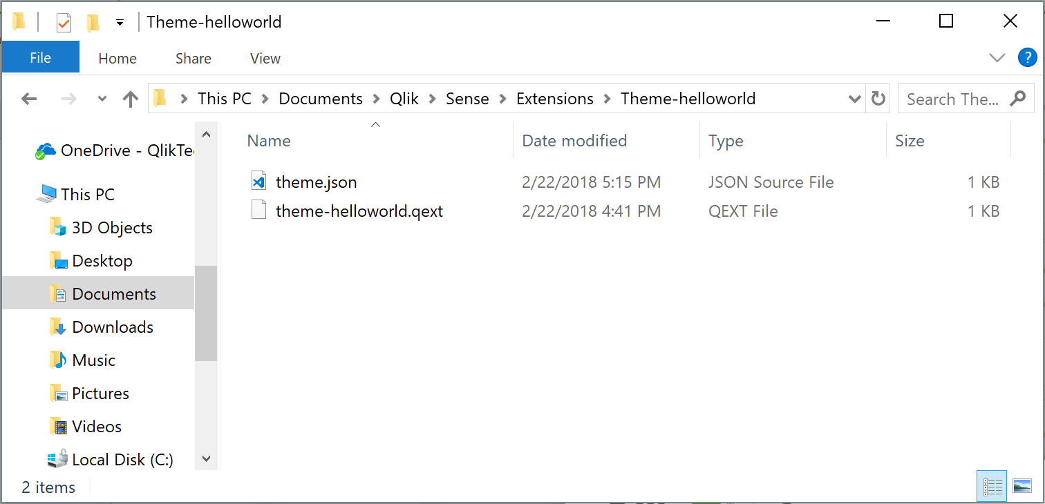
- Go to your extensions folder: C:\Users\[username]\Documents\Qlik\Sense\Extensions
- Create a new folder, I'll call mine theme-helloworld
- Create a new file and rename it to theme-helloworld.qext. The QEXT file is a definition file that contains a few lines, where only name and type are the only mandatory lines.
{ "name": "Hello World theme", "description": "My first custom theme", "type": "theme", "version": "1.0.0", "author": "Arturo Muñoz" }- Now, it's time for the JSON file. Create a new file, name it theme.json
- Edit the theme.json file with your favorite text/code editor
- My advice is to start your theme with the sample code you can find in Qlik Help so you can familiarize with JSON and it's properties:
{ "_inherit": true, "_variables" : { "@greenColor" : "#61a729", "@text": "#4c4c4c" }, "color": "@text", "fontSize": "12px", "object" : { "title": { "main": { "fontSize" : "16px" } } }, "dataColors": { "primaryColor": "@greenColor" } }- The JSON file will change the primary color of your charts from Qlik dark blue to the custom green as defined in the variable at line 4 and will also modify the charts title to a font size of 16 pixels.
This is a simple example but there are much more you can do with the JSON file, you could for example, define new color schemes for measures, change the axis', labels, legends font size and color and much more.
Actually you could even load your custom CSS through the JSON file so you can target and hack any predefined style within your app, so you could modify object paddings, change font family, and so forth.
If you've followed the steps above you should have something like:
How to activate a Custom Theme?
Check how to apply a Custom Theme to your app in the animation below
Tips from the expert... and theme sharing!
I've asked my colleague Nabeel Asif for some tips since he created the Custom Theme based on Color Brewer that we are sharing today (check the attachments). This is what he said:
All of our standard themes just give one sequential and one diverging gradient for measures, and two color schemes for dimensions. But you can actually define as many options as you like through the “scale” and “palettes” properties in the theme’s JSON.
For sequential and diverging gradients, Qlik uses seven colors to define a scheme. But you don’t actually need to specify all seven colors. Just define the two colors at the extremes, and Qlik does a nice job of calculating the rest. Of course, if you want very specific colors you can define them yourself.
Often apps will be designed with red representing something bad or dark colors representing higher values. To maintain this look as the user switches themes, you should follow these conventions in the JSON:
- Diverging scales should be ordered from reddish hues to bluish hues.
- Sequential scales should be ordered from dark to light.
Please don't forget to always check Qlik Help for the most recent specifications.
Enjoy

-
Tech Layoffs 2020–2023 (Decomposition Tree & More)
Tech Layoffs in 2020–2023 AnyChart — QS Extensions Explore tech layoffs in-depth using decomposition tree and other interactive visualizations powered by Qlik and AnyChart based on data from Layoffs.fyi by Roger Lee. Discoveries Identify which countries, industries, and companies have experienced the most job cuts and when they occurred. Compare the number of layoffs with funds raised and gain other insights into tech layoff statistic... Show MoreTech Layoffs in 2020–2023AnyChart — QS Extensions Explore tech layoffs in-depth using decomposition tree and other interactive visualizations powered by Qlik and AnyChart based on data from Layoffs.fyi by Roger Lee.
Discoveries
Identify which countries, industries, and companies have experienced the most job cuts and when they occurred. Compare the number of layoffs with funds raised and gain other insights into tech layoff statistics over the past few years.
Impact
Analyze layoffs in the technology sector worldwide since the COVID-19 pandemic with data from Layoffs.fyi.
Audience
Everyone who wants to know more about tech layoffs.
Data and advanced analytics
This app features charts built with AnyChart's Decomposition Tree and Combo Chart extensions for Qlik Sense. The data used in this analysis is from Layoffs.fyi.
-
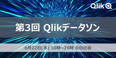
【開催レポート】 第3回 Qlikデータソン @ 日比谷国際ビル
6月22日、第3回のQlikデータソンを開催しました。 過去2回のデータソンはオンライン開催でしたが、今年はついにリアル会場で開催できました。QlikユーザーやQlikパートナー、初級者から上級者まで、約70名のQlikアプリ開発者が日比谷の会場に一堂に会しました。ここから丸一日、参加者全員がQlikに向き合う、まさにQlik漬けの熱い一日になりました。 このブログでは、第3回Qlikデータソンの様子をお届けします。 なお、受賞者のQlik Senseアプリは、日本語デモアプリサイト「Qlik Showcase」に一般公開されています。また、7月11日(火曜) 14時より「Qlik Japan Live:Qlikデータソンアフター配信(視聴申込はコチラ)」と題して、アワード受賞アプリのご紹介などデータソンの様子をライブ配信でお届けさせていただきます! ■朝10時、日比谷に集合!そしてデータソンスタート! 最初に、Qlikの中嶋よりオープニングのご挨拶とデータソンの課題やデータ... Show More6月22日、第3回のQlikデータソンを開催しました。
過去2回のデータソンはオンライン開催でしたが、今年はついにリアル会場で開催できました。QlikユーザーやQlikパートナー、初級者から上級者まで、約70名のQlikアプリ開発者が日比谷の会場に一堂に会しました。ここから丸一日、参加者全員がQlikに向き合う、まさにQlik漬けの熱い一日になりました。
このブログでは、第3回Qlikデータソンの様子をお届けします。
なお、受賞者のQlik Senseアプリは、日本語デモアプリサイト「Qlik Showcase」に一般公開されています。
また、7月11日(火曜) 14時より「Qlik Japan Live:Qlikデータソンアフター配信(視聴申込はコチラ)」と題して、アワード受賞アプリのご紹介などデータソンの様子をライブ配信でお届けさせていただきます!■朝10時、日比谷に集合!そしてデータソンスタート!
最初に、Qlikの中嶋よりオープニングのご挨拶とデータソンの課題やデータに関する説明がありました。参加者にはデータソンの課題や使用するデータに関する情報は一切事前に告げられておらず、このとき初めて課題とデータが提供されました。
参加者の皆さんは「大手モバイル通信会社のデータアナリスト」として、自社顧客データの分析を言い渡されました。以下のような「社内からの要望」を受けて、Qlik Sense SaaSを使ったデータの可視化や分析に取り組みます。
"顧客属性・契約・請求・サポートといったあらゆる角度から探索できるBIアプリが欲しい。"
"支払遅延を頻繁に起こしている顧客の特徴を知りたい。"
"現在の契約者と解約してしまったお客様の特徴を比較して、改善点があれば指摘してほしい。"また、今回のデータソンではQlik Sense SaaSによる分析のみならず、自動機械学習「Qlik AutoML」を使用した予測分析にも挑戦することができました。過去に通信契約を解約してしまった顧客の属性や行動履歴をヒントに、「一体どんな顧客が将来解約に至りやすいのか」といったことを機械学習を用いて予測分析しました。
データや課題の読み込みからデータの可視化、探索、予測、そしてプレゼンテーションの準備まで...途中お弁当タイムを挟みながら、提出締切の15時30分まで5時間みっちりと取り組みました。皆さん、ものすごい集中力でした!
(こっち見んな)
■いよいよ成果発表会!プレゼン大会!
16時からは、全参加者が分析結果をプレゼンする成果発表会が行われました。参加者数が非常多かったため、ユーザー部門とパートナー部門で部屋を分かれてそれぞれで発表会を実施しました。持ち時間は1チーム5分間!どのチームも短時間でアピールポイントを詰め込んだ素晴らしい発表でした。
成果物の評価は、参加者による投票とQlik審査員による審査で行いました。皆さん、食い入るように他の参加者の発表を熱心に見聞きしていましたね!
■ドキドキのアワード授賞式!そして懇親会で互いの健闘をたたえあう
発表と投票が終わったあと、ユーザーとパートナーが改めてひとつの部屋に集合しました。ここで、我らがQlik Japanカントリーマネージャー今井 浩の乾杯挨拶を皮切りに、懇親会スタート!
ちなみに、乾杯挨拶の中では最近発表されたQlikとTalendの統合の話題にも触れられました。
Qlik CloudプラットフォームにさらにTalendの強力なデータ統合・データ品質などのソリューションが加わることにより、市場でもユニークなデータソリューションベンダーにQlikは進化しています!そして...いよいよアワード発表の時間がやってきました!Qlikの濱野と中嶋が壇上にあがり、パートナー部門、ユーザー部門それぞれの賞を発表しました。
受賞者は以下の通りです。
*チーム参加の場合「チーム」と併記し、個人参加の場合は、個人名を記載しています。①パートナー部門
・デザイン賞: 久米 弘文 様
・テクニカル賞: ちいかわ(チーム、TDCソフト)
・優秀賞: インサイトクラン(チーム、日立社会情報サービス)
・最優秀賞: 吉野 智士 様(株式会社アシスト)
②ユーザー部門
・アイデア賞: K2000(チーム)
・デザイン賞: チーム横浜(チーム、富士通株式会社)
・テクニカル賞: BHI(チーム)
・優秀賞: 川上 直人 様(株式会社デンソー)
・最優秀賞: DdSD(チーム、本田技研工業株式会社)受賞されたみなさま、おめでとうございます!
受賞者のQlik Senseアプリは、日本語デモアプリサイト「Qlik Showcase」に一般公開されています。ぜひ一度覗いてみてください!また、7月11日(火曜) 14時より、「Qlik Japan Live:Qlikデータソンアフター配信(視聴申込はコチラ)」と題して、アワード受賞アプリのご紹介など、データソンの様子をお届けさせていただきます!
■さいごに
第3回Qlikデータソンは、参加者が熱心にデータ分析に取り組み、すばらしい成果を共有する場となりました。QlikユーザーもQlikパートナーも、初級者も上級者も、さまざまなバックグラウンドを持つ参加者が一堂に集まり、データソンの魅力を存分に楽しんでいただけたのではないかなと思います。ご参加いただいた皆様、本当にありがとうございました。
-
Fully Integrated AI and ML - The Path Forward (Part 3 of the Series)
Welcome to the next video in our series focused on our strategy, capabilities and direction for AI and ML. During this series, we describe our unique approach to AI and ML, demonstrate existing and new capabilities for Augmented Analytics in Qlik Sense, AutoML and Predictive Analytics, and offer a look at our future direction and what’s coming next. -
U.S. Climate, 2010–2023
U.S. Climate, 2010–2023 AnyChart — QS Extensions Explore climate data for the United States between 2010 and 2023 from various perspectives with the help of advanced Combo Charts powered by AnyChart's extension for Qlik Sense. Discoveries Monitor air temperatures and assess the comfort level of the weather. Delve into precipitation, wind, humidity, pressure, UV index, and cloud cover data, compare year-over-year trends, and discover m... Show MoreU.S. Climate, 2010–2023AnyChart — QS ExtensionsExplore climate data for the United States between 2010 and 2023 from various perspectives with the help of advanced Combo Charts powered by AnyChart's extension for Qlik Sense.Discoveries
Monitor air temperatures and assess the comfort level of the weather. Delve into precipitation, wind, humidity, pressure, UV index, and cloud cover data, compare year-over-year trends, and discover more insights.
Impact
Check out AnyChart's Combo Chart extension in action and see how it can help you analyze the changes of several metrics over time or by category when they vary in scale, to discover possible correlations.
Audience
Anyone who wants to analyze weather data in-depth and see examples of advanced, yet still very intuitive to build combo charts in Qlik Sense.
Data and advanced analytics
The data is taken from the U.S. Climate Data dataset on Kaggle. The application features combo charts built with AnyChart's dedicated extension for Qlik Sense.
🔗 >> VIEW IT LIVE OR DOWNLOAD (.QVF) <<
-
Register Now for an Upcoming Live Instructor Webinar!
Qlik Continuous Classroom Live Instructor Webinars for the second half of the year are now available for registration! -
Document Approval
Document Approval Inphinity Documents, approval steps, final decision, related data as well as additional notes. All in one secure place - in the Qlik application. Upload the document and let it be checked (facts, finance, legal). Capture data about checks and save notes if needed. Open the document, see the data, and make the decision - approve or decline it. The application is available for FREE (www.demo.myinphinity.com). Discoveri... Show MoreDocument ApprovalInphinityDocuments, approval steps, final decision, related data as well as additional notes. All in one secure place - in the Qlik application. Upload the document and let it be checked (facts, finance, legal). Capture data about checks and save notes if needed. Open the document, see the data, and make the decision - approve or decline it. The application is available for FREE (www.demo.myinphinity.com).Discoveries
See all documents that are/were in the approval process, their current stage, and related data.
Impact
TRANSPARENCY, EFFICIENCY, and SECURITY in approval processes.
Audience
Anyone involved in approval processes in your organization.
Data and advanced analytics
Documents, a full changelog, as well as a visual representation of the process flow, are available throughout.
-
Qlik Data Integration Newsletter - June 2023
This is our inaugural edition of our Monthly Newsletter for Qlik Data Integration updates. We'll cover one endpoint per month and share our top resources, best practices, release updates and upcoming webinars. Subscribe to the Qlik Data Integration topic to be notified of future editions! Index Resource Highlights:WebinarsKnowledgebase ArticlesAnalyze Qlik Replicate LogsEndpoint Spotlight: OracleNew Issues ReportedTips! Release Up... Show MoreThis is our inaugural edition of our Monthly Newsletter for Qlik Data Integration updates. We'll cover one endpoint per month and share our top resources, best practices, release updates and upcoming webinars.
Subscribe to the Qlik Data Integration topic to be notified of future editions!Index
- Resource Highlights:
- Webinars
- Knowledgebase Articles
- Analyze Qlik Replicate Logs
- Endpoint Spotlight: Oracle
- New Issues Reported
- Tips!
- Release Updates
- Fixes
- Enhancements
- Qlik Data Integration Product End of Life Versions:
Resource Highlights:
Webinars
Book your calendar for the upcoming Qlik Replicate Q&A session scheduled for July 25th at 10:00 AM EDT. It is a live Q&A session with a panel of Qlik experts. Bring your questions, and we do our best to answer them.
Explore Qlik Support's recorded Techspert webinar series on-demand or visit our YouTube Channel to discover more!
Knowledgebase Articles
Analyze Qlik Replicate Logs
- We have put together a comprehensive guide on how to analyze Qlik Replicate log files. The guide will show you how to verify what version you are running what types of tasks are being run, and more: How to analyze a Qlik Replicate log
- In addition, we've compiled a List of the error types in Qlik Replicate.
Endpoint Spotlight: Oracle
Find our latest knowledge base articles for Oracle endpoints.
New Issues Reported
- Resume tasks failing after upgrading to 2022.11 SP03(.475) and SP04(.546).
- The correct SCN is not stored when the task is stopped. The task cannot be resumed due to the wrong SCN captured. Find the resolution in Qlik Replicate with Oracle endpoint: Resume tasks failing after upgrading to 2022.11 SP03(.475) and SP04(.546).
- Qlik Replicate captures no Data after the Oracle Source has been upgraded to 4 Node RAC
- The SCN value of the Qlik Replicate task is no longer valid after the Oracle environment upgrade as the SCN has changed. Find the resolution in Qlik Replicate captures no Data after the Oracle Source has been upgraded to 4 Node RAC.
- Qlik Replicate using Oracle source fails with missing redo log
- Qlik Replicate is always reading V$archived_log to get the archived REDO information. The redo log needs to have an active/available status from the V$archived_log.
- Find a solution to this error in Replicate using Oracle source fails with missing redo log.
Tips!
- How to start a Replicate task with Oracle source endpoint from a requested SCN
- To find the current SCN value follow the steps in How to start a Replicate task with Oracle source endpoint from a requested SCN.
- What is the usage of Oracle directories in Replicate Oracle source?
- Find answers for the following related question:
- Purpose for creation of directories in Oracle (Source)
- What are files we are going to keep in these directories
- What storage required for the directories
- If files are going to keep in the directories then what will be the retention period
- What's the usage of Oracle directories in Replicate Oracle source
- Find answers for the following related question:
- Best Practice: Configure Oracle ASM with copy redo logs to a temporary folder
- When the Copy redo logs to temporary folder option is enabled, Qlik Replicate instructs Oracle to copy the full redo log or chunks of the redo log to a local folder residing on the Oracle Server machine or to a shared network folder accessible by Oracle Server.
- Find out more in Configure Oracle ASM with copy redo logs to a temporary folder.
Release Updates
Fixes
Qlik Replicate May 2023 SP1
Type: Issue
Component/Process: Oracle Source - Replicate Log Reader
Description: Added support for Oracle DIRECT INSERT statements with PARALLEL_DML for non-compressed pages.
Enhancements
August 2023 SR
- New Confluent Endpoint (based on Kafka)
November 2023 IR
- Confluent Schema Register using BOTH authentication methods (Public Key + Username & password)
- Expose stream buffer tuning parameters in task settings per ideation request: Replicate & QEM - Expose stream buffer tuning para... - Qlik Community - 1763259
Note: To request features, share ideas, and upvote other ideas check out our ideation platform: Request | Feedback (qlik.com)
Qlik Data Integration Product End of Life Versions:
Qlik Release Qlik Replicate / Enterprise Manager End of Support Date Qlik Compose End of Support Date February 2021 November 2020 SR1 November 2022 February 2021 February 2023 May 2021 May 2021 May 2023 May 2021 May 2023 August 2021 May 2021 SR1 May 2023 August 2021 August 2023 November 2021 November 2021 November 2023 November 2021 November 2023 For more information, see Qlik Product Lifecycles.
-
Visualization Innovations Extend Self-service Exploration and Analysis
Qlik continues to invest in enhancements to Qlik Sense visualization capabilities, and the recent Qlik Sense SaaS and Client-Managed releases are no exception. -
【オンデマンド配信】富士通(株)事例:どうする?!データ利活用 悩める推進リーダーの集い
企業のビジネス活動において、データはこれまで以上に必要不可欠な資産となっています。増え続けるデータを管理・統合・分析し、データでアクションを起こす必要性が増している現在、成功している企業はどのようなデータ戦略を実行しているのか?本 Web セミナーシリーズでは、Qlik でデータからアクションを起こすデータ主導のビジネスで成功しているお客様より、課題から導入の経緯、デモンストレーション、活用例などをご紹介します。 ※ 参加費無料。パソコン・タブレット・スマートフォンで、どこからでもご視聴いただけます。 オンデマンド配信:どうする?!データ利活用 悩める推進リーダーの集い 各社でデータ利活用を推進する、悩めるリーダー仲間のみなさん。正解がない中、確かな手ごたえを感じることばかりではない中、次の一手に迷っていませんか?本セッションでは、富士通が進める「データドリブン経営」の推進現場の今!をご紹介します。データ利活用基盤・サービス/人財育成/カルチャー変革、それぞれの推進リーダーが、活動を進め... Show More企業のビジネス活動において、データはこれまで以上に必要不可欠な資産となっています。増え続けるデータを管理・統合・分析し、データでアクションを起こす必要性が増している現在、成功している企業はどのようなデータ戦略を実行しているのか?
本 Web セミナーシリーズでは、Qlik でデータからアクションを起こすデータ主導のビジネスで成功しているお客様より、課題から導入の経緯、デモンストレーション、活用例などをご紹介します。※ 参加費無料。パソコン・タブレット・スマートフォンで、どこからでもご視聴いただけます。
オンデマンド配信:
どうする?!データ利活用 悩める推進リーダーの集い各社でデータ利活用を推進する、悩めるリーダー仲間のみなさん。正解がない中、確かな手ごたえを感じることばかりではない中、次の一手に迷っていませんか?
本セッションでは、富士通が進める「データドリブン経営」の推進現場の今!をご紹介します。データ利活用基盤・サービス/人財育成/カルチャー変革、それぞれの推進リーダーが、活動を進める中で見えてきた課題と、その課題をどう乗り越えようとしているのかをお伝えします。 -
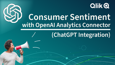
Consumer Sentiment with #chatgpt and the Qlik Analytics OpenAI Connector - Comi...
Need insights from other sources? Check this out!