Unlock a world of possibilities! Login now and discover the exclusive benefits awaiting you.
Analytics & AI
Forums for Qlik Analytic solutions. Ask questions, join discussions, find solutions, and access documentation and resources.
Data Integration & Quality
Forums for Qlik Data Integration solutions. Ask questions, join discussions, find solutions, and access documentation and resources
Explore Qlik Gallery
Qlik Gallery is meant to encourage Qlikkies everywhere to share their progress – from a first Qlik app – to a favorite Qlik app – and everything in-between.
Qlik Community
Get started on Qlik Community, find How-To documents, and join general non-product related discussions.
Qlik Resources
Direct links to other resources within the Qlik ecosystem. We suggest you bookmark this page.
Qlik Academic Program
Qlik gives qualified university students, educators, and researchers free Qlik software and resources to prepare students for the data-driven workplace.
Recent Blog Posts
-
Vizlib Input Form
Vizlib Input FormVizlibVizlib Input Form (included in Vizlib Collaboration) lets you capture user input and enter new data points into your published ... Show MoreVizlib Input FormVizlib Vizlib Input Form (included in Vizlib Collaboration) lets you capture user input and enter new data points into your published Qlik Sense apps. Store the data to QVDs, CSVs, REST APIs, and more.
Discoveries
Vizlib Input Form helps you to shape and manage the quality of form data quickly and efficiently. Entering data into an online form is one of the most common methods of collecting data from a user group. As more data is collected, you may decide to make changes to the form, or even create a new one. Vizlib Input Form gets you started quickly by using a layout wizard and templates, and it has a range of features for customizing format, color and layout.
Impact
Saves time, intuitive, additional customizations.
Audience
Business analysts.
Data and advanced analytics
Vizlib Input Form can send dynamic data to almost any business tool—from another system, like your CRM, to email or Slack or an output file (like .csv or .qvf). Using a range of classic data input types, you can design your own custom and fully branded data input form to blend in with your dashboards.
-
Vizlib Teamwork
Vizlib TeamworkVizlibVizlib Teamwork is part of Vizlib Collaboration, the most comprehensive full-cycle collaboration layer for your analytics solutio... Show MoreVizlib TeamworkVizlibVizlib Teamwork is part of Vizlib Collaboration, the most comprehensive full-cycle collaboration layer for your analytics solutions. It’s designed to support your entire insights-to-action journey in Qlik Sense: from team discussions and insight sharing in real-time to workflows and data adding and editing on the fly.Discoveries
Vizlib Teamwork is all about collective intelligence and bringing your team and data together in Qlik Sense. Users can easily kick-off discussions right in their dashboards, call attention to interesting data points with contextualised comments and share their view of data with other people on the team. With in-context communication and real-time conversations inside your dashboards, teams can ask and answer questions in minutes, saving time and making better decisions.
Impact
Vizlib Teamwork improves the process of communication around your data. It gives your team the ability to share insights, handle data confidently and converse, collaborate and share knowledge directly in Qlik Sense, powering their analysis and aiding with decision-making.
Audience
Business analysts, Line of Business team members from analyst to VP/Director.
Data and advanced analytics
With in-context communication and real-time conversations inside an organization's dashboards, teams can ask and answer questions in minutes, saving time and making better decisions.
-
TRUECHART for Qlik Sense
TRUECHART for Qlik SenseTRUECHARTTRUECHART reduces the time required both to prepare reports, and also for the consumer to review and understand the c... Show MoreTRUECHART for Qlik SenseTRUECHARTTRUECHART reduces the time required both to prepare reports, and also for the consumer to review and understand the content being presented by fully-enabling the International Business Communication Standards (IBCSà ®) in any corporate environment. Creating and displaying data using IBCSà ® within your BI results in uniform data visualizations that offer dynamic, meaningful reports giving your business a valuable strategic advantage. For business analysts, report authors and report developers. Consumed/used by any team member.Discoveries
Take advantage of TRUECHARTs key features - Charting Engine, Charting Wizard, Cross-Platform Charting Library, Report Annotation System - to extend your Business Intelligence and Analytics Platform. Explore TRUECHART and extend the possibilities of your Qlik Sense environment. With this extension, you will be able to go a step further and break out of the sheet layout. Building upon a grid-based layout, TRUECHART lets you design your reports and dashboards without boundaries. Choose from a variety of charting, commenting and layout functions. Once your design is finished, save it as a template and speed up the future design process throughout your company. Use the TRUECHART service to profit from an enterprise-wide standard that can be updated or altered by one click pushing the effect to all TRUECHART extensions. While being connected to the TRUECHART service, comments and collaboration functions will be user-specific, enhancing the data literacy bringing your Qlik Sense ecosystem to the next level.
Impact
Ability to choose from different visualizations while using one extension, use TRUECHART FO QLIK SENSE to make things more narrow, commenting in TRUECHART create tables with inline comments based on the values you choose.
Audience
Business Analysts, functional team members, report developers.
Data and advanced analytics
TRUECHART reduces the time required both to prepare reports, and also for the consumer to review and understand the content being presented by fully-enabling the International Business Communication Standards (IBCSà ®) in any corporate environment.
-
The Master Time Table
Often you should create a separate table for the Time dimension. To understand why, we need to look at the cardinality of the field used as key, i.... Show MoreOften you should create a separate table for the Time dimension. To understand why, we need to look at the cardinality of the field used as key, i.e. the number of possible values. If a date is used as key, there can be at most 366 unique values per year. Hence, the Master Calendar will have at most 366 records per year. This makes the Master Calendar a small, efficient dimension table.
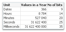
But if we instead use a timestamp as key, we have a different situation. A timestamp rounded to the nearest second will have over 30 million possible values per year. And if it has milliseconds too, it becomes even worse… A timestamp usually has almost the same number of unique values as the transaction table has records. It goes without saying that such a timestamp is inappropriate as dimension key. The dimension table would in many cases become just as big as the transaction table and nothing would be gained.
So, what should we instead do?
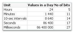
One good way is to convert the timestamp to two keys: Date and Time. The Date key needs to be truncated to the nearest integer so that no time information remains. For the Time key, it's the other way around: The integer part of the number needs to be removed so that no date information remains. In addition, it should be truncated - preferably to the nearest minute or 10-second interval - to keep the cardinality down.
These keys can be created through:
Date(Floor(Timestamp)) as Date
Time(Floor(Frac(Timestamp),1/24/60),'hh:mm') as TimeThis way you will be able to have two master tables, one with 366 records per year, and one with perhaps 1440 records – both tables small and efficient. The Master Time table can have fields for hours, minutes and e.g. work shifts and can easily be created from the above key.
However, you lose information when you remove the information about seconds and milliseconds. So, you need to ask yourself whether you need this information or not. If you do, the best option is often to keep the original timestamp in the transaction table, in addition to the created keys, so that it can be used to calculate different measures. If not, just don’t load the original timestamp.
Summary:
- Think of the cardinality when you create dimensions.
- Make sure that the key to the Master Calendar table is an integer (formatted as a date): Use the Floor() function to remove the time component.
- If you need hour and minute as fields, create a Master Time table.
- Make sure that the key to the Master Time table is the fractional part of the timestamp, truncated to e.g. the nearest minute: Use a combination of the Floor() and the Frac() functions to create it.

-
Looking for Qlik Opportunities?
Did you know that the Qlik Community has a Job Board? Yes, indeed, it does! The job board is available to help companies acquire candidates with Qlik... Show MoreDid you know that the Qlik Community has a Job Board? Yes, indeed, it does!
The job board is available to help companies acquire candidates with Qlik skills and offer a platform for people to post their own interest in obtaining positions using their Qlik skills! In addition, the job board offers an opportunity for companies to post internships and allows students to promote themselves for hire! It’s as easy as following the guideline and creating a post! Check it out today!
Tips for students- Join the Qlik Academic Program for access to software, training, and the chance to obtain a Qlik Sense certificate to help boost your employability.

-
【オンデマンド配信】2023年展望:データ統合における重要な一年
ここ数年、多くの企業が DX を実現してきましたが、真のイノベーターと呼べるのは、この先の道を切り開いていく企業です。 本 Web セミナーでは、Ventana Research 社と Qlik が、2023年のデータ統合市場に影響を及ぼす重要なアーキテクチャ・アプローチ・革新的な技術について、議... Show Moreここ数年、多くの企業が DX を実現してきましたが、真のイノベーターと呼べるのは、この先の道を切り開いていく企業です。
本 Web セミナーでは、Ventana Research 社と Qlik が、2023年のデータ統合市場に影響を及ぼす重要なアーキテクチャ・アプローチ・革新的な技術について、議論します。新たな成功を目指したデータ統合テクノロジーの導入とは?そのヒントをご紹介します。
※ 参加費無料。パソコン・タブレット・スマートフォンで、どこからでもご視聴いただけます。日本語字幕付きでお届けします。
- クラウドデータ統合と自動化の関連性
- 信頼性の高いリアルタイムデータで、アナリスト、データサイエンティスト、データスチュワードをサポートする方法
- 最新データスタックの構築と導入。データファブリックとデータメッシュの違い
- クラウドデータ統合と自動化の関連性
-
Fun facts about the Friday the 13th movie franchise
Here are some fun facts I discovered about the Friday the 13th movie franchise using Qlik Sense. The automatic data relationships and associations eve... Show MoreHere are some fun facts I discovered about the Friday the 13th movie franchise using Qlik Sense. The automatic data relationships and associations even pointed a few things I did not know. Enjoy!
Data scraped from: https://fridaythe13th.fandom.com/ - .qvf and Qlik Sense sample data attached
Can't see the video - check out Qlik's video host here

-
PowerKPI
PowerKPIRBC GroupPowerKPI trusted visualization extension allows you to visually design responsive and interactive user experience for Qlik Sense: fro... Show MorePowerKPIRBC GroupPowerKPI trusted visualization extension allows you to visually design responsive and interactive user experience for Qlik Sense: from simple KPI dashboards to interactive detailed table/list views.Discoveries
PowerKPI component allows developers to visually design stunning-looking, responsive and interactive dashboards using spreadsheet-like visual editor: from simple kpi to interactive fancy and stunning-looking "table-like" data views (with the ability to build custom multiline detailed row templates). For Qlik Sense developers.
Impact
Add more features to Qlik Sense applications, find out new ways of data visualization and makes the process of development faster and easier.
Audience
Business analysts, managers and Qlik Sense app developers.
Data and advanced analytics
Expand visualization capabilities in Qlik Sense for Pixel Perfect design, merge cells the same way as in Microsoft Excel, change the size of columns and rows, use various formatting styles - font, color, background, cell borders, text alignment in cells. Extend functionality and interoperability while designing dashboards in Qlik Sense due to action libraries. Manage data display by using visualization templates, conditionally or interactively. Use true mobile responsive design.
-
Inphinity Forms
Inphinity FormsInphinityInphinity Forms multiplies the value of your Qlik Sense investment by shifting your Qlik from data analytics to an actionable ... Show MoreInphinity FormsInphinityInphinity Forms multiplies the value of your Qlik Sense investment by shifting your Qlik from data analytics to an actionable and fully-collaborative platform. Inphinity Forms is a fully self-service extension ready to be used right after the installation. Thanks to its Qlik-style design, its management and usage are intuitive. For advanced users, there is comprehensive documentation available. For business analysts, Qlik application developers.Discoveries
List of all active users is truly revolutionary for Qlik-native extensions. Knowing who else is working with the same data as you are (especially when more of you can edit it) brings transparency, and entices users to use built-in collaboration. Autorefresh of the object whenever any change is saved. Locking row when editing. Whenever you start editing a row, it is locked for you. Because of the previous features, everyone else sees it immediately – the row is locked as well and by whom.
Impact
Inphinity Forms enables users to efficiently act upon data, collaborate and removes the need for spreadsheets. Natively integrated in Qlik Sense Inphinity Forms is the premium Qlik writeback extension.
Audience
business analysts, managers in line of business.
Data and advanced analytics
Zero coding, no time-consuming configuration, and a short learning curve. Just install the add-on, choose from dozens of ready-made models and templates, and you are all set.
-
Komment by ExtendBI
Komment by ExtendBI ExtendBI Komment is the writeback extension that is easy to install, easy to use and easy on your wallet. So easy to setup t... Show MoreKomment by ExtendBIExtendBIKomment is the writeback extension that is easy to install, easy to use and easy on your wallet. So easy to setup that you can start to write and edit data directly in your Qlik Sense apps in less than five minutes. It is so well-integrated with Qlik Sense that you feel like it is a native Qlik product.Discoveries
Komment has all the features to support your writeback use cases including the following: Data entry: Write comments directly in your Qlik Sense application. You can also create, delete or edit data points. Design: Select from a range of input options (Date, Select, Group, Text, Number, Check, Measure, Variable, and more) Use the data: Your data entries are immediately available to use in other charts and tables. Just press save and everybody is on the same page. Traceability: Out-of-the-box audit trail provides insight into what has been changed, by who, and when it was changed. Data storage: Your entries are saved into QVD files that you can manage and back-up as you do with any other data sources. If you need to store data in a MS SQL DB Komment can handle that as well.
Impact
Unbelievably simple. Configure a fully working writeback app in less than five minutes. No external services or databases are needed.
Audience
Business users - analysts, managers.
Data and advanced analytics
Easy to set up that you can start to write and edit data directly in your Qlik Sense apps in less than five minutes.
-
Qommentary Insights
Qommentary InsightsQommentaryManagement reporting and approval workflows are an extremely time consuming and manual process which has a direct impact ... Show MoreQommentary InsightsQommentaryManagement reporting and approval workflows are an extremely time consuming and manual process which has a direct impact on cost and wasted resources. Qommentary Insights allows teams to write governed and secured commentary, fire-up conversations, share insights or kick-off multi-step approval workflows - directly in Qlik Sense, always in context.Discoveries
Commentary global search - Get a holistic understanding of all commentaries shared across your entire Qlik Sense environment - in one single place. Integrated approval workflows - Moderate commentary with sensitive information for each stream, application or sheet. Enterprise grade security.
Impact
Easy install setup Qommentary in less than 5 minutes with our easy-to-use installer and start writing commentary straight away. No additional configuration required. Enterprise collaboration platform Enterprise collaboration platform Qommentary was built with enterprise-first design in mind. That's why all our extensions are jam-packed with rich collaboration features. Scalable architecture Qommentary scales with your organization's needs. Deploy to a single Qlik Sense environment within minutes or distribute across a multi-node cluster. All products All products, one license. Qommentary gives users access to all extensions with a single price point. And yes, read-only users are 100% free. For life.
Audience
Any business user working with Qlik Sense.
Data and advanced analytics
Cost reduction - Eliminate time wasted involved in collating feedback from multiple sources and running around seeking information. Process optimization - Remove the burden from manual reporting and focus your time where it matters the most. Increase Qlik ROI - Maximise user adoption in Qlik Sense by facilitating collaboration in your analytic process and inviting teams to share insights in context with data.
-
Write! Plan by Inform
Write! Plan by InformInform Data https://www.write.biFinancial planning extension with writeback capabilities in Qlik. Forecasting, Budgeting, What-... Show MoreFinancial planning extension with writeback capabilities in Qlik. Forecasting, Budgeting, What-If-Scenarios, Workflows, Approval processes. Costs-, Sales-, Financial-, Personnel planning, etc. Write! Plan allows financial planning in Qlik You can create budgets, scenarios, forecasts for different types of plans: costs-, sales-, financial-, personnel planning, etc. With a multitude of different distribution algorithms and calculation strategies, we fulfill your requirements in simple and effective planning! While many planners are still trying to master challenges arising from tedious Excel reports, this extension allows you to use all the relevant data for optimal planning in one click.Discoveries
Write! allows for detailed planning on different levels, easy adaptation of reference data, rapid performance of top-down and bottom-up planning, seasonal arrangement according to reference levels, automatic rewriting of databases, effortless adding of new elements or weighting factors.
Impact
Quick and easy data entry, not bound to specific use cases. It can be used for costs-, sales-, personell-, fincancial planning, etc., full native integration in Qlik Sense, enterprise security and governance, no duplication of master data storage, no duplication of data maintenance, low cost.
Audience
Finance, Sales Operations, Marketing Operations managers, analysts
Data and advanced analytics
Write! Plan is a simple input option for planning data that contains complex planning functions. The high level of user-friendliness and intuitive operation enables enormous time savings in the manual consolidation of planning data and in the daily work. This allows you to completely eliminate the need for external tools, such as Excel, in the planning process, and makes planning, budgeting, and forecasting much easier, more accurate, and more flexible.
-
BOS Explorer™
BOS Explorer™Blue Orbit SolutionsBOS Explorer is a Self-Service Accelerator for Qlik Sense business users. It provides four powerful yet easy to use p... Show MoreBOS Explorer™Blue Orbit SolutionsBOS Explorer is a Self-Service Accelerator for Qlik Sense business users. It provides four powerful yet easy to use pre-built dashboards to speed up the process of data discovery. It consists of following extensions to automate integration of BOS Explorer Analysis tools into any Qlik Sense application: BOSToolsConfiguration, BOSToolsIntegration, BOSListbox Features: Accelerator for Qlik Sense - Qlik Sense Accelerator for simplified self-service for non-technical users Integrates with any Qlik Sense Applications - Integrates with your Qlik Sense Applications in minutes to explore data Ready to use Visual Analysis tools - Suite of powerful and easy to use Visual Analysis tools to perform data discovery Enhances User Experience - Enhances Qlik Sense user experience and empowers users to intuitively interact with dataDiscoveries
»Increased user adoption »Consistent user experience »Simplified data exploration »No development required
Impact
Significant development time savings (30%+) and Increased end user productivity.
Audience
Business managers, analysts within any line of business.
Data and advanced analytics
-
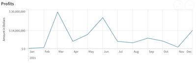
Line Charts and how they represent data
For my last blog entry, we went over bar Charts and how they are used to show data, that entry can be found here. Continuing our coverage of the diffe... Show MoreFor my last blog entry, we went over bar Charts and how they are used to show data, that entry can be found here. Continuing our coverage of the different charts available to showcase your data, today we will look at line charts.
Line charts are composed of an X and Y axis, commonly the X axis displays time, with the Y axis representing an amount. Putting these two elements together, we can create a chart that shows how data has changed throughout time. Within this chart, points of data are connected to create the lines for the line chart. This chart can also be used to compare multiple sets of data, displaying two separate lines that can be shown alongside each other.So now that we know what a line chart is, how can we use line charts to visualize our data?
Above you’ll find a line chart that appears in one of our demo apps. This chart’s X axis displays time, and the Y axis provides a dollar amount. When our data is added, we are given points that are connected to show growth and loss of revenue throughout the year. This chart allows the audience to see the spikes or large growth months for this data. We can see that March and June were great months, where as the rest of the year was about the same.
How can we use this information in the real world? In a hypothetical scenario, a user could see this data and retroactively learn why March and June were such better months. What was done differently during these months, and how could we duplicate this success in the other months to raise them up? It could be that a promotion was run during this time, or maybe there was increased manager assistance. Whatever it was, this chart can provide the first clues to finding out and increasing profits.
Why would you want to use a line chart, instead of a bar chart, or a pie chart?
As we can see, we are missing a key element that the line chart provides, time comparison. In our bar chart, we have our amounts that can be compared, but we are not provided the change over time. We cannot easily see the spikes that a line chart would provide.
Our pie chart shows the time period of the year as a whole, and then the different months as segments of the whole. While, this does show that March and June are the biggest portions of the yearly sales, we’re unable to compare March to Feburary, or June to August easily. Additionally, a pie chart lacks the ‘linear’ aspect of the data, the order is gone.
When trying to decide if a line chart is the right visualization for your data, simply ask yourself what you are trying to show. Remember that line charts excell with two elements: amount and time.
Thank you again for taking the time to read this entry in our exploration of the different charts that Qlik provides. Please return next time when we take a look at pie charts.
-
Are you a new or trial Qlik Cloud user? Read this ↓↓↓
Register here Learn how easy is it to: Quickly load data from multiple sources Create powerful interactive visualizations Co-develop and collaborate ... Show MoreLearn how easy is it to:
- Quickly load data from multiple sources
- Create powerful interactive visualizations
- Co-develop and collaborate with other Qlik Sense users
- Create data alerts and
- Take your analytics on the go with Qlik Sense Mobile
Whether you are a new, trial, or beginner user - this webinar is the perfect way to make sure you get the most out of Qlik Cloud. Register now and prepare to be amazed.
-
test
testtesttestDiscoveriestestImpacttestAudiencetestData and advanced analyticstest -
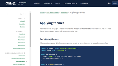
Using Qlik Sense Themes with nebula.js
Using Qlik Sense themes with nebula.js is easy. The basic idea is to get the theme, configure the theme to be loaded by nebula.js, and then tell nebul... Show MoreUsing Qlik Sense themes with nebula.js is easy. The basic idea is to get the theme, configure the theme to be loaded by nebula.js, and then tell nebula.js that's the theme you'd like to use. Let's take a look.
Loading a Qlik Sense Theme
There are 3 common scenarios here, either you load your theme locally into your project, you load your theme from Qlik Sense Enterprise, or you load your theme from Qlik Sense Enterprise Windows, or you load your theme from Qlik Sense Enterprise SaaS.
Loading your theme in your project is as simple as including it.
import myTheme from '{path-to-theme}/theme';Loading your theme from Qlik Sense Enterprise Windows looks like this
const myTheme = await fetch('{qlik-sense-enterprise}/resources/assets/external/sense-themes-default/{theme-name}/theme.json')
      .then((response) => response.json());
And loading your theme from Qlik Sense Enterprise SaaS looks like this
const myTheme = await fetch('https://your-tenant.us.qlikcloud.com/api/v1/themes', {
      headers: {
        'Authorization': `Bearer ${<API-key>}`
      }
    })
    .then((response) => response.json());
Configure nebula.js to load the theme
Next you need to configure nebula.js to load the theme. This is done in the embed function, similar to loading types. It looks like this.
const nebula = embed(app, {
      themes: [
        {
          id: 'myTheme',
          load: () => Promise.resolve(myTheme),
        },
      ],
      types: [],
    });
You can configure nebula.js to load multiple themes.
Tell nebula.js what theme to use
And finally, you need to tell nebula.js what theme to use. That's done by setting the theme property in the context. You can do this either in the embed function, or change it any other time using the context function. This is what it looks like doing it in the embed function.
const nebula = embed(app, {
      context: {
        theme: 'myTheme',
      },
      themes: [
        {
          id: 'myTheme',
          load: () => Promise.resolve(myTheme),
        },
      ],
      types: [],
    });
And this is what it looks like doing it later with the context function.
const nebula = embed(app, {
      themes: [
        {
          id: 'myTheme',
          load: () => Promise.resolve(myTheme),
        },
      ],
      types: [],
    });
    nebula.context({ theme: 'myTheme' });
And that's it! Now your theme will be applied to your nebula.js visualizations. Custom visualizations will need to be configured to consume the theme. And there are some differences between themes applied in nebula.js and themes applied in Qlik Sense. For that information, and more, please visit Applying Themes with nebula.js
-
Migrating to Qlik Cloud Learning Plans
We are excited to offer Migrating to Qlik Cloud Learning Plans within Qlik Continuous Classroom:Qlik Sense Client-Managed to Qlik CloudThis learning p... Show MoreWe are excited to offer Migrating to Qlik Cloud Learning Plans within Qlik Continuous Classroom:
- Qlik Sense Client-Managed to Qlik Cloud
This learning plan is designed for organizations that are migrating from Qlik Sense Enterprise Client-Managed to Qlik Cloud. These tools will assist migration efforts and create a successful transition plan.
- Moving from QlikView to Qlik Cloud
This plan is designed for experienced QlikView Business Analysts and Data Architects who need to learn about creating apps in Qlik Sense. Whether they are working with QlikView and Qlik Sense together or transitioning from QlikView to Qlik Sense, this learning plan will explore the similarities and differences between the software to jump start your adoption of Qlik Sense.
To access learning plans, Select Migrating to Qlik Cloud from Continuous Classroom → Learning Plan menu
In each plan, once you have completed the recommended courses, we have identified Next Steps you can take in your learning journey:
Visit Migrating to Qlik Cloud Learning Plans today. Happy Learning!

-
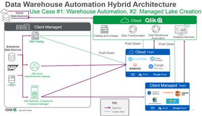
Qlik Compose or Qlik Cloud Transformation Service – which one should you choose?
Let us look at three broad areas of functionality to help us choose the correct option.Database Connectors:Qlik Compose is truly platform agnostic.Dat... Show MoreLet us look at three broad areas of functionality to help us choose the correct option.
Database Connectors:
Qlik Compose is truly platform agnostic.
- Data can be loaded with Qlik Replicate or Qlik Cloud Data Integration.
- A third-party application can load data if Qlik Compose is used to automate a data warehouse.
- Transformations can be performed on popular cloud analytic targets including Snowflake, Google BigQuery, Microsoft Azure Synapse, and Databricks.
- Transformations can also be performed on a whole range of on-premises data platforms.
Qlik Cloud Transformation service on the other hand focuses on cloud data stores.
- Transforms data loaded by Qlik Cloud Data Integration's data movement service.
- Transformations can be performed only on popular cloud analytic targets including Snowflake, Google BigQuery, Microsoft Azure Synapse, and Databricks.
- Currently does not transform data loaded by Qlik Replicate or other third-party applications.
Data Quality and Custom Transformation:
Qlik Compose performs a variety of transformations.
- It offers a mapping designer that can push down processing to the data store.
- It offers data validation and data quality rules routing rows that fail into an error mart.
- It offers global expressions on data that follow the data rules that can be customized with SQL
- Transformations cannot be performed without data models.
Qlik Cloud Transformation Services on the other hand complements.
- It offers a mapping designer as well that can push down transformations to the data warehouse or lake.
- It allows flexible data architectures and performs rule-based transformations that can be customized using SQL.
- However, data validation and data quality rules must be implemented elsewhere.
- Transformations can be performed without data models offering greater flexibility.
Data mart transformations:
Qlik Compose offers a far wider variety of data marts.
- While having low-code / no-code data modeling, these transformation patterns cannot be reused.
- A flexible data warehouse following data vault architecture can be created.
- A variety of data marts such as state-oriented, aggregated facts or conformed dimensions can be automatically generated.
Qlik Cloud Transformation Services on the other hand allows limited data mart flexibility.
- It offers low-code / no-code data modeling that can be reused multiple times.
- It offers automated data mart generation but does not offer data vault architecture, state-oriented facts, or aggregated facts.
So, which one should you choose?
If you want to transform data within a flexible data architecture without first creating data models, or if you want to create reusable, rule-based transformation patterns, and forego any choice of data mart transformations, then you should select Qlik Cloud Transformation service.
On the other hand, if your environment includes lakes in the cloud such as AWS EMR or object storage, you will want to go with Qlik Compose. Also, if you are looking for data vault architecture support or data marts with state-oriented or aggregated facts, Qlik Compose will be your choice.
Learn more about these architectures that combine Qlik’s traditional client-managed offerings with the new Qlik-managed offerings here.
-
Data Literacy for Everyone
In today’s world, data drives pretty much everything we do. There’s no question that, for tomorrow’s workforce to be successful, they will need excep... Show More
In today’s world, data drives pretty much everything we do. There’s no question that, for tomorrow’s workforce to be successful, they will need exceptionally strong analytical and data literacy skills, along with the tools and know-how to keep pace with rapid change. But here’s the twist: these skills are not just important for future business analysts anymore. It’s for everyone. Including – and I would say especially – our future leaders. Why? To quote a recent excellent article on this topic, “Data literacy is the new intellectual underpinning of every successful strategy going forward.”
To read the full article visit Data Literacy for Everyone | Qlik