Unlock a world of possibilities! Login now and discover the exclusive benefits awaiting you.
Analytics & AI
Forums for Qlik Analytic solutions. Ask questions, join discussions, find solutions, and access documentation and resources.
Data Integration & Quality
Forums for Qlik Data Integration solutions. Ask questions, join discussions, find solutions, and access documentation and resources
Explore Qlik Gallery
Qlik Gallery is meant to encourage Qlikkies everywhere to share their progress – from a first Qlik app – to a favorite Qlik app – and everything in-between.
Qlik Community
Get started on Qlik Community, find How-To documents, and join general non-product related discussions.
Qlik Resources
Direct links to other resources within the Qlik ecosystem. We suggest you bookmark this page.
Qlik Academic Program
Qlik gives qualified university students, educators, and researchers free Qlik software and resources to prepare students for the data-driven workplace.
Recent Blog Posts
-
【オンデマンド配信】機械学習の力:「残り 90%」のユースケース対応で分析部門をサポート
機械学習モデルを容易に作成して予測的分析を実現 シンプルでコード不要のユーザーエクスペリエンスで、機械学習の力を引き出すには?ビジネスの世界では、データサイエンティストが対応できない「残り 90%」のユースケースに対応すべく、予測的分析の民主化が進行しています。次世代の AutoML ソリューショ... Show More機械学習モデルを容易に作成して予測的分析を実現
シンプルでコード不要のユーザーエクスペリエンスで、機械学習の力を引き出すには?
ビジネスの世界では、データサイエンティストが対応できない「残り 90%」のユースケースに対応すべく、予測的分析の民主化が進行しています。次世代の AutoML ソリューションは、履歴データから容易に事象の要因を特定したり、今後起こり得る結果を予測する機械学習モデルの作成を可能にします。これにより、ビジネスユーザーがシナリオを探索してテストができる強力な予測分析アプリケーションを構築することができます。
本 Web セミナーでは、TDWI 社と Qlik が次世代の拡張アナリティクス、AutoML 主導型の予測的分析がもたらすメリットをご紹介します。※ 参加費無料。パソコン・タブレット・スマートフォンで、どこからでもご視聴いただけます。日本語字幕付きでお届けします。
- 自動化された機械学習で、説明できる強力な予測的インサイトを生成
- 容易に予測を作成して分析アプリに組み込み、ビジネスユーザーの探索とアクションをサポート
- AutoML がもたらす、売上予測・解約率の低減・顧客生涯価値など、あらゆる「日常的」ユースケースに対するメリット
-
We're back in action! - February 2023 Enhancements
Hello Qlik Community! The team took some time at the beginning of the year to take a breath, reflect, and plan for the upcoming year. Great things are... Show MoreHello Qlik Community!
The team took some time at the beginning of the year to take a breath, reflect, and plan for the upcoming year. Great things are coming, and we could not be more thrilled! Our goals are simple for 2023: to connect with each of you more and make this Community even more helpful, informative, and full of life!
We have our plan, but what would you like to see this year? How can we make your experience even better? Drop a comment below or feel free to reach out to one of the admins via private message. We love hearing your feedback!
Now, on to the February enhancements…
‘Ditto – same here!’ button on Forum posts
Do you have the same question another user posted in the forums? Instead of asking the same question in a new post, let us know by clicking the new ‘Ditto – same here!’ button.
‘Ditto – same here!’ on Accepted Solutions
If you found that a solution was also helpful, hit the ‘Ditto – same here!’ button at the Accepted Solution level.
The 'Ditto - same here!' buttons will help us identify specific questions and issues that are occurring for our users - with the end goal of producing the content you need.
Partner Area Navigation
For Partners only - the Partner homepage has been added back (Partners, start here!) and the Private Groups have been moved out of the main navigation.
Your Qlik Community Admins,
Melissa, Sue, Jamie, and Nicole
-
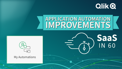
Qlik Application Automation - the first release of the year includes new connect...
New Connectors Azure Purview Azure Purview is a cloud-based data governance service that helps you catalog, manage, and govern your on-premises, mul... Show MoreNew Connectors
Azure Purview
Azure Purview is a cloud-based data governance service that helps you catalog, manage, and govern your on-premises, multi-cloud, and software-as-a-service (SaaS) data. With Purview, you can create a holistic, up-to-date map of your data landscape and prepare this with automated data discovery, sensitive data classification, and end-to-end data lineage. This connector expands the number of metadata catalogs supported by Qlik Application Automation to encourage you to share and sync metadata between Azure Purview, Qlik Catalog, and Alation.
Read the following knowledge article, "Getting started with the Azure Purview Connector" to begin.
Microsoft Outlook 365 Connector
You've always been able to send email with Qlik Application Automaton via SMTP and other email services like SendGrid, but this release added a new connector for Microsoft Outlook 365. This new feature allows you to send mail with your own corporate email credentials via OAuth2 and the Microsoft Graph API. This differs from our mail connector because of the use of oAuth2, which will be more accepted in enterprise organizations.
To find out more read, "Getting started with Microsoft Outlook 365."
Apache Kafka
Apache Kafka is an open-source distributed event streaming platform used by thousands of companies for high-performance data pipelines, streaming analytics, data integration, and mission-critical applications. Many of you have asked for a connector to publish data to an existing topic for scenarios like synching data with warehouses, CRM or ERP systems.
Check out "Getting started with Apache Kafka" for more information.
Databricks
Databricks is a cloud-based collaborative data science, data engineering, and analytics platform that combines a data lake and warehouse into a single lakehouse architecture. Many Qlikkies incorporate Databricks jobs as a part of their analytical data pipelines and wanted a way to programmatically control those tasks as part of a larger workflow. Therefore we've added blocks such as create, stop, get pipeline updates, and more that let you manage Databricks tasks.
Unsurprisingly we've got a "Getting started with Databricks" article on the knowledge base, too.
New Features
Automation Monitoring
As you can imagine, we've received many requests to improve automation management and monitoring for users an tenant admins' alike. This is a complex and long-term roadmap category, but we've broken it into stages and will roll out improvements in subsequent releases. Therefore we begin this month by introducing an automations overview page that can be accessed from a new switcher menu item called "My Automations".
The automations overview page is a central place where each user can monitor their automations and runs. From here you'll be able to view basic usage metrics, a history view of a specific automations and a new connection management page. Basic usage metrics show your total automations, the number of active automations, the number of runs, the number of runs per context, and the total run duration for the last day or seven days.
The automation history list has also been improved to support rapid switching between different runs to support debugging and troubleshooting workflows more efficiently. Also, user experience improvements to the automation editor included new settings menu groups to enable and disable automations.
Finally, the connections summary page has been overhauled to cleanly provide the status of all the SaaS applications referenced in your automations.
I'm sure you'll agree that the Automation Overview page helps you understand which automations are running, and verify the status or context, which should go a long way to improving your automation governance. In summary, these improvements are part of a longer-term plan, so keep your eyes peeled in the coming months. We intend to improve monitoring features for tenant admins’, add new automation user roles and enhance automations for shared space. Stay tuned for losts to come.
New Templates
I also want to mention two new templates that I think Qlikkies will find extremely useful.
Slack Channel Notication of Jira Change
Most development teams live and die by collaboration driven by notifications. Consequently, we create a template to automate notifications between Jira and Slack. The new template creates a new Slack channel, invites the members, and sends a message to the channel along with the Jira ticket information when there is a change in the status of the Jira ticket. The template creates channels only for tickets with status changes from New to Committed, New to In Progress, or New to Designing. You can modify this template to trigger on different status changes, or use Microsoft Teams connector instead of the Slack connector.
Check out this knowledge article to see this template in action.
App Reload Optimization by Splitting QVDs
We’re always looking to increase the efficiency of our Qlik Apps, but one method to achieve a fast loading time is to split an app’s data into multiple QVDs. Consequently we’ve built an automation template to do just that. You’’ll find an extensive community article with detailed instructions and example apps here so go check it out.
Conclusion
If you've made it to the end, congratulations! You've seen that Qlik Application Automation continues to improve on all fronts, driven by requests from users like you. As always, we encourage you to explore using Qlik Application Automation to seek efficiencies in your daily data and analytics workflows.
-
Qdt-components 2020 Update
Almost two years ago, in February of 2018, the Qlik Demo Team (Qdt) publicly released qdt-components (GitHub, npm). We originally built Qdt-components... Show MoreAlmost two years ago, in February of 2018, the Qlik Demo Team (Qdt) publicly released qdt-components (GitHub, npm). We originally built Qdt-components as an internal library designed to help us create demos to showcase Qlik Sense Enterprise. We opened up the library to help others use the new Qlik APIs and create interesting mashups with their data. Since that initial release, we've written over a dozen blog posts to the Qlik Community Design Blog detailing how to use the various Qlik Sense and Picasso.js charts available via Qdt-components. In 2019, we hit 50 stars on GitHub, putting us in the top 1% of all open-source projects on GitHub. We've recently made some updates to our documentation and we wanted to re-introduce Qdt-components, show off our new logo, and highlight this powerful library's practical uses and recently added features.
Qdt-components is designed to be a library-agnostic method of connecting to Qlik Sense and displaying visualizations. Whether that is bringing in entire Qlik Sense charts and objects or building your own visualizations, Qdt-components is an easy-to-setup wrapper that can be used in a number of different ways. We've written in the past on this blog about the pros and cons of using the various APIs to connect to Qlik Sense (Getting Started with Qlik APIs, Integrating Qlik Sense into your Web App), an area that developers can easily get tripped up on. With Qdt-components, the question of whether to use the Capability API or incorporating Enigma.js has already been handled. You just need to answer one simple question: do I want to use charts and objects directly from my Qlik Sense app? If so, then you want access to the Visualization API; otherwise, the Engine API is sufficient.
Bringing in Qlik objects with the Visualization API means that it'll have the appearance you'd see in a Qlik Sense app. If you don't need to customize the look of your objects for your web app, then you can just build the charts / toolbars / etc. in Qlik Sense and bring them into your mashup using their object id's. If you want to skip all that, you can use our pre-built components by simply specifying the dimensions, measures, columns, etc. you need. Here are the available components as of 01/01/2020, the appropriate Qlik API required for the configuration object, and links to documentation to get you started:
QdtViz
These are used to bring in Qlik Sense objects exactly as they are in Qlik Sense. QdtViz components require the Visualization API (vizApi: true) and are one of the easiest to implement; you just need the object's id.
Visualization API: yesEngine API: noBlog Posts: qdt-components - A Components Library that can be used in simple Html, Angular 5 and ReactQdtCurrentSelections
Like QdtViz, QdtCurrentSelections requires the Visualization API and appears as it is from Qlik Sense. It can be used to show your user's current selections in the familiar, Qlik-styling. The only property you need to specify is its height.
Visualization API: yesEngine API: noQdtFilter
Using the Engine API, QdtFilter is a simple dropdown based on a column from your data.
Visualization API: noEngine API: yesQdtSelectionToolbar
This component displays a toolbar with the current app selections.
Visualization API: noEngine API: yesQdtPicasso
The QdtPicasso component actually comprises several Picasso.js charts; fifteen (15) as of January 10, 2020. Picasso.js is a charting library streamlined for building interactive visualizations for the Qlik product suites. With Qdt-components, connecting to and using Picasso.js is super easy because it's already built in...no need to import Picasso.js yourself.
Visualization API: noEngine API: yesBlog Posts: qdt-components - Horizontal Barchart by Picasso.js & Selection Toolbar, Qdt-components & Picasso.js - More Charts!, Qdt-components - custom charts with Qlik's Open Source picasso.js, Creating custom charts with qdt-components,QdtSearch
The QdtSearch component is a simple text input field that can be used to search a dimension of your data.
Visualization API: noEngine API: yesQdtMapBox
We've recently added our MapBox integration with the QdtMapBox component. You'll just need a MapBox API key and desired styling to create a map showcasing your data.
Visualization API: noEngine API: yesQdtTable
Build a sortable table of your data using QdtTable.
Visualization API: noEngine API: yesGetting started with Qdt-components is easy but we've created several templates to make it even easier:
- HTML / Vanilla JavaScript Template, HTML Documentation, Demo
- React Template, React Documentation, Demo
- Angular Template, Angular Documentation, Demo
And lastly, do you have an idea for a feature, bug fix, or chart to add? You can open an issue on GitHub or contribute!
-
Qlik Partner Engineering Team releases Qlik AWS Cost Explorer
Amazon Web Services (AWS) provides the Cost Explorer as the standard report tool for exploring costs related to an account. Using that service you can... Show MoreAmazon Web Services (AWS) provides the Cost Explorer as the standard report tool for exploring costs related to an account. Using that service you can see your consumption using pre-defined reports or customize one report for your needs.
But what if you want to be able to analyze your AWS spending based on different criteria that are not supported by the existing reports? What if there are multiple organizations worth of data and you would like to analyze based on different projects and users? Wouldn’t it be nice to have access to that data and combine it with data from other sources for some custom reports? Wouldn't be great if we had access to that information in a modern BI platform? Turns out that you can, using Qlik Sense in combination with the AWS Cost Explorer API! By bringing the AWS spend data into Qlik Sense, you can make it easy for a broader audience to consume that data and get access to insights that would be otherwise not available.
Two months ago Qlik Partner Engineering was asked separately by both a customer and our own IT Team for a better and more sophisticated solution for AWS spend management. One of the key questions was “Would it be possible to connect Qlik Sense to AWS and extract our spend data? We want to leverage the power of Qlik Sense to better analyze our AWS spend.”
The biggest challenge we faced was around figuring out how to perform the authentication. The highly secure authentication method that AWS uses for their API is just beyond what Qlik Sense can do using the regular REST connector. Thinking outside the box, I found a scripting solution to collect that spend data and then place the data into a location where Qlik Sense can easily read using an existing connector.
The Qlik AWS Spend solution consists of two parts:
- A script to extract spend data from AWS and land that data into an S3 bucket
- A Qlik Sense application that connects and reads the spend data from that S3 bucket
The best part? The solution is published on the Qlik Partner Engineering Github page (https://github.com/Qlik-PE/qlik-aws-cost-explorer) where you can download and use it for free.
Let me know your thoughts on how to improve this solution!
-
Deluxe Combo Chart Features
Deluxe Combo Chart Features AnyChart — Extensions for QS Combo charts for trend analysis can help you identify correlations that might exist bet... Show MoreDeluxe Combo Chart FeaturesAnyChart — Extensions for QS Combo charts for trend analysis can help you identify correlations that might exist between two values over a given period of time. Meet the unprecedentedly flexible combo charting in Qlik! With up to 3 dimensions to help analyze your data, error bars for statistical analysis at a glance, a wide variety of chart types available, and more. Explore all major features of the Deluxe Combo Chart Extension for Qlik Sense in this Qlik demo app.
Discoveries
Visualizing how several metrics change over time or by category when they are different in scale, a combo chart lets you discover possible correlations. One of its most popular varieties is a Pareto chart, which consists of a line and bars. This app reveals how various chart types and features beyond Qlik's native implementation help make the most sense of data.
Impact
Explore all major features of the intuitive Deluxe Combo Chart Extension for Qlik Sense as you look into fictional business data. Surf through multiple available chart types and their combinations. See nested axes, error bars, stacking, rich visual settings, and much more demonstrated in action.
Audience
Data analysts and all levels of management across all industries. Also, all who want to see what kind of advanced combo charts are now available in Qlik Sense and how they work.
Data and advanced analytics
This application was built using AnyChart's Deluxe Combo Chart extension for Qlik Sense. The dataset is fictional.
-
Basics of data analytics and how it might be a great career choice
In a rather interesting article, the basics of data analytics are explained from a career perspective. The author sheds some light on various technolo... Show MoreIn a rather interesting article, the basics of data analytics are explained from a career perspective. The author sheds some light on various technologies that are setting up the landscape in the technology space and how data analytics will be an important piece among them. Further, he makes a point on the in-demand job roles in analytics and those which will continue to be in demand, in the future.
To read more about this article, follow this link: https://economictimes.indiatimes.com/news/how-to/what-is-data-analytics-and-how-it-may-help-in-your-career/articleshow/94698633.cms
-
Cloud版 Qlik Sense のロードスクリプトの履歴管理ができるようになりました。
データロードエディタでロードスクリプトのバージョン管理ができるようになりました。 最新のスクリプトに名前をつけて履歴として保存することができ、これらの履歴を復元したりダウンロードしたりすることができます。 スクリプトの変更履歴を管理し、開発を効率化することができます。 詳しくはヘルプをご覧くだ... Show Moreデータロードエディタでロードスクリプトのバージョン管理ができるようになりました。
最新のスクリプトに名前をつけて履歴として保存することができ、これらの履歴を復元したりダウンロードしたりすることができます。
スクリプトの変更履歴を管理し、開発を効率化することができます。
詳しくはヘルプをご覧ください。

-
Cloud版 Qlik Sense の新しいビジュアライゼーション機能でさらに美しいダッシュボードを!
Cloud版 Qlik Sense でさらに美しいダッシュボードを作るための機能が追加されました。ご紹介する機能はClient-Managed版のFebruary 2023のリリースにも反映される予定です。 1.散布図にバブルで表示できるデータ数が増えました。 非常にご要望の多かった機能です。... Show MoreCloud版 Qlik Sense でさらに美しいダッシュボードを作るための機能が追加されました。ご紹介する機能はClient-Managed版のFebruary 2023のリリースにも反映される予定です。
1.散布図にバブルで表示できるデータ数が増えました。
非常にご要望の多かった機能です。プロパティで密度表示に移行するバブル表示最大数を設定することができます。最大50000ポイントまで表示できますがレスポンスに注意しながらご使用ください。
2.タイトルフォントのスタイリング
タイトル、サブタイトル、脚注のフォントのスタイリングができます。フォント種類やスタイル、色、大きさを指定できます。現在は下記のチャートに対応しています。
- 円
- 棒
- 地図
- テーブル、ピボットテーブル
- ゲージ
- 分布プロット
- ボックスプロット
- ヒストグラム
- KPI
- ウォーターフォール
3.シートグリッドをより細かく設定できるようになりました。
もっと自由にレイアウトしたいというご要望に対応しました。最大、横に42マスの設定が可能です。
4.シートの背景に色や画像を表示できるようになりました。
コーポレートカラーやシンボル画像を配置して装飾したり、シートの目的ごとに色をわけてわかりやすくしたりすることができます。
5.チャートの背景に色や画像を表示できるようになりました。
シートと同様、チャートの背景にも色や画像を設定できます。現在は下記のチャートに対応していますが、今後増えていく予定です。
- ゲージ
- 分布図
- 箱ひげ図
- ヒストグラム
- KPI
- ウォーターフォール
6.チャートがアニメーションで切り替わるようになりました。
選択が変更された場合に、チャートがスムーズに切り替わります。アプリケーションの設定でオンとオフを切り替えることができます。
是非お試しください!
-
Nutra Green Sales
Nutra Green SalesOpenreachPreparation test App for Qlik Sense Qualification on Business Analyst. DiscoveriesFirst experience with Qlik SaaS.ImpactFirs... Show More Nutra Green SalesOpenreachPreparation test App for Qlik Sense Qualification on Business Analyst.
Discoveries
First experience with Qlik SaaS.
Impact
First Qlik official Qualification.
Audience
Beginners
Data and advanced analytics
Solidify knowledge
-
Special Free Webinar: What is Data Literacy and Why is it Important?
Many people have heard the buzzword data literacy , but few actually understand what it really is, why it is important to your professional developmen... Show MoreMany people have heard the buzzword data literacy , but few actually understand what it really is, why it is important to your professional development, and how you can go about increasing your data literacy skills
This webinar will discuss the various components of data literacy, along with the various topics and skills related to each component.
Those who have attended this webinar will be placed into a drawing to have a chance a winning a copy of the recently released book ‘Data Literacy in Practice’ co-authored by Angelika Klidas and Kevin Hanegan.
Host: Kevin Hanegan
Language: English
Session duration: 60 minutesRegister Here

-
Qlik Digest - February 2023
Qlik Ahead: Our Direction for 2023 In his first blog of the year, Qlik’s Chief Product Officer James Fisher unveils the product strategy and directio... Show MoreQlik Ahead: Our Direction for 2023
In his first blog of the year, Qlik’s Chief Product Officer James Fisher unveils the product strategy and direction for 2023.
QlikWorld: The Conference for Data Thrill-Seekers
From exciting innovations to spine-tingling keynote presentations and lots of peer networking, you'll discover how you and your data can help your business succeed. Learn more and register
Qlik Insider Webinar
Our next quarterly update on what’s new and what’s next across our data integration and analytics portfolio will take place on 22 February. Learn about our innovation approach and priorities for the new year. Register
The Business Case for Data Fabric
Join us on February 8 as we explore how data fabrics work, success factors to consider, and why data integration plays such a critical role in any successful implementation. Register
Love is in the air
Hear from renowned mathematician, Dr Hannah Fry on why humans and AI machines can be a dream match, and how there is a mathematical angle to almost everything, including love! Listen Now
ADDITIONAL FEATURED CONTENT
-
Toma de Decisiones Jhonathan Paucar
Toma de Decisiones Jhonathan PaucarUCETarea FinalDiscoveriesJhonathan PaucarImpactDashboard para la satisfacción del clienteAudienceRecursos HumanisDa... Show MoreToma de Decisiones Jhonathan PaucarUCETarea FinalDiscoveries
Jhonathan Paucar
Impact
Dashboard para la satisfacción del cliente
Audience
Recursos Humanis
Data and advanced analytics
Datos de encuensta
-
Qlik Sense Custom Report
Four years ago, I wrote the Customizable Straight Table blog illustrating how you can build a custom table in QlikView. Last year, I wrote the Custom... Show MoreFour years ago, I wrote the Customizable Straight Table blog illustrating how you can build a custom table in QlikView. Last year, I wrote the Custom Report Extension blog that shows how to use the Climber Custom Report in Qlik Sense. Today, with the help of Patric Nordstrom and Jason Michaelides, I am going to blog about how you can build a custom report in Qlik Sense. With continued enhancements to the Qlik Sense table such as column show conditions and the ability to change the column order of a table, building a custom report in Qlik Sense is possible right out-of-the-box.
Patric built the attached Qlik Sense app that illustrates how to build a custom report in Qlik Sense. In this blog, I will review the steps needs to build your own report. Below is an example of how the report looks with some dimensions and metrics selected. On the left there are two filter panes, one for the dimensions and one for the metrics, that can be used to select the columns you would like to see in the report. Then there is the table which by default will be empty and will prompt the user to select the dimensions and metrics. In this example app, the user is encouraged to select no more than 5 dimensions and 4 metrics.
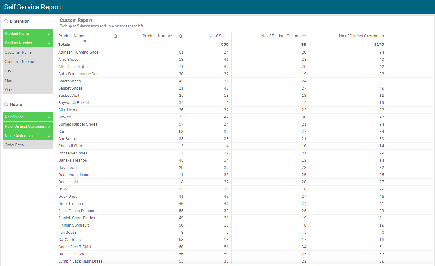
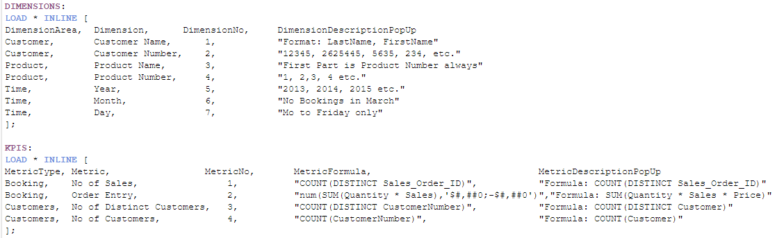
Let’s start by looking the script. You would load your data as usual but what you will need to add to the data model is a data island for the dimensions and for the metrics. In the script below, you can see how Patric did it, providing very clear details of each dimension and metric. The first field in each table is the dimension/metric grouping, the second field is the dimension/metric name as it will appear in the filter panes. The third field is a number to represent the default order of the dimension/metric columns in the report and the last field is description data about the dimension/metric. The KPIs table has a fourth field that shows the formulas for the metrics.
Once the app is loaded with the data islands, you can begin to build the custom report. You will need to add two filter panes and a table to your sheet. The Dimension filter pane uses the Dimension field and the Metric filter pane uses the Metric field. In the table, you will add 5 dimension columns and 4 measure columns since that is what is encouraged in this example. Now here is where Patric used Jason’s FirstSortedValue trick. For the first dimension, enter the text below in the Field.

And this in the Label:

So, you may be wondering what the expression is doing. Basically, the Dimension field is being sorted by the DimensionNo field and then, since the third rank parameter is being used, the expression returns the Dimension for the nth sorted value. In the report screenshot above, the dimensions Product Name and Product Number were selected. When you sort these by DimensionNo, Product Name comes before Product Number since 3 comes before 4 and when you rank these by their sorted value, Product Name is first and Product Number is second. This same idea was used in all the dimensions as you can see in the second dimension shown below.

The measures are done in the same manner. Below is the Field and Label for the first measure and the additional measure columns will follow the same concept as the dimension columns.
Field

Label

Now the last step is to add a conditional show to the columns. Basically, you only want the column to show if there is a dimension and/or metric selected to be displayed. For the first dimension column, you will set the “Show column if” property to:

For the second dimension, it will be the same except if greater than or equal to 2 and so on. The first measure will have the “Show column if” property set to:

Additional measure columns will follow the same format as described above for dimension columns.
Once all the columns are added and the properties are applied, the user can select the dimensions and metrics they would like to see in the report. By default, the column order will be based on the DimensionNo field but feel free to drag columns in the table to a new position. For more information on how Jason used FirstSortedValue, check out his document or Qlik Sense Help.
Thanks,
Jennell
-
Custom Narratives with Speech
Custom Narratives with SpeechCognizantThe app's goal is to describe how the simple narratives are derived without using expensive tools, but using the... Show MoreCustom Narratives with SpeechCognizantThe app's goal is to describe how the simple narratives are derived without using expensive tools, but using the Qlik variables and native functionalities like sort values, filter, etc.. Depending on the criteria given, the narratives offer insights on how different financial KPIs interact with one another. Additionally enabled the audio option to help people comprehend the insights.Discoveries
Simple custom narratives can be created using Qlik native methods rather than a costly third-party extension or plugin.
Impact
The use of narratives makes it easier to combine data, story, and visual insights. When using the third-party tools or extensions that are available, they typically talk about a visualisation. Developers must learn a new programming language in order to shift the narrative since there are either too many statistics or not enough data. However, this straightforward custom narrative makes use of core Qlik features, making it more affordable and flexible.
Audience
All the app developers who want to build narratives with available Qlik functions
Data and advanced analytics
The use of narratives makes it easier to combine data, story, and visual insights. When using the third-party tools or extensions that are available, they typically talk about a visualisation. Developers must learn a new programming language in order to shift the narrative since there are either too many statistics or not enough data. However, this straightforward custom narrative makes use of core Qlik features, making it more affordable and flexible.

-
Announcing the 2023 class of Qlik Academic Program Educator Ambassadors!
Academic Program Ambassadors are educators who champion the Qlik Academic Program at their universities and beyond, with a passion for preparing s... Show MoreAcademic Program Ambassadors are educators who champion the Qlik Academic Program at their universities and beyond, with a passion for preparing students for the data driven workplace. These individuals are some of our most active participants of the Qlik Academic Program who fully utilise the free software, training resources and qualifications that we provide to university students and educators. The members of our 2023 class are:
- Nassir Ibrahim
- Cesar Brochero Castel
- Blerim Emruli
- Javier Leon
- Sumitra Pundlik
- Dorina Kabakchieva
- Angelika Klidas
- Marisa Sánchez
- Angel Monjarás
- Michael Siek
Meet the Qlik Academic Program Professor Ambassadors for 2023
We are thrilled to be recognizing the efforts of these individuals to help the Qlik Academic Program to achieve its mission - to create a data literate world, one student at a time. Each ambassador has been selected through a self-nominated application process, where they were required to answer various questions covering their motivations for becoming an ambassador, and to evidence their passion for upskilling their students in analytics over the past 12 months. This year, we are excited to select another 10 ambassadors, 3 new ones and 7 returning ambassadors whose efforts continued to impress us. By way of thanks for their efforts our ambassadors will receive exclusive benefits such as webinars and discussion groups with Qlik leaders, opportunities to showcase their experience with the Qlik Academic Program and the chance to grow their network with other educators across various fields and geographies.
Throughout 2023 our ambassadors will continue their advocacy for the Qlik Academic Program and help us to reach even more students and educators with our free resources. Stay tuned over the coming months for more in-depth profiles on each of our ambassadors, and get to know who they are, what they teach and why they are so passionate about bridging the data literacy skills gap! Learn more about the program and how to apply for future classes.
-
Academic Program Builds Foundations for Career Success
In 2022 Thomas De Dobbeleer and Rutger Mols were students at Thomas More University and were looking for a way to get some practical experience in ana... Show MoreIn 2022 Thomas De Dobbeleer and Rutger Mols were students at Thomas More University and were looking for a way to get some practical experience in analytics, using a real world tool. They wanted an opportunity to explore the potential of working with data and how to apply these skills to global use cases.
Through their studies they were introduced to the Qlik Academic Program and the free learning resources available to them through their membership. These resources helped them to discover the potential of Qlik Sense and start transforming their thoughts and ideas into visualizations. Eventually they found they were able to create something meaningful with the data in front of them.
Both students eventually pursued an internship with Qlik partner, Epic Data, and it was here that they first heard about the Qlik Academic Program datathon. The datathon challenge invited students to help develop solutions towards achieving three of the United Nations 17 Sustainable Development Goals: Goal 13 Climate Action, Goal 14 Life Below Water, and Goal 15 Life on Land. They eventually won the datathon challenge, setting in motion the steps for achieving full time BI consultancy jobs. To learn more about their journey, find the success story below.
If you're a university student or educator , sign up to the Qlik Academic Program for access to software, training, and the chance to obtain Qlik Sense qualifications and certificates to help boost your employability.
-
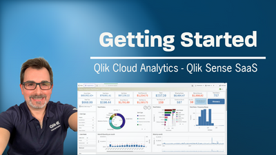
New and Trial Users - Getting Started with Qlik Cloud and so much more!
I have been recently asked by some members attending a webinar to create a video playslist on getting started with Qlik Cloud. This is video 1 in the ... Show MoreI have been recently asked by some members attending a webinar to create a video playslist on getting started with Qlik Cloud. This is video 1 in the list that will walk you through setting up a tenant and creating your first app. More videos to come - available in the YouTube Playlist:
https://www.youtube.com/playlist?list=PLW1uf5CQ_gSqF5bcmbBrk1q7Q4-h899V1
Don't forget our instructor lead training and tailored online learning experience at - learning.qlik.com

-
All you need to know about deploying the Qlik Sense Monitoring Applications
Today I will try to answer and clarify the following question you may have What and how many are they? How does the Reload work? Setup and configurat... Show MoreToday I will try to answer and clarify the following question you may have
What and how many are they?
How does the Reload work?
Setup and configuration
What and how many are they?
In total, and as of now, there are 5 monitoring applications. Yes 5! Two of them are already imported in Qlik Sense after the installation and three others waiting to be manually imported in C:\Programdata\Qlik\Sense\Repository\DefaultApps
Operation Monitor: Gives you a global overview of your environment’s healthiness. There you can find information about error and warning reported in the logs, task reloads, resource consumption, active users and more
License Monitor: Give you a global overview of your license usage helping you to manage license allocation more efficiently.
Log Monitor: An application going deep dive into your Qlik Sense logs to help you better understand what is happening in your environment.
Reloads Monitor: Will let you understand exactly how your applications are being reloaded, how often, how long, on which nodes and how successful those reloads are.
Session Monitor: Who is using your applications, when, where and how often. This application will also help you to understand which apps are popular or not in your environment.
How does the Reload work?
To display the relevant information, the Monitoring Applications are loading data from two data sources; The logs and the database.
As of Qlik Sense September 2017, it is now possible to store the logs into PostgreSQL database (Centralized logging) and/or files. If Centralized Logging has been configured in your environment, it will fetch the data from there. If it’s not configured or for some reason not accessible, it will load the data from the files.
Once loaded that information will be stored into a QVD file in C:\Programdata\Qlik\Sense\Log on the node doing the reload.
Each monitoring application is generating its own set of QVDs:
Operation Monitor: governance_date_time_ops_version.qvd, governance_time_range_ops_version.qvd
License Monitor: governanceLicenseLog_version.qvd and governanceSession_version.qvd
and governanceLogContent_version_file.qvd
Log Monitor: governanceLogMonitor_version.qvd
Reload Monitor: reloadsMonitorLogContent_version.qvd
Sessions Monitor: sessionsMonitorLogContent_version.qvd
In addition, for some of those QVD's you will see an extension _file or _db. and it depends from which source the monitoring applications are loading the data from. (Centralized logging or files)
Finally, to load data from the database, the Monitoring Applications are using a set of Rest Connector data connections. Those are used to load different information such as users, applications, application objects, tasks, license, …
Setup and configuration
Depending if you are running a single or multi-node environment and using Centralized Logging or not there are several steps to ensure the Monitoring Applications will fetch all the data in your environment.
I would suggest following the steps described here. Please make sure to select the correct version at the top right
Once you have set up everything according to the link above depending on your environment, I’ll drive you through a couple of useful setting allowing you to customize your Monitoring Applications.
If you open the Script Load Editor for any of the Monitoring Applications (You will need to create an unpublish copy the application to do that)
In the first tab called Initialize, you will find two useful settings
SET db_v_file_override = 0; (line 10)
And
SET monthsOfHistory = 3; (line 24)
db_v_file_override: This variable defines which data source the application will use to loads its data. (Centralized Logging or Log files)
By default, this is set to 0 meaning that the application will check connectivity toward the Centralized Logging database and if it works it will load data from there. If it doesn’t then it will load from the log files.
By setting it to 1 you will force the application to load from log files and by setting it to 2 you will force it to load from the Centralized Logging.
monthsOfHistory: This variable control how much history will be available in the application. The default is 3 but you can increase/decrease it.
Keep in mind that more history available equal more data to load and process so it will increase time and resource consumption.
If you do any change in the script, don’t forget to publish the application again in the Monitoring Apps stream.
Finally, in a multi-node environment, by default, the Monitoring Apps will only be available on the Central Node.
This means that if you have a dedicated scheduler rim node or want to open those applications in the hub from a rim node, it won’t work.
This is control by the load balancing rule called ResourcesOnNonCentralNodes.
Basically, this default rule says that every application will be accessible on every node, but the ones published in the Monitoring Apps stream.
To get rid of that you can, for instance, remove the highlighted text in the Conditions box which will make the Monitoring Applications available on every node or you can even custom the rule so that they are available on specific rim node(s) only.
Hope this will be clear and useful for hopefully many of you and don’t hesitate to like, comment and share (I will try to answer ALL your questions)
-
Vizlib Writeback Table
Vizlib Writeback TableVizlibWith the Vizlib Writeback Table, you can easily edit, update and comment on data points or entire rows directly in your da... Show MoreVizlib Writeback TableVizlibWith the Vizlib Writeback Table, you can easily edit, update and comment on data points or entire rows directly in your dashboards, while remaining in the analysis flow.Discoveries
Fully customizable, Vizlib Writeback Table lets you edit Qlik dimensions, measures and fields, and add new data using a wide variety of data types. It allows the business user to correct data, insert new information, adjust numbers and create new data segmentations.
Impact
Vizlib Writeback Table enables you to skip the error-prone manual steps required for maintaining multiple spreadsheets and work with your data directly in Qlik Sense.
Audience
Business analysts, Line of Business managers.
Data and advanced analytics
Reduction in spreadsheet risk, solves all your business case needs. More information at https://home.vizlib.com/vizlib-collaboration-for-qlik-sense/