Unlock a world of possibilities! Login now and discover the exclusive benefits awaiting you.
Analytics & AI
Forums for Qlik Analytic solutions. Ask questions, join discussions, find solutions, and access documentation and resources.
Data Integration & Quality
Forums for Qlik Data Integration solutions. Ask questions, join discussions, find solutions, and access documentation and resources
Explore Qlik Gallery
Qlik Gallery is meant to encourage Qlikkies everywhere to share their progress – from a first Qlik app – to a favorite Qlik app – and everything in-between.
Qlik Community
Get started on Qlik Community, find How-To documents, and join general non-product related discussions.
Qlik Resources
Direct links to other resources within the Qlik ecosystem. We suggest you bookmark this page.
Qlik Academic Program
Qlik gives qualified university students, educators, and researchers free Qlik software and resources to prepare students for the data-driven workplace.
Recent Blog Posts
-
Qlik Data Visualization Tip-a-Day Recap
Each tip below links to the post on LinkedIn, which provides you with additional details on how to create advanced visualizations using these tips. ... Show MoreEach tip below links to the post on LinkedIn, which provides you with additional details on how to create advanced visualizations using these tips. Spread the word, and share on your social feeds and also share your feedback - we want to hear from you!
1. Commonly known as 80/20 distribution, the Pareto chart surfaces representative data that makes up 80% of the total share. This percentage can, of course, be easily adjusted.
2. Need to count and show the frequency of combinations? For example: products sold together or components used together. Qlik Sense makes it easy.
3. The Sunburst chart looks nice and can be useful. It's basically a double pie chart with hierarchy. It’s also fun to create with the Qlik Sense map chart.
4. Most charts only show dimension values when the measure is not null. However, sometimes it's important to indicate a zero or null value.
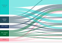
5. Parallel coordinate plot shows distribution across many variables. Related to the Sankey chart, it’s most frequently used in life science, machine learning and other industries to analyze multivariate data.
6. When copying a chart to a slide deck, use the web browser zoom ctrl + to enable Qlik Sense to automatically adjust the graph and labels making it more audience-friendly.
7. The Arc chart, the linear sibling to the chord chart, shows connections between pairs of values. It works best if the number of values minimal. Also, the order matters to reduce clutter.
8. Control charts are popular for monitoring processes, detecting outliers, and keeping an eye on quality. Build it with the line chart (https://lnkd.in/eHWqaQ_U) or automate creation via Qlik Sense Insight Advisor.
9. Annotations turn data into knowledge by adding context to insights displayed. Annotations can be dynamic, so they adjust when data or selections change.
10. Using Inline SVG, you can add patterns to separate dimension values, making your charts stand out.
11. Pivot tables are typically sorted by dimensions; however, a new setting allows you to sort by measure.
12. The Chord chart, like the Arc chart, shows relationships between values. It’s a visually-appealing chart that is useful as long as there are not too many dimension values.
13. New settings for sheet backgrounds are now available in Qlik Sense SaaS (coming soon to Qlik Sense Client-Managed) enhancing the style of your dashboards.
14. KPI cards enable you to mix a set of KPIs and graphs into a single visualization by spawning a combo chart across a dimension to provide a better understanding of multiple data points.
15. To track key metrics, the Bulls eye chart provides an overview of categories and priority order. It’s basically a scatter plot with a background, and you can include a custom tooltip for additional context.
16. Color per measure are dynamic by default. You can customize color per measure with fixed limits by converting select measures into master measures and using segment colors.
17. Need to display an unbalanced tree or ragged hierarchy? Use the Org chart or the Pivot table in Qlik Sense.
18. The improved Scatter plot in Qlik Sense SaaS provides greater flexibility and customization, including heatmap mode and extended threshold to show more points at a time. (coming soon to Qlik Sense Client-Managed)
19. The elegantly simple Slope chart is easy to interpret and create using the line chart in Qlik Sense.
20. Besides being great for exploring organizational structures, the Org chart is also well suited for decision trees, task and sub tasks or compositions of KPIs.
21. Custom tooltips provide an overview first then important details. You can add custom tooltips to bar, combo, map and KPI charts.
22. The Fine grid helps you quickly arrange and align objects on a sheet. For greater control, you can utilize custom grid spacing. (coming soon to Qlik Sense Client-Managed)
23. The Lexis chart is a nice variant for plotting duration against time, for instance call center data or service cases.
24. Innovate with Animations through by simulating activity or changes in values. Use the slider to manually choose the dimension values to display.
Check out our past data visualization tips on Qlik Community, here.
To continue exploring Qlik Sense data visualization innovations, you can check out the Qlik Visualization Showcase. There, you will be able to not only view, but also interact with our latest and greatest Qlik Sense visualizations. And, for tips on taking your visualization to the next level, check out this eBook.
-
Inline Load with Delimiter
I have done many inline loads before, but I was not aware of the delimiter option until recently so I thought I would share what I learned in my blog ... Show MoreI have done many inline loads before, but I was not aware of the delimiter option until recently so I thought I would share what I learned in my blog today. When loading data that is typed in the script or added manually via the Data Manager, an inline load is used. Below is an example - it is a simple load script that includes the Inline keyword as well as square brackets to load data directly from the script versus a file or external data source.
Looking at the data in the square brackets, the first line indicates the fields that will be loaded – in this case Name and Age. Each line after that and before the ending square bracket, is a new row of data. Each row is on its own line in the script. This example will load four rows of data with two fields: Name and Age.
By default, the field data is separated by commas in the load script – comma is the default delimiter. I recently ran into an issue where the data I needed to load via the inline load script included commas. For example, assume that Name needed to be loaded with the last name first like this:
This script would load the last name in the Name field and the first name in the Age field and the actual ages would not be loaded at all. This is because there are only two fields listed to be loaded Name and Age so the script ignores the second comma and the age because a third field was not defined (on the line after the open square bracket). There are a few ways to handle this as seen below: 1) “delimiter is” can be used to define a delimiter other than the default comma; 2) double quotes and 3) single quotes. My preference is to use the “delimiter is” option and to use a delimiter that is not part of the data I am loading. All three of these options load the data correctly. If changing the delimiter, be sure to change it on the row with the column names as well as the rows of data.
Using “delimiter is” with the inline load is not required but is useful in certain situations. The delimiter can be any character such as a comma, semi-colon or pipe. The key is to use a character that is not found in the data that is being loaded. Inline can be used to load data as seen in this blog but is can also be added to the script manually via Qlik Sense Data Manager. To learn more about using the Data Manager to load data manually, read my blog titled Manual Entry – Adding data manually in Qlik Sense.
Thanks,
Jennell
-
Data literacy principles that you can start practicing now
Looking at these guiding principles and how you can start to practice them could put you a step ahead of the rest when it comes to looking for that da... Show MoreLooking at these guiding principles and how you can start to practice them could put you a step ahead of the rest when it comes to looking for that data driven job role in the future. Check out the list below to learn how you can start to sharpen those workplace skills:
- Foster a culture of humility and curiosity
“Data literacy is not all about data. Yes, you need to analyze and work with the data at your disposal, but it also involves developing non-technical skills like curiosity, critical thinking, creativity, and collaboration to gain different perspectives and challenge your own assumptions about the data. “
This is not dissimilar to the lessons learnt through academic studies, curiosity and gaining different perspectives is required of all students and is a vital skill in the data driven workplace too. Start practicing this by asking more questions and interrogating the information you see, whether that be in the classroom or what you read about online.
- Encourage employees to put training into practice
“To really drive data literacy, employees can be empowered to consistently put their training into action and use their skills on a daily basis, no matter their level or role.”
Demonstrating a time when you did this during your studies is great practice for an interview and a future job. Did you study a course on building visualizations? Did you then use this knowledge for a project on a different module? Maybe you found a data set related to a hobby and practiced building visualizations that way.
- Focus on the desired outcomes
“The first step to effectively using data is understanding and being clear on the problem you want to solve.”
Its fantastic to have all the technical skills, but if you don’t know what the aim of a project is then these skills are irrelevant. If you do extra study on data skills in your free time, what do you want to learn? Do you want to learn to build an application or to tell a story with the data? Having a clear focus can save a lot of time.
- Measure the impact of your efforts!
Make sure to keep a note of your achievements and proud moments whether that be during your course, during work experience or an achievement on a sports team, for example. What did you do and what did you achieve? Was there a challenge you overcame to do this?
You can start to work on your data skills by signing up to the Free Qlik Academic Program, our program gives you access to data analytics software and a comprehensive library of training courses through the Qlik Continuous Classroom. Follow this link to learn more: qlik.com/academicprogram
- Foster a culture of humility and curiosity
-
HR Example
HR ExampleUnkwowA test to my workDiscoveriesNew usues to qlik and new things that i foundImpactCan have a more impartial seeing off the employersAudie... Show MoreHR ExampleUnkwow A test to my work
Discoveries
New usues to qlik and new things that i found
Impact
Can have a more impartial seeing off the employers
Audience
Ba
Data and advanced analytics
Get more consice
-
Moving from Client-Managed Qlik Sense to SaaS?
Qlik Education has added a new Live Instructor Webinar helping you learn topics moving from client-managed Qlik Sense to Qlik Sense SaaS.Dates of the ... Show MoreQlik Education has added a new Live Instructor Webinar helping you learn topics moving from client-managed Qlik Sense to Qlik Sense SaaS.
Dates of the upcoming webinar and Details:
- March 29 – For Business Users/Data Architects at 9 am and 6 pm CET
https://qlik.zoom.us/webinar/register/WN_pAzZuPfgR1K74J_aRhCzMw
https://qlik.zoom.us/webinar/register/WN_PFtrRoL2QxWxI_Ub3NPHzQ
- April 1 – For Admins at 9 am and 6 pm CET
https://qlik.zoom.us/webinar/register/WN_mI4q7Bc_TSmw7L71sdQhkg
https://qlik.zoom.us/webinar/register/WN_SBAtksZXQVCQmxhJRMBRJg
In these webinars,
- Business Users/Data Architects will learn how customize your own page, use spaces, connecting to data sources and much more!
- Admins will learn everything they need to manage the SaaS architecture, starting from setting up a tenant to new security model and IDPs.
Get more details and register for these webinars via Qlik Learning Portal Calendar.
As a part of a Qlik Continuous Classroom subscription, Live Instructor Webinars are delivered on a regular basis by our expert instructors on a variety of topics above and beyond content offered in our self-paced learning. These are 1-hour sessions and will be recorded.
Happy Learning!

-
Data Trends for 2023!
Find out what are the top 10 #BI and #datatrends for 2023, register to join us on Jan. 11, register today!
-
New Year, New Chance to Join the Qlik Academic Program!
Happy New Year! If you haven't made a resolution, now is the time! And if your resolution happens to involve learning data analytics and data literac... Show MoreHappy New Year! If you haven't made a resolution, now is the time! And if your resolution happens to involve learning data analytics and data literacy then you have come to the right place! As a university student and or educator you can apply to the @Anonymous #AcademicProgram for a year of FREE resources which include software and data literacy training! All of which will get you ready to begin your analytics careers and or boost course interest from students
But first, join us for a free webinar to learn more about our amazing program! Register today, https://learning.qlik.com/calendar/view.php?id=8609
-
Quran in Qlikview
I have made a QlikView application to read Arabic & English Quran, The people who often read Quran , will enjoy reading through QlikView application.F... Show MoreI have made a QlikView application to read Arabic & English Quran, The people who often read Quran , will enjoy reading through QlikView application.
Features:1. Read Arabic Quran2. Read English Translation & Transliteration3. Compare different translations.4. Searching Arabic word.5. Searching Arabic Root word.6. Writing personal notes on each verse.Let me know, if any one have suggestions.
Long Time Ago, in 2009 I built this application and uploaded in Qlik Community. I think it was Qlik V9 during that time. After the Qlik Community upgrade , my upload got lost but my post is still there as below. Some how I found the file and re-uploaded.
https://community.qlik.com/t5/QlikView-App-Dev/Quran-in-Qlikview/td-p/145817
Regards,
Abdul Khalique -
Why you should stop using Qlik’s Capability API
As a hardcore Qlik mashup developer, you probably have tried many different Qlik APIs. Among all of them, I bet capability API is the apple of your ey... Show MoreAs a hardcore Qlik mashup developer, you probably have tried many different Qlik APIs. Among all of them, I bet capability API is the apple of your eye; it is at least for me. Since its release, it has no doubt been my №1 tool for visualization embedding. However, I think it is about time to say my saddest farewell.
Goodbye, capability API.
Well, first of all, I would like to explain why I think the Capability API no longer works for me.
The primary reason is the Capability API is chunky. It wraps every single possible function into one js file. Most projects only leverage 20 percent of the functions. Using the Capability API imposes significant redundancy, especially during load time.
To me, another limitation of the Capability API is that it is loaded from the Qlik server.
Most users take three steps to load a chart into a webpage:
Authenticate -> Load Require.js from Qlik -> use Require.js to load the Capability API. (#Tip: You can use your local instance of Require.js, to improve performance.)
The Capability API itself is a 3MB JavaScript file, which often takes significant time to initialize. And this delay is inevitable. Yuck!
The Capability API is too old. Its development was based on the first version of Angular.js, which was invented in the Stone age of the web programming world. Even though it is still usable, i̵t̵ ̵m̵a̵k̵e̵s̵ ̵m̵e̵ ̵f̵e̵e̵l̵ ̵o̵l̵d̵ ̵u̵s̵i̵n̵g̵ ̵i̵t̵, it is awkward to use together with newer frameworks like React.JS or mobile development.
I decided it’s about time to switch to enigma.js and nebula.js, both of which are open-source libraries from Qlik.
First of all, both enigma.js and nebula.js are available on NPM, which is a huge plus for me. Below is a graph explaining why. (TLDR: it is faster, lighter, and more flexible)
For me, enigma.js and nebula.js together are the perfect replacement for the Capability API. They are not only faster, but they also don’t compromise functionality. Below is a list of all APIs in Capability API and their relevant counterparts in enigma+nebula.
So that concludes the article, but that is not the end of it. Below is a list(very long) mapping all functions from the Capability API to enigma.js and nebula.js. Hope you find it useful.
Happy coding!
╔════════════════════╦════════════════════════════════╗
║      Root API      ║             Enigma             ║
╠════════════════════╬════════════════════════════════╣
║ callRepository     ║ General http request           ║
║ currApp            ║ Global.getActiveDoc            ║
║ getAppList         ║ Global.getDocList              ║
║ getExtensionList   ║ Global.reloadExtensionList     ║
║ getGlobal          ║ Session.global                 ║
║ getThemeList       ║ NA                             ║
║ off                ║ remove angular listener        ║
║ on                 ║ angular listener               ║
║ openApp            ║ Global.openDoc                 ║
║ promise object     ║ angular listener               ║
║ registerExtension  ║ NA                             ║
║ resize             ║ NA                             ║
║ sessionApp         ║ Global.createSessionApp        ║
║ sessionAppFromApp  ║ Global.createSessionAppFromApp ║
║ setDeviceType      ║ NA                             ║
║ setLanguage        ║ NA                             ║
║ setOnError         ║ angular listener               ║
╚════════════════════╩════════════════════════════════╝
╔═══════════════════════╦═══════════════════════════════════╗
║        App API        ║              Enigma               ║
╠═══════════════════════╬═══════════════════════════════════╣
║ addAlternateState     ║ Doc.addAlternateState             ║
║ back                  ║ Doc.back                          ║
║ clearAll              ║ Doc.clearAll                      ║
║ close                 ║ Doc.deleteConnection              ║
║ createCube            ║ Doc.createObject                  ║
║ createGenericObject   ║ Doc.createObject                  ║
║ createList            ║ Doc.createObject                  ║
║ createTable           ║ Doc.createObject                  ║
║ destroySessionObject  ║ Doc.destroySessionObject          ║
║ doReload              ║ Doc.doReload                      ║
║ doSave                ║ Doc.doSave                        ║
║ field                 ║ Doc.getfield                      ║
║ forward               ║ Doc.forward                       ║
║ getAppLayout          ║ Doc.getAppLayout                  ║
║ getAppObjectList      ║ Doc.searchObjects                 ║
║ getFullPropertyTree   ║ Doc.getFullPropertyTree           ║
║ getList               ║ Doc.getObject                     ║
║ getObject             ║ Doc.getObject                     ║
║ getObjectProperties   ║ GenericObject.getFullPropertyTree ║
║ getScript             ║ Doc.getScript                     ║
║ getSnapshot           ║ Doc.getSnapshotObject             ║
║ lockAll               ║ Doc.lockAll                       ║
║ off                   ║ remove angular listener           ║
║ on                    ║ angular listener                  ║
║ removeAlternateState  ║ Doc.removeAlternateState          ║
║ searchAssociations    ║ Doc.searchAssociations            ║
║ searchResults         ║ Doc.searchResults                 ║
║ searchSuggest         ║ Doc.searchSuggest                 ║
║ selectAssociations    ║ Doc.selectAssociations            ║
║ selectionState        ║ NA                                ║
║ setScript             ║ Doc.setScript                     ║
║ unlockAll             ║ Doc.unlockAll                     ║
╚═══════════════════════╩═══════════════════════════════════╝
╔═══════════════════════╦═════════════════════════════╗
║      Global API       ║           Enigma            ║
╠═══════════════════════╬═════════════════════════════╣
║ cancelReload          ║ Global.cancelReload         ║
║ getAppList            ║ Global.getDocList           ║
║ getAuthenticatedUser  ║ Global.getAuthenticatedUser ║
║ getProgress           ║ Global.getProgress          ║
║ getProductVersion     ║ Global.productVersion       ║
║ getQTProduct          ║ Global.QTProduct            ║
║ isPersonalMode        ║ Global.isPersonalMode       ║
║ off                   ║ remove angular listener     ║
║ on                    ║ angular listener            ║
╚═══════════════════════╩═════════════════════════════╝
╔════════════════════════╦════════════════════════════════╗
║      Variable API      ║             Enigma             ║
╠════════════════════════╬════════════════════════════════╣
║ create                 ║ Doc.createObject               ║
║ createSessionVariable  ║ Doc.createSessionVariable      ║
║ get                    ║ Doc.getVariableByName          ║
║ getByName              ║ Doc.getVariableById            ║
║ getContent             ║ Variable.getContent            ║
║ setContent             ║ Variable.setContent            ║
║ setNumValue            ║ GenericVariable.setStringValue ║
║ setStringValue         ║ GenericVariable.setNumValue    ║
╚════════════════════════╩════════════════════════════════╝
╔══════════════╦═════════════════════╗
║ Bookmark API ║       Enigma        ║
╠══════════════╬═════════════════════╣
║ apply        ║ Doc.applyBookmark   ║
║ create       ║ Doc.createBookmark  ║
║ remove       ║ Doc.destroyBookmark ║
╚══════════════╩═════════════════════╝
╔═══════════════════╦══════════════════╗
║ Visualization API ║ Nebula.JS        ║
║ Field API         ║ Doc.getField     ║
║ Table API         ║ Doc.createObject ║
║ Selection API     ║ GenericObject    ║
║ Navigation API    ║ NA               ║
║ Theme API         ║ NA               ║
╚═══════════════════╩══════════════════╝
-
Qlik Digest - January 2023
SHARE YOUR STORY AT QLIKWORLD!Our global annual conference #QlikWorld is back LIVE and in person in Las Vegas! From April 17-20, expect a thrill-ride ... Show MoreSHARE YOUR STORY AT QLIKWORLD!
Our global annual conference #QlikWorld is back LIVE and in person in Las Vegas! From April 17-20, expect a thrill-ride full of insights, learning and peer-to-peer connections. Do you have an inspiring Qlik success story to share on our global stage? This is an amazing opportunity for you to showcase the incredible things you have accomplished with Qlik. Submit your proposals by January 13. LEARN MORE
Qlik Cloud Reporting Now Supports PowerPoint
This new capability enables Qlik Sense users to produce presentation-ready slides from their analytics and distributed reports can now be generated in PowerPoint format. Watch Preview Video
Product Portfolio Roadmap Webinar
Join our Product Management team on January 12 for an overview of Qlik’s Data Integration product strategy, roadmap, and new capabilities, exclusively for customers and partners. Register Now
Curious about what's next in Data and Analytics?
Check out this Qlik webinar – Calibrate for Crisis: Top 10 BI & Data Trends 2023 on January 11. We’ll reveal the trends that will impact you and your organization over the coming year. Register Now
Early Access Program: Review Our New Product Features!
We will soon be releasing Business Glossary capabilities as part of our Qlik Cloud Catalog services. Before we release them, we want customers to test drive the new features and share their feedback. Interested?
Email Chris.Ortega@qlik.com
ADDITIONAL FEATURED CONTENT
-
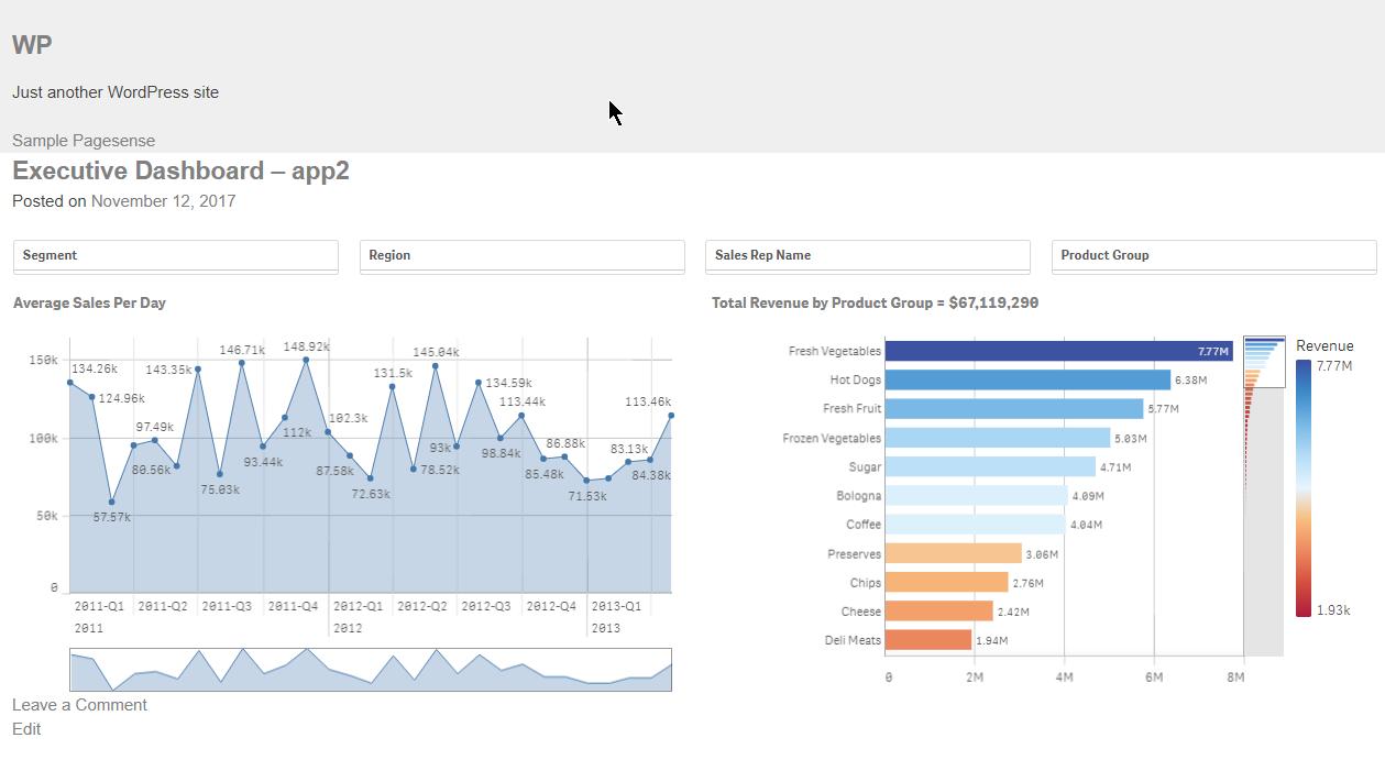
Qlik Sense Wordpress Plugin
There are a lot of people that use Wordpress as their company's portal. If you are one of these people then, you may find this plugin very useful. You... Show MoreThere are a lot of people that use Wordpress as their company's portal. If you are one of these people then, you may find this plugin very useful. You can create a mashup from within wordpress, using the Capabilities API, without writing a single line of code. Just add the settings with the host and the App ID, then the shortcode for the objects that you want and you are done.
Here, I will show you how to do that.
- First go to your wp admin panel, under "Plugins" click on "Add New" and then search for "Qlik"
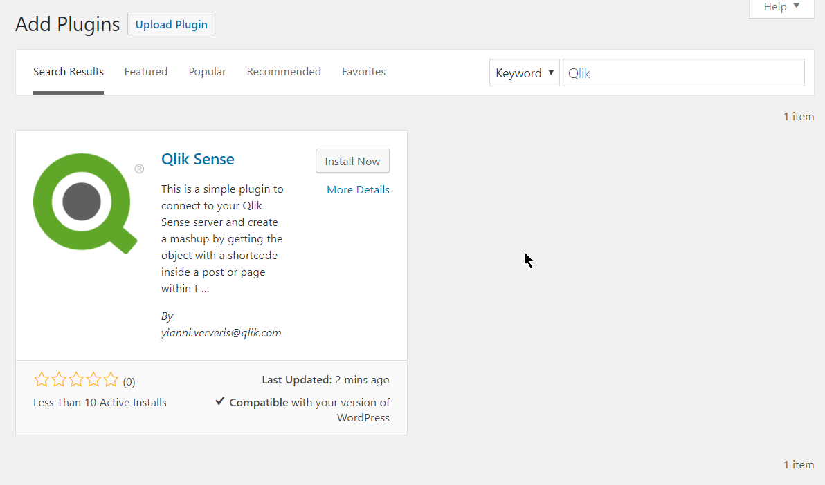
- Click on "Install Now" and then on "Activate"
- This will create a "Qlik Sense" settings page, just open that
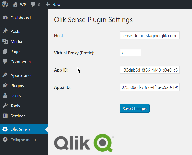
- Here you need to define your host, the Virtual Proxy (prefix) and the App Id, as you would in a regular mashup. If you are planning on using a second app, then add the second app id in "App2 ID".
- Save changes.
- Then add the shortcode into your posts "[qlik-sense-object id="page1-obj2" qvid="nvqpV" height="400" app2="true"]"
- id: is the unique div id. This is needed especially when you want to display the same object in 2 different instances
- qvid: Is the object id as found in the "dev-hub/single-configurator"
- height: The height of the visualization in pixels
- nointeraction: Add this if you want to disable interactions. If you want the objects to have interaction, you can just omit this.- app2: Add this if your object is coming from the second app that you have specified in the settings
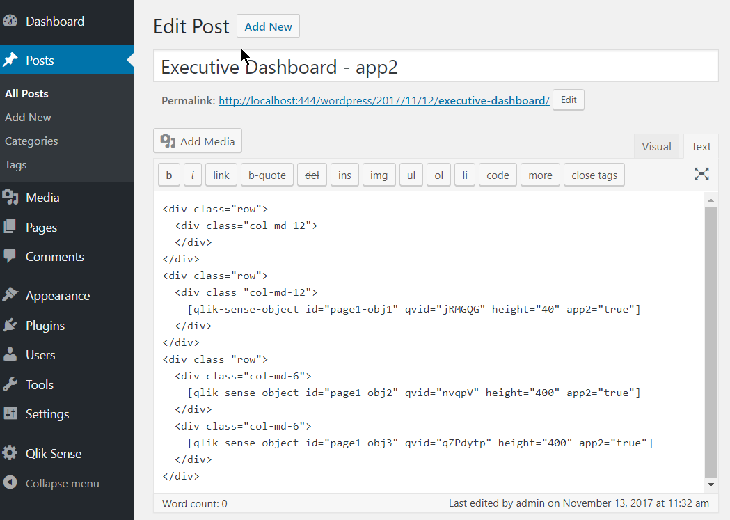
- I have added few objects with a specific height in a bootstrap template for better layout. Now, lets preview the page
Make sure you whitelist your url in the virtual proxy.
If you use it and like it, please give it a 5 star in Wordpress.
This is it!
Yianni
In Portuguese: Qlik Sense Plugin para Wordpress by cleveranjos. Thank you Clever!
- First go to your wp admin panel, under "Plugins" click on "Add New" and then search for "Qlik"
-
IT Service Desk
IT Service Desk Senwes The purpose of this app is to monitor the tickets the service desk receives in order to improve efficiency. Discove... Show MoreIT Service DeskSenwesThe purpose of this app is to monitor the tickets the service desk receives in order to improve efficiency.Discoveries
The app discovered that the time it takes for certain tickets to be completed can be improved.
Impact
The Pro-active monitoring dashboard included in the app allows the IT department to pro-actively respond to high priority incidents that's having a direct impact on business.
Audience
IT Monitoring/ Service Management.
Data and advanced analytics
Better tracking of ticket duration.
-
Rise in demand for data analytics skills
Data Analytics professionals are indispensable in any organisation. Company leaders develop lucrative strategies for the growth of the organisation ba... Show MoreData Analytics professionals are indispensable in any organisation. Company leaders develop lucrative strategies for the growth of the organisation based on data analytics done by professionals, hence their work is instrumental in the highest decision-making of an organisation. The demand for data analytics and data science professionals is only going to increase in the coming years, not just in India but also globally. A huge 45% increase in jobs in the Indian market is a result of data analytics requirements.
Read more on this in an article in Education Times: https://www.educationtimes.com/article/higher-education-by-invitation/95905611/why-there-is-a-rise-in-demand-for-data-analytics-professionals
If you are a student or educator, learn how to get trained and qualified in data analytics: qlik.com/academicprogram -
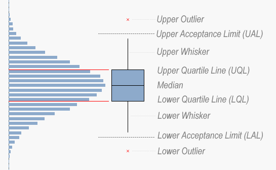
Recipe for a Box Plot
When you want to look at the distribution of a measurement, a histogram is one possibility. However, if you want to show the distribution split over s... Show MoreWhen you want to look at the distribution of a measurement, a histogram is one possibility. However, if you want to show the distribution split over several dimensional values, a Box Plot may be a better choice.
You may, for instance, want to evaluate the quality of units produced in different machines, or delivered by different suppliers. Then, a Box Plot is an excellent choice to display the characteristic that you want to examine:
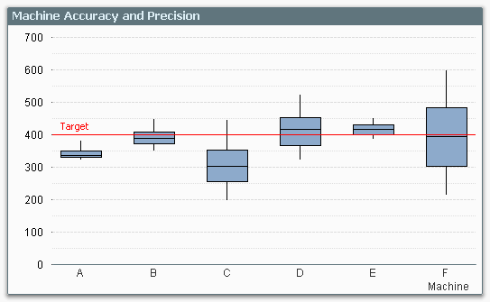
The graph clearly shows you the performance of the different machines compared to target: Machine A has the precision, but not the accuracy. Machine F has the accuracy, but not the precision.
The Box Plot provides an intuitive graphical representation of several properties of the data set. The box itself represents the main group of measurements, with a center line representing the middle of the data. Usually the median and the upper and lower quartile levels are used to define the box, but it is also possible to use the average plus/minus one standard deviation.
The whiskers are used to show the spread of the data, e.g. the largest and smallest measurements can be used. Usually, however, the definition is slightly more intricate. Below I will use the definition used in six sigma implementations.
There, the whiskers are often used to depict the largest and smallest values within an acceptable range, whereas values outside this range are outliers.
The concept of the Inter Quartile Range (IQR) – the difference between the upper and lower quartile level – is used to calculate the acceptance range. Hence:
- Inter Quartile Range (IQR) = Upper Quartile Line (UQL) – Lower Quartile Line (LQL)
- Upper Acceptance Limit (UAL) = UQL + 1.5 * IQR
- Lower Acceptance Limit (LAL) = LQL - 1.5 * IQR
The picture below summarizes the box plot.
And here is how you implement this in QlikView…
- Go to the Tools menu and choose “Box Plot Wizard”.
- On the “Step 1 - Define data” page, you choose your dimension. In my example, this was Machine, but it could be Supplier or Batch or something similar.
- Use the same dimension once more in the “Aggregator” control.
- Use the average of your measurement in the “Expression” control – Avg(Measurement).
- Click “Next”.
- On the “Step 2 - Presentation” page, you should choose “Median mode”.
- Check “Include Whiskers” and “Use Outliers”.
- Click “Finish”.
QlikView has now created a Box Plot with general expressions that almost always display a meaningful result, and allows for an intermediate aggregator. However, the expressions are not what we want for a six sigma box plot, so we need to change them to the following: (Below, the dimension is called Dim, and the measurement is called Val.)
- Box Plot Middle: Median(Val)
- Box Plot Bottom: Fractile(Val,0.25)
- Box Plot Top: Fractile(Val,0.75)
The whiskers and the outliers all need a nested aggregation – each value needs to be compared to the acceptance levels for the group – so they all contain an Aggr() function that calculates the relevant acceptance limit:
- Box Plot Lower Whisker:
Min(If(Val>= Aggr(2.5*Fractile(total <Dim> Val,0.25) -1.5*Fractile(total <Dim> Val,0.75), Dim, Val), Val)) - Box Plot Upper Whisker:
Max(If(Val<= Aggr(2.5*Fractile(total <Dim> Val,0.75) -1.5*Fractile(total <Dim> Val,0.25), Dim, Val), Val)) - Lower Outlier:
Min(If(Val< Aggr(2.5*Fractile(total <Dim> Val,0.25) -1.5*Fractile(total <Dim> Val,0.75), Dim, Val), Val)) - Upper Outlier:
Max(If(Val> Aggr(2.5*Fractile(total <Dim> Val,0.75) -1.5*Fractile(total <Dim> Val,0.25), Dim, Val), Val))
And with this, I leave you to create your own box plots.
Further reading related to data classification:

-
Qlik アドボケイトミートアップ開催報告
今回のミートアップは、世界でも50名しかいないQlik Luminary のお一人、セガの萬さま司会進行によるオフラインでの開催となりました。第1部は2テーブルに分かれたグループディスカッションで「Qlik を使ったビジネスインパクト」と「Qlik の社内展開」の2テーマを取り上げました。 それぞ... Show More今回のミートアップは、世界でも50名しかいないQlik Luminary のお一人、セガの萬さま司会進行によるオフラインでの開催となりました。第1部は2テーブルに分かれたグループディスカッションで「Qlik を使ったビジネスインパクト」と「Qlik の社内展開」の2テーマを取り上げました。
それぞれのテーマを OGI 荻本さま、富士通中川さまにテーブルリーダーとして進行いただき、各社の課題やベストプラクティスの紹介など、活発な議論が交わされました。中には、実際に使っているアプリを見せながら自社の取り組みを紹介された方もいらっしゃいました。
議論の内容の一部をご紹介します。
Qlik を使ったビジネスインパクト
- 隠れていた、ばらばらだったデータがよりわかりやすくなり、可視化される
- ユーザ同士で集まって、ノウハウを交換、分析の技術の交換している、週に一回の共有会、月一回の顔合わせ:今月やった自慢話、ノウハウとして持ち帰る、など
- Qlik Sense を使うと会議でパワポがいらなくなった
A社事例
人事メンバーが自らボトムアップで Qlik とアラートを実装・展開し、人事から有給取得状況に関するアラートが届くようになった。「決められた有休日数を消化する」というアクションに繋がっている。
Qlik の社内展開
- 多くの人に使わせるのではなく、濃い人たちに「これがないと困る」という環境を作る。
- 成果を作って広げていく、エバンジェリスト構想(やる気のある人を配置して、ボトムアップ)
- 家庭教師方式(課の人間がプロジェクトに入り、5人くらいのチームでコンサル形式でやる。課題のヒアリング、成果を出す)がよい
B社事例
業務に必要な分析に関する相談を受けるチケットシステムとそれに対応するチームを作っている。分析の実装の仕方はあえて教えない。分析の方針などについてコンサルしていくイメージ。業務の課題からスタートしているので必要なデータや可視化だけが作られていく。その結果、ちゃんと使われる。
第2部は学研福田さま、山上さまより、小学生の間で話題の「ナニコレンズ」の事業化の経緯、そして本事業を Qlik Sense でどのように管理しインサイトを得ているのか、ビジネストランスフォーメーション(BX)から実際のアプリに至る深い示唆をいただきました。
その後、弊社槙野よりご挨拶とともに始まった懇親会兼忘年会では、セガ萬さまから各ゲームタイトルを管理するアプリをご紹介いただいたり、ご希望の方には会場と同じビル内にあるQlikの新オフィス見学ツアーを実施、「リアルイベント」ならでは醍醐味を楽しまれました。
引き続き来年もユーザーのみなさまが他のユーザーの方やQlikと交流できる機会をたくさん作っていきます。ご期待ください!
-
Data literacy skills are not all about data
When thinking about what it means to be data literate, it's easy to focus only on technical skills. We assume that to be data literate our priority sh... Show MoreWhen thinking about what it means to be data literate, it's easy to focus only on technical skills. We assume that to be data literate our priority should be to fine tune our data preparation, or data visualization abilities, for example. But being data literate encompasses a vast range of competencies that sometimes don't relate directly to data at all.
In his recent blog for The Data Literacy Project, Kevin Hanegan (Chief Learning Officer at Qlik) discusses how technical data skills alone are not enough when it comes to discovering insights in data and being data literate. Asking the right questions of our data, and developing soft skills such as critical thinking and creativity are just as important as the technical skills. While AI can automate many human tasks, our human intuition and emotional intelligence mean we are still a crucial piece of the puzzle. Learn more about the competencies required to become truly data literate in the Data Literacy Project blog here.
You can start working on your data literacy skills by making the most of your access to the Academic Program. By studying on the data literacy courses included in our program, the same courses used by customers, you can start to lay the foundations for your future in the data driven workplace. Data literacy is set to be the most in-demand skill by 2030, with 85% of executives believing these skills will be as vital in the future as the ability to use a computer is today. Taking the time to learn these skills will help to cement your future success, check out our Data Literacy courses here. If you haven't yet signed up for the Qlik Academic Program, you can follow this link: qlik.com/academicprogram
-
Vision 360 hospital management
Vision 360 hospital managementToccatoWe have a complete view of all matters in a hospital, from arrival, admission, procedures and discharge.Discoveri... Show MoreVision 360 hospital managementToccatoWe have a complete view of all matters in a hospital, from arrival, admission, procedures and discharge.Discoveries
Understand all the resources used in the passage of patients through the hospital sectors.
Impact
Managers are able to change the format of views quickly and autonomously.
Audience
hospital managers
Data and advanced analytics
Managers can quickly see which specialty or sector is in greatest demand or spending.

-
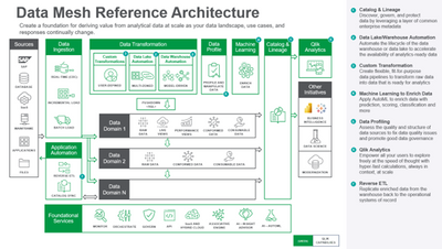
Qlik Use Case Reference Architecture - #6: Data Mesh Reference Architecture
The architecture comprises the following components:Data is ingested from transactional systems with low latency. Change data capture for real-time da... Show MoreThe architecture comprises the following components:
Data is ingested from transactional systems with low latency. Change data capture for real-time data replication ingests data without impairing production system performance.
Data Warehouse Automation accelerates the availability of analytics-ready data by automating the entire data warehouse lifecycle.
Data Lake Automation powers the process of providing continuously updated, accurate, and trusted data sets for business analytics.
Custom Transformation allows users to create flexible, fit-for-purpose data pipelines to transform raw data into data that is ready for analytics.
Data Profiling enables users to assess the quality and structure of data sources to fix data quality issues and promote good data governance.
Machine Learning enriches data with prediction, scoring, classification, and more.
Catalog & Lineage capabilities empower users to discover, govern, and protect data using AI and machine learning built on a layer of common enterprise metadata.
Analytics is used to discover, interpret, and communicate meaningful patterns in data to apply toward effective decision making
Reverse ETL replicates enriched data from the warehouse back to the operational systems of record.
-
Qlik Reporting PowerPoint Format
Can't see the video? View it on the Qlik site here Want to see more?YouTube - PowerPoint Output Format - Subscription and Report Service Walkthrough Q... Show MoreCan't see the video? View it on the Qlik site here
Want to see more?
- YouTube - PowerPoint Output Format - Subscription and Report Service Walkthrough
- Qlik Site - PowerPoint Output Format - Subscription and Report Service Walkthrough
For Qlik business users, PowerPoint output format is now available when scheduling sheet or chart report delivery. For report developers, PowerPoint format is also available from the Qlik Reporting Service when used via direct API call or with Qlik Application Automation and the reporting connectors.
When delivering sheets to PowerPoint, the visualizations within a Qlik Sense sheet are optimally presented in the PowerPoint slide as individual images with opaque backgrounds, allowing the recipient to resize individual images, annotate with native objects and apply PPT theming to the slide before business presentation. An associated Qlik Sense Client change will also allow for background images in a Qlik Sense sheet and a finer grain grid if application/report developers wish to pre-design an app for PowerPoint format report usage.
Qlik continues extend functionality and future-proof investment for Qlik cloud reporting with our release today. As we head into 2023, we continue to partner with our customers on addressing their critical reporting requirements and delivering against our cloud reporting roadmap. Join us on January 24th for our Talk to Experts Tuesday Qlik Community webinar, “Q&A with Qlik: Making the Move to Qlik Cloud Reporting”.
-
Customer Managed Keys and GeoOperations now available Qlik Cloud Government
Qlik is committed to our US Public Sector customers through Qlik Cloud Government and continuing our investment into the platform. Our latest release... Show MoreQlik is committed to our US Public Sector customers through Qlik Cloud Government and continuing our investment into the platform. Our latest release for Qlik Cloud Government includes the following two features:
- Customer Managed Keys – enhanced encryption capabilities offering customers the ability to bring their own encryption keys
- GeoOperations – advanced mapping calculations to solve geographical problems with data
To learn more about both, please see content on each below and the attached links for videos, workshops, and more!
2. Customer Managed Keys
We are pleased to announce that Customer Managed Keys is now available in Qlik Cloud Government, offering advanced data encryption and allowing customers to bring their own encryption keys when storing data in Qlik Cloud.
For public sectors customers with higher security requirements, Customer Managed Keys offers an additional security layer enabling organizations to bring their own encryption keys (BYOK) to protect the data stored at rest in their Qlik Cloud tenant. This empowers the customer to retain full control over their data’s encryption key.
Additional control around data access
Customer Managed Keys ensures only the customer has access to the data – not Qlik. If data is encrypted using customer-managed keys and the customer disables access to the encryption key, it is technically impossible for Qlik to decrypt the data without the customer’s consent. The customer keeps full control over the data’s lifecycle.
Qlik’s first implementation of Customer Managed Keys will use AWS Key Management Service (AWS KMS). AWS KMS is a managed service that makes it easy to create and control the cryptographic keys that are used to protect your data. AWS KMS uses hardware security modules (HSM) to protect and validate your AWS KMS keys under FIPS 140-2.
Technical Diagram of integration with AWS KMS
Customer Managed Keys brings that extra level of trust and governance for sensitive data moving in to Qlik Cloud.
Supporting Resources:
- Overview and Walk-through Video
- Qlik Help Site to configure tenant encryption
- Additional support resources click here.
2. GeoOperations
GeoOperations enables geographic calculations and functions such as calculating routes or travel areas and supports loading geographic data from a wide variety of data sources into Qlik Cloud Government. Qlik’s GeoOperations empowers organizations to solve geographic problems and unlock more value of out their data.
GeoOperations functions are available in script layer for both the application’s load script and at the visualization level. GeoOperations functions also can be used to transform geographic data or make calculations.
Advanced Mapping Features of GeoOperations:
- Extracts spatial relations so that they can be handled by Qlik.
- Load time lookups of locations (as an alternative to the presentation time lookups in the map chart).
- Aggregation of points in clusters or bins.
- Specify locations as:
- Point, line, or area geometries
- Latitude and longitude fields
- Named points or areas
- Load geographic data from a range of input formats.
- Use operations on data already loaded in Qlik.
A few examples below of GeoOperations:
- Multi-layered mapping visualizing natural disaster impact to populations/structures, etc.
- Determining travel areas from points to identify under-served geographies
- Finding quickest route to deploy resources in response to emergency and/or disaster events
- Linking GPS positions to hospitals, schools, or road networks
- Building custom areas from a list of municipalities or constituents
To learn more about GeoOperations, visit the Qlik Help page or check out the YouTube Video.
For a GeoOperations example and follow along exercise, click here.