Unlock a world of possibilities! Login now and discover the exclusive benefits awaiting you.

Analytics & AI
Forums for Qlik Analytic solutions. Ask questions, join discussions, find solutions, and access documentation and resources.
Data Integration & Quality
Forums for Qlik Data Integration solutions. Ask questions, join discussions, find solutions, and access documentation and resources
Explore Qlik Gallery
Qlik Gallery is meant to encourage Qlikkies everywhere to share their progress – from a first Qlik app – to a favorite Qlik app – and everything in-between.
Qlik Community
Get started on Qlik Community, find How-To documents, and join general non-product related discussions.
Qlik Resources
Direct links to other resources within the Qlik ecosystem. We suggest you bookmark this page.
Qlik Academic Program
Qlik gives qualified university students, educators, and researchers free Qlik software and resources to prepare students for the data-driven workplace.
Recent Blog Posts
-
Do you have what it takes to be a Qlik Academic Program Educator Ambassador?
The Qlik Academic Program provides educators, students, and researchers from accredited universities with free Qlik software and learning resources to... Show MoreThe Qlik Academic Program provides educators, students, and researchers from accredited universities with free Qlik software and learning resources to educate and train the next generation of experts leading with data. Our Educator Ambassador Program aims to shine a spotlight on our most active educator members. Our ambassadors will champion our vision to make more students data literate and to prepare them for the data-driven workplace.
Are you a current educator member who is:
- Passionate about the Qlik Academic Program and the resources provided to students and educators
- Passionate about educating students to be prepared for the data-driven workforce and to secure jobs?
- An active promotor of the Qlik Academic Program to academic peers as well as students?
- Willing to share your experience of the Qlik Academic Program at (virtual) events, in forums, on social media and in the press?
- A contributor to blogs, forums, university publications, professional journals, papers, or other materials that promote the Qlik Academic Program?
If you answered YES to one or more of the above, then we encourage you to apply to the Educator Ambassador Program! Learn more and apply now!
All current educator members are eligible to apply. If you have not already signed up for the Qlik Academic Program, you can do so at https://www.qlik.com/us/academicprogram and then check out our current 2022 Educator Ambassadors.
Application Deadline: The application deadline is November 18, 2022 and the new class of ambassadors will be announced in early 2023.
Ambassador Benefits:
If you are selected as a Qlik Academic Program Educator Ambassador, you will receive a host of benefits including:
- Insight: Exclusive webinars with Qlik leaders, covering the latest trends in analytics and other industry topics
- Credibility: A digital badge to certify ambassador status and a featured online profile
- Exposure: Outreach opportunities to showcase your experience with the Qlik Academic Program via Qlik marketing channels or speaking engagements
- Perks: Discounts on Qlik events and other exclusive rewards
- Community: Collaborate with other educators across various fields and geographies
- Opportunity: Potential to advance your career including meeting university requirements for scholarly contribution beyond the classroom

-
How to make a lollipop chart with Qlik Sense
It's been a while since I posted a tip about creating charts. I say roll up your sleeves and let's hack one of the standard charts to create a chart t... Show MoreIt's been a while since I posted a tip about creating charts. I say roll up your sleeves and let's hack one of the standard charts to create a chart type that doesn’t exist in our chart library. Who's in?
We will be making a lollipop chart and something extra, because, well, why not.
First, let's describe what a lollipop chart is and why it can be useful.
What is a lollipop chart?
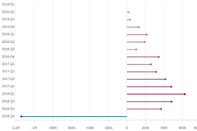
A lollipop chart is a variation of a bar chart. It differs from a traditional bar chart in two ways: bars are reduced to a line, and the bar tips are oversized in the shape of a circle. If you're a sweet tooth, it'll remind you of a lollipop.
One of the main benefits of a lollipop chart is that it can be used to represent a large set of tall bars in a less intimidating way. However, it is pertinent to emphasize that this chart is less accurate than a regular bar chart. This is mainly because the center of the circle at the end of the lollipop marks the value. In comparison to the straight edge of a bar, it is difficult to determine where the center is located.
Hands on
We will use a combo chart and some of its not-so-new features to create a lollipop chart. Remember a bar chart needs at least one dimension and one measure.
Drag a combo chart and add a dimension and one measure
Nothing wrong with this chart
Next, let’s start messing with the chart settings. Go to Appearance, Presentation, and then Advance Styling. There you will be presented with a bunch of configuration options. What we want is to make the bar width really thin. Anything around 0.1 usually works well.
Now our combo chart should look something like the one below.
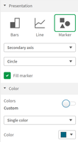
Next, is the time to add the candy on top of those lines. Since we are using a combo chart we can quickly add another measure to it and pick a marker as its representation. Simply add the same measurement you used for the bars again. It will be added as a line and the label will say height of line. Don’t panic, no yet. Next expand the new measure panel and scroll down to click on “More properties” button and pick “Marker” from the options displayed.
Your chart should be looking something like this
The next step is to get the colors of the bars and the marker in sync. Simply select the appropriate color in the menu option under the measure “More properties” panel.
If you want your circle markers in sync with your bars, and you are using something more sophisticated than single color you can go a long way with colors by using expression instead of single color in the panel.
As a final step, make sure that neither the legend nor the tooltip ruin our little hack by showing both metrics. To do that just scroll to the very bottom of the combo chart Presentation properties panel deactivate the legend and change the tooltip properties from basic to custom to make sure you have control over it.
EXTRA TIP:
After learning how to make a fancy lollipop chart using the combo chart, we can spend some time creating a bar chart with rounded corners as in the picture below.
The process is simple, just adjust the bar width until it matches the circle diameter size and voila, your rounded corner bar chart is ready. There are some colors that work better than others at dissimulating marker borders (darker colors), keep that in mind if you are looking for perfection.
Thank you for reading this post I hope you enjoyed it.
Arturo

-
Qlik Sense Mobile SaaS - September Release
Qlik is pleased to announce some exciting new features for Qlik Sense Mobile SaaS. These new updates are intended to simplify and improve the experien... Show MoreQlik is pleased to announce some exciting new features for Qlik Sense Mobile SaaS. These new updates are intended to simplify and improve the experience for all our mobile customers!
With simplified access to our mobile apps, you can now easily navigate to your applicable app store, download the app, and have your tenant automatically added to your mobile device via the options below:
- Scan a QR code using your mobile device found in Qlik Clould
- Click an App Store or Play Store button from Qlik Cloud, your welcome email, or your email alerts
- In the mobile browser, click on the newly added banner!
In addition, we’ve extended our support of landscape mode to our entire application, going beyond just apps (QVFs) and charts. We took into consideration the difference between modals and actual navigation, identified breakpoints where just a regular flip wouldn’t work, and adapted an efficient landscape design for every screen. From start to finish, the Qlik Sense Mobile application is navigable in landscape mode!
We’ve also improved the rendering, performance, and memory consumption of the KPI object as well as added support for the "Link to sheet" action that allows users to navigate to other apps and sheets via the KPI object.
For more information, please check out our SaaS in 60 video – Setting Up Qlik Sense Mobile Improvements and Native Landscape Mode.
-
Qlik AutoML Tips - Tip #2 - The data you should be using - (must contain outcome...
Can't see the video? Watch on the Qlik video site here.Missed Tip #1? - View it here.Tip #2 covers the data you should be using with Qlik AutoML. Whe... Show MoreCan't see the video? Watch on the Qlik video site here.
Missed Tip #1? - View it here.
Tip #2 covers the data you should be using with Qlik AutoML. When creating new ML experiments with Qlik AutoML – you are prompted to select data from the Qlik Catalog. Though you will see data that has been registered in the catalog, it is important to note that not just any data can be used with Qlik AutoML. Historical data ( data you normally use for analytics and reporting with dimensions, measures, time periods, etc. ) is generally not suitable for machine learning. Why? Data you’re accustomed to using in analytics apps is captured all at the same point in time (current, end of day, end of month, etc.). With machine learning and predictive analytics, the dataset needs to contain an outcome we care about and a set of attributes we call features (typically your dimension fields / values) that existed prior to that outcome. That way, a machine learning model can learn the patterns that led to that outcome and therefore identify them in advance when we apply the model to live or current data. That being said – you must select data from the catalog that has been prepared with the main ingredients needed to train machine learning models.
Stay tuned for Tip #3 where I will briefly cover architecting the data set and the needed ingredients.Qlik AutoML Helpful Resources:

-
Qlik Sense Chart Property - Data Handling
Check out this brief video to see how I use the Data Handling property and let the community and I know if you ever used it and if so, how?Can't see t... Show MoreCheck out this brief video to see how I use the Data Handling property and let the community and I know if you ever used it and if so, how?
Can't see the video? View it on the Qlik Video site here
Data handling - Available under Add-on of the selected chart properties
-
Climate Risk Overview
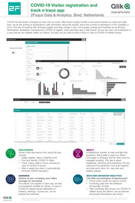
Climate Risk OverviewVan OordThe Climate Risk Overview, a global tool powered by Van Oord where open source data has been mapped onto 10km segments of... Show MoreClimate Risk OverviewVan Oord The Climate Risk Overview, a global tool powered by Van Oord where open source data has been mapped onto 10km segments of the world’s coastlines. The overview brings together key parameters such as populations, low lying land and expected sea level rise to anticipate the hazard of flooding for all coastlines and societies around the world. Use the filters on different criteria to find your own selection of hotspots based on your own perspective. This tool is the first step in a broader plan to bring climate adaptation solutions to the coastal areas which need it the most. Once you have had a look why don’t you reach out to us to discuss how we can collaborate further? The Climate Risk Overview has initially been developed in Qlik Sense. The internal Qlik Sense version is still used to explore new data and visualizations. But most of all to find Climate Adaptation Action opportunities. This Qlik Gallery dashboard is a public demo version for Qlik for Climate Action. https://climaterisk.data.vanoord.com/
Discoveries
Van Oord identified 10 locations where we now pursue sustainable business opportunities.
Impact
The planet is facing enormous challenges, caused by human activity, increasing the vulnerability of coastal communities and ecosystems to the forces of nature. This is worsened by the effects of climate change, which is threatening the world’s coastal defences. Van Oord has responded to these challenges by developing the Climate Risk Overview. It is designed to raise awareness and encourage meaningful dialogue between stakeholders in order to provide ready-to-scale marine solutions that help increase the resilience of the communities and ecosystems of coastal areas.
Audience
All stakeholders that deal with coastal communities at risk due to sea level rise on one hand, and are dedicated to further the use of Nature based Solutions on the other hand.
Data and advanced analytics
The app has impacted our field by adding an intuitive geo-spatial multi-criteria analysis with Qlik's famous data exploration dedicated to the general public. The Qlik app adds a valuable new combination to the plethora of valuable, yet siloed data portals on the web.
-
A look at our EMEA Survey Results
87% of respondents said their Academic Program experience was either ‘Somewhat Positive’ or ‘Very Positive’.76% of our educator respondents said they ... Show More- 87% of respondents said their Academic Program experience was either ‘Somewhat Positive’ or ‘Very Positive’.
- 76% of our educator respondents said they felt that earning a Qlik Sense qualification helped to make their students ‘Extremely Marketable’ or ‘Very Marketable’ to prospective employers.
- When asked on a scale of 0-10, how likely they would be to recommend the Academic Program to a colleague or student, 76% gave either a 9 or a 10.
When asked to rank the most useful Academic Program resource, our QCC offering came out as the most useful:
1 – Qlik Continues Classroom Business Analyst and Data Architect Videos
2 – Data Analytics Curriculum
3 – Qlik Sense Qualifications
4 – Academic Program forum on Qlik Community
Here are some of the ways respondents described their experience with Qlik and our Academic Program:
- ‘Qlik Academic Program is practical, supportive and enables me to teach students skills…which will enhance their graduate employability’
- ‘The Qlik Academic Program offers a very professional, straight forward entry for students into the modern, data-driven world of business intelligence applications’
- ‘Our students felt that they gained important skills in an industry-leading tool’
- ‘Qlik Academic Program provide great opportunities for ensuring high quality teaching for me and learning experience for my students’
- 'Qlik Sense, one of the top 3 BI & Analytics platforms worldwide, is my favorite because of its beautiful look & feel, its easy handling, & the great support given for all aspects of a modern cloud based BI platform.'
- 'Thank you for the many years of support and materials, we appreciate it a lot!'
If you’d like to explore our program for yourself, and understand what all the excitement is about, follow this link to learn more: qlik.com/academicprogram
-
Example Questions in Insight Advisor
Insight Advisor helps a user explore their data, generate visualizations, and analyze their data through Qlik Sense features such as Insight Advisor S... Show MoreInsight Advisor helps a user explore their data, generate visualizations, and analyze their data through Qlik Sense features such as Insight Advisor Search, Insight Advisor Analysis Types, and Insight Advisor Chat. In this blog, I am going to review how example questions can be added to Insight Advisor to help users when they start their analysis. Example questions are added at the app level and a developer can add example questions to any of their apps. When using Insight Advisor Search, users will see the example questions when they click in the “Ask Insight Advisor” search box (see image below). From there, users can select one of the example questions or enter a question of their own.
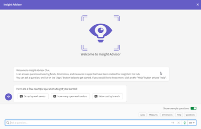
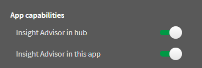
When using Insight Advisor Chat, users will see example questions from all apps that have example questions provided they have access to those apps. Below is an example from Insight Advisor Chat. Notice that the “Show example questions” is toggled on. This needs to be on for the example questions to be presented.
When Insight Advisor Chat is opened, the example questions are presented. If a user would like to see the example questions again later in a chat thread, all they need to do is click on the Questions button to view them. As with Insight Advisor Search, a user can select one of the example questions or enter a question of their own. If you find that the example questions are not showing up in Insight Advisor Chat, be sure to check the app options and make sure “Insight Advisor in hub” is toggled on. This setting can be accessed from within an app by clicking on the app name in the navigation bar and then selecting the app options icon.
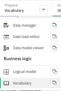
Now, let’s take a look at how to add example questions to an app. From within an app, click on Prepare and then select Vocabulary.
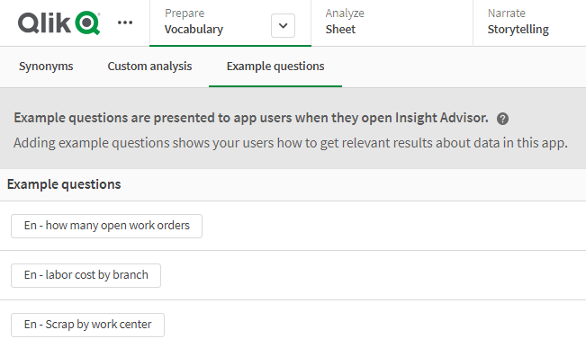
Click on the Example questions tab and click on the + Add question button. In the Add Example Question pop-up window, select the language for the question and then enter the question. Once you hit enter, a preview of a generated visualization will be displayed. If you would like to add an example question in multiple languages, click the + Add language button, select the language, and enter the example question in the respective language. Once you are done adding the question, in their respective languages, click the Add button to add the example question.
Repeat this process until all example questions have been added to the app. Here is what it will look like once all the example questions have been added.
Example questions for Insight Advisor allow developers to provide hints and help when using Insight Advisor. They can be used to get the user started with using Insight Advisor and guide them on how to ask their questions about an app. Check out Michael Tarallo's SaaS in 60 video and if you need more information, check out Qlik Help. If you are interested in Insight Advisor Analysis Types, check out my blog.
Thanks,
Jennell
-
Qlik Sense on Windows: Node.Js Vulnerability for versions prior to Nov. 2021
A node.js security update released new versions of14.x, 16.x, and 18.x to address three medium and two high severity issues. Impact Client-managed ... Show MoreA node.js security update released new versions of14.x, 16.x, and 18.x to address three medium and two high severity issues.
Impact
Client-managed Qlik Sense Enterprise on Windows release versions prior to November 2021 are affected.
Recommendation
It is recommended affected users upgrade to the following releases:
- November 2021 latest patch
- February 2022 latest patch
- May 2022 latest patch
- August 2022 IR
To download the latest patch, log into Qlik Community with your Qlik ID, and navigate to our downloads page. Filter by Data Analytics, Qlik Sense Enterprise on Windows, and find the latest version to upgrade to.
-
Qlik AutoML Tips - Tip #1 - Know the outcomes you wish to predict
Can't see the video? Watch on the Qlik video site here.Tip #1 – covers knowing the outcomes you wish to predict, as well as the questions you want to ... Show MoreCan't see the video? Watch on the Qlik video site here.
Tip #1 – covers knowing the outcomes you wish to predict, as well as the questions you want to ask based off your current findings from your historical analytical data. Let’s say when analyzing your sales and order data you have noticed a number of orders that have been cancelled. Further investigation shows those cancelled orders have gone unfulfilled for a specific period of time since being placed. This may be due to the sheer volume of orders and the number employees you have available to process them. You may want to get a better handle on understanding the pattern of cancellation and create some predictions to answer questions like:
- Will a customer cancel their order before it is fulfilled? - Or -
- How many days pass before a customer cancels their unfulfilled order?
Answering these questions will enable you to be proactive with certain customer orders and possibly direct your employees to give those order priority and fulfill them sooner to avoid cancellation. Now that we have our predictive question, we need to architect a data set that will support it so Qlik AutoML can use it effectively. Stay tuned for Tip #2 where I will cover the data you should be using to train machine learning models with Qlik AutoML.
Qlik AutoML Helpful Resources:
-
Analytics in Tennis Has Been an Evolution, Not a Revolution
The New York Times recently shared an interesting story about how analytics now plays an important part into the world of tennis, check it out, https:... Show MoreThe New York Times recently shared an interesting story about how analytics now plays an important part into the world of tennis, check it out, https://lnkd.in/eCcW7qrD
The article got me thinking about sports analytics in general and in my research I found the demand is on the rise. According to a Forbes article published this spring, "sports analytics market is expected to grow from $2.5 billion in 2021 to $8.4 billion by 2026." Now is the time to jump on board and cash in on this opportunity. Students can now begin studying sports analytics and many universities have already begun offering degrees such as Columbia University and New York University Sports Masters Programs.
However, you do not have to join those program for access to analytics! University students and educators/professors can join the @Anonymous #academicprogram for access to FREE #qliksense data analytics software, training, and certificate opportunities themselves! Simply visit https://www.qlik.com/us/company/academic-program and apply as a student or educator.
And check out just a small portion of app examples you can use for sports analytics, https://demos.qlik.com/qliksense?industry=Non-business&tags=Sports
-
How to create a Butterfly (Tornado) Chart in Qlik Sense
My previous post versed about what I think it is a very interesting use case of Set analysis element function P() to create dynamic sets and how to op... Show MoreMy previous post versed about what I think it is a very interesting use case of Set analysis element function P() to create dynamic sets and how to operate with those sets to solve really complex analysis scenarios in an easy and elegant way.
In the comments section of that post, I got a couple of questions regarding one of the charts we used in our web app, the so-called Tornado Chart. This post goes to answer that question by showing how to create a Tornado/Butterfly Chart.
Step by step guide:
Note: For the following example I got a sample data containing Population by Age data from the US census. It has 3 columns, Age Range, Male population and Female population.
- Drag and drop a bar chart to your sheet.
- Add a dimension. I’ll add Age Range to mine.
- Add two expressions. I need one expression to display female’s population and a second one for males.
At this point, my chart looks like this: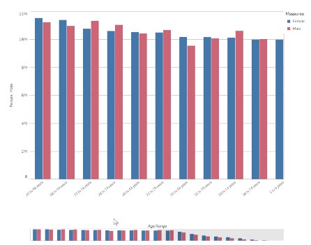
- Next, we will adjust the bar chart sorting and appearance.
Sort the chart according to your data. For this data set my best option is to sort Age Range using load order, to do so, move Age Range to the top and then uncheck all the sorting options to sort on load order.
In the Appearance section of the chart property panel, switch Presentation to Horizontal and Stacked and set Value labels to Auto.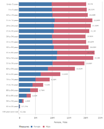
- Now we need to figure out how to “move the y axis to the center of the chart". To do so I’ll transform the data to make Female population negative by changing my expression to: Sum(FemalePopulation)*-1
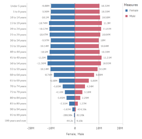
- My chart looks almost right but there’s still a detail that doesn't fits well in the picture above. Note that the value labels for Female Population are displayed as negative numbers. While technically correct, it doesn't work for this chart, I need it to be displayed as positive vales as well.
As a general note remember we can set up the format for positive and negative values for any expression. Format argument in the Num function can take 2 parameters, first one indicates how to format the number if it is >0 and the second piece if number <0.
=num(sum(x), 'postivenumberFormat;negativenumberFormat')As I want negative and positive number to look exactly the same I could use the following format arguments:
num(sum(FemalePopulation)*-1,’#,##0;#,##0’)
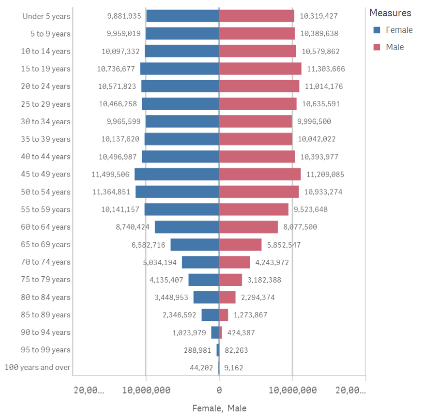
Note: Please be aware of some potential issues when exporting the chart as data since the resulting file could contain negative values.
Enjoy it.
-
【オンデマンド配信】達人に学ぶ、「本当にわかりやすいデータビジュアライゼーション」の極意
BI ツールを導入したものの、「社内に浸透しない、活用されない」といった課題を抱える企業は多いと思います。実はデータビジュアライゼーションには体系化された手法があり、これを学ぶことで、誰もが効果的なデータ視覚化が行えるようになります。学研グループでは、Qlik 導入後 1 年でデータドリブン文化が急... Show MoreBI ツールを導入したものの、「社内に浸透しない、活用されない」といった課題を抱える企業は多いと思います。実はデータビジュアライゼーションには体系化された手法があり、これを学ぶことで、誰もが効果的なデータ視覚化が行えるようになります。
学研グループでは、Qlik 導入後 1 年でデータドリブン文化が急速に浸透し始めています。その成功の極意とは?(株)学研ホールディングスのご担当者様より、「学研式データリテラシー講座」からの超抜粋で、データビジュアライゼーション手法のエッセンスを基に、企業内のデータ利活用高度化のヒントをご紹介いたします。※ 参加費無料。パソコン・タブレット・スマートフォンで、どこからでもご視聴いただけます。
-
ValueList() – For those tricky situations
Have you ever been asked to create a table that has several independent calculations over different metrics? Mixing aggregation formulas and counts in... Show MoreHave you ever been asked to create a table that has several independent calculations over different metrics?
Mixing aggregation formulas and counts in the same table?
Did you end up creating different tables for every view point on the same information?
Or did you create a table like the one below?
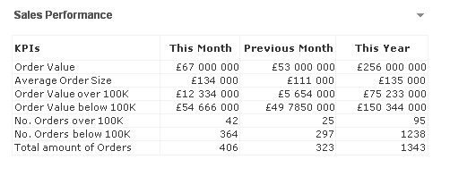
If not, let me introduce you to ValueList() and its number oriented big brother ValueLoop().
ValueList
ValueList (value {, value })ValueList allows us to specify a set of arbitrary values within the function, when used as a calculated dimension in a chart this will act as a synthetic dimension.
We can later restate the same function, with the same parameters, in our expression to reference the corresponding value in our newly created synthetic dimension.
And it is as simple as creating a straight table with following dimension and expression
Calculated Dimension:
=ValueList('My First KPI','My Second KPI')
Expression:
=IF( ValueList('My First KPI','My Second KPI')='My First KPI',
Sum([My First KPI Field],
Count([My Second KPI Field])
)
And voila we have created a table/chart with a dimension that does not exist in our data model and with an expression that has the possibility to mix and match aggregation functions over each dimension.
Matthew Crowther has also created an excellent Explosion Chart that also leverages ValueList, you can read more on his blog
ValueLoop
ValueLoop(from [, to [, step = 1 ]])ValueLoop shares the same characteristics as it’s little brother ValueList with the exception that it will create a series of numbers as the synthetic dimension.
To create a dimension with values that spans between 1-100 we would create a calculated dimension with
=ValueLoop(1,100,1)
which we can reference from our expression with the expression
IF( ValueLoop(1,100,1)=3,
'Almost Pi',
'Not Pi'
)
ValueLoop also allows us to create the, not so useful but fun to make, square pie chart which you can read more on in this technical brief.

-
Summer Sizzle. What’s Hot with Qlik Sense August 2022 - (on premise, Windows Ent...
Visualizations & Dashboards Developers now have more control of a sheet’s appearance to better guide users for a more desirable and easy to use interf... Show MoreVisualizations & Dashboards
- Developers now have more control of a sheet’s appearance to better guide users for a more desirable and easy to use interface. With Distinguishable Sheet Style Titling, a sheet’s background color and gradient for its titles will help users to tell the difference between public, private, and community sheets. By default, the background is transparent.
- Chart level scripting is a powerful new feature that allows users to modify the dynamic data set behind a chart using Qlik scripting language, with techniques such as variables and loops. Rows and columns can be added or modified that were not in the original data set. With the ability to edit HyperCube modifiers within visualizations, this enables calculations that have previously not been possible in chart expressions, such as simulations, goal seeking, etc.
- A react styling panel is now available that will include general and chart specific styling options, allowing for more settings and visual fluidity when editing your bar and pie charts. More charts will follow in future releases to assist in increasing the ease of use for developers across other available chart objects as well.
Connectivity
- You can now enjoy more of the same data connections already in Qlik Cloud with the addition of support for the Office 365 SharePoint Metadata Connector. Two new tables are now included within the connector - ‘Views’ and ‘ItemsFromList’. Now having access to Sharepoint lists and views will enhance team’s ability for collaboration and tracking within Qlik Sense.
- Also, since our standalone web connectors will be deprecated, the following (4) new connectors will now become available as part of the installed versions of Qlik Windows products: GitHub, Google Analytics Connector, Jira and Twitter Connectors.
Platform
- Self-service task management capabilities have been enhanced where we have now added the ability to add, edit, and delete scheduled reload tasks from directly within the hub! This will allow users to run numerous self-service scenarios from one location at scale, both more efficiently and intuitively.
We hope you enjoy the value these new capabilities bring to your organization this August. As the summer continues to heat up, Qlik will continue to deliver capabilities you’ve been waiting for; along with some surprises.
Be sure to subscribe to this Qlik Innovation Blog to be informed as we release new features and capabilities.
For a more in-depth review of Qlik’s latest innovations, subscribe to the quarterly Qlik Insider webinar to be in the know of what’s new and what’s next!
Resources
Check out the Qlik Help documentation site for more information on these and other new features
- Developers now have more control of a sheet’s appearance to better guide users for a more desirable and easy to use interface. With Distinguishable Sheet Style Titling, a sheet’s background color and gradient for its titles will help users to tell the difference between public, private, and community sheets. By default, the background is transparent.
-
Qlik Cloudの自動機械学習機能 Qlik AutoMLのご紹介
この記事は下記の英語版記事の翻訳です。Introducing Qlik AutoML on Qlik Cloud 予測分析機能を提供するQlik AutoMLが、Qlik Sense Enterprise SaaSの全顧客に提供されました。 Qlik AutoMLは、AIのサブセットを使用して過去... Show Moreこの記事は下記の英語版記事の翻訳です。
Introducing Qlik AutoML on Qlik Cloud
予測分析機能を提供するQlik AutoMLが、Qlik Sense Enterprise SaaSの全顧客に提供されました。 Qlik AutoMLは、AIのサブセットを使用して過去のデータから学習し、予測を作成して、将来の結果を分析するのに役立ちます。
Qlik AutoMLは、Qlik Cloud完全に統合されて使用可能となりました。 これにより、ビジネスアナリストや分析チームが直接、機械学習の力を利用することができ、機械学習モデルの生成、予測、計画決定を、すべて直感的にコード不要でユーザー体験の中で簡単に行うことができます。 Qlik Sense Enterprise SaaSをご利用のお客様は、すべてのサブスクリプションに無制限の実験と2つのモデルのデプロイが含まれているため、すぐにQlik AutoMLを使い始めることができます。
Qlik AutoMLを使用すると、以下のことが可能になります。
- ML実験を簡単に作成し、データセットのキードライバーを特定し、モデルをトレーニングすることができます。
- レコードレベルでの予測インフルエンサーデータ(シャープレイ値)を使って、現在のデータで将来予測を行うことができます。
- データを簡単に公開し、モデルをQlik Senseに統合して、探索やwhat-ifシナリオによるプランニングを行うことができます。
こちらの動画をご参照ください。(英語)
Qlik AutoML - What you should knowQlik AutoML - Basic Walkthrough Creating a Qlik Sense Predictive Analytics App
下記は学習のためのコンテンツです。(英語)

-
Gartner® データ統合ツールの Magic Quadrant™ - Qlik が企業におけるデータ移行をどのように変革しているのか。(Qlik Blog ...
ブログ著者:Dan Potter 本ブログは Gartner’s Magic Quadrant for Data Integration Tools Highlights how Qlik Is Transforming The Way Data Moves in the Enterprise の翻... Show Moreブログ著者:Dan Potter 本ブログは Gartner’s Magic Quadrant for Data Integration Tools Highlights how Qlik Is Transforming The Way Data Moves in the Enterprise の翻訳になります。
本レポートの重要な部分の 1 つである Gartner 社の「戦略的計画の予測」は、市場の方向性を示すのに役立ちます。今年、Gartner 社が示している 3 つの予測は、Qlik のデータ統合戦略と非常に合致しています。
“2024年までに、拡張データ統合をサポートするデータファブリックデザインパターンの導入で、手動によるデータ統合作業が最大 50% 削減される”
“2024年までに、AI を活用した拡張型のデータ管理・データ統合で、IT 専門家の必要性が最大30% 削減される”
拡張化は再び大きなテーマとなります。Gartner 社は、Qlik における最近の買収が、この分野の主な機能を大幅に向上したと評価しました。具体的には、メタデータとデータ系統の Nodegraph 社、AutoML および拡張データ統合の Big Squid 社、アプリケーションおよび API 統合の Blendr.io 社の買収です。また、手作業を低減する上で大きな役割を果たす自動化において、データウェアハウスの自動化における Qlik の成熟度を特に高く評価しています。
“2025年までに、PaaS モデルによるマルチクラウドハイブリッドのデータ統合機能を備えていないデータ統合ツールは、この機能を備えている事業者に市場シェアの50% を奪われるだろう”
この予測は、Qlik Cloud が提供する新たな PaaSと非常に合致しています。マルチクラウドへの対応はもちろん、各ハイパースケーラープラットフォーム上のあらゆるデータソースとターゲットに対して、手厚く幅広いサポートも必要です。また、「ハイブリッドデータ統合」の予測を見逃さないでください。ほとんどのデータは未だにオンプレミスに存在し、クラウドにアクセスしてデータを移行するための大規模かつ安全な方法が必要です。そこで、Qlik の変更データキャプチャとローカルゲートウェイのアプローチの出番です。
Qlik の今後の展開は?Qlik はここ数年、最も急速に成長しています。Qlik のデータ統合は、最も評価の高いデータ統合ソリューションの 1 つであり、企業の変化する課題に対応できる体制を整えています。
次の四半期には、Qlik Cloud データ統合の一部として、重要な新しい PaaS 機能を提供できる予定です。このサービスは、既存のデータ移行サービスと連携して SQL ベースの変換とデータマートの自動化を定義し、最も普及しているクラウドデータウェアハウスプラットフォーム(Snowflake、Azure Synapse、Google BigQuery、Databricks)にプッシュダウンすることができます。
また、新しい Qlik Gateway for Data Movement は、ファイアウォールの背後に設置して、企業のすべてのオンプレミスデータへのアクセスを促進。安全で拡張性の高い変更データキャプチャ機能で、クラウドへのリアルタイムのデータ提供を支援します。
今週、米国オーランドで開催予定の Gartner Data and Analytics Summit の Qlik ブースでお待ちしています。データ統合の未来についてご紹介する Qlik の講演に、ぜひご参加ください。
-
Introducing Qlik AutoML on Qlik Cloud
Qlik AutoML is now available and fully integrated into Qlik Cloud. This brings the power of machine learning directly to business analysts and analyt... Show MoreQlik AutoML is now available and fully integrated into Qlik Cloud. This brings the power of machine learning directly to business analysts and analytics teams, allowing you to easily generate machine learning models, make predictions, and plan decisions – all within an intuitive, code-free user experience. All Qlik Sense Enterprise SaaS customers can begin using Qlik AutoML immediately, as we have included unlimited experimentation and 2 deployed models with every subscription.
With Qlik AutoML, you can:
- Easily create ML experiments, identifying key drivers in the dataset and training models.
- Make future predictions on current data, complete with prediction influencer data (Shapley values) at the record-level.
- Easily publish data and integrate models into Qlik Sense for exploration and what-if scenario planning.
Before you get started with Qlik AutoML please watch these videos to learn more:
Qlik AutoML - What you need to know before you get started
Qlik AutoML - Basic Walkthrough Creating a Qlik Sense Predictive Analytics App
We encourage you to take advantage of the included capacity in Qlik Sense Enterprise SaaS, and to educate yourself with the large variety of training material available. This includes educational content available on continuous classroom, online help, and sample data files to get you started. It’s very important to get up to speed on the data science concepts you need to properly define your business problem and craft an ML-ready data set.
REGISTER FOR THE UPCOMING "DO MORE WITH QLIK " SESSION IN SEPTEMBER ON AUTOML ON CLOUD
And of course, we’re here to help. Please reach out to sales and services as you begin your Qlik AutoML journey.
Helpful Resources:
-
What you need to know about a career in analytics
In an article in siliconrepublic.com , KPMG’s Jitesh Goyal shares the traits and skills needed for an analytics career and gives his top tips for some... Show MoreIn an article in siliconrepublic.com , KPMG’s Jitesh Goyal shares the traits and skills needed for an analytics career and gives his top tips for someone starting out.
Jitesh Goyal leads the data and analytics strategy capability in the applied intelligence practice of KPMG Ireland.
He has been working in the data and analytics domain for 16 years and has delivered solutions to complex problems across a number of sectors and geographies. His first job involved working with large datasets to derive business metrics for reporting.
To read more about this interesting article and how one can explore a career in analytics, visit: https://www.siliconrepublic.com/people/data-analytics-career-skills-kpmg
To know more about you can start your analytics learning and get certified, if you are a student or educator, please visit: qlik.com/academicprogram
Article source: siliconrepublic.com
Image source: educba.com