Unlock a world of possibilities! Login now and discover the exclusive benefits awaiting you.
Analytics & AI
Forums for Qlik Analytic solutions. Ask questions, join discussions, find solutions, and access documentation and resources.
Data Integration & Quality
Forums for Qlik Data Integration solutions. Ask questions, join discussions, find solutions, and access documentation and resources
Explore Qlik Gallery
Qlik Gallery is meant to encourage Qlikkies everywhere to share their progress – from a first Qlik app – to a favorite Qlik app – and everything in-between.
Qlik Community
Get started on Qlik Community, find How-To documents, and join general non-product related discussions.
Qlik Resources
Direct links to other resources within the Qlik ecosystem. We suggest you bookmark this page.
Qlik Academic Program
Qlik gives qualified university students, educators, and researchers free Qlik software and resources to prepare students for the data-driven workplace.
Recent Blog Posts
-
Additional Styling Options for the Bar Chart
A few months ago, I blogged about KPI color and Map label enhancements that are available in Qlik Sense SaaS. Today, I will add to the list of visuali... Show MoreA few months ago, I blogged about KPI color and Map label enhancements that are available in Qlik Sense SaaS. Today, I will add to the list of visualization enhancements and discuss the bar chart. The bar chart now has additional styling options that allow the developer to style the title, subtitle, and footnote as well as the bars. Below is a horizontal bar chart with the default styling and bars that are colored based on the sales value.
In the bar chart properties window under Presentation, the Styling section can be expanded to view the properties that can be changed.
On the General tab, the font family and font size of the title, subtitle, and footnote can be changed. Developers can also make the text bold, italic or underlined. There is a “reset all” option to undo all changes made and return to the defaults or individual text (title, subtitle or footnote) can be reset. This is nice if you would like to play with various settings to see how it will look and opt to return to the default.
On the Chart tab, there are styling options for the bars. Developers can add an outline – small, medium, or large – and they can adjust the width of the bars. Like the General tab, there are reset options on this tab as well.
Below is the same bar chart with styling changes. The font family was changed to Tahoma for the title, subtitle and footnote and the color of the title was changed to a reddish color. On the Charts tab, the width of the bars was increased, and a small outline was added to the bars. When making these styling changes, keep in mind that the data is the most important part of the visualization, and you want that to stand out and not be overshadowed by distracting color titles, subtitles, or footnotes.
The new bar chart styling options gives developers more ways to customize their visualizations. Check out the styling properties the next time you are building an app. You can also learn more about the bar chart properties in Qlik Help.
Thanks,
Jennell
-
12 million UK workers lack essential digital skills
Last week the BBC published an article about just how much the talent shortage in the UK is impacting the technology sector. Last year there were over... Show MoreLast week the BBC published an article about just how much the talent shortage in the UK is impacting the technology sector. Last year there were over two million job vacancies in the UK tech industry, with nearly 12 million workers lacking in the essential digital skills needed to fill roles.
The roles most impacted include software developers, data scientists, data analysts, enterprise architects and programme and project managers. So, while these are amazing opportunities for graduates, or those looking to change career, most of the UK workforce would be lacking in the basic skills to even apply for such roles in the first place.
To try tackle the problem many companies are offering upskilling and training, however this comes a little too late when we consider that most jobs being advertised still have some form of a digital skill requirement to begin with.
Education is one of the key ways to overcome this problem, many are upskilling by taking additional course while working or enrolling on courses after they finish their studies. Our Qlik Academic Program means students at accredited universities can do this for free. Students who are not studying tech focused degrees can start upskilling and increasing their employability by enrolling on our free program.
Busy university students with a heavy workload might find it difficult to motivate themselves to add something to the to do list. However, our training is structured around easy to follow short videos, and when you consider the fact that tech jobs can pay an average of 80% more than non tech jobs, this investment of time certainly seems worth it!
To learn more about the free Qlik Academic Program and start upskilling, follow this link: www.qlik.com/academicprogram
-
Game on! How Qlik Customers can earn Qlik Nation points through actions you take...
Hello, Qlik Customers! Do you fancy a Qlik-branded Ember mug, or a new t-shirt to show off... Show MoreHello, Qlik Customers!
Do you fancy a Qlik-branded Ember mug, or a new t-shirt to show off your data swagger? Or maybe you’re looking for an opportunity to get a free 3-month subscription to the Qlik Continuous Classroom to enhance your learning? These are only a few of the rewards that you can earn with points in Qlik Nation, our customers-only advocate hub. Qlik Nation members also receive:
- Early notification of new product features, training and webinars
- Opportunities to build your personal brand, highlight your success and influence the Qlik product roadmap
- Exclusive Qlik Nation-only events, discounts and perks
- Points for participating in educational and fun activities, which can be redeemed for rewards
Want to be a “Bounty Hunter”?Thanks to a new integration with Qlik Community, you’ll be able to earn a point bounty in Qlik Nation for being one of the first 3 respondents to an unanswered question in Qlik Community. Here’s how to do it:
First, join Qlik Nation use the same QlikID that you do for Qlik Community. Note, Qlik Nation is a community only for Qlik customers.
Then, go to the Community channel.
Look for a challenge pointing to an unanswered question in Qlik Community. It will usually begin with the words “We need your help on this topic”. Click on the challenge to open it.
The opened challenge will look very similar to this:
Click on the hyperlink to the discussion thread in Qlik Community, answer the question, and then go back and click Accept.
You’ll receive 5 points for every thread you reply to and 10 extra points if your post is deemed an accepted solution to the question!
These challenges are time-sensitive: most only last 5 days, so you need to respond quickly!
Also, for every burning question you want to ask in the Qlik Community, you will receive 20 points in Qlik Nation for every new topic in Qlik Community that you post.
Of course, there are lots of different activity challenges in Qlik Nation in a variety of categories, including a new channel that changes every month! July’s channel is all about healthy habits—learn some great ways to live healthier, lower your stress level, and get points for sharing your favorite tips.
Come on in and check it all out!
@Sarah-Clark on my team manages Qlik Nation—if you have any questions, don’t hesitate to reach out!
Enjoy your “bounty hunting”, learning opportunities, and networking-- and let the games begin!
-
Qlik Sense SaaSに新しい編集モードが追加されます。
Qlikでは、製品を改善するために、ユーザー調査とインタビューを継続的に実施しています。その結果に基づき、新しい編集モードを追加しました。より簡素化された編集画面で、分析画面の作成がさらに容易になります。特にグラフの作成、データの探索、プロパティの定義、フィルタリングなどにすぐアクセスでき、分かりや... Show MoreQlikでは、製品を改善するために、ユーザー調査とインタビューを継続的に実施しています。その結果に基づき、新しい編集モードを追加しました。より簡素化された編集画面で、分析画面の作成がさらに容易になります。特にグラフの作成、データの探索、プロパティの定義、フィルタリングなどにすぐアクセスでき、分かりやすくなっています。この機能のコンセプトのいくつかは、2020年にQlikが買収したKnarr Analytics に由来しています。
現在はプレビュー期間として、管理コンソールの設定>機能のプレビュー>チャートおよび既定のシートの動作の作成をオンにすることで使用できます。このフラグは元に戻せませんのでご注意ください。オンにするとデフォルトの編集モードが新しいモードとなります。
新しい編集モードは、8月中旬にすべてのテナントに適用される予定です。
新しい編集モードには次のような機能があります。
- 編集モードの項目一覧から値や頻度を参照、選択が行えます。
- 編集モードのまま、選択などの分析操作を行うことができます。
- 簡単にビジュアライゼーションに表示するデータにフィルタを適用することができます。
- ビジュアライゼーションの変更やプロパティの変更がすぐに行えます。
- ソーステーブルビューアにより、シートの検証が容易になります。
- 詳細(従来)モードと切り替えて使用することができます。
ビジュアライゼーションの種類やプロパティはよく使用するものに限定しています。
詳細の使用方法については下記をご参照ください。
Qlik TECH TALK 動画:Qlik Sense の新しい編集モード New Authoring Experience のご紹介
Qlik TECH TALK 資料:Qlik Sense の新しい編集モード New Authoring Experience のご紹介
また下記の資料(英語)もご利用ください。
- Qlik Product Innovation Blog:Get ready for the Simplified Authoring Experience in Qlik Sense SaaS
- ヘルプサイト:Managing access to the new authoring experience view
- ユーザーガイド:New authoring experience user guide
- Continuous Classroom:New authoring experience course
新しい編集モードを是非ご活用ください。

-
Spicing up the Community in July!
Hello Qlik Community! We are spicing things up in the Community with our July enhancements! Here are the updates that we pushed out: Top 5 Weekly Pa... Show MoreHello Qlik Community!
We are spicing things up in the Community with our July enhancements! Here are the updates that we pushed out:
Top 5 Weekly Participants
The Homepage lists the Top Participants. We wanted to spice it up a bit and give others a chance! The list will now show the Top 5 Weekly participants based on likes received! Each week, we hope to see a different set of our members! To our overall Top Participants – we still got you! Look for a new exciting page coming in the next couple of months that will share your amazing achievements with the Community.
Qlik Nation members are rewarded for activities in Qlik Community!
Qlik Nation is our invitation-only customer advocate hub. Members who are a part of both Qlik Community and Qlik Nation will now receive Qlik Nation points for activities completed in Community (eg., creating posts, replies, and solutions accepted).
See the Qlik Greenway for more information about Qlik Nation, including a cool new video about the program.
Enter Qlik AutoML cases in the Case Portal
Qlik AutoML customers can now enter cases via the Case Portal. Be sure to also check out the Qlik AutoML forum for peer-to-peer discussions!
Products Alphabetized in Case Portal
Along with the addition of Qlik AutoML, the Product list was alphabetized to make selections easier.
Product Download - Contact Information Updated
The error message for reaching an unauthorized page now includes who to contact for the Downloads page.
Users that should be able to reach the Downloads page should contact Customer Support via the chat or create a case for assistance.Let us know what you think about these enhancements using the comments below. Is there anything you would like to see? Be sure to let us know! We love hearing from you all!
Things will only get hotter as summer continues, so check back next month to see what’s new!
Your Qlik Community Team,
Melissa, Sue, Jamie, Nicole, and Emma
-
Qlik Digest - July 2022
Be a Part of QlikWorld Tour 2022 – We are finally back on the road visiting over 30 cities and can’t wait to see you in person. Meet other Qlik Custom... Show MoreBe a Part of QlikWorld Tour 2022 – We are finally back on the road visiting over 30 cities and can’t wait to see you in person. Meet other Qlik Customers, hear their success stories, and get inspired to own your next big business decision using the power of data. Discover your data swagger at a city near you. Register today
Can’t find a tour location near you? Join the QlikWorld Virtual Event from anywhere in the world, anytime you want.
Calling all cycling fans! Join Qlik for this unique virtual experience with Olympian and cycling commentator Katherine Bates. Qlik is partnering with charity Qhubeka to support their amazing work throughout South Africa, and we need your pedal power! For every kilometer you ride, Qlik will donate on your behalf. For more details check out the Qlik in for Qhubeka site.Do More with Qlik Webinar – Join Mike Tarallo on July 27 as he explores how to extend analytic capabilities for big data and near–real–time use cases with our new Direct Query capability. You will also learn how to securely push data from on–premise sources into an analytics application in Qlik Cloud, thanks to our new Data Gateway – Direct Access, releasing mid–July. Sign up today
Take advantage of Data Integration and Analytics enhancements in Qlik Cloud!
Qlik Cloud Release Highlights for JulySimplified Authoring – create visualizations even more easily with a new all–in–one drag and drop interface – learn more
Data Services
Coming soon, new Data Integration capabilities in Qlik Cloud will help securely replicate on–prem data to the cloud (Real–time Hybrid Data Delivery using Data Gateway), and quickly standardize, enrich or define fit–for–purpose data sets and automatically generate the necessary SQL code for push–down execution in your data warehouse (Data Transformation). Available soon in early access, please work with your account team to learn more.
To stay up–to–date on what’s new, bookmark qlik.com/roadmap for access to all product innovation resources, including our Product Innovation Blog. You can also subscribe to the RSS feed for our SaaS Change log."The analysis tool of dreams"…well, according to Kazutaka Yourozu of SEGA’s Game Content Service Division at least! In a world with rapid change, SEGA needed a reliable platform to help them understand current trends and act on their data. Learn how SEGA enables deep–dive analysis and slick, responsive mobile game management with Qlik.
Solving challenges and save time – Hear from Dinesh Soni from India’s National Stock Exchange on how they’re using core features, like the associative engine, data visualization and integration of data from multiple sources.Qlikkie Spotlight – Don’t know Mike Tarallo yet? We need to fix that, stat! Mike is Qlik’s Principal Technical Marketing Manager and one of the best Qlik Evangelists out there. You might recognize him from the popular, “Do More with Qlik” webinar series, where Mike introduces the latest and greatest Qlik features every month. He loves kicking the tires on new Qlik products and sharing them with our community. When he’s not at work you can find Mike gaming or enjoying just about anything Star Wars related. #TeamJedi
Fun facts about Mike
Favorite Food: Mostly everything and anything...Oh, except liver and onions 🙂
Favorite Place in the World: Sitting on the couch, holding my wife’s hand, watching movies- Make sure you check out the new Qlik YouTube Community Page for polls and news on the latest happenings at Qlik
- We have re–structured our Qlik Community home page to reflect what Community is all about: learning, searching and asking! Explore this update, and others, and be sure to tell us what you think!
- Discover the new Data Integration training available for Qlik Replicate and Qlik Compose.
- Quick Qlik Sense tip: To add charts with annotations, use the combo chart and custom marker layers on a secondary axis. Add a custom expression for the marker and the label. Tweak the axis and the expression to get the markers on the right place.
This month we want to know which tech buzz words drive you crazy! Have your say in our flash poll and find out how everyone else is voting.
Enjoyed this month’s edition? Subscribe for more news every month.
Connect with us on LinkedIn, Facebook, and Twitter. If you have any comments or feedback we would love to hear from you. Please contact lucy.bannister@qlik.com. -
Students at XJTLU China develop apps using Qlik Sense
At XJTLU China, during a summer school boot camp, participants worked on a business scenario to prepare for a business case to develop and challenge ... Show MoreAt XJTLU China, during a summer school boot camp, participants worked on a business scenario to prepare for a business case to develop and challenge their assumptions at different stages. Participants were divided into project teams and discussed those assumptions in virtual rooms. Project teams collected, interpreted, analyzed various forms of internal and external data, and presented their results in the form of digital artifacts (visual dashboards of performance indicators) to a Judge Panel using the Technological Authoring Tool Application (Qlik Sense).
To read more about this, visit: https://www.learningmall.cn/en/homepage/ceie/project-based-learning-on-learning-mall-on-data-analytics-using-qlik-sense-(technological-authoring-tool-application).htmlFor access to the Qlik Academic Program's free resources including training and certifications visit: qlik.com/academicprogram
-
【オンデマンド配信】実務に応用可能!(株)デンソー様講演:第 2 回 Qlik データソン最優秀賞受賞アプリのご紹介
大手自動車部品メーカー、株式会社デンソーのご担当者様より、第 2 回 Qlik データソンにて最優秀賞を受賞したアプリをご紹介いただきます。製品の製造から納入までに関わるあらゆるデータを紐づけて分析できる、All-in-One アプリです。経営、稼働、品質、環境、物流、多様なフォーマットのデータを紐... Show More -
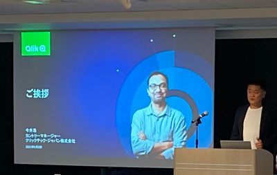
アクティブインテリジェンスフォーラム 2022 開催報告
先月のご報告になりますが、Qlik では「アクティブインテリジェンスフォーラム2022」を開催しました。久しぶりの対面イベントということもあり、多くのお客様にご来場いただきました。 当日はカントリーマネージャー今井のご挨拶に続き、セールスディレクター槙野から、国連でのデータ活用の取り組みや今後企業に... Show More先月のご報告になりますが、Qlik では「アクティブインテリジェンスフォーラム2022」を開催しました。久しぶりの対面イベントということもあり、多くのお客様にご来場いただきました。
当日はカントリーマネージャー今井のご挨拶に続き、セールスディレクター槙野から、国連でのデータ活用の取り組みや今後企業に求められる経営指標とそのために必要なことなどを、また営業本部村田よりアクティブインテリジェンスのグローバル事例、技術本部中嶋より最新のアクティブインテリジェンスのデモをご紹介しました。
後半は、お客様事例として Qlik アドボケイトであるコマツ伊藤様より QlikViewのクラウド上での活用と今後の全社データ基盤構想をご紹介いただきました。同じく Qlik アドボケイトである学研ホールディングス福田様、横尾様からは Qlik 活用基盤構築やダッシュボード作成のノウハウ、最新機能の Application Automation の活用例などをお話しいただきました。トリドールホールディングス磯村様からはクラウド化のお取り組みを中心に同社のDX推進戦略をご紹介いただきました。
フォーラム終了後は Qlik Luminary である SEGA 萬様から乾杯のご発声をいただき、懇親会を開催しました。ご参加の方々は、ご講演者や Qlik アドボケイトメンバーとこの場ならではの貴重な意見交換をされていらっしゃいました。
本フォーラムの内容はオンデマンドで視聴可能です。ぜひご登録・ご視聴ください。
-
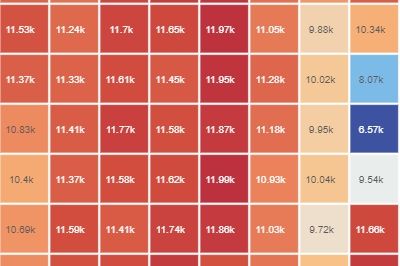
Heatmaps with the updated Grid Chart
How to create a heatmap with the new GridChart What is a heatmap chart? Heatmaps are two-dimensional representations of data that show magnitudes as c... Show MoreHow to create a heatmap with the new GridChart
What is a heatmap chart?
Heatmaps are two-dimensional representations of data that show magnitudes as colors. A color variation - may be based on hue or intensity - gives a clear indication to the reader of how the data measured is distributed or varies over space.
The result should be a data piece that doesn't require a lot of explanation. Typically, warm high-contrast colors are used to represent high-value data points, while cool colors represent low-value data points in heatmaps.
Most common Birth Dates (US)
Qlik Sense Feb 22 (day of the month/month)
The chart above is an excellent use case for a heatmap, it is simple and straight to the point. Births are fairly evenly distributed throughout the year, with a slight bias towards the summer months. The average number of births drops significantly on some days, such as 4th July, 24th-25th December, and January 1st.
There is also a very popular version control product out there that displays a punch-card-like activity chart like the one below that I think is an excellent implementation of a heatmap.
Not my profile
With the February 22 release, the Grid Chart will be your first choice when it comes to heatmaps. In addition to all the features that one expects in a Grid Chart, there is now a shortcut that lets us create a heatmap just like that.
Remember that this chart is especially useful if it is self-explanatory, so try to avoid complex combinations of dimensions. This chart is best suited to time-series-based dimensions.
Enjoy it!
Arturo

-
Meet Emma! Our Newest Member to Qlik Community Team
Dear Members, I am thrilled to introduce Emma Spickerman (@emmaspickerman) who joins Global Customer Marketing as a Community Manager. Emma will b... Show MoreDear Members,
I am thrilled to introduce Emma Spickerman (@emmaspickerman) who joins Global Customer Marketing as a Community Manager. Emma will be focused on driving engagement across our newly launched Partner area within the Qlik Community. She will also contribute to other advocacy programs including the Partner Ambassador Program.
If you are a Qlik Partner who is also participating in our Qlik Community, this is the person you want to know! (and If you are not participating she will find you! 😄) Emma will be working in collaboration with the Partner Organization to bring news and updates to our (partner) members while making sure no question is left behind.
Emma comes to us with a strong background in Digital Marketing, Consumer Marketing, Public Relations and Sales. She has worked with big brands such as TJX Companies, Inc, Zac Posen and Lexus. Her Bachelor’s degree is from Parsons School of Design in Strategic Design & Management and she also holds a Master’s in Integrated Marketing Communications from Georgetown University.
Based in Massachusetts, Emma loves animals and will be adopting a Cavapoo puppy in the coming months, who she plans to name Beau.

-
Academic Program Student Success Story
As you may remember we announced the winners of our 2022 Qlik Academic Program Datathon back in May, Thomas De Dobbeleer and Rutger Mols won with an i... Show MoreAs you may remember we announced the winners of our 2022 Qlik Academic Program Datathon back in May, Thomas De Dobbeleer and Rutger Mols won with an impressive app that focused on the United Nations 17 Sustainable Development Goals.
We run this challenge to give students the opportunity to showcase their Qlik Sense and data analytics skills. We always hope that students can learn from the Datathon and apply those skills to the future workplace, or that by taking part in the Datathon they have something extra to add to their CV. We are so excited to hear about where 2022 winners take their careers after their win! But in the meantime, we have put together a success story about our winner from 2021 - Jesse van Haasteren.
Our story is all about how Jesse registered with our free Academic Program as a complete newbie to data analytics. Using our free training resources he prepared himself to compete, and later win, in the 2021 Datathon. His enrollment on the program and subsequent Datathon win, helped to secure him an amazing job offer with Bitmetric. In his own words, “The Qlik Academic Program played a big role in getting me started in formulating data. It gave me the confidence to use the data analytics tools effectively and enter an exciting data-driven workspace”.
Read Jesse’s story to learn about how his journey with the free Academic Program helped him to carve out a new career path. If you’d like to know how to start your own journey with the Academic Program, follow this link for information on our free software and resources: https://www.qlik.com/us/company/academic-program.
Click the link below to read Jesse's Qlik Academic Program Success Story!
-
Qlik Replicate and Qlik Enterprise Manager May 2022 Client Managed Release Highl...
We want to highlight some of the cool things now available in the Qlik Replicate and Qlik Enterprise Manager May 2022 Client Managed Releases. Endpoi... Show MoreWe want to highlight some of the cool things now available in the Qlik Replicate and Qlik Enterprise Manager May 2022 Client Managed Releases.
Endpoint Improvements
Salesforce Incremental Load (Source)
We have introduced support for incremental loading from all Salesforce objects which provides a greater flexibility from this source endpoint with respect to objects and fields replicated.
The Salesforce (Incremental Load) uses the salesforce Bulk API v2 which is based on change polling and as has the advantage of supporting almost all tables, compared to some limitations in the Salesforce (Streaming CDC) method in the Salesforce endpoints. You can use this method if you need to capture changes from tables that are otherwise not supported with Salesforce (Streaming CDC).
Additionally, driven by customer feedback you can also leverage “query like” incremental loads via the Salesforce BULK and SOAP APIs which has support for calculated and compound fields.
Parquet File fFormat for Amazon S3 (Target)
Again, based on customer demand, we are pleased to announce that the Amazon S3 endpoint now supports the Parquet file format, enabling a simple “file based” raw lake for data science use cases. Parquet is an open-source file format built to handle flat columnar storage. It’s well known for both its performant data compression and the ability to handle a wide variety of encoding types. The addition of Parquet will provide optimizations in Qlik Replicate that speed query execution due to its efficient file format. We hope to be able to soon support Parquet file format in other BLOB storage like ADLS and GCP. Stay Tuned!
Microsoft Azure SQL (MS-CDC) (Source)
The Microsoft Azure SQL (MS-CDC) endpoint now supports capturing changes from Azure SQL Database using Microsoft Change Tables. This effectively adds Azure SQL Database as a ‘new source’ enabling secure, real-time data replication from Azure SQL Database systems in the cloud. We are working towards certification for “bare metal” SQLServer as well, so keep an eye out for that announcement soon.
Security
SAP Extractor (Source)
The May 2022 release continues our support for various authentication methods. You can now connect to an SAP Server using Secure Network Communication (SNC). You can enable the new SNC option in the SAP Extractor endpoint's General tab.
Google Cloud BigQuery (Target)
With this target endpoint we have added tighter security options by supporting the role “Job User” which can load data without requiring editing rights.
When you are wanting to replicate to Google Cloud BigQuery you can now choose the following permissions:
- BigQuery > BigQuery Data Editor
- BigQuery > BigQuery Job User
Support for Azure Government Cloud and China Cloud
As part of our ongoing commitment for supporting our public sector customers we have introduced support for connecting to Azure resources on Microsoft’s Azure Government Cloud or China Cloud when using the following target endpoints:
- Microsoft Azure ADLS
- Microsoft Azure Event Hubs
- Microsoft Azure HDInsight
- Microsoft Azure Synapse Analytics
- Microsoft Azure Databricks
- Microsoft Azure Databricks Delta
- Snowflake on Azure
Performance
SAP Improvements
We have enhanced our SAP endpoints in the May 2022 release which will offer significant improvements in performance.
SAP Extractor Based
Particularly interesting for customers with an SAP runtime license looking to improve their latency times. Some of our ‘early adopter’ customers are seeing up to 13x improvements.
SAP Application Support via TriggersFor those SAP customers with an SAP Enterprise License, also in our early access trials, customers are reporting improved performance up to 50% faster and improved SAP source utilization, with some customers managing up to 60% cost savings.
If you are interested in working with the new SAP Extractors or SAP Triggers please reach out to your Qlik account team. While the new SAP Extractors and Triggers are fully supported, they are not yet generally available to all customers.
Google Cloud BigQuery and Snowflake INSERT Optimization
Following on from adding support for MERGE in previous releases, May 2022 release now supports an optimization for INSERT only activity which can significantly help to improve costs when moving data to a cloud target.
A The new “Optimize inserts” option is available in added to the “Change Processing Tuning” tab of “Task Ssettings”. To use the new option, ”Apply changes using SQL MERGE” must also be turned on.
With these options turned on when a batch of change records consist of INSERTs only. Qlik Replicate will perform INSERTs instead of using SQL MERGE, which will help to improve performance and reduce costs for these types of workload.
In this release the “Apply changes using SQL MERGE” and “Optimize inserts” options are currently only available for tasks configured with the following target endpoints:
- Google Cloud BigQuery
- Snowflake on Azure, Snowflake on Google, and Snowflake on AWS
Notification Type and API
We are always striving to help you to be more proactive when monitoring and managing your Qlik Data Integration environments and to that end May 2020 2022 releases for both Qlik Replicate and Qlik Enterprise Manager incorporate a new Notfication notification type and an API improvementa new API.
New task notification for CDC interruptions
The new “No changes were captured in the last <n> minutes notification” will alert you if no changes were captured from the source database within the specified time limit. With most databases, receiving this notification will usually indicate a connectivity problem. However, it is worth noting that with the following databases, it could simply mean that no changes occurred during the specified period.
- Microsoft SQL Server
- IBM DB2 for LUW
- IBM DB2 for iSeries
When the task resumes capturing changes, an additional notification that change capture has resumed will be sent, and the notification timer will be reset.
Support for replacing endpoint properties using the Qlik Enterprise Manager API
This version adds the ability to edit specific endpoint properties using the Enterprise Manager API. When not editing the value directly in the user interface, this was previously only possible using export, edit, and import operations. The functionality is available through the new PatchEndpoint method, which is available in all of the APIs (REST, .NET, and Python).
We hope you enjoy trying out the new releases and would love to hear your feedback and success stories, especially in the improvement gains.
As always if you would like to try out this release. Go to the Qlik Downloads Site and filter for “Qlik Data Integration”, and then select the product and version you would like to download.
-
Introducing DAR mashup template
NOTE: To increase resolution or size of the video, select the YouTube logo at the bottom right of the player. You will be brought directly to YouTube... Show MoreNOTE: To increase resolution or size of the video, select the YouTube logo at the bottom right of the player. You will be brought directly to YouTube where you can increase the resolution and size of the player window. Look for the 'settings' gears icon in the lower right of the player once at YouTube.
What
Just that, a mashup template for dev-hub (aka dead simple drag and drop mashup creator) that ships with a bunch of cool features such as:
- Dev-hub ready
- Multi Page
- KPI row built in
- Prebuilt CSS color library
- Cards with full screen toggle
- Offcanvas filters pane
- Help modal popup
- Responsive design
- Bootstrap built in
- Custom fonts ready
Why
Because we’ve heard you asking for a more powerful and good-looking template that can constitute a solid framework to create your customized mashups.
Who
Anyone looking for a feature rich mashup template designed for use in the dev-hub.
When
Available today!
Where
You can grab the latest* version here GitHub - fkabinoff/qs-dev-hub-dashboard-template: Dashboard template for Qlik Sense dev hub
*Please notice this is a live project, we will keep updating it frequently. Right now the project documentation (readme.md) is far from what we would like it to be.
-
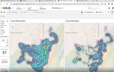
Using Qlik for the Birds and the Bees! A MUST WATCH!
A MUST WATCH! Green River College - Danny Najero Having worked in the Academic Program for many years now, meeting Educator Danny Najera was so exciti... Show MoreA MUST WATCH! Green River College - Danny Najero
Having worked in the Academic Program for many years now, meeting Educator Danny Najera was so exciting because I have never worked with an educator using Qlik for such unique purposes!
Danny teaches biology, environmental science and northwest ecology at Green River College in Washington State. In these courses he use Qlik for both wild flower and bird data collection and analysis. What do they do with this data? The goal is to share the data with nature lovers who cannot visit the forest themselves or want to be prepared for their visit. It can also be shared with local wildlife enthusiasts such as birding clubs, bee keeping societies, etc. Most importantly, it helps them establish and compare metrics about the health of the forest and compare it to others.
In this video he demos the applications he has built which are used by his colleagues and the students. He expresses his gratitude for Qlik Sense and credits the tool for allowing the students to focus on the science. He explains "In the past before we were using Qlik, the question was how do I get excel to show this graph. when we are using Qlik, they ask about the species, how long the buds last, etc, that alone shows me they get more knowledge about the species and are not being bogged down with the computer programming. "
In summarizing the students overall benefit using Qlik Danny explains "Even when we are out in the field, there are questions they will come up with as they watch a bird or smell a flower but there are also questions they cant think about yet. Those only show up until after we've shown them the data. So they get both that naturalistic in person experience but also that scientific quantitative data level analysis as well"
He also credits Qlik for its ease of use, saying "The questions now are much more organism focused, biology focused, content focused and not so much on the difficulties".
Interested in joining the Academic Program?! University educators and students can apply today!

-
Simplify Enterprise Access Control and Sharing Analytics Content
Qlik has enhanced enterprise access controls and flexible app sharing to improve content security, governance, and sharing of analytics content across... Show MoreQlik has enhanced enterprise access controls and flexible app sharing to improve content security, governance, and sharing of analytics content across larger deployments of users and groups.
With the new update admins and users will have more options and flexibility for fine-grain security, permissions, and sharing across a variety of content within their spaces and individual apps. These updates support customers to better scale and organize security permissions across large deployments while making it easy to invite others and share insights.
Space owners, facilitators, and admins can now directly share individual apps with any group or users without adding those users into the space. Shared users and their specific access controls can easily be managed from the Member Section of the managed space. Subsequent releases will include more granular user roles as well as global custom roles and expanded access control for additional content, including Notes.
Sharing analytics content with security precision streamlines the process of inviting others into the analytics realm and fosters collaboration by allowing others to easily and safely be included in the decision-making process.
- Check out the SaaS in 60 video for Enterprise Access Control here
- Qlik Help Topic
- Don't have access to YouTube check out the video on the Qlik Site here
Learn about all of the latest Qlik Cloud enhancements on our SaaS Change Log - subscribe to the RSS feed! -
Evaluate() Function
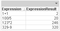
The Evaluate() function is a string function that takes one text string parameter. If the string is a valid QlikView or Qlik Sense expression then th... Show MoreThe Evaluate() function is a string function that takes one text string parameter. If the string is a valid QlikView or Qlik Sense expression then the evaluated result of the expression will be returned. If the string is not a valid expression, then Null is returned. The Evaluate() function can only be used in the script and not in a chart expression. Evaluate() will do the math for you in the script and return the result. For example, if you are loading a field whose content is expressions like this:
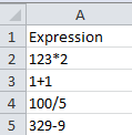
Then you can view that data in two ways. You can either view the actual expression or you can use Evaluate() and view the results.
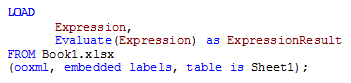
The Evaluate() function is also useful when you are loading a number from a text file or a text field in a database with more than 14 digits. When that number is loaded into QlikView, it is interpreted as a string since it is too long (more than 14 digits).
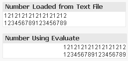
Note that while using Evaluate() returns a number, it is only stored with 14 digit precision. While you may be able to see more than 14 digits, this is just the formatting. The internal mantissa is only 14 digits.
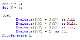
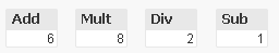
Evaluate() can similarly be used with variables which can be helpful if you have a value that you would like to use multiple times in the script.
So why use a Evaluate()? At first it seemed unnecessary to me because the calculation would still be done without the Evaluate() function but then I realized that that is only the case when the values are numeric and not strings. So Evaluate() is helpful when your expression is in a string format or when the expression is a number with more than 14 digits. It allows a string expression to be evaluated and the result returned. It is like a short-cut to solving the expression. Try it out!
Thanks,
Jennell
-
Exciting updates to Qlik Compose are now available
Let us start with the top improvements to data warehouse automation.Flexibility to manage change data. When the option to keep changes in change table... Show MoreLet us start with the top improvements to data warehouse automation.
Flexibility to manage change data. When the option to keep changes in change tables is selected, Compose will not delete nor archive the landed data after reading it. Instead, Compose will track which data has been read and which hasn’t. This capability allows users to manage change data to fit their use case as they can reuse change data across Compose and ETL tasks within those projects. Customers can reduce cloud data processing costs for low latency use cases by deleting data at a scheduled maintenance time.
Qlik Hybrid Data Delivery (HDD) to ingest data into DW projects. When users choose to keep changes in change tables, they can now use Qlik Cloud Data Service – Hybrid Data Delivery to land data instead of using Replicate. This option enables flexibility to access and ingest data from different previously inaccessible cloud data sources into a data warehouse and create new data marts.
Reference dimensions. Users would like to use the same dimension in several data marts by reference to manage it once and use it several times with minimal overhead. By reusing dimension tables across data marts, users can break up fact tables into smaller units for both design and data loading while ensuring data consistency for analytics. This reuse improves developer efficiency, data mart design, execution flexibility, and reuse of data sets within Compose by providing conformed reference dimensions.
Data Mart Adjustment Enhancements. As we know, data warehouse automation improves designer agility. Now designers can adjust the data mart without dropping and recreating it, so a lengthy, costly reload of the data mart can be saved. Now users can flexibly control how to handle data mart changes to increase data availability and improve project deployment capabilities.
Second, let us examine improvements to simplify data lake creation.
Faster Execution with Databricks Photon. Databricks 9.1 LTS is now certified for Qlik Compose 2021.08 and above. We recommend enabling Photon in your Databricks clusters to boost your existing workloads to execute faster and reduce your data lake query costs.
Live View Performance Enhancements. We now alter Live Views with each change data capture run to ensure pruning Change Table partitions for optimal performance.
Try out the release by going to Support > Downloads on Qlik.com and filtering your options to Qlik Compose version 2022.5.
Check out this eBook for your options for optimizing your experience with data lakes and data warehouses.
Register for the upcoming Data Integration Roadmap Session on September 16 at 11 am EST. Register here
-
Qlik Digest - June 2022
Head to the Product Innovation Blog for the latest release highlights for Qlik Sense, Qlik Replicate and Qlik Enterprise Manager.Watch the latest Qlik... Show MoreHead to the Product Innovation Blog for the latest release highlights for Qlik Sense, Qlik Replicate and Qlik Enterprise Manager.
Watch the latest Qlik Insider Webinar covering new key SaaS capabilities for Data Integration and Analytics including real-time hybrid data delivery and much more.QlikWorld – If you missed the live virtual event you can catch all the great content, including key notes and over 85 breakout sessions on demand. And that was just the beginning! We are gearing up for the QlikWorld Tour coming soon to a city near you – get ready to be informed and inspired!
Customer Success Forum – Join our next Forum happening on June 22 to hear from your fellow Qlik customers on what they have achieved by leveraging the power of Qlik. Register now to reserve your spot.
Do More with Qlik – Watch the latest webinar for beginners and beyond, for a demonstration from Qlik legend Mike Tarallo on a day in the life of a Qlik Cloud Analyst.Qlik Global Transformation Awards – Every year we recognize the customers using Qlik who drive the most remarkable business outcomes through data. Discover the game changing achievements of all 6 winners for 2022 including Siemens and Leroy Merlin.
Qlik Luminary Spotlight – Laura Ashworth is our featured Qlik Luminary for June. As a Senior Qlik Engineer and Architect at Raymond James Financial, Laura creates and implements business intelligence best practices for all departments. Her main goal is to ensure that everyone has access to data and can understand its potential so that they can make better, faster business decisions. Laura is a long time Qlik fanatic, having spoken at QlikWorld Conferences since 2014.
Fun facts about Laura
Favorite Food: Why Chocolate Cake, of course 🙂
Favorite Place in the World: The Blue Ridge Mountains
What is a Qlik Luminary?- Qlik Fix – Check out our series of short videos, designed to give you quick and clear solutions to Qlik questions, like how to download our products, or how to fix a connection lost error.
- Data Brilliant podcast – Ever wondered what it’s like to explore space? Hayley Arceneaux shares her experience on the SpaceX Inspiration4 mission and discusses how data gives confidence and certainty; not just in outer space, but also in the hospital where she works.
- Top pick – QlikWorld Break out session: Building the Active Intelligence Platform How Qlik's Data Integration and Data Analytics portfolios work together to deliver results. Search for code: 665721 to locate the session during the QlikWorld Event.
- Quick Qlik Sense tip: To build a line chart with different markers on each line add two measures, one for line and one for the symbol. Be sure to use master measures to keep colors consistent.
This month we want to know how you use Qlik. Have your say in our flash poll and find out how everyone else is voting.
Enjoyed this month’s edition? Subscribe for more news every month.
Connect with us on LinkedIn, Facebook, and Twitter. If you have any comments or feedback we would love to hear from you. Please contact lucy.bannister@qlik.com. -
Recipe for a Pareto Analysis
This type of question is common in all types of business intelligence. I say “type of question” since it appears in many different forms: Sometimes it... Show MoreThis type of question is common in all types of business intelligence. I say “type of question” since it appears in many different forms: Sometimes it concerns products, but it can just as well concern customers, suppliers or sales people. It can really be any dimension. Further, here the question was about turnover, but it can just as well be number of support cases, or number of defect deliveries, etc. It can in principle be any additive measure.
It is called Pareto analysis. Sometimes also known as 80/20 analysis or ABC analysis.
The logic is that you first sort the products according to size, then accumulate the numbers, and finally calculate the accumulated measure as a percentage of the total. The products contributing to the first 80% are your best products; your “A” products. The next 10% are your “B” products, and the last 10% are your “C” products.
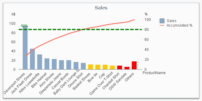
And here’s how you do it in QlikView:
- Create a pivot table and choose your dimension and your basic measure. In my example, I use Product and Sum(Sales).
- Sort the chart descending by using the measure Sum(Sales) as sort expression. It is not enough just to check “Sort by Y-value”.
- Add a second expression to calculate the accumulated sales value:
RangeSum(Above(Sum(Sales), 0, RowNo()))
Call this expression Accumulated Sales. The Above() function will return an array of values – all above values in the chart – and the RangeSum() function will sum these numbers. - Create a third expression from the previous one; one that calculates the accumulated sales in percent:
RangeSum(Above(Sum(Sales), 0, RowNo())) / Sum(total Sales)
Format it as a percentage and call it Inclusive Percentage. - Create a fourth expression from the previous one; one that calculates the accumulated sales in percent, but this time excluding the current row:
RangeSum(Above(Sum(Sales), 1, RowNo())) / Sum(total Sales)
Format it as a percentage and call it Exclusive Percentage. - Create a fifth expression for the ABC classification:
If([Exclusive Percentage] <= 0.8, 'A', If([Exclusive Percentage] <= 0.9, 'B', 'C'))
Call this expression Pareto Class. The reason why the Exclusive Percentage is used, is that the classification should be determined by the lower bound of a product’s segment, not the upper. - Create a conditional background color, e.g.
If([Pareto Class] = 'C', LightRed(), If([Pareto Class] = 'B', Yellow()))
You should now have a table similar to the following. In it you can clearly see the classification of different products.
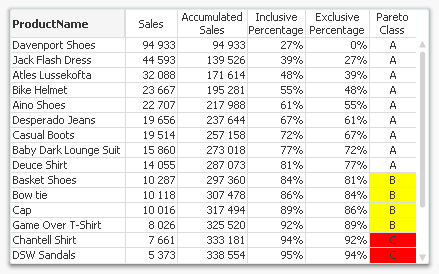
In this table, there are five different expressions that you can use for Pareto analysis. The graph in the beginning of this post uses Sales and Inclusive Percentage for the bars and the line, respectively; and Pareto Class for the coloring of the bars.
Further, you may want to combine the Pareto Class and the Exclusive Percentage into one expression:
Pareto Class =
If(RangeSum(Above(Sum(Sales),1,RowNo())) / Sum(total Sales) <= 0.8, 'A',
If(RangeSum(Above(Sum(Sales),1,RowNo())) / Sum(total Sales) <= 0.9, 'B', 'C'))Good luck in creating your Pareto chart.
Further reading related to this topic:

- Create a pivot table and choose your dimension and your basic measure. In my example, I use Product and Sum(Sales).


.png")