Unlock a world of possibilities! Login now and discover the exclusive benefits awaiting you.

Analytics & AI
Forums for Qlik Analytic solutions. Ask questions, join discussions, find solutions, and access documentation and resources.
Data Integration & Quality
Forums for Qlik Data Integration solutions. Ask questions, join discussions, find solutions, and access documentation and resources
Explore Qlik Gallery
Qlik Gallery is meant to encourage Qlikkies everywhere to share their progress – from a first Qlik app – to a favorite Qlik app – and everything in-between.
Qlik Community
Get started on Qlik Community, find How-To documents, and join general non-product related discussions.
Qlik Resources
Direct links to other resources within the Qlik ecosystem. We suggest you bookmark this page.
Qlik Academic Program
Qlik gives qualified university students, educators, and researchers free Qlik software and resources to prepare students for the data-driven workplace.
Recent Blog Posts
-
A few notes on integrating Qlik Sense visualizations into your webapp
Overview I've seen a few questions regarding integrating Qlik Sense visualizations into existing webapps lately, and figured I'd lay out a few tips he... Show MoreOverview
I've seen a few questions regarding integrating Qlik Sense visualizations into existing webapps lately, and figured I'd lay out a few tips here that may be of help.
There's really two ways of integrating Qlik Sense visualizations into your webapp, by either using the Capability APIs or iFrames. I'll discuss the pros and cons of both.
Capability APIs
The Capability APIs include the Root API, the App API, and the Visualization API, among a few others. The Root API is used to connect to an app, and either the App API or the Visualization API can be used to then embed Qlik Sense objects onto the sheet. There's quite a few resources regarding the details of actually doing this available already, so I'll skip that, but if there's any questions surrounding it, let me know. What I do want to talk about is the pros and cons of using the Capability APIs vs iFrames.
The pros of the Capability APIs are that all you have to do to use them is load the assets that are conveniently served from the Qlik server, supply a config, require the qlik.js file, and you're set. You can quickly get up and running, and you're able to not only embed existing visualizations, but you can create visualizations on the fly using the Visualization API and patch them as you go. So, it's easy to get going, and to embed, create, or even update visualizations on the page.
The downside is that the assets needed for the Capability APIs include Require.js and Angular 1.5.8, and they're both globals that can be quite intrusive, and force you to redesign your existing app to play nicely with their residency in the global scope.
iFrames
And that's exactly the best thing about iFrames. Since an iFrame is totally encapsulated from its parent page, there's no issues with existing assets and assets needed to embed Qlik visualizations colliding. And for all the other features that the Capability APIs offer, you can simply use enigma.js, which can share the same session as the iFrame'd objects.
One of the things to watch out for when using iFrames is that Internet Explorer, by default, only allows a maximum of 6 concurrent connections. So that's a limitation if you need to support IE. Another thing that you won't be doing is creating any visualizations on the fly.
Hybrid
To help overcome the websocket number limit, or if you really need to create visualizations on the fly, but also want to use the iFrame approach, what you can do is instead of embedding visualizations using iFrames, you can create a mashup, and then embed that into your webapp in an iFrame. Using HTML5's window.postMessage API, you can enable communication between your app and the mashup in the iFrame, and you can also still use enigma.js in your webapp.
-
Data analytics remains the hot choice for a high growth career
A recent article in The Hans India suggests that if you are keen to pursue a career in technology, training in data science is the right way to see y... Show MoreA recent article in The Hans India suggests that if you are keen to pursue a career in technology, training in data science is the right way to see your dream come true. The demand of data science experts is huge not only in leading industries but also at leading locations across the world. Many leading businesses around the world are offering job roles related to data science.
Read more about the article here: https://www.thehansindia.com/hans/young-hans/data-sciences-courses-beneficial-for-career-in-tech-743325?infinitescroll=1
To prepare yourself for a career in data analytics, know how the Qlik Academic Program equips for the in demand roles such as Business Analyst, Data Architect, visit : qlik.com/academicprogram
-
Qlik completes TISAX assessment for the German Automobile Industry
At Qlik, we strive to deliver our customers the highest level of security within our products so they can comfortably support analytics with their dat... Show MoreAt Qlik, we strive to deliver our customers the highest level of security within our products so they can comfortably support analytics with their data. We have recently completed the TISAX assessment that sets industry standards for information security in the German Automobile Industry and continues to broaden our standards and compliance offerings.
TISAX (Trusted Information Security Assessment Exchange) is an industry-standard developed by the VDA (Association of the German Automotive Industry) and the governance organization, ENX Association. TISAX was developed to provide standardized IT Security Assessments for assessing information security in the automotive industry. To complete the TISAX assessment, Qlik was successfully audited by an accredited independent assessor.
What services have been TISAX assessed?
The scope and audited locations cover all Qlik Products. The TISAX assessment is Product-agnostic, and locations are assessed instead (i.e., it doesn’t test controls unique to a product or service).
More to come!
Customer security is a core mission of ours and we will continue to expand our compliance and security protocols across our product ecosystem. The TISAX Assessments are conducted by accredited audit providers that demonstrate their qualifications at regular intervals. The result is exclusively retrievable here on the ENX Portal.
Resources:
ENX Page https://portal.enx.com/en-US/TISAX/
ENX Portal TISAX Assessment https://portal.enx.com/en-US/TISAX/tisaxassessmentresults/
-
Customer Newsletter "Qlik Digest" - June 2022
Head to the Product Innovation Blog for the latest release highlights for Qlik Sense, Qlik Replicate and Qlik Enterprise Manager.Watch the latest Qli... Show MoreHead to the Product Innovation Blog for the latest release highlights for Qlik Sense, Qlik Replicate and Qlik Enterprise Manager.
Watch the latest Qlik Insider Webinar covering new key SaaS capabilities for Data Integration and Analytics including real-time hybrid data delivery and much more.QlikWorld – If you missed the live virtual event you can catch all the great content, including key notes and over 85 breakout sessions on demand. And that was just the beginning! We are gearing up for the QlikWorld Tour coming soon to a city near you – get ready to be informed and inspired!
Customer Success Forum – Join our next Forum happening on June 22 to hear from your fellow Qlik customers on what they have achieved by leveraging the power of Qlik. Register now to reserve your spot.
Do More with Qlik – Watch the latest webinar for beginners and beyond, for a demonstration from Qlik legend Mike Tarallo on a day in the life of a Qlik Cloud Analyst.Qlik Global Transformation Awards – Every year we recognize the customers using Qlik who drive the most remarkable business outcomes through data. Discover the game changing achievements of all 6 winners for 2022 including Siemens and Leroy Merlin.
Qlik Luminary Spotlight – Laura Ashworth is our featured Qlik Luminary for June. As a Senior Qlik Engineer and Architect at Raymond James Financial, Laura creates and implements business intelligence best practices for all departments. Her main goal is to ensure that everyone has access to data and can understand its potential so that they can make better, faster business decisions. Laura is a long time Qlik fanatic, having spoken at QlikWorld Conferences since 2014.
Fun facts about Laura
Favorite Food: Why Chocolate Cake, of course 🙂
Favorite Place in the World: The Blue Ridge Mountains
What is a Qlik Luminary?- Qlik Fix – Check out our series of short videos, designed to give you quick and clear solutions to Qlik questions, like how to download our products, or how to fix a connection lost error.
- Data Brilliant podcast – Ever wondered what it’s like to explore space? Hayley Arceneaux shares her experience on the SpaceX Inspiration4 mission and discusses how data gives confidence and certainty; not just in outer space, but also in the hospital where she works.
- Top pick – QlikWorld Break out session: Building the Active Intelligence Platform How Qlik's Data Integration and Data Analytics portfolios work together to deliver results. Search for code: 665721 to locate the session during the QlikWorld Event.
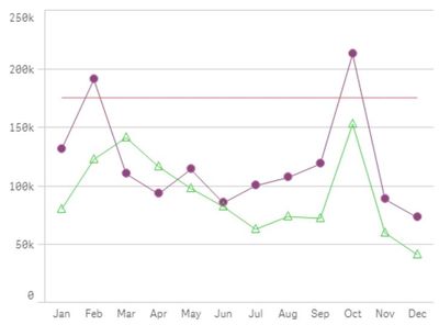
- Quick Qlik Sense tip: To build a line chart with different markers on each line add two measures, one for line and one for the symbol. Be sure to use master measures to keep colors consistent.
This month we want to know how you use Qlik. Have your say in our flash poll and find out how everyone else is voting.
Enjoyed this month’s edition? Subscribe for more news every month.
Connect with us on LinkedIn, Facebook, and Twitter. If you have any comments or feedback we would love to hear from you. Please contact lucy.bannister@qlik.com. -
Theming with Picasso.js
Picasso.js is a powerful charting library that plays really well within the Qlik Sense ecosystem to build simple or very complex visualization.By leve... Show MorePicasso.js is a powerful charting library that plays really well within the Qlik Sense ecosystem to build simple or very complex visualization.
By leveraging its component-based nature, you can combine the building blocks to create virtually any type of chart.
To learn more about Picasso.js, I recommend the following resources:
- Creating Picasso chart with data from Qlik: https://community.qlik.com/t5/Qlik-Design-Blog/Qlik-Engine-and-Picasso-js/ba-p/1706241
- What makes Picasso unique: https://community.qlik.com/t5/Qlik-Design-Blog/Picasso-js-What-separates-it-from-other-visualization-libraries/ba-p/1829951
- An advanced chart using Picasso: https://community.qlik.com/t5/Qlik-Design-Blog/Create-a-Slope-chart-with-tooltips-and-brushing-using-Nebula-js/ba-p/1827168
The full documentation of the library can be found on qlik.dev at https://qlik.dev/libraries-and-tools/picassojs. Navigating the documentation is easy, you can dig deeper into the main concepts, learn more about the different types of supported scales, but more importantly discover the different components that you can mix and match to create unique visualizations.
A feature of Picasso that I really like but is not very clear from the docs is Theming.
Picasso.js is themeable meaning that you can easily control the look and feel across all visualizations by creating a theme and changing a few base variables.
To do that, you simply pass in a theme object when instantiating Picasso js as follows:
…
Import picassojs from ‘picasso.js’;
…
  const picasso = picassojs({
    style: {
      '$font-color': '#FF00FF',
      '$font-size': '10px',
      '$font-family': 'Arial',
      '$font-size--l': '16px',
      '$guide-color': '#00FF00',
      '$shape': { // for use with type point component
      fill: '#00FF00',
      strokeWidth: 1,
      stroke: 'rgba(255, 255, 255, 0.2)',
      shape: 'star',
     },
    },
    palettes: [{
      key: 'categorical',
      colors: [
        chroma.bezier(['#00FF00', '#0000FF']).scale().colors(5),
      ],
    }, {
      key: 'sequential',
      colors: [
        ['#00FF00', '#0000FF'],
      ],
    }],
  });
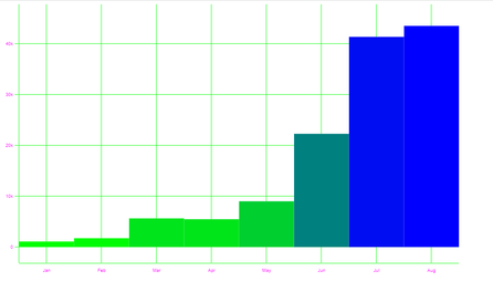
Notice that you can change the labels’ font styling, colors, and even shapes of points (star, triangle, etc..) on the style object, and also pass in a color palette for categorical and sequential color scales.
The result looks like this (the ugly colors are for demo purposes only!)
Below is the complete code of the settings file and attached is the full project to run and edit.
/* eslint-disable no-unused-vars */ import { useElement, useState, useStaleLayout, useRect, useEffect, } from '@nebula.js/stardust'; import picassojs from 'picasso.js'; import picassoQ from 'picasso-plugin-q'; import chroma from 'chroma-js'; export default function supernova() { const picasso = picassojs({ style: { '$font-color': '#FF00FF', '$font-size': '10px', '$font-family': 'Arial', '$font-size--l': '16px', '$guide-color': '#00FF00', // $shape: { // for use with type point component // fill: '#00FF00', // strokeWidth: 1, // stroke: 'rgba(255, 255, 255, 0.2)', // shape: 'box', // }, }, palettes: [{ key: 'categorical', colors: [ chroma.bezier(['#00FF00', '#0000FF']).scale().colors(5), ], }, { key: 'sequential', colors: [ ['#00FF00', '#0000FF'], ], }], }); picasso.use(picassoQ); return { qae: { properties: { qHyperCubeDef: { qDimensions: [], qMeasures: [], qInitialDataFetch: [{ qWidth: 2, qHeight: 5000 }], qSuppressZero: false, qSuppressMissing: true, }, showTitles: true, title: '', subtitle: '', footnote: '', }, data: { targets: [ { path: '/qHyperCubeDef', dimensions: { min: 1, max: 1, }, measures: { min: 1, max: 1, }, }, ], }, }, component() { const element = useElement(); const layout = useStaleLayout(); const rect = useRect(); const [instance, setInstance] = useState(); useEffect(() => { const p = picasso.chart({ element, data: [], settings: {}, }); setInstance(p); return () => { p.destroy(); }; }, []); useEffect(() => { if (!instance) { return; } instance.update({ data: [ { type: 'q', key: 'qHyperCube', data: layout.qHyperCube, }, ], settings: { scales: { x: { data: { extract: { field: 'qDimensionInfo/0', }, }, }, y: { data: { field: 'qMeasureInfo/0' }, invert: true, expand: 0.1, }, c: { data: { field: 'qMeasureInfo/0' }, type: 'color', }, }, components: [ { type: 'axis', dock: 'left', scale: 'y', }, { type: 'axis', dock: 'bottom', scale: 'x', settings: { line: { show: true, }, }, }, { type: 'grid-line', x: 'x', y: 'y', }, { key: 'bars', type: 'box', data: { extract: { field: 'qDimensionInfo/0', props: { start: 0, end: { field: 'qMeasureInfo/0' }, }, }, }, settings: { major: { scale: 'x' }, minor: { scale: 'y' }, box: { fill: { scale: 'c', ref: 'end' }, }, }, }, ], }, }); }, [layout, instance]); useEffect(() => { if (!instance) { return; } instance.update(); }, [rect.width, rect.height, instance]); }, }; } -
【オンデマンド配信】データリテラシーでビジネスを加速:受け身から能動的な分析への移行に不可欠な要件
企業におけるデータの役割が急速に進化し続ける中、データリテラシーはこれまで以上に重要になっています。データリーダーは、受け身の BI モデルからアクティブインテリジェンスへと移行し始めています。リアルタイムのインサイトにアクセスし、迅速な意思決定と情報に基づいたリアルタイムのアクションを起こすには... Show More企業におけるデータの役割が急速に進化し続ける中、データリテラシーはこれまで以上に重要になっています。データリーダーは、受け身の BI モデルからアクティブインテリジェンスへと移行し始めています。リアルタイムのインサイトにアクセスし、迅速な意思決定と情報に基づいたリアルタイムのアクションを起こすには、能動的な分析への移行が不可欠です。
迅速な意思決定ができていない最大の障壁の 1 つにデータリテラシー不足が挙げられます。つまり、データを読み取り、活用、分析し、データとのコミュニケーションスキルが不足しているのです。かつてないほどデータから得られる機会が増えている今、情報に基づいたアクションを取るためには、必要なスキルアップと文化の変革を早急に検討する必要があります。
本 Web セミナーでは、新着レポート「データリテラシー:スキルアップの革新」の調査結果をはじめ、受け身の分析から能動的な分析に移行して、ビジネスの加速およびデータリテラシーを促進する方法をご紹介します。
能動的な分析への移行におけるデータリテラシーの重要性について、ぜひご確認ください。
※ 参加費無料。パソコン・タブレット・スマートフォンで、どこからでもご視聴いただけます。日本語字幕付きでお届けします。
-
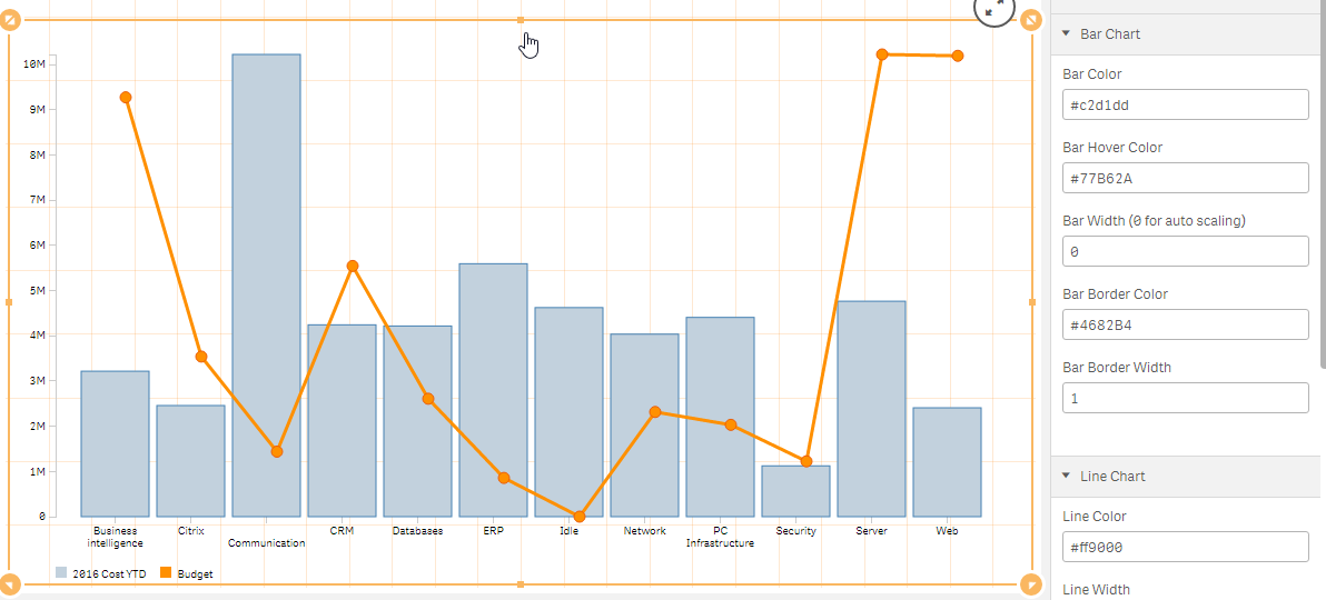
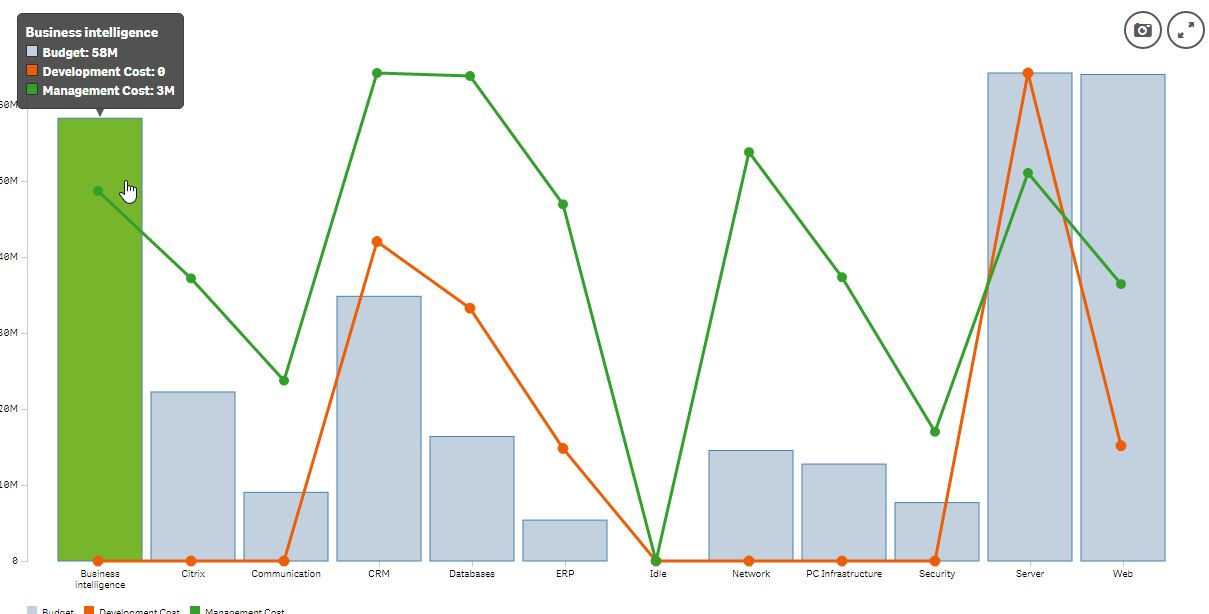
Combo Chart extension for Qlik Sense
As we were working on one of our projects, we had the need of creating multiple combo charts. The problem was that we could not change the colors to m... Show MoreAs we were working on one of our projects, we had the need of creating multiple combo charts. The problem was that we could not change the colors to match our mashup/webpage. So, I decided to make an extension, that gives full control of the chart appearance and it's labels. The same as my Barchart extension this is wrapping text labels underneath the bars. If you still have problems with the text, then just increase the width of the bars and everything should be back in place.
Installation
- [Download zip file](https://github.com/yianni-ververis/SenseUI-ComboChart/archive/master.zip)
- Desktop - Unzip at the extension folder (C:\Users\<user>\Documents\Qlik\Sense\Extensions\SenseUIComboChart)
- Server - Upload the zip file
Usage
Dimensions and Measures
- Set 1 dimension for the x Axis
- Set 1 Measure for an additional Line Chart
General Settings
- Font Size
- Font Color
- Display the Legend
- Enable/Disable Selections
Bar Chart Settings
- Bar Color
- Bar Hover Color
- Bar Width (0 for auto scaling)
- Bar Border Color
- Bar Border Width
Line Chart Settings
- Line Color
- Line Width
- Dot Color
- Dot Stroke Color
- Dot Stroke Width
- Dot Radius
Barnch: http://branch.qlik.com/#!/project/5894e07a75db504d76ac3123
Git: GitHub - yianni-ververis/SenseUI-ComboChart: Qlik Sense Combo Chart
Yianni
-
Qlik Sense Education and Learning - Project - TC Ice Cream Inc.
The TC Ice Cream Application project provides students a structured approached to learn the basics of Qlik Sense. A variety of visualizations, maste... Show MoreThe TC Ice Cream Application project provides students a structured approached to learn the basics of Qlik Sense. A variety of visualizations, master dimensions/measures and variable input are topics that are covered within the project.
This video provides an overview of the project:
Business Requirements Document:
https://drive.google.com/file/d/1vUNgJQB0ZyJuTzlIBL-T7Q41u4YjbvmN/view
Videos related to the development and functionality of the TC Ice Cream Application can be found on the following You Tube Playlist :
https://www.youtube.com/watch?v=1h_Pvr-aiT4&list=PLl4F1FsqnyHD6Wz9Q63qxqp9EnIpkqfNt
If you have any questions please let me know.
Thanks - Jerry
-
Which Data Literacy persona are you?
Every month our Academic Program team meets with our Educator Ambassadors to get inspired by guest speakers and customer stories or knowledge share an... Show MoreEvery month our Academic Program team meets with our Educator Ambassadors to get inspired by guest speakers and customer stories or knowledge share and ask questions. Some of our most interesting sessions are those in which our Educator Ambassadors present on how they incorporate the Academic Program into their teaching.
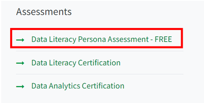
There are a variety of ways in which educators have used our program, from embedding the assessments to including portions of the instructor led training videos in classes. However, it is often the case that students starting the course have different strengths and weaknesses, and varying levels of data literacy. During our meeting last Friday one of our educators explained that his students are required to take a Qlik data literacy assessment before beginning their course, this then helps to him to understand what training and resources could be useful to the students. This level test, our Data Literacy Persona Assessment, is provided for free by Qlik. It can be accessed through our ‘Data Literacy Program’ which you can navigate to inside the ‘Self-Paced Learning’ section.
It can be found at the bottom of the page under the subheading ‘Assessments’, you will then be directed to sign in with your Qlik ID to gain access to the test.
Our Data Literacy Persona test takes minutes, it includes 15 different questions and can be used to assess your current knowledge level and then establish the next steps in your training. Some of the questions are geared towards those already working in industry; however, it is still possible to answer the questions as a student to better understand both knowledge level and attitude. For example, are you a data newcomer? Someone who understands the importance of data but still needs to learn the foundations. This test will help you find that out, and once you have the results, you will be provided with a custom learning plan to help you get started on your journey.
Your learning plan will detail a variety of ways to get started, whether that be content available to you through the Qlik Continues Classroom, interesting YouTube videos or blogs and podcasts. The learning plan is themed around the crucial indicators of data literacy, for example reading, working with, analyzing and communicating with data. It is intended to be done over the course of 8 weeks, giving you optimum time to dip in and out of study when it’s most convenient.
If you have recently gotten access to the Academic Program but you don’t know where to start with all the resources available to you, then understanding your knowledge level with our Data Literacy Persona test could help you take that first step. To understand more about how you can access the test through our Academic Program, go to qlik.com/academicprogram.
-
Kobe - Basketball Career Highlights
Kobe - Basketball Career Highlights Vizlib The Kobe Bryant app was designed as a tribute to the Black Mamba and his incredible career in the NBA... Show MoreKobe - Basketball Career HighlightsVizlib The Kobe Bryant app was designed as a tribute to the Black Mamba and his incredible career in the NBA. Over 20 seasons with the Lakers, he owned the court with his favored shot: the Jump Shot. Analyzing his game is my small way of taking time to respect his work and contributions. Inspired by work from the LA Times. Data from Kaggle.
Discoveries
Out of 30,697 shots, Kobe's favorite type was the jump shot. He was dominant across the entire NBA for 20 seasons. He could score from nearly any position on the half court, and had a number past half court as well.
Impact
Using sports data in this fashion on a scatter plot is applicable to many business use cases where positional data is present. Mapping over top of images like a basketball court, warehouse floorplan, or airport terminals opens up a wide array of possibilities of displaying data in more consumable ways.
Audience
Data geeks, Qlik dorks, and sports nerds will love this branded app.
Data and advanced analytics
Visualizing 30K+ points on a scatter usually yields little insight - but by combining with the basketball court as the background, the data comes to life to tell a story.

-
【オンデマンド配信】Qlik Espresso Web セミナーシリーズ
Qlik Espresso Web セミナーシリーズでは、Qlik 製品のプロフェッショナル達が Qlik 製品の簡単な概要、製品デモンストレーション、使用例についてご紹介します。本 Web セミナーは、毎月 1回・最大 30分間の内容でお送りします。 コーヒーを飲みながら、短時間でお気軽に参加でき... Show MoreQlik Espresso Web セミナーシリーズでは、Qlik 製品のプロフェッショナル達が Qlik 製品の簡単な概要、製品デモンストレーション、使用例についてご紹介します。
本 Web セミナーは、毎月 1回・最大 30分間の内容でお送りします。コーヒーを飲みながら、短時間でお気軽に参加できる Web セミナーシリーズです。ぜひ、ご視聴ください。
※ 参加費無料。パソコン・タブレット・スマートフォンで、どこからでもご視聴いただけます。
オンデマンド配信:
データをビジネス成果へ結びつけるデータ活用プラットフォームとは -「目的」ではなく「手段」としてのデータ活用 -ビジネスにおけるデータ活用。かねてよりその重要性が説かれていましたが、新型コロナウイルスによって加速度を増し、今後ますます重要度が高まっていくと予想されています。リアルタイムなデータのビジネスへの活用が企業の将来を左右する、と言っても過言ではありません。
この講演では、Qlik が掲げるビジョンである「アクティブインテリジェンス」」を具現化するリアルタイムのデータ活用プラットフォームと、その具体例についてご紹介します。オンデマンド配信:
『DNP の価値創造プロセス』を実現するためのデータ利活用の推進DNP 様におけるビジネス推進のためのデータ利活用について、インタビュー形式で実際の取り組みを具体的に語っていただきます。ビジネス課題を解決するためのアクションと成果とは?Qlik 導入を機に全社におけるデータ活用への取り組み、今後の展望などを語っていただきます。ぜひ、ご参加ください。
-
Self Service Analytics Template
Self Service Analytics Template Imaps Intelligence The purpose of the app is to provide a simple interface for a Business User get an answer abo... Show MoreSelf Service Analytics TemplateImaps IntelligenceThe purpose of the app is to provide a simple interface for a Business User get an answer about the data with only 3 clicks.Discoveries
The main metrics should be displayed as KPI objects and the other metrics can be analyzed as alternative measures in the charts. The 2 bar charts provide users with the ability to compare metrics and freely explore the data selecting an alternative dimension. The botton line chart allow user to see trends of each metric along the time.
Impact
We have applied this template to rapidly release the locked data and let Business Users explore and validate the data even before building a dashboard.
Audience
All users that need to engage with analytics for the first time with a simplest interface.
Data and advanced analytics
This template can be improved with forecasting analysis and trend lines. Any data can be analyzed using this template.
-
Activity trackers and Analytics Part 2 - Strava
Activity trackers and Analytics Part 2 - Strava Mayborn Group Back in 2020 I talked about personal Qlik Sense App which I use to analyse my Garm... Show MoreActivity trackers and Analytics Part 2 - StravaMayborn GroupBack in 2020 I talked about personal Qlik Sense App which I use to analyse my Garmin activity tracker data. More recently, I we've begun a transition to Qlik Sense SaaS, as part of that journey I've been playing with the platform and using my Strava data to create a new app through SaaS. I wanted to use this as an exercise to understand the process a user can go through to build an app from simple data set to quickly generate insights. Within less than an hour I had imported the data and created a summary dashboard showing my distribution of activity types and distance, pace vs heart rate and aerobic training effect. All of which I can drill down by activity type and time periods.Discoveries
Understanding the journey for a user to rapidly build out an Qlik Sense App through the SaaS platform. Along with Build my own analytics tool to allow me to compare activity statistical data, speed, stroke rate, distance, etc.. .
Impact
Rapidly build out an insightful app through SaaS with the objective of visualising, analysing and understanding my activity tracker data in a more intuitive and flexible manor, beyond the functionality the tracker vendor or 3rd party provided analytics functions.
Audience
The audience for this app was me personally
Data and advanced analytics
The data and analytics within this app has provided me with the ability to compare similar activities in order to understand effort, performance and time improvement through my training program.
-
U.S. Demographics (2010)
U.S. Demographics (2010) AnyChart — Extensions for QS Get a bird's-eye view of the U.S. population trends revealed by key demographic statistics... Show MoreU.S. Demographics (2010)AnyChart — Extensions for QSGet a bird's-eye view of the U.S. population trends revealed by key demographic statistics from the 2010 Census — across states, divisions, and regions. Just at a glance, compare the territories by size of population and recognize where it grows slower than the national average or even declines. Drill down to different levels. Hover over to check the exact counts along with the rates of birth, death, and natural increase.Discoveries
Some of the discoveries from using this app include:
* Key demographics at different hierarchical levels: population size, rates of births, deaths, and natural increase.
* RNI for each state, division, and region compared to the national average.Impact
Helps estimate and project population counts and shifts to draw conclusions and make decisions in respect of the current and future distribution of social and economic resources and activities at national, regional, divisional, and state levels.
Audience
Demographics analysts, researchers, and planners seeking to understand the size and change of populations. All who want to analyze hierarchical data structures in Qlik Sense — the app features a good example of a Sunburst chart and is publicly available among AnyChart demo apps for Qlik Sense.
Data and advanced analytics
The dataset is derived from Kaggle.com: “United States Energy, Census, and GDP 2010-2014.” It contains demographic data from the United States Census of 2010.
-
Regression Lines
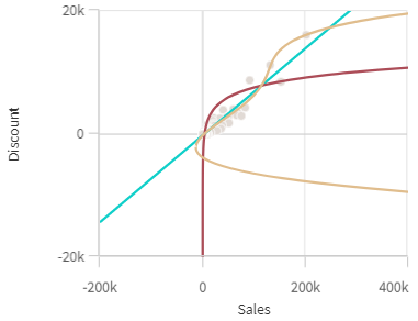
What is a regression line? In simple terms, it is a line that best describes the behavior of a set of data. They are often used for forecasting to ill... Show MoreWhat is a regression line? In simple terms, it is a line that best describes the behavior of a set of data. They are often used for forecasting to illustrate the relationship between the dependent y variable and the independent x variables when there is linear pattern. Using a regression line can show future behavior of the dependent variable using different inputs for the independent x variables. Scatter plots now support regression lines and provide many options to choose from. In the properties pane of the scatter plot chart under Add-ons, is an option for Regression Lines.
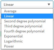
Click the Add Regression Line button to add a regression line to your chart. There are many types to choose from depending on your data and what you would like to show. According the Qlik Help, here are the regression line types available to add to a scatter plot chart.
- Average: Shows the average value of the data.
- Linear: Shows a linear increase or decrease of values.
- Second Degree Polynomial: Shows a curved line to represent fluctuating data with one hill or valley.
- Third Degree Polynomial: Shows a curved line to represent fluctuating data with up to two hills or valleys.
- Fourth Degree Polynomial: Shows a curved line to represent fluctuating data with up to three hills or valleys.
- Exponential: Shows a curved line. Use when data values rise or fall at increasingly higher rates.
- Logarithmic: Shows a curved line. Use when the rate of change in data increases or decreases quickly, then levels out.
- Power: Shows a curved line. Use with data sets that compare measurements that increase at specific rates.
Here are some regression line examples:
Average
Linear
Second Degree Polynomial
Fourth Degree Polynomial
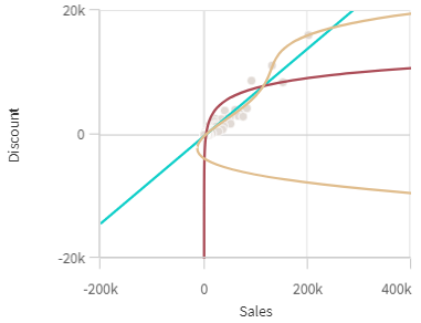
There are some additional properties that can be set for a regression line. The color of the line and label can be set, and the line can be displayed as solid or dashed. The direction of fit can also be set to either minimize vertically or minimize horizontally. A scatter plot can also have more than one regression as seen in the chart below.
Regression lines are helpful for analysis because it allows us to see patterns in our data. They allow us to see the relationships between two or more variables and examine which variables may have an impact. Check them out - Qlik Sense makes it easy to use them in your scatter plots charts.
Thanks,
Jennell
-
May = QlikWorld + Community Enhancements
Hello Qlik Community! QlikWorld 2022 is less than a week away! Are you all excited?! We sure are! If you’re not already registered, you may do so here... Show MoreHello Qlik Community!
QlikWorld 2022 is less than a week away! Are you all excited?! We sure are!
If you’re not already registered, you may do so here. Qlik Community will be a part of the “Let’s Connect!” booth, so stop by and say ‘Hi’!
I cannot believe it’s May already – in the US that means schools are winding down and summer is coming! Bring on the sunshine, pool, and BBQ! For the Qlik Community, that means we have some hot new updates for you!
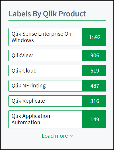
Product List
Products are primarily used within our Support Knowledgebase and Release Notes. We’ve cleaned up the products list to make filtering easier. We also condensed Qlik Sense Enterprise SaaS and Qlik Sense Business to one product, Qlik Cloud.
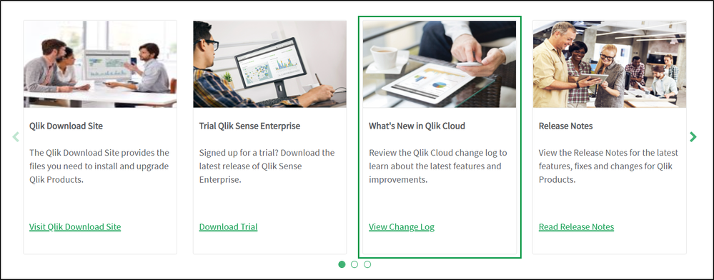
Qlik Cloud Change Log
Use the new Qlik Cloud Change Log card on the Product News carousel for easy access to what’s new in Qlik Cloud. A link to the Help page has also been added to the Qlik Cloud release notes (going forward).
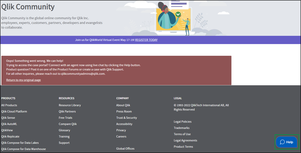
Chat Bot
Have you reached an inaccessible area on Qlik Community? The message directs you where to go for assistance, but we’ve also added the Chat Bot to the page so you can easily reach out to Customer Support for assistance!
Typically, we would be on a freeze until July but we are just too excited to wait for the upcoming enhancements! Check back in a few weeks for a few new updates!
Your Qlik Community Admins,
Melissa, Sue, Jamie and Nicole
-
Cyclistic Case Study
Cyclistic Case Study Cyclistic Cyclistic’s finance analysts have concluded that annual members are much more profitable than casual riders. Alth... Show MoreCyclistic Case StudyCyclisticCyclistic’s finance analysts have concluded that annual members are much more profitable than casual riders. Although the pricing flexibility helps Cyclistic attract more customers, Cyclistic believes that maximizing the number of annual members will be key to future growth. Rather than creating a marketing campaign that targets all-new customers, Cyclistic believes there is a very good chance to convert casual riders into members. Goals : Design marketing strategies aimed at converting casual riders into annual members. In order to do that, however, the marketing analyst team needs to better understand how annual members and casual riders differ, why casual riders would buy a membership, and how digital media could affect their marketing tactics. The marketing analyst team and financial team are interested in analyzing the Cyclistic historical bike trip data to identify trends. The business task we defined as the analyst team : Analyze usage patterns in order to give insights to the marketing team. Explore how to convert casual riders into annual members based on their different behaviors.Discoveries
1. Afternoon is the preferred time of day for occasional members. Afternoon accounts for 47% of total trips per day. 2. The summer months are the most popular of the year for occasional members and they account for 52% of the annual period. 3. Following the introduction of electric bicycles, we noticed an increase of 59% in their use by occasional members during their first 3 months and a decrease of 30% of bicycles at the dock during this same period. 4. We noticed occasional members keep the bikes almost 3 times longer than the annual members. 5. In summer, trips for occasional cyclists are concentrated near the beaches, unlike the rest of the year.
Impact
The marketing recommendations we came to a conclusion are the following: 1. Offer flexible weekend subscriptions for occasional cyclists between 4 p.m. and 6 p.m. at the most popular stations: Streeter Dr & Grand Ave, Lake Shore Dr & Monroe St, Theater on the Lake and Lake Dr & North Blvd. 2. As the number of cyclists increases on Friday and last the entire weekend, the marketing team may offer discounts to speed up membership for occasional cyclists. 3. Make the dockside bicycle stations more accessible and available depending on the start and ending place of the journey. 4. Create a loyalty program in the form of bonuses / rewards for occasional rides who cycle for long kilometers. A smartwatch could be a great reward. 5. Send a newsletter via email every Thursday evening with the unusual places in the region, the latest discounts and news from Cyclistic. 6. Collect the body mass index in order to track trends.
Audience
The app is made for the marketing as well as the financial team of the company in order to make business decisions on the next months.
Data and advanced analytics
N/A
App with data under the link: https://drive.google.com/file/d/1gRIoiU6C_bqariyC3AiWkqkPM3PrY6w_/view?usp=sharingApp with data