Unlock a world of possibilities! Login now and discover the exclusive benefits awaiting you.
Analytics & AI
Forums for Qlik Analytic solutions. Ask questions, join discussions, find solutions, and access documentation and resources.
Data Integration & Quality
Forums for Qlik Data Integration solutions. Ask questions, join discussions, find solutions, and access documentation and resources
Explore Qlik Gallery
Qlik Gallery is meant to encourage Qlikkies everywhere to share their progress – from a first Qlik app – to a favorite Qlik app – and everything in-between.
Qlik Community
Get started on Qlik Community, find How-To documents, and join general non-product related discussions.
Qlik Resources
Direct links to other resources within the Qlik ecosystem. We suggest you bookmark this page.
Qlik Academic Program
Qlik gives qualified university students, educators, and researchers free Qlik software and resources to prepare students for the data-driven workplace.
Recent Blog Posts
-
Creating 3D bars on a Map with Nebula.js
Couple of months ago I blogged about Mapbox GL and Nebula.js https://community.qlik.com/t5/Qlik-Design-Blog/Using-Mapbox-GL-with-Nebula-js/ba-p/181762... Show MoreCouple of months ago I blogged about Mapbox GL and Nebula.js https://community.qlik.com/t5/Qlik-Design-Blog/Using-Mapbox-GL-with-Nebula-js/ba-p/1817621.
Today, I will take that example and add some 3D Bars with Three.js.
I will be using the observable notation but you can substitute "require" with "import" on your React/Angular apps
First, fork or follow the setup as described in my previous blog. Then, we have to add the installation and importing of Three and GSAP for the animation.
// Observable
GSAP = require('gsap');
TweenMax = GSAP.TweenMax;

// React / Angular
import { TweenMax } from 'gsap';
import * as THREE from 'three/build/three';
Lets define the constants
  let maxBarΝumberFromData = 0;
  let maxNumberOfBars = 0;
  let map;
  let camera;
  let scene;
  let renderer;
  const barWidth = 100;
  const barOpacity = 1;


  // parameters to ensure the model is georeferenced correctly on the map
  const modelOrigin = [-30, 55];
  const modelAltitude = 0;
  const modelRotate = [Math.PI / 2, 0, 0];
  const modelAsMercatorCoordinate = mapboxgl.MercatorCoordinate.fromLngLat(
    modelOrigin,
    modelAltitude,
  );

  // transformation parameters to position, rotate and scale the 3D model onto the map
  const modelTransform = {
    translateX: modelAsMercatorCoordinate.x,
    translateY: modelAsMercatorCoordinate.y,
    translateZ: modelAsMercatorCoordinate.z,
    rotateX: modelRotate[0],
    rotateY: modelRotate[1],
    rotateZ: modelRotate[2],
    /* Since our 3D model is in real world meters, a scale transform needs to be
  * applied since the CustomLayerInterface expects units in MercatorCoordinates.
  */
    scale: modelAsMercatorCoordinate.meterInMercatorCoordinateUnits(),
  };
Now we can add the function that creates the bars on the map and animates the height
      const createBar = (posx, posz, posy, order) => {
        const max = 3000;
        const ratio = Number(posy) / Number(maxBarΝumberFromData);
        const y = max * ratio;
        const _posy = 1;
        const geometry = new THREE.BoxGeometry(barWidth, 1, barWidth, 1, 1, 1);
        const material = new THREE.MeshLambertMaterial({ color: 0xfffff, transparent: true });
        const bar = new THREE.Mesh(geometry, material);
        bar.position.set(posx, _posy, posz);
        bar.name = `bar-${order}`;
        bar.userData.y = y;
        bar.material.opacity = barOpacity;
        scene.add(bar);
        // Animate
        TweenMax.to(bar.scale, 1, { y, delay: order * 0.01 });
        TweenMax.to(bar.position, 1, { y: y / 2, delay: order * 0.01 });
        maxNumberOfBars = order;
      };
Now, lets switch the "buildLayer" function with this one so we can create a custom 3d layer using three.js
      // Create the layer that will hold the bars
      const buildLayer = () => {
        const layer = {
          id: '3d-model',
          type: 'custom',
          renderingMode: '3d',
          onAdd(_map, gl) {
            camera = new THREE.Camera();
            scene = new THREE.Scene();

            // create two three.js lights to illuminate the model
            const directionalLight = new THREE.DirectionalLight(0xffffff);
            directionalLight.position.set(-90, 200, 130).normalize();
            scene.add(directionalLight);
            // sky color ground color intensity
            const directionalLight2 = new THREE.DirectionalLight(0xffffff, 0.3);
            directionalLight2.position.set(90, 20, -100).normalize();
            scene.add(directionalLight2);

            qMatrix.forEach((row, index) => {
              maxBarΝumberFromData = (maxBarΝumberFromData < row[1].qNum) ? row[1].qNum : maxBarΝumberFromData;
            })

            qMatrix.forEach((row, index) => {
              createBar(row[2].qNum * 150, row[1].qNum * 150, row[5].qNum, index);
            })

            // scale up geometry
            scene.scale.set(300, 300, 300);

            // use the Mapbox GL JS map canvas for three.js
            renderer = new THREE.WebGLRenderer({
              canvas: _map.getCanvas(),
              context: gl,
              antialias: true,
            });

            renderer.autoClear = false;
          },
          render(gl, matrix) {
            const rotationX = new THREE.Matrix4().makeRotationAxis(
              new THREE.Vector3(1, 0, 0),
              modelTransform.rotateX,
            );
            const rotationY = new THREE.Matrix4().makeRotationAxis(
              new THREE.Vector3(0, 1, 0),
              modelTransform.rotateY,
            );
            const rotationZ = new THREE.Matrix4().makeRotationAxis(
              new THREE.Vector3(0, 0, 1),
              modelTransform.rotateZ,
            );

            const m = new THREE.Matrix4().fromArray(matrix);
            const l = new THREE.Matrix4()
              .makeTranslation(
                modelTransform.translateX,
                modelTransform.translateY,
                modelTransform.translateZ,
              )
              .scale(
                new THREE.Vector3(
                  modelTransform.scale,
                  -modelTransform.scale,
                  modelTransform.scale,
                ),
              )
              .multiply(rotationX)
              .multiply(rotationY)
              .multiply(rotationZ);

            camera.projectionMatrix = m.multiply(l);

            renderer.state.reset();
            renderer.render(scene, camera);
            map.triggerRepaint();
          },
        };
        return layer;
      }
This is it! The final result should be similar to this:
You can view, fork and play with the above demo at
https://observablehq.com/@yianni-ververis/nebula-js-mapbox-with-three-js?collection=@yianni-ververis/nebula
/Yianni -
AJAX and URL parameters
Sometimes you want QlikView to open with a specific set of selections, apply a bookmark or perhaps even deep link to a specific sheet.A typical use ca... Show MoreSometimes you want QlikView to open with a specific set of selections, apply a bookmark or perhaps even deep link to a specific sheet.
A typical use case could be to embed an entire app or a single object inside a CRM or ERP system and depending on the context, current customer for example, filter the QlikView app to only show records related to that specific context.
So how do I use this black magic?
One approach would be to use triggers with the obvious downside being that the trigger would always fire regardless of how you opened the app.
Another approach is to supply a set of parameters to the URL for that specific app.
Let’s take an example, the Sales Compass demo from the demo site. Below us the URL to access the app and the different components explained.
Actual URL
demo.qlik.com/QvAJAXZfc/opendoc.htm?document=qvdocs%2FSales%20Compass.qvw&host=demo11
Explained URL
<host name>/<virtual directory>/opendoc.htm?document=<url encoded full name for the application>&host=<name of QVS>
In addition to this URL you can also supply some extra parameters to control which actions will fire when the app is opened. For example the URL below will open the Sales Compass app with the value “Q2” selected in the listbox with id LB5699 (yes we create way to many objects
 )
)demo.qlik.com/QvAJAXZfc/opendoc.htm?document=qvdocs%2FSales%20Compass.qvw&host=demo11&select=LB5699,Q2
Of course this is only a simple example, in the table below you will find all the available parameters you can append to your URL.
Feel free to mix and match these til your hearts content.
Action Parameter Example Select a single value &select=<Listbox ID>,<Value> &select=LB01,Total Select multiple values &select=<Listbox ID,(Value|Value2) &select=LB02,(2011|2012) Open the app on a specific sheet &sheet=<Sheet ID> &sheet=SH01 Open the app with a bookmark applied &bookmark=<Bookmark ID> &bookmark=Server\BM01 Wait a minute, you mentioned single objects?
Ah, yes! When QlikView 11 was launched we also introduced the capability to display a single object from an app.
This allowed customers to integrate objects from different applications into a single view in a external system. It is also this screen that powers the small devices client.
Substitute opendoc.htm with singleobject.htm and specify the object id you want to display,
demo.qlik.com/QvAJAXZfc/singleobject.htm?document=qvdocs%2FSales%20Compass.qvw&host=demo11&object=CH378
And voila! You now have a fully interactive single QlikView object!

-
Students from XJTLU-China present Qlik Sense applications at the Summer Bootcamp...
A Summer Bootcamp was organized by the Data Mining Lab of International Business School Suzhou, XJTLU, China during August 16- 20, 2021. Students we... Show MoreA Summer Bootcamp was organized by the Data Mining Lab of International Business School Suzhou, XJTLU, China during August 16- 20, 2021. Students were asked to build applications using Qlik Sense using different data sets. Their applications were assessed by a panel of judges from the industry.
The IBSS@Data Mining Lab was established in November 2015 at International Business School Suzhou (IBSS) in order to support research-led initiatives in data technology driven management and accounting practices related for Research, Learning and Teaching.
IBSS@DataMiningLab aims to promote initiatives in Learning & Teaching in the field of Data Analytics and respond to employers needs for new skills in data analytics at IBSS and across XJTLU through cross-departmental initiatives
IBSS@Data Mining Lab offers free access to professional data analytics software and related learning resources. The Lab is led jointly by International Business School Suzhou (IBSS) and CSSE (Computer Science and Engineering Department) departments of XJTLU.
During the bootcamp, students presented applications built on Qlik Sense and a panel of judges from the industry assessed these applications. The applications were based on different data sets including sales, logistics, manufacturing etc. and presented interesting insights using features of Qlik Sense.
Presenting a dashboard using Qlik Sense
Students were able to demonstrate capabilities of Qlik Sense and build dashboards including graphs, story telling in their presentation.
The Qlik Academic Program provides free resources in data analytics to support the learning experience of students, to know more visit: qlik.com/academicprogram
-
Exciting updates to Qlik Compose and Enterprise Manager are now available
A new release of Qlik Data Integration is here with exciting updates to Compose and Enterprise Manager. These updates address our customers’ needs acr... Show MoreA new release of Qlik Data Integration is here with exciting updates to Compose and Enterprise Manager. These updates address our customers’ needs across data lake creation, improved warehouse automation, and platform component integrations.
Let us start with simplified data lake creation.
Transactionally Consistent Live Views for Optimal Latency. Data consumers want a way to get the freshest data while ensuring high accuracy, a challenge often encountered with constantly updated data. Consumers now can increase data integrity by enforcing transactional consistency while viewing changed data ingested into data lakes. This option leads to more accurate real-time insights with minimal delays in the freshness of data.
Support for Databricks on GCP. Users adopting Databricks Delta lakes in Google Cloud environments wanted to continue using the management tools they have used in AWS and Azure environments. Users can now automate the creation, hydration, and changes to Delta Lakes on GCP using the latest Compose release.
Second, let us examine improvements to data warehouse automation.
More comprehensive data marts. As datamarts have grown, so have the entities within them. Users can now easily automate the lifecycle of these large data marts to support comprehensive analyses across a much larger set of entities using an improved user interface with minimal declines in performance.
Support for a variant data type in Snowflake. Users expanding their use of Snowflake data warehouses often look to incorporate semi-structured data. Now, users can ingest and transform semi-structured data within their automated Snowflake data warehouses.
Finally, let us investigate data integration platform enhancements.
Workflow Support in Enterprise Manager. Users seek a single pane of glass to obtain a comprehensive view to initiate and track various automation and creation tasks. In addition, to Replicate tasks, users can now start and track Compose workflows across data lakes and warehouses using a single interface or a third-party tool of their choice that integrates with an expanded set of Qlik platform APIs.
Multiple Replicate Servers. Users automating their warehouses and lakes are looking to ingest data in real-time from numerous distributed source systems. Now users can onboard and process data faster into their data lakes or warehouses by scaling to multiple simultaneous real-time data pipelines and automating complex distributed data architectures.
View these capabilities in action in the video below using Databaricks on GCP as an example:
Click here for the Transcript
Try out the release by going to Support > Downloads on Qlik.com and filtering your options to Qlik Compose for Data Lakes (or Data Warehouses) version 2021.8 and Qlik Enterprise Manager 2021.5 SR2.
Register for the upcoming Data Integration Roadmap Session on September 16 at 11am EST. Register here
-
Data Literacy within the workforce
I really enjoyed reading this article Data literacy skills crucial for the workforce of tomorrow because it affirmed the importance of what @Anonymou... Show MoreI really enjoyed reading this article Data literacy skills crucial for the workforce of tomorrow because it affirmed the importance of what @Anonymous and the #AcademicProgram have been doing for years! Which is to teach the importance of Data Literacy and encourage people to become Data Literate! The Qlik Academic Program has been promoting Data Literacy for several years now and we are excited for our competitors to finally begin their own journey with Data Literacy. While this article mentions Tableau, its exciting to read as it confirms all of the ground work Qlik has laid is paying off . Here at Qlik, our Academic Program encourage our members to learn as many analytics platforms as possible and we have been heavily invested in building both hard and soft skills of analytics skills for our students for many years now.
Our Qlik Academic Program is open to any and all educators and students within higher education and provides a full year of FREE Qlik Sense software, Qlik Sense training and certificates, Data Literacy training and certificates, and more!
If you are interested in improving your Data Literacy skills, visit the Qlik Academic Program and apply today!

-
NEW Qlik Sense Business Analyst Certification Exam - Get certified on February 2...
The 2-hour exam costs $250 and can be taken in a local test center or via online proctoring. Learn more about this exam on our Certifications & Quali... Show MoreThe 2-hour exam costs $250 and can be taken in a local test center or via online proctoring. Learn more about this exam on our Certifications & Qualifications page.
For the most commonly asked questions you can visit our Frequently Asked Questions page. If you have further questions, please send an email to certification@qlik.com.
-
k-Means clustering using Qlik's Nebula.js
In the past few years, Qlik Sense has introduced a solid range of advanced analytics capabilities that compliments the Data Analytics platform. This i... Show MoreIn the past few years, Qlik Sense has introduced a solid range of advanced analytics capabilities that compliments the Data Analytics platform. This includes using techniques such as Machine Learning, Natural Language Processing, etc. to help analysts/scientists explore data in a better way, get insights into any hidden patterns & take necessary actions. Bringing these methods together with the Data Analytics platform is often termed ‘Augmented Intelligence’. For a more detailed description of the what’s & why’s, please refer to this link.
Problem:
Consider the following scenario. An analyst needs to explore geographical data for a variety of neighborhoods in Toronto to help the city’s crime department set up some hotspots to monitor the neighborhoods and analyze the criminal activities in an effective way. Segregating the neighborhoods into five different clusters based on some kind of similarities between them would be the first step.
Qlik Sense client approach:
A solution to this from the Qlik Sense client perspective would be to use the KMeans2D chart function that applies k-Means clustering internally and calculates the cluster_id for each of the neighborhoods. The results can then be visualized in the form of a Scatter plot with latitude on the X-axis, longitude on the Y-axis, and bubbles representing each neighborhood’s ID. Here’s a snippet that shows the data configuration.
To visually explain the five clusters, the chart can be ‘colored by dimension’ based on the cluster_id’s. Please note that we use color by dimension (and use a dimension expression) and not color by expression. Here’s where we define our dimension expression.
Expression:
=pick(aggr(KMeans2D(vDistClusters,only(Lat),only(Long)),FID)+1, 'Cluster 1', 'Cluster 2', 'Cluster 3', 'Cluster 4','Cluster 5')
Embedded Analytics approach:
Now, consider that you are a full-stack Qlik developer and you leverage the open-sourced Nebula.js library to build your analytics portal. What would be an easy way for you to apply k-Means clustering to this dataset without relying on any 3rd-party libraries?
Solution:
Technically there are two ways to achieve this using Nebula.js.
Develop the visualization in Qlik Sense client & embed it to your page.
Develop a visualization on the fly & use the kMeans2D chart function.
The first point is fairly simple & straightforward. You can create your Scatter plot in the Qlik Sense client and just call the <object_id> using Nebula’s render( ) function like this.
n.render({
  element,
  id: '<ObjectID>',
});
In this blog post, we will keep our focus on Point 2. i.e. we will develop a visualization on the fly and then apply the clustering algorithm using the chart function to achieve our goal.
Implementation:
Before we start developing the visualization, let’s recap one of the amazing things about Nebula.js. It is a collection of JavaScript libraries, visualizations, and CLIs that helps developers build and integrate visualizations on top of Qlik's Associative Engine. Essentially it serves as a wrapper on top of the Engine allowing us to use expressions as we can inside the Qlik Sense client.
Since Nebula sits on top of the Engine, we also have direct access to the data (dimensions & measures) from the Qlik Sense app that is connected to our Nebula app. This makes building an existing or custom visualization using Nebula easier & quicker from a data structure perspective. It also goes without saying that Qlik Sense ‘associations’ works seamlessly when using Nebula.
Now, let’s quickly build an on-the-fly scatter plot and use the kMeans2D chart function to color each point/bubble on our plot.
Step 1: Define the qAttributeDimensions for the ‘dimension expression’.
qAttributeDimensions: [
          {
            qDef:
              "=pick(aggr(KMeans2D(vDistClusters, only(Lat), only(Long)), FID)+1, 'Cluster 1', 'Cluster 2', 'Cluster 3', 'Cluster 4', 'Cluster 5')",
            qAttribute: true,
            id: "colorByAlternative",
            label: "Cluster id"
          }
        ]
      }
    ],
Since we would like to use color by dimension as a coloring technique in our scatter plot, we have to explicitly specify it using id:"colorByAlternative" in the qDef as shown in the above code. An alternative to this would be id: "colorByExpression" if we wanted to color by expression.
Also, we use a dimension expression (not just a dimension field) in the qDef property of qAttributeDimensions. Therefore, the dimension expression has to be defined inside the qDef property (as shown in the code).
Step 2: Define the properties.
Next, we define the required properties in the root of the object. An important property here is the color. We tell Nebula to not color our chart automatically first (code below) so we can override using our expression’s color. Also, we set have to set the right color mode inside the color. In our case, it is “byDimension”.
The other crucial property within color is byDimDef. It is used to configure the settings for coloring the chart by dimension. byDimDef consists of three properties -
type - either ‘expression’ | ‘libraryItem’
key - if it is a ‘libraryItem’, then the libraryId | dimension expression if using an ‘expression’
label - Label displayed for coloring (in the legend). Can be string | expression
The code for defining the properties is below.
  properties: {
      title: "k-Means clustering",
      color: {
        auto: false,
        mode: "byDimension",
        byDimDef: {
          type: "expression",
          key:
            "=pick(aggr(KMeans2D(vDistClusters, only(Lat), only(Long)), FID)+1, 'Cluster 1', 'Cluster 2', 'Cluster 3', 'Cluster 4', 'Cluster 5')",
          label: "Cluster id"
        }
      }
    }
That is pretty much it! To elucidate the clustering method, we also embed a scatter plot to our Nebula app with non-clustered data.
Let us take a look at the two plots -
Using the KMeans2D function the neighborhoods have now been segregated into five different clusters based on their similarity. The color by cluster helps us in interpreting the five groups distinctly.
Before we end this post, let’s take a look at the clustering function once and understand the parameters.
KMeans2D(num_clusters, coordinate_1, coordinate_2 [, norm])
num_clusters - implies the no. of cluster we would like to have. Typically this value is calculated using the elbow curve or silhouette analysis methods. Read more here.
coordinate_1, coordinate_2 - indicates the columns used by the clustering algorithm. These are both aggregations.
norm - This is an optional normalization method applied to datasets before k-Means clustering. Possible values are - (0/‘none’ - no normalization, 1/ ‘zscore’ -zscore normalization, 2/‘minmax’ - min-max normalization).
In our current Nebula application, we play around with the num_clusters parameter to understand the differences such as neighborhood overlaps, etc. We embed three action-buttons in our dashboard and the final result can be seen below.
-
The Master Calendar
A master calendar table is a dimensional table that links to a date in the data, e.g. OrderDate. The table usually does not exist in the database, bu... Show MoreA master calendar table is a dimensional table that links to a date in the data, e.g. OrderDate. The table usually does not exist in the database, but is nevertheless needed in the QlikView application for a proper analysis. In the master calendar table you can create all time and date fields that you think the user needs; e.g. Month, Year, Quarter, RollingMonth, FiscalMonth or flags like IsCurrentYear, etc.
A typical master calendar tables contains one record per date for the time period used in the QlikView app, perhaps a two-year period, i.e. 730 records. It is in other words a very small (short) table. Since it is small, you can allow yourself to have many fields in it – it will not affect performance in any significant way.
There are in principle three ways you can generate the records (with an infinite number of variations in the details):
- Load from the fact table, e.g.
Load distinct Date, Month(Date) as Month … resident TransactionTable ; - Generate all dates within a range, using autogenerate, e.g.
Load Date, Month(Date) as Month … ;
Load Date($(vStart) + RecNo()) as Date autogenerate $(vEnd) - $(vStart) ; - Generate all dates within a range, using a while loop, e.g.
Load Date, Month(Date) as Month … ;
Load Date(MinDate+iterno()) as Date While iterno() <= MaxDate - MinDate ;
Load Min(Date)-1 as MinDate, Max(Date) as MaxDate resident TransactionTable
In the first case you use the table to which you are going to link the master calendar. This way you will get exactly those values that really exist in the database. Meaning that you will also miss some dates – e.g. Saturdays and Sundays most likely - since they often do not exist in the database.
In the second case, you generate a range of dates. This is a good solution, but it means that you will need to define the range beforehand. There are several ways to do this, e.g. find largest and smallest value in the data; or hard-code the days for the relevant year.
In the third solution, you generate all dates between the first and last date of your transaction table. This is my preferred solution. Optionally you can use YearStart(Min(Date)) and YearEnd(Max(Date)) to define the range.

The word "Master" for the calendar table is really misleading. There is no reason to have only one calendar table. If you have several dates, you should in my opinion use several calendar tables in the same data model. The alternative - to have the same calendar for all dates - is possible using a link table but complicates the data model and limits how the user can make selections. For example, the user will not be able to select OrderMonth=’Sep’ and at the same time ShipperMonth=’Nov’.
Bottom line: Use a calendar table whenever you have a date in your database. Use several if you have several dates.

- Load from the fact table, e.g.
-
Client-Managed Qlik Product Release August 2021
Move Fast. It’s one of Qlik’s core values. We entered 2021 with the momentum that continues to accelerate with our continuous weekly release cycle to ... Show MoreMove Fast. It’s one of Qlik’s core values. We entered 2021 with the momentum that continues to accelerate with our continuous weekly release cycle to the cloud. We are moving fast but we do take time to pause to listen to our customers in the Ideation Discussion Board that influences the rapid innovations that our Qlik Sense SaaS customers are realizing weekly in the cloud.
To start, the release of Qlik Sense Enterprise Client-Managed edition (Windows / on-premise) provides some of the same great innovations recently released to Qlik Sense SaaS over the past few months. A unique update, specific to Windows, is the ability to keep load script and data files in ODAG apps.
Other August 2021 release features are already available to our Qlik Sense SaaS customers. Augmented Analytics continues to be a primary focus given its importance in influencing the entire data lifecycle from data preparation to delivery of insights. Augmented Analytics combined with human intuition is the recipe for more people to get the most value from their data, asking questions in a conversational manner leading to faster insights and data-driven business decisions. Enhancements in this area include the Insight Advisor’s ability to demonstrate which fields influence and are drivers of another target field. Other enhancements in this area include improved business logins error handling, DPS exceptions, and error refactor and Insight Advisor Profiling.
NOTE: If you want to learn more about the Qlik Sense Insight Advisor, be sure to join @Michael_Tarallo on this week's Do More with Qlik ( Wednesday at 10AM ET) where he will show you how to get the most out of Insight Advisor!
Register here: https://go.qlik.com/Do_More_with_Qlik_Webinar_Series-Aug25_Registration-LP.html?sourceID1=innoblog0823The Qlik Sense client’s underscore.js library has been updated from 1.5 to 1.13. Please note, with this enhancement, that the following properties and methods are removed with version 1.13:
- unzip method is replaced by _zip.apply(_,list).
- _.escape function no longer escapes /.
- _.matches function is replaced by _.matcher.
In the area of visualizations, we also continue to march forward at a steady pace. Combo charts now allow for bars to be added to a secondary axis as well as measures to have their own color setting. Other visualization features include a dark mode theme, images added to a point layer, charts allowed in Nebula.js and the ability to add URL-based images to straight tables.
Our data integration enhancements include simplified data lake creation, improved data warehouse automation, and platform integrations. Changed data propagated to data lake landing zones will now be current and transactionally consistent leading to accurate, real-time insights. We now add Databricks Delta Lakes on Google’s platform to our ever-expanding list of supported data lakes. With support for a significant number of entities, automated data marts can now support more comprehensive analyses. A single user interface to track workflows across lakes and warehouses eases management, while tight integration of ingestion processes from one or many data pipelines to transformation and provisioning processes automate and speed data delivery to consumers. Lastly, ingestion and transformation of semi-structured data within Snowflake bring in new data sources.
To stay informed on “what’s new” and what’s next, check out qlik.com/roadmap – our one-stop web page for everything related to product innovation and direction.
NOTE: Catch the keynotes at the Best of QlikWorld to better understand how we are delivering on our vision of Active Intelligence.Don't forget to register to become a Qlik Insider for more detail on this release and a peek into what is next. Register Here.
-
Analyzing the 2021 Global 500
In a new chapter of our collaboration with the Fortune Magazine I'm proud to introduce today the 2021 Global 500. In this year's Global 500 app we are... Show MoreIn a new chapter of our collaboration with the Fortune Magazine I'm proud to introduce today the 2021 Global 500. In this year's Global 500 app we are aiming to throw some light over the impact of COVID-19 on the list.
We analyzed how two of the list’s main indicators evolved over the years. In 2021 Revenue saw a 5% decline while Profits plummeted some 20% to $1.65 trillion. It was the biggest decline since a 48% plunge in 2009.
But not all the regions performed in the same way, to visualize the impact of the economic crisis that followed the COVID-19 pandemic we plotted the contribution of different regions to the Global 500 list using two measures, number of companies and revenue.
The chart above shows how each region have performed since the first Global 500 list was published back in 1990. When looking at each evolution line, the meteoric rise of China over the years it's very impressive while Europe’s dominant position on the list on decline.
In 2021 the European countries were heavily impacted by the economic shutdown. Europe's representation in the list dropped in number of companies and their reported revenues decreased as well. Other regions like China continued to thrive despite of the current world situation. The US position remained almost unchanged when compared with the previous year 2020.
To focus even more in the 2020-2021 change readers can check the next section, where a world map holds indicators that helps us to visualize the change. The image below shows 2020-2021 change measured in number of companies in the Global 500 list. Again, Europe dominate the losses while both US and specially China increase the number of companies with presence in the list.
We putted an end to the app analyzing how each sector behaved last year. The chart below shows the size of the entire economy in 2020 and in 2021 (Profits). The entire Global 500 list profits dropped by 20% year over year, but not every sector was impacted equally. Technology, Telecommunications and Retailing increased their profits while the Energy sector took a massive hit on profits losing 1.7 trillion USD disappearing from the top sectors measured by profits.
We really hope you enjoy the experience, don’t forget to check the live app here: https://qlik.fortune.com/global500
Enjoy it! 😊

-
Picasso.js - What separates it from other visualization libraries and how to bui...
Picasso.js has been there for a while since its first release in 2018. It is an open-source charting library that is designed for building custom, int... Show MorePicasso.js has been there for a while since its first release in 2018. It is an open-source charting library that is designed for building custom, interactive, component-based powerful visualizations.
Now, what separates Picasso from the other available charting libraries?
Apart from the fact that Picasso.js is open-sourced, here is my take on certain other factors -
Component-based visuals: A visualization usually comprises various building blocks or components that form the overall chart. For example, a Scatter plot consists of two axes with one variable on each of the axes. The data is displayed as a point that shows the position on the two axes(horizontal & vertical). A third variable can also be displayed on the points if they are coded using color, shape, or size. What if instead of an individual point you wanted to draw a pie chart that presents some more information? Something like this -
As we can see on the right-side image, a correlation between Sales and Profit is projected. However, instead of each point, we have individual pie charts that show the category-wise sales made in each city. This was developed using D3.js- a library widely used to do raw visualizations using SVGs.
Picasso.js provides a similar level of flexibility when it comes to building customized charts. Due to its component-based nature, you can practically build anything by combining various blocks of components.
Interactive visuals: Combining brushing and linking is key when it comes to interactivity between various visual components used in a dashboard or web application. Typically what it means is if there are any changes to the representation in one visualization, it will impact the others as well if they deal with the same data (analogous to Associations in Qlik Sense world). This is crucial in modern-day visual analytics solutions and helps overcome the shortcomings of singular representations.
Picasso.js provides these capabilities out of the box. Here is an example of how you could brush & link two charts built using Picasso:
const scatter = picasso.chart(/* */); const bars = picasso.chart(/* */); scatter.brush('select').link(bars.brush('highlight'));- Extensibility: What if you wanted to create visualizations with a set of custom themes that aligns with your organization? What if you needed to bind events using a third-party plugin like Hammer.js? Most importantly for Qlik Sense users, how do you bring the power of associations to these custom charts? Picasso.js allows users to harness these capabilities easily.
- D3-style programming: Picasso.js leverages D3.js for a lot of its features and this allows the D3 community to reuse and easily blend D3-based charts into the Picasso world. Having come from a D3.js background, I realized how comfortable it was for me to scale up when developing charts using Picasso since the style of programming(specifically building components) was very common.
If you would like to read more about the various concepts & components of Picasso, please follow the official documentation.
Now that we know a bit more about Picasso.js, let us try to build a custom chart and try to integrate it with Qlik Sense’s ecosystem, i.e. use selections on a Qlik Sense chart and apply it to the Picasso chart as well.
Prerequisite: picasso-plugin-q
In order to interact with and use the data from Qlik’s engine in a Picasso-based chart, you will need to use the q plugin. This plugin registers a q dataset type making data extraction easier from a hypercube.
Step 1: Install, import the required libraries for Picasso and q-plugin and register -
npm install picasso.js
import picassojs from 'picasso.js';
import picassoQ from 'picasso-plugin-q';

picasso.use(picassoQ); // register
Step 2: Create hypercube and access data from QIX -
 const properties = {
    qInfo: {
      qType: "my-stacked-hypercube"
    },
    qHyperCubeDef: {
      qDimensions: [
        {
          qDef: { qFieldDefs: ["Sport"] },
        }
      ],
      qMeasures: [
        { qDef: { qDef: "Avg(Height)" }
        },
        { qDef: { qDef: "Avg(Weight)" }
        }
      ],
      qInitialDataFetch: [{ qTop: 0, qLeft: 0, qWidth: 100, qHeight: 100 }]
    }
  };
Our idea is to build a scatter plot to understand the height-weight correlation of athletes from an Olympic dataset. We will use the dimension ‘Sport’ to color the points. Therefore, we retrieve the dimension and 2 measures(Height, Weight) from the hypercube.
Step 3: Getting the layout and updating -
Once we create the hypercube, we can use the getLayout( ) method to extract the properties and use it to build and update our chart. For this purpose, we will create two functions and pass the layout accordingly like below.
const variableListModel = await app
    .createSessionObject(properties)
    .then(model => model);

  variableListModel.getLayout().then(layout => {
    createChart(layout);
  });

  variableListModel.on('changed',async()=>{
    variableListModel.getLayout().then(newlayout => {
    updateChart(newlayout);
  });
  });
First, we pass the layout to the createChart( ) method, which is where we build our Scatter plot. If there are any changes to the data, we call the updateChart( ) method and pass the newLayout so our chart can reflect the updated changes.
Step 4: Build the visualization using Picasso.js -
We need to let Picasso know that the data type we will be using is from QIX, i.e. q and then pass the layout like below:
function createChart(layout){
chart = picasso.chart({
 element: document.querySelector('.object_new'),
  data: [{
    type: 'q',
    key: 'qHyperCube',
    data: layout.qHyperCube,
  }],
}
Similar to D3, we will now define the two scales and bind the data (dimension & measure) extracted from Qlik Sense like this:
 scales: {
      s: {
        data: { field: 'qMeasureInfo/0' },
        expand: 0.2,
        invert: true,
      },
      m: {
        data: { field: 'qMeasureInfo/1' },
        expand: 0.2,
      },
      col: {
        data: { extract: { field: 'qDimensionInfo/0' } },
        type: 'color',
      },
    },
Here, the scale s represents the y-axis and m represents x-axis. In our case, we will have the height on the y-axis and weight on the x-axis. The dimension, ‘sports’ will be used to color as mentioned before.
Now, since we are developing a scatter plot, we will define a point component inside the component section, to render the points.
  key: 'point',
      type: 'point',
      data: {
        extract: {
          field: 'qDimensionInfo/0',
          props: {
            y: { field: 'qMeasureInfo/0' },
            x: { field: 'qMeasureInfo/1' },
          },
        },
      },
We also pass the settings of the chart inside the component along with the point like this:
settings: {
        x: { scale: 'm' },
        y: { scale: 's' },
        shape: 'rect',
        size: 0.2,
        strokeWidth: 2,
        stroke: '#fff',
        opacity: 0.8,
        fill: { scale: 'col' },
      },
Please note that I have used the shape ‘rect’ instead of circle here in this visualization as I would like to represent each point as a rectangle. This is just an example of simple customization you can achieve using Picasso.
Finally, we define the updateChart( ) method to take care of the updated layout from Qlik. To do so, we use the update( ) function provided by Picasso.
 function updateChart(newlayout){
       chart.update({
       data: [{
    type: 'q',
    key: 'qHyperCube',
    data: newlayout.qHyperCube,
  }],
    });
        }
The result is seen below:
Step 5: Interaction with Qlik objects -
Our last step is to see if the interactions work as we would expect with a native Qlik Sense object. To clearly depict this scenario, I use Nebula.js (a library to embed Qlik objects) to call & render a predefined bar chart from my Qlik Sense environment. If you would like to read more on how to do that please refer to this. Here’s a sample code.
    n.render({
    element: document.querySelector(".object"),
    id: "GMjDu"
  })
And the output is seen below. It is a bar chart that shows country wise total medals won in Olympics.
So, now in our application, we have a predefined Qlik Sense bar chart and a customized scatter plot made using Picasso.js. Let’s see their interactivity in action.The complete code for this project can be found on my GitHub.
This brings us to an end of this tutorial. If you would like to play around, here are a few collection of Glitches for Picasso. You can also refer to these set of awesome examples in Observable.
-
Everyone can get prompted for timely action. Data Alerting is now also included...
With our intelligent data alerts, organizations can provide sophisticated, data-driven alerts that help users more proactively monitor and manage thei... Show MoreWith our intelligent data alerts, organizations can provide sophisticated, data-driven alerts that help users more proactively monitor and manage their business. This capability allows you to manage your business by exception and increase the value of Qlik analytics with notifications that lead to immediate further analysis and prompt actions based on insights. Leveraging data alerting helps our users take-action in the business moment.
Click here for video transcript
Can't see the video? YouTube blocked by your region or organization? Download the .mp4 file attached to this post to watch on your computer or mobile device.
- Stay informed with powerful, data-driven alerts - Create alerts that go way beyond simple KPI thresholds. Alerting in Qlik Sense makes it easy to spot outliers and anomalies using trends and advanced statistics, sophisticated alert logic and monitoring of individual dimension values. And unlike other products, our alerting is data-driven, not based on visualizations, giving you the freedom to monitor all your data without limitations.
- Enable self-service and centrally managed alerting - Alerting in Qlik Sense supports both self-service and centralized models, allowing users to request alerts and organizations to broadcast insights to large groups of users. A simple interface allows users to easily set up data alerts for themselves. Administrators can define and manage sophisticated alerts for wide distribution. And insights can be delivered through multiple channels in a flexible fashion, either through customized emails or on mobile.
- Drive intelligent action, adoption, and value - Increase the value of your analytics investments by notifying users and managers when potential issues arise, allowing them to manage by exception. Qlik Sense alerts promote user engagement with data by providing direct links to analyze further, with context awareness to take users directly to the right analytics with selections applied. This means more adoption and action based on insight.
Some of the most popular use cases of our alerting capability include the statistical evaluation of new data against thresholds, comparisons between measures and conditions, and the ability to trigger alerts based on individual dimension values.
Tell us what you think in the comments below.Resources:
- Hear from Caique Zaniolo and @Michael_Tarallo in this “Do More with Qlik” session on Data Alerting to help you create your first alert. Access here
- Qlik Help Site - Alerting Tutorial
- Qlik Help YouTube Channel - Alerting
- Digest Notification Delivery
-
Is there really one type of Ad-hoc Reporting with Qlik Sense?
Hi guys - I hope you enjoy this one. It has been a while since I actually typed-out a blog. I have been so used to recording video for so long, man my... Show MoreHi guys - I hope you enjoy this one. It has been a while since I actually typed-out a blog. I have been so used to recording video for so long, man my fingers hurt! 😩 - Stay well all.
Sample .QVF and .MP4 video attached to this post.
Regards,
MikeWhat I want from you
I invite you to share your spin in "Ad-hoc Reporting" as well. I am aware that our valued partners have packaged solutions - so please comment and share your solutions.What does Ad-hoc mean?
The term "ad-hoc" means "created for a particular purpose" or "when needed". In the analytics world, we have commonly used the the term "ad-hoc reporting" to basically describe the process of easily making your own reports as opposed to consuming standard KPIs in a dashboard or static and operational reports created for you. With the change in BI technology I think it is time to consider new ways and other types of "Ad-hoc" reporting.
Ad-hoc reporting interfaces can vary - and usually provide a means of selecting your tables, fields (dimensions and measures), aggregations, filters etc. They may include ways to combine data and much more. Regardless of the approach and interface it is providing you with answers to your business questions on the fly when needed with the criteria that you are interested in. Here are some new ways of thinking about "ad-hoc" reporting.
The Qlik Sense Design Canvas
Calling attention to the obvious, out of the box - the Qlik Sense Design canvas - provides all the tools you need to select tables, add measures, dimensions, selections, visual objects etc. So technically could be considered an "Ad-hoc" approach to creating reports and analytics. BUT you can also use this UI to create easy to use "Ad-hoc-like" apps for others to consume. More on this later.
Insight Advisor and the Cognitive Engine
Again, out-of-the-box, Qlik Sense provides an easy to use analytical assistant to answer questions using natural language. Our Insight Advisor Search and Insight Advisor Chat interfaces could be seen as means to create ad-hoc content as you are providing the dimensions, measures and filters in a simple chat or search UI and the Qlik Cognitive Engine produces or suggests results to answer your question, that you can then easily review or add to your design canvas for analysis. It is important to note that when analyzing data , at any time you can use Insight Advisor search to further your exploration and discovery - it IS NOT just an easy way to create charts to be added to your design canvas for your dashboard.
Alternative Dimension and Measures feature
There may be a time when you want more control on what is displayed in the chart or table, without having to create multiple copies of the object with different fields, aggregations and properties. This can be done easily with the Alternative Dimensions and Measures feature available in the data tab of the chart object. BUT - with this feature you are predefining the chart object to use a set list of dimensions and measures. It requires the used to open the Exploration menu in the chart to change the fields - or they can use the arrows on the legend.
Creating Custom Qlik Sense "Ad-hoc" apps
Other approaches to "Ad-hoc" with Qlik Sense involve creating custom Qlik Sense apps (or web-based mashups) that have selection interfaces that drive dynamic "report templates". These report templates are pre-defined with expressions , master items, variables etc. These expressions and/or variables are substituted with dimension and measure fieldname values provided by the selectors. A chart object (table, graph) uses placeholders variables or fieldnames that will change on the fly based off the selected value. Therefore creating a purely dynamic chart from the user's input.
Our Tomi Komolafe has contributed a great video showing us one of his examples of how he built a simple Ad-hoc reporting app for a customer. Check it out below! f you are a YouTube user, I suggest you subscribe to his channel to see what other great Qlik tips and techniques he has to offer. Thanks for your valuable contributions Tomi!For other examples of working with your own ad-hoc interfaces - check out my Do More with Qlik session on Fun with variables.

-
A Primer on Section Access
Section Access is a QlikView feature that is used to control the security of an application. It is basically a part of the load script where you can d... Show MoreSection Access is a QlikView feature that is used to control the security of an application. It is basically a part of the load script where you can define an authorization table, i.e. a table where you define who gets to see what. QlikView uses this information to reduce data to the appropriate scope when the user opens the application.
This function is sometimes referred to as Dynamic Data Reduction, as opposed to the loop-and-reduce of the Publisher, which is referred to as Static Data Reduction.
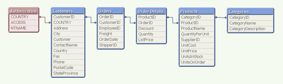
For example, above you have the authorization table in Section Access to the left, linking to the field COUNTRY. (In a real application, the authorization table is not visible in the data model.) This means that when a user opens the application, QlikView uses the user name (NTNAME) to establish which countries this user is allowed to see, and then makes the corresponding selection in the Customers table.
The selection propagates to all the other tables in the standard QlikView manner, so that the appropriate records in all tables are excluded, whereupon QlikView reduces the scope for this user to only the possible records. This way, the user will only see data pertaining to the countries to which he is associated.
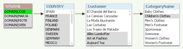
A good way to debug your Section Access is to temporarily remove the Section Access statement and run the script. The authorization table will then be visible in the data model and you can make selections in NTNAME.
Within Section Access you should define at least three fields: ACCESS, NTNAME and a third reducing field that links the authorization table with the real data. You may have additional fields also, like user roles or departments.
Some points around Section Access:
- All fields in Section Access must be upper case. Hence, the reducing field must be in upper case also in the data. Use the Upper() function and name the fields in upper case.
- Don’t use the fields USERID and PASSWORD, unless it is for testing or debugging. Proper authentication is achieved through NTNAME.
- NTNAME is the field used to match an authenticated user – also if you set up ticketing using other authentication mechanisms than Windows integrated security.
- NTNAME may contain names of groups as well as individual users.
- Make sure "Initial Data Reduction..." and "Strict Exclusion" are checked (Document properties - Opening). If the field value of the reducing field in Section Access doesn't exist in the real data, the will be no data reduction unless Strict Exclusion is used.
- If your users work off-line, i.e. download the physical qvw file, the security offered by Section Access has limited value: It does keep honest people honest, but it will not prevent a malicious user from seeing data which he shouldn't have access to, since the file is not encrypted. So for off-line usage I instead recommend the static data reduction offered by the Publisher, so that no files contain data the user isn't allowed to see.
- In most of our examples, an inline Load is used in Section Access. This is of course not a good place to keep an authorization table. Store it in a database and load it using a SELECT statement instead!
And finally
- Always save a backup copy when making changes to Section Access. It is easy to lock yourself out...
Section Access is a good, manageable and flexible way of allowing different access scopes within one document. And when used on a server, it is a secure authorization method.
Further posts related to this topic:
Data Reduction – Yes, but How?
Data Reduction Using Multiple Fields
Tips and tricks for section access in Qlik Sense (2.0+)
https://youtu.be/ObuetXgk2R8
-
Fall semester with Qlik starts August 30th!
Data is everywhere. Exponential growth of data opens incredible opportunities that create unique competitive advantages for organizations that can tap... Show MoreData is everywhere. Exponential growth of data opens incredible opportunities that create unique competitive advantages for organizations that can tap into their data and truly make data driven decisions.
Sounds simple, right? Yet, we continue to face challenges with data.
- Are you using the right data sets?
- Are you asking the right questions?
- Can you turn business questions into analytical questions?
- Are you sure you are getting the whole story?
- Are you mitigating any unconscious bias?
With Qlik’s new course Applied Data Analytics Using Qlik Sense, you will not only learn best practices for analytics but also learn how to shift from looking at data and information to looking for insights and knowledge. Our unique blended learning approach creates a collaborative learning environment mixed with expert instructors and industry professionals. In just 15 weeks, you will:
- Learn how to design and build the best Qlik Sense apps and visualizations
- Get a broader and richer view of what you can accomplish through analytics
- Get the knowledge you need to become a leader in enabling a data-driven culture within your organization
In addition, you will walk away prepared to tackle Qlik Sense Business Analyst Qualification, Data Analytics and Data Literacy Certifications.
Become an Analytics Expert. Download the Course information and Register to secure your spot!

-
Qlik Sense System Administrator BETA Certification Exam - February 2021!
Important DetailsPurpose of BETA Exam: to gather statistics on the new exam questions, which will be used to create the final exam.Audience: The BETA ... Show MoreImportant Details
Purpose of BETA Exam: to gather statistics on the new exam questions, which will be used to create the final exam.
Audience: The BETA exam is open to Qlik employees, partners and customers with expertise in Qlik Sense administration and architecture. This BETA exam is not intended for new Qlik Sense users.
Cost: Only $75 and seats are limited
Important Dates:
- Exam registration open now!
- Exam registration closes: August 30th
- Available for testing**: August 30th
- Last day to take test**: September 7th
**Exams can only be taken in a Pearson Vue Test Center; Online proctoring will not be available. PLEASE REGISTER IMMEDIATELY to ensure availability in your local test centers.
Exam length: 3 hours (180 minutes)
Promo code REQUIRED: QSSA#2021 - Code is entered on the final payment screen.
You are encouraged to add comments during the exam to help us select the best questions. You will have 3 hours to complete 83 questions.
After the final exam is completed in Q4 2021, your beta results will be scored using that exam form. (Only 50 questions are scored based on how they perform during the BETA exam.)
If you receive a passing score, you will be among the first to be awarded the certification for Qlik Sense System Administrator – February 2021 Release.
CALL TO ACTION: Reserve your seat immediately at Pearson VUE with the promo code QSSA#2021 to ensure test center availability. For questions please contact Certification@qlik.com.
-
Students of National University of Singapore get introduced to Qlik!
One of the leading Universities in Asia and Singapore, National University of Singapore (NUS), as a part of their induction of students for their new ... Show MoreOne of the leading Universities in Asia and Singapore, National University of Singapore (NUS), as a part of their induction of students for their new Master’s Batch MSBA (Master of Science in Business Analytics), organised a session to introduce Qlik. The objective of this session was to present leading technologies in analytics and showcase the capabilities of a leading product used by the industry, Qlik Sense.
After due deliberations, it was agreed to organise this session on 4th August. The session included a company presentation by Consulting Practise Manager, Vivek Pandey, a presentation about the Qlik Academic Program by Pankaj Muthe, followed by a product demo, explaining the key features of Qlik Sense by Senior Solution Architect, Kam Wei Leong. From the side of NUS, Professor James Pang , Co-Director, Business Analytics Centre, coordinated with Qlik for this event. This 3-hour session was attended by more than 60 students of MSBA.
Students were quite interactive during the sessions and were interested in understanding about the Qlik Academic Program. Some of them asked questions around how to make the best use of the academic program resources and get qualified for exams offered by the program. During the product demo, students asked about the various features of Qlik Sense such as how could one use the story telling feature, leverage the “power of grey” to explore data in greater depth etc.
Overall, the session was excellent and NUS and Qlik are exploring other ways to engage in the future!
-
Visualizing comorbidity. Set analysis element function P()
A few months ago we at the demo team accepted the challenge to create a prototype for the healthcare industry. The goal was to create a user-friendly ... Show MoreA few months ago we at the demo team accepted the challenge to create a prototype for the healthcare industry. The goal was to create a user-friendly way to analyze a huge dataset provided by one of our healthcare partners, DarkMatter2bd. They carefully explained to us some usage cases for their data and we agreed to create a mashup to analyze and visualize “comorbidity”.
So what does comorbidity means?
In medicine, comorbidity is the presence of one or more additional diseases or disorders co-occurring with (that is, concomitant or concurrent with) a primary disease or disorder; in the countable sense of the term, a comorbidity (plural comorbidities) is each additional disorder or disease.
Source: Wikipedia
If you are in the healthcare industry then I am sure you have heard someone asking something like: can you show me patients that have X and Y and Z? To answer that question and some more we came up with a new mash up called Pre-launch Targeting & Clinical Trial Recruitment. It contains non-real data for almost six hundred thousand patients located in the state of Pennsylvania.
When a user gets into the mashup we prompt them with a search box that performs a search across the entire range of diseases or disorders available in our data sample. Once the user has chosen a primary disease we take them to the Recruitment page where data can be freely explored and analyzed, and more importantly, where more disorders or diseases can be added to the query.
Real use case scenario.
An imaginary healthcare company is planning to launch a new drug for people suffering from diabetes and they need to find a group of patients that meet some requirements. They must have diabetes and must have hypertension but must not be allergic to penicillin.
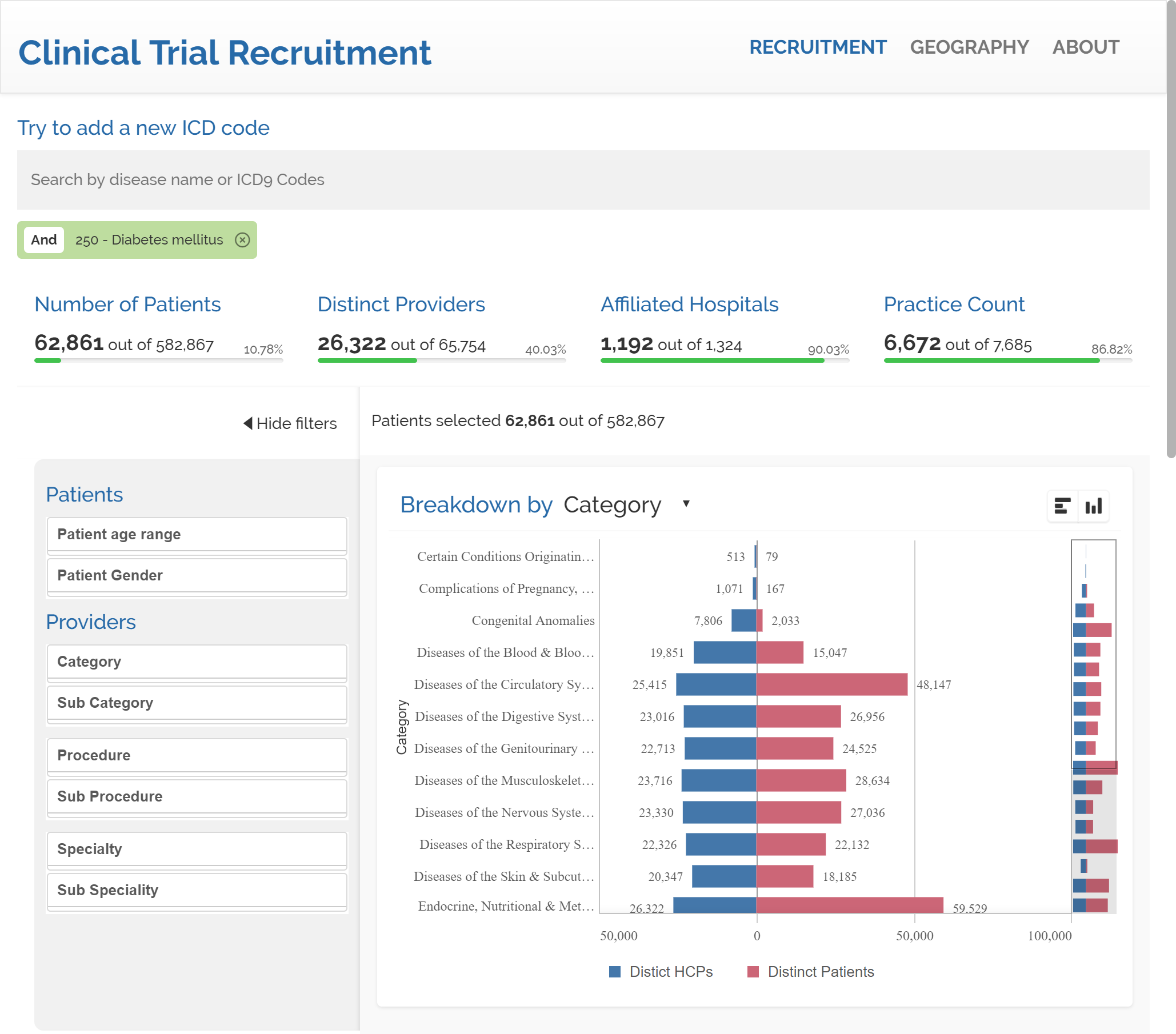
After we search for diabetes we get to a count of 62,861 patients in our data. It represents approximately a 10% of our sample. Next is time to search for hypertension. We will add a second condition to our query.
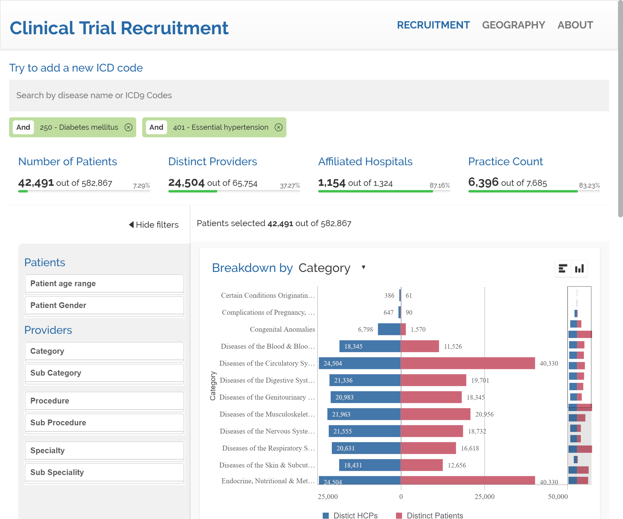
The inclusion of hypertension draws 42,491 patients that suffer from both diabetes & hypertension.
Our last search will be penicillin intolerance. Please notice that by default our mashup will add new search terms with AND condition to the query. The count of patients temporarily reflects 113 patients for the combination of diabetes AND hypertension AND penicillin allergy. Users can freely switch any condition to AND NOT by clicking into the tag. By doing so in the "Personal History of Allergy to Penicillin" tag we end up having a result set that matches our initial request, resulting in 42,378 patients with diabetes AND hypertension AND NOT penicillin allergy.
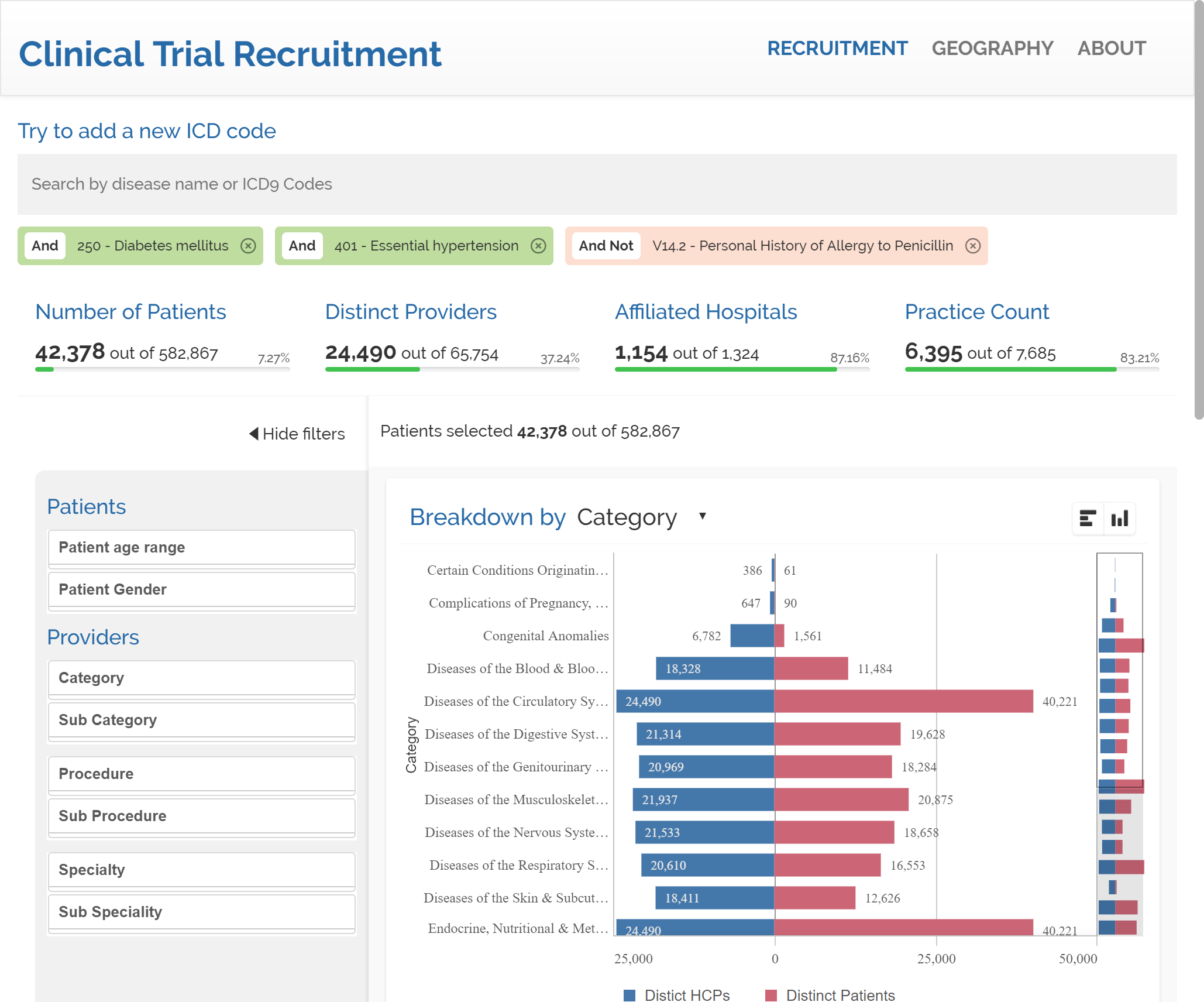
Set analysis element function P()
The secret sauce in our recipe is the Set analysis element function P(), it helps us to create subsets of data which we can operate with.
We basically want to count patients where disease = X and disease = Y. If we use Qlik notation for that condition would look like:
Count({<patient = P({<disease={'X'}>}patient) * P({<disease={'Y'}>}patient)>} distinct Patient)
The expression above will create two sets, P({<disease={'X'}>}patient) will contain all the possible patients that have disease = X, while the second piece P({<disease={'Y'}>}patient), will retrieve all the possible patients with disease = Y. Finally the " * " operator will calculate the intersection of both sets.
The webapp Pre-launch Targeting & Clinical Trial Recruitment dynamically creates as many P sets as needed and the right operator to compose the right expression.
If you want to learn more about Set Analysis please check this posts:
Why is it called Set Analysis?
I hope you like Pre-launch Targeting & Clinical Trial Recruitment
Arturo (@arturoqv)
-
Community Enhancements (2021 - 6)
Hello Members! How is it August already? This year is flying by! July’s release brought some fantastic enhancements for our end users. This month’s re... Show MoreHello Members!
How is it August already? This year is flying by!
July’s release brought some fantastic enhancements for our end users. This month’s release is more focused on improving the accessibility of the Qlik Community, along with a few additional enhancements.
Here are a few of the enhancements that went live on August 3rd, 2021:
1. Product Support Lifecycle
Do you ever have questions on when a specific product release will reach the end of support? Look no further! We’ve added a new Product News section under Support with a new Product Support Lifecycle page. You can look up your product, the release and find the end of support date.
Currently, only Data Analytics products are available. We are working with Product Management to add the Data Integration products so check back soon!
Also, stay tuned to find out more about the new Product News section!
2. Qlik Professor Ambassadors and Qlik Partner Ambassadors added to the Qlik Greenway
Two additional programs are available on the Qlik Greenway: Qlik Professor Ambassadors and Qlik Partner Ambassadors!
Qlik Professor Ambassadors is a part of the Qlik Academic program. These individuals champion our Academic Program resources to promote data literacy among students.
Qlik Partner Ambassadors is a new program that focuses on our exceptional Qlik technologists within the Qlik Partner ecosystem.
3. Product Icons on the Data Integration Documents board
The Product Icons allow you an easy way to filter out the board by selecting a specific product. The icons have only been rolled out to the Data Integration Documents board to pilot. We are thinking of adding the icons to the Knowledge Base and the new Product Support Lifecycle page. Let us know what you think or if you have any suggestions on where else they should go!
4. Updated Support and About Navs
Along with adding Product News to the Support nav, we simplified Knowledge Base to Knowledge. Don’t worry about any articles you may have bookmarked – any saved links will auto direct!
To better align with Product News, we renamed the Community Manager Blog to Community News.
We hope you enjoy these new enhancements! We would love to hear from you so let us know what you think or if there is anything you would like to see using the comments below.
We will not have an official release next month but will be sprinkling a few updates here and there. We will be back in October with some exciting new features!
Thank you for being a part of the Qlik Community!
Stay well,
Melissa, Sue and Jamie
-
Create a Slope chart with tooltips and brushing using Nebula.js and Picasso.js
In this article, we will explore creating a slope chart extension using Nebula.js and the Picasso.js charting library. We will walk through the proces... Show MoreIn this article, we will explore creating a slope chart extension using Nebula.js and the Picasso.js charting library. We will walk through the process, explain the different Picasso components that make up the chart, and introduce a few concepts along the way including tooltips and brushing.
Documentation for both libraries can be found here:
The slope chart we're about to create was featured on the 2021 Fortune 500 app. It visually explains how sectors have been impacted by the COVID-19 pandemic by ranking the sectors of the Fortune 500 list and showing their increase or decrease between 2020 and 2021.Connecting to the Qlik Sense app
First things first, let's connect to our QS app using Enigma.js. We create a QIX session using "Enigma.create" then use the "Session.open" function to establish the websocket connection and get access to the Global instance. We use the "openDoc" method within the global context to make the app ready for interaction.
// qlikApp.js
const enigma = require('enigma.js');
const schema = require('enigma.js/schemas/12.170.2.json');
const SenseUtilities = require('enigma.js/sense-utilities');

const config = {
  host: '<HOST URL>',
  appId: '<APP ID>',
};
const url = SenseUtilities.buildUrl(config);
const session = enigma.create({ schema, url });

session.on('closed', () => {
  console.error('Qlik Sense Session ended!');
  const timeoutMessage = 'Due to inactivity, the story has been paused. Refresh to continue.';
  alert(timeoutMessage);
});

export default session.open().then((global) => global.openDoc(config.appId));
Configuring Nebula
Now that we have successfully connected to the QS app, let's move on to configuring Nebula.js. In this step, we use the "embed" method to initiate a new Embed instance using the enigma app. We then register the chart extension named "slope" (the actual creation of this extension is covered further down).
// nebula.js
import { embed } from '@nebula.js/stardust';
import qlikAppPromise from 'config/qlikApp';
import slope from './fortune-slope-sn';

export default new Promise((resolve) => {
  (async () => {
    const qlikApp = await qlikAppPromise;
    const nebula = embed(qlikApp, {
      types: [{
        name: 'slope',
        load: () => Promise.resolve(slope),
      }],
    });
    resolve(nebula);
  })();
});
Rendering the chart
In our "Slope" react component, we proceed to render the visualization into the DOM on the fly. We use the "render" method and pass configuration options that include a reference to the HTML element, the type (we named it "slope" in the previous step), and the array of fields. In this case, we use 2 dimensions (Year, Sector) and 2 measures (Set Analysis that returns the ranking by sector profits as well as the actual profit numbers for the two years we're interested in).
import React, { useRef, useEffect } from 'react';
import useNebula from 'hooks/useNebula';

const Slope = () => {
  const elementRef = useRef();
  const chartRef = useRef();
  const nebula = useNebula();

  useEffect(async () => {
    if (!nebula) return;
    chartRef.current = await nebula.render({
      element: elementRef.current,
      type: 'slope',
      fields: [
        '[Issue Published Year]',
        '[Sector2]',
        '=Rank(Sum({$<[Issue Published Year]={2020, 2021}>} [Inflation Adjusted Sector Profit]))',
        '=Sum({$<[Issue Published Year]={2020, 2021}>} [Inflation Adjusted Sector Profit])',
      ],
    });
  }, [nebula]);

  return (
    <div>
      <div id="slopeViz" ref={elementRef} style={{ height: 600, width: 800 }} />
    </div>
  );
};

export default Slope;
The slope chart extension
This is where the magic happens! Let's explore different sections of the file and go through them (the full project can be found at the end of the article).
In the following code snippet, we make use of the q plugin that makes it easier to extract data from a QIX hypercube (or alternatively a list object). Notice the values of the initial fetch and the min and max properties of the dimensions and measures, these should match the number of fields we previously set in our Slope react component.
export default function supernova() {
  const picasso = picassojs();
  picasso.use(picassoQ);

  return {
    qae: {
      properties: {
        qHyperCubeDef: {
          qDimensions: [],
          qMeasures: [],
          qInitialDataFetch: [{ qWidth: 4, qHeight: 2500 }],
          qSuppressZero: false,
          qSuppressMissing: true,
        },
        showTitles: true,
        title: '',
        subtitle: '',
        footnote: '',
      },
      data: {
        targets: [
          {
            path: '/qHyperCubeDef',
            dimensions: {
              min: 1,
              max: 2,
            },
            measures: {
              min: 1,
              max: 2,
            },
          },
        ],
      },
    },
...
Scales
Our x scale is related to the year field, the color scale represents our second dimension - sectors, and lastly the y and y-end scales use custom "ticks" values because we would like to show labels in the format "rank # - sector".
Both "yaxisVals" and "yaxisendVals" arrays have been constructed by manipulating the data extracted from the layout object (see lines 76 to 92 of the slope-sn.js file).
You can learn more about scales and the different types of scales that the Picasso library offers here.
scales: {
    x: {
      data: {
        extract: {
          field: 'qDimensionInfo/0',
        },
      },
      paddingInner: 0.8,
      paddingOuter: 0,
    },
    color: {
      data: {
        extract: {
          field: 'qDimensionInfo/1',
        },
      },
      range: ['#5D627E'],
      type: 'color',
    },
    y: {
      data: {
        field: 'qMeasureInfo/0',
      },
      invert: false,
      expand: 0.03,
      type: 'linear',
      ticks: { values: yaxisVals },
    },
    yend: {
      data: {
        field: 'qMeasureInfo/0',
      },
      invert: false,
      expand: 0.03,
      type: 'linear',
      ticks: { values: yaxisendVals },
    },
},
...
Components
The components that make up the chart are:
- Type "axis" - notice that we have two y-axes that use two different scales covered above
- Type "lines" - notice that we're using the series prop that represents sectors
- Type "point" - this represents the circles at the edges of the slope lines, notice that we're extracting some additional data here since we're gonna be using it for the tooltip component.
- Type "tooltip" - there are three aspects to rendering tooltips:
- Interaction to bind events to the chart. We use 'mousemove' and 'mouseleave' to show or hide the tooltip.
- Extracting the relevant data from the hovered node, in this case we're filtering to look for nodes with key 'point', then we manipulate this data to return an object containing the values we will be displaying
- Generating content using the 'content' setting to format the information from the object we previously constructed and generate virtual nodes using the HyperScript API.
components: [ { type: 'axis', key: 'x-axis', scale: 'x', dock: 'bottom', settings: { labels: { show: true, fontSize: '10px', mode: 'horizontal', }, }, }, { type: 'axis', key: 'y-axis', scale: 'y', settings: { labels: { show: true, mode: 'layered', fontSize: '10px', filterOverlapping: false, }, }, layout: { show: true, dock: 'left', minimumLayoutMode: 'S', }, }, { type: 'axis', key: 'y-axis-end', scale: 'yend', settings: { labels: { show: true, mode: 'layered', fontSize: '10px', filterOverlapping: false, }, }, layout: { show: true, dock: 'right', }, }, { type: 'line', key: 'lines', data: { extract: { field: 'qDimensionInfo/0', props: { y: { field: 'qMeasureInfo/0', }, series: { field: 'qDimensionInfo/1', }, }, }, }, settings: { coordinates: { major: { scale: 'x', }, minor: { scale: 'y', ref: 'y', }, minor0: { scale: 'y', }, layerId: { ref: 'series', }, }, orientation: 'horizontal', layers: { sort: (a, b) => a.id - b.id, curve: 'monotone', line: { stroke: { scale: 'color', ref: 'series', }, strokeWidth: 2, opacity: 0.8, }, }, }, brush: { consume: [{ context: 'increase', style: { active: { stroke: '#53A4B1', opacity: 1, }, inactive: { stroke: '#BEBEBE', opacity: 0.45, }, }, }, { context: 'decrease', style: { active: { stroke: '#A7374E', opacity: 1, }, inactive: { stroke: '#BEBEBE', opacity: 0.45, }, }, }], }, }, { type: 'point', key: 'point', displayOrder: 1, data: { extract: { field: 'qDimensionInfo/0', props: { x: { field: 'qDimensionInfo/0', }, y: { field: 'qMeasureInfo/0', }, ind: { field: 'qDimensionInfo/1', }, rank: { field: 'qMeasureInfo/0', }, rev: { field: 'qMeasureInfo/1', }, }, }, }, settings: { x: { scale: 'x' }, y: { scale: 'y' }, shape: 'circle', size: 0.2, strokeWidth: 2, stroke: '#5D627E', fill: '#5D627E', opacity: 0.8, }, brush: { consume: [{ context: 'increase', style: { active: { fill: '#53A4B1', stroke: '#53A4B1', opacity: 1, }, inactive: { fill: '#BEBEBE', stroke: '#BEBEBE', opacity: 0.45, }, }, }, { context: 'decrease', style: { active: { fill: '#A7374E', stroke: '#A7374E', opacity: 1, }, inactive: { fill: '#BEBEBE', stroke: '#BEBEBE', opacity: 0.45, }, }, }], }, }, { key: 'tooltip', type: 'tooltip', displayOrder: 10, settings: { // Target point marker filter: (nodes) => nodes.filter((node) => node.key === 'point' && node.type === 'circle'), // Extract data extract: ({ node, resources }) => { const obj = {}; obj.year = node.data.x.label; obj.industry = node.data.ind.label; obj.rank = node.data.rank.value; obj.rankchange = rankChange[obj.industry]; obj.profitsChange = profitsChange[obj.industry]; obj.profits = resources.formatter({ type: 'd3-number', format: '.3s' })(node.data.rev.value); return obj; }, // Generate tooltip content content: ({ h, data }) => { const els = []; let elarrow = null; let rankCh = ''; data.forEach((node) => { // Title const elh = h('td', { colspan: '3', style: { fontWeight: 'bold', 'text-align': 'left', padding: '0 5px' }, }, `${node.year} ${node.industry}`); const el1 = h('td', { style: { padding: '0 5px' } }, 'Rank'); const el2 = h('td', { style: { padding: '0 5px' } }, `#${node.rank}`); // Rank Change if (node.rankchange > 0 && node.year !== '2020') { rankCh = `+${node.rankchange}`; elarrow = h('div', { style: { width: '0px', height: '0px', 'border-left': '5px solid transparent', 'border-right': '5px solid transparent', 'border-bottom': '5px solid #008000', }, }, ''); } else if (node.rankchange < 0 && node.year !== '2020') { rankCh = node.rankchange; elarrow = h('div', { style: { width: '0px', height: '0px', 'border-left': '5px solid transparent', 'border-right': '5px solid transparent', 'border-top': '5px solid #FF0000', }, }, ''); } else { rankCh = ''; elarrow = ''; } // Rest of Info const el3 = h('td', { style: { display: 'flex', alignItems: 'center', }, }, [rankCh, elarrow]); const elr1 = h('tr', {}, [el1, el2, el3]); const elr2 = h('tr', {}, [h('td', { style: { padding: '0 5px' } }, 'Profits:'), h('td', { style: { padding: '0 5px' } }, node.profits.replace(/G/, 'B')), h('td', {}, (node.year !== '2020') ? `${numeral(node.profitsChange).format('+0a').toUpperCase()}` : '')]); els.push(h('tr', {}, [elh]), elr1, elr2); }); return h('table', {}, els); }, placement: { type: 'pointer', area: 'target', dock: 'auto', }, }, }, ], interactions: [ { type: 'native', events: { mousemove(e) { this.chart.component('tooltip').emit('show', e); }, mouseleave() { this.chart.component('tooltip').emit('hide'); }, }, }, ],Brushing
In the code above, you will notice 'brush' settings on both the "lines" and "point" type components. We observe changes of a particular brush context (in this case we have two contexts, one named "increase" to show increasing lines and one for "decrease" to show lines that represent sectors that have fallen in ranks).
The active and inactive properties contain styles to be applied to the component when it is brushed.
In our scenario, we want to programmatically control these brushes from our Slope react component through a toggle button. Let's modify the Slope.jsx file to reflect that.
Notice that we are accessing the "increase" and "decrease" brushes through the global window object containing the Picasso chart instance (we assign this on line 456 of slope-sn.js). We then use a combination of the "start", "clear", "end", and "addValues" methods to react to our "toggleBrush" state changes when one of the buttons is clicked.
import React, { useRef, useEffect, useState } from 'react';
import useNebula from 'hooks/useNebula';
import Button from '@material-ui/core/Button';

const Slope = () => {
  const elementRef = useRef();
  const chartRef = useRef();
  const nebula = useNebula();

  const [toggleBrush, setToggleBrush] = useState(false);

  const increaseValues = [11, 16, 17, 5, 8, 12];
  const decreaseValues = [4, 6, 19];

  useEffect(async () => {
    if (!nebula) return;

    chartRef.current = await nebula.render({
      element: elementRef.current,
      type: 'slope',
      fields: [
        '[Issue Published Year]',
        '[Sector2]',
        '=Rank(Sum({$<[Issue Published Year]={2020, 2021}>} [Inflation Adjusted Sector Profit]))',
        '=Sum({$<[Issue Published Year]={2020, 2021}>} [Inflation Adjusted Sector Profit])',
      ],
    });
  }, [nebula]);

  useEffect(() => {
    if (!nebula || !window.slopeInstance) return;
    const highlighterIncrease = window.slopeInstance.brush('increase');
    const highlighterDecrease = window.slopeInstance.brush('decrease');
    highlighterIncrease.start();
    highlighterIncrease.clear();

    highlighterDecrease.start();
    highlighterDecrease.clear();

    if (toggleBrush) {
      highlighterIncrease.addValues(increaseValues.map((val) => ({ key: 'qHyperCube/qDimensionInfo/1', value: val })));
    } else {
      highlighterDecrease.addValues(decreaseValues.map((val) => ({ key: 'qHyperCube/qDimensionInfo/1', value: val })));
    }
  }, [toggleBrush]);

  const handleClearBrushes = () => {
    if (!nebula || !window.slopeInstance) return;
    const highlighterIncrease = window.slopeInstance.brush('increase');
    const highlighterDecrease = window.slopeInstance.brush('decrease');

    highlighterIncrease.clear();
    highlighterIncrease.end();

    highlighterDecrease.clear();
    highlighterDecrease.end();
  };

  return (
    <div>
      <div id="slopeViz" ref={elementRef} style={{ height: 600, width: 800 }} />
      <Button onClick={() => setToggleBrush(!toggleBrush)}>{toggleBrush ? 'Highlight Decrease' : 'Highlight Increasae'}</Button>
      <Button onClick={() => handleClearBrushes()}>Clear Brushes</Button>
    </div>
  );
};

export default Slope;
You can check out the full project code on Github.
Don't forget to take a look at this year's Fortune 500 and Global 500 apps that feature this chart as well as other custom ones all made possible with Nebula.js and Picasso.js!