Unlock a world of possibilities! Login now and discover the exclusive benefits awaiting you.
Analytics & AI
Forums for Qlik Analytic solutions. Ask questions, join discussions, find solutions, and access documentation and resources.
Data Integration & Quality
Forums for Qlik Data Integration solutions. Ask questions, join discussions, find solutions, and access documentation and resources
Explore Qlik Gallery
Qlik Gallery is meant to encourage Qlikkies everywhere to share their progress – from a first Qlik app – to a favorite Qlik app – and everything in-between.
Qlik Community
Get started on Qlik Community, find How-To documents, and join general non-product related discussions.
Qlik Resources
Direct links to other resources within the Qlik ecosystem. We suggest you bookmark this page.
Qlik Academic Program
Qlik gives qualified university students, educators, and researchers free Qlik software and resources to prepare students for the data-driven workplace.
Recent Blog Posts
-
Free Build your First Qlik Sense App Workshops hosted by Qlik Education
In this workshop, you will learn how to build a Qlik Sense application and experience some of the functionality and add on products that will increase... Show More
-
New Qlik Sense Data Architect Certification Exam- Pre-Register Today!
Pre-registration for the new Qlik Sense Data Architect Certification Exam is available - testing begins October 11, 2021. Pre-register now for the bes... Show MorePre-registration for the new Qlik Sense Data Architect Certification Exam is available - testing begins October 11, 2021. Pre-register now for the best choice of appointment times. This new certification is based on the February 2021 release.
The 2-hour exam costs $250 and can be taken in a local test center or via online proctoring. Learn more about this exam on our Certifications & Qualifications page.
For the most commonly asked questions you can visit our Frequently Asked Questions page. If you have further questions, please send an email to certification@qlik.com.
-
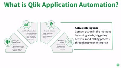
Code Less and Take More Action is the Mantra of Qlik Application Automation
Qlik Application Automation uses a no-code, drag-and-drop approach that helps you assemble automated flows that optimize processes, integrate SaaS app... Show MoreQlik Application Automation uses a no-code, drag-and-drop approach that helps you assemble automated flows that optimize processes, integrate SaaS applications and drive actions. These automations are fast to develop and eliminate the low-level complexity often required to automate back-office and analytics workflow activities. Check out the condensed overview and quick demo video below. Don't forget to check out the excellent resources at the end of this article.
We first unveiled the concept earlier this year at Qlik World and were pleased by the reception from our customers and partners. In July we launched an Early Access Program (EAP) and recently hosted a “Do More with Qlik” webinar (view the replay). Three questions were consistently asked throughout these activities:
- What’s included in the box?
- What can I do with it?
- How can I get started?
The remainder of this article will answer those questions 😊
What’s Included “in the Box?”
Qlik Application Automation cuts down the time needed to develop analytics workflows because of the following features:
- SaaS connectivity and smart blocks – Currently 31 SaaS application connectors ship with Qlik Application Automation. This allows you to easily connect to market leading SaaS applications such as Salesforce, Slack and MS Teams etc. Callable system functionality is represented as smart blocks, thus removing the need to technically understand an application’s low-level API. New connectors and blocks will be rolled out on a regular basis, but please file an Ideation request for connectors to SaaS applications that are not currently supported.
- No-code user interface (UI) – The UI is intuitive for business users, yet also offers advanced features like conditions, variables, loops, data mapping, and error handlers that IT specialists can use to accelerate their flow development. See help.qlik.com for the full user guide.
- Native Qlik Cloud integration – There’s no separate login or id to manage. You just login to your Qlik Cloud tenant with your ID, select “Add Automation” from the menu and start building flows that leverage Qlik’s powerful APIs to automate your analytics DevOps processes.
- Dynamic automation triggers – Automations can be initiated in four different ways. Ad-hoc automations can be started by the “Run” button in the UI. Automations can be scheduled to execute at a specific date and time. Automations can be triggered by a webhook call and they can be also called from an application event.
- Central management and robust runtime – Your automations are centrally cataloged, managed and monitored from a single place to maximize your efficiency and productivity.
Finally, let’s discuss “fair use limits and what’s included before I end this section:
Each Qlik Sense Enterprise SaaS subscription includes 5000 automation runs per tenant month at no additional cost. A run is defined an automation execution that’s started by one of the four methods (manual, schedule, API or event) regardless of run completion success. A run also includes ANY test run performed during development. There’s “no per connector” cost, however we are not responsible for any charges you may incur from other 3rd party systems. For example, some SaaS applications impose usage charges when called via their API’s.
For more questions about fair use, automation run allocation, overages, and product packages see Qlik Application Automation FAQ – Sept 2021
Example Uses
The second question that everyone asks is “What can I do with it?”. To be honest, a lot! But generally, there’s 3 broad scenarios:1) Drive Insights to Action: The first scenario is any situation where you need to respond to an event or drive actions in your business.
- Responding to Data Events: For example, let’s consider an automation that responds to a “low stock warning event” issued by an inventory system. That alert could automatically trigger a larger flow that sends an email, a Slack message or MS teams notification to a group of coworkers to solicit a response.
- Driving Action from Data: Conversely, you can also build flows that proactively start downstream process from insights gleaned from a Qlik Sense app. For instance, you can now build an interactive sales performance app’ that automatically rebalances your sales pipeline by triggering the workflow at the click of a button. The former and latter situations are just two examples and I’m sure you can think of many more for your business. Incidentally, automations can be manually started, run on a schedule, initiated from an API, or called by a webhook event.
2) Simplify Software as a Service (SaaS) Integrations: The second scenario is commonly referred to as application integration or business process integration. Here you can useQlik Application Automationtointegratemarket-leadingSaaSapplications(Salesforce, Hubspot, ServiceNow, Zendesk, Slack, MS Teamsetc.)to form efficient business workflows. Example workflows include automating employee zero-day start/stop, customer onboarding,eCommerce data flows, customer support flows, AI chatbot integration… the list is only restricted by your imagination.
3) Increase Analytics DevOps Productivity: The third and final scenario might sound a little boring, but I think it’s very important. You can use Qlik Application Automation to orchestrates your Qlik Sense Enterprise SaaS DevOps processes. You can divide DevOps into two categories. One category focuses on tenant administration tasks and the other category automates analytics app development. For example, you can build automations in your tenant to orchestrate app reloads and task chaining (check out this great knowledge base article on the community), to provision spaces for new departments, or backup apps. You can also build automations to help with app development, such as adding a batch of new measures to a host of applications en-masse rather than manually assign the measures an app at a time.
Getting Started
We’ve got a bunch of resources to help you get started on your journey with Qlik Application Automation. The product documentation is here , community answers are here, knowledge base articles here, and explainer videos here. You’ve now got every reason to try out this great new feature for yourself.
Watch the on-demand "Do More with Qlik" Session on Application Automation - here
Conclusion
We’re really proud of Qlik Application Automation and feel that this fantastic new innovation helps you code a lot less and provides you with more time to drive more actions from your insights.
-
Qlik: Data is Changing the World, and We Cannot Afford to Leave Future Generatio...
The pandemic disrupted education on a level we are still trying to analyze. The ramifications are significant – for young people’s personal developme... Show MoreThe pandemic disrupted education on a level we are still trying to analyze. The ramifications are significant – for young people’s personal development, their ability to acquire skills, the impact this will have on the global workforce and, by extension, the economy. So, it is little wonder that many warn of a generation lost to the pandemic and how this disruption might impact their ability to support the economic recovery.
With International Literacy Day having been recognized earlier this month, there is no better time than now to reflect and examine how we can ensure our future generations have the right resources and skills to succeed in today’s increasingly digital and data-driven workplace.
Read the full article here
How is Qlik handling this?! Our Qlik Academic Program can help university students build up the critical Data Literacy and Analytics skills necessary for todays job market, learn more and apply today!

-
ATP/WTA Latest app (Abridged data - since 2013)
ATP/WTA Latest app (Abridged data - since 2013).In order to get the full data set, load from RAW source, then use dropdown on front page to switch to ... Show MoreATP/WTA Latest app (Abridged data - since 2013).
In order to get the full data set, load from RAW source, then use dropdown on front page to switch to "final data model".
-
A potentially controversial subject on CO2 and how "population" affects this?...
... it seems it's not population per se, but more the CO2 per capita of any given country/society that affects the global CO2 picture. Attached app is... Show More... it seems it's not population per se, but more the CO2 per capita of any given country/society that affects the global CO2 picture. Attached app is using a combination of Oxford University Martin School data and UN data.
Video explaining the app logic and "argumentation" of the hypothesis posited HERE .
-
Capgemini finds value in the Qlik Academic Program
Global IT and Consulting major Capgemini has major operations in India spanning cities like Mumbai, Pune, Bangalore, Hyderabad, Chennai. Among the ser... Show MoreGlobal IT and Consulting major Capgemini has major operations in India spanning cities like Mumbai, Pune, Bangalore, Hyderabad, Chennai. Among the service offerings that are offered the data analytics vertical is strong and growing. Capgemini and Qlik work together on various projects.
Recently, the Capgemini Data Analytics and Qlik teams met to discuss on how the Academic Program could support its talent hiring. Currently, Capgemini invests resources in hiring Qlik talent from universities. Much of the time is spent on onboarding them and training them on Qlik technologies. It’s a time-consuming process and if there is an active project, the learning curve could be quite daunting.
Qlik-Capgemini discussion
The Qlik Academic Program provides complete training of Qlik Sense including structured pathways for a student to get trained and qualified as Business Analyst and Data Architect. Many Universities and institutions are leveraging these advantages so that students could get deployed on projects with employers immediately. The best part is the free access to all these resources for students and professors.
During the discussion, various possibilities were explored and the Capgemini team found great value in the academic program of Qlik. Not only will the onboarding time reduce, but the hiring process can also be potentially shortened since students who are registered with the program would be already familiar with Qlik. In India, more than 700 Universities and institutions have enrolled into this program and more than 17,000 students are leveraging these resources, thus providing a ready skill base for recruitment. Capgemini and Qlik are fine tuning plans on how these strengths could be leveraged resulting in a competitive advantage for the company.
To know about the Qlik Academic Program, visit: qlik.com/academicprogram and explore the amazing resources of the program!
-
Premium Web Connectors are now free to all Qlik Analytics customers
As Qlik continues to focus on being a SaaS-first company, we’ve been transitioning various add-ons into the base product subscription. In line with t... Show MoreAs Qlik continues to focus on being a SaaS-first company, we’ve been transitioning various add-ons into the base product subscription. In line with that, we’ve decided to expand access to Qlik Premium Web Connectors and eliminate any remaining requirements that they need to be purchased separately.
Just a reminder that Qlik Premium Web Connectors offer more value and capabilities than the Standard Web Connectors. A full list of both Standard and Premium Connectors can be found here.
Premium Web Connectors are already free to Qlik Sense customers who use the Professional/Analyzer licensing model. But for other Qlik Sense users as well as any QlikView customers, a separate price and license was required.
After February 1, 2021, when any Qlik Sense or QlikView customer renews their subscription or support agreement, they will also be licensed to use all Premium Web Connectors at no additional cost.
If you have any questions, please contact your local Qlik representative.
-
Insight Advisor – More accessible and powerful
In recent releases, we have delivered several new updates that make Insight Advisor even more powerful - centered on our user experience, insight gene... Show MoreIn recent releases, we have delivered several new updates that make Insight Advisor even more powerful - centered on our user experience, insight generation, and customization. This month, we introduced a refined in-app discovery experience, allowing users to more easily auto-generate the most relevant analyses and insights from their data. A new UI button opens the "Discovery" pane, where users can select fields and generate insights without having to navigate away from the current sheet. And a new "Ask Insight Advisor" search box is now visible at all times within dashboards, allowing people to generate insights using natural language processing. Visualizations and analyses can be refined and directly added directly to dashboards, for further exploration.
In addition to this new experience, we have also introduced several new types of advanced analyses, auto-generated by Insight Advisor. This started with K-means clustering, which groups similar data points together based on similarity in scatter plots. We then added correlation charts, process control charts, key drivers and more. Recently, we introduced a new period-over-period analysis type, which generates a comparison of time periods showing the relative progression between them. Time periods are based on defined calendar periods and can be further refined by the user in the Insight Advisor properties panel.
Finally, we have added a number of new customization capabilities, starting with a new business logic layer that provides the ability to create business rules and metadata to guide the behavior of Insight Advisor when generating insights and processing natural language.
Most recently, we've added the ability to define custom analysis types tied to specific natural language questions - for example, you could specify a period-over-period analysis returned for the question "how's my business doing"?
With all these improvements, we are consistently raising the bar on the overall functionality and value of AI in Qlik Sense. And stay tuned, because we'll continue to add new augmented analytics capabilities as we drive towards our vision for Active Intelligence.
-
CarMax Analytics Student Challenge
Calling all U.S students with Qlik Sense skills! CarMax has launched an analytics data challenge! Help CarMax determine where they should focus thei... Show MoreCalling all U.S students with Qlik Sense skills! CarMax has launched an analytics data challenge! Help CarMax determine where they should focus their efforts to increase customer satisfaction and you could be a winner!
For more information and to register visit https://analyticsshowcase.carmax.com/
Note: This is not a Qlik Academic Program event however, we do encourage you to include Qlik in your team name if you choose to participate using Qlik Sense!
If you are interested in the data challenge but do not have the software or training, we recommend you apply to the Qlik Academic Program! To apply as a university student, visit Qlik Academic Program
-
Announcing the Updated Qlik Community MVP Program
Our journey in innovating on the Qlik Community platform started when we relaunched the Community at the end of 2018. Since then, not only has the Co... Show MoreOur journey in innovating on the Qlik Community platform started when we relaunched the Community at the end of 2018. Since then, not only has the Community grown exponentially, but we have added numerous improvements and updates to ensure the online experience is increasingly positive and valuable for each member.
Today, we refer to the Qlik Community as the real “Heartbeat of Qlik” – and it is, thanks to our members – made up of employees, customers, partners, and other data enthusiasts from across the globe. While all our members are amazing Qlikkies, there is a special group that really stands out. Made up of Qlik Community’s most active and well-respected contributors, we lovingly – and accurately – refer to these special members as Qlik Community MVPs. The hallmarks of a Qlik Community MVP? Helping others; sharing knowledge; answering questions; finding solutions; and of course, demonstrating deep expertise and passion for all things Qlik.
Today we are delighted to unveil the updated Qlik Community MVP program and our newly accredited MVPs. The MVP designation recognizes our most dedicated and passionate Community members for their invaluable contributions in support of the Qlik Community and its tens of thousands of active members.
Qlik Community MVPs go above and beyond answering questions, moderating, and dedicating time to help other members. They are renowned technical experts whose depth of knowledge and customer experience impact every member of the Community. We are grateful that they have chosen Qlik and Qlik Community to share their talents.
Please join me in recognizing our new Qlik Community MVPs and celebrating their impacts. And, if you’re interested in learning more about how you can become MVP-worthy in the future, the new Qlik Community MVP page has what you’re looking for.
Welcome #QlikCommunityMVP superstars!
-
Students at UCLL win with Qlik
Learn more about how the Qlik #AcademicProgram is supporting UC Leuven-Limburg build their #students #analytics skills!https://pub.be/nl/ucll-eerste-d... Show MoreLearn more about how the Qlik #AcademicProgram is supporting UC Leuven-Limburg build their #students #analytics skills!
https://pub.be/nl/ucll-eerste-data-driven-marketing-studenten-studeren-af/
-
Using Nebula.js with React.js or in Simple html pages
Nebula.js is an open source “collection of JavaScript libraries, visualizations, and CLIs that helps developers build and integrate visualizations on ... Show MoreNebula.js is an open source “collection of JavaScript libraries, visualizations, and CLIs that helps developers build and integrate visualizations on top of Qlik's Associative Engine”.
It connects to all of our available Qlik Sense products, including the Qlik hosted, Qlik Sense Business and Qlik Sense Enterprise for SaaS.
You can find documentation and how to get started here
https://qlik.dev/libraries-and-tools/nebulajs.There are also some tutorials like
- https://qlik.dev/tutorials/build-a-helloworld-extension-using-nebulajs
- https://qlik.dev/tutorials/build-a-simple-mashup-using-nebulajs
- https://qlik.dev/tutorials/build-a-simple-web-appReact.js
Today I will show you a template that I put together that uses the React framework and some of the available Picasso charts.
The template can be found here https://github.com/yianni-ververis/nebula-react.
From bash, powershell or any other cli interface start by
- Downloading the repository ‘git clone git@github.com:yianni-ververis/nebula-react.git’
- Add your Qlik Sense url, appId and/or the webIntegrationId if you are building against the Qlik Hosted, Qlik Sense Business and Qlik Sense Enterprise for SaaS, in the src/components/Provider.jsx
- Install the appropriate packages by running ‘npm install’
- Change the dimensions and measures in the charts. You can start by changing the dimension and measure fields in the Barchart at scr/containers/Barchart.jsx, Lines 22 and 25. The ones in the template are from the Helpdesk app.This is how you can start with a React template.
You can view it live at https://qdt-apps.qlik.com/nebula-react/index.html.
Simple Html
If you do not want to use any framework and you want to use the library and the charts in a simple html page, I have put together samples in observablehq where you can copy or fork and test it against your Qlik Sense installation at https://observablehq.com/collection/@yianni-ververis/nebula.
/Yianni
-
Introducing Qlik Cloud Government for the U.S. Public Sector
As governments and agencies modernize their digital infrastructure and adopt new technologies like automation, AI, and edge devices, the ability to ex... Show MoreAs governments and agencies modernize their digital infrastructure and adopt new technologies like automation, AI, and edge devices, the ability to extract insights from data is increasingly crucial. Qlik Cloud Government can support these initiatives with a modern data and analytics platform built for speed, security, and scale.
Qlik has achieved the Federal Risk and Authorization Management Program (FedRAMP) “In Process” designation at the “Moderate” Impact Level. FedRAMP is a U.S. government program that approves cloud products and services for the U.S. Public sector and has established a set of Impact Levels categorized by the sensitivity of data that can be contained in a Cloud Service Provider (CSP). FedRAMP’s Moderate level status is also recognized by the Department of Defense (DoD) at the IL2.To learn more about Qlik Cloud Government, click here.
-
On the Next Do More with Qlik - Introduction to Qlik App Automation - Register N...
Register now Qlik App Automation is a SaaS based no-code approach to automating your analytics applications and business processes. Connect to popular... Show MoreQlik App Automation is a SaaS based no-code approach to automating your analytics applications and business processes. Connect to popular SaaS applications, including Qlik Cloud Services, MS Teams, Slack and more to not only generate context aware user alerts, but sophisticated workflows that trigger processes and actions directly in various systems.

-
Row Level Formatting in Qlik Sense
Our @TomiKomo is back with another customer requested problem / solution - take it away Tomi! Morning, afternoon, or evening y’all. In this entry I w... Show MoreOur @TomiKomo is back with another customer requested problem / solution - take it away Tomi!
Morning, afternoon, or evening y’all.
In this entry I will cover a unique request that I received from a customer. My customer, whom tried to solve a particular issue with their current BI tool -- and failed, wanted to see if Qlik could solve their problem. The stakeholder I was speaking with leads the BI and Analytics team in her organization. One of her critical daily tasks is to send out reports to colleagues in different departments. Her colleagues however, are usually very picky about how the reports should look. They wanted each row to fit the data format they prefer - with knowledge that these format preferences could change week to week. This is why I love my join in the Qlik Pre-Sales group - I am always surprised with some new challenges from a customer that Qlik can easily handle.
Enjoy!
Sample solution / document / video - attached below.
-
Forum Consolidation - Phase 2
[Production push March 31 - April 2. System mail and notifications will be disabled]Update: April 2 - Forum Consolidation is complete. System checks... Show More[Production push March 31 - April 2. System mail and notifications will be disabled]
Update: April 2 - Forum Consolidation is complete. System checks underway.
Please report any issues in Community CornerHello Members,
In our continuation to offer improvements to Qlik Community we would like to make you aware about changes coming to forums that reside under the Data Analytics umbrella.
Phase 1 of our forum consolidation project focused on a consolidation of QlikView forums.
This article will walk you thru the changes you can soon expect in Phase 2.and yes, I'm attempting to soften the blow with more kitten memes
Read on.. !- 3 Data Analytics forums are being retired
- Qlik Connectors (all content being moved)
- Qlik Server Side Extensions (all content being moved)
- Qlik Insight Bot
- 3 Data Analytics forums are being moved beneath Qlik Sense
- Qlik Alerting
- Qlik Sense Mobile
- Qlik GeoAnalytics
- Then, 4 Qlik Sense forums are being retired. Content in retired forums will be relocated.
- Qlik Sense Advanced Authoring
- Qlik Sense EA Powertools
- Qlik Sense SaaS and MultiCloud
- Qlik Sense on Virtual Private Cloud
Take notice forums that will be renamed.
- 1 new forum is being created
- Insight Advisor (more to come about this later)
- Insight Advisor (more to come about this later)
Here is a visual depiction of the final outcome:
We'd like to thank the Qlik Product Marketing Team and all members that submitted survey feedback. We anticipate the change to go live by end of month.
Read this article in case you missed details on Phase 1 Forum Consolidation.
See you online!

- 3 Data Analytics forums are being retired
-
Auditing Hybrid Data Delivery Service Events
What is Hybrid Data Delivery Service Event Auditing?Many of you are familiar with the “Events” page in the Qlik Cloud Management Console where you can... Show MoreWhat is Hybrid Data Delivery Service Event Auditing?
Many of you are familiar with the “Events” page in the Qlik Cloud Management Console where you can review information for system events, such as user session data and app creation data. However, Hybrid Data Delivery Service events will also be included in the event page, starting with the August 31st release. Adding these events will help you audit your service activity and also assist debugging data transfers. An example of a data delivery service event is illustrated below:
The selection can be expanded to reveal more information by clicking the down arrow in the right-hand column.
What Events are Recorded?
We currently support three categories of Hybrid Data Delivery Service Events:
- Qlik Enterprise Manager (QEM) Events
- Creation of QEM resource - com.qlik.v1.qem-server.created
- Deletion of QEM resource - com.qlik.v1.qem-server.deleted
- Disabling of a QEM resource - com.qlik.v1.qem-server.disabled
- Enabling a QEM resource - com.qlik.v1.qem-server.enabled
- Updating the key registration for a QEM resource - com.qlik.v1.qem-server.updated
- Data Asset Events
- Creating a new data asset - com.qlik.v1.integration-app.created
- Request to delete a data asset - com.qlik.v1.integration-app.delete-requested
- Successful data asset deletion - com.qlik.v1.integration-app.deleted
- Instance-related Events
- Start request from a user/system - com.qlik.v1.integration-app.app-instance.start-requested
- Successful start of a data asset app (running state) - com.qlik.v1.integration-app.app-instance.started
- Stop request from a user - com.qlik.v1.integration-app.app-instance.stop-requested (including abort indication)
- Successful stop of a data asset app (stopped state, error flag off) - com.qlik.v1.integration-app.app-instance.stopped
- Stop of a data asset due to an error (stopped state or pending recovery state, error flag on) - com.qlik.v1.integration-app.app-instance.error
Where to go for More Information?
If you’d like to learn more about the capabilities of the event subsystem and managing your Qlik Cloud user resources then check out the documentation on the Qlik Help sit here. Finally, you can find out more about the Hybrid Data Delivery Service here.
Clive Bearman, Sr Director of Product Management
- Qlik Enterprise Manager (QEM) Events
-
Creating 3D bars on a Map with Nebula.js
Couple of months ago I blogged about Mapbox GL and Nebula.js https://community.qlik.com/t5/Qlik-Design-Blog/Using-Mapbox-GL-with-Nebula-js/ba-p/181762... Show MoreCouple of months ago I blogged about Mapbox GL and Nebula.js https://community.qlik.com/t5/Qlik-Design-Blog/Using-Mapbox-GL-with-Nebula-js/ba-p/1817621.
Today, I will take that example and add some 3D Bars with Three.js.
I will be using the observable notation but you can substitute "require" with "import" on your React/Angular apps
First, fork or follow the setup as described in my previous blog. Then, we have to add the installation and importing of Three and GSAP for the animation.
// Observable
GSAP = require('gsap');
TweenMax = GSAP.TweenMax;

// React / Angular
import { TweenMax } from 'gsap';
import * as THREE from 'three/build/three';
Lets define the constants
  let maxBarΝumberFromData = 0;
  let maxNumberOfBars = 0;
  let map;
  let camera;
  let scene;
  let renderer;
  const barWidth = 100;
  const barOpacity = 1;


  // parameters to ensure the model is georeferenced correctly on the map
  const modelOrigin = [-30, 55];
  const modelAltitude = 0;
  const modelRotate = [Math.PI / 2, 0, 0];
  const modelAsMercatorCoordinate = mapboxgl.MercatorCoordinate.fromLngLat(
    modelOrigin,
    modelAltitude,
  );

  // transformation parameters to position, rotate and scale the 3D model onto the map
  const modelTransform = {
    translateX: modelAsMercatorCoordinate.x,
    translateY: modelAsMercatorCoordinate.y,
    translateZ: modelAsMercatorCoordinate.z,
    rotateX: modelRotate[0],
    rotateY: modelRotate[1],
    rotateZ: modelRotate[2],
    /* Since our 3D model is in real world meters, a scale transform needs to be
  * applied since the CustomLayerInterface expects units in MercatorCoordinates.
  */
    scale: modelAsMercatorCoordinate.meterInMercatorCoordinateUnits(),
  };
Now we can add the function that creates the bars on the map and animates the height
      const createBar = (posx, posz, posy, order) => {
        const max = 3000;
        const ratio = Number(posy) / Number(maxBarΝumberFromData);
        const y = max * ratio;
        const _posy = 1;
        const geometry = new THREE.BoxGeometry(barWidth, 1, barWidth, 1, 1, 1);
        const material = new THREE.MeshLambertMaterial({ color: 0xfffff, transparent: true });
        const bar = new THREE.Mesh(geometry, material);
        bar.position.set(posx, _posy, posz);
        bar.name = `bar-${order}`;
        bar.userData.y = y;
        bar.material.opacity = barOpacity;
        scene.add(bar);
        // Animate
        TweenMax.to(bar.scale, 1, { y, delay: order * 0.01 });
        TweenMax.to(bar.position, 1, { y: y / 2, delay: order * 0.01 });
        maxNumberOfBars = order;
      };
Now, lets switch the "buildLayer" function with this one so we can create a custom 3d layer using three.js
      // Create the layer that will hold the bars
      const buildLayer = () => {
        const layer = {
          id: '3d-model',
          type: 'custom',
          renderingMode: '3d',
          onAdd(_map, gl) {
            camera = new THREE.Camera();
            scene = new THREE.Scene();

            // create two three.js lights to illuminate the model
            const directionalLight = new THREE.DirectionalLight(0xffffff);
            directionalLight.position.set(-90, 200, 130).normalize();
            scene.add(directionalLight);
            // sky color ground color intensity
            const directionalLight2 = new THREE.DirectionalLight(0xffffff, 0.3);
            directionalLight2.position.set(90, 20, -100).normalize();
            scene.add(directionalLight2);

            qMatrix.forEach((row, index) => {
              maxBarΝumberFromData = (maxBarΝumberFromData < row[1].qNum) ? row[1].qNum : maxBarΝumberFromData;
            })

            qMatrix.forEach((row, index) => {
              createBar(row[2].qNum * 150, row[1].qNum * 150, row[5].qNum, index);
            })

            // scale up geometry
            scene.scale.set(300, 300, 300);

            // use the Mapbox GL JS map canvas for three.js
            renderer = new THREE.WebGLRenderer({
              canvas: _map.getCanvas(),
              context: gl,
              antialias: true,
            });

            renderer.autoClear = false;
          },
          render(gl, matrix) {
            const rotationX = new THREE.Matrix4().makeRotationAxis(
              new THREE.Vector3(1, 0, 0),
              modelTransform.rotateX,
            );
            const rotationY = new THREE.Matrix4().makeRotationAxis(
              new THREE.Vector3(0, 1, 0),
              modelTransform.rotateY,
            );
            const rotationZ = new THREE.Matrix4().makeRotationAxis(
              new THREE.Vector3(0, 0, 1),
              modelTransform.rotateZ,
            );

            const m = new THREE.Matrix4().fromArray(matrix);
            const l = new THREE.Matrix4()
              .makeTranslation(
                modelTransform.translateX,
                modelTransform.translateY,
                modelTransform.translateZ,
              )
              .scale(
                new THREE.Vector3(
                  modelTransform.scale,
                  -modelTransform.scale,
                  modelTransform.scale,
                ),
              )
              .multiply(rotationX)
              .multiply(rotationY)
              .multiply(rotationZ);

            camera.projectionMatrix = m.multiply(l);

            renderer.state.reset();
            renderer.render(scene, camera);
            map.triggerRepaint();
          },
        };
        return layer;
      }
This is it! The final result should be similar to this:
You can view, fork and play with the above demo at
https://observablehq.com/@yianni-ververis/nebula-js-mapbox-with-three-js?collection=@yianni-ververis/nebula
/Yianni -
AJAX and URL parameters
Sometimes you want QlikView to open with a specific set of selections, apply a bookmark or perhaps even deep link to a specific sheet.A typical use ca... Show MoreSometimes you want QlikView to open with a specific set of selections, apply a bookmark or perhaps even deep link to a specific sheet.
A typical use case could be to embed an entire app or a single object inside a CRM or ERP system and depending on the context, current customer for example, filter the QlikView app to only show records related to that specific context.
So how do I use this black magic?
One approach would be to use triggers with the obvious downside being that the trigger would always fire regardless of how you opened the app.
Another approach is to supply a set of parameters to the URL for that specific app.
Let’s take an example, the Sales Compass demo from the demo site. Below us the URL to access the app and the different components explained.
Actual URL
demo.qlik.com/QvAJAXZfc/opendoc.htm?document=qvdocs%2FSales%20Compass.qvw&host=demo11
Explained URL
<host name>/<virtual directory>/opendoc.htm?document=<url encoded full name for the application>&host=<name of QVS>
In addition to this URL you can also supply some extra parameters to control which actions will fire when the app is opened. For example the URL below will open the Sales Compass app with the value “Q2” selected in the listbox with id LB5699 (yes we create way to many objects
 )
)demo.qlik.com/QvAJAXZfc/opendoc.htm?document=qvdocs%2FSales%20Compass.qvw&host=demo11&select=LB5699,Q2
Of course this is only a simple example, in the table below you will find all the available parameters you can append to your URL.
Feel free to mix and match these til your hearts content.
Action Parameter Example Select a single value &select=<Listbox ID>,<Value> &select=LB01,Total Select multiple values &select=<Listbox ID,(Value|Value2) &select=LB02,(2011|2012) Open the app on a specific sheet &sheet=<Sheet ID> &sheet=SH01 Open the app with a bookmark applied &bookmark=<Bookmark ID> &bookmark=Server\BM01 Wait a minute, you mentioned single objects?
Ah, yes! When QlikView 11 was launched we also introduced the capability to display a single object from an app.
This allowed customers to integrate objects from different applications into a single view in a external system. It is also this screen that powers the small devices client.
Substitute opendoc.htm with singleobject.htm and specify the object id you want to display,
demo.qlik.com/QvAJAXZfc/singleobject.htm?document=qvdocs%2FSales%20Compass.qvw&host=demo11&object=CH378
And voila! You now have a fully interactive single QlikView object!