Unlock a world of possibilities! Login now and discover the exclusive benefits awaiting you.
- Qlik Community
- :
- All Forums
- :
- Visualization and Usability
- :
- Trellis Container QlikSense - Filter and Update Is...
- Subscribe to RSS Feed
- Mark Topic as New
- Mark Topic as Read
- Float this Topic for Current User
- Bookmark
- Subscribe
- Mute
- Printer Friendly Page
- Mark as New
- Bookmark
- Subscribe
- Mute
- Subscribe to RSS Feed
- Permalink
- Report Inappropriate Content
Trellis Container QlikSense - Filter and Update Issue
Hi,
I tried using Trellis extension and its a great way to to comparative analysis. However, I have encountered below problems. Let me know if you can address them
1. I have a Trellis chart creates on State dimension (and Sales). Unique State values 20
2. I have a filter on country.
3. When Trellis chart is created, It creates 20 chart structures, each for one state.
4. When Country filter applied. The data gets filtered for country and only relevant states shows chart with data, BUT the issue I am facing is the Trellis chart still shows 20 chart structures.
Am I missing something or can this be addressed by any other calculation. My requirement is The trellis chart should dynamically re-structure itself to only relevant values for selected filter.
- Mark as New
- Bookmark
- Subscribe
- Mute
- Subscribe to RSS Feed
- Permalink
- Report Inappropriate Content
I think that I am facing the same problem. I have made a visualization that shows a stacked bar chart. I want this to be shown for each center (state in your case) in a trellis container. This works fine. But I also want the trellis container to respond to a filter pane where I choose education (country in your case), so that when I select an education that has four centers, the trellis chart only shows those four centers. But right now it still shows all 11 centers.
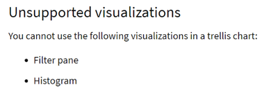
If I understand the documentation of trellis container, filters are not supported. It is a bit cryptically written by Qlik when they write, that "Filter pane" as a visualization is not supported in trellis container (as I do not consider a filter pane as a visualization and also I do not use the filter pane IN the trellis container but next to the container):
BR Kim
