Unlock a world of possibilities! Login now and discover the exclusive benefits awaiting you.
- Qlik Community
- :
- All Forums
- :
- QlikView App Dev
- :
- Bar Chart
- Subscribe to RSS Feed
- Mark Topic as New
- Mark Topic as Read
- Float this Topic for Current User
- Bookmark
- Subscribe
- Mute
- Printer Friendly Page
- Mark as New
- Bookmark
- Subscribe
- Mute
- Subscribe to RSS Feed
- Permalink
- Report Inappropriate Content
Bar Chart
Hi Community,
today I would like to create a bar chart with the following look:
I have three KPIs (NSR, GSR, Fundings) for each year which should be displayed next to each other. The following "connection" exists between the different KPIs:
NSR = GSR - Fundings
I attached a screenshot (made with Think Cell) which shows the result I would like to achieve.
First Row: GSR
Second Row: Fundings, starting from the GSR value and going down to the x-axis
Third Row: NSR
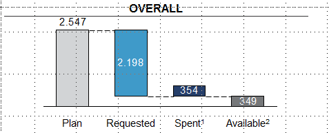
Can anybody help me how to design this in QV?
Thanks ind advance!
Philip
- Mark as New
- Bookmark
- Subscribe
- Mute
- Subscribe to RSS Feed
- Permalink
- Report Inappropriate Content
you can work this by using the waterfall model where you can create an expression in the bar offset for each expression rather than the plan expression