Unlock a world of possibilities! Login now and discover the exclusive benefits awaiting you.
- Qlik Community
- :
- All Forums
- :
- QlikView App Dev
- :
- Graph design
- Subscribe to RSS Feed
- Mark Topic as New
- Mark Topic as Read
- Float this Topic for Current User
- Bookmark
- Subscribe
- Mute
- Printer Friendly Page
- Mark as New
- Bookmark
- Subscribe
- Mute
- Subscribe to RSS Feed
- Permalink
- Report Inappropriate Content
Graph design
Hello,
I was wondering if there is a way to do a graph like the one in the picture:
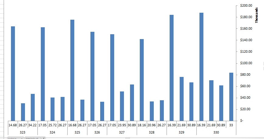
I got my main field thats the 320's-330 (trip) u see in the image. On the DB each register has a trip, the different prices, and the ammount of income.
The graph groups all trips, then the different prices of the trip, and adds the ammount.
I cant figure out how to create a graph like that on QV.
Any ideas?
thanks,
KR
- « Previous Replies
-
- 1
- 2
- Next Replies »
Accepted Solutions
- Mark as New
- Bookmark
- Subscribe
- Mute
- Subscribe to RSS Feed
- Permalink
- Report Inappropriate Content
I think it is quite demanding to achieve a good visualization with the bar chart. I have enclosed a version but also made an alternative approach that might work better in my opinion - hope this works for you.

- Mark as New
- Bookmark
- Subscribe
- Mute
- Subscribe to RSS Feed
- Permalink
- Report Inappropriate Content
Something like this?
- Mark as New
- Bookmark
- Subscribe
- Mute
- Subscribe to RSS Feed
- Permalink
- Report Inappropriate Content
Not sure if I understand your setting.
Have you tried a grouped style bar chart with two dimensions, trip and price, and a sum(AmountIncome) as expression?
- Mark as New
- Bookmark
- Subscribe
- Mute
- Subscribe to RSS Feed
- Permalink
- Report Inappropriate Content
im not sure how to use this
- Mark as New
- Bookmark
- Subscribe
- Mute
- Subscribe to RSS Feed
- Permalink
- Report Inappropriate Content
This works when selecting a voyage, but it not like the one on the picture that im trying to create, for several trips.
- Mark as New
- Bookmark
- Subscribe
- Mute
- Subscribe to RSS Feed
- Permalink
- Report Inappropriate Content
Well you asked if it was possible - and I just wanted to get you to confirm that this would be sufficient layout and presentation wise... If it is I can explain the steps to get it to work. It would be much quicker for me if you have some test-data in Excel or a table-format...
- Mark as New
- Bookmark
- Subscribe
- Mute
- Subscribe to RSS Feed
- Permalink
- Report Inappropriate Content
I would love the help, im just trying to attach the excel file here but im not sure how, cant find the attach file option
- Mark as New
- Bookmark
- Subscribe
- Mute
- Subscribe to RSS Feed
- Permalink
- Report Inappropriate Content
You have to get the discussion up fully by clicking on the title-link Graph design and then click REPLY and lastly click "Use advanced editor" to get a link at the bottom of the text input box that says "Attach"....
Yes this is quite cumbersome to find the first time  I struggled quite a while before I found how to attach files.
- Mark as New
- Bookmark
- Subscribe
- Mute
- Subscribe to RSS Feed
- Permalink
- Report Inappropriate Content
o thanks, here it is.
I would like to know how to make this excel show with main field voyage, then freight, and adding net freight.
thanks in advance
- Mark as New
- Bookmark
- Subscribe
- Mute
- Subscribe to RSS Feed
- Permalink
- Report Inappropriate Content
I think it is quite demanding to achieve a good visualization with the bar chart. I have enclosed a version but also made an alternative approach that might work better in my opinion - hope this works for you.
- « Previous Replies
-
- 1
- 2
- Next Replies »