Unlock a world of possibilities! Login now and discover the exclusive benefits awaiting you.
Announcements
April 13–15 - Dare to Unleash a New Professional You at Qlik Connect 2026: Register Now!
- Qlik Community
- :
- All Forums
- :
- QlikView App Dev
- :
- Grid Chart
Options
- Subscribe to RSS Feed
- Mark Topic as New
- Mark Topic as Read
- Float this Topic for Current User
- Bookmark
- Subscribe
- Mute
- Printer Friendly Page
Turn on suggestions
Auto-suggest helps you quickly narrow down your search results by suggesting possible matches as you type.
Showing results for
Specialist III
2016-03-31
01:52 PM
- Mark as New
- Bookmark
- Subscribe
- Mute
- Subscribe to RSS Feed
- Permalink
- Report Inappropriate Content
Grid Chart
Hi All,
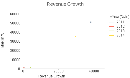
I'd like to build a like below chart in qlikview showing Revenues on X axis and Contribution % on Y axis.
I want to compare with Year.
I am attaching sample data in Qlikview file, but I don't know how to create this graph...
Please Can anyone help me on that ?
Thanks in Advance..
950 Views
5 Replies
Specialist III
2016-04-01
01:59 AM
Author
- Mark as New
- Bookmark
- Subscribe
- Mute
- Subscribe to RSS Feed
- Permalink
- Report Inappropriate Content
Please anyone help me out...
591 Views
MVP
2016-04-01
02:05 AM
- Mark as New
- Bookmark
- Subscribe
- Mute
- Subscribe to RSS Feed
- Permalink
- Report Inappropriate Content
Probably you need scatter plot with vertical and horizontal reference line
591 Views
Champion III
2016-04-01
02:10 AM
- Mark as New
- Bookmark
- Subscribe
- Mute
- Subscribe to RSS Feed
- Permalink
- Report Inappropriate Content
May be using a scatter chart like:
Dim: Year
Exp 1: Revenue Growth Exp.
Exp 2: Margin % Exp
591 Views
MVP
2016-04-01
02:44 AM
- Mark as New
- Bookmark
- Subscribe
- Mute
- Subscribe to RSS Feed
- Permalink
- Report Inappropriate Content
591 Views
Champion III
2016-04-01
02:58 AM
- Mark as New
- Bookmark
- Subscribe
- Mute
- Subscribe to RSS Feed
- Permalink
- Report Inappropriate Content
Perhaps not exactly so you could get, however, you can probably make it appear close to so, using reference line (Presentation tab). Just play with it.
591 Views