Unlock a world of possibilities! Login now and discover the exclusive benefits awaiting you.
- Qlik Community
- :
- All Forums
- :
- QlikView App Dev
- :
- Re: Help creating a stacked bar chart where each s...
- Subscribe to RSS Feed
- Mark Topic as New
- Mark Topic as Read
- Float this Topic for Current User
- Bookmark
- Subscribe
- Mute
- Printer Friendly Page
- Mark as New
- Bookmark
- Subscribe
- Mute
- Subscribe to RSS Feed
- Permalink
- Report Inappropriate Content
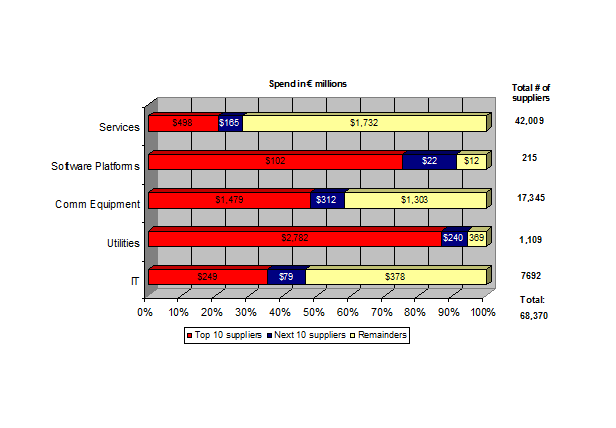
Help creating a stacked bar chart where each stack has a calculation
I want to create the following chart but i cant quite get it to give the correct results.
My fields are:
SUPPLIER_ID
SPEND
SERVICE_DESC
- Mark as New
- Bookmark
- Subscribe
- Mute
- Subscribe to RSS Feed
- Permalink
- Report Inappropriate Content
You could create such chart by using one dimension (your category) and in your case three expressions (top 10, next 10, others) and then choose as design stacked bar. To get both amounts within the bars and percentages on the axis you might need to create two charts which are overlaying eachother and are appropriate layouted (I have tried to adjust this with a dual-function but it didn't worked).
- Marcus
- Mark as New
- Bookmark
- Subscribe
- Mute
- Subscribe to RSS Feed
- Permalink
- Report Inappropriate Content
You can do something like below
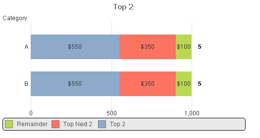
I have create this using dummy data. You can change the expression accordingly
- Mark as New
- Bookmark
- Subscribe
- Mute
- Subscribe to RSS Feed
- Permalink
- Report Inappropriate Content
is there anyway to get this with the relative percentage on the bottom~?
i know it can be done by SUM(Value)/SUM(TOTAL Value) but how can this be displayed on the axis?
- Mark as New
- Bookmark
- Subscribe
- Mute
- Subscribe to RSS Feed
- Permalink
- Report Inappropriate Content
Very probably it's only possible with my suggestion from above by using two charts - one with amounts and one with percentages.
- Marcus
- Mark as New
- Bookmark
- Subscribe
- Mute
- Subscribe to RSS Feed
- Permalink
- Report Inappropriate Content
Yes it is possible.. go to chart properties, presentation tab, add text in chart and put the above expression.. now press ctrl and shift to adjust the position of text
- Mark as New
- Bookmark
- Subscribe
- Mute
- Subscribe to RSS Feed
- Permalink
- Report Inappropriate Content
im having trouble getting this to work as there isnt an even number of suppliers distributed between categories in my data
nor is there an equal amount of money spent in each category