Unlock a world of possibilities! Login now and discover the exclusive benefits awaiting you.
- Qlik Community
- :
- All Forums
- :
- QlikView App Dev
- :
- Help trying to create chart
- Subscribe to RSS Feed
- Mark Topic as New
- Mark Topic as Read
- Float this Topic for Current User
- Bookmark
- Subscribe
- Mute
- Printer Friendly Page
- Mark as New
- Bookmark
- Subscribe
- Mute
- Subscribe to RSS Feed
- Permalink
- Report Inappropriate Content
Help trying to create chart
Hi All,
Is there a way i can create a chart that looks like the following?
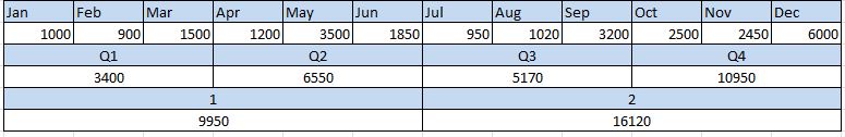
i want to see the values by the different timeframes in the same chart if possible..
I have attached a qvw with the above data in.
Can someone help please? 
- Tags:
- new_to_qlikview
- « Previous Replies
-
- 1
- 2
- Next Replies »
- Mark as New
- Bookmark
- Subscribe
- Mute
- Subscribe to RSS Feed
- Permalink
- Report Inappropriate Content
I don't think the options available within QV will allow you to do something like this, but as a work around you can place three straight tables next to each other make them look like as if they are one table. Not sure if that will work for you?
- Mark as New
- Bookmark
- Subscribe
- Mute
- Subscribe to RSS Feed
- Permalink
- Report Inappropriate Content
see tis,
- Mark as New
- Bookmark
- Subscribe
- Mute
- Subscribe to RSS Feed
- Permalink
- Report Inappropriate Content
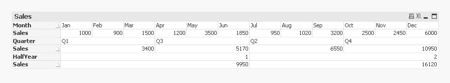
See if the attached image (work around) looks good
- Mark as New
- Bookmark
- Subscribe
- Mute
- Subscribe to RSS Feed
- Permalink
- Report Inappropriate Content
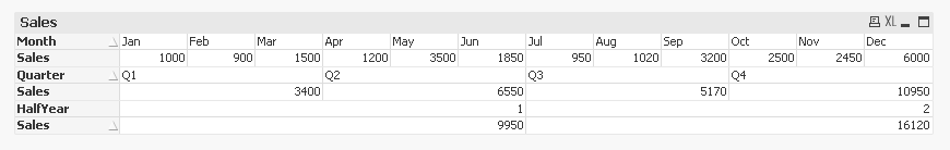
With correct sorting:
- Mark as New
- Bookmark
- Subscribe
- Mute
- Subscribe to RSS Feed
- Permalink
- Report Inappropriate Content
In Qlikview we don't have a option to build such a kind of representation, try with the Pivot table that would yield almost similar result. You can try with other ways too but keep in mind it will be always static and if the number of data changes then the position of the static object won't change
- Mark as New
- Bookmark
- Subscribe
- Mute
- Subscribe to RSS Feed
- Permalink
- Report Inappropriate Content
sunindia bro nice work ...but this will fail when user tries to export the data and if user selects some filter then it might fail .
- Mark as New
- Bookmark
- Subscribe
- Mute
- Subscribe to RSS Feed
- Permalink
- Report Inappropriate Content
Agreed Avinash ... But that is why I called it a work around... You are right, may be Pivot table might be able to get him the result... but will have to play around with it a little
- Mark as New
- Bookmark
- Subscribe
- Mute
- Subscribe to RSS Feed
- Permalink
- Report Inappropriate Content
Hi Sunindia,
Kindly help me resolve the following query using the SCD solution
Well, I have the following Inline table
LOAD * INLINE
[
Product, ProdName, Price, Updated
123, Watch, 150$, 1/1/2015
134, Fruit, 30$, 1/1/2015
145, Ring, 3000$, 3/1/2015
123, Watch, 125$, 5/1/2015
123, Watch, 119$, 5/5/2015
134, Fruit , 50$, 5/5/2015
145, Ring, 2500$, 5/12/2015
234, Pen, 12$, 5/17/2015
312, Jeans, 50$, 6/9/2015
];
Using the above input table, I need to get the below reults
| Product | ProdName | Price | Updated | From | To Date |
| 123 | Watch | 150$ | 1/1/2015 | 1/1/2015 | 4/30/2015 |
| 123 | Watch | 125$ | 5/1/2015 | 5/1/2015 | 5/42015 |
| 123 | Watch | 119$ | 5/5/2015 | 5/5/2015 | 6/18/2015 |
Help me implementing the same.
Thanks in advance
- Mark as New
- Bookmark
- Subscribe
- Mute
- Subscribe to RSS Feed
- Permalink
- Report Inappropriate Content
Thanks for all of the replies.
I actually tried separate charts before posting here. it looks ok but one of the requirements is that the user can make a selection on Month, QTR or half year to see a breakdown of the sales at Department level in another table. the problem with charts is that once a selection is made the chart hides all grey values therefore it will go smaller which will then mean that the 3 charts are different sizes.
I have also tried a pivot table but i can't get the expression to show below each of the pivoted dimensions.
- « Previous Replies
-
- 1
- 2
- Next Replies »