Unlock a world of possibilities! Login now and discover the exclusive benefits awaiting you.
- Qlik Community
- :
- All Forums
- :
- QlikView App Dev
- :
- Re: How do use Data from one Objekt in another one...
- Subscribe to RSS Feed
- Mark Topic as New
- Mark Topic as Read
- Float this Topic for Current User
- Bookmark
- Subscribe
- Mute
- Printer Friendly Page
- Mark as New
- Bookmark
- Subscribe
- Mute
- Subscribe to RSS Feed
- Permalink
- Report Inappropriate Content
How do use Data from one Objekt in another one ?
Hello all together,
I'm new in Qlikview and so I need some good advice. I have to make a Diagramm that looks like the one at the bottom.
I already built the Chart at the top which is correct. How can I get the numbers at the right side of the 100%-bar per calculation ?
(at the Moment I only wrote the number in the formula). Taking the expression from the chart doesn't work because it is a rangesum (with above).
The only data I have from dhe original excel chart is the "Umsatz" (sales) from the years 2010 to 2012.
Is there a possibility to solve my problem ?
Thanks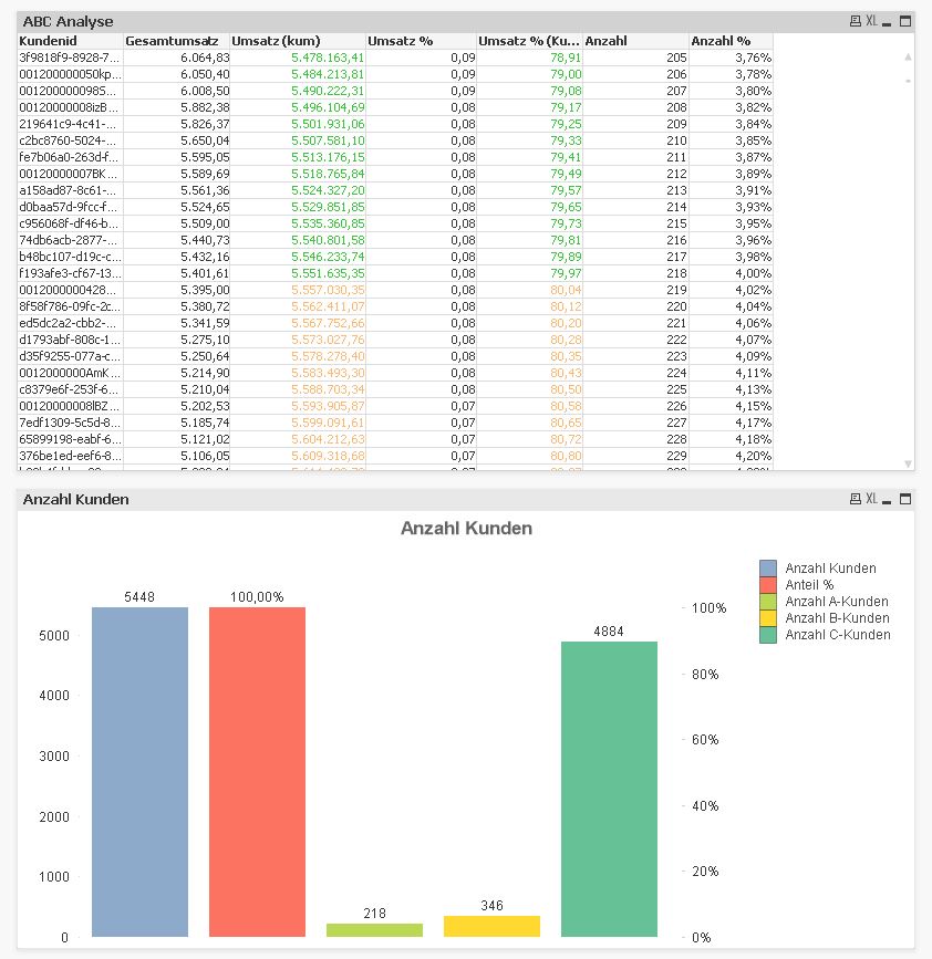
- Tags:
- qlikview_scripting
- Mark as New
- Bookmark
- Subscribe
- Mute
- Subscribe to RSS Feed
- Permalink
- Report Inappropriate Content
Hi
Use FastType Changes into Bar from chartproperties.
- Mark as New
- Bookmark
- Subscribe
- Mute
- Subscribe to RSS Feed
- Permalink
- Report Inappropriate Content
Hi srinivasa1,
Thanks for your answer, but this doesn't work. The upper chart has a dimension, the lower one not.
- Mark as New
- Bookmark
- Subscribe
- Mute
- Subscribe to RSS Feed
- Permalink
- Report Inappropriate Content
Hi,
can you upload your example as qvw (Use advanced editor).
- Ralf
- Mark as New
- Bookmark
- Subscribe
- Mute
- Subscribe to RSS Feed
- Permalink
- Report Inappropriate Content
Sorry, that is not possible because some of the data in this qwv is confidential.
Thank you anyway.
- Mark as New
- Bookmark
- Subscribe
- Mute
- Subscribe to RSS Feed
- Permalink
- Report Inappropriate Content
You could scramble confident fields (via Settings/Document Properties/Scrambling) or load sample data..