Unlock a world of possibilities! Login now and discover the exclusive benefits awaiting you.
Analytics & AI
Forums for Qlik Analytic solutions. Ask questions, join discussions, find solutions, and access documentation and resources.
Data Integration & Quality
Forums for Qlik Data Integration solutions. Ask questions, join discussions, find solutions, and access documentation and resources
Explore Qlik Gallery
Qlik Gallery is meant to encourage Qlikkies everywhere to share their progress – from a first Qlik app – to a favorite Qlik app – and everything in-between.
Qlik Community
Get started on Qlik Community, find How-To documents, and join general non-product related discussions.
Qlik Resources
Direct links to other resources within the Qlik ecosystem. We suggest you bookmark this page.
Qlik Academic Program
Qlik gives qualified university students, educators, and researchers free Qlik software and resources to prepare students for the data-driven workplace.
Recent Blog Posts
-
Qlik Sense Cloud Business - REST Connector
Happy Tuesday everyone! Thanks for joining me in this week’s Qlik Community Design Blog. Today I have the pleasure of introducing our newest guest blo... Show More
Happy Tuesday everyone! Thanks for joining me in this week’s Qlik Community Design Blog. Today I have the pleasure of introducing our newest guest blogger, Denise LaForgia. Denise is a colleague of mine in the Product Marketing group and is a Senior Product Marketing Manager focused on our cloud solutions. In this week's edition she will be covering our new REST connectivity recently made available to Qlik Sense Cloud Business subscribers. On an occasional basis, Denise will share updates on our Qlik Sense Cloud solutions. Take it away Denise.Hi Everyone,
Welcome to this first installment of what I would like to refer as our Qlik Sense Cloud Update blog. I plan on bringing you all the news about the latest updates in Qlik Sense Cloud as well as some tips and tricks to help you get the most out of your Qlik Sense Cloud subscription. Occasionally, I might even ask Mike to embed a supplemental video to go along with the topic as we have done in this article. Please note that I will also provide continuous updates in the Qlik Sense Cloud Community Section along with the occasional appearance here. We have a lot of exciting features rolling-out, so stay tuned!
This week we’re excited to announce the launch of REST Connectivity in Qlik Sense Cloud Business. We know Qlik Sense Cloud Business users are eager for additional data connectivity options in order to automatically import and associate data sets from multiple sources. REST connectivity provides flexibility to a wide range of connectivity options with many of the applications you may be using in your business or project group or team.
So what is REST?
REST stands for Representational State Transfer, a modern and lightweight, secure communications protocol used to transfer data over the web. The Qlik Sense Cloud Business REST connector is designed to load data into a Qlik Sense app from a service that supports REST. It can return data in many formats such as JSON, XML, or CSV. Most web-based applications, social media channels, cloud-based CRM systems and even Google Analytics are REST-enabled, which means you can now build a connection between Qlik Sense Cloud Business and those data sources.
How does it work?
The Qlik Sense Cloud Business REST Connector can be considered a 'generic' connector, meaning it gives you the flexibility to configure a connection with any REST-enabled source you’d like to pull data from. Depending on which application you want to connect to, you can navigate to its developer area and configure that application’s settings to open up a REST connection. Visit this area in our help section to read examples on how to do that for LinkedIn, Twitter, Facebook, and Google Analytics. (included in video) Once you have the query parameters, head to the data manager or data load editor in Qlik Sense Cloud Business to complete the connection.
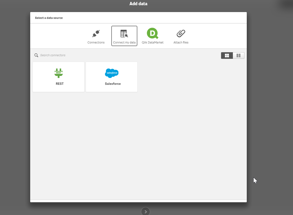
You can also use the REST Connector to load data files directly from public web files, such as DropBox, by simply entering the file’s URL in the REST Connector configurator. The Qlik Sense Cloud Business REST Connector loads the data into your app and automatically parses the information into appropriate table and field structures so that it’s easily used with your application’s data model. And, you can use the scheduled refresh feature in Qlik Sense Cloud Business to ensure your data files from the REST Connector are always up to date.
Ready to learn more - webinars, videos:
Watch Mike's video below or go to the Set Up Select Sources for REST Connectivity page for more information about how to connect to different data sources – including Facebook, Twitter, and Google Analytics - using REST. Mike will also be presenting a Tips and Trick's webinar on REST Connectivity with a LIVE Q&A on May 10th at 1PMEST - you can learn more about it and register HERE.
Regards,
Denise LaForgia
Senior Product Marketing Manager
Qlik
Introduction to the Qlik Sense Cloud Business REST Connector and JSON Schemas
Can't see the video? Download the .mp4 to play on your machine or mobile device.
Additional Qlik Sense Cloud Connectivity Resources
How-To Guides:
- Connect to a REST Data Source
- Set Up Select Sources for REST Connectivity (Facebook, Google Analytics, LinkedIn, Twitter)
- Connect to Dropbox Using REST
How-To Videos:

-
Mutiple hypercubes in an extension
Recently, I needed to make an extension that required multiple hypercubes with dimensions and measures that were able to be set by the user. The follo... Show MoreRecently, I needed to make an extension that required multiple hypercubes with dimensions and measures that were able to be set by the user. The following is the solution I came up with. It could be a bit more generalized, and there's some other things to consider such as making selections, but it's a good starting point and an interesting topic, so I wanted to share with you.
Step 1 - Add the hypercubes to initialProperties
The hypercubes need to be added to initialProperties. They can each be added within their own object in initialProperties, as below.
initialProperties: {
cube1: {
qHyperCubeDef: {
qDimensions: [],
qMeasures: [],
qInitialDataFetch: [{
qWidth: 2,
qHeight: 5000
}]
}
},
cube2: {
qHyperCubeDef: {
qDimensions: [],
qMeasures: [],
qInitialDataFetch: [{
qWidth: 2,
qHeight: 5000
}]
}
}
}
Step 2 - Add ability for user to define dimensions and measures in definition
Now, you'll need to add the ability for users to define the dimensions and measures for each cube into the properties panel.
definition: {
type: "items",
component: "accordion",
items: {
cube1props: {
label: "Cube 1",
type: "items",
items: {
dimension: {
label: "Dimension",
type: "string",
expression: "always",
expressionType: "dimension",
ref: "cube1props.dimension"
},
measure: {
label: "Measure",
type: "string",
expression: "always",
expressionType: "measure",
ref: "cube1props.measure"
},
}
},
cube2props: {
label: "Cube 2",
type: "items",
items: {
dimension: {
label: "Dimension",
type: "string",
expression: "always",
expressionType: "dimension",
ref: "cube2props.dimension"
},
measure: {
label: "Measure",
type: "string",
expression: "always",
expressionType: "measure",
ref: "cube2props.measure"
}
}
}
}
}
Step 3 - Updating the hypercube with user defined properties
This is where the interesting stuff happens. When the user updates one of the properties associated with a hypercube, we need to actually update the hypercube to reflect that. So in the extension's controller, we're going to watch for changes to the props for a cube, and then use the Backend API ApplyPatches method to update the cube.
//Set cube1
$scope.$watchCollection("layout.cube1props", function(props) {
$scope.backendApi.applyPatches([
{
"qPath": "/cube1/qHyperCubeDef/qDimensions",
"qOp": "replace",
"qValue": JSON.stringify([{qDef: {qFieldDefs: [props.dimension]}}])
},
{
"qPath": "/cube1/qHyperCubeDef/qMeasures",
"qOp": "replace",
"qValue": JSON.stringify([{qDef: {qDef: props.measure}}])
}
], false);
});
//Set cube2
$scope.$watchCollection("layout.cube2props", function(props) {
$scope.backendApi.applyPatches([
{
"qPath": "/cube2/qHyperCubeDef/qDimensions",
"qOp": "replace",
"qValue": JSON.stringify([{qDef: {qFieldDefs: [props.dimension]}}])
},
{
"qPath": "/cube2/qHyperCubeDef/qMeasures",
"qOp": "replace",
"qValue": JSON.stringify([{qDef: {qDef: props.measure}}])
}
], false);
});
That'll do it. Now the user can define a dimension and measure for each hypercube, and the hypercube will be patched accordingly. There's still some more to think about and some nice-to-have's with this approach, such as the ability to add variable numbers of dimensions and measures, allowing the user to set other properties of the hypercube, selections, and more. But, I think this pattern is a decent starting point.
Here's a link to a github repo I started around this idea, just in case you try this out and have anything cool to add.
-
Getting to Know Qlik GeoAnalytics
Hello Qlik Community! In my last blog entry Introducing Qlik GeoAnalytics - I um...well....introduced our latest product offering... Qlik GeoAnalyitcs... Show More
Hello Qlik Community!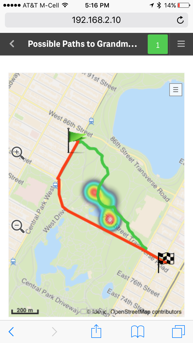 In my last blog entry Introducing Qlik GeoAnalytics - I um...well....introduced our latest product offering... Qlik GeoAnalyitcs.
  I also included a promo video showcasing its various capabilities. (In case you have not seen it, I suggest you start with that first.)
I've been working with Qlik GeoAnalytics for a few weeks now and I am really enjoying it. I'm gathering tremendous knowledge (thanks to the fantastic Idevio team who is now part of the Qlik family) and compiling it so I can share it with you so you can get started quickly. You can see some of the efforts in this new video index which provides a few primers to help you get started with Qlik GeoAnalytics for both Qlik Sense and QlikView. If you have Qlik GeoAnalytics related questions you can also start a discussion in our new section on the Qlik Sense forums: Qlik GeoAnalytics Community.
Over the next few weeks I'll be presenting other topics in a series of blogs and community posts that will help you learn more about Qlik GeoAnalytics, presenting its various capabilities. To that point, I recently discovered the Qlik GeoAnalytics Connector which can grab data from a variety of external geo-data services to return route information, distance, time and spatial relationships and associate them with your 'decision making data'. Look at this fun example using Qlik GeoAnalytics Line, Bubble (flags), and Heatmap layers to represent long and short travel routes, along with a fictional "area of concern" depicted by the heatmap. With Qlik Sense small devices mode it even fits and reacts perfectly on my iPhone too, I did not have to create a separate mobile-version of the app....."Oh, no - I don't want to take that shortcut through Central Park, there are way too many street performers along that route!!" ...but more on that later. What I love the most about Qlik GeoAnalytics, it's more than just plotting simple dots on a map, it moves Qlik beyond visualization and supports a broad range of advanced geoanalytic use cases. I hope you will see the value and benefits it has to offer and that you have as much fun with it as I.
To kick of the knowledge share, in this below video I show you how to create a very simple Area map, which can also be known as a boundary or choropleth map, that you can drill-down into.
If you cannot see the video, or you would like the sample data, you can find both here: Qlik GeoAnalytics - Creating a Drill-down Area Map
Let me know what you think and I looking forward to joining the conversation on the Qlik GeoAnalytics Community.
Regards,
Michael Tarallo (@mtarallo) | Twitter
Senior Marketing Manager
Qlik
-
Big Data and Your Smart Phone
How convenient would it be to have a smart superphone that can carry out tasks autonomously — even while offline? We’re not just talking about random ... Show More
How convenient would it be to have a smart superphone that can carry out tasks autonomously — even while offline? We’re not just talking about random tasks like updating email or displaying social alerts. We’re talking about full-blown actions like making calls, sending messages and more.
The idea sounds pretty crazy, right? Believe it or not, it may soon be a reality.
To read more visit the article published by Inside Big Data http://insidebigdata.com/2017/03/28/big-data-ai-make-phone-scary-smart/

-
Registering extensions on the fly
Did you know that you can register extensions on the fly in mashups? That's right, you can register an extension in a mashup to use in that mashup, re... Show MoreDid you know that you can register extensions on the fly in mashups? That's right, you can register an extension in a mashup to use in that mashup, regardless of whether the extension is already loaded into your Qlik Sense environment. That means you can distribute your mashup with any extensions it uses as one package, and you have total control of the extension version your mashup is using.
Doing it is pretty straightforward. You just need to load the extension code into your mashup, then register it. It'll look something like this.
require(["js/qlik"], function (qlik) { //load qlik module

  require(["path-to-my-extension/my-extension.js"], function(myExtension) { //load extension entry point
   qlik.registerExtension( 'my-extension', myExtension ); //register extension
    //do stuff with extension
  });

});
Notice that I loaded the extension entry point after loading the
qlikmodule. That's because many extensions use theqlikmodule, and if your extension loads theqlikmodule but you try to load your extension code before loading theqlikmodule in your mashup, you'll end up with errors. So better just to load the extension after theqlikmodule has been loaded in your mashup.Once the extension has been registered you can do stuff with it, like use it with the Visualization API. An interesting use case is if you are loading objects that use an extension from an app into your mashup. The version of the extension you register with the mashup will override the extension loaded into your Qlik Sense environment, which can be really useful.
You can read more about it and see a few examples here Creating extensions on the fly.
-
Get Certified, Get Ahead
Data and big data analytics are the foundation of business, and as such, data literacy and analytic skills are in high demand. Those who successfully ... Show More
Data and big data analytics are the foundation of business, and as such, data literacy and analytic skills are in high demand. Those who successfully capitalize on the vast amounts of data available to businesses are proving to be critical for today’s most successful organizations. According to the Bureau of Labor Statistics, both Database Administration and Information Research Scientist roles are projected to increase by 11% between 2014-2024. The discovery, curation, and dissemination of data by highly-trained experts creates smarter, more successful organizations.
To read the full article visit
http://global.qlik.com/us/blog/posts/kevin-hanegan/get-certified-get-ahead
-
All About Selections
The ability to make selections and see what data is associated is one of the powerful capabilities of Qlik Sense and QlikView. Selections allow users... Show MoreThe ability to make selections and see what data is associated is one of the powerful capabilities of Qlik Sense and QlikView. Selections allow users to explore the data in an app and to answer their specific questions at any given time. In this blog, I will discuss the following selection options you may find in a selection pop-up window (shown below): Clear selection, Select all, Select possible, Select alternative and Select excluded.
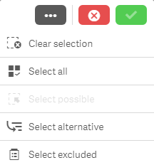
Clear selection
Let’s start with the Clear selection option. As you may expect, this will clear all selections that have been made in an app excluding locked selections. Locked selections are selections that cannot be cleared or changed. They are used when the user wants to protect a selection.
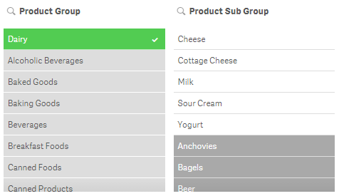
Select all
Select all will select all values in a field making them green. If there are excluded values in the field when you select all, then they will become selected excluded – these items will remain gray but they will get a check mark next to them indicating that they are also selected. In the image below, Dairy was selected in the Product Group field and Cheese was selected in the Product Sub Group field. All the other values in the Product Group field are excluded and therefore gray. Once all values are selected in the Product Group field, the excluded items stay gray but now have a check mark to indicate they are selected excluded.
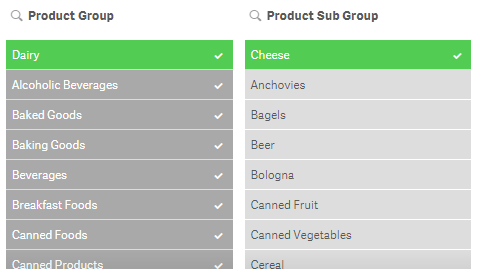
If the selection that excludes some of the values (which is Cheese in this example) is removed then they will all become selected and turn green.
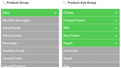
Select possible
To explain the select possible selection, let’s first define possible values. Possible values are values that are not selected and not excluded by a selection. They appear with a white background. For example, all values in a filter pane will be possible if no selections have been made. In the image below, Dairy is selected in the Product Group field and the Product Sub Group has 5 possible values (the first 5 values in the list). The possible values are product sub group items that are associated with the Dairy selection.
If select possible is applied to the Product Sub Group, you will get the following results:
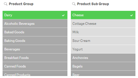
Select alternative
What are alternative values? Alternative values (light gray) are values that would have been possible (white) if a selection was not made in the field. We have already seen an example of that in the image below. In this example, Dairy was selected first and then Cheese was selected. Before Cheese was selected, the first five values in the Product Sub Group field were white (possible values). After Cheese was selected, Cheese became selected (green) and the other four values became alternative (light gray).
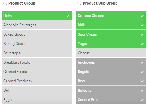
Select excluded
Select excluded will select all the non-selected values in a field. If Dairy is selected in the Product Group field, then select excluded will select all values that were excluded (gray) and will make them green and the Dairy selection will become an alternative value (light gray). If Dairy (Product Group) and Cheese (Product Sub Group) were selected and select excluded was selected in the Product Sub Group field (see image below), then the selected value Cheese becomes an alternative value (light gray), the possible values become green and selected and the excluded values become selected excluded (gray with a check mark).
The selection options reviewed in this blog can be used not only in filter panes and the selections tool but they can also be used in charts. This gives the user the ability to drill down in the data and see what data is associated and excluded by selections. Selections are very powerful so it is important to know all your options and how you can make selections to analyze your data. The example images used in this blog are based on the data in the Consumer Goods Sales demo. Feel free to use the selection tool in the app to test out selections or log in to qlik.com so you can add your own filter panes to the demo app.
Thanks,
Jennell
-
Automatic Number Interpretation
I have in several previous blog posts written about the importance to interpret dates and numbers correctly e.g. in Why don’t my dates work?. These ... Show MoreI have in several previous blog posts written about the importance to interpret dates and numbers correctly e.g. in Why don’t my dates work?. These posts have emphasized the use of interpretation functions in the script, e.g. Date#().
But most of the time, you don’t need any interpretation functions, since there is an automatic interpretation that kicks in before that.
So, how does that work?
In most cases when QlikView encounters a string, it tries to interpret the string as a number. It happens in the script when field values are loaded; it happens when strings are used in where-clauses, or in formulae in GUI objects, or as function parameters. This is a good thing – QlikView would otherwise not be able to interpret dates or decimal numbers in these situations.
QlikView needs an interpretation algorithm since it can mix data from different sources, some typed, some not. For example, when you load a date from a text file, it is always a string: there are no data types in text files – it is all text. But when you want to link this field to date from a database, which usually is a typed field, you would run into problems unless you have a good interpretation algorithm.
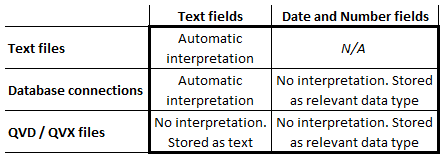
For loaded fields, QlikView uses the automatic interpretation when appropriate (See table: In a text file, all fields are text - also the ones with dates and timestamps.) QlikView does not use any automatic interpretation for QVD or QVX files, since the interpretation already is done. It was done when these files were created.
The logic for the interpretation is straightforward: QlikView compares the encountered string with the information defined in the environment variables for numbers and dates in the beginning of the script. In addition, QlikView will also test for a number with decimal point and for a date with the ISO date format.
If a match is found, the field value is stored in a dual format (see Data Types in QlikView) using the string as format. If no match is found, the field value is stored as text.
An example: A where-clause in the script:
Where Date > '2013-01-01' will make a correct comparison
The field Date is a dual that is compared to a string. QlikView automatically interprets the string on the right hand side and makes a correct numeric date comparison. QlikView does not (at this stage) interpret the content of the field on the left hand side of the comparison. The interpretation should already have been done.
A second example: The IsNum() function
IsNum('2013-01-01') will evaluate as True
IsNum('2013-01-32') will evaluate as False since the 32:nd doesn't existIn both cases, strings are used as parameters. The first will be considered a number, since it can be interpreted as a date, but the second will not.
A third example: String concatenation
Month(Year & '-' & Month & '-' & Day) will recognize correct dates and return the dual month value.
Here the fields Year, Month and Day are concatenated with delimiters to form a valid date format. Since the Month() function expects a number (a date), the automatic number interpretation kicks in before the Month() function is evaluated, and the date is recognized.
A final example: The Dual() function
Dual('Googol - A large number', '1E100') will evaluate to a very large number
Here the second parameter of Dual() is a string, but QlikView expects a number. Hence: automatic interpretation. Here, you can see that scientific notation is automatically interpreted. This sometimes causes problems, since strings – that really are strings – in some cases get interpreted as numbers. In such cases you need to wrap the field in a text function.
With this, I hope that the QlikView number handling is a little clearer.
Further reading related to this topic:

-
BiPartite Extension
One interesting Qlik Sense extension that we have successfully used, is the BiPartite one. We have used it in couple of mashups like the UK Migration ... Show MoreOne interesting Qlik Sense extension that we have successfully used, is the BiPartite one. We have used it in couple of mashups like the UK Migration http://webapps.qlik.com/telegraph/uk-migration/index.html.
I like this one since you have a visual representation of all the values, selected and not and there is a nice animation moving from one dimension value to the next.
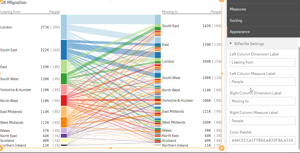
This is a responsive extension with minimum view of 320px. You add One dimension for the left column and one for the right and then one measure for the values in each column.
You can write your own labels for each column and add your custom coloring palette.
That's it! Give it a try
Branch : http://branch.qlik.com/#!/project/58b820c55efd3b8f0b6743ce
Git: https://github.com/yianni-ververis/SenseUI-BiPartite
-
Scrambling Data
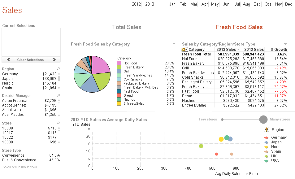
When building demos, I am often required to scramble the data. QlikView has a scrambling feature that allows selected fields to be scrambled in some ... Show MoreWhen building demos, I am often required to scramble the data. QlikView has a scrambling feature that allows selected fields to be scrambled in some random fashion. I find this to be a quick and easy way to scramble data but when I have a lot of fields to scramble, I think it can make the application difficult to follow because QlikView’s scrambled data is not readable and does not appear realistic. For example, let’s see what the sheet below looks like after it has been scrambled.
Before scrambling
After Scrambling
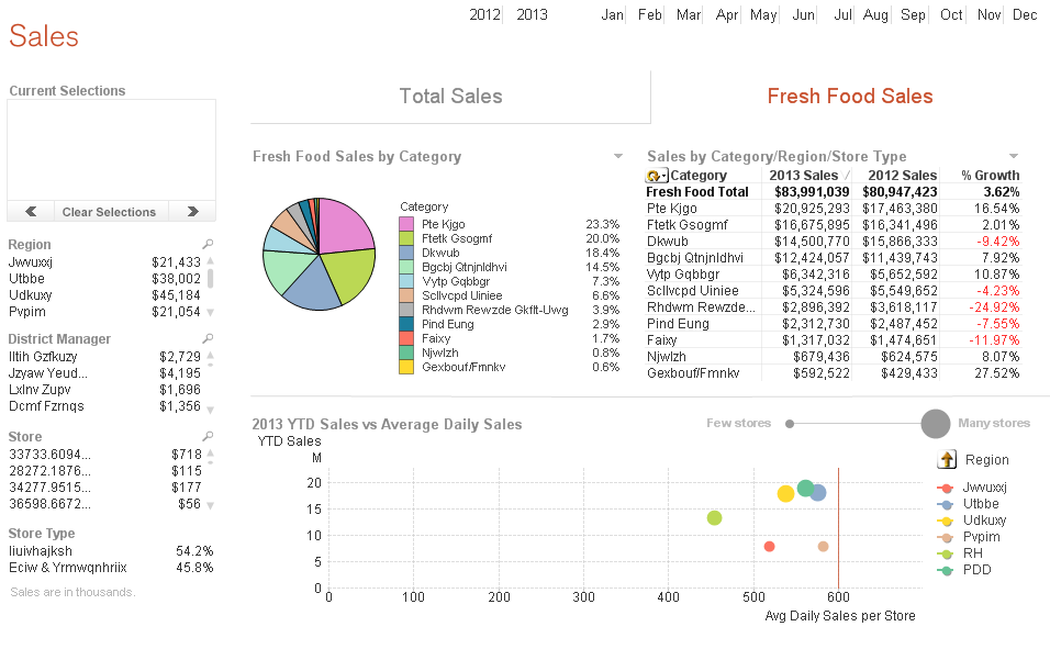
At a glance, it may be hard to comprehend what you are looking at because names do not look like names and regions do not look like regions, etc. The scrambled data is not readable so it is harder to make sense of what you are looking at.
An alternative to using QlikView’s scrambling feature is to use mapping and modifiers. I have used modifiers as seen in the example below to change numeric data in my script so that sales figures are not recognizable.
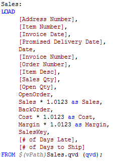
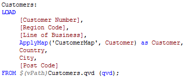
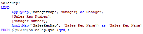
Mapping can be used to change the text data to values that are readable and realistic to the user. For instance, if I want to change the names in the Manager, Sales Rep and Customer fields I can load mapping tables that store the original name and the new name as seen below.
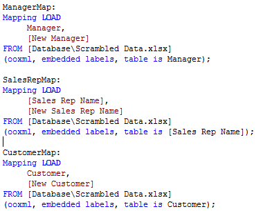
Then I can use ApplyMap() on the fields that need to be changed.
After a reload, the new “scrambled” data is being used in the visualizations. Note: If you plan to distribute the application, I recommend removing the scrambled script or creating QVDs and loading from these. You do not want the user to be able to re-engineer your scrambling and determine the original values.
Check out my technical brief on this topic for more detailed information. Have fun scrambling!
Jennell
-
Responsive Design Tips
The responsive design of Qlik Sense allows apps to be developed once and deployed anywhere. This makes the developer’s life easier but there are still... Show MoreThe responsive design of Qlik Sense allows apps to be developed once and deployed anywhere. This makes the developer’s life easier but there are still a couple of things to keep in mind when you are building your app.
Object Positioning – On a small device like a phone, Qlik Sense will redisplay the page by ordering objects in a single column. The order of displayed objects is determined by a top to bottom, left to right fashion. Meaning that the object that sits in the top left corner of the full dashboard will be displayed first, next the object to the right of the first object will be displayed. So if you are going to build out a dashboard, it makes sense to build it horizontally and not vertically.
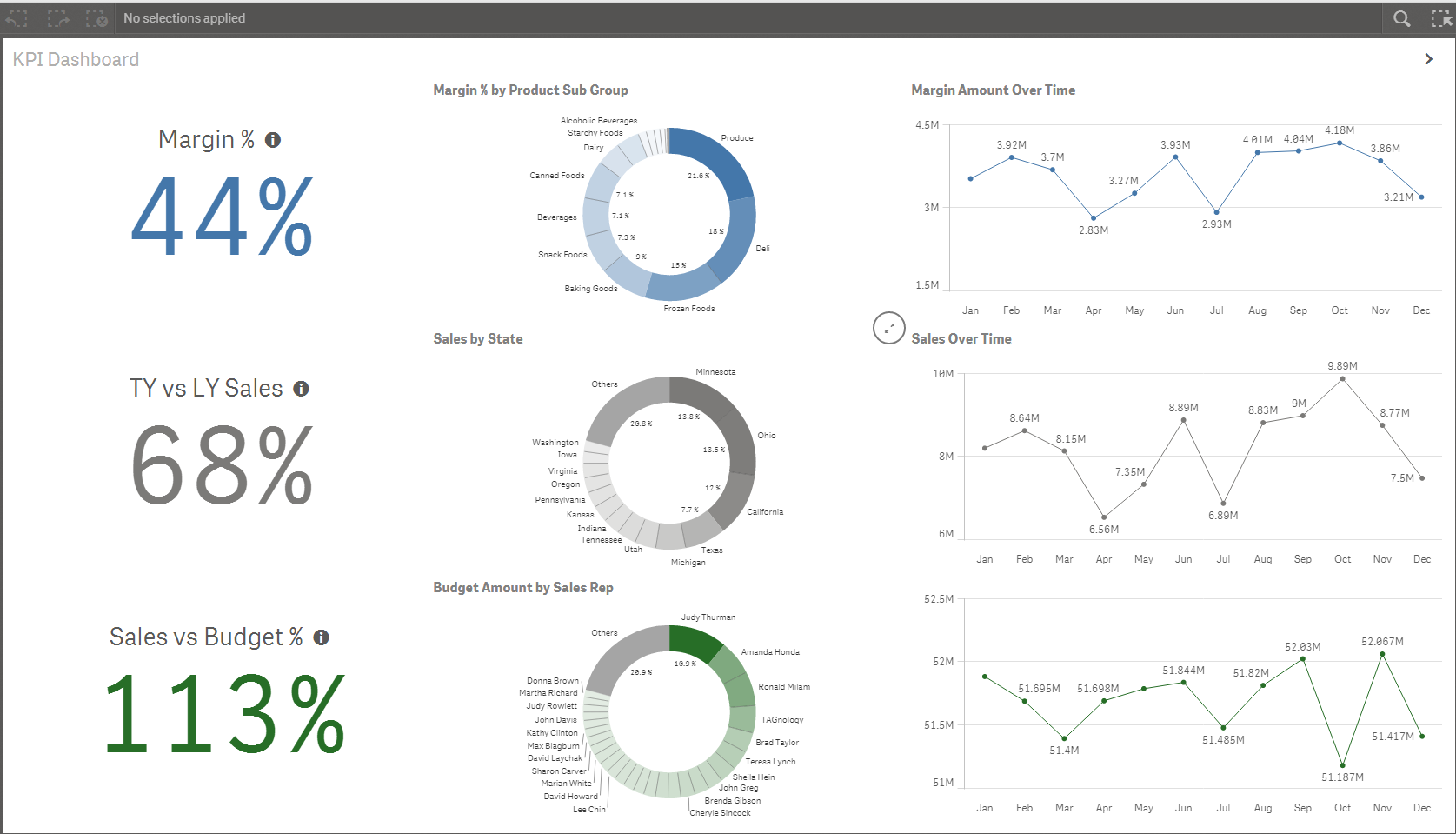
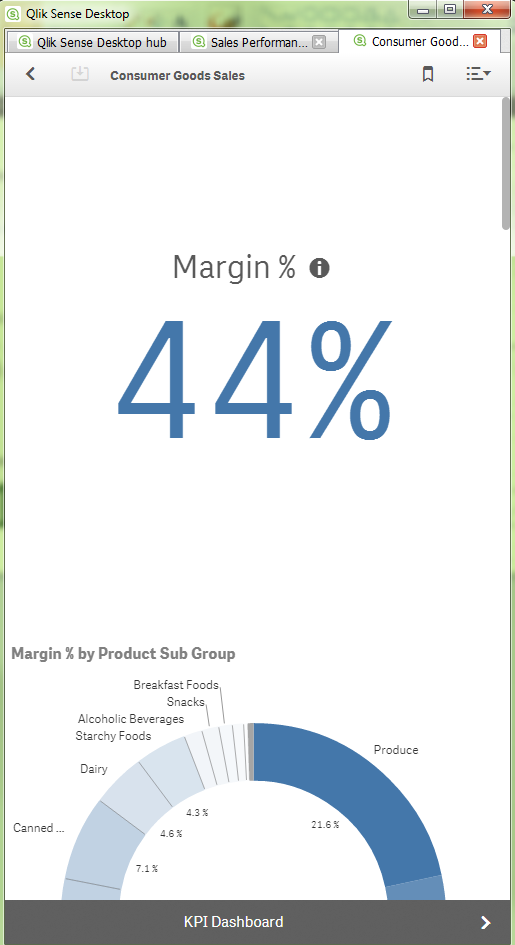
Chart Titles and Subtitles - Using chart titles and subtitles ensures that objects can be interpreted by the users who are looking at your chart as a single object.
Text and Image Objects - I would recommend that you use text and image objects wisely. In small device mode, images and text can look out of place as they shift positions to accommodate the viewing area of a small device.

So if you keep small devices in mind when you are building your app, you can be sure that all users will have the best user experience possible. Happy Qliking!

-
ColorStyler: extension and mashup
It’s been a while since the last time we covered an extension in this blog, this time I would like to introduce ColorStyler by Johannes Sunden jsn .Th... Show MoreIt’s been a while since the last time we covered an extension in this blog, this time I would like to introduce ColorStyler by Johannes Sunden jsn .
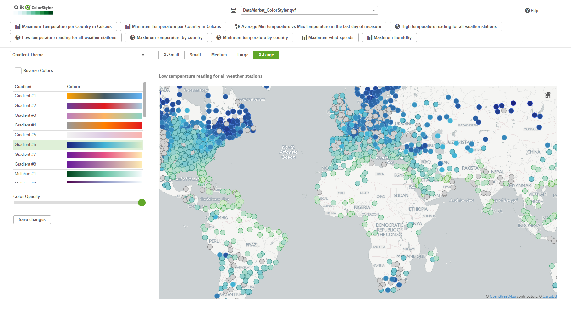
The reason I found ColorStyler very special, besides its obvious value, is due the way this extension was built. It’s half an extension half a mashup or should I rephrase it as a “mashup that extends your Qlik Sense app”.
ColorStyler as you might have figured out by now is a coloring extension, it will let you preview and apply different color schemes to your charts, no coding is required, it will take care of the not-so-easy task of creating a ColorMix expression for you.
Once installed in your computer, ColorStyler sets up a mashup that will let you interact with the available apps and apply some color options to your charts.
To start working with ColorStyler you must pick an app from a list of your available Qlik Sense apps, then you will be presented with a list of available visualizations (as of today it only loads Master Items), and finally ColorStyler will offer you four main color categories to pick from.
I find very useful the gradient options, and especially gradient themes, it’s a good selection of nice and safe colors palettes. If you are not happy with the proposed themes you can always create your own by defining the gradient colors.
It’s quite interesting to see the chart update on real-time and compare how different color alternatives affect to our ability to read the visualization. Once you’re happy with your color selection you just need to “Save Changes” to make it persistent not only in the mashup but in the actual Qlik Sense app.
As I mentioned before,ColorStyler will only let you interact with Master Visualizations from your Qlik Master Items library so you must have at least one master object in your app to be able to use this tool. After applying color to your master item, you can edit it as normal in your Qlik Sense client and copy the generated expression (ColorMix1 or ColorMix2) and then apply it to any other visualization.
Note: I would recommend to be extra careful when applying colors to charts by dimension, it’s very important to use color with care, just remember color in data visualization should be used to convey information, and not as decoration. Also, is very important to make sure that a dimension chosen color will be applied consistently across your app, avoiding situations where the same dimension value has two different colors in two charts.
For latest version and technical questions please check Qlik Branch project page: Qlik Branch
If you prefer to watch a video instead:

-
Recipe for a Memory Statistics analysis
In a previous blog post I described the internal data tables and the symbol tables. (See “Symbol Tables and Bit-Stuffed Pointers”). These tables const... Show MoreIn a previous blog post I described the internal data tables and the symbol tables. (See “Symbol Tables and Bit-Stuffed Pointers”). These tables constitute the QlikView internal data model. Then there are the state space vectors that keep track of the user’s selections (See “Colors, states and state vectors”).
In addition to these, there are other structures used to calculate the sheet objects. Sometimes a sheet object can use quite a lot of memory, e.g., a chart with many dimensions.
Often you need to ask yourself – “What in this application uses a lot of memory? What can I improve or optimize?” Is it the data model itself or is it the symbol tables? Or is there a chart that uses a lot of memory?”
To get an answer to these questions, you can use the memory statistics tool. Here follows a basic recipe for a memory analysis:
- Create a memory statistics file from the application you want to analyze (Document Properties -> General -> Memory Statistics). This will export some memory statistics data to a tab separated file.
- Create a new QlikView document in which you load the created file.
- Create list boxes for the fields Class, Type, and Subtype.
To understand what these fields display, see the table below.
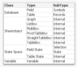
The Class field tells you whether the memory used is part of the internal database (data tables and symbol tables), the state space (the selections), the sheet objects (volatile structures to calculate the sheet objects), or a variable. The Type and SubType fields give you additional information about where memory is used.
- Create a drill-down group of the fields Class, Type, and Subtype named ">Type".
- Create a stacked bar chart with Id as first dimension, >Type as second dimension, and Sum(Bytes) as expression.
- Sort the chart descending according to y-value.
- Restrict the chart to show only the first 10 bars.
You should now have a graph similar to the one below.
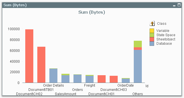
In this you can see which objects, tables, or fields are consuming memory in your application. The bars to the left are the ones that use a lot.
Now you can start to optimize!
If most of your memory consumption is made by sheet objects, look at them and see if there is anything you can do. Does this chart have too many dimensions? Is the expression too complex? Do I really need to sort this list box with a very large number of distinct values? Do I need to show it at all?
If most of your memory consumption is due to database symbols, look at whether you can use the autonumber function to make these symbol tables use less memory.
If most of your memory consumption is made by database tables, you might want to remove columns, or aggregate data. Or maybe realize that optimization isn’t worth wile…
One small word of warning: The numbers in the memory statistics analysis should not be trusted too literally – they do not always describe the situation completely. For instance, if a calculation is cached, it will not show up in the memory usage. Further, if an object has not been opened yet, its memory consumption is unknown and will display as zero. But in spite of these shortcomings, the memory statistics function will most of the time help you find where memory is used.
-
Qlik Virtual Event- The Year of Data Literacy
Combating data ignorance is essential for any business user. Learn to become data literate at our 2017 Qlik virtual event: The Year of Data Literacy.... Show More
Combating data ignorance is essential for any business user. Learn to become data literate at our 2017 Qlik virtual event: The Year of Data Literacy. It’s going to be a great event!
Date: March 30th
Time: 12:00pm est, USA
Register your place for the Qlik Virtual Event – 2017: The year of Data Literacy to:
- Spread data literacy throughout your organization. Unleash the game-changing possibilities hidden within your data.
- Connect and learn. Network with Qlik customers, partners and subject-matter experts; discuss industry- and role-specific solutions.
- See Qlik’s new products. Discover the very latest on Qlik’s product strategy and latest releases.
Highlights:
- Customer success stories: Hear how Forrester, KitchenAid, and many more customers harnessed visual analytics for a competitive advantage
- How-to sessions: See a practical guide for data visualization from industry experts
- Access to virtual booths and interactive zones: Learn about the latest analytics technology and industry—and role-specific solutions—and live chat with peers and customers
To register visit Qlik Virtual Event - 2017: The Year of Data Literacy | Registration
The event start
-
Dual & Exists – Useful Functions
I find that the Dual and Exists functions are useful functions that I often use in my script. The Dual function allows me to represent a string field... Show MoreI find that the Dual and Exists functions are useful functions that I often use in my script. The Dual function allows me to represent a string field numerically, making it ideal for sorting purposes. The Exists function, used in conjunction with the Where clause, allows me to only load related data into my data model.
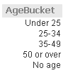
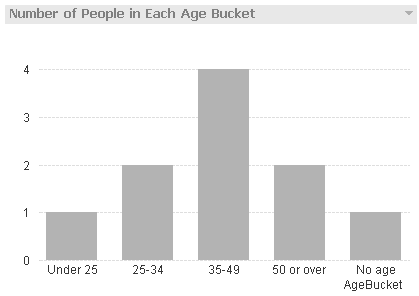
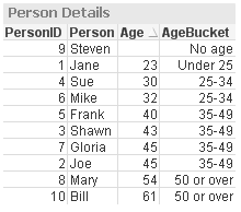
The Dual function can be used in the script and chart expressions. I tend to use it in the script when I need the ability to sort a string field numerically. For example, in the script snippet below, I created age buckets and I want to be able to sort them in a list box and a chart so I used the Dual function to give each bucket a numeric value.
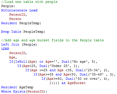
By using the Dual function, I am able to sort the AgeBucket list box and the AgeBucket dimension in my chart numerically.
The Exists function is used to determine whether a “specific field value exists in a specified field of the data loaded so far.” I often use this with the Where clause to load data only when the specified data has already been loaded in the data model. For example, in the script below the Age and AgeBucket fields are loaded only if the PersonID has already been loaded in the data model.
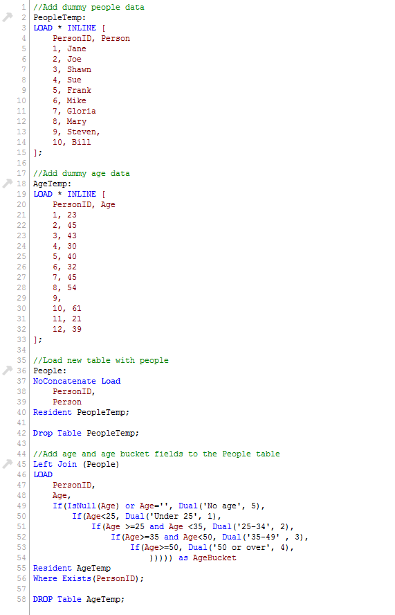
Notice in the AgeTemp table that there are ages listed for PersonID 11 and 12 but since those IDs were not loaded in the data model (in the People table), they are excluded by the Where Exists(PersonID) clause. The table below shows the data that was loaded.
I often blog about functions used in QlikView but I find the Dual and Exists to be two functions that I use often so that I can present data in a desired sort order and can keep my data model free of unassociated data. If you would like to learn more or see an example application, check out my technical brief.
Thanks,
Jennell
-
2017 College Basketball Championship
Check out the Qlik Sense mashup to pick your bracket and analyze team and player stats!http://collegebasketball.qlik.com/
-
Counter Aggregation Functions
Today I am going to blog about five Counter Aggregation Functions that can be used in Qlik Sense and QlikView in both charts expressions and the scrip... Show MoreToday I am going to blog about five Counter Aggregation Functions that can be used in Qlik Sense and QlikView in both charts expressions and the script.
- Count()
- MissingCount()
- NullCount()
- NumericCount()
- TextCount()
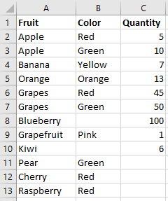
Before taking a closer look at how we can use each of these functions, let’s first look at the data set I will use for the examples. Below is the Excel data I will load. It is a simple list of fruits, their color and quantity.
1. Count()
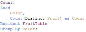
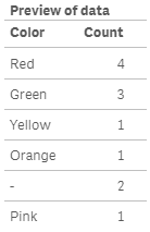
The Count function is probably one of the most common functions that can be used. In a chart, Count() aggregates the number of values in each chart dimension. In the script, Count() returns the number of values aggregated in the expression as defined by a group by clause.
Expression for a chart: Count(Distinct Fruit)
In the script below, Count() will return color and the number of fruits that have that color.
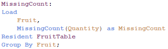
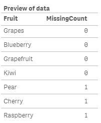
2. MissingCount()
In a chart, the MissingCount() function will aggregate the number of missing values in each chart dimension. In the script, it will return the number of missing values aggregated in the expression, as defined by the group by clause.
Expression for a chart: MissingCount(Quantity)
In the script below, MissingCount() will return 1 if the Quantity field is missing a value.
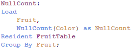
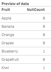
3. NullCount()
NullCount() will return the number of null values in each chart dimension in a chart. In the script, NullCount() returns the number of null values aggregated in the expression, as defined by a group by clause.
Expression for a chart: NullCount(Color)
In the script below, NullCount() returns 1 if the Color field is null.
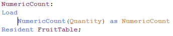
4. NumericCount()
In a chart, NumericCount() aggregates the number of numeric values by each chart dimension and in the script, NumericCount() returns the number of numeric values found in the expression, as defined by a group by clause.
Expression for a chart: NumericCount(Quantity)
In the script below, the total Quantity fields that have numeric data is returned.
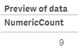
5. TextCount()
In a chart, TextCount() aggregates the number of non-numeric values by each chart dimension and in the script, TexCount() returns the number of non-numeric values found in the expression, as defined by a group by clause.
Expression for a chart: TextCount(Color)
In the script below, TextCount() will return the total number of text values in the Fruit field.
Here is a table with all these functions used in a chart:
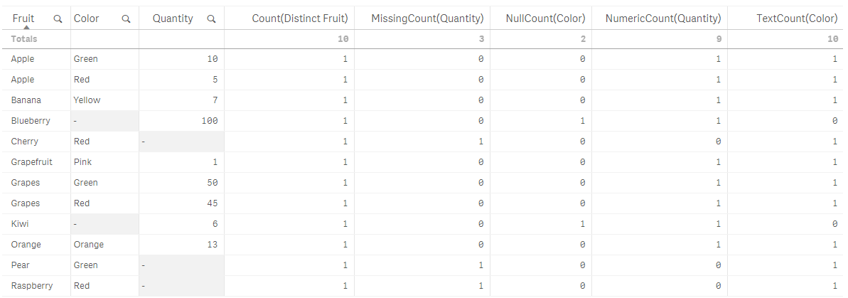
While I have not used all of the counter aggregation functions in my work with QlikView and Qlik Sense, I think they can be valuable when auditing and checking the health of your data. They can highlight gaps in the data that should not be there and point out data type issues in the data. I would be interested in hearing how you use these functions in your apps.
Thanks,
Jennell
-
Higher Education: You’re Not Keeping Up
What does student debt, a workforce talent squeeze, & disruptive innovation have in common? We live in a time where the business world is rapidly chan... Show More
What does student debt, a workforce talent squeeze, & disruptive innovation have in common?
We live in a time where the business world is rapidly changing. The knowledge-driven and information-centered economy is forcing businesses to innovate and come up with new business models and capabilities. These technological and disruptive innovations are happening all over the business world, resulting in the ability to detect these changes and adapt to seize market opportunity being crucial to the success of a company. At the same time, higher education has yet to follow the technological disruptions and globalization to change how they educate students to prepare them for today’s workplace.
To read more visit Higher Education: You’re Not Keeping Up | Qlik
-
Field Functions
There are several field functions that can be used in Qlik Sense and QlikView charts to return information about a field and/or selections in an app. ... Show MoreThere are several field functions that can be used in Qlik Sense and QlikView charts to return information about a field and/or selections in an app. They are:
- GetSelectedCount
- GetAlternativeCount
- GetPossibleCount
- GetExcludedCount
- GetCurrentSelections
- GetFieldSelections
In this blog, let’s take a look at how each of these functions can be used in your chart expressions.
GetSelectedCount
getselectedcount(field_name [, include_excluded])
This function returns the number of selected (green) values in a field.
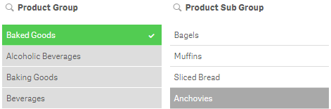
The GetSelectedCount of the Product Group field below will return 3 for the 3 selected (green) items.
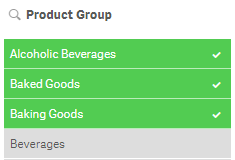
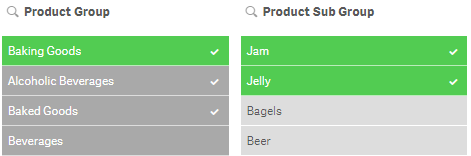
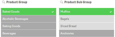
If the optional include_excluded parameter is set to True(), the returned count will include selected values which are currently being excluded by selections in other fields. If it is False() or omitted, then these values will not be included in the count. In the image below, the selection of Jam and Jelly in the Product Sub Group field has excluded Alcoholic Beverages and Baked Goods so they are now gray instead of green. The GetSelectedCount function for the Product Group will now return 1. If the include_excluded parameter is set to True(), then it will return 3, counting the excluded selections.
GetSelectedCount([Product Group]) = 1
GetSelectedCount([Product Group], True()) = 3
GetAlternativeCount
getalternativecount(field_name)
This function returns the number of alternative (light gray) values in a field.
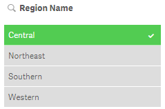
The GetAlternativeCount of the Region Name field below will return 3 for the light gray items in the field.
GetPossibleCount
getpossiblecount(field_name)
This function returns the number of possible values in the field. If the field includes selections, then the selected items (green) are counted. Otherwise associated (white) values are counted.
In the image below, the GetPossibleCount function for the Product Sub Group field will return 3 for the 3 associated (white) items in the list.
If I were to select Muffins in the Product Sub Group field (see image below), then the GetPossibleCount function will return 1 for the selected item.
GetExcludedCount
getexcludedcount(field_name)
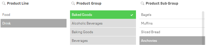
This function returns the number of excluded (dark gray) values in the field.
In the image below, GetExcludedCount of the Product Line field would return 1 for Drink which is dark gray.
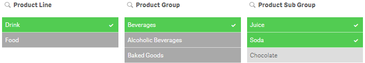
GetCurrentSelections
getcurrentselections([record_sep [,tag_sep [,value_sep [,max_values]]]])
Unlike the other functions we have looked at so far, this function returns a string containing the current selections in an app. The optional tag_sep parameter allows you to select the separator between the field name tag and the field values. The default is a colon (:). The optional value_sep parameter allows you to select the separator between the field values. The default is a comma (,). The optional max_values parameter allows you to set the maximum number of field values that can be individually listed. The default is 6 and anything more than that is shown as 'x of y values'.
In the image below the GetCurrentSelections function will return the following:
Product Group: Beverages
Product Line: Drink
Product Sub Group: Juice, Soda
GetFieldSelections
getfieldselections(field_name [, value_sep [, max_values]])
This function also returns a string with the current selections for a field. The optional value_sep parameter allows you to select the separator between the field values. The default is a comma (,). The optional max_values parameter allows you to set the maximum number of field values that can be individually listed. The default is 6 and anything more than that is shown as 'x of y values'.
In the Product Sub Group filter pane above, Juice, Soda will be returned by the GetFieldSelections for the Product Sub Group field.
Field functions provide valuable information about selections in a field that can be used in an app to display information or help determine if another action needs to take place. For instance, if more than one field value is selected, do something. Try using a field function next time you are building an app to see how they work.
Thanks,
Jennell
-
Qliks Facebook Connector- Coke vs Pepsi
The age old question has always been, are you a Coke or Pepsi fan? Have you ever wondered what company really is more popular? Qlik Sense can fina... Show More
The age old question has always been, are you a Coke or Pepsi fan? Have you ever wondered what company really is more popular? Qlik Sense can finally help you solve the mystery! Using Qlik Web Connectors, Qlik was able to extract publically available data from Facebook to make this fun, interactive dashboard.
- Fun fact- The winner received 64 million more likes on their page!
To find out who won, visit Qlik Demos


