Unlock a world of possibilities! Login now and discover the exclusive benefits awaiting you.
- Qlik Community
- :
- Forums
- :
- Archive
- :
- Archived Groups
- :
- QlikView Epic Integration Example - Clinical Pathw...
- Subscribe to RSS Feed
- Mark Topic as New
- Mark Topic as Read
- Float this Topic for Current User
- Bookmark
- Subscribe
- Mute
- Printer Friendly Page
- Mark as New
- Bookmark
- Subscribe
- Mute
- Subscribe to RSS Feed
- Permalink
- Report Inappropriate Content
QlikView Epic Integration Example - Clinical Pathways.qvw
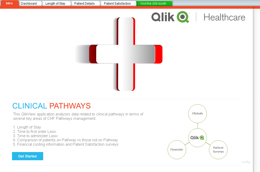
Experience QlikView within Epic with the Clinical Pathways App
This demonstration from HIMSS15 will allow you to experience how QlikView can and is being used by customers to perform visual data discoveries and take action upon results within Epic. In particular, the QlikView application is centered on Clinical Pathways for patients with CHF (congestive heart failure). Data is brought together from various areas of the EHR, including clinicals and financials, and also from an external data source regarding patient satisfaction surveys. This highlights a powerful aspect of QlikView in combining data from disparate sources to provide a holistic view of information.
Using the Clinical Pathways App
The prevalence of congestive heart failure (CHF) in the United States is approximately 4 million, with associated annual health care expenditures exceeding $8 billion. Clinical pathways for CHF have been developed, but they have not been rigorously evaluated regarding efficacy and improvement in the quality of care. This QlikView app seeks to calculate the effects of such CHF clinical pathways. Understanding that clinical pathways often involve rigorous guidelines and increased resources, we can use this application to clearly see the impact on Length of Stay (LOS), overall costs, and interestingly patient satisfaction. Using the integrations with Epic available, we will launch a patient’s chart or snapshot directly from QlikView.
Launch QlikView Clinical Pathways app from Radar. Note how Qlik opens within Hyperspace and doesn’t require another browser to be opened. This is QlikView embedded in Epic.
Intro – read the overview and highlight the fact that data from 3 very different sources is combined in the app: clinical, financial, and patient surveys (pat sat). Click Get Started button to move to Dashboard sheet.
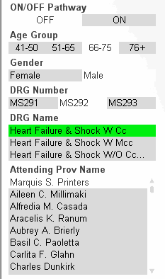
Dashboard – as a care coordinator or hospital administrator, I can use the Dashboard to analyze the effectiveness of the pathways program. Looking at pathways KPIs, I can quickly see if the patients are faring better or worse on when on Pathways, such as Door to First Order Placed, Order Time to Administration Time for Lasix, Length of Stay, Severity of Illness, Correct Primary Discharge Diagnosis, and Average Cost. Click on the different DRGs to cycle through and see the differences between patients on/off pathways for those groups of diagnoses. Leave just the first DRG highlighted in Green and then move to the Length of Stay sheet.
Length of Stay – Here I can quickly compare the LOS (x-axis) and Total Charges (y-axis) for patients on and off pathways. Note how the “blue On-Pathways” patients have generally lower costs and shorter lengths of stay. I want to use this visualization to find outliers and perhaps figure out which patients make sense to add enroll in our pathways program to improve care and reduce costs. Notice the red dot for the patient in the middle that has outlining costs for around 7 days LOS. Click that dot:
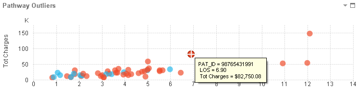
Now I notice how the other visualizations and items update to show me more details like the patient is male, between the ages of 66-75, and had Dr. Printers as his attending physician. I know this because QlikView highlights what I selected in GREEN and shows me what is associated or related in WHITE. Things not associated are in GREY.
Patient Details – I can take a look at some more details regarding this or other patients. In this case, I would like to get more information on this patient and perhaps send a MyChart message or review the patient’s chart for more details on their conditions and admission. By clicking the Launch Chart or Launch Snapshot link in the detailed section, I will use the Epic Qlik integrations to directly and securely open the patient’s information and take my next steps. Once I finish my work in the chart, I can return to QlikView and continue my analysis.
Patient Satisfaction – Not only do I have clinical and financial data at my fingertips, my QlikView app has also combined patient surveys. I can see how patients on pathways versus those not on pathways have rated their care, our hospital, and our providers. Perhaps not unexpectedly, patients on the clinical pathways reported lower satisfaction – this could be due to the more stringent guidelines of care and processes. It may even help us to determine where to make changes in our care plans to improve satisfaction and engage the patient more.
Configuration
The QlikView app has been crafted to be easily configured for launching Epic patient charts. Click the small ‘config’ text in the bottom right corner of the first tab (Intro) to open the Configuration page.
In the green 2 row table, type in the Patient ID (EPT .1 – Clarity PAT_ID) of the patient in the demo system that is built out with CHF. Testing with padding or no padding should be performed prior to HIMSS.
Hit Finish and now your app is configured to launch that patient’s chart.