Unlock a world of possibilities! Login now and discover the exclusive benefits awaiting you.
Product Innovation
By reading the Product Innovation blog, you will learn about what's new across all of the products in our growing Qlik product portfolio.
Support Updates
The Support Updates blog delivers important and useful Qlik Support information about end-of-product support, new service releases, and general support topics.
Qlik Academic Program
This blog was created for professors and students using Qlik within academia.
Community News
Hear it from your Community Managers! The Community News blog provides updates about the Qlik Community Platform and other news and important announcements.
Qlik Digest
The Qlik Digest is your essential monthly low-down of the need-to-know product updates, events, and resources from Qlik.
Qlik Learning
The Qlik Learning blog offers information about the latest updates to our courses and programs, as well as insights from the Qlik Learning team.
Recent Blog Posts
-
Introducing a powerful no-code data flow designer: Qlik Data Flow
No scripting skills? No problem. With Qlik Data Flow, our no-code data prep tools, we’re flipping the script on how analysts spend their time. Instead of drowning in data preparation—often taking up to 80% of your time—you can now focus on what really matters: uncovering insights. This shift means quicker, more impactful decision-making for your business. Read the full announcement on our Qlik Innovation Blog. Key Highlights: User-friendly, ... Show MoreNo scripting skills? No problem.
With Qlik Data Flow, our no-code data prep tools, we’re flipping the script on how analysts spend their time. Instead of drowning in data preparation—often taking up to 80% of your time—you can now focus on what really matters: uncovering insights. This shift means quicker, more impactful decision-making for your business.
Read the full announcement on our Qlik Innovation Blog.
Key Highlights:
- User-friendly, visual interface with drag-and-drop functionality
- Natively built into Qlik Cloud Analytics
- Supports a wide range of use cases, from simple analytics to complex AI applications
- Reduces time spent on data preparation
- Adaptable platform that evolves with changing analytics needs
Want to learn more?
- Data Preparation Tour
Take an extensive tour of Qlik Data Flow - What’s New in Qlik Cloud
Learn about new features and improvements - Data Flow - Prepare Training Data for Predictive Models Overview
This episode of Do More with Qlik Tips and Tricks will present a brief scenario on how to use Data Flow to prepare your data for predictive modeling. - Loading and preparing data with data flow
Our Qlik Help Sources
Thank you for choosing Qlik,
Qlik Support -
How are new AI tools changing “Learning Analytics”?
AI tools are revolutionizing learning analytics in education by automating tasks and personalizing learning experiences. They help educators efficiently analyze dashboards, grade open-ended responses, and tag discussions. An expert from the University of California, Berkeley, emphasizes AI’s role in translating complex data into actionable insights for both educators and students. However, ensuring its responsible deployment is crucial to strike ... Show MoreAI tools are revolutionizing learning analytics in education by automating tasks and personalizing learning experiences. They help educators efficiently analyze dashboards, grade open-ended responses, and tag discussions. An expert from the University of California, Berkeley, emphasizes AI’s role in translating complex data into actionable insights for both educators and students. However, ensuring its responsible deployment is crucial to strike a balance between innovation and accountability, with a strong focus on ethical use.
To explore more about how AI tools are changing “Learning Analytics,” check out the full article here.
To support these advancements, the Qlik Academic Program provides free resources, including software, self-paced training and other learning resources (including qualifications), enabling participants to enhance their data literacy and adopt ethical, impactful approaches to AI and analytics education. To learn how you can access free resources in data analytics as a student or educator, visit www.qlik.com/academicprogram.
-
-
Driving Data Literacy in LATAM: Meet your new Qlik Academic Project Manager
I’m Talita Mesquita, the new Project Manager for the Qlik Academic Project in LATAM. I’m excited to introduce myself and share a bit about what I’ll be doing! -
Backlog Refinement
Backlog RefinementSiemensManage backlog - Analytics, refinement and prioritizationDiscoveriesDiscover work done by your team. Prioritization of your backlogImpactEasy to Manage your Backlog Backlog Refinement and AnalyticsAudienceJira; Agile; DevOpsData and advanced analyticsUsing Qlik for backlog management in Jira allows you to visualize and analyze your backlog data, helping you identify trends, prioritize tasks, and make data-driven decisions... Show MoreBacklog RefinementSiemens Manage backlog - Analytics, refinement and prioritization
Discoveries
Discover work done by your team. Prioritization of your backlog
Impact
Easy to Manage your Backlog Backlog Refinement and Analytics
Audience
Jira; Agile; DevOps
Data and advanced analytics
Using Qlik for backlog management in Jira allows you to visualize and analyze your backlog data, helping you identify trends, prioritize tasks, and make data-driven decisions. This integration enhances your ability to manage and optimize your workflow efficiently.
-
Qlik Cloud Reporting's Perfect Update
Qlik Cloud Reporting is just perfect. PixelPerfect. PixelPerfect Report Authoring is a powerful new template designer enabling precise report authoring. It offers seamless integration with existing reports, data source connectivity, customization options, and collaborative features for creating high-fidelity, visually stunning reports. In addition to PixelPerfect Authoring, we've put the finishing touches on our cloud reporting capabilities in Q... Show MoreQlik Cloud Reporting is just perfect. PixelPerfect.
PixelPerfect Report Authoring is a powerful new template designer enabling precise report authoring. It offers seamless integration with existing reports, data source connectivity, customization options, and collaborative features for creating high-fidelity, visually stunning reports.
In addition to PixelPerfect Authoring, we've put the finishing touches on our cloud reporting capabilities in Q4, introducing:
- Report Cycling: Developers can set up report tasks to cycle through a dimension, creating reports for each value.
- Report Task History: Developers have better visibility into past task runs with a new report task history feature that keeps track of up to three months of execution data. Plus, we surface error and warning messages to help troubleshoot any issues.
Want to learn more?
- Designing PixelPerfect report templates
A comprehensive playlist on creating PixelPerfect Reports in Qlik Cloud - Qlik Reporting: Creating Reports with PixelPerfect Editor
This free course teaches you how to work with the PixelPerfect editor in the Reporting section of Qlik Cloud Analytics. Follow along with the activities to explore the various features and options in this new tool! - PixelPerfect Reports: Getting Started
The help.qlik.com main resource - All your reporting needs: Qlik Reporting Service eBook
- PixelPerfect Authoring, SaaS in 60
- Qlik Insider Webinar: Crafting the Perfect Report
Dive into the role of reporting in the world of modern BI
More Resources
Thank you for choosing Qlik,
Qlik Support -
Predicting House Prices using Qlik AutoML Regression Model
If you have been learning about Qlik AutoML or looking for examples to get started, you might have only came across Binary Classification problems (such as Customer churn, Employee retention etc…). In this post, we will be solving a different type of problem with Qlik AutoML using a Regression model. What is Regression, and Why Does It Matter? Regression is a type of supervised learning used to predict continuous outcomes like housing prices, sal... Show MoreIf you have been learning about Qlik AutoML or looking for examples to get started, you might have only came across Binary Classification problems (such as Customer churn, Employee retention etc…). In this post, we will be solving a different type of problem with Qlik AutoML using a Regression model.
What is Regression, and Why Does It Matter?
Regression is a type of supervised learning used to predict continuous outcomes like housing prices, sales revenue, or stock prices. In industries such as real estate, understanding the factors driving prices can guide better decision-making. For example, predicting house values based on income levels, population, and proximity to the ocean helps realtors and developers target key markets and optimize pricing strategies.
In the upcoming sections, we go through how to build and deploy a regression model using Qlik AutoML to predict house prices using the common California Housing Dataset.
Step 1: Defining the Problem
Before creating the AutoML experiment, let’s define the core elements of our use case:
- Trigger: New houses or listing entries are added to the dataset.
- Target: Predict the house's value.
- Features: Latitude, longitude, median age, total rooms, total bedrooms, population, households, median income, and proximity to the ocean.
Step 2: AutoML
The California Housing dataset is split into Training (historical) housing_train.csv and Apply (new) housing_test.csv data files.
Start by uploading these files to your Qlik Cloud tenant.
(The files are attached at the end of the blog post)
Creating the AutoML Experiment
- Start a New Experiment:
- In your Qlik Cloud tenant, click on Create → ML Experiment
- Select Your Dataset:
- Choose housing_train.csv as your dataset. AutoML will automatically identify columns as features and recommend their types.
- Set the Target Variable:
- Choose median_house_value as the target for prediction.
- Ensure all relevant features are selected, and adjust any feature types if needed.
- Run the Experiment:
- Click Run Experiment and let AutoML analyze the data. After a few minutes, you'll see the initial results, including SHAP values and model performance metrics.
- You can also take a look at the Compare and Analyze tabs for more advanced details.
Deploying the AutoML Model
- Choose the top-performing model from the experiment results.
- Click on Deploy
Creating Predictions
Once in the Deployment screen, add the Apply dataset, create a Prediction, and make sure to select SHAP and Coordinate SHAP as files to be generated. We will use these later on in our Qlik Sense Analytics app to gain explainability insights.
Step 3: Creating the Qlik Sense Analytics App
Now it’s time to visualize the predictions:
-
Load the Predictions:
- Navigate to the Catalog and locate the newly created Housing_test_Prediction.parquet file.
Click Create Analytics App. - Add additional data, including SHAP and Coordinate SHAP files as well as the apply dataset.
- Navigate to the Catalog and locate the newly created Housing_test_Prediction.parquet file.
-
Build the Dashboard:
- Create visualizations such as:
- A SHAP ranking to highlight the most influential features.
- A histogram showing the distribution of predicted house values.
- A map with gradient colors to visualize house prices by location.
You can experiment with different visualization types to explore the data from multiple perspectives.
- Create visualizations such as:
Understanding the results:
Based on the Qlik AutoML model, we can clearly see how features like income levels and ocean proximity can influence housing prices.
For more inspiration on how you can use your predictions within your Qlik Sense Apps or in your embedded use cases, check out my previous blog posts:
-
Introducing Qlik AutoML
There is no doubt that Machine Learning applications have become ubiquitous in today’s world. From using it to solve critical healthcare problems to recommending music/products, we have seen the kind of impact it can have in our daily lives. However, there is a fair cost associated with building ML-based solutions specifically when -dealing with the end-to-end ML pipelinehaving skilled resources (Data Scientists, ML Engineers) to build & deploy m... Show MoreThere is no doubt that Machine Learning applications have become ubiquitous in today’s world. From using it to solve critical healthcare problems to recommending music/products, we have seen the kind of impact it can have in our daily lives. However, there is a fair cost associated with building ML-based solutions specifically when -
- dealing with the end-to-end ML pipeline
- having skilled resources (Data Scientists, ML Engineers) to build & deploy models
Typically, an ML pipeline would look like this -
Machine Learning process
Each of these steps is complex and involves spending a crucial amount of time. Also, specific expertise(statistical, software engineering knowledge, etc.) is needed to be able to perform these tasks and ultimately productionize the models to be consumed by end-users. These factors have led to the possibility of automating the pipeline and helping cut down the manual costs.
Organizations today also need to be able to empower teams who are already data literate and leverage data for decision making. Consider a BI Engineer who is already part of the analytics process. Wouldn’t it be great if we can enable them to engineer the features, train & automatically select a robust model and help them deploy it without needing to rely on a team of data scientists & ML engineers? This has given rise to a new role called ‘Citizen Data Scientist’.
These are nascent steps towards the democratization of Machine Learning and can help organizations maximize their data & analytics strategy providing them with a matured analytics team. And this is where Qlik AutoML comes in!
Source: Qlik AutoML
Qlik AutoML is an automated machine learning platform for analytics teams used to generate models, make predictions, and test business scenarios using a simple, code-free experience. I had the opportunity to get my hands-on and the experience has only been promising. In this introductory blog, we will quickly walk through some of the features as part of the ML pipeline while solving a binary ‘classification’ problem.
For this use case, we will use the Breast Cancer Wisconsin (Diagnostic) dataset and our goal is to classify blood cells as ‘benign’ or ‘malignant’. First, we will create our project and load the dataset using the AutoML interface.
Qlik AutoML presents a nice overview of the dataset for exploratory data analysis with information about unique values, null values, min/avg/max, etc.
Since our label is the ‘diagnosis’ field, we will set it as target.
The interface automatically creates a pipeline which by default consists of the preprocessing steps applied by Qlik AutoML such as null value imputation, encoding of categorical values, feature scaling, k-fold cross-validation, etc.
It also presents the list of algorithms based on the selected target label and you will have the option to select/deselect from this list.
Additionally, you can add Hyperparameter optimization into the pipeline that would tell the system to perform a search optimization over multiple parameter settings & models to find the best ones.
To start our training and let Qlik AutoML do its job of finding the best algorithm(good F1 score criteria) we will click on Analyze. As the training process runs, the interface would look like this.
After the training is over, the best candidate is automatically selected by the AutoML system. In our case, Logistic Regression is selected as the best model with an F1 score of 0.951. The analysis results are presented for further drill down. There are 4 key components as seen below.
Analysis results after training
Let’s quickly take a look at each of these as they are crucial in helping citizen data scientists/analysts understand their model & features.Feature importance
This view presents Permutation importance, i.e. how much the model performance depends on a feature, and SHAP importance, i.e. how each feature contributes to the predicted outcome.
Permutation importance can be beneficial in refining our model by dropping some of the less important features. In our case, we see that there are a lot of features(left image) that are not important, so will drop them later and refine our model to see if it improves performance.
Similarly, SHAP importance can help us understand the most important features. We know now that ‘texture_worst’, ‘radius_worst’, ‘concavity_mean’, etc. are some of the most important features that impact the decisions.
Correlations
This view lets us know how each features are correlated to each other in 2 forms — correlation matrix & target correlations.
Fit
Fit shows how well Qlik AutoML performed in comparison to the historical data. In our case, looks like the model did pretty well with the predictions.
Model Stats
The final view lets a way to evaluate our model. In a classification problem, typically this can be done by analyzing a ROC curve and Confusion matrix. Qlik AutoML also presents the same plots.
For our Logistic Regression model, the ROC curve looks like below. Classifiers that give curves closer to the top-left corner indicate better performance and we know that our model does great from this.
ROC Curve
Next, let’s look at the Confusion matrix.
Confusion Matrix
For our use case, i.e. classifying diagnosis of cancer cells, it is imperative to know the false negatives (i.e. where the predictions incorrectly indicate the absence of a condition when it is actually present). We can see that 3 of them are FN.
If you would like to explore all the models used in the training pipeline, the Model Metrics screen presents all the details. You can also understand the hyperparameters used in a specific model by clicking on a specific model. Here is an example from our Logistic Regression model.
Now, let’s use this analysis and predict on unknown test data(not used in training the model) to see how it performs.
The Create Predictions section allows us to load a test dataset and predict.
Here’s our Prediction analysis.
Analysis after prediction on test data
One of the interesting views in this analysis is the Scenarios where you can modify(increase/decrease) your features and see how it impacts the predictions. Let’s try something in our use case — we will increase the ‘texture_worst’ value and see how the results look.
Qlik AutoML presents a nice visual comparison in the form of grouped bar charts to understand how this scenario change has changed the predictions. Looks like an increase in the ‘texture_worst’ feature leads to more ‘Malignant’ patients.
Once we are satisfied with both training and test analysis, the AutoML system allows us to easily deploy and make a production version of the model via an API(Prediction API) for inferences. You can now integrate this into any workflow or framework that allows you to make HTTPS POST Requests.
This brings us to the end of this introductory blog on Qlik AutoML. My personal experience using the system has been seamless. Here are some key takeaways:
- easy-to-use interface (native Qlik Sense experience)
- quickly train, evaluate & deploy ML models with minimal adjustments
- visualization-assisted analysis
- no-code machine learning
- seamless integration with frameworks using Prediction API
In the next blog, we will deep dive into how to build, deploy and evaluate a Machine Learning model using Qlik AutoML and consume it in Qlik Sense to take advantage of augmented analytics.
~Dipankar, R&D Advocate
-
Building What-If Scenarios using SSE and the Qlik AutoML Prediction API
Qlik AutoML is a powerful tool that makes it easy for analytics teams to easily generate models, make predictions, and test business scenarios using a code-free experience.In a previous introductory blog post by Dipankar, you can learn more about how to get started with AutoML and find out just how easy it is to navigate the interface and start training and evaluating ML models in a few steps.Today, we will leverage the power of Qlik Server-Side ... Show MoreQlik AutoML is a powerful tool that makes it easy for analytics teams to easily generate models, make predictions, and test business scenarios using a code-free experience.
In a previous introductory blog post by Dipankar, you can learn more about how to get started with AutoML and find out just how easy it is to navigate the interface and start training and evaluating ML models in a few steps.
Today, we will leverage the power of Qlik Server-Side Extension (SSE) to build a simple Scenario Analysis dashboard right into Qlik Sense.
“What-if scenarios” are a great way to plan for decisions and actions by testing different parameters while capitalizing on AutoML’s prediction API.
So what is SSE?
Server-side Extension protocol allows us to extend the Qlik built-in expression library with functionality from external calculation engines. In our case, we will use AutoML’s re-calculation of the prediction based on changes on variables to show the result in a KPI chart.
Let’s go through the process in a practical example. We will look at Employee Turnover Risk (dataset attached at the end of the post)
- Create your AutoML project and load the dataset making sure to select the “left” field as the target. After successfully completing the training process, go ahead and deploy your model and enable API Access. Take note of the Access URL and Token, we will need them to make the connection in Qlik Sense.
- On our QS tenant, we need to create a new Data Connection via the "Qlik AutoML" Analytics source connector. If you don’t see it, make sure to enable Machine learning Endpoints in the Management Console.
- Now, let’s move on to building our Scenario analysis sheet on the Qlik Sense app (find the qvf attached at the end of the post).
- First, we create multiple variables to be used in our “Variable Input” objects. We concentrate on the features that are more important according to the Feature Importance chart.
- Next, we create our objects:
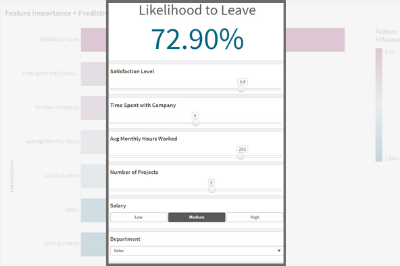
- The KPI that shows the Likelihood for Employees to leave is based on a measure that uses the SSE expression as follows, where some of the features are passed in as variables.
P.S: note the first argument of the ScriptEvalEx matches the field types of our features in order - with N being number and S being string. Also, the features passed as the third argument need to map 1 to 1 with autoML, missing features will result in an error.
- The KPI that shows the Likelihood for Employees to leave is based on a measure that uses the SSE expression as follows, where some of the features are passed in as variables.
=endpoints.ScriptEvalEx('NNNNNNNSS','{"RequestType":"endpoint", "endpoint":{"connectionname":"Qlik_AutoML_Employee_Turnover","column":"probability_yes"}}', vSatisfactionLevel AS satisfaction_level, last_evaluation, vNumberOfProjects AS number_project, vAvgMonthlyHoursWorked AS average_montly_hours, vTimeSpent AS time_spend_company, Work_accident, promotion_last_5years, vDepartment AS sales, vSalary AS salary)- Next. we build our variable inputs using the “Variable Input” chart under Custom Objects > Qlik Dashboard Bundle. Adjust the “Show as” type as needed.
And that’s all! You can now adjust the variables to trigger AutoML which automatically redistributes the data and re-predicts the outcome in order to understand the implication of any potential action.
Below, notice that Employee #2 has a high turnover %. Upon adjusting the “Avg Monthly Hours Worked”, “Number of Projects”, and “Salary” or a combination of these parameters, the % drops drastically.Attached is the dataset used as well as the qvf.
I hope you found this post helpful!
- Create your AutoML project and load the dataset making sure to select the “left” field as the target. After successfully completing the training process, go ahead and deploy your model and enable API Access. Take note of the Access URL and Token, we will need them to make the connection in Qlik Sense.
-
Qlik Digest - January 2025
Welcome to the January Qlik Digest, your one-stop source for the latest updates from Qlik. This month, we highlight our Trends 2025 webinar, Qlik Connect certifications, and more. Let’s dive in! -
Qlik Academic Program boosting employment prospects
The Qlik Academic Program offers world class data analytics training, software, qualifications and certifications to students and educators. So far, students and educators from more than 3300 universities around the world, are a part of the program and getting trained in data analytics. Recently, we spoke to Radhika Rajendra who is an MBA from Christ University Bangalore and she had an interesting story to share. During Covid, when there was a ge... Show MoreThe Qlik Academic Program offers world class data analytics training, software, qualifications and certifications to students and educators. So far, students and educators from more than 3300 universities around the world, are a part of the program and getting trained in data analytics.
Recently, we spoke to Radhika Rajendra who is an MBA from Christ University Bangalore and she had an interesting story to share. During Covid, when there was a general freeze on job opportunities, she undertook training on the Qlik Academic Program and qualified as a Qlik Sense Business Analyst. While she had an interest in data analytics, she was more keen to secure a job for herself during those tough times. She met success with a top global consulting firm who hired her as a Qlik Sense Developer. Radhika continues to work on Qlik Sense in a different role even today and credits her success to the Qlik Academic Program.
To read more about Radhika's story, visit: https://www.qlik.com/us/solutions/customers/customer-stories/christ-university
To learn how you can access free training and qualifications on the Qlik Academic Program, visit: qlik.com/academicprogram -
AI Splits for Impacts
AI Splits for Impacts AnyChart Auto-detect key impacts to accelerate root cause analysis — Showcasing the AI Splits feature (October 2024) alongside other key capabilities of the Decomposition Tree visual in Qlik Sense. Discoveries Instantly identifies the highest and lowest impact factors across multiple dimensions. Impact Streamlines root cause analysis by delivering deeper insights straight away. Audience Aiming to empo... Show MoreAI Splits for ImpactsAnyChartAuto-detect key impacts to accelerate root cause analysis — Showcasing the AI Splits feature (October 2024) alongside other key capabilities of the Decomposition Tree visual in Qlik Sense.Discoveries
Instantly identifies the highest and lowest impact factors across multiple dimensions.
Impact
Streamlines root cause analysis by delivering deeper insights straight away.
Audience
Aiming to empower end users with the ability to instantly uncover critical factors affecting key metrics.
Data and advanced analytics
Features decomposition trees visualizing (fictional) sales data.
🔗 >> View Live or Download QVF <<
🔗 >> Learn More About AI Splits <<
🔗 >> Read “Visualizing Dimensional Relationships” by Dalton Ruer (Qlik) <<
-
Org Chart
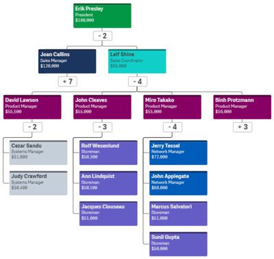
With the Qlik Sense April 2020 release, the Org Chart was added to the Qlik Visualization bundle. The Org chart provides a way to visualize hierarchies in your data. In this blog post, I will review how easy it is to create an Org chart provided you have the hierarchical data structure in your data model. Below is a snapshot from an Excel file that was loaded. It has the employees within a company and who each person reports to.The things to note... Show MoreWith the Qlik Sense April 2020 release, the Org Chart was added to the Qlik Visualization bundle. The Org chart provides a way to visualize hierarchies in your data. In this blog post, I will review how easy it is to create an Org chart provided you have the hierarchical data structure in your data model. Below is a snapshot from an Excel file that was loaded. It has the employees within a company and who each person reports to.
The things to note in this file are:
- Every employee has a unique Employee ID.
- The Manager ID is the Employee ID of the employee’s manager.
This spreadsheet is designed to go 5 levels deep (EmpName 1 through EmpName5) but additional columns can be added or removed as needed. Other supporting employee data can also be added to the data model to use in the org chart or in other charts in the app.
To begin, add the Org chart to a sheet. The Org chart takes 2 dimensions and 1 measure. The first dimension added is EmployeeID. In the Org chart, each employee will have their own card. In the properties for the EmployeeID dimension, other information that you would like to show on the card for each employee can be added.
In this example, the card title has been set to EmployeeName, the sub-title to the employee’s title and the card description to the employee’s salary. There are some colors loaded in the data model so the field, Color2, was selected coloring the cards by the employee’s title. The second dimension added to the Org chart is the Reports To field. This field stores the EmployeeID of the employee’s manager like the ManagerID field. There is also the option to add a measure. In this example, a measure was not added. If a measure is added, it will be visible when you hover over a card. That’s it – that is all that needs to be done to add an Org chart to your Qlik Sense app.
Now, let’s take a look at the Org chart. By default, the Org chart will show 2 levels when you come to the sheet.
If an employee is a manager, there will be a number under their card indicating the number of employees that report directly to them. Clicking on that number will open the cards of their direct report(s). When there is a plus sign (+) that means that there are cards that are not visible. Once the cards of a manager are opened, it will turn into a minus sign (-) to indicate that the card is opened. This is visible in the image below.
The Org chart provides an easy way to see the hierarchical structure within an organization. Users can zoom in and out in the chart as needed and Qlik Sense will handle closing cards if newly opened cards may overlap or get in the way. Check out this chart and other new features of the Qlik Sense April 2020 release in the resources listed below.
Demo: What's New - Qlik Sense April 2020
Video: What’s New – Qlik Sense April 2020
Video: April 2020 Feature Demonstration
Blog: Qlik Data Analytics Product Release - April 2020Thanks,
Jennell -
Watch Q&A with Qlik: Qlik Sense – Client Managed!
Don't miss our previous Q&A with Qlik! Pull up a chair and chat with our panel of experts to help you get the most out of your Qlik experience. SEE THE RECORDING HERE!
-
Iceberg を活用してお客様に成功をもたらすスケーラブルでオープンなデータソリューション
Qlik を代表して、Upsolver の買収について、また、この買収がどのようにお客様に新たな可能性を提供し、これまで手の届かなかった方法でお客様の目標達成を支援するかについて、いくつかの考えを共有できることを嬉しく思います。 -
Qlik Cloud WordPress Plugin: updated version using Qlik Embed
If you’ve came across the initial Qlik Cloud Wordpress plugin on the Qlik Community Design blog and gave it a try, you probably have run into some issues with it. Today, I’m going to share a new updated version of the Qlik Cloud WordPress plugin that brings a more efficient way to embed Qlik Cloud analytics into your WordPress websites. In this post, I'll walk you through the steps to install, configure, and use the new version of the plugin to b... Show MoreIf you’ve came across the initial Qlik Cloud Wordpress plugin on the Qlik Community Design blog and gave it a try, you probably have run into some issues with it. Today, I’m going to share a new updated version of the Qlik Cloud WordPress plugin that brings a more efficient way to embed Qlik Cloud analytics into your WordPress websites.
In this post, I'll walk you through the steps to install, configure, and use the new version of the plugin to bring your Qlik Cloud visualizations directly into your WP pages and posts.
Why the Update?
The previous version of our plugin relied on JWT tokens for auth, iframes (single integration API) and nebula.js for embedding, which worked but had limitations such as third-party cookies. Qlik Embed is the new embedding library and adopts better auth flows. In this version, I'm using OAuth impersonation to generate access token on the backend without need for users to interact with a login page.
Installation Steps
1. Install the Plugin
- Log in to your WordPress Admin Dashboard.
- Navigate to Plugins on the left sidebar.
- Click on "Add New" at the top of the page.
- Upload the zipped file (download it from GitHub here)
- Locate the plugin and click "Install Now".
- After installation, click "Activate".
Note: If you have the previous version installed, deactivate and delete it before installing the new one to avoid conflicts.
Configuring Qlik Cloud Wordpress Plugin
Before using the plugin, you'll need to set up OAuth impersonation in your Qlik Cloud tenant.
Create an OAuth Client
- Log in to your Qlik Cloud tenant as an administrator.
- Navigate to Management Console > Integrations > OAuth.
- Click on "Create new" and fill in the required details:
- Name: Give a recognizable name like "WordPress Integration".
- Allowed Origins: Add your WordPress site's URL.
- Select the right scopes to grant to the client from the Scopes list.
- Check “Allow Machine-to-Machine (M2M)” and “Allow M2M user impersonation”
- Change the consent method to Trusted
- Save the client credentials (Client ID and Client Secret) to be used in WordPress Config.
Docs here: https://qlik.dev/authenticate/oauth/create/create-oauth-client-m2m-impersonation/
Make sure to read through the Guiding Principles of OAuth Impersonation: https://qlik.dev/authenticate/oauth/guiding-principles-oauth-impersonation
P.S: this method will create a number of anonymous users on your tenant and you need to implement a way to remove these users periodically (using a Qlik Application Automation / users API)
Configuring the Plugin
- In your WordPress dashboard, go to Settings > Qlik Cloud Embed.
- Fill in the required fields:
- Host: e.g.,
https://your-tenant.region.qlikcloud.com. - Client ID: From the OAuth client you created.
- Client Secret: From the OAuth client.
- Host: e.g.,
- Click "Save Changes".
Using the Plugin
Embedding Sheets and Visualizations
With the plugin configured, you can now embed Qlik Cloud content using Shortcodes.
1. Embed an Entire Sheet/App
Use the
[qlik-embed-app]shortcode:[qlik-embed-app appid="1234-c56a-4062-ac50-377bba443e85" sheetid="12345-698f-449f-9a17-dca17eeadb71"]Parameters:
- appid: App ID
- sheetid: Sheet ID
2. Embed Individual Visualizations/Objects
Use the
[qlik-embed-object]shortcode:[qlik-embed-object appid="1234-64317-8432" objectid="1234-5553-326432"]Parameters:
- appid: App ID
- objectid: Object ID
3. Embed Selections bar
Use the
[qlik-embed-selections]shortcode:[qlik-embed-selections appid="1234-c56a-4062-ac50-377bba443e85"]Parameters:
- appid: App ID
Tip:
Finding IDs in Qlik Cloud
- Open your app in Qlik Cloud.
- Navigate to the sheet or object you want to embed.
- In the URL, find the sheet ID
- Sheet ID comes after
/sheet/
- Sheet ID comes after
- For object, right click on the chart, click on Embed, and look for objectid under the chart preview.
You can download the plugin here: https://github.com/qlik-demo-team/wp-qlik-saas-plugin
P.S: this plugin is maintained by myself. If you find any bugs or issues, please report them to me or create an issue on Github and I'll do my best to resolve them quickly.
Thank you!
-
Empowering Education Through Data: Meet Your New EMEA Lead
I’m thrilled to introduce myself as the new EMEA Lead for the Qlik Academic Program. Let’s empower educators and students to thrive in a data-driven world! -
The Importance of Data Literacy in Education: Preparing Students for the Future
you don't want to miss this! -
Sensibo - Temp and humity
Sensibo - Temp and humityPersonalDashboard based on the API of Sensibo.DiscoveriesMore insights into the temperature and humidity in a room. Historical information is also available, but only 1 day of history in the app.ImpactNo business impact, but it can be used for home automation.AudiencePersonal / Home automationData and advanced analyticsMore insight and historical data. -
Techspert Talks - SAP Connection to Qlik Talend Cloud
Hi everyone, Want to stay a step ahead of important Qlik support issues? Then sign up for our monthly webinar series where you can get first-hand insights from Qlik experts. The Techspert Talks session from January looked at SAP Connection to Qlik Talend Cloud. But wait, what is it exactly?Techspert Talks is a monthly free webinar, where you can hear directly from Qlik Techsperts on topics relevant to Customers and Partners today. In this session... Show MoreHi everyone,
Want to stay a step ahead of important Qlik support issues? Then sign up for our monthly webinar series where you can get first-hand insights from Qlik experts.The Techspert Talks session from January looked at SAP Connection to Qlik Talend Cloud.
But wait, what is it exactly?
Techspert Talks is a monthly free webinar, where you can hear directly from Qlik Techsperts on topics relevant to Customers and Partners today.In this session, we cover:
- Completing connection requirements
- Setting up SAP connection to Qlik Talend Cloud Data Integration
- SAP data best practices
Click on this link to watch the recording.