Unlock a world of possibilities! Login now and discover the exclusive benefits awaiting you.

Analytics & AI
Forums for Qlik Analytic solutions. Ask questions, join discussions, find solutions, and access documentation and resources.
Data Integration & Quality
Forums for Qlik Data Integration solutions. Ask questions, join discussions, find solutions, and access documentation and resources
Explore Qlik Gallery
Qlik Gallery is meant to encourage Qlikkies everywhere to share their progress – from a first Qlik app – to a favorite Qlik app – and everything in-between.
Qlik Community
Get started on Qlik Community, find How-To documents, and join general non-product related discussions.
Qlik Resources
Direct links to other resources within the Qlik ecosystem. We suggest you bookmark this page.
Qlik Academic Program
Qlik gives qualified university students, educators, and researchers free Qlik software and resources to prepare students for the data-driven workplace.
Recent Blog Posts
-
Data Science: The New Art
Data Science is a new and growing field, but what exactly is it? In this digital world of data, the Internet of Things, and more, there is one term w... Show MoreData Science is a new and growing field, but what exactly is it?

In this digital world of data, the Internet of Things, and more, there is one term which seems to come up everywhere: Data Science.
Data Science has taken on a life of its own, bringing immense value to organizations when utilized correctly - but what does it mean? And how should organizations embrace it? I recently asked an industry thought leader and expert on this topic, Marie Clark of Ambient Intelligence, to help define and shed light on this curious world.
To read the full article written by Jordan Marrow (Qlik Global Head of Data Literacy) visit Data Science: The New Art | Qlik Blog

-
Thank you team for the New Qlik Help Site
Hello Qlik Community! In Tuesday's edition of the Design Blog I highlight some of the latest features found in our new Help Site - created with collab... Show More
Hello Qlik Community! In Tuesday's edition of the Design Blog I highlight some of the latest features found in our new Help Site - created with collaboration from our engineers, technical writers and our Product Content and Media team. We hope that the site's new layout and navigation features make it easier to find the information you need, when you need it.
The New Qlik Help Site
"Teamwork for results" -- this is one of Qlik's core values that many of us embrace when creating content that makes our community successful with the Qlik platform. However, few are aware of our unsung heroes that work behind the scenes to bring you this great content, delivered to the Qlik Help site as well as our Qlik Help YouTube channel. I'd like to take this moment to thank and recognize them on behalf of the Qlik Community.
There is a small army led by Renata Rieschel, Director Product Content and Media. Renata manages the development and maintenance of all the content, design and infrastructure of the Qlik Help site. Our technical writers and architects not only design and write the help documentation, but they are also tasked with writing video scripts and verifying content from a linguistic point of view for many of the structured help videos you will find on the Qlik Help Channel. We have even enlisted the appealing voice talents of our Collaboration Product Designer, Stephen Jasionowski and our Internal Communications Manager Helene Rudzinski to provide the voice-overs for many of the help channel videos created by our interaction designer Giuseppe Panella, including those from our new series Qlik Tuesday Tips and Tricks - found on YouTube.
With all this great content being created, both visual and text-based - how should it be hosted, what will the UI look like, how will people search, navigate and find what they need? That is where Magnus Franzen and Tobias Leander come in. They have built a framework and implemented a platform to host all this content and strive to improve the performance, accuracy and usability of it daily, providing you with the best user experience possible.
I'd also like to recognize our technical writers, interaction designers, web developers, architects and engineers in Product Content and Media whom all work together to bring you the best content in a timely and efficient manner.
Sara Garmark
Jim Siwila
Mary Newell
Chris Bushnell
Konstantinos Fioretos
Thomas Oxenby
Thomas Lewis
Daniel Chabot
Daniel Rignell
Filippo Guizzetti
Greg Ralston
Julia Beingessner
Kyle Weishaar
Mary Newell
Michelle Thomas
Ralf Narfeldt
Sarah Anderson
Ingemar Hansson
Karin Dahlgren
Swati Jha
Thank you Team!
Regards,
Michael Tarallo (@mtarallo) | Twitter
Senior Product Marketing Manager
QlikCan't see the video?
Download the .mp4 and watch from your computer or mobile device.

-
Barcelona Marathon, a mashup for discovery
Guided apps are probably the more common data viz pieces nowadays. Are strongly influenced by the traditional journalistic approach to a story and rel... Show MoreGuided apps are probably the more common data viz pieces nowadays. Are strongly influenced by the traditional journalistic approach to a story and related with storytelling. The goal of guided apps is to walk the reader from point A to point Z.
A well-constructed guided visualization is incredible powerful at proving a point, examples can be found almost daily at mass media websites. As a data professional, I love data stories but maybe because I’m such a data geek I usually never get completely satisfied by the visualizations used to emphasize the story. I almost always hungry for ways to explore the data or I simply miss one angle from the story to feel fulfilled.
On the other hand, the so-called Discovery apps are intended to let the user to manage the ride and rely on reader capacity to be able to interact and to understand the data they are looking at. Scenarios with simple and familiar data are generally more appropriate for discovery apps.
We recently got one of those great data sets for discovery, simple data and containing thousands of potential stories in it. Barcelona Marathon organization contacted us to create a piece to let runners (data users) to explore every corner of their data. They have been collecting runners’ data during the last decade, our part was just to put a nice wrap around it. We like to see it as a nice hybrid (more on the discovery side) of guided and discovery app.
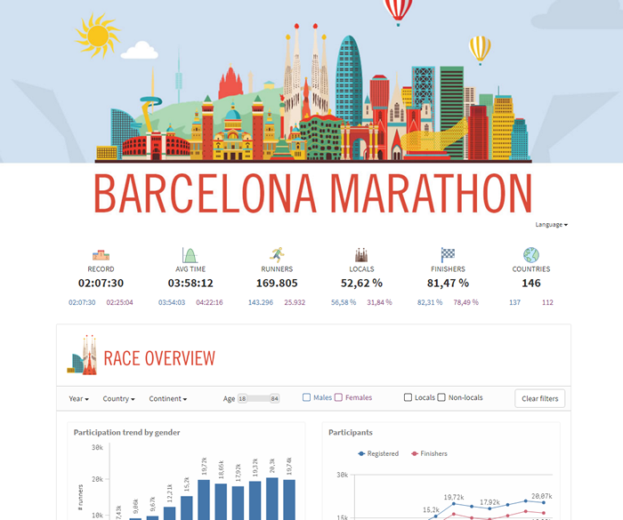
We divided the mashup into three sections trying to help first time users to better get familiarized with the data. It’s just a visual separation of the data, each section belongs to the same data model, filters are global and every selection affect all the charts. For the clarity of it we reduced the use of set analysis as much as possible.
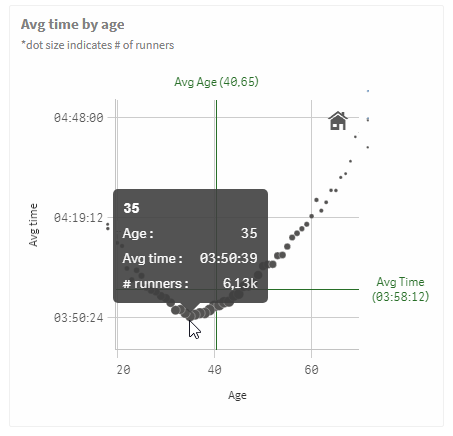
The app starts with race overview data, about participation and finishing times. The second section serves as demographic info, with three main characteristics to consider, age, sex and nationality. Finally, we reserved a little bit of complexity for the very last section, we called it Performance. As you can see in the picture below taken from the chart “Avg time by age” the sweet spot age for someone to run this marathon is 35 years old, in average people in that age get the best results.
You can check the mashup live at Barcelona Marathon page here or as a stand-alone version at Marató Barcelona.
Regards,
Arturo Munoz (@arturoqv)

-
NULL – The Invisible Nothing
NULL is not a value. It is a lack of value. It is a placeholder that marks nothingness. So, how does QlikView show the concept of nothing – when thi... Show MoreNULL is not a value. It is a lack of value. It is a placeholder that marks nothingness.
So, how does QlikView show the concept of nothing – when this is the relevant answer to the user’s click?
To investigate this, I will use a hypothetical database with two tables: Customers and Orders. The Customers table is a list of customers, and the Orders table is a list of orders that these customers have placed.
List boxes
In the picture below, you have a selection of two customers that haven’t placed any orders, i.e. they exist in the Customers table but there are no corresponding records in the Orders table. As a result, all values in the OrderID list box are gray.
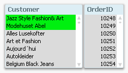
In other words; for a list box, it is simple: NULL is not visible as an explicit list box entry. If all entries are marked as gray, then the empty set is the answer to the click, i.e. NULL is the answer.
If you have a list box where you have a visible entry that is blank; that you can click on; that can be selected, then it is not a NULL. NULLs are never visible in list boxes and can never be selected. Instead, you have an empty string or some kind of white space.
Table boxes
In a table box, as well as in all other places where a NULL can occur, e.g. labels, text boxes, buttons, etc., NULLs are displayed as dashes. In these places, NULL is visible but not selectable.
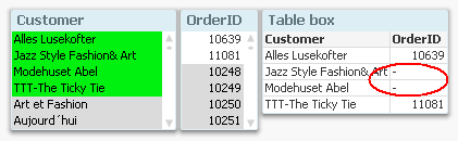
Chart dimensions
For a chart, it becomes more complicated. First of all, a NULL can occur either as a dimensional value or in the measure - the expression. These are two very different cases and should not be confused. Further, the two cases are managed in two different places in the chart properties.
With the above data, it would be reasonable to make a chart that shows sales per customer. If there are orders that are not attributed to any customer, then you will get a NULL in the dimension of the chart – a NULL which is displayed as a dash. Below you can see that order nr 10874 has no customer associated:
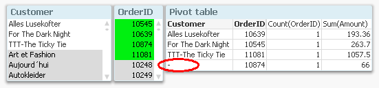
If you don’t want to show lines with NULLs in the dimension, you can suppress these on the Dimensions tab in the chart properties.
Chart measures
If your data is the other way around, i.e. you have customers that are not attributed to any orders, you will for these get NULLs in OrderID and Amount. However, the Sum() and Count() functions still return zero, which is correct, since Sum(NULL) is zero. Other aggregation functions such as Only() may return NULL, though, and this will be displayed as a dash.
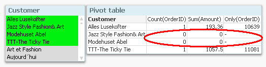
If you don’t want to show lines with zeros or NULLs as expression value, you can suppress these on the Presentations tab in the chart properties.
So, the bottom line is that NULLs are sometimes visible, sometimes not. Sometimes they are displayed as dashes, and when aggregated, usually as zeros. But they are never selectable.
And with this, I hope that the mystery around NULLs is somewhat less of a mystery.
PS. In this blog post, I use “NULL” to denote both real NULLs and missing values. What the difference is? Read this (updated) white paper and find out. There you can also read about how to make NULLs both visible and selectable.

-
Professor references Qlik Sense in International Conference on Analytics
At an International conference on Data Science and Analytics ( ICDSA '17) organised by Department of Computer Science of Rathinam College, Coimbatore,... Show MoreAt an International conference on Data Science and Analytics ( ICDSA '17) organised by Department of Computer Science of Rathinam College, Coimbatore, Dr. Siddhartha Ghosh, Kandula Neha and Ballari Saha from Vidya Jyothi Institute of Technology, Hyderabad presented a paper of 'Data Analytics in Academics' explaining the challenges and issues faced by the academic community in analytics. This paper was among the final 120 papers selected from a total of 215 papers received by the organisers. Papers from the conference are being published in the ICT Academy, Bonfring and IJSER Journal. The publication has been undertaken by Coimbatore Institute of Information Technology, ISBN 978-1-941505-70-0
The researchers presented the various tools and technologies used most commonly in academics. They made some sample analysis using Qlik Sense of data using in educational institutions such as placement data, test results,faculty data and visualised their findings with the help of various charts and graphs in Qlik Sense. They also demonstrated how associations can reveal connections between various data sets thus demonstrating the potency of the patented Qlik Associative Indexing technology.
In the words of the researchers, following are their concluding remarks- This paper gives an overview of the Qlik Sense and its application the field of academics. It explores data deeply and shares insights instantly and reveal connections in the data to see opportunities visualized through charts, bar graphs, pie charts, histograms etc. The learning and understanding to look at data with new visualization options enriched us with data analytics in modern world and its application in academics.
-
Data profiling as you load data
Since the introduction of Data Manager (the Data manager is where you visually add and manage data from your own data sources, or from Qlik DataMarket... Show MoreSince the introduction of Data Manager (the Data manager is where you visually add and manage data from your own data sources, or from Qlik DataMarket, so that you can use it in your app) Qlik has been constantly improving the set of features that makes the task of loading data an enjoyable part of the analysis process.
One of the most recent (and genius) additions to Data Manager is the “Summary card”
So what is the Summary card?
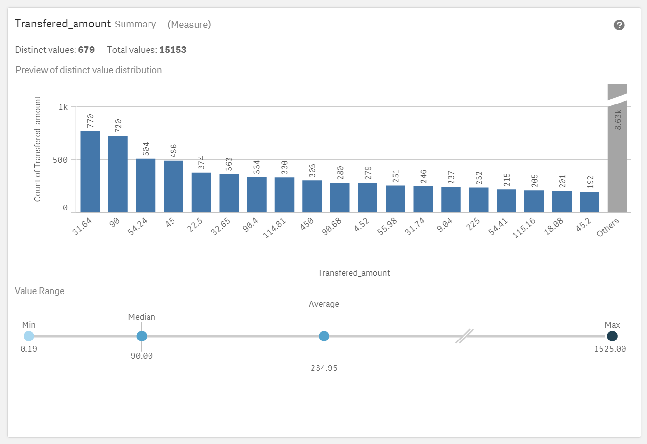
Summary data profiling card is a visual representation of your data. It contains a set of elements, values and charts, that let you better understand each field in your data set.
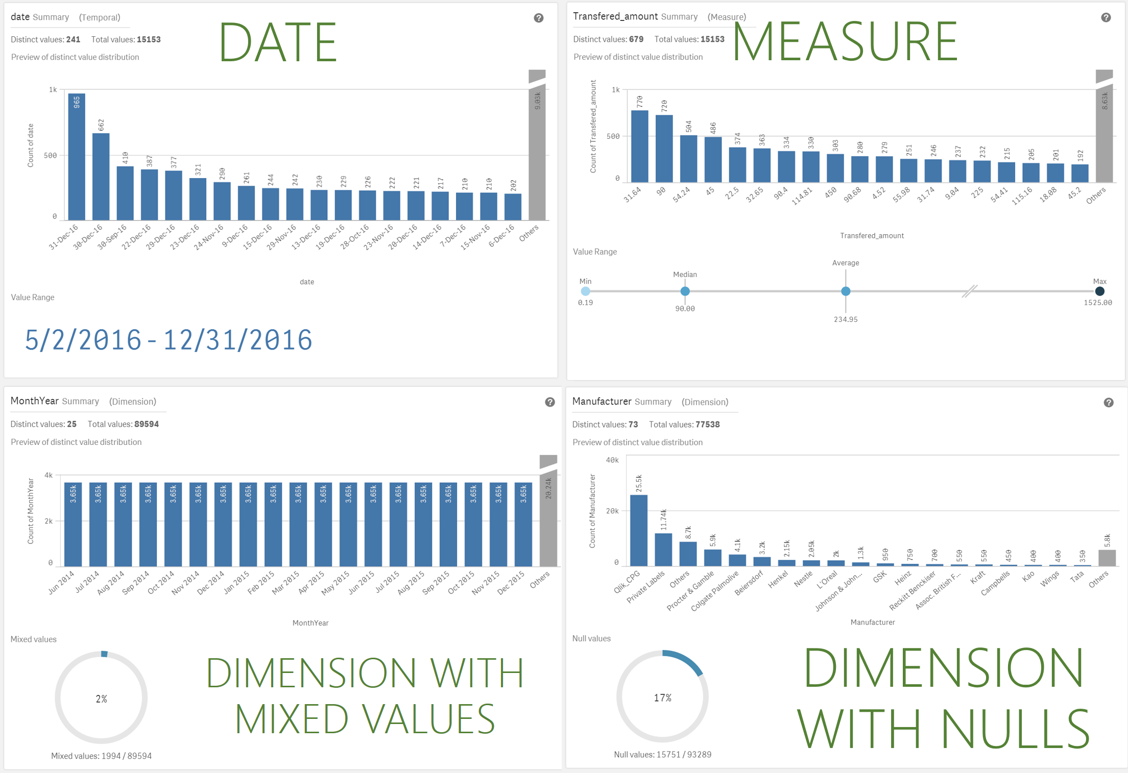
Summary card has been designed to help you anticipate and prevent data quality issues before loading data into Qlik Sense. The Summary card content adapts to the field selected, so depending on the column data type, measure, dimension, or time it will present you with different insights.
For measures the following information is provided
- Field name
- Field type
- Distinct Values
- Total Values
- Preview of the distinct value distribution in a bar chart showing the 20 highest count elements.
- Value Range. It is a very interesting chart itself, for a measure field it will show a distribution chart showing the Min, Median, Average, and Max values for the field.
If a temporal field is selected the Value Range will display the first and last date in the range. - Null Values and Mixed values charts only appears based on the field data.
How to access the Summary card
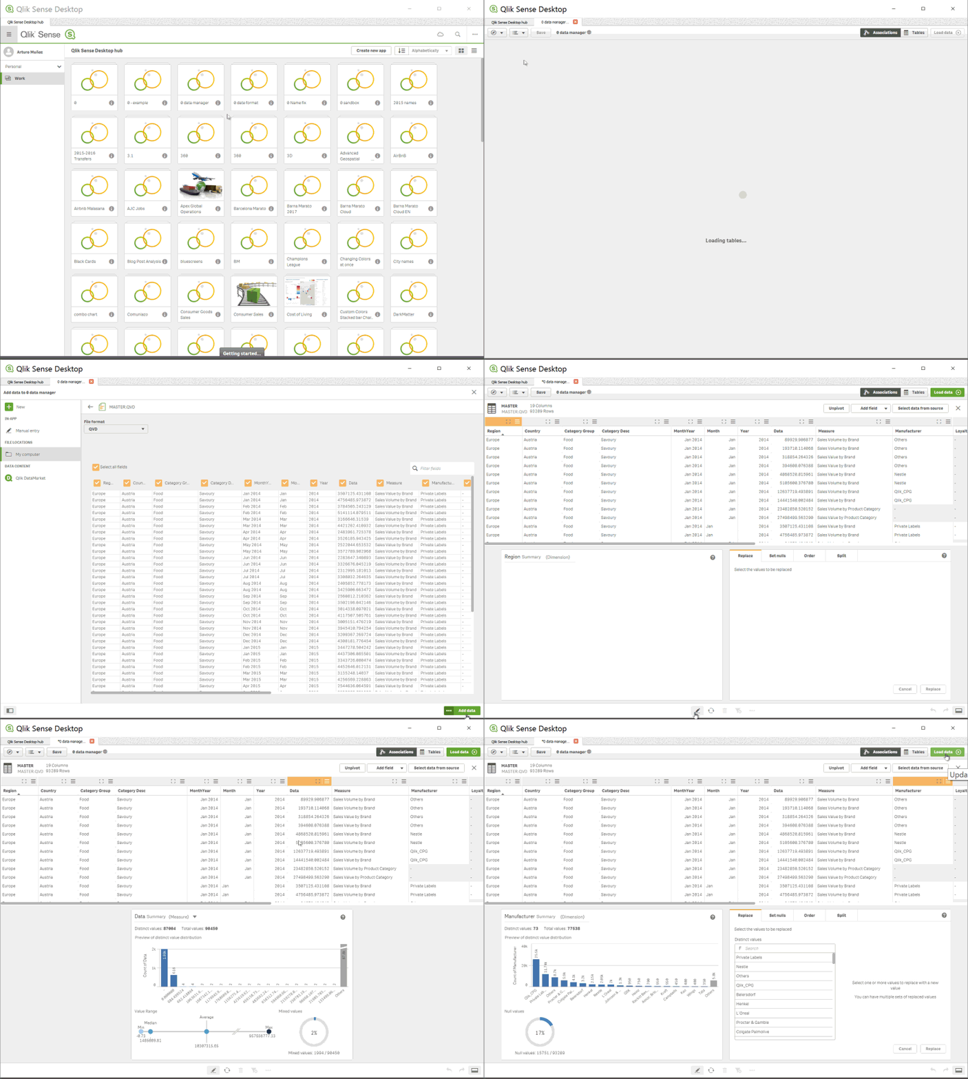
To see and use the Summary card by yourself you have to get to Data manager, In Data manager, select a table and click the pencil icon, then select a table field and the Summary card appears. Or just check the animation below:
Enjoy it!
Arturo (@arturoqv)
-
Qlik Sense November 2017 is now available
Qlik Sense November 2017 is now available from our Customer Download Site. You can also try out many of the new capabilities in Qlik Sense Cloud wh... Show MoreQlik Sense November 2017 is now available from our Customer Download Site. You can also try out many of the new capabilities in Qlik Sense Cloud where you can use Qlik Sense Cloud Basic for free or try Qlik Sense Cloud Business with a free 30 day trial.
Watch this brief highlights video to learn more:
You will find many new features and capabilities in this release including:
For Business Users
- Improvements to existing chart types
- Tables - Ability to scroll sideways.
- Box Plot - Ability to color by expression.
- Distribution Plot – Ability to color by expression, control bubble size, and add jitter (to keep dots from overlapping).
- Combo Chart - Ability to display value labels.
- Navigation Improvements using Keyboard - Ability to use the tab key to move around the screen.
For App Builders
- Dynamic Sheet Names - Ability to utilize an expression in the name of a sheet.
- Ongoing Visual Data Prep Enhancements
- UI based in-line data table
- Data Transformation Lineage
- Refresh and add data available from analysis edit mode - The ability to both refresh and add data from the UI under data icon in edit mode. This eliminates the need to switch over to the data manager in order to initiate these common tasks.
- Control Calculation Condition Message - Ability to control the message that a user sees when a calculation condition hasn't been met.
- Update to Quote Interpretation in Set Analysis
- This change ensures that set analysis interprets quotes in the same way as other areas of the engine and is consistent with our documentation and best practices. However, some developers may have incorrectly utilized the single quote in places that should have double quotes and this enforcement of the intended use will cause issues in these cases.
- Apps created in prior versions will not need to be updated as the system will respect the old method for these apps. However, customers may opt to force all apps to respect the new rules.
- This change (using single quotes for literal values) allows for the ability to support case sensitive search strings in Set Analysis.
For Administrators
- SAML Single Sign-on Logout
- Continued On Demand App Generation Enhancements
For Developers
- Extension Certification Badging
- Qlik Sense Cloud Specific Improvements
- Utilize Linux as platform for presenting demo apps on Qlik Sense Cloud
- Note: See connector updates under Qlik Connectors
Qlik Connectors
- Additional Web Connectors – The following web connectors are now available in Qlik Sense Cloud Business and included in Qlik Sense Cloud Business trials and subscriptions: Facebook Insights, Microsoft Dynamics CRM, SugarCRM, Survey Monkey, MailChimp, Bit.ly, Slack. The Facebook Pages and Google Analytics also now include access to additional tables. These connectors are already available for Qlik Sense Enterprise.
- Redshift, Google BigQuery and Dropbox- A new native connector for Redshift will be made available to Qlik Sense Cloud Business in November. Connectors for both Redshift and Google BigQuery will be released to Qlik Sense Enterprise in November also a Dropbox Connector will be made available to Qlik Sense Cloud Business and Enterprise.
- Improvements to existing chart types
-
Qlik and Accenture; The Netflix Data Challenge
For several months now myself along with colleagues from the Academic Program and our industry partners Accenture, have been working to build a Data C... Show More
For several months now myself along with colleagues from the Academic Program and our industry partners Accenture, have been working to build a Data Challenge; a Hackathon if you will but with a focus on students who aren't specifically from Computer Science backgrounds.
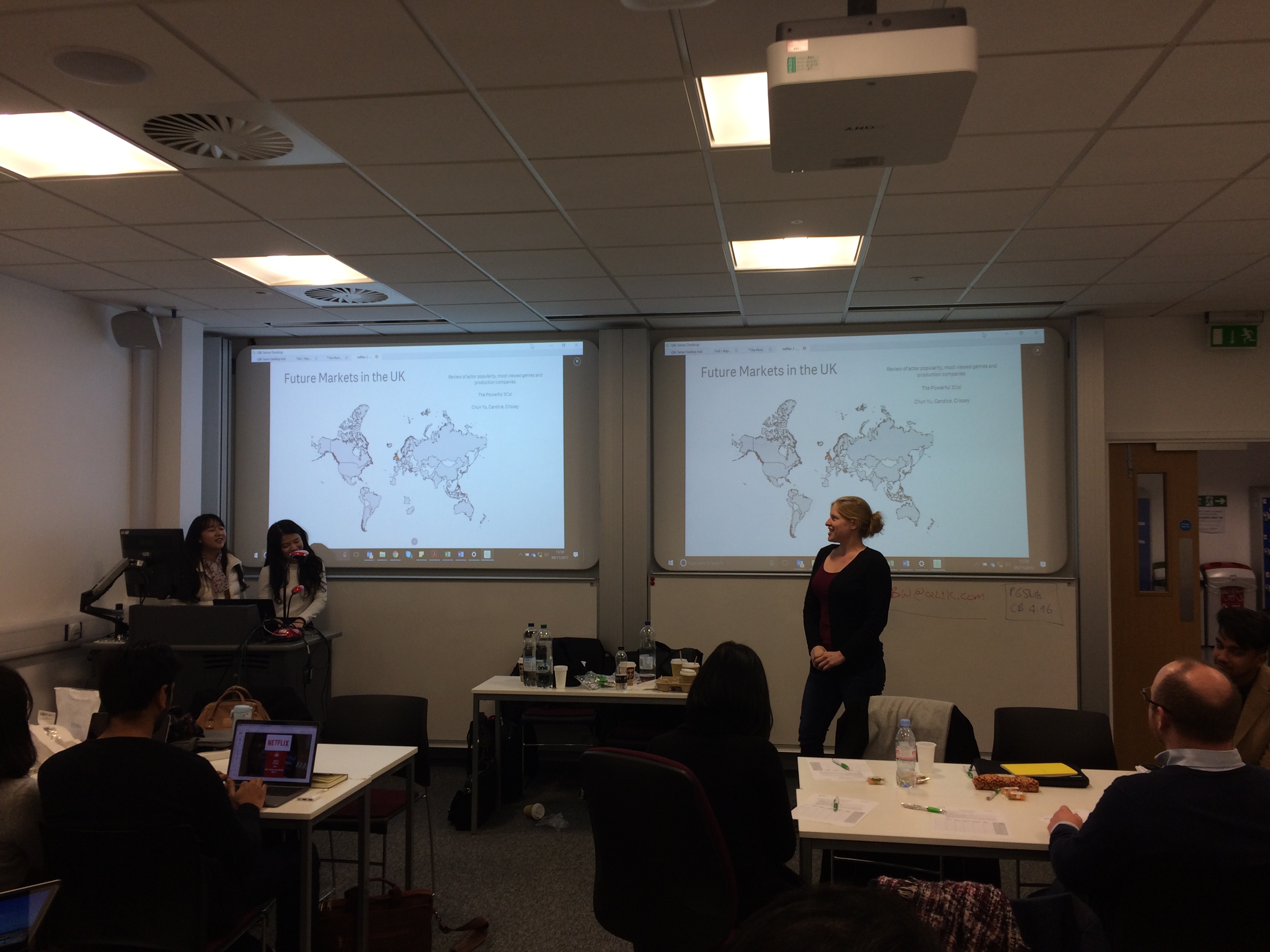
In conjuncture with the University of Bath, we arranged to run a two day session looking to provide students skills on key topics in Data Analytics and get hands on with some real world data. Invitations to the event were sent to the Business Analytics and MBA students, with around 40 students in attendance with teams of 3-4.
What was the challenge?
Participants were to use data provided by Qlik from the moviedatabase.com, along with the wealth of resources and data available on the internet around Netflix's catalogue, to design a schedule of releases for next year based on what the students decided would be popular films from the data. Finally they were to come up with an original content idea as this is where Netflix make the most margin from their investments.
Day 1
The first day consisted of introductions from Qlik and Accenture, covering topics around industry use of BI tools and techniques, customer case studies and finally a workshop using Qlik Sense. The workshop was designed to show participants features of Qlik including;
- Data loading
- Data modelling
- Data visualisation.
Day 2
Day 2 was the main day, a 6 hour data challenge to bring together the students new knowledge in Qlik Sense and use the movie database and other resources available to them online to answer the brief. The students were scored out of 10 on 5 different areas;
1. Quality of Dashboard
2. Data Model structure
3. Presentation structure and content
4. Has the team answered the question?
5. Original Netflix content idea
Outcome
It was an opportunity for everyone involved to try something that we hadn't explored before. The University of Bath was for them a chance to improve students knowledge of data analytics, team work and the real world data challenges.
Accenture were provided an opportunity to show themselves as a major future player in the analytics space and hopefully to persuade some students to come and work with them.
For Qlik, a chance to help students in their career paths and for me to understand the complexities in organising a data challenge and ultimately to provide a group of students a small insight the future data economy and improve their data literacy.
A huge thanks must go out to those that helped me organise this, Deniz Kog, Aylar Charyyarova and Jian Yi Oh from Accenture. Martin Royds from Qlik and finally Gunes Erdogen from The University of Bath, who made this event possible.

-
Why does it take so long to get results from a Qlik Certification BETA Exam?
Pass/fail results are typically sent 8-10 weeks after taking a beta certification exam. I'm sure many out there wonder why!Here's what happens behind ... Show MorePass/fail results are typically sent 8-10 weeks after taking a beta certification exam. I'm sure many out there wonder why!
Here's what happens behind the scenes during this phase of the exam development process:
1. After the beta exam period ends, we gather all the result data and send it to our test development partner, Alpine Testing Solutions.
2. Alpine calculates all kinds of statistics on the result data and identifies which items are performing well and which are not. Poorly performing items can be too easy (>90% get it right), too hard (<10% get it right) or have other warnings which indicate it is not measuring what we expect. Then they recommend which items to "Keep" or "Delete"
3. Qlik then reviews the recommendations and every single comment entered by beta testers, which may indicate something is off or the item is unclear. Final Keep/Delete decisions are made by the Certification Program Manager, which are sent back to Alpine.
4. Using the kept items, Alpine assembles a new form and statistically equates it to the previous form. This is needed to assure congruence between releases of the certification exams.
5. Qlik receives the new form (which is a list of items to go on the operational form), and creates an exam specification to send to Pearson VUE.
6. Pearson VUE uses the exam specification to build the operational form, which then goes through a few QA and review cycles between Qlik and Pearson VUE. We check the exam many times to ensure there are no errors in it!
7. After the operational form is finalized, it is published and the exam is ready for delivery.
8. Then we take the operational form and use it to score the beta results.
And that, my friends, is why it takes so long to get your beta results!

Thanks to those who participated in taking a beta exam, and your continued patience is appreciated.
Karen Origlio
Sr. Certification Program Manager @ Qlik

-
Colors in charts
It is not uncommon that users want specific products or customers to be displayed in specific colors. The most obvious way to do this is to change the... Show MoreIt is not uncommon that users want specific products or customers to be displayed in specific colors. The most obvious way to do this is to change the colors in the chart properties. This is in fact quite easy if you use the copy and paste functions found when you right-click a color button. Just copy one button and paste on another, and you have moved the color.
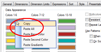
This way you can assign which color is to be used for the different values of the field. However, a prerequisite for this to work is that the order of the field values doesn’t change.
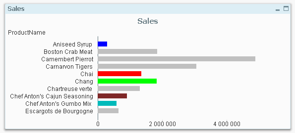
A more robust way is to use color functions. Usually, you want to set the color of a bar, line or bubble and this is done by using the “Background Color” on the Expression tab:
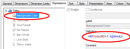
By the way – don’t use Visual cues. This feature is old and not very versatile. Use color functions as described here instead.
In the picture above, both the product ID and the color are hard-coded in the expression. However, if you want to define colors for many products, the if-function will not be manageable. Then it is better to store this information in a table – either in the database or in an Excel sheet or as an inline statement in a scriptlet that is included in the script. Hence,
- Create your color definition table and store it in an appropriate place. The Red, Green and Blue columns hold the different color components and define the color uniquely.
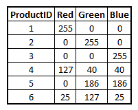
- Load the color definitions into a mapping table:
ProductColors:
Mapping Load ProductID, Rgb(Red,Green,Blue) as ProductColor From ProductColors - Use this mapping table when loading the products table, creating a new field for the product color:
Applymap('ProductColors', ProductID , LightGray()) as ProductColor
The third parameter, here lightgray(), defines which color the unlisted products should get. If you instead use null(), the unlisted products will be multicolored according to the color settings in the chart properties. - Finally, use this field as product color in the charts:
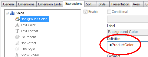
This way it is easy to define which color specific products, customers, or other dimensions should get.
Which colors to use? Oh, that is a completely different topic:
- Stephen Few has a number of good general recommendations.
- Adam Bellerby has some recommendations on how to avoid problems for color blind users.
- Shima Auzins suggests using colors as warning signals.
- Create your color definition table and store it in an appropriate place. The Red, Green and Blue columns hold the different color components and define the color uniquely.
-
Academic Program expanding in South India
Recently, the Academic Program has seen a good number of University enrollments from the South of India particularly in Bangalore and Coimbatore. Some... Show MoreRecently, the Academic Program has seen a good number of University enrollments from the South of India particularly in Bangalore and Coimbatore. Some of the top ranked higher educational institutions in the country are also from the South of India. In Bangalore, the academic program has a footprint in educational institutions such as BMSIT, Christ University, Jain University, SIBM Bangalore.
Coimbatore city which is one of the major hubs of higher education in the South has a presence of more than 50 institutions from engineering, management, medicine, pharmacy, arts and humanities faculties. The academic program has built its engagement with some of the well known Universities such as Hindusthan College of Engineering and Technology, Karpagam, Sri Krishna College of Technology, SREC, Kumaraguru College of Technology. Students and Professors from these institutions have enrolled for the program and continue to develop their data analytics skills through the resources offered under the program and pursue the path of data literacy.
-
Introducing Qlik Sense June 2017!
We are pleased to announce the release of Qlik Sense June 2017!With releases five times per year, it could be difficult to stay up to date on what’s n... Show MoreWe are pleased to announce the release of Qlik Sense June 2017!
With releases five times per year, it could be difficult to stay up to date on what’s new. The document attached to this post will help you keep up to date. You will find a look back at some of the key features released over the past 12 months as well as a detailed outline of the the most current release.
But first.... check out this overview video:
Some of the most exciting enhancements in this release include:
- New Visualizations – New visualizations including the Box Plot, Distribution Plot, and Histogram,
- Advanced Analytics Integration – The ability to call out to third party engines (such as R & Python) during analysis.
- Visual Data Prep Enhancements – A wide array of improvements to the visual data preparation capability of Qlik Sense including Visual Data Profiling, Data Binning, Visual Table Concatentation, Data Quality Transformations, Filtering, and inclusion of scripted data sets in visual data preparation.
- On Demand App Generation – User-generated on-demand analysis apps drawn from Big Data.
WHAT YOU SHOULD DO NEXT:
- Customers can visit the Qlik Customer Download Site HERE
- If you are new to Qlik, you can download the Qlik Sense June 2017 desktop version HERE.
- Stay informed and learn more by joining us on an upcoming webinar or local event.
-
My Pleasant Surprises - Qlik's Associative Difference
Hey Guys happy Tuesday! Today I will continue my series on some of my many pleasant surprises when first learning Qlik. My last pleasant surprise cove... Show More Hey Guys happy Tuesday! Today I will continue my series on some of my many pleasant surprises when first learning Qlik. My last pleasant surprise covered how Qlik creates data models without any complex data modeling skills and how the use of its metadata was a bit different from what I was use to - you can learn more about it here: My Pleasant Surprises Learning Qlik - a multi-part series. In this edition of the Qlik Design blog I cover one of our most important differentiators - the Qlik Associative Difference. By now you should know of my love for creating short succinct videos, and I personally feel they are more fun then reading walls of text - so in this entry I have embedded a video presentation and demonstration to show you Qlik's Associative Difference - thanks for watching,
Try the app here:
https://webapps.qlik.com/associative-difference/index.html
NOTE: To increase resolution or size of the video, select the YouTube logo at the bottom right of the player. You will be brought directly to YouTube where you can increase the resolution and size of the player window. Look for the 'settings' gears icon in the lower right of the player once at YouTube. (video and sample files)
For more videos that can help you get started with Qlik Sense:
-
What's New in Qlik Sense November 2017
Hey Guys - welcome to this week's Tuesday edition of the Qlik Design Blog. In this post we are excited to announce the availability of Qlik Sense Nove... Show MoreHey Guys - welcome to this week's Tuesday edition of the Qlik Design Blog. In this post we are excited to announce the availability of Qlik Sense November 2017. It has only been 2 months since our last release demonstrating our commitment to continuous and iterative improvements with our products. In this video I quickly breakdown what’s in the Qlik Sense November 2017 release. Included are some various chart improvements, new connectors and usability improvements to visual data preparation and the design interface. Let me know what you think, and leave a question or comment below.
Other videos for your viewing pleasure:
- Adding data manually: https://youtu.be/NprqnRWfveo
- Connecting Qlik Sense to Apache Hive: https://youtu.be/y8wl7Wtfwwo
- Dropbox Connector: Refreshing File-based Data and the New Dropbox Connector - Qlik Sense Cloud Business
NOTE: To increase resolution or size of the video, select the YouTube logo at the bottom right of the player. You will be brought directly to YouTube where you can increase the resolution and size of the player window. Look for the 'settings' gears icon in the lower right of the player once at YouTube.
Try Qlik Sense now: Try or Buy
Can't see the video? Download the .mp4 to watch on your computer or mobile device.
Regards,
-
Qlik Sense September 2017 - What's New
Hey guys, happy Tuesday! I'm pleased to be back in this edition of the Qlik Design Blog to introduce you to the September 2017 release of Qlik Sense..... Show More
Hey guys, happy Tuesday! I'm pleased to be back in this edition of the Qlik Design Blog to introduce you to the September 2017 release of Qlik Sense....right off the heels of hurricane Irma I might add. Florida (my home state) and its surrounding neighbors have been hit hard by this storm and I would like to first express my deepest sympathy for those that were affected by Irma's wrath. We will recover, as we always have, and by working together and supporting one another, we will be back on our feet in no time...oh and hurricane Maria, you better watch yourself Missy!) Now on to the show!
As we have previously mentioned, Qlik will be releasing software 5 times a year. Which equates to a new release about every 10 weeks or so. (You can learn more about our continuous release cycle by checking out this blog here: Qlik Sense® will release 5 times a year!)Rather than list the new feature highlights in this blog, I created a brief video to cover and demonstrate them. You can always check out the Qlik Sense release notes on the Qlik Help site as well as download the attach data sheet to learn more. You can also try these features right now by logging in to the Qlik Sense Cloud or by downloading a free version of Qlik Sense Desktop: Download Free Data Visualization Development Platform.
Now remember, each release will vary in capabilities and features, with some releases possibly having "more" in certain areas than others. It is important to note that the releases will not only cover Qlik Sense specifics, but other product areas such as Qlik NPrinting, Qlik GeoAnalytics, Qlik Sense Mobile, Qlik DataMarket, data connectors, API enhancements and new services and procedures. For example, with the September 2017 release we are also introducing a new Extension Certification Pilot program to allow extension authors to submit their extensions for review, to be certified and supported by the author for use within the Qlik platform. Stay tuned for more information on this pilot program to learn how you can submit your extension for certification.
NOTE - Qlik Sense Mobile: The app is available on the iOS VPP app store (Apple’s enterprise app store) this week.
This is a huge milestone for Qlik as it brings the power of our Associative Technology to the iPad, online AND offline. Customers and partners need to have signed up for Apple’s enterprise developer program to get access to the app. Once they are members of enterprise developer program, they can download the app from https://vpp.itunes.apple.com. Most medium and large business have this relationship with Apple and for those who do not, we are bringing the app to the iOS public app store in the near future, so hold tight.
Enjoy!
Regards,
Mike Tarallo
QlikAdditional Resources:
* To learn more about extensions - check out these videos:
* Did you miss what's new in our Qlik Sense June 2017 release? - Check it out here: Qlik Sense 2017 Releases - What's New
* More Videos
NOTE: To increase resolution or size of the video, select the YouTube logo at the bottom right of the player. You will be brought directly to YouTube where you can increase the resolution and size of the player window. Look for the 'settings' gears icon in the lower right of the player once at YouTube.
Can't see the video?
Download the .mp4 and watch from your computer or mobile device
-
The Academic Program at Saint Joseph's University
The Academic Program was onsite at Saint Joseph's University in Philadelphia to present Qlik Sense to students from the BIT (Business Information and ... Show More
The Academic Program was onsite at Saint Joseph's University in Philadelphia to present Qlik Sense to students from the BIT (Business Information and Technology) Society. The students consisted of Juniors and Seniors studying Business Analytics who are interested in learning more about Qlik Sense capabilities and everything the Academic Program has to offer.
The students were very impressed by Qlik's The Associative Differenceand they were eager to join the program because they indicated Qlik Sense looked more robust than other tools they have seen before.
The Qlik presenters included former Saint Joseph's Alumni and members of the Academic Program. The Qlik team attended several presentations that day including courses whose professors and students have already joined the program and are utilizing Qlik Sense.
If you are interested in hosting a Qlik presentation please email academicprogram@qlik.com
-
How to Prepare for a Certification Exam
Dear Qlik Community Members, If you are planning to take a QlikView or Qlik Sense Certification Exam, there are instructions and guidance for how to... Show MoreDear Qlik Community Members,
If you are planning to take a QlikView or Qlik Sense Certification Exam, there are instructions and guidance for how to prepare on the web pages.
Want to know the topics? Study the "Exam Domain Areas" - these are the topics used to write the exam questions.
These are EXPERT level exams, and hands-on experience in a production environment is usually needed to pass. The primary purpose of the exams is to validate the skills and knowledge of Qlik partners, so they can install, configure, develop, maintain and support Qlik products in an enterprise environment. Please know, using the QCC assessments are a good start to your learning, but these questions DO NOT represent the certification exam. There are FREE Certification Practice questions on the web pages under "Recommended Preparation Resources".
I'd like to remind you that discussing ANY Certification Exam content is a violation of the Qlik Certification Examination Access and Use Agreement, specifically paragraph 5, "Confidential Information and Ownership". If you need a refresher on the agreement accepted before you can register for an exam, here's a link: http://www.pearsonvue.com/qlikview/qlikview_nda.pdf
The exams are challenging, which gives the certifications value. If members discuss exam content, you are effectively reducing the value of your certification. Please keep ALL exam information confidential, or you risk having your certification revoked.
Thank you,
Karen Origlio
Certification Program Manager
-
Qlik NPrinting September 2017 Now Available
Qlik NPrinting September 2017 has been released to the customer download site. This release includes several key capabilities as described below. Re... Show MoreQlik NPrinting September 2017 has been released to the customer download site. This release includes several key capabilities as described below.
- Report Cycles - Qlik NPrinting September 2017 can generate a separate report file for each combination of one or more dimension values. Each report will be filtered according with the combination of values that generates it. For example, the report file generated for the combination Year = 2017 and Country = USA will contain only data related to USA in 2017. Each generated report file will have a unique and customizable filename. For this reason, the dynamic naming feature will be enabled every time you select cycling. This was a gap feature from Qlik NPrinting 16.
- Report Export/Import - It is possible to export a report into a compressed file and import it into a different installation of Qlik NPrinting 17. This is useful when you have separate development and production servers. Upgraded reports can be replaced in the final destination. Exported compressed files also contain other information related to the report, like users and filters.
- Object filters for Qlik Sense Charts - Allows you to apply a filter to a single Qlik Sense object like a chart without applying that filter to all objects in the report. It can also be used to block filtering of an object so that even though the rest of the report has filters applied, that object doesn't. Previously you could only add filters to QlikView charts. You can still add only one filter for each chart.
Customer can download the latest versions of our software on the Customer Download Page.
-
A picture is worth a thousand words
Student Supply Employer Demand According to a report published by the Business-Higher Education Forum BHEF, “…by 2021, 69% of em... Show MoreStudent Supply Employer Demand
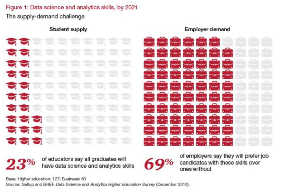
According to a report published by the Business-Higher Education Forum BHEF, “…by 2021, 69% of employers expect candidates with DSA skills to get preference for jobs in their organizations. Yet only 23% of college and university leaders say their graduates will have those skills.” It’s important to understand that this gap does not just apply to data scientists in training looking for jobs in Silicon Valley. We are all living in a big data world, and Data Science and Analytical skills will soon be fundamental at every level of the workforce from entry-level to CEO.
To help solve this skills gap the Academic Program provides FREE analytics training available in the Qlik Continuous Classroom and FREE Data Analytics Curriculum materials for professors and students to learn the what, why, and how of analytics. Access these resources by logging into the QCC using your Qlik username and selecting “Academic Program” on the top menu of the QCC homepage.
Share The Qlik Academic Program to friends or colleagues who are new to analytics and need a place to get started!
-
Continuous Classroom has a new look!
For all the Continuous Classroom users, and those of you who want to check out expertly created Qlik Training for free, go to qcc.qlik.com.Existing us... Show MoreFor all the Continuous Classroom users, and those of you who want to check out expertly created Qlik Training for free, go to qcc.qlik.com.
Existing users will notice that there are new tabs at the top of the page to help you navigate to the most important parts of the Continuous Classroom in order to get the most of your subscription. Easily access the libraries, learning plans, live webinar schedule, instructor Q&A sessions, and learn more about the platform.
Email questions and comments to ContinuousClassroom@qlik.com