Unlock a world of possibilities! Login now and discover the exclusive benefits awaiting you.

Analytics & AI
Forums for Qlik Analytic solutions. Ask questions, join discussions, find solutions, and access documentation and resources.
Data Integration & Quality
Forums for Qlik Data Integration solutions. Ask questions, join discussions, find solutions, and access documentation and resources
Explore Qlik Gallery
Qlik Gallery is meant to encourage Qlikkies everywhere to share their progress – from a first Qlik app – to a favorite Qlik app – and everything in-between.
Qlik Community
Get started on Qlik Community, find How-To documents, and join general non-product related discussions.
Qlik Resources
Direct links to other resources within the Qlik ecosystem. We suggest you bookmark this page.
Qlik Academic Program
Qlik gives qualified university students, educators, and researchers free Qlik software and resources to prepare students for the data-driven workplace.
Recent Blog Posts
-
Coloring a Scatter Plot
It is known as the Skittles effect. It happens when a developer creates a scatter plot and decides to color the plotted values by the dimension. This... Show More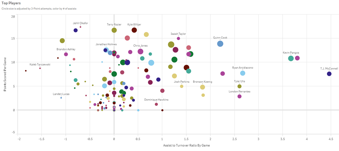
It is known as the Skittles effect. It happens when a developer creates a scatter plot and decides to color the plotted values by the dimension. This practice not only does nothing to tell the data story, it actually distracts the user from understanding what the data is actually saying. Have no fear; there are a couple of solutions to this problem. In this blog, I will discuss one: coloring the dimension by an expression.
Using an expression to color your plotted values
Both QlikView and Qlik Sense allow users to color the plotted values using an expression. In Qlik View, this is achieved by going to the expressions tab. Under the expression simply select Background color and enter the color expression.
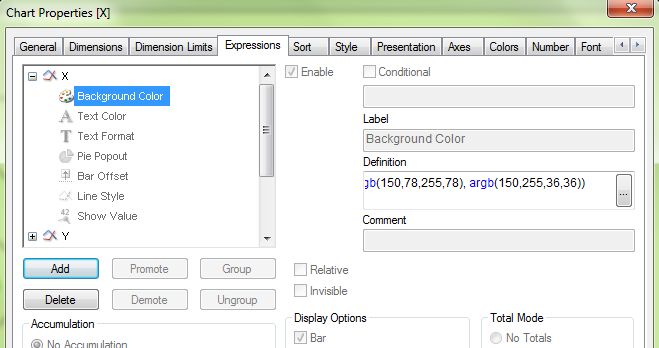
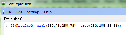
This expression is telling QlikView to color all plotted values greater than zero as green, else color them red.
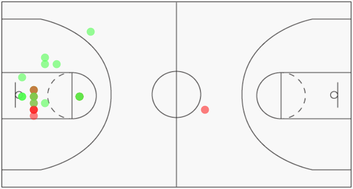
By coloring the plotted values using green and red, I can now identify which shots were made vs missed.
In Qlik Sense, this is accomplished by navigating to the properties panel on the right and selecting Colors and Legends. Switch the radio button off of the default setting of single color. Then select By expression, enter the color expression and make sure to check the box for This expression is a color code.
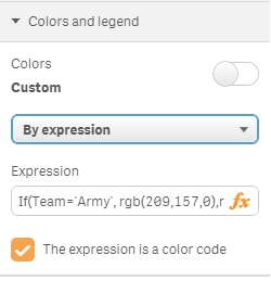
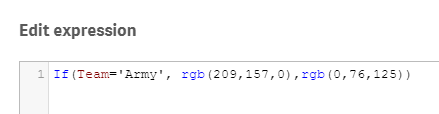
The expression defined here tells Qlik Sense to color all players from Army as gold, else color the players as blue.
Here is how Qlik Sense will render the chart once the color expression has been defined. I can easily identify the players from Army versus the players from Duke.
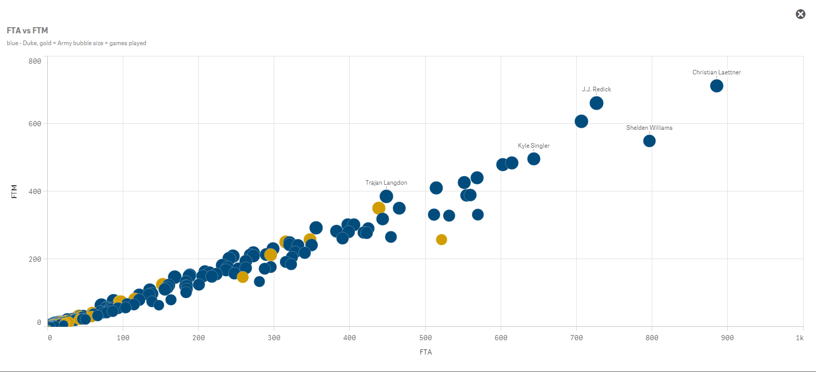
One word of caution, coloring by expression is best suited for small groups of colors. I would say 3-4 colors maximum. Otherwise you start to create your own controlled Skittles effect. It is also best practice to let the user know what the colors represent. Here I utilized Qlik Sense’s subtitle field to define the colors for the users.
Happy Qliking!

-
String functions: searching from the end of the string
Qlik String functions are an extremely handy set of functions to clean, manipulate, and ultimately normalize data before (or after) loading it into an... Show MoreQlik String functions are an extremely handy set of functions to clean, manipulate, and ultimately normalize data before (or after) loading it into an app. String functions ‒ Qlik Sense
I was working with a new data set recently, among other fields the data set contains addresses, something like this:
Abbey Road, London
Since the data set doesn’t have a dedicated city field I decided to apply Subfield() to extract the City as a separate field. Easy task, right? I use the comma as a separator to split the string.
…
Subfield (address, ',', 2) as City,
…
Shortly after we decided to expand the data universe of the app to include other countries in our analysis, we ended up having multiple sources with slightly different address formats:
Abbey Road, London
Paseo del Prado, s/n , Madrid
91, Rue de Rivoli, 75001, Paris
Not great news, right? Due to the variable number of commas in the address field I can no longer use subfield to manipulate the string, or maybe I still can use it.
Searching from the end of the string
Subfield function not only takes positive values for the third parameter, it also accepts negatives values. A negative value searches from the end of the string. This will help us to extract the City while keeping my script highly readable. The new function will be something like:
Subfield (address, ',', -1)
The function above will return the first portion of the string separated by the delimiter comma (',') searching from the end of the string, right to left. The newly created "City" field contains:
London
Madrid
Paris
Right to left search in String functions
The use of negative values, or right to left search (remember the read will still be performed from the start of the string) also apply to other string functions:
- Subfield
Subfield('Abbey Road, London', 'o',-2)
Returns 'nd' (the second occurrence of 'o' starting from the end) - Index
Index('Abbey Road, London', 'o',-2)
Returns 14 (the second occurrence of 'o' starting from the end) - FindOneOf
FindOneOf('Abbey Road, London', 'oes',-3)
Returns ‘8’ because the search is for any of the characters: o, e or s, and "o" is the third occurrence starting from the right, and is in position 8 starting from the left.
I hope you find it as useful as I do.
AMZ @arturoqv

- Subfield
-
Qlik Sense Mashup - Changing Chart Dimension on the fly
There are cases where we need to switch among charts in a mashup. The easiest way is with jQuery show/hide or if you are using Angular then show the c... Show MoreThere are cases where we need to switch among charts in a mashup. The easiest way is with jQuery show/hide or if you are using Angular then show the chart based on the model value.
But what about if we have many charts, with the same measures but only the dimensions change? What if we could just change the dimension in the engine and let the engine take care of all the changes and animations?
This is possible through the Visualization API and the applyPatches() method.
Here I will explain how to create a simple dropdown that changes based on the dimension selected. Since I am using Angularjs 1.5.8 like Qlik Sense September 2017, I have created a component that
a) gets first object,
b) populates a dropdown with titles and
c) upon change, the chart is changing based on the dimension provided
First, we get the first object as usual and display it in our mashup. This is what the html looks like
<sense-object-multi-dropdownqvid="'BRjnYJ'"
height="300"
data="[
{title:'Total Costs by Branch', dimension:'Branch'},
{title:'Total Costs by Work Center', dimension:'Work Center Name'},
{title:'Total Costs by Division', dimension:'Division'},
{title:'Total Costs by Collection', dimension:'Collection'}
]"
></sense-object-multi-dropdown>
Here, in the "qvid" is the id (BRjnYJ) of the first object. In the "data" we add the title as we want it to display in our dropdown and the actual dimension.
In our components's Javascript code, we get and then show the object as usual
qlik.app.visualization.get($ctrl.qvid).then(function (viz) {$ctrl.viz = viz;
$ctrl.viz.show($element.find('#obj'))
$element.find('.qv-object-header').remove();
});
Here is the html code for the component
<div class="sense-object-multi-dropdown"><div class="v title-1">{{ $ctrl.currentData.title }}</div>
<div class="dropdown">
<a class="btn btn-secondary dropdown-toggle" type="button" id="dropdownMenuButton" data-toggle="dropdown" aria-haspopup="true" aria-expanded="false">
<i class="fa fa-chevron-down" aria-hidden="true"></i>
</a>
<div class="dropdown-menu" aria-labelledby="dropdownMenuButton">
<a class="dropdown-item" href ng-repeat="item in $ctrl.data" ng-click="$ctrl.change(item)">{{item.title}}</a>
</div>
</div>
<div class="qvobject" id="obj" height="{{$ctrl.height}}"></div>
</div>
Now, by just this, the page should have a chart and a dropdown populated.
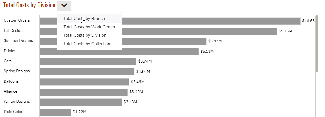
Now, let's add the code that will change the dimension
$ctrl.change = function(item) {$ctrl.currentData = item;
$ctrl.viz.model.applyPatches([{
qOp: "replace",
qPath: "/qHyperCubeDef/qDimensions/0/qDef/qFieldDefs/0",
qValue: `\"${$ctrl.currentData.dimension}\"`
}], true);
}
Here we are telling the engine that, hey for this object (model), replace the first field (qFieldDefs) of the first dimension (qDimensions) to the one I am giving you.
That's it. Once the engine receives the new change via websocket, it will redraw automatically, without any flickering and it will animate from one chart to the next.
Attached is my entire component if you want to use it in your Angular apps. Feel free to remove all the unnecessary libraries to make it work.
Live example: Plant Operations "Total Costs by Division"
Yianni
-
Virtual Scrolling - Improving Performance of Mashups and Extensions
The problem, the solutionRecently, while making a mashup in Angular.js using the Capability APIs I noticed that my UI was performing very poorly. In p... Show MoreThe problem, the solution
Recently, while making a mashup in Angular.js using the Capability APIs I noticed that my UI was performing very poorly. In particular, making a selection in one of my custom selection boxes was basically freezing the up the entire UI for up to a few seconds! After poking around a bit, I discovered the problem: there was just too many dom elements being watched for changes.
You may have seen this problem yourself if you've ever tried to use Angular.js to create a mashup. And this problem isn't inherent to only mashups; the same problem applies to extensions. So how do we deal with it? We can use virtual scrolling.
Virtual scrolling is a way to render and watch only the dom elements that are currently in view, and changing those elements to other elements as we scroll, as opposed to actually rendering and watching all of the elements. The Qlik Sense client already does this, which, in a minute, you'll see we're going to use to our advantage.
Here's two examples to show you just what I mean. You can see that the render time is much faster on the page that implements virtual scrolling, and that the UI responsiveness when making selections on the Case IDs is drastically better.
Virtual Scrolling Example No Virtual Scrolling Example
So how can you implement virtual scrolling in your mashup or extension? I'm going to walk through an example implementing virtual scrolling in a custom listbox for a mashup, but the same idea can be applied to extensions as well.
Using what's already there
Remember I said that the Qlik Sense client already implements virtual scrolling, and that we can use that to our advantage? We're simply going to make use of the same library that Qlik Sense objects already use to implement virtual scrolling. When building mashups or extensions, it's possible to use any library the client is already using. To see the full list, you can go to the "Menu" in the Qlik Sense client and click "About," then "Third-party Software."

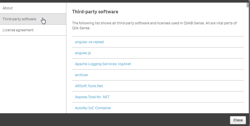
We can see in the images above that something called "angular-vs-repeat" is used by Qlik Sense, and, in this case, that's what we're after. The angular-vs-repeat library is an angular directive for virtual scrolling.
It's super easy to include this in your Angular.js based mashup.
var app = angular.module('app', ['vs-repeat']);
That's all you need to include it, since it's already loaded with the Capability APIs.
Implementing virtual scroll
Using it is pretty simple, too. In the most simple of cases, all you need to do is include the vs-repeat directive on the direct parent of an element with ng-repeat. In our example, that looks like this:
<ul vs-repeat class="cases-container">
     <li ng-repeat="case in cases" ng-click="selectCase(case)" class="{{case.qState}} case">{{case.qText}}</li>
</ul>
Resources and wrap-up
And that's basically the idea. The entire code for the example mashup is attached, and the link to the angular-vs-repeat repository on github is below. Hope this helps you improve the performance of your mashups and extensions

-
Updated Qlik Sense Certification Exams (June 2017 Release)
Qlik recently released an updated Qlik Sense Business Analyst Certification Exam, which completes the annual update of these exams. One exam is availa... Show MoreQlik recently released an updated Qlik Sense Business Analyst Certification Exam, which completes the annual update of these exams. One exam is available for each of these roles:
- System Administrator
- Data Architect
- Business Analyst
All of these exams are 50 questions to complete in 2 hours. To prepare, study the "Exam Domain Areas" and download the new PDF Study Guide from the Qlik Sense Certification web page.
A note about exam releases
The new Qlik Sense Certification Exams are based on the June 2017 Release of Qlik Sense. Our exams lag behind the product release, because they take 6 to 8 months to develop. We will only release new exams once per year, so the next exams are planned to be based on the June 2018 Release of Qlik Sense.
Previous exam versions are retired
All previous versions of the Qlik Sense Certification Exams have been retired, including the translated versions. Candidates who have difficulty because English is a second language may request an accommodation for extra time on the exam by emailing certification@qlik.com at least 10 days before they want to take their exam. Each individual must make a request for this exception.Questions? Contact certification@qlik.com

-
The Table Viewer
The table viewer is a gem.I use it for many things: to get an overview; to debug what I have done in the script; to check that all tables are linked; ... Show MoreThe table viewer is a gem.
I use it for many things: to get an overview; to debug what I have done in the script; to check that all tables are linked; to check that I don’t have any unwanted synthetic keys; to preview data. I can hardly remember what I did before QlikView had it¹.
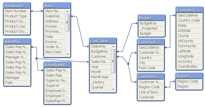
Just hit <ctrl>-T and you will see it.
I move around the tables until the structure corresponds to the picture I have in my head of the data. I tell new users developing applications to draw the wanted data model on a piece of paper so they know what the goal is. If they can't draw it on a piece of paper, they need to sit down and think. Or play around with data in QlikView until they can draw the data model. The structure seen in the table viewer then becomes an acknowledgement that the data model is correctly implemented. Or a warning that it isn't.
There are two modes of the table viewer: The Internal table view and the Source table view. The only difference is how the synthetic keys are displayed. During the script development, I always use the source table view, since it shows me exactly what I have done in the script.
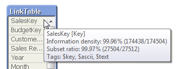
If you hover above the table headers, you can see the number of records and number of fields. If you hover above an individual field, you will get the data for this specific field: Whether it is a key, the information density, the subset ratio and – if applicable – the tags.
Many, when they see the table viewer, start thinking about a graphical tool to define which source data to load. But this is not what the table viewer is – it is a viewer only. Unfortunately or luckily, whichever way you look at it…
“Unfortunately” since a graphical tool no doubt would help many people, especially in the initial phase, when they want to load data quickly just to get a look at it. “Luckily”, since you never will get the same versatility using a graphical tool as you will with a script editor. For instance, almost all advanced data transformations I have shown in previous blog posts (e.g. How to populate a sparsely populated field) would be almost impossible to describe with a graphical tool. They would at least be very complex to depict, and most likely less user-friendly than having to write the actual code.
So, if we get a graphical script generator some day in the future, it should be some kind of hybrid where scripting still is allowed and we have the best of both worlds.
Until then, I will happily use the table viewer as it is: As the best available tool to get an overview of the data model. And as one of the best debugging tools in the application development process.
And that is not bad.
¹In fact, I do remember what we did before the table viewer existed: We used a cross table (a pivot table) with the system fields $Field and $Table as dimensions and Only([$Field]) as expression. It worked, but it did not give the same overview.

-
Card style web component w/ fullscreen capability for mashups
Recently I've been working on building a mashup template that will work in the dev-hub that will have a few more advanced features than many of the av... Show MoreRecently I've been working on building a mashup template that will work in the dev-hub that will have a few more advanced features than many of the available dev-hub templates. One of these features that I thought was important was a card container for Qlik Sense objects that has fullscreen capability built in. I'd like to share that with you today.
Here's an example of a really simple mashup with just the selection toolbar, and 2 Qlik Sense objects that use the qliksense-card web component I've built - Qlik Sense Mashup.
To use the qliksense-card web component yourself, you have a couple of options. You can either install the dev-hub template and create a new mashup from the dev-hub using the template, or you can just grab the necessary files and load them into your project.
Installing dev-hub template
You can download the dev-hub template here - GitHub - qliksense-card-template. After downloading, install the template as you would install any extension in Qlik Sense. After the template is installed, you can go to the dev-hub, create a new mashup, and select "Card template" from the dropdown list of templates.
The template is really kind of bare. There's not much going on besides the qliksense-card web component and a bit of bootstrap, but it's a good way to check out how the qliksense-card web component works.
Including the files in your own project
You don't have to use the dev-hub template to make use of the qliksense-card web component. What you will need is the qliksense-card.html file and the webcomponents-lite.min.js file. The easiest way to include them is to use the RawGit CDN, example below.
<script src="https://cdn.rawgit.com/download/polymer-cdn/1.7.0.2/lib/webcomponentsjs/webcomponents-lite.min.js"></script>
<link rel="import" href="https://cdn.rawgit.com/fkabinoff/qliksense-card-template/master/qliksense-card.html">
Using the qliksense-card component
After you're all setup, whether you've generated a new project using the dev-hub template, or included the necessary files in your own project, using the qliksense-card web component is easy. All you want to do is wrap your Qlik Sense object container with the qliksense-card tag, and set the height of the Qlik Sense object with the content-height attribute of the qliksense-card tag. You'll also want to set the width and height of your Qlik Sense object container to 100%. If you've generated a project using the template, this stuff has already been done, and you can check it out and just reuse as you'd like. If you've just included the necessary files in your own project, you can still check out the template files to see how it's done. Generally, it'll look something like below
<qliksense-card content-height="300px">
<div class="qvobject" id="QV01"></div>
</qliksense-card>
-
Qlik GeoAnalytics: An example of binning
A few weeks ago, we got into a new project to create an interactive piece with the Canadian media, National Post. The goal was to illustrate the donat... Show MoreA few weeks ago, we got into a new project to create an interactive piece with the Canadian media, National Post. The goal was to illustrate the donations candidates of the Conservative Leadership Race received from the start of the race through March 2017. Qlik Sense was integrated with Qlik GeoAnalytics to visualize where the donations were coming from and which candidates received the most donations in each area.
The map below was one of our first tries, we decided to use color to illustrate the top candidate by amount collected, and by postal code.
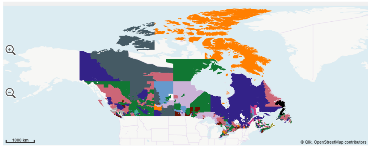
Problem with this approach appeared obvious at a first glance, postal codes areas have an insane size variance, regions such as the northern and barely populated province of Nunavut extents thousands of square miles in just one postal code while postal areas in urban zones, such as in Toronto, span a few city blocks and are hidden in the map.
So, how to make Nunavut and Toronto visible and comparable?
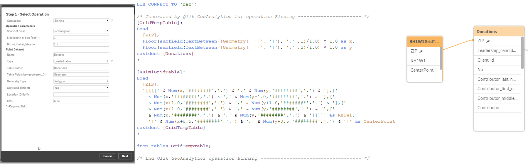
We decided to apply a binning operation to our data to solve most of the issues described. Qlik GeoAnalytics has a wizard that lets you chose operation, making the process seamless. The result is a new table containing squares (or hexagons) geo-polygons.
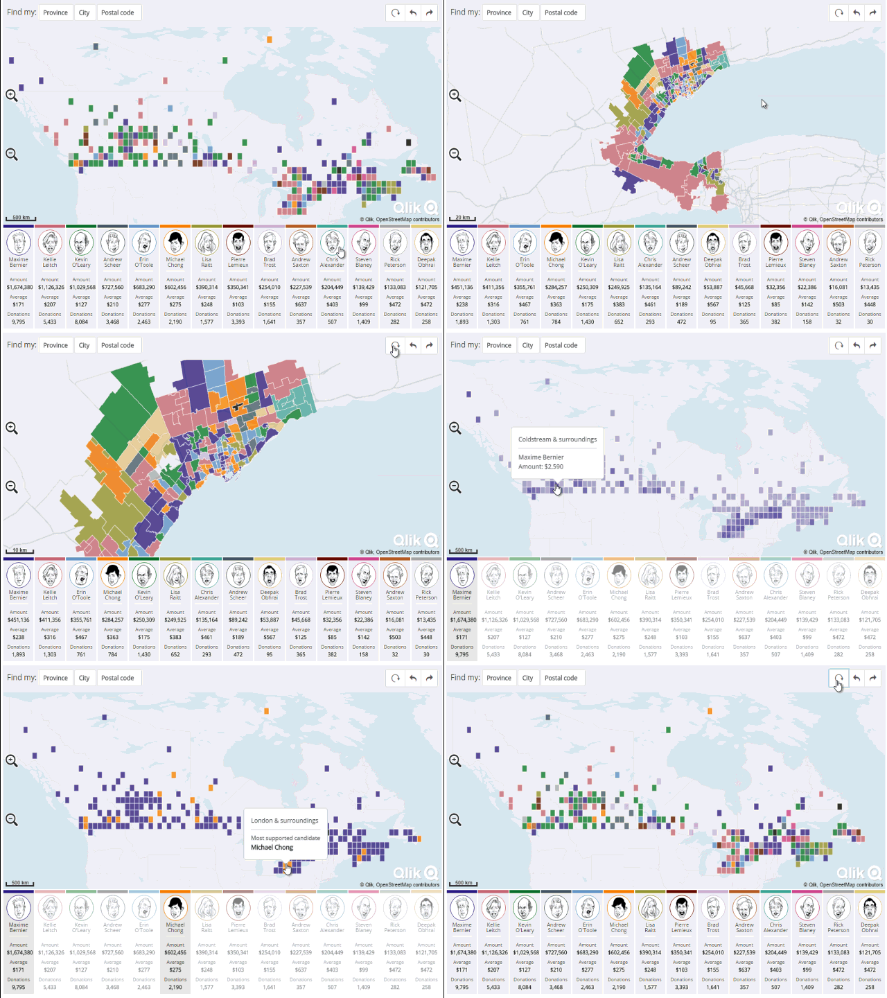
In this new map version, readers can compare areas easily without the distortion introduced by the different postal code sizes, letting us to see what’s going on in Toronto and in Nunavut at the same time.
We've added some extra cool features to the resulting Qlik Mashup. I recommend you to visit it and explore it at http://news.nationalpost.com/news/qlik
Enjoy,
AMZ
-
Redefining the Week Start
Six days thou shalt work, but on the seventh day thou shalt rest. [Exodus ... Show MoreSix days thou shalt work, but on the seventh day thou shalt rest.
[Exodus 34:21]
The idea that you should rest on the seventh day is a central concept in both Christianity and Judaism. But which weekday is the seventh day of the week? And which day is the first?
The old texts of the Abrahamic religions clearly consider the Sabbath – Saturday – as the seventh day of the week. This day is also still today the resting day for Jews around the world. The same texts also describe how Adam was created on the sixth day, which is one of the reasons why Friday is the day of congregation and prayers for Muslims.
Hence, these two religions agree on the numbering of week days: Friday is the sixth day of the week and Saturday is the seventh.
However, in the rest of the world, the situation is more confusing: Although Sunday is observed as resting day in most countries, there is a disagreement on whether Sunday is the first or the seventh day of the week. In North America, Sunday is the first day of the week, but in many European countries it is the last day of the week. According to the International Organization for Standardization (ISO 8601), the week starts on a Monday, and Sunday is thus the seventh and last day of the week.
How weekdays are ordered makes a difference in all Business Intelligence applications, most notably in how list boxes and charts are sorted. Note the order of the week days in the list boxes below. In the left one, Sunday is on top of the list and in the right one it is Monday.


This difference can also be seen in calendar displays, used in many types of software and on many sites in the web. Again, note the order of the week days.


QlikView uses ISO 8601 to define the week days and the week start. WeekDay() returns the name of the week day (as defined in the variable DayNames) and a number from 0 to 6; Monday being day number 0. WeekStart() returns the date of the Monday immediately before the date supplied as parameter.
If you want redefine this, e.g. if you want QlikView to show Sunday as the first day of the week – here’s how you do it:
Start by creating a variable that defines the beginning of the week:
Set vCal_FD = 6; // First Day of the week (0=Mon, 1=Tue, ... , 6=Sun)
The WeekStart() function has an offset parameter, and if you use your variable here, you can redefine how the function works and get the week start on the correct day:
WeekStart( Date, 0, $(vCal_FD) ) as WeekStart
The WeekDay() function, however, cannot take any offset parameter, so you need to define the week day using the Dual() function:
Dual( WeekDay( Date ), Mod( WeekDay( Date - $(vCal_FD) ), 7 ) +1 ) as WeekDay
Using these two expressions in your Master Calendar instead of the standard function calls, you can redefine the week start to any of the week days.
Further reading related to this topic:
-
Ask Mike - What is Qlik Market?
Hey guys, I'm trying something new this time around, a talking-head video - or perhaps better known as video blogging.In this video I answer community... Show MoreHey guys, I'm trying something new this time around, a talking-head video - or perhaps better known as video blogging.
In this video I answer community members' and twitter followers' questions. Recently I was asked to explain what Qlik Market was and who should use it. Watch this brief video to learn more.
- Visit Qlik Market today: http://market.qlik.com/
- Partners: Partner Portal | Over 1,700 partners around the world
- must obtain access to Qlik Market to submit your solution
If you have a specific question (that's right - I said specific question) about Qlik or Qlik Products and you want me to answer it, hit me up on Twitter https://twitter.com/mtarallo or tag me in a Qlik Community discussion. Now note I can't promise to answer every question, but hopefully our valued members and Qlikies can jump in too. If your specific question benefits others it may be featured in my next video blog. Enjoy!
Next on deck: How you can get your product ideas heard and considered.
NOTE: To increase resolution or size of the video, select the YouTube logo at the bottom right of the player. You will be brought directly to YouTube where you can increase the resolution and size of the player window. Look for the 'settings' gears icon in the lower right of the player once at YouTube.
Can't see the video?
Download the .mp4 and watch from your computer or mobile device.

-
Push the Boundaries of Analytics - Qlik Sense Bot (video)
Good Tuesday Qlik Community! Today I have a fun and entertaining way to showcase the power of the Qlik Sense platform, its APIs and the art of the pos... Show More
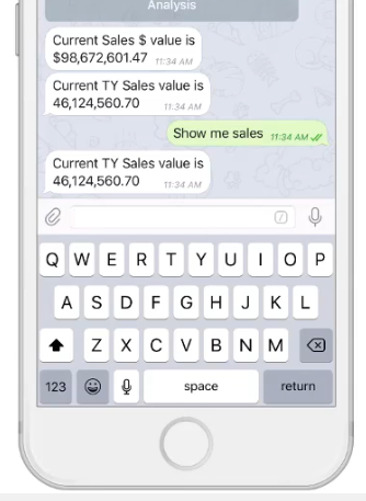
Good Tuesday Qlik Community! Today I have a fun and entertaining way to showcase the power of the Qlik Sense platform, its APIs and the art of the possible. But first, let me give you some background. In March, Qlik participated in the Gartner BI Bake Off (direct highlights here) - and for the 'innovation' portion of the presentation, my colleague Josh Good demonstrated a neat concept, showing what is possible with the Qlik platform and it's robust set of APIs - a Qlik Sense Bot - developed by my colleague Juan Gerado Cabeza. Since then we are getting numerous requests to see and learn more about what was shown on that day, so I have create this brief video to share some of its insights.
 What is a Bot you may ask?
You already know some popular bots – Siri, Cortana, Alexa and of course Google. These guys are programs designed to perform tasks, such as setting an alarm, telling you the weather, searching online or even ordering a pizza. So why not have a bot tell you who your top sales people are, alert you when profit margin reaches 20% – or - even have it send you charts and reports directly to your device? The possibilities are endless. Juan as done just that, creating an analytical assistant - that in actuality turns Qlik data visualization into conversational analytics.
Now understand the Qlik Sense Bot - IS NOT a product provided by Qlik, but rather a neat concept that demonstrates the art of the possible when using the Qlik platform and its APIs. Now - neatness, coolness and Qlik platform superiority aside, what I like the most about this innovation is that it provides many real world applications. Bots can be used by anyone, anywhere, on any device and at anytime – scheduling automated tasks and providing access to information when and where you need it – reducing complexities, and increasing availability of insight by simply having a conversation. So in my opinion I do see this as a viable product offering, but you never know. Watch this brief video to learn more about this awesome concept. If you want even more information about this superior innovation, please contact us at qlik.com, or you can reach out to us on Twitter or on the Qlik Community.
Have a great day!
Regards,
Michael Tarallo (@mtarallo) | Twitter
Pushing the Boundaries of Analytics - Qlik Sense Bot
We want to hear from you. Please leave your comments and questions in the comments section below.
NOTE: To increase resolution or size of the video, select the YouTube logo at the bottom right of the player. You will be brought directly to YouTube where you can increase the resolution and size of the player window. Look for the 'settings' gears icon in the lower right of the player once at YouTube.
NOTE: Can't see the video? Download the .mp4 to play on your machine or mobile device.

-
Context Is Next
Why Contextual Learning Is The Best New Way to Learn Software?"The way that we learn as adults has evolved over time. As technology continues to evolv... Show MoreWhy Contextual Learning Is The Best New Way to Learn Software?

"The way that we learn as adults has evolved over time. As technology continues to evolve, we learn more about how our brains process information. We are going through another inflection point in leaning towards a model of learning based off contexts and relationships."
From one-to-one to many-to-many
Learning started as apprenticeships where students learned on the job with a master teacher. This worked well, but since this was a one-to-one relationship, it did not scale well. Then, the model evolved to a one-to-many, teacher-centric approach where one teacher trained many students at once. This then evolved into a learner-centric approach where learners took control of their own learning, including self-directed learning approaches and performance support. Some of the benefits of the learner-centric approach are that students are able to learn what they want, when they want to learn it. In that way, teachers didn't have to teach concepts which may not be relevant to all, or which may go at different levels or speeds which are not ideal for each student. However, what was initially lacking from the learner-centric approach is context and social relationships, a many-to-many approach to learning.
To read the full article written by Kevin Hanegan (VP Knowledge & Learning) visit Context Is Next | Qlik Blog

-
Engine API and qSocks - Connecting and getting a list of available apps
In an earlier post, i have demonstrated how to connect to our app using Mashup API and displaying the objects on our webpage without much coding (http... Show MoreIn an earlier post, i have demonstrated how to connect to our app using Mashup API and displaying the objects on our webpage without much coding (https://community.qlik.com/blogs/qlikviewdesignblog/2015/05/22/creating-a-webpage-based-on-the-qlik-sense-desktop-mashup-api).
In one of my projects, I had to create custom charts one of which is to compare two golf players versus one measure. That means that I had to have a chart with 2 lines, one for each player, compared hole by hole This kind of visualization does not exist yet in Qlik Sense so I decided to build everything with qSocks and the Engine API.
I think this is the best solution for custom projects like this, since the Engine API is faster and it is loading only raw data.
qSocks is a wrapper intended to make our life easier on communicating with the Engine.(QSocks - Engine API wrapper).
In this first tutorial, I will show you how to connect to your Qlik Sense server and get a list of the available apps with qSocks.
- In your html header, add qSocks that you downloaded from the link above and your js file.
  <script src="js/qsocks.bundle.js"></script>
  <script src="js/index.js"></script>
- In your index.js, or however you have named your js file, add the connection configuration.
var config = {
  host: 'yourserver.com',
  isSecure: true
};
- Establish a connection with the server based on that configuration.
qsocks.Connect(config).then(function(global) {
- Get the list of all available apps on the server.
global.getDocList().then(function(docList) {
- If you want to view the available apps on your console, do a forEach loop on that docList.
docList.forEach(function(doc) {
- Here is what the console will output if you do "console.log(doc)"

Here is the full code:
var config = {
  host: 'yourserver.com',
  isSecure: true
};

function connect() {
  qsocks.Connect(config).then(function(global) {
       global.getDocList().then(function(docList) {
            docList.forEach(function(doc) {
                 console.log(doc.qDocId)
            });
       });
  });
};

connect();
In the next tutorial I will show you how to use the app id (qDocId) to connect to the app and get the available objects to display
-
November 2017 Features and Amazon Redshift Now Available in Qlik Sense Cloud
(Originally posted on 11/29 on the Qlik Sense Cloud blog, so in case you missed the updates, read on!)Qlik Sense November 2017 ReleaseOur Qlik Sense N... Show More(Originally posted on 11/29 on the Qlik Sense Cloud blog, so in case you missed the updates, read on!)
Qlik Sense November 2017 Release
Our Qlik Sense November 2017 release features are available in Qlik Sense Cloud. Qlik Sense Cloud Basic and Qlik Sense Cloud Business users now have access to the newest data prep, visualization, and usability improvements, including:
- Improvements to existing chart types:
- Tables – scroll sideways
- Box Plot – color by expression
- Distribution Plot – color by expression, control bubble size, and add jitter (to keep dots from overlapping)
- Combo Chart – display value labels
- Ongoing Visual Data Prep Enhancements
- UI based in-line data table
- Data Transformation Lineage
- Refresh and add data available from analysis edit mode
- Dynamic Sheet Names – utilize an expression in the name of a sheet
- Navigation Improvements using Keyboard – use the tab key to move around the screen
Mike Tarallo shows off all of these new features in his recent design blog post.
New Connectivity – Amazon Redshift
We’re excited to announce that Amazon Redshift is the newest addition to our expanding list of connectivity options for Qlik Sense Cloud Business users. Now you can easily connect to data stored in your Amazon Redshift database by creating a new connection in Add Data or the Data Load Editor. Visit our help section to learn more about how to set up the connection.
The full list of connectivity options in Qlik Sense Cloud Business now includes:
- General Connectivity: upload or attach files; connect to web files; REST, Microsoft SQL Server, and Amazon Redshift
- CRM Connectivity: Salesforce, SugarCRM, and Microsoft Dynamics
- Other Cloud applications: Bitly, Facebook, Google Analytics, Google Adwords, MailChimp, Slack, SurveyMonkey, Twitter, and YouTube
Coming Soon
We’re close to releasing our Dropbox connector for Qlik Sense Cloud Business and excited to add another flexible connectivity option for users. For a preview of how to use the Dropbox connector, check out Mike Tarallo’s recent design blog and video below about how to refresh file-based data stored in Dropbox.
More Qlik Sense Cloud highlights:
- On-Demand Webinar: Cloud BI Strategy: Do’s, Don’ts, and Gotchas
Hear about the latest trends in cloud BI! Cindi Howson of featured analyst firm Gartner explains all the factors you need to know about cloud BI. Plus, Anthony Deighton, Qlik's Chief Technology Officer and Senior Vice President, Products, shares the latest on Qlik's unique hybrid cloud solution.
- Live Qlik Sense Cloud Webinars: attend a live, interactive webinar with the team to get your Qlik Sense Cloud questions answered and learn more.

- Improvements to existing chart types:
-
PRESS RELEASE! Qlik Expands Academic Program with Mission to Bridge the Data Lit...
The Academic Program is excited to announce that we released a global press release today that features information about all of the programs new reso... Show More The Academic Program is excited to announce that we released a global press release today that features information about all of the programs new resources and feedback from students and professors who have successfully shared in the benefit of becoming members!
Sneak Peek...
“By participating in the Qlik Academic Program, these students are not only making themselves more marketable, but they’re prepared to stand out in today’s competitive workforce and set the new standard as the next generation of data literate business leaders driving the analytics economy.”
For the full article visit
https://www.qlik.com/us/company/press-room/press-releases/0103-qlik-expands-academic-program
We encourage you to share this article through social media!
-
Looking to be Data Literate? Begin with Curiosity!
Data literacy is everywhere, but don’t know where to begin? Start with a curious mind....It has been said that curiosity killed the cat, well, in the ... Show MoreData literacy is everywhere, but don’t know where to begin? Start with a curious mind....

It has been said that curiosity killed the cat, well, in the case of data and analytics, curiosity brings success.
In the world of data and analytics, we are hearing a lot more about data literacy, and the reality is, data literacy is vitally important to companies and their cultures to succeed, but most people are asking: where do we begin? There are many steps and things that can be done to build the right data literate culture, infusing success in data literacy throughout an organization, but there is a certain mindset that needs to permeate throughout the organization: curiosity. What does it mean to be curious within analytics? Why is curiosity such a vital mindset to have within the world of data literacy?
Did you know the Academic Program offers a Data Analytics course that delves into Data Literacy?! Professors and students can review the course materials by visiting the Course: Academic Program Learning Resources.
NOTE: If you do not have access you can reapply to the program by visiting https://www.qlik.com/us/company/academic-program
To read the full article written by Jordan Marrow (Qlik Global Head of Data Literacy) visit Looking to be Data Literate? Begin with Curiosity! | Qlik Blog
-
Year in review. 2017 Top Blog Posts
It's time for the end-of-the-year in review post, it's time for the cream of the crop.During 2017 six main authors and a respectable number of guest b... Show MoreIt's time for the end-of-the-year in review post, it's time for the cream of the crop.
During 2017 six main authors and a respectable number of guest bloggers posted a total number of 85 articles (plus this one).
We wrote 39,822 words (7,819 distinct words), that’s 15% more than the number of words we wrote previous year. We wrote the word “Qlik” 566 times, an absolute record. You contributed 695 times to the success of this blog in the comments section, we truly appreciate your feedback and comments!
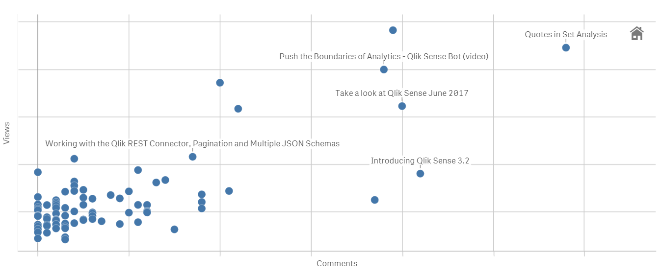
Most popular posts in 2017
Most read/visited posts
Don't be the last one to read it!
- Qlik Sense September 2017 - What's New
- Quotes in Set Analysis
- Push the Boundaries of Analytics - Qlik Sense Bot (video)
- Take a look at Qlik Sense June 2017
- Introducing DAR mashup template
Most commented posts of the year
Everyone is buzzing
- Quotes in Set Analysis
- Introducing Qlik Sense 3.2
- Take a look at Qlik Sense June 2017
- Qlik Sense September 2017 - What's New
- Push the Boundaries of Analytics - Qlik Sense Bot (video)
The underdogs 2017
They worth a second read.
- Qlik Sense WordPress Plugin
The world most popular CMS and the most powerful Analytics platform combined? it seems like a perfect match. This blog post is capturing a lot of comments, check it out and join the conversation. - Rank Function
Some of the old Qlik functions still have secrets, check this post to learn what you are missing from the Rank function. - Intro to Qlik Open Source Software
It feels great to contribute to the Open Software community, read what Qlik has to offer! - Salesforce and CIO dashboard mashups available to the public
You can use these examples as templates or just dissect them into pieces to learn more about Qlik APIs and how to build impacting data sites.
I wish you an enjoyable New Year countdown!
Arturo (@arturoqv)
-
Qlik Help!
Did you know about Qlik | Help ?! The Help page is dedicated to ensure you are equipped with all the resources and knowledge necessary to be successf... Show More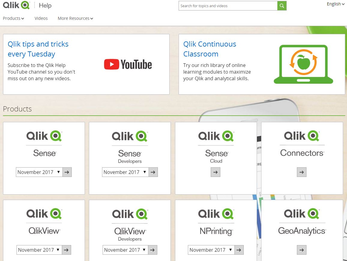 Did you know about Qlik | Help ?! The Help page is dedicated to ensure you are equipped with all the resources and knowledge necessary to be successful with Qlik Sense or any other Qlik product you might be working with!
After using the free training from the Qlik Continuous Classroom, the Help page is a great resources which provides videos, tutorials, guides, demos, and much more! Plus its available in multiple languages!
Save this link Qlik | Help and remember to take advantage of the Help site when in need!
-
Mashup Editor - Search as you type box
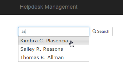
In my previous posts I have showed how to use bootstrap's drop-down menus with the Capabilities API. In this tutorial I will show you how to use jQuer... Show MoreIn my previous posts I have showed how to use bootstrap's drop-down menus with the Capabilities API. In this tutorial I will show you how to use jQuery's UI to get results as you type like this
- From the dev-hub (http://localhost:4848/dev-hub/) click on "Create New", to create a new mashup. Give it a name and select as template the "Grid mashup template"
- Select the "Helpdesk Management.qvf" for your app.
- On the right hand side, click on "Create a list". This will be the results that we would like to search on.
- From the left hand side click and drag the "case details" table onto the preview panel
- Click on "Fields" and select "Case Owner".
- Under "Rows" put 100 since we do not need any more for this tutorial, and give a name to your callback function. I usually name mine as "refactorData" because I restructure all of the data in a more accessible format. Once you hit create, you will see that the code for the list was added as well as the refactorData in line 108.
- In our html's headers, after bootstrap css and right before requirejs, add the jquery ui css and js
<link rel="stylesheet" href="https://community.qlik.com//code.jquery.com/ui/1.11.4/themes/smoothness/jquery-ui.css">
<script src="https://code.jquery.com/jquery-2.1.4.min.js"></script>
<script src="https://code.jquery.com/ui/1.11.4/jquery-ui.min.js"></script>
<script src="https://maxcdn.bootstrapcdn.com/bootstrap/3.2.0/js/bootstrap.min.js"></script>
- Let's add the code into our callback function
function refactorData(reply, app){
     var data = [];
     for (var i = 0; i < reply.qListObject.qDataPages[0].qMatrix.length; i++) {
          data.push(reply.qListObject.qDataPages[0].qMatrix[0].qText);
     }
     $("#search").autocomplete({
          source: data
     });
};
- In our "function AppUi ( app ) {" add the code below that will make the actual selection in our app
$( "#searchBtn" ).on( 'click', function () {
     app.field('Case Owner').selectValues([$('#search').val()], false, false);
});
- Now Let's add the text box in our html page. Replace the "<div class="col-sm-4 qvplaceholder" id="QV01">" with this one
<div class="col-sm-4 qvplaceholder" id="QV01">
     <div class="input-group input-group-sm">
          <input type="text" class="form-control" placeholder="Type in the Case Owner" aria-describedby="basic-addon1" id="search" name="search">
          <span class="input-group-btn">
               <button class="btn btn-default" type="button" id="searchBtn"><span class="glyphicon glyphicon-search" aria-hidden="true"></span> Search</button>
          </span>
     </div>
</div>
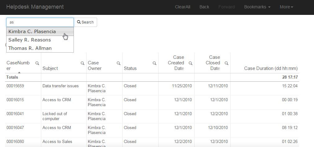
And that's it. The final should look like this
YV
-
We want you - Apply to be a 2018 Qlik Luminary!
Hi Guys, we are almost at the finish line for 2017! So roll up your sleeves and get ready to show off that Qlik creativity and passion as we are ready... Show More
Hi Guys, we are almost at the finish line for 2017! So roll up your sleeves and get ready to show off that Qlik creativity and passion as we are ready to start accepting applications for our 2018 Qlik Luminary program. Here to tell you more is our Global Customer Communications Manager, Viktoria Lindback.
Viktoria Lindback has had many roles during her 5-year tenure at Qlik. Today, she runs global customer programs including the https://www.qlik.com/us/solutions/customers/qlik-luminaries which means she gets to spend the majority of her time interacting with the most enthusiastic Qlik users around the world.
If you haven’t heard of the Qlik Luminary Program yet, this is a great time to get educated about it because we’re accepting applications to the 2018 Qlik Luminary Program as we speak!

Click here to see our awesome Qlik Luminary Class of 2017
Every year, we roll out the green carpet to a remarkable group of people who all receive the “Qlik Luminary” designation. With deep drive, passion and expertise, Qlik Luminaries are constantly pushing the envelope, finding new and innovative ways to use, deploy and talk about Qlik solutions. Some of them are BI thought leaders; others are recognized industry visionaries, business leaders, or masterful developers. But what they all have in common is a passion for innovating with Qlik and sharing their expertise with others in a global arena. You will catch them speaking at events, running Qlik Dev Group, writing blog posts, contributing to case studies, and participating in Qlik Community and other social networks. A great place to follow their work is #QlikLuminary on Twitter.
Here are some of the characteristics of a Qlik Luminary:
- Passionate about Qlik and widely recognized as a BI innovator and expert in his or her field
- Active and consistently helpful on Qlik Community
- Active on online forums, industry social networks, and/or organizational or personal blog
- Willing to share best practices and knowledge at industry events, forums, in the press, and with industry analysts
- Prolific content creator who creates or contributes to blogs, white papers, reviews, articles, videos, etc.
There are also plenty of benefits to being a Qlik Luminary. They enjoy free access to state of the art Qlik training, custom merchandise, exclusive engagements with R&D, Product Management, and Support teams, membership in a private Qlik Community group, NDA briefings with Qlik product executives, and VIP treatment at Qonnections.
We are accepting applications for the 2018 cohort until December 31st here: https://www.qlik.com/us/solutions/customers/qlik-luminaries
Don't miss your chance to join a group of the sharpest brains and most skilled users in the BI industry!Kinds Regards,
Viktoria (@VLindback) | Twitter
Global Communications Manager
Qlik