Unlock a world of possibilities! Login now and discover the exclusive benefits awaiting you.

Analytics & AI
Forums for Qlik Analytic solutions. Ask questions, join discussions, find solutions, and access documentation and resources.
Data Integration & Quality
Forums for Qlik Data Integration solutions. Ask questions, join discussions, find solutions, and access documentation and resources
Explore Qlik Gallery
Qlik Gallery is meant to encourage Qlikkies everywhere to share their progress – from a first Qlik app – to a favorite Qlik app – and everything in-between.
Qlik Community
Get started on Qlik Community, find How-To documents, and join general non-product related discussions.
Qlik Resources
Direct links to other resources within the Qlik ecosystem. We suggest you bookmark this page.
Qlik Academic Program
Qlik gives qualified university students, educators, and researchers free Qlik software and resources to prepare students for the data-driven workplace.
Recent Blog Posts
-
Is a picture still worth a thousand words?
Narrative Science, creators of Quill a natural language generation (NLG) platform, reached out to me recently and asked if I could create a short vide... Show More Narrative Science, creators of Quill a natural language generation (NLG) platform, reached out to me recently and asked if I could create a short video introducing its extension for Qlik Sense, Narratives for Qlik. Always willing to play with a "shiny new toy" and willingness to please our valued partners, of course I agreed. I have heard about this extension a few months back, but never got a chance to actually work with it until now. Since it is created as a Qlik Sense extension, it integrates very easily into Qlik Sense. I just had to unzip the file to Extensions directory under my Qlik Sense Desktop installation: C:\Users\<user account>\Documents\Qlik\Sense\Extensions and refresh. (Qlik Sense Enterprise users will want to use the Qlik Management Console and the Extensions import utility.)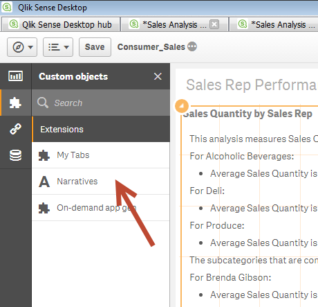
The free extension is available as a "hosted" version. I assume the NLG algorithm is processed over the network on one of their servers and then results are sent back to the client object. However, I just found out they have an on-premise version as well where you can use their NLG platform locally in your environment. Regardless of where the operations run from, I have one thing to say - this stuff is Qool.
So is a picture worth a 1000 words? Yes sir, especially if those words are automatically generated, contain valuable insights and reduce any misconception or interpretation that is usually performed when analyzing visualizations. Narratives for Qlik is the perfect compliment to the Qlik data visualization platform. You may ask, "In a world where we try to use visuals to reduce the amount of text one has to read, why in the world would we want to revert our visualizations back to text?" I think this below example will answer that question. Look at the below example using a Treemap (right) and the complimentary, bullet-ed narrative (left) - automatically created by Narrative Science - which one provides the most accurate insights without interpretation?
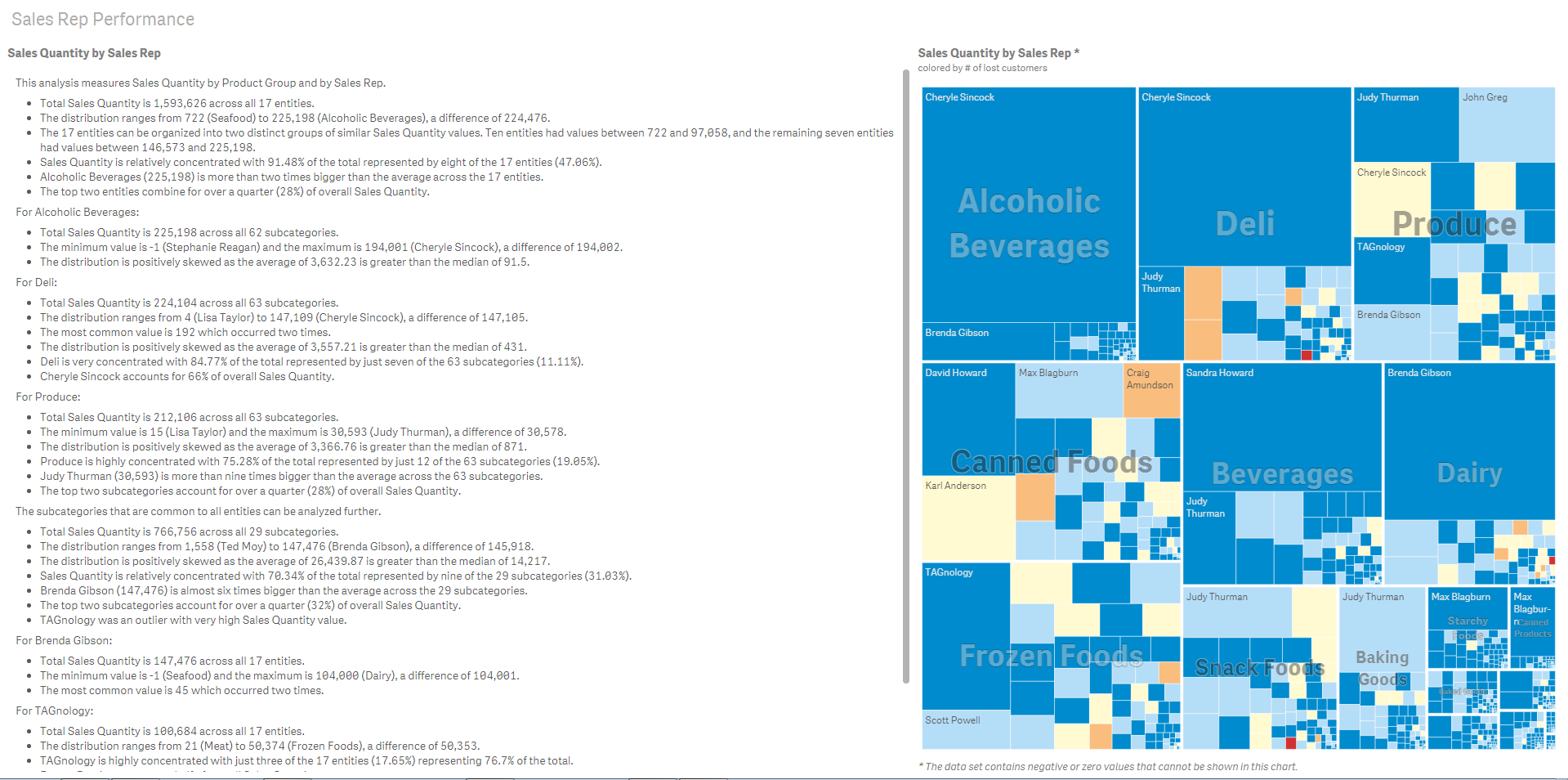 (click to enlarge)
The automatic narrative is just the beginning. There are also settings to control text formatting, how much or how little information is displayed, and analytical options that leverage predictive and statistical capabilities.
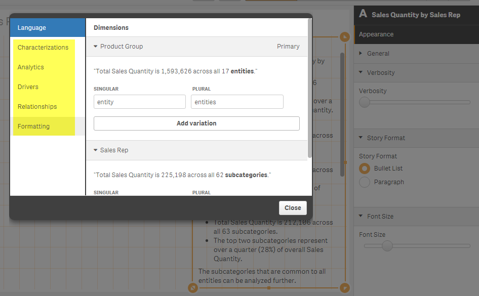
If you would like to see this in action check out the below video that briefly introduces Narratives for Qlik. Be sure to download the extension and visit their website to learn more.
Narratives for Qlik is an extension created by Narrative Science. It integrates seamlessly into Qlik Sense and leverages advanced natural language generation, a subset of artificial intelligence that translates structured data to text, which automatically transforms your visualizations into powerful narratives that explain the most interesting and important facts.
NOTE: To increase resolution or size of the video, select the YouTube logo at the bottom right of the player. You will be brought directly to YouTube where you can increase the resolution and size of the player window. Look for the 'settings' gears icon in the lower right of the player once at YouTube.
Can't see the video? - You can download the attached copy to play on your machine.
Michael Tarallo (@mtarallo) | Twitter
Senior Product Marketing Manager
Qlik
-
How to custom color a stacked bar chart
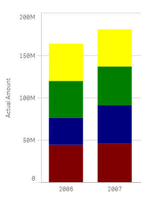
Stacked bar charts are perfect to represent the contribution of particular elements to the total, the classic example is Sales by Year and by Quarter.... Show MoreStacked bar charts are perfect to represent the contribution of particular elements to the total, the classic example is Sales by Year and by Quarter.
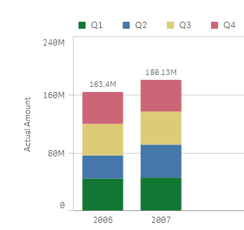
Just by observing the chart a few seconds we can conclude that Actual Amount was higher in 2007 than 2006, and it seems clear that Q2 rise in 2007 contributed significantly to the 2007 total increase in Actual Amount.
To create a simple stacked bar chart like the one in our example we've needed 2 dimensions (Year and Quarter) and one measure. Alternatively, we could recreate the chart using one single dimension "Year" and 4 expressions one per each one of the quarters. The procedure to customize the colors will depend of what type of chart you have, bi-dimensional chart or multi-expression chart, let’s start with bi-dimensional chart coloring.
Bi-dimensional stacked bar chart
This is the simplest case, you just need to target each one of the segments (Quarters in our example) by name, you could just use an if statement to target them, something like:
if(Quarter='Q1',red(),if(Quarter='Q2',blue(), if(Quarter='Q3', green(), yellow())))
Alternatively, you could use conditional functions for a more elegant approach:
pick(match(Quarter,'Q1','Q2','Q3','Q4'),red(),blue(),green(),yellow())
Multi-expression stacked bar chart
In this scenario our data table contains one column per quarter as in the image below but we still want to represent them in one stacked chart using custom colors.

We could get a stacked bar chart using one single dimension "Year", and 4 expressions Q1,Q2, Q3 and Q4. The problem comes when trying to color the segments, at this point we can’t target specific segments anymore because each one of our segments is made of an expression.
To solve this situation, we need to work-around our chart to make it again bi-dimensional. In order to do that we’ll add a new table to our data model. Our table will contain the name of the segments for our chart, I called it [segment names] in my example.
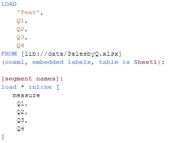
Once the data has been loaded then it’s time to create our chart. The dimensions will be “Year” and the recently created “measure”. To complete our chart, we’ll need to add a simple if statement (or the more elegant pick&match combo) in our measure expression, similar to this one:
if(measure='Q1', sum(Q1),
if(measure='Q2', sum(Q2),
if(measure='Q3', sum(Q3),
if(measure='Q4', sum(Q4)))))
Now that our chart is standard bi-dimensional bar chart, all we need to do is to apply custom colors as described earlier in this post. So again we could use the good old if statement or pick&match to end up having customized segment colors in our stacked bar chart.
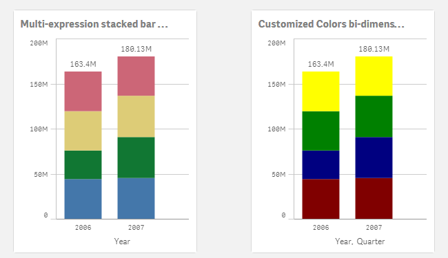
I'm attaching an example app so you can check how it's done.
I want to give credits to all the contributors to How to use custom colours in a stacked bar chart, please check that community thread if you have questions or just to learn more about custom colors in stacked bar charts.
AMZ

-
Qlik Sense Certifications Coming Soon!
Qlik Sense Certification Exams are in development and coming soon! By March 31, the first two Qlik Sense certifications will be released: Qlik Sense A... Show More
Qlik Sense Certification Exams are in development and coming soon! By March 31, the first
two Qlik Sense certifications will be released: Qlik Sense Administrator and Qlik Sense Data Architect. These exams will be available through our test delivery partner, Pearson VUE. Look for all the details about the exams at Qlik Certification.com in March.
To better prepare yourself, make sure to register for Qlik Sense training! Classes are filling up fast so don't miss out. For a list of Qlik Sense courses visit Qlik Sense.com.

-
Ditching the Old Print Manuals
Online training manuals provide much more than just a digitized version of what’s in print.Learn more about how Qlik is innovating the future of train... Show MoreOnline training manuals provide much more than just a digitized version of what’s in print.

Learn more about how Qlik is innovating the future of training by moving away from traditional, stagnant books in favor of online manuals, Ditching the Old Print Manuals | Qlik
Benefits of an online manual:
- Searchability so you can do a full text search and quickly find what you are looking for.
- Content integration so you can access everything you need in one place. Whether it’s all the class files, job aids, exercise files, quizzes, or even links to additional related learning content and resources, like blogs, YouTube videos, or forums.
- Ability to handle multiple use cases, for example so you can check the new features in the latest software release, or the activities from the class, additional follow up activities, or even toggle from content to one product version to another, all from one location.
- 24/7 access, anytime and anywhere without having to actually carry anything with you – besides your smartphone, tablet or laptop.
- Notes and annotations tools so you can take notes just as you would do on printed books.
-
Mashup Editor - Toggle charts with jquery
There were numerous times that I was asked to show more than one chart in the same page. This tutorial will show you how to place two buttons which wi... Show MoreThere were numerous times that I was asked to show more than one chart in the same page. This tutorial will show you how to place two buttons which will toggle the visibility of certain graphs.
- From the Mashup Editor create a new mashup and select the "Grid mashup template". This will add in your page Bootstrap which we will need for the buttons that will handle the toggling.
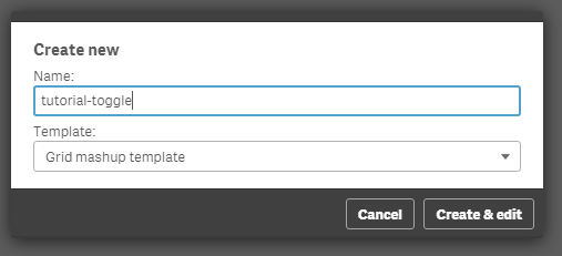
- Then, select the "Helpdesk Management" and place the charts that you want to toggle onto the grid. I selected "Avg Case Resolution Time" and "Open Cases by Age".
- If you want to preview your files in another tab outside of the Mashup editor, the url would be something like "http://localhost:4848/extensions/tutorial-toggle/tutorial-toggle.html".
- You will see in your html the grid with rows and columns and your visualizations.
<div class="row">
  <div class="col-sm-6 qvplaceholder" id="QV01">
  </div>
  <div class="col-sm-6 qvplaceholder" id="QV02">
  </div>
  </div>
  <div class="row">
  <div class="col-sm-6 qvobject" id="QV03">
  </div>
  <div class="col-sm-6 qvobject" id="QV04">
  </div>
</div>
- Make sure you remove the "qvplaceholder" from QV01 and QV02, otherwise you will have a lot of extra space between your buttons and the chart.
- In your js file you will see the code that places the objects into the html grid. Just for now, we will place both of the objects. We only need their ids, so later on we will remove the second chart.
  //callbacks -- inserted here --
  //open apps -- inserted here --
  var app = qlik.openApp('Helpdesk Management.qvf', config);

  //get objects -- inserted here --
  app.getObject('QV04','a5e0f12c-38f5-4da9-8f3f-0e4566b28398');
  app.getObject('QV03','PAppmU');
- Now, we will create 2 radio buttons that handle the toggling of the charts. In row 1 and column 1 we will add the following:
<div class="btn-group" data-toggle="buttons">
  <label class="btn btn-default active">
  Avg Case Resolution Time
  <input type="radio" id="chart" name="chart" value="PAppmU" checked="checked"/>
  </label>
  <label class="btn btn-default">
  Relative to Population
  <input type="radio" id="chart" name="chart" value="a5e0f12c-38f5-4da9-8f3f-0e4566b28398"/>
  </label>
  </div>
- Now we can remove the second chart, 'QV04' from the JS file.
- The final page should look like this

- If you have time and you want to make this more visual appealing, you can add some transition effects like fading.
- We will add the "$('#QV03').fadeOut" in the JS file. Once this is completely faded out, we will then replace the object and fade it back in.
$( document ).ready(function() {
  $("input[name='chart']").change(function(obj){
      $('#QV03').fadeOut('fast', function(){
      app.getObject('QV03',obj.target.value);
      $('#QV03').fadeIn('fast');
    });
  });
});
- If for any reason the object does not show after hiding the first element, try to add qlik.resize and the id of the new object.
qlik.resize(obj.target.value)
Attached you will find all of the files. Just unzip and place into your "Documents\Qlik\Sense\Extensions" folder.
-
Performance of Conditional Aggregations
In my previous post I compared different methods for making Conditional Aggregations. In it, I claimed that Set Analysis often is faster than other me... Show MoreIn my previous post I compared different methods for making Conditional Aggregations. In it, I claimed that Set Analysis often is faster than other methods, like an If()-function or a multiplication with a flag.
Also, in a recent discussion on the forum performance benefits of the different methods are discussed, and the multiplication method is favored by some.
So I decided to make my own test.
The main conclusion from my test is that Set Analysis is by far the most performant way to make a conditional aggregation – in the cases when you need performance. The chart below shows the average chart calculation time for the five different ways to make a conditional aggregation in a situation where you have a large amount of data.
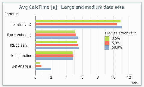
From this chart, you can draw several conclusions:
- Set Analysis is the fastest alternative for large data sets.
- Set Analysis is relatively better if the selection ratio is small (the sub-set of data that the condition picks out), since the following aggregation runs over a much smaller number of rows. This is in sharp contrast to the other methods where the selection ratio hardly affects the result.
- The three methods in the middle (numeric comparison as condition, Boolean flag as condition and multiplication) are roughly the same from a performance perspective.
- An If()-function with a string comparison is by far the worst choice.
But it is not a clear-cut case: If you instead make the same measurements with a smaller data set, Set Analysis is not the most efficient method. The chart below shows the result for a smaller data amount. Note that even though the data amount still is considerable (1M records), it is small enough for all response times to be under a second, whereas they in most cases are an order of magnitude larger in the above graph.
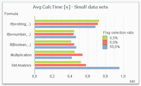
The reason is that there is an overhead in Set Analysis, that has to be performed independently of whether the data amount is large or not. So for small data amounts, the performance gain in the aggregation is not large enough to cover the overhead.
The bottom line is that Set Analysis is the method you should use for large data amounts. For smaller data amounts, it doesn’t really matter which method you choose: They are all fast enough.
About the test:
The test was made on my dual-core laptop with 16GB of memory. The data model consisted of three tables; one fact table and two dimension tables. The fact table contained 100 million records.

The calculation time of a pivot table with the field Dim as dimension and the sum of Amount as expression was measured, using the different ways to code the condition. The field Condition was used as flag in the condition.
The measurement was repeated for different user selections in Dim (99M records, 10M records and 1M records), for different selection ratios in the condition (0.5%, 5% and 50%), and for different cardinality in the Condition Dimension (1000 records, 1M records).
The measurements were made starting with a cleared cache, then making a series of different selections in the field Dim of which the last three were recorded. This way the cache was populated with basic calculations and indexes, but not with the specific chart calculation.
Further reading related to this topic:

-
Aggregations and Function Classes
A typical QlikView application may have one million records in the data, one hundred rows in a pivot table and a single number, a KPI, in a gauge or t... Show MoreA typical QlikView application may have one million records in the data, one hundred rows in a pivot table and a single number, a KPI, in a gauge or text box. Although different in magnitudes, all three numbers may still represent all data. The numbers are just different aggregation levels.
There are many functions in QlikView that can help you write the necessary formulae to calculate aggregated KPI:s. Some will collapse many records into one value, others will not. Today I will write about the different function classes, and how you can combine them.
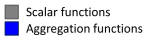
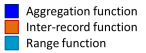
 The Scalar Functions constitute the first class. Typical for these is that they are one-to-one functions, i.e. they take a single value as parameter and return a single value (of the dual data type). Examples: Left(), If(), Num(), Date(), Year(), Subfield(), etc.
 The Aggregation Functions constitute the second class. These are many-to-one functions, i.e. they use the values from many records as input and collapse these into one single value that summarizes all records. Examples: Sum(), Count(), Avg(), Min(), Only(), Concat(), etc.
Aggregation functions are special: You must use one to collapse several records into one number – which means that you need them in pretty much any formula in QlikView: In Chart expressions, in Text boxes, in Labels, etc. If you don’t write an aggregation function in your expression, QlikView will assign one for you: It will use the Only() function.
Scalar functions can be used both inside and outside the aggregation function:
Date( Min( Date )
Money( Sum( If( Group='A', Amount ) ) )
There is one restriction: You can normally not use an aggregation function inside another aggregation function. Hence, you usually need every field reference to be wrapped in exactly one aggregation function.
 The next function class has only one member: The Aggr Function. It is – in spite of its name – not an aggregation function. It is a many-to-many function, rather like a tensor or a matrix in mathematics. It converts a table with N records to a table with M records. In other words: It returns an array of values. Regard it as a virtual straight table with one measure and one or several dimensions.
Most places in QlikView demand that you write your expression so that it returns one single value. This means that you must wrap the Aggr function in an aggregation function to get a meaningful result. The only exception is if you use the Aggr function to define a calculated dimension or field. This means that you have two aggregation steps; one nested in the other:
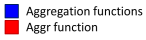
Avg( Aggr( Sum( Amount ), Month ) )
Charts complicate the matters slightly: A chart is like a For-Next loop where the number of distinct dimension values determines the number of loops. In each loop, the expression must return one value only, and this is the value used for the bar/slice/pivot table row.
However, sometimes you need values from other rows in the chart, and it could even be that you need values from several rows. To solve this, there are two additional classes of functions that should be used together:
 The Chart Inter-record Functions return values fetched from other rows in the chart. Some of these can return several values, i.e. an array of values. These functions are only meaningful inside a chart or Aggr() function. Examples: Above(), Below(), Top(), etc.
 The Range Functions are functions that can collapse a chart inter-record array into one single value. Examples: RangeSum(), RangeMin(), RangeMax(), etc.
Example:
RangeSum( Above( Sum( Amount ), 0, 12 ) )
Bottom line: Know your functions. It will help you write correct expressions.
See also
-
Calculated Dimensions
In most cases, you will use an existing field as dimension, i.e. an attribute that exists in the source data. In such a case, the answer to the above ... Show MoreIn most cases, you will use an existing field as dimension, i.e. an attribute that exists in the source data. In such a case, the answer to the above question is easy: Just make sure to load the field in the script, and you're done.
But in some cases you want to use derived attributes: Attributes that do not exist in the source data but one way or another can be calculated from existing fields.
One example is the fields of the Master Calendar: Year, Month, etc. These can all be derived from a date found in the source data:
Month(Date) as Month
Year(Date) as Year
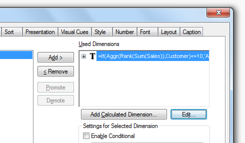
A more advanced example is if you want to classify or rank a field. The following expression returns ‘A’ for the 10 best customers and a ‘B’ for the rest:
If(Aggr(Rank(Sum(Sales)),Customer)<=10,'A','B')
For such fields the above question is very relevant: Should they be calculated in the script and saved as fields, or should they be calculated on the fly in a sheet object?
There are pro:s and con:s with both approaches: A field calculated in the script is calculated once and for all, so it does not need to be re-calculated every time the user clicks. Hence, response times will be slightly shorter if the field is calculated in the script.
On the other hand, in some cases you want the field to be re-calculated every time the user clicks. A good example is the classification using Rank() above. Most likely you want this field to depend on the selection made: If you have selected a product, you want to see the classification of the customers given this selection. Such a number is in its nature dynamic and should be calculated every time the user clicks.
The key is whether the calculated field should be static or dynamic. The field Month is static: A specific date always belongs to the same month, irrespective of user selection. As opposed to a classification or a rank where the calculation usually should be dynamic, since the result potentially could change every time the user clicks.
Bottom line is that dynamic fields must be calculated in the chart or the list box. But for static fields it is better if they are calculated in the script, since precious CPU-time otherwise will be unnecessarily spent every time the user clicks.
Note: The Rank() function cannot be used in the script, so if you want to calculate a static rank in the script, you need to do it in a different way, using e.g. a combination of Order By and RecNo().
Further reading related to this topic:
-
Keep Your Head in the Clouds
3 minute read♫ Ding Dong! ♪ It’s here! I tore open the Amazon package to reveal my new Nest Cam. It was so shiny. I could not wait to set it up. One ... Show More3 minute read
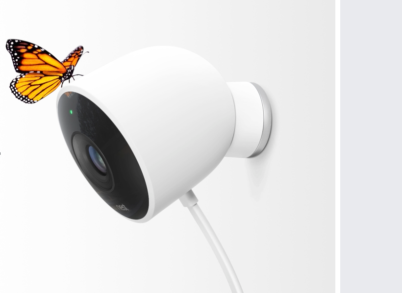
♫ Ding Dong! ♪ It’s here! I tore open the Amazon package to reveal my new Nest Cam. It was so shiny. I could not wait to set it up.
 One of the most innovative features it provided was state-of-the-art surveillance software and video history running from within a hosted cloud solution. It basically was plug and play. While I was setting up my camera this past weekend it made me appreciate how far cloud technology has come and sparked some initial thoughts on our own cloud-based solutions. I wanted to share some of these with you and give you a glimpse into Qlik’s cloud-based future.
A Brief History of Cloud Computing
Cloud computing has grown in popularity over the years however, a steady increase has only been seen within the last 6 years or so. The arrival of Salesforce.com in the late 90s paved the way for software companies to deliver their software over the internet, by collecting data in the cloud and therefore Salesforce created the space for cloud CRM and ERP. In the early 2000s we saw Amazon Web Services (AWS) and (Elastic Cloud Computing) EC2 offer cloud-based services for computation, storage and virtualization. This helped many organizations reduce costs and allowed IT departments to focus more of their attention on pressing business matters. With the increase in bandwidth and a maturing internet web specification, logically, browser-based applications soon followed. (Anyone remember how cool it was to first use Google Docs??)
So why am I telling you all this?
Because…."As cloud computing extends its reach beyond a handful of early-adopter Google Docs users, we can only begin to imagine its scope and reach. Pretty much anything can be delivered from the cloud." - Cloud computing pioneer Jamie Turner.
That’s right, anything can be delivered from the cloud, and Qlik is building cloud solutions that will support the future. We are seeing a shift in data gravity to the cloud so now cloud analytics makes much more sense, pun intended. Sure there were some early movers who just took on-premise software and packaged it in cloud-style – but they were not engineered to be cloud first and some still aren’t. That being said - Qlik Sense is truly a cloud analytics product that was built to work within virtualized and global environments.
Qlik Sense Cloud
That brings me to Qlik Sense Cloud. A global, fully operational cloud analytics solution that you don’t have to setup or maintain. Quickly approaching 100,000 users from over 170 countries, this is definitely no passing fad and it will only get better. If you look at the evolution of Qlik Sense Cloud from its early release in 2015 to now – you have seen a tremendous transformation in a very short period of time. In little over a year Qlik Sense Cloud has evolved from a simple read-only app sharing platform to a 100% online analytics and collaborative solution. In January 2016 we introduced Qlik Sense Cloud Plus, offering more storage, larger apps sizes, unlimited shares and access to our Data As a Service offering, Qlik DataMarket (providing easy access, cloud-based, syndicated external data, directly into your analysis).
Continuing down this path of innovation, later this year we will have Qlik Sense Cloud Business, enabling groups and teams to create, manage, and collaborate with visual analytics in the simplicity of the cloud. That’s right, workgroups. You will be able to privately manage your own data and applications, schedule data refreshes and collaboratively develop with your invited peers, from either inside or outside your organization. You can check out the Qlik Sense Cloud Business product preview available in the Qlik Community (requires community login).
AND - It just keeps getting better… with the acquisition of Industrial Codebox (makers of the popular QVSource data connectors for Qlik) – we plan to integrate a number of cloud-based data source connectors such as Salesforce, REST, Google, Facebook, Twitter and many more. Further out on our roadmap, we plan to integrate Qlik Market to enable 1-Click Application solutions provided by Qlik Partners, similar to what you see on many web hosting platforms that offer 1-Click installation for blogs, databases, shopping carts and portals.
The future is bright my friends, and the old idiom “Get your head out of the clouds” does not apply here. If the best and brightest minds stopped dreaming, they might've never dreamt what is possible today with cloud computing, and you and I should thank them for that. I implore you, keep your head in the clouds and see what the future has to offer.
Happy Qlikking,
Michael Tarallo (@mtarallo) | Twitter
Senior Product Marketing Manager
Qlik
-
Mid-Week Humor with the Marketoonist
Over the next few weeks we will be posting weekly 'funnies' by the Marketoonist. Each one has a humorous take on BI or Business Information in the cor... Show MoreOver the next few weeks we will be posting weekly 'funnies' by the Marketoonist. Each one has a humorous take on BI or Business Information in the corporate world. We hope you enjoy them

Here's this weeks:
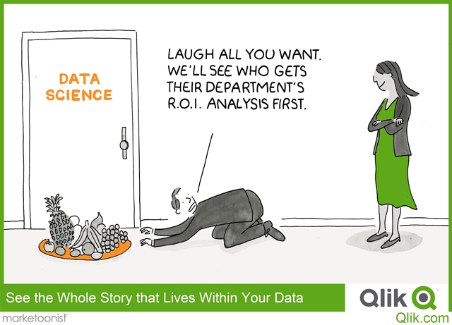
Feel free to click on the image/link to share your feedback or rate the document.
Cheers, Qlik Community team

-
App API and Viz API noSelections option
Sometimes you may want to use a chart in a mashup that does not allow selections. Before Qlik Sense 3.0, you basically had three options. One of those... Show MoreSometimes you may want to use a chart in a mashup that does not allow selections. Before Qlik Sense 3.0, you basically had three options. One of those options I blogged about before Disable selections in charts using Capability APIs. With this approach, you basically locked the field used in the chart to not allow any selections on that field. This had the side effect of not allowing a selection on that field anywhere in the mashup. The other two options were very similar. You could "mask" the chart with a div that sat over top of the chart, or you could use the noInteraction option that basically did the same thing. The problem with these approaches was that you could not scroll the chart or see the tooltips.
A better solution
Introduced with Qlik Sense 3.0, the noSelections option is a much better solution to this problem than any that previously existed. It disallows selections in the chart, without affecting the tooltips, ability to scroll, or the field used in the chart. And it's really easy to use.
Using noSelections option with the App API
To use the noSelections option with the getObject() method of the App API, simply set it in the options parameter like below
app.getObject(<htmlElement>, <objId>, {noSelections: true});
It's really that simple.
Using the noSelections option with the Visualization API
Using the noSelections option with the Visualization API is just a tiny bit trickier. I didn't realize I could even do it at first, because it's a little buried in the docs. But all you have to do is set the noSelections option in the options parameter of the show() method, like below.
qlik.app.visualization.create(type, cols, options).then(function(viz) {
 viz.show(<htmlElement>, {noSelections: true});
});
And that's it. I find that this can often be really useful, because many there are many use cases where I want to embed just a chart or two into a page, and it makes no sense to allow selections on those charts, and now that we have the noSelections option is definitely the best way of accomplishing this.
-
The Qlik Continuous Classroom
Have you subscribed to the Qlik Continuous Classroom (QCC) yet?! If not we recommend you visit the Qlik Continuous Classroom and watch the free modul... Show MoreHave you subscribed to the Qlik Continuous Classroom (QCC) yet?!
If not we recommend you visit the Qlik Continuous Classroom and watch the free modules to learn everything it has to offer! From product training to Data Analytics concepts, the QCC has everything you need to understand the why and the how of analytics!
-
Mobile Friendly Horizontal Bar Chart
In our Qlik Demo Team we are trying to create mashups that are suitable for all devices. This is why we created another version of a Horizontal Bar Ch... Show MoreIn our Qlik Demo Team we are trying to create mashups that are suitable for all devices. This is why we created another version of a Horizontal Bar Chart that we use almost exclusively. This has various options like setting the bar height, color, text color, text hover color etc. It can also change from regular Horizontal Bar Chart to Horizontal Stacked Bar Chart, Grouped Bar Chart or a Lollipop.
All of the UI/UX guidance is coming from my colleague Michael Anthony | Qlik
Installation
- Download Zip file from Branch: http://branch.qlik.com/#!/project/57161998713777448667b063
- Desktop - Unzip at the extension folder (C:\Users<user>\Documents\Qlik\Sense\Extensions\SenseUIBarChart)
- Server - Upload the zip file
Settings
Dimension and Measures
- Set 1 dimension for the Labels and
- up to 5 Measures for Grouped, Stacked Bar or Lollipop
General Settings
- Text Color
- Font Size
Bar
- Height
- Comma separated colors for the stacked bar fill color
- Fill color when you mouse over
- Text Color for each bar
- Text Color when you mouse over
- Border Weight
- Border Spacing
- Enable Selections
- Toggle between Stacked and Grouped Bar Chart
Tooltip
- Enable Tooltip
- Show Dimension in the Tooltip
X-Axis
- Show X-Axis
- Show Legend (check Stacked Bar image below)
Y-Axis
- Show Y-Axis
- Label Width (Usually 150px, even for the smallest device )
- Number of visible characters, if you want to truncate your labels.
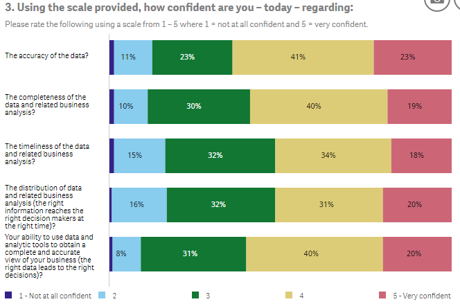
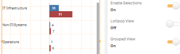
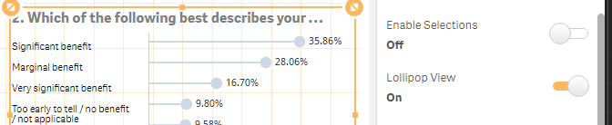
Even though we still have a long way to go to make this perfect, features are always welcome!
YIANNI
Files
-
Qlik Sense Certifications now available in multiple languages!
We have wonderful news to share for those of you who are looking to get Qlik Sense certified! All three Qlik Sense Version 2 exams for System Adminis... Show More
We have wonderful news to share for those of you who are looking to get Qlik Sense certified! All three Qlik Sense Version 2 exams for System Administrator, Data Architect and Business Analyst – are now available in eight languages:
- Brazilian Portuguese
- Chinese
- English
- French
- Japanese
- Korean
- Spanish
Also, FREE Qlik Sense Practice Questions are now available here: Qlik Sense Certifications
-
Pivot Table Loading
With the release of Qlik Sense 3.1 this week came the Pivot Table Loading feature. This feature provides the ability to “un-pivot” data that is store... Show MoreWith the release of Qlik Sense 3.1 this week came the Pivot Table Loading feature. This feature provides the ability to “un-pivot” data that is stored in a pivot table format. I am excited about this new feature because I often have data that I need to “un-pivot” in Qlik Sense. I must admit that in the past I occasionally used QlikView to generate the script to load this type of data using the CrossTable wizard but now with the Pivot Table Loading feature, I can do it all in Qlik Sense.
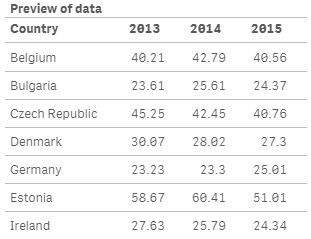
Let’s take a look at an example. Assume I have a data set that looks like the image below where the first column is country and I have data values for various years.

When I load this into Qlik Sense, the data is loaded just like the Excel file with a field named Country, 2013, 2014 and 2015 (see image below). What I would prefer is to have a country field, a year field and then a field that stores the data values. This is where the Pivot Table Loading comes into play.
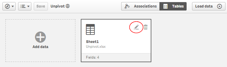
In Qlik Sense, I can drag my Excel file into Qlik Sense to load it. Once the file is loaded I can open the Data Manager and click on the edit icon for the table.
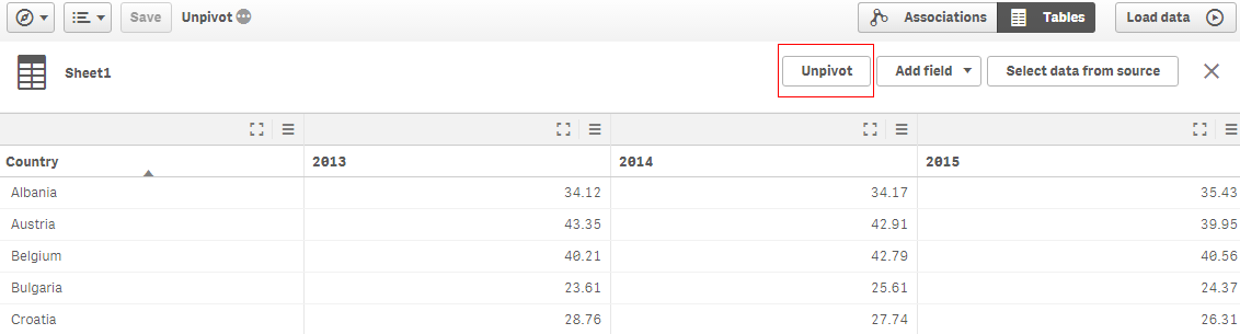
Below in the Data Manager window, there is now the Unpivot option.
When Unpivot is clicked, you are prompted to select the fields that you want to transpose into rows. Since I want to transpose the 2013, 2014 and 2015 fields into rows, I will select those three columns and select the Apply unpivoting button. At the bottom of the screen, I am provided a preview of the data and I can see that my years are all in one field now.
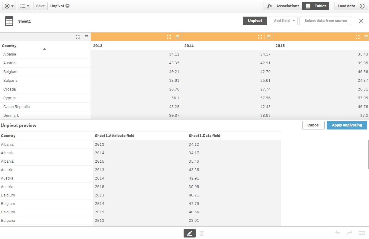
Once the unpivoting is applied, I can rename the attribute and data fields and load the data.
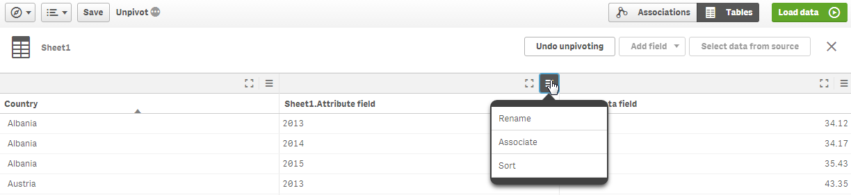
Now if I preview the table I loaded, it looks like this:
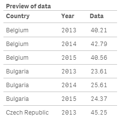
The 2013, 2014 and 2015 fields have been transposed into rows and I now have a Year field that I can use in a filter pane or in my visualizations. My script was auto-generated and you can see the use of the CrossTable prefix to load the Excel file.
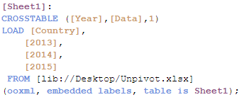
The Pivot Table Loading feature is a valuable new feature in Qlik Sense 3.1 that will make it easier to load pivot table formatted data. Check out Michael Tarallo’s video titled Qlik Sense 3.1 - Using Unpivot (video) to see the Pivot Table Loading feature in action.
Thanks,
Jennell
-
Learning Is Not Just For Newbies
Never stop learning, because life never stops teachingIn today’s workplace, where technology is rapidly changing and evolving, there’s no doubt that l... Show MoreNever stop learning, because life never stops teaching

In today’s workplace, where technology is rapidly changing and evolving, there’s no doubt that learning has to play an important and ever-present role. But often, training programs fail to go beyond the needs of the uninitiated ‘new’ student which has to be brought up to speed. In fact, there are at least five, and all just as important, use cases that a learning platform should support.
- The “first” experience
- The “continuous” experience
- The “knowledge refresh” experience
- The “real world” experience
- The “keep current” experience
So what is Qliks solution to ensure you never stop learning? Visit the full blog to learn!
-
What’s new in Qlik Sense 3.0 - Time-aware Charts
One of my personal favs and long time awaited features that ships with Qlik Sense 3.0 is the new time-aware charts. We could simply describe it as con... Show MoreOne of my personal favs and long time awaited features that ships with Qlik Sense 3.0 is the new time-aware charts.
We could simply describe it as continuous scale in x-axis line chart but it’s much more than that, let me show it to you.
Before the introduction of Qlik Sense 3.0 Time-aware charts, line charts displaying a time dimension in the X-axis would show a portion of the line at a reasonable scale although the complete sequence was still visible in the mini-chart at the bottom of the object.
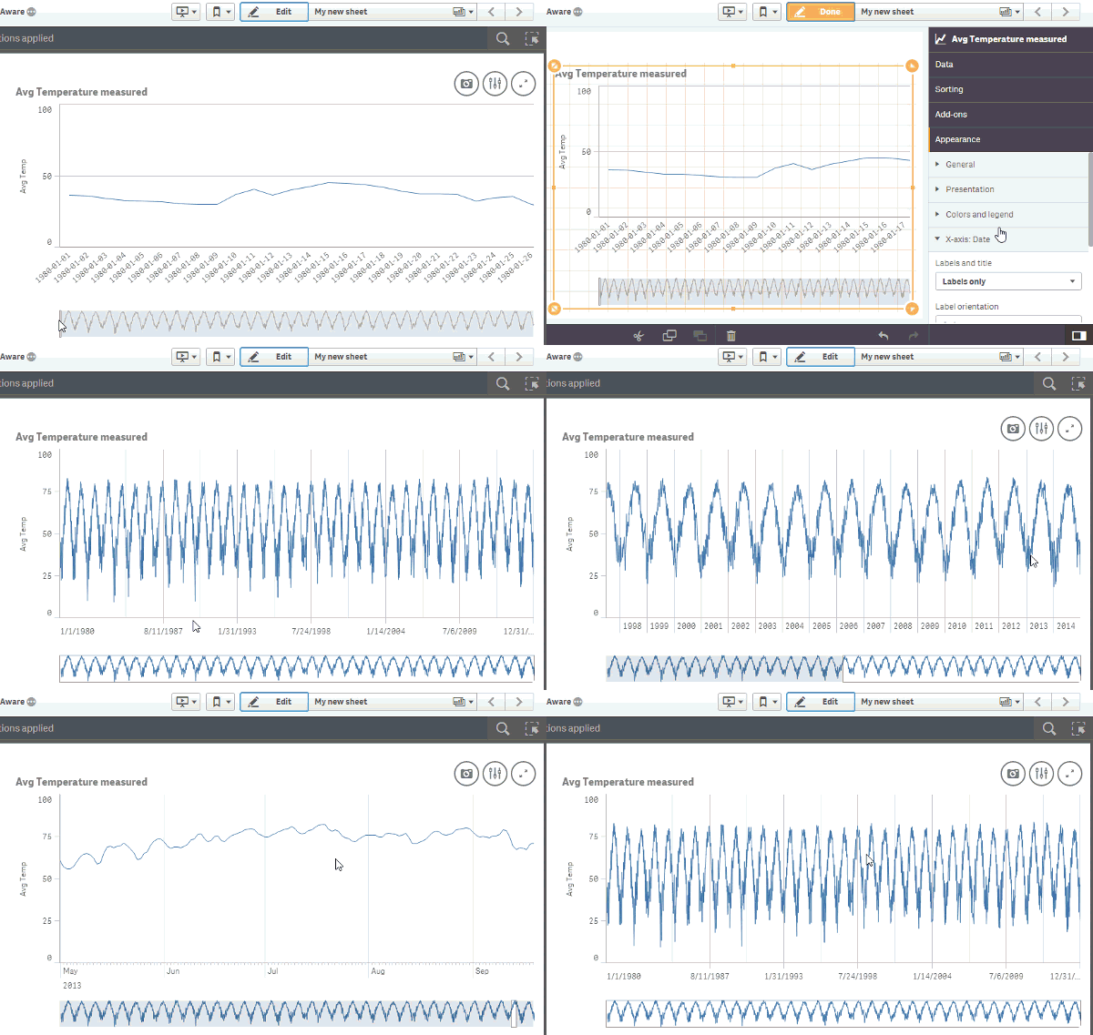
Time-aware charts are visualizations that use a continuous scale to provide a complete and accurate view of time-based data. That is, when you enable continuous scaling on the x-axis in a chart with date fields, data points are separated from each other by a distance relative to their associated time. As well, the axis labels are evenly separated whether or not there is data for that point and the chart view is compressed to avoid scrolling.
You can zoom in, zoom out or modify the size of the visible window that appears over the mini-chart at the bottom of the object to get a closer look into the data. As you can see in the animation above, content gets immediately adjusted showing the relevant x-axes label information at any zoom level.
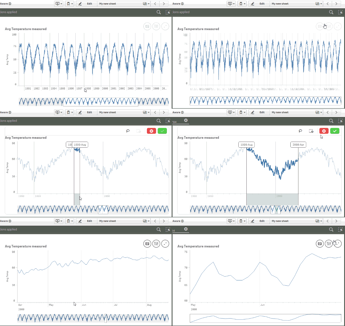
Selections are smart as well, when browsing the chart at a yearly level any selection in the chart will perform a selection in the year derived field, but when a more detailed view of the data is visible, for example at day level, selections will be performed in day (derived) field in the data model.
How to get it working?
Time-aware charts needs, of course, a time dimension to work. Good thing is since Qlik Sense 1.1 we can declare and derive time fields in our data model. Read Jennell’s blog post to learn how to do it. Alternatively, if you are loading data using the data load wizard, then chances are Qlik Sense will automatically detect your field(s) containing a date and it will do the rest for you.
Once you have your time dimension working the next step will be pretty straightforward, as shown in the animation above you just need to activate it by checking the box “Use continuous scale”.
Thanks,
Arturo
-
QlikView 11.2 SR5 and Maps
You wake up in the morning and head down to the living room; faintly you hear a lingering “hohoho” from the chimney. Santa was here – and he left us s... Show MoreYou wake up in the morning and head down to the living room; faintly you hear a lingering “hohoho” from the chimney. Santa was here – and he left us something wonderful!
Santa is early this year, not only did he bring us a new and shiny service release for QlikView he also included a free to use mapping extension!
When you install the latest version of QlikView, http://www.qlik.com/download/, we now ship an Example Extension Object that makes use of OpenLayers and MapQuest.
So how do I make use of this sweet nectar you say?
Let me take you on a journey and explore some mapping possibilities!- Head out and install the latest version of QlikView, make sure you install the examples.
- Navigate to C:\Program Files\QlikView\Examples\Extensions and double click the “Extensions Examples.qar” file. This will install all of the extension examples.
- Open the QlikView “Extension Examples that you can find in C:\Program Files\QlikView\Examples\Documents\
- In the Mapping tabs you will find examples on how to plot either dots/points, lines or polygons.
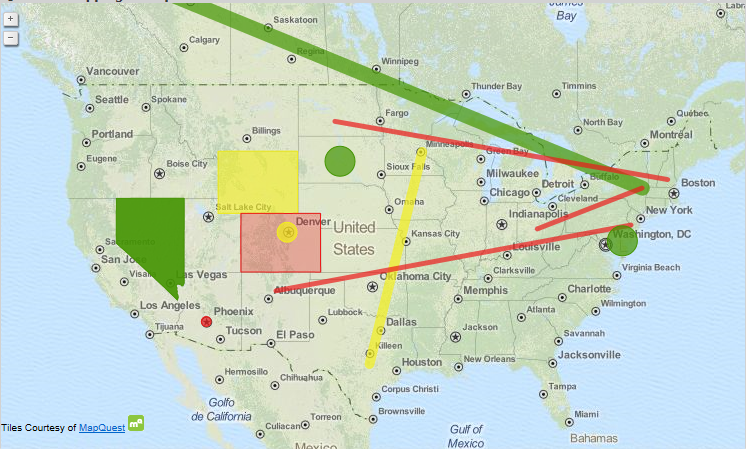
Attached to this post you will also find a dataset and an app that contains all of the high speed cameras in Sweden with corresponding latitude and longitude points if you want to play around with the extension, make sure you install the extension first, on your own.
Keep on Qliking!
Keep in mind
Extensions are generally built upon web technologies such as HTML and JavaScript and for QlikView to be able to render these objects on the screen you will need to run QlikView Desktop with WebView mode enabled or access the document through the AJAX-client over AccessPoint. The IE-plugin does not support extensions.
Disclaimer
The QlikView Mapping Example Extension can be configured to use many different map tile sources.
Each map tiles source has its own terms and conditions and the user assume all responsibility for the selection of a source for map tiles and for compliance with the terms and conditions of the selected source. Any and all liability associated with the selection of a tile source and the compliance with the terms and conditions of the selected source is hereby disclaimed.

-
Qlik Sense 3.1 - Improved User Experience and Enhanced Data Prep
Qlik Sense 3.1 is our first release after June’s Qlik Sense 3.0. Qlik Sense 3.0 introduced us to major new innovations including Visual Search, Visua... Show MoreQlik Sense 3.1 is our first release after June’s Qlik Sense 3.0. Qlik Sense 3.0 introduced us to major new innovations including Visual Search, Visual Data Preparation as well as developer and user experience improvements. (In case you missed it you can see this 50 second action inspired trailer that shows highlights of what was previously released in Qlik Sense 3.0.) Qlik Sense 3.1 builds on many of the same themes that improve the user experience, enhance data preparation and address our developer community. During this release schedule we also have a few other "extras" that will both please and surprise you. Read on to learn more my friends.
User Experience
We continue to focus on driving our user experience alongside enhancements to our engine and ecosystem. In 3.1 we made a number of chart improvements including more granularity in time-aware charts which were introduced in 3.0. We’ve added more controls to line and combo charts and added auto recognition of city and country data to our mapping. We’ve added the capability to "unpivot" pivot table and cross table data in the data manager and included the ability to pre-filter data via selected bundled connectors and made the visual data preparation algorithm even smarter. We’ve also added a number of UI enhancements including drag and drop chart coloring.
You can view a brief presentation on the new feature highlights in this video below and see some of these features in action by clicking the links mentioned above
Embracing Developer Innovation
We not only continue to build and invest in our 9,000 strong developer community via Qlik Branch but we continue to create tools for developers to better experience the power of our platform and make it easier to build on. Our new Qlik Playground™ does just that. It is a free, one-of-a-kind programming environment that allows developers to learn about, use, and experiment with Qlik‘s associative engine and APIs.
By accessing public data sets (including your own Twitter data) through our available APIs; Playground allows you to get hands-on with your data and create cool data-driven apps using powerful search and other capabilities that Qlik offers quickly and easily.
AND Finally let me introduce you to ....
Qlik Sense Cloud Business
Qlik Sense Cloud Business empowers groups of people within your organization to deploy and manage a series of analytical apps. Qlik Sense Cloud Business adds additional security and governance features within your managed work group. Control which users have access to your shared apps, and allow them to collaborate, create, edit and access group data and content. This cloud-based model allows you to add new users and apps as requirements change, with the ability to scale to support current and future needs. Also included is the ability to schedule data refreshes and additional data connectivity to cloud-based sources. You can get a sneak peek at Qlik Sense Cloud Business right now and learn more by visiting our preview page.
Well friends, that is all I have. For a "point release" there's lots of goodness to go around both in and out of the product. I hope you enjoy it. Remember to reach out to myself or my colleagues in the qlik community with any questions and we will to our best to help.
Regards,
Michael Tarallo
Qlik
-
Aligning objects and making a mashup responsive using Twitter’s Bootstrap and jq...
From my previous blog Creating a webpage based on the Qlik Sense Desktop Mashup API, we've learned how to get the objects from our app and display the... Show MoreFrom my previous blog Creating a webpage based on the Qlik Sense Desktop Mashup API, we've learned how to get the objects from our app and display them on our website with the Mashup API. These are individual objects though and most likely we would like to display them as we do in the app sheet.
For this blog we will use the sheet from the "How European are you" app. So here is the sheet with objects.
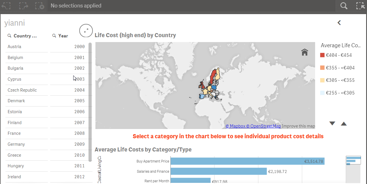
- Make sure you add bootstrap css and js references in your html.
  <!-- CSS -->
  <!-- Latest compiled and minified CSS -->
  <link rel="stylesheet" href="https://maxcdn.bootstrapcdn.com/bootstrap/3.3.4/css/bootstrap.min.css">
  <!-- Optional theme -->
  <link rel="stylesheet" href="https://maxcdn.bootstrapcdn.com/bootstrap/3.3.4/css/bootstrap-theme.min.css">
  <link rel="stylesheet" href="https://sense-demo.qlik.com/resources/autogenerated/qlikui.css">
  <link rel="stylesheet" href="https://sense-demo.qlik.com/resources/assets/client/client.css" media="all">
  <!-- Custom -->
  <link rel="stylesheet" href="css/style.css">
  <!-- JS -->
  <!-- Latest compiled and minified JavaScript -->
  <script src="//code.jquery.com/jquery-1.11.3.min.js"></script>
  <script src="https://maxcdn.bootstrapcdn.com/bootstrap/3.3.4/js/bootstrap.min.js"></script>
  <script src="https://sense-demo.qlik.com/resources/js/external/requirejs/require.js"></script>
  <!-- Custom -->
  <script src="js/index.js"></script>
- In my previous blog in step 7, I used app.getObject(), to place the object into a specific div id. Now, we will go one step further and we will just use the object id from the app as our html data-qvid and we will let jquery handle the rest.
- So we start by laying out the grid for the above sheet. We need 3 columns and for the 3nd column we will need three rows.
  <div class="container">
     <div id="template">
       <div class="row">
            <!-- Left Column -->
            <div class="col-md-2">
                 <article style="height: 600px" class="qvobject" data-qvid="ZZpXPE" id="filterCountry"></article>
            </div>
            <div class="col-md-2">
                 <article style="height: 600px" class="qvobject" data-qvid="TrjNJ" id="filterYear"></article>
            </div>
            <!-- Right Column -->
            <div class="col-md-8">
                 <div class="row">
                     <article style="height: 300px" class="qvobject" data-qvid="KtCKy" id="lifeCostByCountry"></article>
                 </div>
            <div class="row notification">
                 Select a category in the chart below to see individual product cost details
            </div>
            <div class="row">
                 <article style="height: 300px" class="qvobject" data-qvid="jsmEE" id="avgLifeCost"></article>    </
            </div>
       </div>
  </div>
- We overwrite bootstrap's css for some elements that do not show up properly, like the icons below with:

.sel-toolbar-span-icon {
  top: -10px;
}
- and we make sure that all of the qlik sense objects are visible by setting their width to match bootstraps grid.
.qvobject {
  width: 100%
}
- Now we add in our js jquery's $.each method to display the objects in our grid.
$('#template').find('.qvobject').each(function() {
  var qvid = $(this).data("qvid");
  app.getObject(this, qvid);
})
- Finally, we need to add a clear selection button to mimic the app. In our html we add the button.
  <div class="row">
     <div class="col-md-12">
        <a id="clear" class="btn btn-default" href="#">Clear Selections</a>
     </div>
  </div>
- and in our js catch the click event with jquery and use the app.clearAll() method.
$('#clear').on('click', function(event) {
   event.preventDefault();
   app.clearAll();
});
There are times that you will want to use many objects in your page and you just do not want to split them up in multiple pages. If you see that there is not scrolling on the page, you need to add the following in your css.
body {
  overflow: auto !important;
}
Here is our final page that looks exactly like we have the objects in our Qlik Sense Desktop Sheet

That's it! I Hope you have fun with your webpages!
Project Files: yianni-ververis/how-european-are-you · GitHub
Website: Qlik Demos: See Qlik Sense in Action | Sense-Demo.Qlik.Com