Unlock a world of possibilities! Login now and discover the exclusive benefits awaiting you.

Analytics & AI
Forums for Qlik Analytic solutions. Ask questions, join discussions, find solutions, and access documentation and resources.
Data Integration & Quality
Forums for Qlik Data Integration solutions. Ask questions, join discussions, find solutions, and access documentation and resources
Explore Qlik Gallery
Qlik Gallery is meant to encourage Qlikkies everywhere to share their progress – from a first Qlik app – to a favorite Qlik app – and everything in-between.
Qlik Community
Get started on Qlik Community, find How-To documents, and join general non-product related discussions.
Qlik Resources
Direct links to other resources within the Qlik ecosystem. We suggest you bookmark this page.
Qlik Academic Program
Qlik gives qualified university students, educators, and researchers free Qlik software and resources to prepare students for the data-driven workplace.
Recent Blog Posts
-
Time-Aware feature has made it to the bar and the combo charts
Not that long ago, with the release of Qlik Sense 3.0, Qlik Sense introduced the Time-aware charts. Line charts are now able to intelligently zoom in ... Show MoreNot that long ago, with the release of Qlik Sense 3.0, Qlik Sense introduced the Time-aware charts. Line charts are now able to intelligently zoom in and out when used in conjunction with a date/time dimension letting us explore the data in a very smart way.
Please check this post for further details: https://community.qlik.com/blogs/qlikviewdesignblog/2016/07/15/what-s-new-in-qlik-sense-30-time-aware-charts
Now with the release of Qlik Sense 3.1 SR2 (Qlik Sense 3.1 Service Release 3 now available, Information on Sense Desktop 3.1.1 expiry) the Time-aware feature has made it to the bar and the combo charts as well. This new feature will expand the capabilities of two of the most common charts in our library.
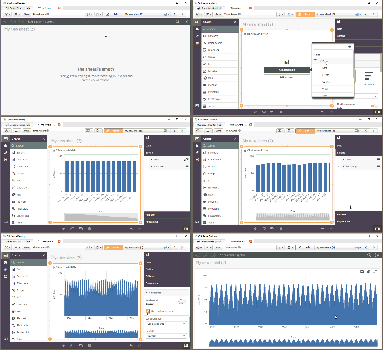
To get a working time-aware bar or combo chart in your app you just need to make sure you are running Qlik Sense 3.1 SR2 or higher, then modify an existing bar (combo) chart or create a new one, remember you should be using a time field as the dimension for your chart. Finally you need to activate the continuous axis in the chart properties panel as shown in the animation below.
AMZ

-
The Pitfalls Of Learning On YouTube
When we need to know something right now, our first instinct these days is to grab our phone and look it up. Google breaks this type of behavior out ... Show More
When we need to know something right now, our first instinct these days is to grab our phone and look it up. Google breaks this type of behavior out into micro-moments: I-want-to-know, I-want-to-go, I-want-to-do, and I-want-to-buy moments.
And when we “want-to-do”, what do we do? We turn to YouTube. Searches related to “how-to” on YouTube are growing 70% year over year. YouTube is not supplementing traditional learning methods anymore, it’s replacing them altogether. And that’s not necessarily a good thing....
To read more visit the newest blog posted by the V.P of Education Services, Kevin Hanegans
http://global.qlik.com/us/blog/posts/kevin-hanegan/the-pitfalls-of-learning-on-youtube

-
QlikView Quoteology
When creating the script or an expression in QlikView, you need to reference fields, explicit values and variables. To do this correctly, you sometime... Show MoreWhen creating the script or an expression in QlikView, you need to reference fields, explicit values and variables. To do this correctly, you sometimes need to write the string inside a pair of quotation marks. One common case is when a field name contains a symbol that prevents QlikView from parsing it correctly, like a space or a minus sign.
For example, if you have a field called “Unit Cost”, then
Load Unit Cost
will cause a syntax error since QlikView expects an "as" or a comma after the word "Unit".If you instead write
Load [Unit Cost]
QlikView will load the field “Unit Cost”. Finally, if you write
Load 'Unit Cost'
QlikView will load the text string "Unit Cost" as field value. Hence, it is important that you choose the correct quotation mark.So, what are the rules? Which quote should I use? Single? Double? Square brackets?
There are three basic rules:
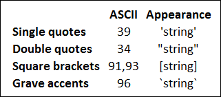
- Single quotes are used to quote literals, e.g. strings that should be used as field values.
- Double quotes are used to quote source field references, i.e. names of fields. (In formulae, or to the left of the “as” inside a Load statement.)
- Double quotes can always be substituted by square brackets or by grave accents.
With these three rules, most cases are covered. However, they don’t cover everything, so I'll continue:
- In the script, but outside a Load statement, double quotes denote a variable reference and not a field reference. If double quotes are used, the enclosed string will be interpreted as a variable and the value of the variable will be used.
A general rule in QlikView is that field references inside a Load must refer to the fields in the input table – the source of the Load statement. They are source field references or in-context field references. Aliases and fields that are created in the Load cannot be referred since they do not exist in the source. There are however a couple of exceptions: the functions Peek() and Exists(). The first parameters of these functions refer to fields that either have already been created or are in the output of the Load. These are out-of-context field references.
- Out-of-context field references and table references, e.g. the parameters in NoOfRows() and Peek(), should be regarded as literals and therefore need single quotes.
- Finally, in many places you are free to use any of the four quotation methods, e.g.
- Inside a Load statement, to the right of the “as”
- In places where QlikView expects a file name, a URL or a table name
- Defining the beginning and end of an inline table
- For the first parameter of Peek() or Exists() when used inside a Load
I have deliberately chosen not to say anything about SELECT statements. The reason is that the rules depend on which database and which ODBC/OLEDB you have. But usually, rules 1-3 apply there also.
With this, I hope that the QlikView quoteology is a little clearer.
Further reading related to this topic:

-
Why You sometimes should Load a Master Table several times
How normalized should the QlikView data model be? To what extent should you have the data in several tables so that you avoid having the same informat... Show MoreHow normalized should the QlikView data model be? To what extent should you have the data in several tables so that you avoid having the same information expressed on multiple rows?
Usually as much as possible. The more normalized, the better. A normalized data model is easier to manage and minimizes the risk of incorrect calculations.
This said, there are occasions where you need to de-normalize. A common case is when the source database contains a generic master table, i.e. a master table that is used for several purposes. For example: you have a common lookup table for customers, suppliers, and shippers. Or you have a master calendar table that is used for several different date fields, e.g. order date and shipping date (see image below).
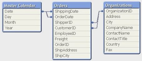
A typical sign for this situation is that the primary key of the master table links to several foreign keys, sometimes in different parts of the data model. The OrganizationID links to both CustomerID and ShipperID and the Date field links to both OrderDate and ShippingDate. The master table has several roles.
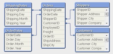
The necessary de-normalization in QlikView is easy. You should simply load the master table several times using different field names, once for every role. (See image below).
However, loading the same data twice is something many database professionals are reluctant to do; they think that it creates an unnecessary redundancy of data and hence is a bad solution. So they sometimes seek a solution where they can use a generic master table also in the QlikView data model. This is especially true for the master calendar table.
If you belong to this group, I can tell you that loading the same table several times is not a bad solution. Au contraire – in my opinion it is the best solution. Here's why:
- From the user’s perspective it is confusing to have an unspecified “Date” field if there are several dates in the data model. For example, the user will not understand whether the date refers to order date or shipping date.
- Without loading the master calendar several times, it will not be possible for the user to make selections that place simultaneous restrictions on several date fields, e.g. “show transactions where the order was placed in September and the items were shipped in November”.
In fact, loading the same table several times in QlikView is no stranger than doing it in SELECT statements using aliases, e.g.,
SELECT OrderID FROM Orders
INNER JOIN MasterCalendar AS OrderCalendar ON Orders.OrderDate=OrderCalendar.Date
INNER JOIN MasterCalendar AS ShippingCalendar ON Orders.ShippingDate=ShippingCalendar.Date
WHERE OrderCalendar.Month=9 AND ShippingCalendar.Month=11In SQL you would never try to solve such a problem without joining the master table twice. And you should do the same in QlikView.
So, if you have several dates in your data model – load the master calendar several times!
PS. But if you still want one common date field, you should create a Canonical Date.
-
Case Study UN: Hierarchical selections and dropdown field generation
UN was one of my most challenging projects in many aspects. This was not just a simple mashup or a simple webpage that uses the Capabilities Api and a... Show MoreUN was one of my most challenging projects in many aspects. This was not just a simple mashup or a simple webpage that uses the Capabilities Api and app.getObject() to display Qlik Sense objects. It was an entire solution that required many teams to be involved and share their expertise.
One of the most interesting problems I faced, was the structure of the qvf. In order for most of the charts to work, there had to be a group of selections made and in some cases, in a specific order.
For this example, I will talk about the chart on the Indicators page.
First we have to select the field "domain" and then get all of the available "Tier" in order to populate the drop down.

app.obj.app.field('DomainName').select([value], false, false)
.then(function(){
     me.getTier();
});
Then to get the HyperCube for the Field "Tier"
  me.getTier = function () {
       api.getFieldDataQ('Tier').then(function (data) {
          $scope.Tier = _.filter(data, function(obj){
          return (obj[0].qState!=='X' && obj[0].qState!=='L')?true:false;
     });
       $scope.selectTier($scope.Tier[0][0].qNum);
  });
  }
and populate the drop down with Angular's ng-repeat
<div class="dropdown" id="dropdownTier">
  <label>Select Tier:</label>
  <button class="btn btn-default dropdown-toggle btn-block text-left" type="button" data-toggle="dropdown" aria-haspopup="true" aria-expanded="true">
  {{selection.Tier}}
  <span class="caret pull-right"></span>
  </button>
  <ul class="dropdown-menu scrollable-menu" aria-labelledby="dropdownTier">
  <li ng-repeat="item in Tier" ng-class="(selection.Tier==item[0].qNum) ? 'active' : ''"><a ng-click="selectTier(item[0].qNum)">{{ item[0].qText }}</a></li>
  </ul>
  </div>
Like this
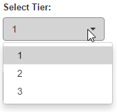
Then we select the first one so get the the data from the field "seriesName" as indicators for only that tier
$scope.selectTier = function (value) {
  $scope.selection['Tier'] = value;
  app.obj.app.field('Tier').selectValues([value], false, false)
  .then(function(){
  me.getIndicator();
  })
  }
me.getIndicator = function () {
  api.getHyperCubeQ(['IndicatorID','SeriesName'],[]).then(function(data3){
  $scope.SeriesName = _.filter(data3, function(obj3){
  return (obj3[1].qState!=='X' && obj3[1].qState!=='L')?true:false;
  });
  if (!$scope.SeriesName.length) {
  $scope.selectionDisplay.SeriesName = "No Data";
  $scope.selection.SeriesName = null;
  } else {
                        $scope.selectIndicator($scope.SeriesName[0][0].qNum, $scope.SeriesName[0][1].qText);
  }
  })
  }
and populate the indicator drop down
  <div class="dropdown" id="dropdownSeriesName">
  <label>Select Indicator:</label>
  <button class="btn btn-default dropdown-toggle btn-block text-left" type="button" data-toggle="dropdown" aria-haspopup="true" aria-expanded="true">
  {{ selectionDisplay.SeriesName }}
  <span class="caret pull-right"></span>
  </button>
  <ul class="dropdown-menu scrollable-menu" aria-labelledby="dropdownSeriesName">
  <li ng-repeat="item in SeriesName" ng-class="(selection.SeriesName===item[1].qText) ? 'active' : ''"><a ng-click="selectIndicator(item[0].qNum, item[1].qText)"> {{ item[0].qText }}-{{ item[1].qText }}</a></li>
  </ul>
  </div>
Like this

Last, select the indicator to get the final chart
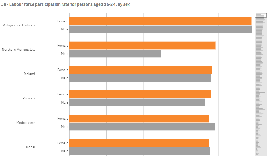
The entire thing takes about 3 seconds to load but there is no delay to the common user because while the selections are made the object is loading and the canvas is drawn.
The Angular Service Api that I use for HyperCubes is here
URL: https://genderstats.un.org/#/indicators
Yianni
-
Technology trends for 2017
Interesting read on the drivers for 2017 in the technology space especially with the proliferation of new technologies and devices:Technology Trends ... Show MoreInteresting read on the drivers for 2017 in the technology space especially with the proliferation of new technologies and devices:
Technology Trends and Market Growth Predictions for 2017 | Enterprise It World | Page 5
-
2017 Data Visualization Trends
The Rise of the Visualization PackageKeeping It MovingNarrative FocusIncreasingly Complex Data SourcesKeep It TidyFear of Scale Is Over To read the fu... Show More
- The Rise of the Visualization Package
- Keeping It Moving
- Narrative Focus
- Increasingly Complex Data Sources
- Keep It Tidy
- Fear of Scale Is Over
To read the full article visit http://visualmatters.com/data-visualization-trends-2017/
-
Mashup Api - Exporting Qlik Sense Table to CSV
I am sure that I am not the only one that at some point a Qlik Sense table was needed to be exported into a spreadsheet. While working with the APIs l... Show MoreI am sure that I am not the only one that at some point a Qlik Sense table was needed to be exported into a spreadsheet. While working with the APIs like Mashup and Engine API, this may get a little trivial, especially when we have so many solutions on the the web but not one that works in all major browsers and especially on our Qlik Sense table Object.
Even though this sound very simple and a simple copy and paste would do, here is a proper way of getting only the relevant fields displayed onto our webpage. This works on a simple html table as well as with a Qlik Sense Table Object.
In my previous posts I have showed you on how to create a webpage with Mashup API Creating a webpage based on the Qlik Sense Desktop Mashup API and for styling purposes, how to beautify your page with bootstrap Aligning objects and making a mashup responsive using Twitter’s Bootstrap and jquery
For this project I used an existing app for College Football Rankings Preseason College Football Rankings vs. Final Rankings Over The Years May Surprise You - RantSports
- Now, lets start by connecting to our app and getting the table object.
var me = {
    config: {
        host: window.location.host,
        prefix: "/",
        port: 443,
        isSecure: true,
    },

    vars: {
        id: '1b4194fd-0ace-4934-80ff-2c679b19624e'
    },

    data: {},

    obj: {
        qlik: null,
        app: null
    },

    init: function () {
        require.config( {
            baseUrl: ( me.config.isSecure ? "https://" : "http://" ) + me.config.host + (me.config.port ? ":" + me.config.port: "") + me.config.prefix + "resources"
        });
    },

    boot: function () {
        me.init();

        me.log('Boot', 'Success!');

        require(['js/qlik'], function (qlik) {
            me.obj.qlik = qlik;
            qlik.setOnError( function ( error ) {
                alert( error.message );
            } );

            // Get the Qlik Sense Object Table
            me.obj.app = qlik.openApp(me.vars.id, me.config);
        } );
    },
- Now lets put the html code that will host the object.
        <div class="row">
            <div class="col-md-12">
                <article style="height: 250px" class="qvobject" data-qvid="DBujmm" id="DBujmm"></article>
            </div>
        </div>
- Now place the object with our code
        // Get the Qlik Sense Table Object
        me.obj.app.getObject(document.getElementById('DBujmm'), 'DBujmm');
- Lets try and get the raw data now from a HyperQube so we can create our custom html table. I have also created here a function that refactors data since I like to be working with more meaningful objects.
  // Get raw data with HyperQube to create the Table
    getData: function (callback) {
        me.obj.app.createCube({
            qDimensions : [{
                qDef : {
                    qFieldDefs : ["School"]
                }
            },{
                qDef : {
                    qFieldDefs : ["Conference"]
                }
            }
            ],
            qMeasures : [
            {
                "qLabel": "# Preseason Top 10",
                "qLibraryId": "HdsZnjL",
                "qSortBy": {
                    "qSortByState": 0,
                    "qSortByFrequency": 0,
                    "qSortByNumeric": 0,
                    "qSortByAscii": 1,
                    "qSortByLoadOrder": 0,
                    "qSortByExpression": 0,
                    "qExpression": {
                        "qv": " "
                    }
                }
            },
            {
                "qLabel": "# Postseason Top 10",
                "qLibraryId": "tEknwb",
                "qSortBy": {
                    "qSortByState": 0,
                    "qSortByFrequency": 0,
                    "qSortByNumeric": 0,
                    "qSortByAscii": 1,
                    "qSortByLoadOrder": 0,
                    "qSortByExpression": 0,
                    "qExpression": {
                        "qv": " "
                    }
                }
            }
            ],
            qInitialDataFetch : [{
                qTop : 0,
                qLeft : 0,
                qHeight : 20,
                qWidth : 5
            }]
        }, function(reply) {
            me.log('getData', 'Success!');
            me.data.hq = reply.qHyperCube.qDataPages[0].qMatrix;
            me.refactorData();
            callback(true);
        });
    },


    // Refactor Data to a more readable format rather than qText etc.
    refactorData: function () {
        var data = [];
        $.each(me.data.hq, function(key, value) {
            data[key] = {};
            data[key].school = value[0].qText;
            data[key].conference = value[1].qText;
            data[key].pre10 = value[2].qText;
            data[key].post10 = value[3].qText;
        });
        me.data.rf = data;
    },
- Now lets create the html holder for this table including the column headers.
      <div class="row">
            <div class="col-md-12">
                <table id="tableData">
                    <tr>
                        <th>Team Name</th>
                        <th>Times in Preseason Top 10</th>
                        <th>Times in Postseason Top 10</th>
                        <th>Times in Pre & Postseason Top 10s</th>
                        <th></th>
                        <th>Conference</th>
                    </tr>
                </table>
            </div>
        </div>
- Here is the code that will generate the table
    // Prepare Data for Display
    displayData: function () {
        $.each(me.data.rf, function(key, value) {
            var html = '<tr>\
                <td>' + value.school + '</td>\
                <td>' + value.pre10 + '</td>\
                <td>' + value.post10 + '</td>\
                <td></td>\
                <td></td>\
                <td>' + value.conference + '</td>\
            </tr>';

            $('#tableData').append(html);
        });

        // After everything is rendered, enable the buttons for export
        $('#export').removeClass('disabled');
        $('#exportSense').removeClass('disabled');
    },
- OK. So far we have the code that connects to the Qlik Sense App, gets the table as an object and as row data and displays both for us to use. Lets now put the buttons that will export these two tables. The first one is for the Html Table and the second one is for the Qlik Sense Object Table
        <div class="row">
            <div class="col-md-12">
                <a href="#" class="btn btn-default disabled" id="export">Export Html Table to CSV</a>
            </div>
        </div>
        <div class="row">
            <div class="col-md-12">
                <a href="#" class="btn btn-default disabled" id="exportSense">Export Sense Table to CSV</a>
            </div>
        </div>
- As you can see I a gave them 2 different classes so I can control the on click events. I can definitely have more efficient way of handling the script execution but for this example it is better if I keep them separate.
- Here is the code that handles the events. We are passing to the exportTableToCSV methis
            $(".export").on('click', function (event) {
                me.exportTableToCSV.apply(this, [$('#tableData'), 'QlikSenseExport.csv']);
            });

            $(".exportSense").on('click', function (event) {
                me.exportTableToCSV.apply(this, [$('.qv-object-table'), 'QlikSenseExport.csv']);
            });
- Finally, here is the code that handles the csv generation and downloading.
  exportTableToCSV: function ($table, filename) {
        var $rows = $table.find('tr:has(th), tr:has(td)'),

            // Temporary delimiter characters unlikely to be typed by keyboard
            // This is to avoid accidentally splitting the actual contents
            tmpColDelim = String.fromCharCode(11), // vertical tab character
            tmpRowDelim = String.fromCharCode(0), // null character

            // actual delimiter characters for CSV format
            colDelim = '","',
            rowDelim = '"\r\n"';

            // Grab text from table into CSV formatted string
            var csv = '"' + $rows.map(function (i, row) {
                var $row = $(row),
                    // Select all of the TH and TD tags
                    // If its a Sense Object, remove the search column
                    $cols = $row.find('th:not(.qv-st-header-cell-search), td');

                return $cols.map(function (j, col) {
                    var $col = $(col),
                        text = $col[0].outerText;

                    text.replace(/"/g, '""'); // escape double quotes

                    return text;

                }).get().join(tmpColDelim);

            }).get().join(tmpRowDelim)
                .replace(/\r?\n|\r/g, '')
                .split(tmpRowDelim).join(rowDelim)
                .split(tmpColDelim).join(colDelim) + '"',

            // Data URI
            csvData = 'data:application/csv;charset=utf-8,' + encodeURIComponent(csv);

        // Check if browser is IE
        if ( window.navigator.msSaveOrOpenBlob && window.Blob ) {
            var blob = new Blob( [ csv ], { type: "text/csv" } );
            navigator.msSaveOrOpenBlob( blob, filename );
        } else {
            $(this)
                .attr({
                'download': filename,
                    'href': csvData,
                    'target': '_blank'
            });
        }
        me.log('exportTableToCSV', 'Success!');
    },
That's it. I hope this will help you to export your tables to a format for your favorite spreadsheet.
The Files and the entire working project is at
https://github.com/yianni-ververis/Export-Table-to-Csv
Also, you can view it live at
Yianni
-
Five Qlik Sense extensions you should check today
It’s been a little bit over a year since last time I posted about extensions here so I thought it would be nice to update this topic with fresh extens... Show MoreIt’s been a little bit over a year since last time I posted about extensions here so I thought it would be nice to update this topic with fresh extensions submitted to our developer community Qlik Branch. Remember you can submit, contribute to others, and download extensions from Qlik Branch.
My favorite 5 extensions (as of April, 2016)
1. qsVariable by erikwett
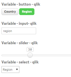
qsVariable is a super useful UI variable handler. The extension will let you not only create a variable while you set it up but also it will let you add a UI layer (buttons, selectors, input fields and sliders) so users can interact with your variable(s).
2. Qlik Sense Trellis Chart by agilos.mla
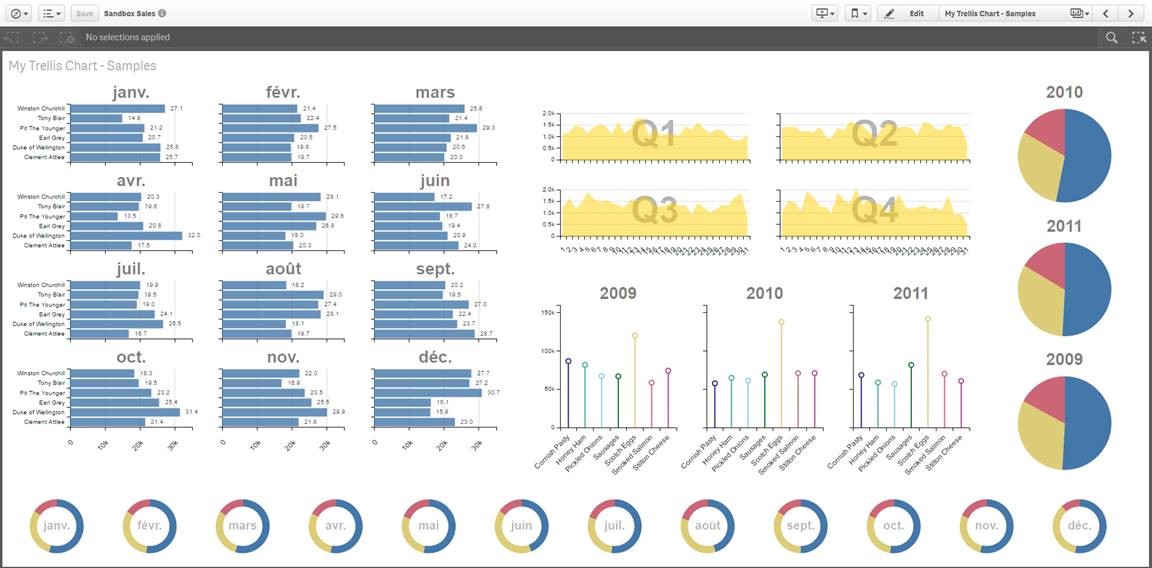
Trellis or more commonly known as Small Multiples (by Edward Tufte) is one of the well-known techniques available to represent the same measure across two dimensions. It’s especially useful when it comes to compare values in across charts using the same scale.
The extension uses the power of D3 to represent the data letting you to pick from pie, bar, or line chart. At this point the extension still needs some work to make it mobile friendly but it's a very promising starting point.
3 Simple KPI by alex.nerush
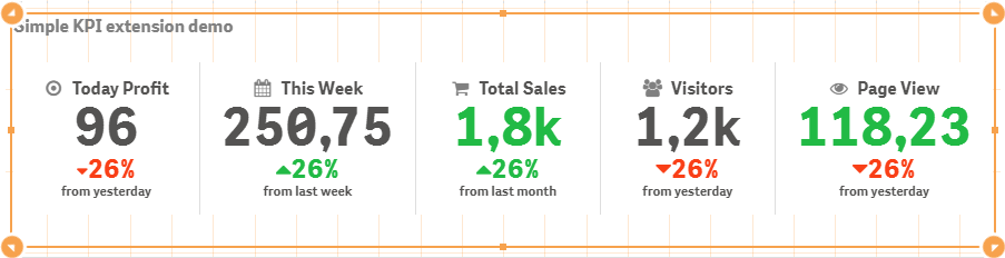
Simple KPI is all about flexibility and options, it's a great example of how customizable an extension can be. Simple KPI will let you create your very own style KPI object adding dimensions, setting up conditional colors and fonts and many more options. Give it a try
4 Measure Builder by LorisLombardo87
Creating complex expressions is sometimes a bit tricky, especially for new users so any help can make a difference. Measure Builder is a wizard style editor extension that will let users to create expressions easily by just simple completing a step by step form in a very visual way. It's really helpful to understand and learn set analysis syntax so if you are new to Qlik I would always recommend you to get this one installed on your computer.
5 Circular KPI by JSN
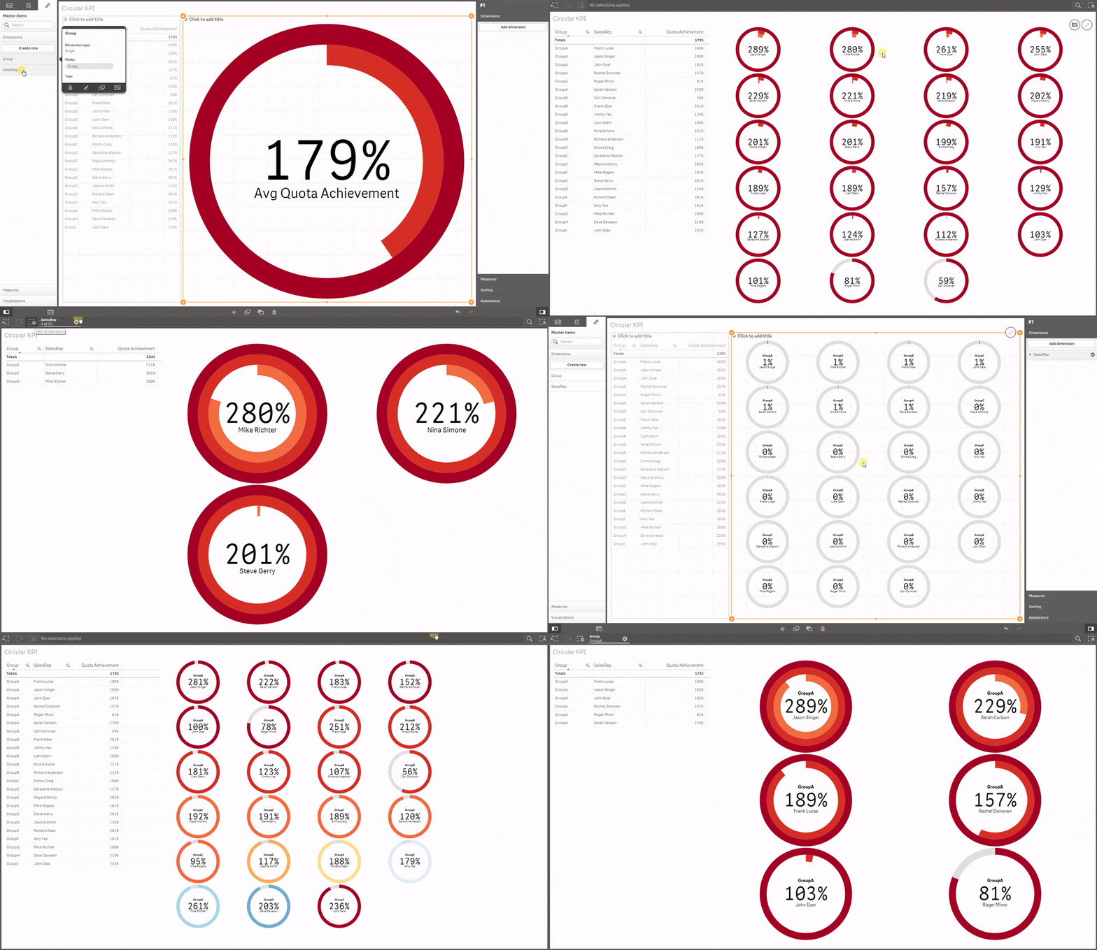
Would you like to use KPI to show target achievements but your values typically are over 100% making classic progress bar useless? Well, then you may want to try Circular KPIs, it supports percentage (%) KPIs up to 300% in a very smart way. Simple but fun extension.If you are using any other extension that you think may be worth it to share with the community please let us all know in the comment section!
Enjoy Qliking!
AMZ
-
Year in review. 2016 Top Posts
2016 is almost over, we've made it this far; we can make it through one more day. To help you to reduce the end-of-year stress nothing better than our... Show More2016 is almost over, we've made it this far; we can make it through one more day. To help you to reduce the end-of-year stress nothing better than our very own top blog posts of the year. Let's start by sharing some numbers.
7 author posted 77 articles (not including this one) during the year, and a total of 34,876 words (6.693 distinct words) were written. Last year we wrote the Q-word 323 times while this year the word “Qlik” appears 366 times in our articles, 4.75 times per post. You helped us to improve our content by commenting in average almost 7 times per post, a total of 531 comments were written.
Most popular posts in 2016
Most read/visited posts
Top selling posts.
Set Analysis in the Aggr function.
The sortable Aggr function is finally here.
Five Qlik Sense extensions you should check out today.
Creating a KPI object in QlikView.
Most commented posts of the year
Something is going on in these posts.
The sortable Aggr function is finally here.
Qlik Sense 2.2 – It just keeps getting better and better.
Creating a KPI object in QlikView.
The underdogs 2016
They worth a second read.
Recipe for a Pareto Analysis – Revisited
When I first wrote about the new sortable aggr function I was really curious to see what uses were unlocked by the new functionality. HIC found one.Implicit Set Operators
Quite popular post that didn't make it to our top 5. It's a good lecture to improve your set analysis skills.Use case for ValueList Chart function
Real life use case for a no-so-common functionQlik Lars Mashup project template
If you are considering creating a mashup page with Qlik charts in it, you may want to check out this template.Hope you all have a great end of the year!
AMZ
-
Community created highlights 2016
It's almost the end of 2016, so I figured I'd look back at some of the stuff the Qlik developer community has created this year. This list does not at... Show MoreIt's almost the end of 2016, so I figured I'd look back at some of the stuff the Qlik developer community has created this year. This list does not attempt to be a "best of 2016" list, there were so many great things created this year that I wouldn't even know where to begin ranking them. Rather, this is just a few highlights I selected. Hope you enjoy!
Qlik Playground
Qlik Playground lets you quickly test out all kinds of stuff with the Qlik Engine and APIs. It gives you a sandbox to play in, and also has some cool showcase projects you can play around in, as well as learning resources. It's very cool.
RxQAP
RxQAP is a reactive JS wrapper that currently supports the Qlik Engine API. Observables are super awesome, and while I haven't had a chance to build a project with this yet, it's very high on my to-do list.
Sense Search Components
Sense Search Components lets you easily embed search in a web app. And it works with the App API or the Engine API!
Lars Mashup Template
Full disclosure, I built this one. It's the template I've been using for most of the year to quickly spin up boilerplate for any App API projects.
qSocks snippets extension for VSCode
Adds snippets for qSocks to VSCode. If you're not using VSCode, you should. If you haven't tried qSocks, check it out. And if you're already using both, this project is for you.
Google Annotation Chart for Qlik Sense
Google annotation charts are sharp. This is an integration of google annotation charts for Qlik Sense.
Climber Selection bar
An extension that allows you to add selection capabilities to your app that look sharp and have some cool functionality.
Dynamic Table with Sparklines
This extension allows you to create tables that include sparklines. It looks really good.
sxBlockRain
This. Is. Necessary.
You can check out Qlik Branch for even more awesome Qlik developer community created projects, and check out the comments to see recommendations by others and add your own!
-
A Look at the Lookup Function
The Lookup function is a script function that allows you to look up and return the first occurrence of a value in a field that has already been loaded... Show MoreThe Lookup function is a script function that allows you to look up and return the first occurrence of a value in a field that has already been loaded in the script. The lookup can occur in the current table or a previously loaded table. Here is the syntax:
lookup(field_name, match_field_name, match_field_value [, table_name])
The first parameter field_name is the field from which the returned value will come from. The field_name must be entered as a string so enclose the field name in single quotes.
The second parameter match_field_name is the field where you will be looking up the value. This parameter also needs to be entered as a string. This parameter and the first parameter, field_name, must be fields in the same table in order for the Lookup function to work.
The third parameter match_field_value is the value that you are looking for in the match_field_name field.
The fourth and last parameter is the table_name. This is an optional parameter. If the lookup is occurring in the current table that is being loaded, then this parameter can be omitted. If the lookup is in another previously loaded table, then this parameter should be the table name enclosed in single quotes.
So, let’s take a look at a small example of the Lookup function. In the script below, the first two inline load scripts load a ProductData and a CustomerData table. The loading of the Temp table is where we can see the Lookup function in action. In this example, I am looking up the customer name with a specified customer ID. The Lookup function will return the value of the Customer field (first occurrence) from the ProductData table where the loaded CustomerID matches the value in the CustomerID field in the ProductData table.
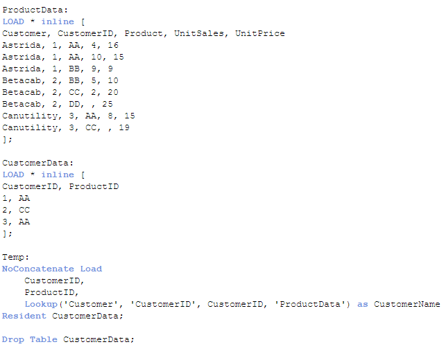
Once this script is run, the Temp table looks like this:
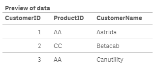
The field CustomerName has the customer name that corresponded to the first occurrence of the CustomerID being loaded in the Temp table. This value was captured by looking it up in the ProductData table.
If the Lookup function does not find a match, null will be returned. The Lookup function is one line of code that is fairly easy to add to your script to look up a value in a field but it has some limitations. First, the order of the search is the load order. You are not able to sort the data so the first occurrence will be based on the load order of the value. Second, the Lookup function is not as fast as the ApplyMap function. While the Lookup function is flexible and easy to use once you know the parameters, ApplyMap should be your first choice when you need to look up a value based on the content of a field. You can read more about the ApplyMap function in the blogs listed below:
Mapping … and not the geographical kind
Don't join - use Applymap instead
Thanks,
Jennell
-
The Aggregation Scope
This seems like a simple question, but there are in fact quite a few things that could be said about it. Normally, there are two different restricti... Show MoreThis seems like a simple question, but there are in fact quite a few things that could be said about it.
Normally, there are two different restrictions that together determine which records are relevant: The Selection, and – if the formula is found in a chart – the Dimensional value. The aggregation scope is what remains after both these restrictions have been taken into consideration.
But not always…
There are ways to define your own aggregation scope: This is needed in advanced calculations where you want the aggregation to disregard one of the two restrictions. A very common case is when you want to calculate a ratio between a chosen number and the corresponding total number, i.e. a relative share of something.

In other words: If you use the total qualifier inside your aggregation function, you have redefined the aggregation scope. The denominator will disregard the dimensional value and calculate the sum of all possible values. So, the above formula will sum up to 100% in the chart.

However, there is a second way to calculate percentages. Instead, you may want to disregard the the selection in order to make a comparison with all data before any selection. Then you should not use the total qualifier; you should instead use Set analysis:

Using Set analysis, you will redefine the Selection scope. The set definition {1} denotes the set of all records in the document; hence the calculated percentages will be the ratio between the current selection and all data in the document, split up for the different dimensional values.

In other words: by using the total qualifier and set analysis inside an aggregation function, you can re-define the aggregation scope.
- To disregard the dimensional grouping – Use the Total qualifier
- To disregard the selection – Use Set Analysis
The above cases are just the basic examples. The total qualifier can be qualified further to define a subset based on any combination of existing dimensions, and the Set analysis can be extended to specify not just “Current selection” and “All data”, but any possible selection.
And, of course the total qualifier can be combined with Set analysis.

A final comment: If an aggregation is made in a place where there is no dimension (a gauge, text box, show condition, etc.), only the restriction by selection is made. But if it is made inside a chart or an Aggr() function, both restrictions are made. So in these places it could be relevant to use the total qualifier.
Further reading related to this topic:
-
Data Cleansing
When building business intelligence solutions one problem is that data usually contains errors, e.g. attributes are written in different ways so tha... Show MoreWhen building business intelligence solutions one problem is that data usually contains errors, e.g. attributes are written in different ways so that data cannot be grouped correctly. The attribute could be written in upper case or not; it could be abbreviated or not; and sometimes several synonyms exist for the same thing.
For instance, ‘United Kingdom’ could be referred to as ‘UNITED KINGDOM’, ‘United Kingdom’, ‘Great Britain’, or just ‘UK’.
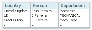
As a consequence, what the users really think of as the same instance will appear on several rows in a list box, or be displayed in several bars in a bar chart. This will cause problems in the data analysis, since selections and numbers displaying totals often will be incomplete.
But there are ways to solve this. The best way, is of course to correct it in the source data. But this is not always possible, so it may be that the correction must be made elsewhere.
In QlikView and Qlik Sense there are several ways to do this. The most obvious (but not the best), is to use a hard-coded, conditional expression in the script:

Similar constructions can be made using Replace() or Pick(). These all work and will do the job.
But they are not manageable.
Should you want to add more cases or change some previous ones, you will soon realize that this isn’t a good method. The expressions will become too long and they will be error-prone. So I strongly recommend not doing this.
There is however a solution which is both manageable and simple: Mapping Load. The first step is to create a mapping table with all changes you want to make:

Then you load this table using the Mapping prefix:
MapTable:
Mapping Load ChangeFrom, ChangeTo
From MapTable.xlsx (...) ;Now you can use this table in the script to correct all field values. The simplest way to use the Map statement: Declare the mapping early in the script before any of the relevant fields are loaded, and the corrections will be made automatically:
Map Country, Department, Person Using MapTable ;
Alternatively, you can use either ApplyMap() or MapSubstring() when you load the field, which both will make a lookup in the mapping table and if necessary make the appropriate replacement, e.g.:
ApplyMap( 'MapTable', Country ) as Country ,
The mapping table will be discarded at the end of the script run and not use any memory in the final application.
Using a mapping table is by far the best way to manage this type of data cleansing in QlikView and Qlik Sense:
- It is easy to add new corrections and to change the old ones
- The mapping table can be stored separately from the script; in an Excel sheet or even in a database
Good Luck!
Further reading related to this topic:
-
Big Data with Qlik - One method does not fit all!
2 min read - 4 min videoIn this week's Qlik Design Blog I have the pleasure of introducing our newest guest blogger, Michael Distler. Michael is a Dir... Show More2 min read - 4 min video

In this week's Qlik Design Blog I have the pleasure of introducing our newest guest blogger, Michael Distler. Michael is a Director of Product Marketing responsible for developing content, positioning, and messaging for Qlik products. His major focus is on data related topics such as Qlik Connectors and Big Data. Today Michael presents a number of approaches that Qlik offers when it comes to handling Big Data.
Qlik's Approaches with Big Data
Just like the term Big Data doesn’t equate to one technology, Big Data also doesn’t relate to one scenario, use case or infrastructure. There can be many differences from one organization to the next. Since every situation is different, Qlik offers multiple techniques which can be used individually or in combination to best meet the Big Data needs of a particular customer.
These approaches include but are not limited to:
- Our default in-memory architecture (QIX)
- Segmentation
- Chaining
- A Hybrid in-memory / direct access approach using Direct Discovery
- On Demand App Generation
Rather than write about these, I created a brief (4 min) video presentation that reviews the different Qlik methods that can be utilized with Big Data including a brief demo of Qlik’s newest technique On demand app generation (ODAG).
To learn more about these approaches and how Qlik works with Big Data you can also download this whitepaper.
Regards,
Michael Distler (@michaeldistler) | Twitter
Director, Product Marketing
Qlik

-
Qlik Sense – Date & Time
One of the new features release on Monday with Qlik Sense 1.1 is the ability to generate date and time fields. Now, you may be thinking that you alwa... Show MoreOne of the new features release on Monday with Qlik Sense 1.1 is the ability to generate date and time fields. Now, you may be thinking that you always generate date fields in your applications – I know that I do – but in Qlik Sense 1.1, we have introduced the Declare and Derive statements that make it easier for you to create a calendar definition that you can use for all date fields in your application. This is brilliant and easy to do.
I tested it out by loading some employee expense data that looks something like this:
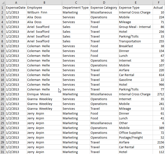
I then used the Declare statement to create a calendar definition.
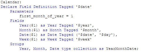
I named the definition Calendar and tagged it as $date. I indicate what the first month of the year should be and then I list the fields that I want generated by the definition. In this example, I entered Year, Month, Date and Week. I could enter others if I want here like Day and Time.
Last, I entered one group that will create a drill down for Year, Month and Date and I named it YearMonthDate. I could list other groups here as well if I need them. In this definition $1 represents the data field from which the date fields will be generated. In this example, that will be the ExpenseDate field.
Now that the calendar definition is created, I just need to use the Derive statement to apply the calendar to the date field that I have already loaded. In this example, the field is named ExpenseDate and my Derive statement looks like this:

If I had more date fields that I had loaded in my data model, I could apply the calendar definition to all of them in the Derive statement by separating the field names with commas. In my Derive statement I used specific data fields but there are alternatives as well. You can also derive fields for all fields with a specific tag or for all fields with the field definition tag. You can find examples of these in Qlik Sense Help.
Once this is complete, simply reload the app. Now when you go into the Fields tab in the Assets panel, you will see a tab for Date & time fields and when you expand it, you will see the date fields that were generated by the calendar definition.
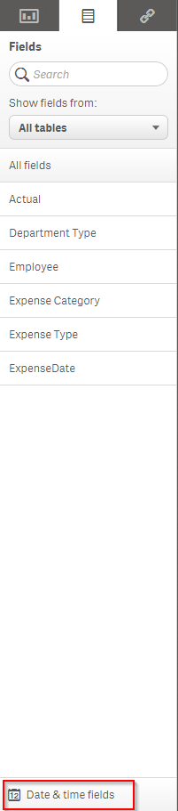
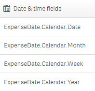
These date fields can be used like you usually use them in your applications – as filters, in visualizations and so on.
I recommend you try it out and refer to Qlik Sense Help for details if you need help. It will save you time especially if you have an application with a lot of date fields that you would like to build out into a calendar. You create the calendar definition one time and in one statement (the Derive statement), you can list all the fields that the definition should be applied to (that you want to generate date fields for). Reload and the calendar is done. Did I already say that this is brilliant!
Thanks,
Jennell
-
Now we're cooking with Class()
Late last week I was working with a Qlik Sense client who wanted to classify a certain range of numeric data. Basically they described it as putting c... Show MoreLate last week I was working with a Qlik Sense client who wanted to classify a certain range of numeric data. Basically they described it as putting certain values into their own respective "buckets" defined by high and low values. Now when I hear "range of data" along with "classify" and "buckets" or even "grouping of data" I think of a histogram.
For the most part we know that a histogram is really nothing more than a bar chart that shows the distribution of numeric data. For example, say you want to know who your strongest customers are and you want to see how many and which customer orders have sales that fall in between a certain monetary range. We can make a bar chart act like a histogram by simply defining the bar chart’s dimension using the Class() function. Simply stated, Class() can be used to classify or group, a measure into bins defined with upper and lower limits.
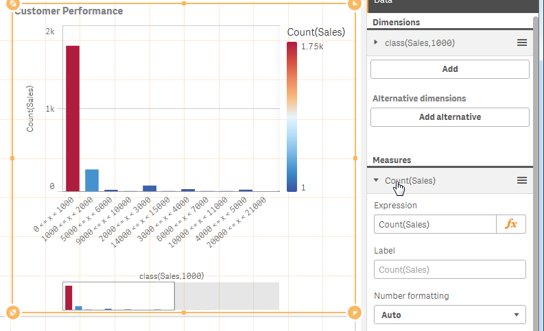
The Class() function takes in a few arguments. The first argument is the actual "measure field name" you would like to count and the second argument is the interval you would like to bin by. For example, let’s see how many customers have sales that fall within 0 and $1000. In my bar chart I define my dimension as class(Sales,1000), and for my measure I count the number of sales transaction using Count(Sales). In the final result you can see most of my sales consist of transactions that fell between 0 and $1000.
To see this in action watch this 60 second video on the topic.

Dimension - class(Sales,1000)
Measure - count(Sales)
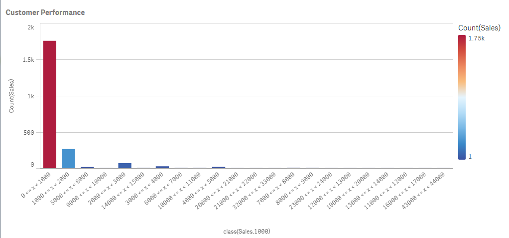 Final Result
For more chart functions like Class() be sure to visit our online help.
See the Qlik Sense sample provided in this post.
If using Qlik Sense Desktop please copy .qvf file to your C:\Users\<user profile>\Documents\Qlik\Sense\Apps and refresh Qlik Sense Desktop with F5. If using Qlik Sense Enterprise Server please import .qvf into your apps using the QMC - Qlik Management Console.
Regards,
Michael Tarallo (@mtarallo) | Twitter
Senior Product Marketing Manager
Qlik
-
Only connect! Qlik and ODBC
It’s a simple but profound statement to say that QlikView has worked with ODBC connectors for many years. Even our new product, Qlik Sense, has worked... Show More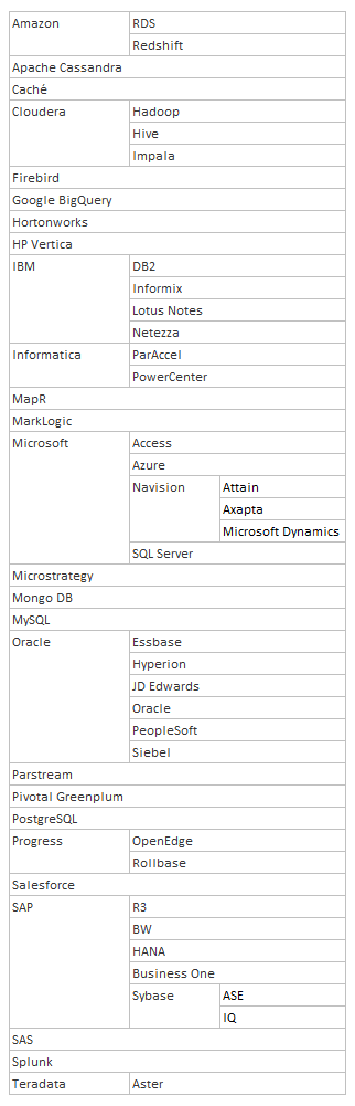
It’s a simple but profound statement to say that QlikView has worked with ODBC connectors for many years. Even our new product, Qlik Sense, has worked with ODBC connectors since its creation. But what are the implications of working with ODBC connectors?
ODBC was created to solve a simple problem: how to extract data from different databases in a fast and standardized way? Nowadays, most database vendors supply ODBC drivers or OLE DB providers and there’s even a thriving market of driver providers. If your application supports ODBC, you have a huge range of databases to connect to. This means that there are many, many databases you can connect QlikView and Qlik Sense to.
I got bored one day and started to list the ODBC databases QlikView and Qlik Sense connect to. You can see my list to the right, not including different versions of the same driver.
Now if you need something more, then you can always use an existing 3rd party custom connector or create one using the Qlik QVX SDK. So there are always options and ways that your data can be loaded into a QlikView or Qlik Sense application. The options are endless.
Do you know of more databases you can connect to with the Qlik ODBC connectors?
-
Mapping … and not the geographical kind
I often use some sort of mapping in the QlikView applications I create to manipulate the data. Mapping functions and statements provide developers wi... Show MoreI often use some sort of mapping in the QlikView applications I create to manipulate the data. Mapping functions and statements provide developers with a way to replace or modify field values when the script is run. By simply adding a mapping table to the script, field values can be modified when the script is run using functions and statements such as the ApplyMap() function, the MapSubstring() function and the Map … using statement.
Let’s take a look at how easy it is to use mapping in a QlikView application. Assume our raw data looks like this:
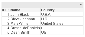
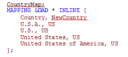
You can see the country United States of America was entered in various ways. If I wanted to modify the country values so that US was used to indicate the United States of America, I could add a mapping table like this to map all the variations of the United States of America to be US.
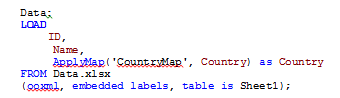
Once I have a mapping table, I can start using it. I usually use the ApplyMap() function when I am mapping. The script below will map the Country field when this table is loaded.
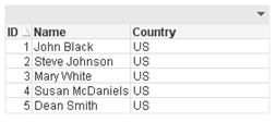
The results are a table like the one below where all the Country values are consistent, even the one that was misspelled (Country field for ID 4). The mapping handled all the variations that were entered in the data source and when the mapping value was not found the default ‘US’ was used.
Now I could have also used the Map … using statement to handle the mapping. Personally, I have never used this statement but if you had many tables that loaded the Country field and you wanted to map each of them, Map … using provides an easier way of doing it with fewer changes to the script. After loading the mapping table, you can say:

...
load data
...

This will map the Country field using the CountryMap until it reached the Unmap statement or the end of the script. The main difference between this and the ApplyMap() function is with the Map … using statement, the map is applied when the field is stored to the internal table versus when the field is encountered.
One last mapping function that is available in QlikView is the MapSubstring() function that allow you to map parts of a field. Using the mapping table below, the numeric data in the Code field is replace with the text value.
Before MapSubstring() function is used:
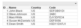
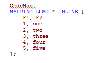
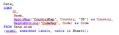
After MapSubstring() function is used:
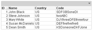
The numeric values in the Code field were replaced with the text values.
Mapping is a powerful feature of QlikView that I use in just about every application. It allows me to “clean up” the data and format it in a consistent manner. I often use it to help scramble data when I have many values that I need to replace with dummy data. So the next time you are editing or “fixing” the data in your data source, consider mapping. Check out the technical brief I wrote on this topic.
Thanks,
Jennell
-
Managing Qlik Sense Streams - Security Rules and Exception Management
Hello Qlik Community, in this post I have the pleasure of introducing Marcus Spitzmiller. Marcus is a member of the Qlik Enterprise Architecture team ... Show More
Hello Qlik Community, in this post I have the pleasure of introducing Marcus Spitzmiller. Marcus is a member of the Qlik Enterprise Architecture team focusing on enterprise deployments and best practices. His areas of expertise include scalability and performance, deployment best practices, integration, and security. Marcus has been with Qlik for 6.5 years. In this post he will introduce you to Qlik Sense Stream management, covering security rules and exception management.Managing Qlik Sense Streams
At the center of Qlik Sense’s security is an attribute based access control component called the Security Rules Engine. Qlk’s Product Manager for security, Fredrik Lautrup, ( flp ) does a great job of explaining just what that means here (https://community.qlik.com/blogs/qlikviewdesignblog/2015/03/10/why-security-rules-in-qlik-sense).
Administrators of Qlik Sense can leverage attributes about users, applications, streams, data connections and much more to govern user authorization (that is, who can do what) via the Security Rules Engine.
Qlik’s Michael Tarallo (@mto) has produced a number of great videos that describe the Qlik Management Console and the functions available within it here (https://community.qlik.com/docs/DOC-7144), and I would encourage you to review those videos in the “Management Console (QMC) Series” if you don’t yet have an understanding of concepts like Streams, Custom Properties, and User Directory Connectors.
In this video I show how you can effectively use the power of the Security Rules Engine to manage multiple groups of users, multiple streams, and do so with as little administrative maintenance as possible.
Be on the lookout for the following best practices leveraged within this video:
- - Build “Many to Many” Security rules to enable one stream security rule to govern many streams and many users at once.
- - Use Custom Properties to avoid hard coding of values into Security Rules.
- - Avoid changing the out of the box rules. If you need to change a rule’s default behavior, disable the rule and make a copy of it.
- - Finally, manage collections of things before you manage the thing itself. With the concepts I detail in this video, you can manage many streams, many groups, (and by extension many data connections, and more) with little administrative overhead, and manage individual things (like applications) as an exception.
The Security Rules Engine is a tremendously powerful component of the Qlik Sense architecture, and your deployment requires planning. As a general guideline, if you find yourself thinking “there has got to be a better way”, there probably is! That is your cue to reach out to the many Qlik resources you have available to you through QlikCommunity, Qlik Education, Qlik Partners, Qlik Consulting, and Qlik Sales teams.
Enjoy the video!
Marcus