Unlock a world of possibilities! Login now and discover the exclusive benefits awaiting you.
Analytics & AI
Forums for Qlik Analytic solutions. Ask questions, join discussions, find solutions, and access documentation and resources.
Data Integration & Quality
Forums for Qlik Data Integration solutions. Ask questions, join discussions, find solutions, and access documentation and resources
Explore Qlik Gallery
Qlik Gallery is meant to encourage Qlikkies everywhere to share their progress – from a first Qlik app – to a favorite Qlik app – and everything in-between.
Qlik Community
Get started on Qlik Community, find How-To documents, and join general non-product related discussions.
Qlik Resources
Direct links to other resources within the Qlik ecosystem. We suggest you bookmark this page.
Qlik Academic Program
Qlik gives qualified university students, educators, and researchers free Qlik software and resources to prepare students for the data-driven workplace.
Recent Blog Posts
-
Qlik Cloud WordPress Plugin: updated version using Qlik Embed
If you’ve came across the initial Qlik Cloud Wordpress plugin on the Qlik Community Design blog and gave it a try, you probably have run into some iss... Show MoreIf you’ve came across the initial Qlik Cloud Wordpress plugin on the Qlik Community Design blog and gave it a try, you probably have run into some issues with it. Today, I’m going to share a new updated version of the Qlik Cloud WordPress plugin that brings a more efficient way to embed Qlik Cloud analytics into your WordPress websites.
In this post, I'll walk you through the steps to install, configure, and use the new version of the plugin to bring your Qlik Cloud visualizations directly into your WP pages and posts.
Why the Update?
The previous version of our plugin relied on JWT tokens for auth, iframes (single integration API) and nebula.js for embedding, which worked but had limitations such as third-party cookies. Qlik Embed is the new embedding library and adopts better auth flows. In this version, I'm using OAuth impersonation to generate access token on the backend without need for users to interact with a login page.
Installation Steps
1. Install the Plugin
- Log in to your WordPress Admin Dashboard.
- Navigate to Plugins on the left sidebar.
- Click on "Add New" at the top of the page.
- Upload the zipped file (download it from GitHub here)
- Locate the plugin and click "Install Now".
- After installation, click "Activate".
Note: If you have the previous version installed, deactivate and delete it before installing the new one to avoid conflicts.
Configuring Qlik Cloud Wordpress Plugin
Before using the plugin, you'll need to set up OAuth impersonation in your Qlik Cloud tenant.
Create an OAuth Client
- Log in to your Qlik Cloud tenant as an administrator.
- Navigate to Management Console > Integrations > OAuth.
- Click on "Create new" and fill in the required details:
- Name: Give a recognizable name like "WordPress Integration".
- Allowed Origins: Add your WordPress site's URL.
- Select the right scopes to grant to the client from the Scopes list.
- Check “Allow Machine-to-Machine (M2M)” and “Allow M2M user impersonation”
- Change the consent method to Trusted
- Save the client credentials (Client ID and Client Secret) to be used in WordPress Config.
Docs here: https://qlik.dev/authenticate/oauth/create/create-oauth-client-m2m-impersonation/
Make sure to read through the Guiding Principles of OAuth Impersonation: https://qlik.dev/authenticate/oauth/guiding-principles-oauth-impersonation
P.S: this method will create a number of anonymous users on your tenant and you need to implement a way to remove these users periodically (using a Qlik Application Automation / users API)
Configuring the Plugin
- In your WordPress dashboard, go to Settings > Qlik Cloud Embed.
- Fill in the required fields:
- Host: e.g.,
https://your-tenant.region.qlikcloud.com. - Client ID: From the OAuth client you created.
- Client Secret: From the OAuth client.
- Host: e.g.,
- Click "Save Changes".
Using the Plugin
Embedding Sheets and Visualizations
With the plugin configured, you can now embed Qlik Cloud content using Shortcodes.
1. Embed an Entire Sheet/App
Use the
[qlik-embed-app]shortcode:[qlik-embed-app appid="1234-c56a-4062-ac50-377bba443e85" sheetid="12345-698f-449f-9a17-dca17eeadb71"]Parameters:
- appid: App ID
- sheetid: Sheet ID
2. Embed Individual Visualizations/Objects
Use the
[qlik-embed-object]shortcode:[qlik-embed-object appid="1234-64317-8432" objectid="1234-5553-326432"]Parameters:
- appid: App ID
- objectid: Object ID
3. Embed Selections bar
Use the
[qlik-embed-selections]shortcode:[qlik-embed-selections appid="1234-c56a-4062-ac50-377bba443e85"]Parameters:
- appid: App ID
Tip:
Finding IDs in Qlik Cloud
- Open your app in Qlik Cloud.
- Navigate to the sheet or object you want to embed.
- In the URL, find the sheet ID
- Sheet ID comes after
/sheet/
- Sheet ID comes after
- For object, right click on the chart, click on Embed, and look for objectid under the chart preview.
You can download the plugin here: https://github.com/qlik-demo-team/wp-qlik-saas-plugin
P.S: this plugin is maintained by myself. If you find any bugs or issues, please report them to me or create an issue on Github and I'll do my best to resolve them quickly.
Thank you!
-
Empowering Education Through Data: Meet Your New EMEA Lead
Empowering Education Through Data: Meet Your New EMEA Lead Hello Qlik Community! 👋 I’m thrilled to introduce myself as the new EMEA Lead for the Ql... Show MoreEmpowering Education Through Data: Meet Your New EMEA Lead
Hello Qlik Community! 👋
I’m thrilled to introduce myself as the new EMEA Lead for the Qlik Academic Program. Stepping into this role is an exciting opportunity to collaborate with educators, universities, and students across Europe, the Middle East, and Africa, empowering them to embrace data analytics and thrive in an increasingly data-driven world.
The Qlik Academic Program offers a wealth of resources designed to transform education:
- Free Access to Qlik Software for teaching and learning.
- Free Comprehensive Learning Resources tailored for educators and students.
- Free Qualifications and Certifications to bolster career readiness.
- Free Webinars and Events to showcase the power of data insights in academia.
What’s New?
As part of my role, I’ll be:
- Sharing regular blog posts here on the Qlik Community to highlight success stories, tips, and upcoming events.
- Collaborating with universities to integrate data analytics into their curricula.
- Promoting the benefits of data literacy to prepare students for future careers.
Let’s Work Together!
Whether you're an educator eager to inspire your students or a student excited about data analytics, the Qlik Academic Program is here to support you. Feel free to connect with me directly or explore this page for more information about the program: Qlik Academic Program
📩 Got questions or want to connect? Email me at eliz.cayirli@qlik.com
Together, let’s cultivate a culture of data literacy and innovation in education! 🚀
Stay tuned for exciting updates and be part of this journey.
-
The Importance of Data Literacy in Education: Preparing Students for the Future
Did you know that data literacy has become one of the top skills that employers are actively seeking in candidates? With the rise of data-driven decis... Show MoreDid you know that data literacy has become one of the top skills that employers are actively seeking in candidates? With the rise of data-driven decision-making in almost every industry, it’s no surprise that this skill is in high demand.
But the big question is: how do we incorporate data literacy into our academic curricula, and more importantly, how do we equip our students with the skills they need to succeed in this data-driven world?
We must start early by introducing students to data literacy. By doing so, we are setting them up to understand the principles of data visualization and analysis, which are essential for making informed decisions, improving communication, and boosting efficiency. These foundational skills will help students stand out in the workforce and be more competitive in an increasingly data-focused job market.
So, how can we provide students with the tools to develop their data literacy skills? The answer is simple: Qlik. Qlik offers a range of data literacy courses, videos, and certifications that empower students to master these critical skills. We understand how important data literacy is, and we want to ensure that students gain the knowledge and expertise they need to thrive in their academic and professional careers.
By incorporating data literacy into education, we are not just teaching students how to work with data—we are helping them prepare for a future where data-driven decision-making will be at the heart of every industry.
Discover Qlik's Academic Program here!
-
Sensibo - Temp and humity
Sensibo - Temp and humityPersonalDashboard based on the API of Sensibo.DiscoveriesMore insights into the temperature and humidity in a room. Historica... Show MoreSensibo - Temp and humityPersonal Dashboard based on the API of Sensibo.
Discoveries
More insights into the temperature and humidity in a room. Historical information is also available, but only 1 day of history in the app.
Impact
No business impact, but it can be used for home automation.
Audience
Personal / Home automation
Data and advanced analytics
More insight and historical data.
-
Techspert Talks - SAP Connection to Qlik Talend Cloud
Hi everyone, Want to stay a step ahead of important Qlik support issues? Then sign up for our monthly webinar series where you can get first-hand insi... Show MoreHi everyone,
Want to stay a step ahead of important Qlik support issues? Then sign up for our monthly webinar series where you can get first-hand insights from Qlik experts.The Techspert Talks session from January looked at SAP Connection to Qlik Talend Cloud.
But wait, what is it exactly?
Techspert Talks is a monthly free webinar, where you can hear directly from Qlik Techsperts on topics relevant to Customers and Partners today.In this session, we cover:
- Completing connection requirements
- Setting up SAP connection to Qlik Talend Cloud Data Integration
- SAP data best practices
Click on this link to watch the recording.

-
Conditional Aggregations
Often you need to create conditional aggregations in QlikView, e.g. when you want to create a graph that shows this year’s numbers only, also if there... Show MoreOften you need to create conditional aggregations in QlikView, e.g. when you want to create a graph that shows this year’s numbers only, also if there are several years possible.
There are basically three ways to do this
- A conditional expression outside the aggregation function, e.g. If(<Condition>, Sum(<Expression>))
- A conditional expression inside the aggregation function, e.g. Sum(If(<Condition>,<Expression>))
- Set Analysis, e.g. Sum( {<Set Expression>} <Expression> )
If you choose a conditional expression outside the aggregation function, you will have a condition that is evaluated once per dimensional value. Further, all three parameters of the If() function are aggregations, so you need to use aggregation functions, also in the condition, otherwise the expression will not be evaluated the way you want to.
So - don’t use naked field references!
If( ShippingDate >= vReferenceDate, Sum( Amount ) ) // Incorrect !
If( Min( ShippingDate ) >= vReferenceDate, Sum( Amount ) ) // Correct
If you instead put the conditional expression inside the aggregation function, you will have a very different situation: First, the condition will be evaluated on the record level of the source data. In other words: You may get performance problems if you have large data amounts.
Sum( If( ShippingDate >= vReferenceDate, Amount ) )
Secondly, the aggregation function now contains an expression based on several fields (in the above example, ShippingDate and Amount), possibly from several source tables. This means that QlikView will aggregate over the Cartesian product of the included source tables. Normally this is not a problem, but in some odd cases, you will have results different from what you expect.
For instance, if the record with Amount has several shipping dates associated with it, the amount will be counted several times, once per shipping date, and you will get a result that you probably consider incorrect. There is usually a way to get around this problem by writing the expression differently, but if you can’t find one, you should use Set Analysis instead.
The conditional expression can be written in several ways:
- String comparison: If( Field = ‘string’, Amount )
- Numeric comparison: If( Field = number, Amount )
- Boolean condition: If( Flag, Amount ) e.g. Sum( If( IsThisYear, Amount ) )
- Multiplication: Flag * Amount e.g. Sum( IsThisYear * Amount )
The two first examples contain comparisons, whereas the two last contain flags - Boolean fields created in the script. All four ways work fine, but I would recommend avoiding comparisons altogether. Use flags instead. See e.g. Year-over-Year Comparisons for more on flags.
Finally, you can choose to use Set Analysis. This is slightly different from other conditional expressions in that it uses the QlikView selection metaphor for the analysis: First, the Set Expression is interpreted as a selection, whereupon the aggregation is evaluated given this selection.
Sum( {$<ShippingDate = {">='$(vReferenceDate)'"}>} Amount )
Sum( {$<IsThisYear = {1}>} Amount )
This means that Set Analysis often is faster than using a conditional expression inside the aggregation. It also means that it calculates what you expect, as opposed to a case where an inside condition creates an unwanted Cartesian product.
However, a drawback with the Set Analysis is that it needs to be performed before QlikView performs the aggregation – you cannot have a Set Expression that evaluates to different values for different rows. The work-around is to calculate the condition in the script and store it in a flag.
Bottom line: Define flags in the script. And use Set Analysis.
Further reading related to this topic:

-
Dissecting the New UI: Analytics
In previous installments of our blog series, we covered a general overview as well as the first installment of our series centered on the Insights sec... Show MoreIn previous installments of our blog series, we covered a general overview as well as the first installment of our series centered on the Insights section of Qlik Cloud’s new UI. Today we’ll move on to the next section: Analytics.
Upon first glance at the Analytics section, you will notice it contains many more options than the Home section, more than double. Please do keep in mind, you will only see the options in this section that you have permissions to access. Additionally, you will see a few familiar options with ‘Home’, ‘Favorites’, ‘Collections’ and ‘Alerts’ being repeated. Due to this, we will be skipping these options, but you can learn more about these options in my previous blog by clicking here. With that out of the way, we are free to begin our deep dive into the ‘Analytics’ section.
The first non-repeated option we’ll find is ‘Create’. Upon clicking create, the user will be shown a vast offering of beginning points for the analytics side of Qlik Cloud. Here users can do so much, from starting an analytics app, to a ML experiment, or even a data connection. Create is the perfect place to begin when you’re wanting to take advantage of Qlik Cloud’s offerings.
‘Catalog’ is the next section of Analytics. The Catalog is great for searching through the various items within your Qlik Cloud tenant. In this section, users can narrow down their search not only by the apps they have created, but by charts, notes, automations they have established. The Catalog makes finding the exact item you are looking for easy so you can get to working with your data, instead of searching.
The ‘Visualize and analyze’ section of Analytics begins a subsection called ‘mini-homes’. Users will find a similar view to the ‘Create’ section, but more focused on creating apps and uploading data. This section also allows users to search for the various apps on their tenant using filters to narrow down their search. In the top right hand corner, users will find a ‘create new’ button in each mini-home which offers easy access to the displayed options as well as an ‘Upload’ option in Visualize and analyze.
‘Prepare Data’ offers a similar view to ‘Visualize and analyze’ though it is focused on the various data files a user has loaded. Here you’ll find QVDs, excel files and any other sources of data that has been loaded. Like the Visualize and analyze section, users can search for a file or narrow down the files displayed through various filters.
Predict is related to Qlik Cloud’s machine learning or ‘ML’ feature. In this section, users can begin creating an ML experiment, establish a data connection or upload a data set. Of course, the various previously established ML experiments can be found here and search for.
Answer is the last mini-home in the subsection. This section allows users to create AI-based assistants to ask questions and get answers from unstructured data sources. In this mini-home, users can create the AI assistant, create a knowledge base and establish a data connection or upload knowledge files. This section also contains previously established knowledge bases and assistants. To learn more about the Answer mini-home, click here to learn more from Qlik Help.
Automations provides users with an interface to create new automations. These automations can be used to do any number of things within your Qlik Cloud tenant. Qlik Cloud comes with various templates that a user can use to begin setting up their own automations, from automatically reloading data, or notifying a team on slack about a reload, the possibilities can no doubt be used by any user. Visit the automations section to see how this section can help your team!
Second to last, we’ll find the ‘Subscriptions’ section of Qlik Cloud. Subscriptions provides an interface to view various charts or sheets that you have subscribed to. Users can select any chart or sheet in an app, and simply click ‘Subscribe’ to set up a subscription to the item. These subscriptions will be sent to a user’s email at an interval that is decided when establishing the subscription. This allows users to stay informed of a collection of important data directly from their email.
Finally, at the bottom of the list, users will find the ‘Getting started’ section. If you find yourself at a loss for a beginning point, this section can help users in their journey of taking advantage of Qlik Cloud’s offerings. This section offers helpful points to jump into uploading your data, while also providing video guides to demonstrate some of the processes of Qlik Cloud, even providing sample data to get you started analyzing data. Getting started is a great resource for new users, or even veterans that want to learn something new!
Thank you for taking the time to read this blog entry, I hope you learned something new in our deep dive through the Analytics sections of the new UI. Throughout this blog, we touched on many points that can be further explored, is there a section you think deserves their own blog entry? If so, leave it down in a comment below. If you missed it, check out my previous blog on the ‘Insights’ section of the UI located here.
-
Accessibility Best Practices for Qlik Sense
Web accessibility is a topic that's not often brought up when planning to build an experience on the web. It is however crucial to acknowledge the imp... Show MoreWeb accessibility is a topic that's not often brought up when planning to build an experience on the web. It is however crucial to acknowledge the importance of ensuring that all users are able to access the content you create as it helps to eliminate barriers to access valuable information and proactively creates an inclusive environment for people regardless of their visual, cognitive, physical, or auditory disabilities.
You can read more about Qlik’s commitment to making products and services available to everyone here. Qlik Sense comes with features and improvements aimed at accessibility compliance with WCAG 2.0 standards.
Accessibility in Qlik Sense
The product features in Qlik Sense include:
- Default color schemes with high contrast
- Support for keyboard navigation
- Keyboard shortcuts
- Screen reader support (A screen reader - NVDA is supported - can be used to interact with apps built-in Qlik Sense)
Note: Navigation through the hub, app sheets, toolbar, and data visualizations can be done using a keyboard only for screen reader users. All key shortcuts can be found on this handy help page.
Recommendations when building apps and visualizations
- Overall app best practices:
- Aim for a simplified design and decluttered apps
- Aim for a simple/flat structure instead of a complicated grid when building sheets (This makes it easier for users with keyboard-only navigation to find their way around the page)
- Build sheets so that the content provides a general overview first, then goes into details later on
- Include descriptive titles that make it easier for users navigating with a screen reader to understand the context of the current object
- Accessible visualizations best practices:
- Color accessibility: since the spectrum of colors is narrower for people who have certain visual impairments, they may interpret visualizations differently than intended.
- For instance: a red and green KPI can be confusing if users see those colors as more yellow and brown. In this case, including shapes with colors can help make it more accessible.
- Stick to standard colors or safe palettes and test for sufficient color contrast ratio to allow better readability.
- Using charts that include the accessible built-in Data View
- Providing context whenever possible through labels and clear text descriptions (titles, subtitles, and footers)
- Limiting values in dimensions to a minimum when possible
- Make use of separation and space, for instance, adjusting the spacing between bars and segments in a bar chart can help users distinguish sections of a chart
- Color accessibility: since the spectrum of colors is narrower for people who have certain visual impairments, they may interpret visualizations differently than intended.
Example:
(Source - https://accessibility.psu.edu/images/charts/)
Inaccessible Bar Chart: Information is conveyed only by color
Accessible version of the Bar Chart: labels for each category added to the bottomAccessibility in Mashups
When it comes to building web apps or mashups that integrate with Qlik Sense, developers should plan for creating an accessible experience.
It is true that there are challenges in doing so especially when relying on direct iframe embeds or certain libraries that have limited support for accessibility features or are still in the works. But leveraging the available methods, enforcing best practices stated above, and making fallbacks available for users can be a good start.
If using the Capability API, you can make use of the Visualization API's toggleDataView method as described here to change between a visualization and a data view.
Otherwise, a screen-reader only text description can be added to explain this feature which will be hidden to users of the site via CSS.
<h3>Nebula.js Rendered Line Chart</h3>
<p>A description of the chart that explains in detail the chart for screen readers</p>
<div className="sr-only">[This text is hidden for screen readers only] Explain here how to toggle between the chart view and the data table view by clicking on the Enter key and the Escape key and navigating the rows with Up/Down arrows.</div>
<div id="barViz" ref={elementRef} style={{ height: 500}} onKeyDown={handleKeyDown}></div>
If working with a third party library such as D3.js, you can use attributes to add descriptive text to your charts.
// append the svg object to the body of the page
var svg = d3.select("#" + id)
 .append("svg")
   .attr("width", width + margin.left + margin.right)
   .attr("height", height + margin.top + margin.bottom)
   .attr("role", "img")
   .attr("aria-label", "Include a clear description here including the type of the chart, the data represente, and the overall trend")
  .append("g")
    .attr("transform", "translate(" + margin.left + "," + margin.top + ")");
I have put together a basic example in this github repo where you can explore the code.
I hope you found this post helpful and it helped motivate you to introduce accessibility into your development workflow. If you have techniques or ideas that you already use, please do not hesitate to share them below!
-
Capacity Pricing and Usage Telemetry in Qlik Cloud – available today for Analyti...
What does this mean for you? Capacity pricing removes restrictions around data sources and users, allowing for greater value around data loading and... Show MoreWhat does this mean for you?
Capacity pricing removes restrictions around data sources and users, allowing for greater value around data loading and analysis. This new pricing model uses Data as the primary value metric and is designed to empower you to better leverage your accessible data sets and support more analytics use cases with the use of AutoML and GenAI capabilities in Qlik Cloud. The structure of our new model is based on extensive market research and customer feedback, with the goal of providing greater flexibility and predictability when using Qlik Cloud. You can now subscribe to pre-defined data packs at a fixed monthly cost while making it easier to adopt the full set of cloud capabilities. All of this, with embedded telemetry, organizations can understand and monitor their data usage.
Capacity pricing offers the following benefits:
- Simplified pricing with data as the primary value metric that is aligned with customer needs and ease of doing business with Qlik
- Expand user access to support more analytics use cases within your organization
- Drive Capability Adoption: access to key cloud capabilities and platform value drivers for faster time-to-value
- Provide Data Usage Transparency: insights into data utilization and telemetry within Qlik Cloud
Can't see the video? Watch it here
What are the new pricing tiers?Understand the details of Qlik’s capacity pricing and packaging options on a new pricing page on Qlik.com showing the list prices of each plan. New customers can choose from three distinct plans when doing business with Qlik: Standard, Premium, and Enterprise. And existing customers can move to the new pricing model on their own timeline and can decide what tier is best for their needs. Work with your account team to explore migration to this capacity model.
-
Get Familiar with Qlik GeoAnalytics - The "Closest" Operator
Hi guys - continuing my series on making your more familiar with Qlik GeoAnalytics, I build on my previous example where we used the Qlik Geocodi... Show MoreHi guys - continuing my series on making your more familiar with Qlik GeoAnalytics, I build on my previous example where we used the Qlik Geocoding service to grab and plot coordinate points for our video game store street addresses. In this example we will use the "Closest" operator, available from the Qlik GeoAnalyics Connector, to see which stores are the closest to my "home" within in a 30 mile radius. We will even take this to the next level and use a Line Layer to visual depict that distance as well. Watch or download the video and samples to learn more!
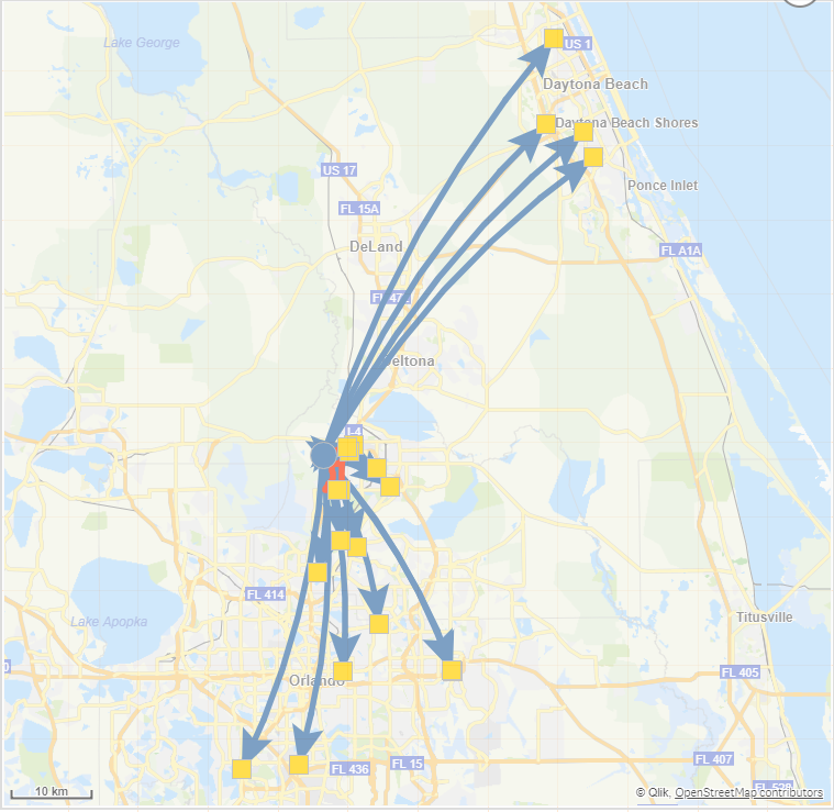
Qlik GeoAnalytics - The Closest Operator
Part 3: Get Familiar with Qlik GeoAnalytics - Custom Info Bubble
Regards,
Qlik
Can't see the video? YouTube blocked by your region or organization? Download the .mp4 video to watch on your computer or mobile device.

-
Bike Share
Bike ShareThilaka BIChicago has a bikeshare system, with hundreds of stations and thousands of bikes and scooters. This app lets you analyze bike tri... Show MoreBike ShareThilaka BIChicago has a bikeshare system, with hundreds of stations and thousands of bikes and scooters. This app lets you analyze bike trip data.Discoveries
This app can help the public discover locations of Divvy bikes and days of usage. For transportation and city planners, usage can be analyzed for improving service and profit.
Impact
This app lets the city decide how to best serve the public based on usage.
Audience
CTA data analysts will be able to assess how the public can make it to the final mile.
Data and advanced analytics
Profitability of the business as well as value for the tax payers dollars can be increased by analyzing the data and noting trends
-
Border Crossing
Border CrossingThilaka BIThis app shows border crossing and entry data collected by the U.S. Customs and Border Protection at the port level. This ca... Show MoreBorder CrossingThilaka BIThis app shows border crossing and entry data collected by the U.S. Customs and Border Protection at the port level. This can be used to analyze North American travel and trade.Discoveries
Government agencies and Private sector organizations can use the app for transportation planning, port studies, travel analyses, corridor assessments, and other purposes.
Impact
This app provides information on the amount of activity at ports along the US-Canada and US-Mexico border. It is also used to track trade and travel flows, particularly for North America.
Audience
It is used by data analysts who provide interpretative reports on the level of trade and travel. It is also used by business managers who want to find an ideal port for shipping goods.
Data and advanced analytics
The app allows analysis of delays. We can also check monthly trends and mode of transportation across the border.
-
Silent Auth using qlik-embed and OAuth
On a previous blog post, we took a look at qlik-embed, Qlik’s newest embedding framework and saw how easy it is to get started using it to integrate c... Show MoreOn a previous blog post, we took a look at qlik-embed, Qlik’s newest embedding framework and saw how easy it is to get started using it to integrate content from Qlik directly in your web applications.
Today, we will see how to integrate qlik-embed UIs in your web applications that are connected to an OIDC-compliant IDP silently, without prompting users for authorization.
Before we get started, consider the following pre-requisites:
1- IDP:
- We need an IDP, in this blog post, I will use Auth0 which offers a Free starter plan that you can use to test out this functionality.
2- Qlik Cloud Tenant:
- We will configure the Qlik Cloud tenant with both the IDP provider and an OAuth Client.
3- Web App
- Our Web App will be served using Node.js, so make sure to have the latest node.js version installed
Step 1- Auth0 IDP Configuration
After creating an account on Auth0, create an Application and select “Single Page Web Application” as the application type.
Next,, navigate to Settings and take node of the following:
- Domain
- Client ID
- Client Secret
- OpenID Configuration URL (you will find this after you expand Advanced Settings under Endpoints)
We will need these values later on in the post.
In the allowed Callback URLs field, add the following URL:
https://{YOUR TENANT DOMAIN}.us.qlikcloud.com/login/callback
In Allowed Web Origins, add the following URL:
Step 2- Qlik Cloud Tenant Configuration
In this step, we will do 2 things, first, we will create and configure an identity provider. Second, we will configure an OAuth client.
2.1- Identity Provider:
- Navigate to your Management Console > Identity Provider > Create New
- Choose OIDC as the type
- Choose Auth0 as the Provider
- Enter the OpenID Configuration URL from Step 1
- Enter the Client ID and Client Secret from Step 1
- Expand Advanced Options and turn ON Email Verified Override
- You can now Save and then Validate the IDP configuration, this will prompt you to authenticate to Auth0 (make sure you have an active user).
2.1- Configure the OAuth Client:
-
Navigate to the Management Console > OAuth > Click on Create new
-
Select Single-page app as the Client type
-
Select user_default for scope
-
Add the following as your Redirect URL
-
Add the following in the allowed origins:
- Once your Save, Copy the Client ID
We will need it in the next step.
Step 3- Creating the Web Application
3.1- Server: We will use Express to spin up a small server and use the “express-openid-connect” as a middleware to configure Auth0 and require authentication when a user tried to access resources without being authenticated.
It will redirect the user to log in and then back to the site once successfully authenticated.
- the .env file should contain your Environment variables with the following:
- HOST → localhost:3000
- clientId → the client ID from Auth0 from step1
- clientSecret → the client secret from Auth0 from step1
- idpUri → the Domain from Auth0 from step1
- sessionSecret → A random string
- tenantUri → Qlik Cloud tenant
- redirectPage → oauth-callback.html
3.2- Frontend
- index.html: In the public folder, the index.html contains the setup for qlik-embed. In the script tag, the following values need to be entered:
- data-host: Qlik Cloud tenant
- data-client-id: The OAuth client Id from Step 2.2
- data-auto-redirect: set to True, this will remove the Authorize button that appears on qlik-embed UIs. It will silently redirect to Qlik Cloud if the user is authenticated.
- oauth-callback.html
This file contains a script tag with a qlik-embed callback. Make sure to set up data-host to your Qlik Cloud tenant url.
The entire source code can be found in the following Github Repo:
https://github.com/ouadie-limouni/silent-auth-qlik-embedRun the project:
First, you will need to generate a self signed certificate to put in the certs folder so we can be able to open localhost as https.
You can do this using openssl by following the directions below:
1- run the following command:
openssl genrsa -out cert.key 20482- then run and hit enter on all the prompts:
openssl req -new -key cert.key -out cert.csr3- then run:
openssl x509 -req -days 3650 -in cert.csr -signkey cert.key -out cert.crtyou will generate a cert.crt and cert.key files that you should put in the certs folder.
To compile and run the project:
- run: npm install
- then run: node index.js
Once you open https://localhost:3000, you will be automatically redirected to the Auth0 page.
After successfully authenticating in Auth0, you will be redirected to the web app and the qlik-embed UI will render the Qlik Sense app.
I hope you found this post helpful, for a more in depth tutorial and more, visit https://qlik.dev/embed/qlik-embed/
-
Getting to know the new UI
Qlik is ever evolving. In my last blog entry, I went over how users can update their tenants to the new UI and give a brand-new look to their interfac... Show MoreQlik is ever evolving. In my last blog entry, I went over how users can update their tenants to the new UI and give a brand-new look to their interface. Today we’re going to go over the changes that have been brought to Qlik’s UI, and how users can take advantage of these changes.
One of the first changes that users will see when logging onto their new tenant is a change in menu location and appearance. Instead of being located on the right-hand side of the screen, users can now access this menu through the top left, which then reveals a collection of activity centers they can visit. From this menu, users can quickly jump into the different sides of Qlik Sense.
Insights will bring users to what was once the Qlik Cloud Analytics hubs, providing options for app and analytic content. Analytics allows customers to explore visualizations and create apps with their data. Data Integration will allow users to establish and view connections, create data projects and set up automations. Through Administration users have access to the different settings and permissions that govern their tenant.
An extremely helpful change to the UI is based around this waffle menu and the administration section of Qlik Cloud. No longer do users have to venture into series of different menus, one click exposes all the sections allowing users to quickly remedy their administrative need.
You’ll notice that this menu also extends into the sections themselves. Below we have a screenshot inside of an app in the analytics section of Qlik Cloud, by pressing the waffle menu in the left-hand corner, we’re given quick access to travel to the other sections once again. The stability of the waffle menu in the upper left-hand corner provides an achor point that can be used throughout your Qlik Cloud experience.
Another addition to the UI is ‘Recents’ which can be found at the bottom of the exposed waffle menu. Recents provides a view of your recently viewed content across activity centers. This means that it doesn’t matter if you were last working on a combination of apps or data projects, they can all be found here, ready for you to get back to work.
This concludes our tour of Qlik Cloud’s new UI. How do you think that Qlik Cloud’s can benefit you and your company? How can this change make you more productive?
-
Extending Talend Studio with DBeaver Plugin
DBeaver is a SQL editor available in both community and enterprise editions. It is available as a web application or a traditional application. The ... Show MoreDBeaver is a SQL editor available in both community and enterprise editions. It is available as a web application or a traditional application. The DBeaver application is built as an Eclipse Rich Client Platform (RCP) and also supports a DBeaver Plugin on the Eclipse Marketplace.
It is a great SQL toolbench that supports navigating schemas and database metadata, viewing data, DDL, and a very good sql editor. Integrations with Git for version control are available and even a prompt-to-sql AI plugin.
Since Dbeaver is available as an Eclipse Plugin it is compatible with Eclipse RCP applications like Talend Studio. The only challenge is that Talend Studio is based on Eclipse 2023-12 (4.30). When Studio is upgraded to a more recent version of Eclipse this problem will go away.
Fortunately, the actual problem is limited to only a single library. DBeaver expects a more recent org.eclipse.text plugin. This is very easy to add and should have minimal risk to the rest of the existing Talend product.
This document provides detailed analysis of the problem as well as simple steps to fix it so you can have DBeaver running in Talend Studio today. It must be emphasized that using the DBeaver plugin in Studio is NOT officially supported.
Installing DBeaver
Start by installing the DBeaver Eclipse plugin from the update site in Talend Studio. Although DBeaver is available in the Eclipse Marketplace, Talend Studio has removed the Marketplace plugin in order to minimize the size of Studio. So you must use the Feature Manager and then click the “Go to the wizard” link. This is equivalent to selecting Help->Install New Software in regular Eclipse installations.
Add the DBeaver update site to the list of repositories. The DBeaver update site url is https://dbeaver.io/update/ce/latest/. If you are running Talend Studio in a restricted location without access to the internet, see the appendix for instructions on creating a local copy of the dbeaver update site as a zip file.
Select the DBeaver IDE feature from the list of features offering in the DBeaver update.
Review the list of features that will be installed and click Next.
The plugin jars are signed. Review and trust the cert authorities. There will be two such dialog windows.
Click through the remaining dialog screens to accept the licenses and install DBeaver into Studio.
Accept the dialog option to restart Studio. At this point DBeaver has been installed in Studio.
Testing DBeaver in Studio
Although the DBeaver Eclipse Marketplace web page lists DBeaver as compatible with many older versions of Eclipse, it is in fact not compatible with the 2023-12 (4.30) version of Eclipse that Talend Studio is built upon. But most of DBeaver will still work with Studio and it is a simple manner to fix the one compatibility bug.
Before we fix it, let’s test DBeaver in Studio. Most of the functionality is working. The Studio Window-Perspective menu is more limited than Eclipse and does not show an option for Open Perspective for other perspectives. So you must use the obscure Open Perspective button in the upper right on the toolbar.
Select the DBeaver Perspective.
Create a Database Project by right clicking on Database Navigator in the left-hand pane and selecting Create->Other.
Select Database Project in the dialog window.
Give the database project a meaningful name.
Accept the default resource folder locations.
You may want to select a different location for your project or resources rather than the default locations if you wish to apply source control to your sql independently from your Talend project.
Click on the Projects tab in the left-hand pane and then right click and select Create -> Connection to create a new database connection.
Select your database type for the connection. The screenshot shows Mysql but you can select whatever database you use.
Configure your database connection and then test it with the Test Connection button.
Back in the Projects tab in the left-hand pane, drill into your new connection to see table details. Expand the new connection you created and drill into Databases, then a specific database, and then Tables. Double click on a table and select the Data tab in the right-hand pane to see a tabular view of the data.
You can try other features of DBeaver, but the most important one will not work (yet). Click on the SQL toolbar to open a sql script.
Either nothing happens or you may see an error message such as
java.lang.ClassNotFoundException: org.eclipse.jface.text.rules.RuleBasedPartitionScanner cannot be found
This is expected albeit not desired behavior which we will fix in the next sections.
Talend Studio and DBeaver Library Problem
Although the DBeaver Eclipse Marketplace web page lists DBeaver as compatible with many older versions of Eclipse, it is in fact not compatible with the 2023-12 (4.30) version of Eclipse that Talend Studio is built upon.
The root cause of the problem is that a number of classes including the RuleBasedPartitionScanner were originally located in the org.eclipse.jface.text.rules package in the org.eclipse.text.jface plugin. But those files were moved to the org.eclipse.text plugin in version 3.14. This is where DBeaver expects to find them, but it is not available in the org.eclilpse.text 3.13 version used by the Eclipse 2023-12 baseline upon which Studio is based.
So we just need to install the org.ecilpse.text 3.14 plugin into Studio using one of the approaches discussed in the next two sections.
Installing org.eclipse.text Plugin into Studio
The most direct way to register the org.eclipse.text_3.14.100.v20240524-2010.jar with Studio is to add the file to the studio/plugins folder.
First, download the plugin file by going to the Eclipse project downloads archive and selecting a recent version of Eclipse such as the Eclipse 2024-9 release which is version 4.33. The links above are in human readable format and have lots of other information. But all you need is the link to the Eclipse 2024-09 repo zip file.
Unzip the file and go to the plugins folder and you will find the org.eclipse.text_3.14.100.v20240524-2010.jar file. Copy this to the plugins folder of your Talend Studio.
Stop Studio if it is running. Now modify the Studio configuration/org.eclipse.equinox.simpleconfigurator/bundles.info file located in
Studio/configuration/org.eclipse.equinox.simpleconfigurator/ bundles.info
Find the following line.
org.eclipse.text,3.13.100.v20230801-1334,plugins/org.eclipse.text_3.13.100.v20230801-1334.jar,4,false
Add a similar line immediately after it.
org.eclipse.text,3.14.100.v20240524-2010,plugins/org.eclipse.text_3.14.100.v20240524-2010.jar,4,false
You should now have two lines different versions of org.eclipse.text in the bundles.info file.
org.eclipse.text,3.14.100.v20240524-2010,plugins/org.eclipse.text_3.14.100.v20240524-2010.jar,4,false
org.eclipse.text,3.13.100.v20230801-1334,plugins/org.eclipse.text_3.13.100.v20230801-1334.jar,4,falseNote that there may be a carriage return shown in this document, but it is a single line in the bundle.info file.
Testing the DBeaver Plugin in Studio with the Updated Libraries
First, confirm that the org.eclipse.text 3.14 plugin has been installed in Studio. Select Help->About Talend Studio from the menu and then click Installation Details in the resulting dialog box. Select the Plugins tab in the new dialog window and click the Plugin-Id column header to sort by that column. Now scroll down to the entries for org.ecilpse.text. Notice that there are two, the original 3.13 and the new 3.14 versions. Co-existence of these libraries is handled smoothly by the Eclipse OSGI framework.
Open the DBeaver perspective.
Click on the SQL Editor.
This time it should open successfully and you should be able to enter and execute query.
-
Tab Container
The tab container, formerly the container object, has many new features that allow developers to style the container tabs. In this blog, I will review... Show MoreThe tab container, formerly the container object, has many new features that allow developers to style the container tabs. In this blog, I will review some of these new features but first let’s do a quick review of what the tab container is and how you can use it. The tab container can be used to show many visualizations, one at a time, thus using less space on a sheet. It is ideal when there is the need to have many visualizations on a single sheet but not quite enough space to display them all. When using a tab container, tabs or menu items are selected to navigate through the visualizations. Tabs and visualizations can also be displayed based on a variable or the user’s access. Below is an example from the What’s New app.
There are many ways a visualization can be added to a container object. A visualization on the sheet or a master visualization can be dragged and dropped onto the tab container object, or a chart can be added from the content section of the tab container. When tabs are toggled on, a tab will exist for each visualization in the tab container.
Some of the new features of the tab container are around the tabs. For example, the font, font size, width, alignment and color for each tab can now be set by the developer. Here are the style settings for the KPI chart tab (Tab container > Content > KPI object > Styling > Tab).
Notice that the width of the tab can be set based on a percentage or pixels. This allows the developer to make accommodations for larger tab labels that may need more width to be fully visible. The background color can be set to a single color, or an expression can be used. This can be done for each tab in the tab container object. Each tab can also have a different font type and/or font size, if desired, although a consistent look and feel (font type and font size) among all tabs is ideal. Note that when the orientation of the tabs is vertical, the width of the tab cannot be set. These styles can also be applied from the styling section of the tab container (Tab container > Appearance > Presentation > Styling > Tabs). Applying a background color here, will apply it to the entire object and all tabs. From here you can also set the table label alignment to left, center or right.
Another new feature is the orientation of the tab container tabs can now be vertical. Notice in the image below how the top chart shows just the icons of the tab, and the bottom chart shows just the labels. Both are neat and clean.
When there are many tabs in a tab container, you may consider showing the menu. This is helpful when all tabs are not visible without scrolling. It provides another way to navigate the tab container.
The added tab container features allow developers to easily style the object so that it fits in better with the theme/style of the sheet it is on. This is a welcomed new feature.
Thanks,
Jennell
-
【開催報告】Qlik ユーザーミートアップ
今回はアドボケイトである富士通中川さまの司会によりスタート。幹事会メンバーである荻本さまより今年の活動報告が行われました。幹事会、オンラインミートアップ、もくもく会など様々な活動が行われ、来年に向けての抱負などをお話しいただきました。 続いては Qlik Luminary でもあるセガ萬さまによる ... Show More今回はアドボケイトである富士通中川さまの司会によりスタート。幹事会メンバーである荻本さまより今年の活動報告が行われました。幹事会、オンラインミートアップ、もくもく会など様々な活動が行われ、来年に向けての抱負などをお話しいただきました。
続いては Qlik Luminary でもあるセガ萬さまによる Luminary Meetup の参加報告です。10月にスウェーデンにある Qlik ルンドオフィスで開催されたこのミートアップでは、萬さまもプレゼンテーションをされたということで、その模様を収めた動画のご紹介を交えながらご説明いただきました。
続いては日立建機さまによる事例発表です。普段あまり聞くことのない建機業界や会社紹介から始まり、同社における Qlik 活用とその課題、特に長年の利用により膨大化したデータファイルをどう運用していくか、というテーマを共有いただきました。
そして万葉倶楽部さまからは、同社におけるマーケティングへのデータ活用の取り組みをお話しいただきました。ソースの異なる会員データや売上データを結合し分析する仕組みや Talend を活用したデータ基盤の更新など盛りだくさんで持ち時間では足りず、後の懇親会でも急遽特別セッションを行なっていただきました。
事例発表の最後はホンダさまより、社内・社外データを誰もが使えるポータルサイトを開設し、その利用頻度をどのように上げていったか、という具体的なお取り組みや、ミートアップならではの「ここだけの話」として、社内で使用されている実際の分析画面をご紹介いただきました。
幹事メンバー DNP 中西さまによるご挨拶で始まった懇親会では、銀座の夜景を眺めながらさまざまな情報交換が行われました。恒例の抽選会では学研の渕さまから当選のみなさまにプレゼントが手渡されました。
最後は恒例の(?)Qlik ポーズで会を終了しました。
2024年は Talend 社の統合が完了し、新生 Qlik が始動した年でした。多くのお客様に支えられ、社員一同大変感謝しております。このミートアップはそうした恩返しの一環でもありますが、ユーザー皆様のさらなる Qlik 活用のための場です。来年もぜひ積極的にご参加いただき、Qlik の輪を広げていただければと思います。
本年は大変お世話になりました。来年も引き続き、どうぞよろしくお願いいたします。
-
Talend Master Data Management (“MDM”) Server End of Life: December 31, 2024
On July 16, 2021, Talend announced the retirement of the Talend Master Data Management (MDM) Server component of the following licenses: Talend MDM Pl... Show MoreOn July 16, 2021, Talend announced the retirement of the Talend Master Data Management (MDM) Server component of the following licenses: Talend MDM Platform, Talend Platform for MDM, Talend Platform for MDM with Big Data, and Talend Data Fabric. At that time, Talend also provided notice that this product would have an End-of-Life date of December 31, 2024.
This is a reminder that Qlik will deprecate the MDM capability as of December 31, 2024. We strongly encourage you to contact us to help you transition to an alternative, supported Talend product. We know that change can be difficult and are here to help.
Please contact your Qlik Customer Success manager or Qlik Customer Support for the next steps regarding Talend MDM Server end of life.
Thank you for choosing Qlik,
Qlik Support -
Connector Factory – November and December 2024 releases
Qlik Talend Additional Qlik Talend Cloud connectors for Infor applications We’re continuing to expand the connectivity of Qlik Talend Cloud with the ... Show MoreQlik Talend
Additional Qlik Talend Cloud connectors for Infor applications
We’re continuing to expand the connectivity of Qlik Talend Cloud with the addition of more Infor applications that can now be used as a data source. These connectors will help the many companies that have both Infor and Qlik eliminate the lengthy development time associated with custom connectors as well as accelerate user access to a wider variety of Infor data sets. The new connectors are for:
- Infor CPQ
- Infor Data Fabric
- Infor Data Lake
- Infor Distribution SX.e
- Infor HR Talent
- Infor LN
- Infor M3
- Infor SyteLine
Additional Replicate Connectors
The November 2024 release of Qlik Replicate included two new source endpoints:
- SAP Odata - This new JAVA source endpoint uses the OData v2.0 protocol, consistent with SAP support, to explore SAP and get data out. All ODP-based services, such as dynamic filters and projection list forwarding, are supported to help reduce the load and impact.
- Oracle XStream - This new endpoint interfaces directly with the Oracle XStream API, so now a Replicate task creates an XStream Out Server. With this new method, you will experience better performance, increased reliability, and simplified maintenance.
More information on these connectors can be found in this blog.
Qlik Analytics
New version of SAP NetWeaver connector
The Qlik SAP NetWeaver connector efficiently loads data into a Qlik Sense app from SAP NetWeaver which in turn accesses the information from different repositories within the SAP architecture, such as SAP BI/BW, SAP ERP, or CRM system. A new version (8.1.0) of the SAP NetWeaver Connector package has been released which contains general bug fixes and improvements, specifically error handling when some SAP objects raise uncaught errors.
More details can be found in this blog.
New version of Direct Access gateway
The Qlik Data Gateway - Direct Access allows Qlik Sense SaaS applications to securely access behind the firewall data, over a strictly outbound, encrypted, and mutually authenticated connection.
We recently released Direct Access gateway 1.6.9 which, in addition to several bug fixes, introduced the following enhancements:
- Process isolation is now turned on by default, but only with a clean installation. If you are upgrading, your existing process isolation configuration will be preserved. To learn more about process isolation, see Mitigating connector crashes during reload.
- The configuration.properties template file has been removed from the Direct Access gateway installation folder to prevent customers mistakenly modifying the wrong configuration.properties file. The only configuration.properties file will now be located in C:\ProgramData\Qlik\Gateway.
Qlik Application Automation
Updated Connectors
- The Gihub Connector now has a download file block
- The Talend Cloud connector now includes Data preparation blocks
- The Salesforce connector now has Alert/Notification blocks
- The Snowflake connector now includes key/pair support
-
2024: A year of strong engagement with the academic community!
The year 2024 saw a strong level of engagement with the academic community in India and the Asia-Pacific region, for the Qlik Academic Program. New in... Show MoreThe year 2024 saw a strong level of engagement with the academic community in India and the Asia-Pacific region, for the Qlik Academic Program. New initiatives, different interactions and activities were the hallmark of 2024!
Here are some of the highlights that marked 2024:
1. Datathon with Anurag University: This year's first datathon featuring Qlik was a big success with over 1/3rd students choosing to work on Qlik Sense among all the other products and companies. The event saw participation from students across the Telangana region.2. Datathon with Kristu Jayanti College: With a Qlik only datathon featuring students from different Bachelors courses including Data Science, students presented impressive Qlik Sense apps. Many of them were successfully qualified as Qlik Sense Business Analyst prior to participating in this datathon.
3. Session on data analytics/ Qlik with Republic Polytechnic, Singapore: Qlik's technical expert and Pre Sales leader, Kam Wei delivered a talk for professors and students of Republic Polytechnic. Most of these students were familiar with other analytics technologies and they were able to appreciate Qlik Sense's strengths with this presentation.
4. Datathon with VJIT: Another successful Qlik specific datathon with one of the active and old academic program partners, VJIT saw participation from more than 200 students, all unleashing their skills on building apps on Qlik Sense. Students came from CSE, IT and other departments
5. Keynote speaker at ICT event: I was privileged to be invited to deliver a key note address at an ICT Academy event on the Future of Technology. Attendees included academicians from different parts of the country including Deans, Heads of Department, Professors. Hon ICT Minister of Tamil Nadu graced the occasion as the Chief Guest. ICT Academy is an organisation, part of the Government of Tamil Nadu, tasked with skilling students with new age technologies helping them get career ready.
Many other engagements marked 2024 including interactions with students, workshops, presentations etc. further strengthening the Qlik Academic Program as the premier data analytics program by a data analytics and AI leader. Students and Professors keep enjoying free resources of this program including training, software, qualifications and certifications.
Signing off 2024 and look forward to a stronger 2025!