Unlock a world of possibilities! Login now and discover the exclusive benefits awaiting you.
Analytics & AI
Forums for Qlik Analytic solutions. Ask questions, join discussions, find solutions, and access documentation and resources.
Data Integration & Quality
Forums for Qlik Data Integration solutions. Ask questions, join discussions, find solutions, and access documentation and resources
Explore Qlik Gallery
Qlik Gallery is meant to encourage Qlikkies everywhere to share their progress – from a first Qlik app – to a favorite Qlik app – and everything in-between.
Qlik Community
Get started on Qlik Community, find How-To documents, and join general non-product related discussions.
Qlik Resources
Direct links to other resources within the Qlik ecosystem. We suggest you bookmark this page.
Qlik Academic Program
Qlik gives qualified university students, educators, and researchers free Qlik software and resources to prepare students for the data-driven workplace.
Recent Blog Posts
-
Anonymized Benchmarking
Anonymized BenchmarkingSiemensThe goal of this app is to be able to track your country's financial KPIs against other country's without breaching data... Show MoreAnonymized BenchmarkingSiemens The goal of this app is to be able to track your country's financial KPIs against other country's without breaching data privacy rules. As such, you can see all KPI values but only the country to which you have access is revealed, while others are represented by a randomized tag.
Discoveries
You can leverage section access to anonymize field values.
Impact
Allows users to get a view of the whole environment without breaching any data privacy rules.
Audience
Financial Controllers
Data and advanced analytics
Financial controllers are able to tell how well their own country is performing in comparison to others and can adjust their strategy accordingly.
-
Watch Q&A with Qlik: App Development!
Don't miss our previous Q&A with Qlik! Pull up a chair and chat with our panel of experts to help you get the most out of your Qlik experience. Our ... Show MoreDon't miss our previous Q&A with Qlik! Pull up a chair and chat with our panel of experts to help you get the most out of your Qlik experience.
Our Qlik experts offer creative solutions to your analytics demands and answer your visualization questions.

-
Meet the Qlik Academic Program Educator Ambassadors for 2025
The Qlik Academic Program is proud to announce our 2025 class of Educator Ambassadors. Academic Program Ambassadors are educators who champion the Qli... Show MoreThe Qlik Academic Program is proud to announce our 2025 class of Educator Ambassadors. Academic Program Ambassadors are educators who champion the Qlik Academic Program at their universities and beyond, with a passion for preparing students for the data driven workplace.These individuals are some of our most active participants of the Qlik Academic Program who fully utilize the free software, training resources and qualifications that we provide to university students and educators. The members of our 2025 class are:Marcin StawarzBlerim EmruliJavier LeonAngelika KlidasDr K KalaiselviAngel R MonjarásDaniel E. O'LearyAlexander FlaigChee-wai HoDr. Manikandan SundaramKatherine Taylor PearsonTerrence PereraDarshan SagarJuana Ines ZuntiniMarisa SánchezWe are thrilled to be recognizing the efforts of these individuals to help the Qlik Academic Program to achieve its mission - to create a data literate world, one student at a time. Each ambassador has been selected through a self-nominated application process, where they were required to answer various questions covering their motivations for becoming an ambassador, and to evidence their passion for upskilling their students in analytics over the past 12 months. This year, we are excited to select 15 ambassadors, 7 new ones and 8 returning ambassadors whose efforts continued to impress us. To thank them for their efforts, our ambassadors will receive exclusive benefits such as webinars and discussion groups with Qlik leaders, opportunities to showcase their experience with the Qlik Academic Program and the chance to grow their network with other educators across various fields and geographies.Throughout 2025 our ambassadors will continue their advocacy for the Qlik Academic Program and help us to reach even more students and educators with our free resources. Stay tuned over the coming months for more in-depth profiles on each of our ambassadors, and get to know who they are, what they teach and why they are so passionate about bridging the data literacy skills gap! Learn more about the Ambassador Program and how to apply for future classes. -
Introducing no-code data preparation in Qlik Cloud Analytics
Meet Data Flow, Qlik Cloud Analytics’ new no-code data flow designer. Whether you are a data pro or new to analytics, Data Flow makes data prep easy f... Show MoreMeet Data Flow, Qlik Cloud Analytics’ new no-code data flow designer. Whether you are a data pro or new to analytics, Data Flow makes data prep easy for you—and everyone you work with. With an intuitive, drag-and-drop interface, it's built to create smoother workflows and help your team turn data chaos into gold. No coding required.
No skill gaps, no delays. Designed to find insights faster.
But don't just take our word for it....check out this awesome video from @igoralcantara to see for yourself!
Ditch the data drama. Data prep for all.
For Getting Started with Qlik
Getting started with Qlik Script can feel daunting. We have eliminated the steep learning curve, making it easy for anyone to jump in. Now you can visually combine and shape your data to automatically generate Qlik script and build your first analytics app.
For Traditional Analytics
Handle diverse and even complex use cases. Create rapid iterations before moving to reusable and governed data models. Built natively into Qlik Cloud Analytics, offering an end-to-end experience from data prep to advanced analytics and visualizations.
For Machine Learning
Preparing data for predictive analytics through AutoML just got easier. Now our no-code data flow and script capabilities simplify this process, making it easier for everyone, especially non-data scientists, to get started with machine learning. Confidently prepare data and dive into AutoML with ease, no advanced technical expertise required.
Shortcut to Insights
No more long hours spent on data prep. Clean, transform, and organize your data in record time. Quit getting bogged down by complicated steps. Get quick results that let you focus on what really matters.
Trust Your Data, Trust Your Decisions
No more second-guessing. Easily and safely connect to Qlik® and other data sources for comprehensive data access. Self-serve data prep with built-in guardrails. Maintain strict governance with the enterprise-grade platform that meets strict standards to keep your data secure.
Solve Data Complexity
Removes IT bottlenecks with user-friendly interface, letting non-technical users easily prepare data. Handle growing data complexity and quality issues with ease with an intuitive platform that adapts to your needs—keeping everything simple, flexible, and in control.
Your analysis is only as good as the data that power it. So let it flow. Only on Qlik Cloud Analytics.
Key Highlights:
- User-friendly, visual interface with drag-and-drop functionality
- Natively built into #QlikCloudAnalytics
- Supports a wide range of use cases, from simple analytics to complex AI applications.
- Reduces time spent on data preparation
- Adaptable platform that evolves with changing analytics needs
Learn More:
- Creating a Data Flow | Step-by-step video guide
- Loading and Preparing Data with Data Flow | Qlik Help
- New Data Prep Webpage on Qlik.com
- Press Release for Data Flow
- What’s New in Qlik Cloud | Qlik Help
Reach out to @OlivierDubois or myself @JulianneDeVincenzo anytime ☺️
-
Analytic Forums Navigation Updates and Improvements
Hello Qlik Community! We’ve made some updates to the Analytics and AI/ML forums to help improve navigation and make it easier for you to find what you... Show MoreHello Qlik Community!
We’ve made some updates to the Analytics and AI/ML forums to help improve navigation and make it easier for you to find what you’re looking for.
Here’s a summary of the changes:
Renamed:
- ‘Move to SaaS’ is now ‘Move to Qlik Cloud Analytics’
- ‘New to Qlik Analytics’ is now ‘Visualizations and Usability’
Combined:
- ‘Qlik Reporting Service’ + ‘Alerting’ are now combined as ‘Reporting Service & Alerting’
Moved:
- ‘Qlik NPrinting’ is now listed only under ‘Forums by Product’
- ‘QlikView’ is now listed only under ‘Forums by Product’
- ‘Integration, Extension & APIs’ is now listed only under ‘Analytics’
Before:
After:
We hope these changes will make your forum experience even better. If you have any questions or feedback, feel free to reach out using the comments below!
Next up we will be tackling the Data Integration forums so stay tuned!
You Qlik Community Admins,
Melissa, Sue, Jamie, Nicole Caleb, and Tammy
@Melissa_Potvin @Sue_Macaluso @Jamie_Gregory @nicole_ulloa @calebjlee @Tammy_Milsom -
Introducing a powerful no-code data flow designer: Qlik Data Flow
No scripting skills? No problem. With Qlik Data Flow, our no-code data prep tools, we’re flipping the script on how analysts spend their time. Instea... Show MoreNo scripting skills? No problem.
With Qlik Data Flow, our no-code data prep tools, we’re flipping the script on how analysts spend their time. Instead of drowning in data preparation—often taking up to 80% of your time—you can now focus on what really matters: uncovering insights. This shift means quicker, more impactful decision-making for your business.
Read the full announcement on our Qlik Innovation Blog.
Key Highlights:
- User-friendly, visual interface with drag-and-drop functionality
- Natively built into Qlik Cloud Analytics
- Supports a wide range of use cases, from simple analytics to complex AI applications
- Reduces time spent on data preparation
- Adaptable platform that evolves with changing analytics needs
Want to learn more?
- Data Preparation Tour
Take an extensive tour of Qlik Data Flow - What’s New in Qlik Cloud
Learn about new features and improvements - Data Flow - Prepare Training Data for Predictive Models Overview
This episode of Do More with Qlik Tips and Tricks will present a brief scenario on how to use Data Flow to prepare your data for predictive modeling. - Loading and preparing data with data flow
Our Qlik Help Sources
Thank you for choosing Qlik,
Qlik Support -
How are new AI tools changing “Learning Analytics”?
AI tools are revolutionizing learning analytics in education by automating tasks and personalizing learning experiences. They help educators efficient... Show MoreAI tools are revolutionizing learning analytics in education by automating tasks and personalizing learning experiences. They help educators efficiently analyze dashboards, grade open-ended responses, and tag discussions. An expert from the University of California, Berkeley, emphasizes AI’s role in translating complex data into actionable insights for both educators and students. However, ensuring its responsible deployment is crucial to strike a balance between innovation and accountability, with a strong focus on ethical use.
To explore more about how AI tools are changing “Learning Analytics,” check out the full article here.
To support these advancements, the Qlik Academic Program provides free resources, including software, self-paced training and other learning resources (including qualifications), enabling participants to enhance their data literacy and adopt ethical, impactful approaches to AI and analytics education. To learn how you can access free resources in data analytics as a student or educator, visit www.qlik.com/academicprogram.
-
DeepSeek の台頭:業界の転換点
本ブログは The Rise of DeepSeek AI: A Turning Point for the Industry の翻訳です。 著者:James Fisher 先週の技術関連メディアの見出しが、画期的な R1 モデルを発表した DeepSeek で占められていました。ここで注目すべき点... Show More本ブログは The Rise of DeepSeek AI: A Turning Point for the Industry の翻訳です。
著者:James Fisher
先週の技術関連メディアの見出しが、画期的な R1 モデルを発表した DeepSeek で占められていました。ここで注目すべき点はなんでしょうか?それは、報告されている開発費が 600万ドル以下であることです。この発表は、「高度な AI モデルの開発には天文学的な投資が必要だ」という長年の通説を覆すもので、ハイテク産業の基盤を揺るがし、世界市場に波紋を広げています。NVIDIA のように AI インフラのブームと大きく結びついている企業の株価は大きく変動し、その影響を示しています。
想定よりも早い AI トレーニングのコモディティ化
AI トレーニングが最終的にコモディティ化することは多くの人が予想していましたが、これほど早く、破壊的に起こるとは予想していませんでした。DeepSeek の成功は、高度な AI 開発への参入障壁がかつてないスピードで低下していることを示しているのです。当初は、セキュリティや信頼性にまつわる疑問が間違いなく生じるため、企業への影響は限定的かもしれません。しかし歴史は、こうした進展が孤立したままでは終わらないことを教えてくれます。
この DeepSeek の件は、おそらく AI モデル界隈の人々を刺激し、オープンソースによる AI イニシアチブの波を巻き起こすでしょう。ここで本当に重要なのは、DeepSeek そのものだけでなく、それが象徴するより大きなトレンド、つまりAI ユースケースのメインストリームにおける勝利の方程式としてのオープンソースなのです。
その兆候はすでに始まっています。高度な AI モデルの運用コストが劇的に低下し、競争の土俵が平準化されつつあります。これは、AI を次の段階へと押し進め、インフラに重点を置いたトレーニングから Applied AI(AI を実用的でスケーラブルな方法で実用化する時代)へと移行させます。
2025年、およびそれ以降にもたらす意味合い
Qlik ではすでにこの変化を予測していました。そしてこれらの変化がもたらすインパクトを2025年のトレンドに反映させています。
1. 真正性が新たな差別化要因に
コンピューティングがコモディティ化する中、AI の真の価値はデータの品質と信憑性にあります。正確で実用的なデータが AI を成功に導く要となり、データの真正性を優先する組織がその道をリードすることになります。
2. 適用価値
AI 業界は、インフラとトレーニングの段階から推論と実装へと移行しつつあります。コストの削減とアクセシビリティの向上が新たなユースケースを生み出し、あらゆる規模の企業が AI を活用して実際に目に見える成果を上げられるようになっています。
3. エージェントと専門AI
DeepSeek の破壊的なローンチにより開かれた道を、他の企業が追随するでしょう。特定の業界、機能、ワークフローに対応する、小規模で目的に特化した LLM(大規模言語モデル)やアプリケーションの台頭が予測されます。これらのモデルは、相互に作用し合う新世代のインテリジェントなエージェントに力を与え、タスクをより効率的にし、複雑なシステムを自律的に動作させることを可能にします。
AI がこの新たな段階に移行する際、ひとつ明確なことがあります。それは、データソースやクラウド環境と同様に、オープン性と相互運用性が AI プラットフォームにとって極めて重要になるということです。AI システムがシームレスに統合され、エコシステム間で協業できるかどうかが、その有効性と長期的価値を左右するのです。
この新しい現実は、巨大でクローズドなモデルの構築から、柔軟でオープン、コラボレーションのために構築されたプラットフォームの構築へと、優先順位の転換を要求しているのです。
機会に満ちた新しい時代
DeepSeek の R1 モデルは、より広範な変革の始まりに過ぎません。AI がより身近で費用対効果の高いものになるにつれて、その焦点は Applied AI、すなわち現実世界の課題を解決するためにこれらの強力なツールを行動に寄与させる時代へと移っています。これは企業にとって、イノベーション、最適化、新たな価値の発見を実現する素晴らしい機会を意味します。
Qlik は、この急速に進化する状況においてお客様をサポートできることを嬉しく思っています。信頼できるデータ、スケーラブルなプラットフォーム、オープンイノベーションを基盤に、私たちは AI の新たな局面をリードし続けます。
AI の状況は今後も進化し続けることは明らかですが、確かなことがひとつあります。変化を受け入れ、データの信頼性を優先し、オープンな力を活用する人々にこそ未来があるということです。
-
Driving Data Literacy in LATAM: Meet your new Qlik Academic Project Manager
Hi, Qlik Community! I’m Talita Mesquita, and I’m so excited to introduce myself as the new Project Manager for the Qlik Academic Program in LATAM! I’v... Show MoreHi, Qlik Community! I’m Talita Mesquita, and I’m so excited to introduce myself as the new Project Manager for the Qlik Academic Program in LATAM!
I’ve been with Qlik for three years, working closely with sales and marketing to develop strategies that transforms data into impactful decisions for our customers. Now, I’m thrilled to take on this new challenge, which combines my passion for data with my commitment to education.
I was born and raised in São Paulo, Brazil. Growing up in a challenging neighborhood taught me to be resourceful and see opportunities where others might see obstacles. This perspective is something I’m eager to bring to my new role.
"As a Latina, a data science student, and a proud member of the Qlik family, I’m deeply passionate about empowering the next generation of data-driven leaders. Through the Qlik Academic Program, I believe we can make data literacy more accessible and impactful, helping students and educators across LATAM thrive in a world where data is everywhere!"
I’m thrilled to embark on this journey and work alongside such a passionate network of educators, students, and data enthusiasts. If you have any questions, ideas, or would like to discuss collaborations, don’t hesitate to reach out.
Let’s make it happen together! 🌟
To learn more about the Academic Program go to qlik.com/academicprogram
-
Backlog Refinement
Backlog RefinementSiemensManage backlog - Analytics, refinement and prioritizationDiscoveriesDiscover work done by your team. Prioritization of your b... Show MoreBacklog RefinementSiemensManage backlog - Analytics, refinement and prioritizationDiscoveries
Discover work done by your team. Prioritization of your backlog
Impact
Easy to Manage your Backlog Backlog Refinement and Analytics
Audience
Jira; Agile; DevOps
Data and advanced analytics
Using Qlik for backlog management in Jira allows you to visualize and analyze your backlog data, helping you identify trends, prioritize tasks, and make data-driven decisions. This integration enhances your ability to manage and optimize your workflow efficiently.
-
Qlik Cloud Reporting's Perfect Update
Qlik Cloud Reporting is just perfect. PixelPerfect. PixelPerfect Report Authoring is a powerful new template designer enabling precise report authorin... Show MoreQlik Cloud Reporting is just perfect. PixelPerfect.
PixelPerfect Report Authoring is a powerful new template designer enabling precise report authoring. It offers seamless integration with existing reports, data source connectivity, customization options, and collaborative features for creating high-fidelity, visually stunning reports.
In addition to PixelPerfect Authoring, we've put the finishing touches on our cloud reporting capabilities in Q4, introducing:
- Report Cycling: Developers can set up report tasks to cycle through a dimension, creating reports for each value.
- Report Task History: Developers have better visibility into past task runs with a new report task history feature that keeps track of up to three months of execution data. Plus, we surface error and warning messages to help troubleshoot any issues.
Want to learn more?
- Designing PixelPerfect report templates
A comprehensive playlist on creating PixelPerfect Reports in Qlik Cloud - Qlik Reporting: Creating Reports with PixelPerfect Editor
This free course teaches you how to work with the PixelPerfect editor in the Reporting section of Qlik Cloud Analytics. Follow along with the activities to explore the various features and options in this new tool! - PixelPerfect Reports: Getting Started
The help.qlik.com main resource - All your reporting needs: Qlik Reporting Service eBook
- PixelPerfect Authoring, SaaS in 60
- Qlik Insider Webinar: Crafting the Perfect Report
Dive into the role of reporting in the world of modern BI
More Resources
Thank you for choosing Qlik,
Qlik Support -
Predicting House Prices using Qlik AutoML Regression Model
If you have been learning about Qlik AutoML or looking for examples to get started, you might have only came across Binary Classification problems (su... Show MoreIf you have been learning about Qlik AutoML or looking for examples to get started, you might have only came across Binary Classification problems (such as Customer churn, Employee retention etc…). In this post, we will be solving a different type of problem with Qlik AutoML using a Regression model.
What is Regression, and Why Does It Matter?
Regression is a type of supervised learning used to predict continuous outcomes like housing prices, sales revenue, or stock prices. In industries such as real estate, understanding the factors driving prices can guide better decision-making. For example, predicting house values based on income levels, population, and proximity to the ocean helps realtors and developers target key markets and optimize pricing strategies.
In the upcoming sections, we go through how to build and deploy a regression model using Qlik AutoML to predict house prices using the common California Housing Dataset.
Step 1: Defining the Problem
Before creating the AutoML experiment, let’s define the core elements of our use case:
- Trigger: New houses or listing entries are added to the dataset.
- Target: Predict the house's value.
- Features: Latitude, longitude, median age, total rooms, total bedrooms, population, households, median income, and proximity to the ocean.
Step 2: AutoML
The California Housing dataset is split into Training (historical) housing_train.csv and Apply (new) housing_test.csv data files.
Start by uploading these files to your Qlik Cloud tenant.
(The files are attached at the end of the blog post)
Creating the AutoML Experiment
- Start a New Experiment:
- In your Qlik Cloud tenant, click on Create → ML Experiment
- Select Your Dataset:
- Choose housing_train.csv as your dataset. AutoML will automatically identify columns as features and recommend their types.
- Set the Target Variable:
- Choose median_house_value as the target for prediction.
- Ensure all relevant features are selected, and adjust any feature types if needed.
- Run the Experiment:
- Click Run Experiment and let AutoML analyze the data. After a few minutes, you'll see the initial results, including SHAP values and model performance metrics.
- You can also take a look at the Compare and Analyze tabs for more advanced details.
Deploying the AutoML Model
- Choose the top-performing model from the experiment results.
- Click on Deploy
Creating Predictions
Once in the Deployment screen, add the Apply dataset, create a Prediction, and make sure to select SHAP and Coordinate SHAP as files to be generated. We will use these later on in our Qlik Sense Analytics app to gain explainability insights.
Step 3: Creating the Qlik Sense Analytics App
Now it’s time to visualize the predictions:
-
Load the Predictions:
- Navigate to the Catalog and locate the newly created Housing_test_Prediction.parquet file.
Click Create Analytics App. - Add additional data, including SHAP and Coordinate SHAP files as well as the apply dataset.
- Navigate to the Catalog and locate the newly created Housing_test_Prediction.parquet file.
-
Build the Dashboard:
- Create visualizations such as:
- A SHAP ranking to highlight the most influential features.
- A histogram showing the distribution of predicted house values.
- A map with gradient colors to visualize house prices by location.
You can experiment with different visualization types to explore the data from multiple perspectives.
- Create visualizations such as:
Understanding the results:
Based on the Qlik AutoML model, we can clearly see how features like income levels and ocean proximity can influence housing prices.
For more inspiration on how you can use your predictions within your Qlik Sense Apps or in your embedded use cases, check out my previous blog posts:
-
Introducing Qlik AutoML
There is no doubt that Machine Learning applications have become ubiquitous in today’s world. From using it to solve critical healthcare problems to r... Show MoreThere is no doubt that Machine Learning applications have become ubiquitous in today’s world. From using it to solve critical healthcare problems to recommending music/products, we have seen the kind of impact it can have in our daily lives. However, there is a fair cost associated with building ML-based solutions specifically when -
- dealing with the end-to-end ML pipeline
- having skilled resources (Data Scientists, ML Engineers) to build & deploy models
Typically, an ML pipeline would look like this -
Machine Learning process
Each of these steps is complex and involves spending a crucial amount of time. Also, specific expertise(statistical, software engineering knowledge, etc.) is needed to be able to perform these tasks and ultimately productionize the models to be consumed by end-users. These factors have led to the possibility of automating the pipeline and helping cut down the manual costs.
Organizations today also need to be able to empower teams who are already data literate and leverage data for decision making. Consider a BI Engineer who is already part of the analytics process. Wouldn’t it be great if we can enable them to engineer the features, train & automatically select a robust model and help them deploy it without needing to rely on a team of data scientists & ML engineers? This has given rise to a new role called ‘Citizen Data Scientist’.
These are nascent steps towards the democratization of Machine Learning and can help organizations maximize their data & analytics strategy providing them with a matured analytics team. And this is where Qlik AutoML comes in!
Source: Qlik AutoML
Qlik AutoML is an automated machine learning platform for analytics teams used to generate models, make predictions, and test business scenarios using a simple, code-free experience. I had the opportunity to get my hands-on and the experience has only been promising. In this introductory blog, we will quickly walk through some of the features as part of the ML pipeline while solving a binary ‘classification’ problem.
For this use case, we will use the Breast Cancer Wisconsin (Diagnostic) dataset and our goal is to classify blood cells as ‘benign’ or ‘malignant’. First, we will create our project and load the dataset using the AutoML interface.
Qlik AutoML presents a nice overview of the dataset for exploratory data analysis with information about unique values, null values, min/avg/max, etc.
Since our label is the ‘diagnosis’ field, we will set it as target.
The interface automatically creates a pipeline which by default consists of the preprocessing steps applied by Qlik AutoML such as null value imputation, encoding of categorical values, feature scaling, k-fold cross-validation, etc.
It also presents the list of algorithms based on the selected target label and you will have the option to select/deselect from this list.
Additionally, you can add Hyperparameter optimization into the pipeline that would tell the system to perform a search optimization over multiple parameter settings & models to find the best ones.
To start our training and let Qlik AutoML do its job of finding the best algorithm(good F1 score criteria) we will click on Analyze. As the training process runs, the interface would look like this.
After the training is over, the best candidate is automatically selected by the AutoML system. In our case, Logistic Regression is selected as the best model with an F1 score of 0.951. The analysis results are presented for further drill down. There are 4 key components as seen below.
Analysis results after training
Let’s quickly take a look at each of these as they are crucial in helping citizen data scientists/analysts understand their model & features.Feature importance
This view presents Permutation importance, i.e. how much the model performance depends on a feature, and SHAP importance, i.e. how each feature contributes to the predicted outcome.
Permutation importance can be beneficial in refining our model by dropping some of the less important features. In our case, we see that there are a lot of features(left image) that are not important, so will drop them later and refine our model to see if it improves performance.
Similarly, SHAP importance can help us understand the most important features. We know now that ‘texture_worst’, ‘radius_worst’, ‘concavity_mean’, etc. are some of the most important features that impact the decisions.
Correlations
This view lets us know how each features are correlated to each other in 2 forms — correlation matrix & target correlations.
Fit
Fit shows how well Qlik AutoML performed in comparison to the historical data. In our case, looks like the model did pretty well with the predictions.
Model Stats
The final view lets a way to evaluate our model. In a classification problem, typically this can be done by analyzing a ROC curve and Confusion matrix. Qlik AutoML also presents the same plots.
For our Logistic Regression model, the ROC curve looks like below. Classifiers that give curves closer to the top-left corner indicate better performance and we know that our model does great from this.
ROC Curve
Next, let’s look at the Confusion matrix.
Confusion Matrix
For our use case, i.e. classifying diagnosis of cancer cells, it is imperative to know the false negatives (i.e. where the predictions incorrectly indicate the absence of a condition when it is actually present). We can see that 3 of them are FN.
If you would like to explore all the models used in the training pipeline, the Model Metrics screen presents all the details. You can also understand the hyperparameters used in a specific model by clicking on a specific model. Here is an example from our Logistic Regression model.
Now, let’s use this analysis and predict on unknown test data(not used in training the model) to see how it performs.
The Create Predictions section allows us to load a test dataset and predict.
Here’s our Prediction analysis.
Analysis after prediction on test data
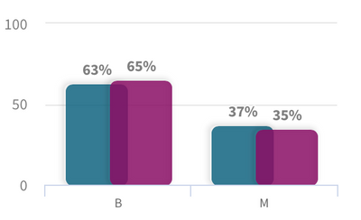
One of the interesting views in this analysis is the Scenarios where you can modify(increase/decrease) your features and see how it impacts the predictions. Let’s try something in our use case — we will increase the ‘texture_worst’ value and see how the results look.
Qlik AutoML presents a nice visual comparison in the form of grouped bar charts to understand how this scenario change has changed the predictions. Looks like an increase in the ‘texture_worst’ feature leads to more ‘Malignant’ patients.
Once we are satisfied with both training and test analysis, the AutoML system allows us to easily deploy and make a production version of the model via an API(Prediction API) for inferences. You can now integrate this into any workflow or framework that allows you to make HTTPS POST Requests.
This brings us to the end of this introductory blog on Qlik AutoML. My personal experience using the system has been seamless. Here are some key takeaways:
- easy-to-use interface (native Qlik Sense experience)
- quickly train, evaluate & deploy ML models with minimal adjustments
- visualization-assisted analysis
- no-code machine learning
- seamless integration with frameworks using Prediction API
In the next blog, we will deep dive into how to build, deploy and evaluate a Machine Learning model using Qlik AutoML and consume it in Qlik Sense to take advantage of augmented analytics.
~Dipankar, R&D Advocate
-
Building What-If Scenarios using SSE and the Qlik AutoML Prediction API
Qlik AutoML is a powerful tool that makes it easy for analytics teams to easily generate models, make predictions, and test business scenarios using a... Show MoreQlik AutoML is a powerful tool that makes it easy for analytics teams to easily generate models, make predictions, and test business scenarios using a code-free experience.
In a previous introductory blog post by Dipankar, you can learn more about how to get started with AutoML and find out just how easy it is to navigate the interface and start training and evaluating ML models in a few steps.
Today, we will leverage the power of Qlik Server-Side Extension (SSE) to build a simple Scenario Analysis dashboard right into Qlik Sense.
“What-if scenarios” are a great way to plan for decisions and actions by testing different parameters while capitalizing on AutoML’s prediction API.
So what is SSE?
Server-side Extension protocol allows us to extend the Qlik built-in expression library with functionality from external calculation engines. In our case, we will use AutoML’s re-calculation of the prediction based on changes on variables to show the result in a KPI chart.
Let’s go through the process in a practical example. We will look at Employee Turnover Risk (dataset attached at the end of the post)
- Create your AutoML project and load the dataset making sure to select the “left” field as the target. After successfully completing the training process, go ahead and deploy your model and enable API Access. Take note of the Access URL and Token, we will need them to make the connection in Qlik Sense.
- On our QS tenant, we need to create a new Data Connection via the "Qlik AutoML" Analytics source connector. If you don’t see it, make sure to enable Machine learning Endpoints in the Management Console.
- Now, let’s move on to building our Scenario analysis sheet on the Qlik Sense app (find the qvf attached at the end of the post).
- First, we create multiple variables to be used in our “Variable Input” objects. We concentrate on the features that are more important according to the Feature Importance chart.
- Next, we create our objects:
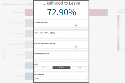
- The KPI that shows the Likelihood for Employees to leave is based on a measure that uses the SSE expression as follows, where some of the features are passed in as variables.
P.S: note the first argument of the ScriptEvalEx matches the field types of our features in order - with N being number and S being string. Also, the features passed as the third argument need to map 1 to 1 with autoML, missing features will result in an error.
- The KPI that shows the Likelihood for Employees to leave is based on a measure that uses the SSE expression as follows, where some of the features are passed in as variables.
=endpoints.ScriptEvalEx('NNNNNNNSS','{"RequestType":"endpoint", "endpoint":{"connectionname":"Qlik_AutoML_Employee_Turnover","column":"probability_yes"}}', vSatisfactionLevel AS satisfaction_level, last_evaluation, vNumberOfProjects AS number_project, vAvgMonthlyHoursWorked AS average_montly_hours, vTimeSpent AS time_spend_company, Work_accident, promotion_last_5years, vDepartment AS sales, vSalary AS salary)- Next. we build our variable inputs using the “Variable Input” chart under Custom Objects > Qlik Dashboard Bundle. Adjust the “Show as” type as needed.
And that’s all! You can now adjust the variables to trigger AutoML which automatically redistributes the data and re-predicts the outcome in order to understand the implication of any potential action.
Below, notice that Employee #2 has a high turnover %. Upon adjusting the “Avg Monthly Hours Worked”, “Number of Projects”, and “Salary” or a combination of these parameters, the % drops drastically.Attached is the dataset used as well as the qvf.
I hope you found this post helpful!
- Create your AutoML project and load the dataset making sure to select the “left” field as the target. After successfully completing the training process, go ahead and deploy your model and enable API Access. Take note of the Access URL and Token, we will need them to make the connection in Qlik Sense.
-
Qlik Digest - January 2025
Trends 2025 Available NOW! Access our Trends 2025 streamed event and its summary companion guide now to help you understand the three key themes and ... Show MoreTrends 2025 Available NOW!
Access our Trends 2025 streamed event and its summary companion guide now to help you understand the three key themes and corresponding trends that will dominate the AI conversation in 2025 and how you can act on them.
Get 2 Free Certifications at Qlik Connect
Choose from a wide variety of awesome data and analytics certifications, plus our brand-new AI Specialist certification. It’s the perfect way to show off your
knowledge of key AI concepts and applications.
The learning (and excitement) doesn’t stop at certs!
- 22 hands-on workshops to sharpen your integration skills
- Breakout sessions galore to deep dive into multiple data integration topics
- Sneak peek at the latest Qlik innovations and product announcements
Register by February 1st and snag $300 savings.
Don’t miss out on the action. Your genius-level journey awaits!
Qlik: Positioned for the 9th Consecutive Year as a Leader in the Gartner Magic Quadrant for Data Integration Tools!
Qlik is proud to be recognized as a leader in the 2024 Gartner Magic Quadrant for Data Integration Tools. Find out why in your complimentary copy of the report.
Lakehouses: Driving the Future of Data & AI
Open lakehouses are becoming critical to enterprises looking for flexible data management and cost efficiencies. Watch our recent webinar with Snowflake where we highlight the Why, What and How of Lakehouses.
Get Ready for the New Qlik Learning Experience!
The New Qlik Learning Experience; single, integrated learning designed to enhance your learning experience and help you get the most out of Qlik, is coming soon.
See the FAQ and Pre-launch Recommendations we have prepared for you.
-
Qlik Academic Program boosting employment prospects
The Qlik Academic Program offers world class data analytics training, software, qualifications and certifications to students and educators. So far, s... Show MoreThe Qlik Academic Program offers world class data analytics training, software, qualifications and certifications to students and educators. So far, students and educators from more than 3300 universities around the world, are a part of the program and getting trained in data analytics.
Recently, we spoke to Radhika Rajendra who is an MBA from Christ University Bangalore and she had an interesting story to share. During Covid, when there was a general freeze on job opportunities, she undertook training on the Qlik Academic Program and qualified as a Qlik Sense Business Analyst. While she had an interest in data analytics, she was more keen to secure a job for herself during those tough times. She met success with a top global consulting firm who hired her as a Qlik Sense Developer. Radhika continues to work on Qlik Sense in a different role even today and credits her success to the Qlik Academic Program.
To read more about Radhika's story, visit: https://www.qlik.com/us/solutions/customers/customer-stories/christ-university
To learn how you can access free training and qualifications on the Qlik Academic Program, visit: qlik.com/academicprogram -
AI Splits for Impacts
AI Splits for Impacts AnyChart Auto-detect key impacts to accelerate root cause analysis — Showcasing the AI Splits feature (October 2024) along... Show MoreAI Splits for ImpactsAnyChartAuto-detect key impacts to accelerate root cause analysis — Showcasing the AI Splits feature (October 2024) alongside other key capabilities of the Decomposition Tree visual in Qlik Sense.Discoveries
Instantly identifies the highest and lowest impact factors across multiple dimensions.
Impact
Streamlines root cause analysis by delivering deeper insights straight away.
Audience
Aiming to empower end users with the ability to instantly uncover critical factors affecting key metrics.
Data and advanced analytics
Features decomposition trees visualizing (fictional) sales data.
🔗 >> View Live or Download QVF <<
🔗 >> Learn More About AI Splits <<
🔗 >> Read “Visualizing Dimensional Relationships” by Dalton Ruer (Qlik) <<
-
Org Chart
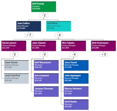
With the Qlik Sense April 2020 release, the Org Chart was added to the Qlik Visualization bundle. The Org chart provides a way to visualize hierarchie... Show MoreWith the Qlik Sense April 2020 release, the Org Chart was added to the Qlik Visualization bundle. The Org chart provides a way to visualize hierarchies in your data. In this blog post, I will review how easy it is to create an Org chart provided you have the hierarchical data structure in your data model. Below is a snapshot from an Excel file that was loaded. It has the employees within a company and who each person reports to.
The things to note in this file are:
- Every employee has a unique Employee ID.
- The Manager ID is the Employee ID of the employee’s manager.
This spreadsheet is designed to go 5 levels deep (EmpName 1 through EmpName5) but additional columns can be added or removed as needed. Other supporting employee data can also be added to the data model to use in the org chart or in other charts in the app.
To begin, add the Org chart to a sheet. The Org chart takes 2 dimensions and 1 measure. The first dimension added is EmployeeID. In the Org chart, each employee will have their own card. In the properties for the EmployeeID dimension, other information that you would like to show on the card for each employee can be added.
In this example, the card title has been set to EmployeeName, the sub-title to the employee’s title and the card description to the employee’s salary. There are some colors loaded in the data model so the field, Color2, was selected coloring the cards by the employee’s title. The second dimension added to the Org chart is the Reports To field. This field stores the EmployeeID of the employee’s manager like the ManagerID field. There is also the option to add a measure. In this example, a measure was not added. If a measure is added, it will be visible when you hover over a card. That’s it – that is all that needs to be done to add an Org chart to your Qlik Sense app.
Now, let’s take a look at the Org chart. By default, the Org chart will show 2 levels when you come to the sheet.
If an employee is a manager, there will be a number under their card indicating the number of employees that report directly to them. Clicking on that number will open the cards of their direct report(s). When there is a plus sign (+) that means that there are cards that are not visible. Once the cards of a manager are opened, it will turn into a minus sign (-) to indicate that the card is opened. This is visible in the image below.
The Org chart provides an easy way to see the hierarchical structure within an organization. Users can zoom in and out in the chart as needed and Qlik Sense will handle closing cards if newly opened cards may overlap or get in the way. Check out this chart and other new features of the Qlik Sense April 2020 release in the resources listed below.
Demo: What's New - Qlik Sense April 2020
Video: What’s New – Qlik Sense April 2020
Video: April 2020 Feature Demonstration
Blog: Qlik Data Analytics Product Release - April 2020Thanks,
Jennell -
Watch Q&A with Qlik: Qlik Sense – Client Managed!
Don't miss our previous Q&A with Qlik! Pull up a chair and chat with our panel of experts to help you get the most out of your Qlik experience. SEE ... Show MoreDon't miss our previous Q&A with Qlik! Pull up a chair and chat with our panel of experts to help you get the most out of your Qlik experience.
-
Iceberg を活用してお客様に成功をもたらすスケーラブルでオープンなデータソリューション
本ブログは "Embracing Iceberg with Scalable, Open, Data Solutions for Customer Success" の翻訳です。 著者:Drew Clark まず最初に、Ori と Upsolver チームのイノベーションとお客様の問題解決への絶え... Show More本ブログは "Embracing Iceberg with Scalable, Open, Data Solutions for Customer Success" の翻訳です。
著者:Drew Clark
まず最初に、Ori と Upsolver チームのイノベーションとお客様の問題解決への絶え間ない取り組みに、私たちは深く感銘を受けています。私たちの出会いは 1年以上前、それぞれのチームが私たちのテクノロジーが共同で機能する方法を検討しているときでした。これは、私たちの旅における素晴らしい第一歩でした。
AI はデータの作成と利用を急速に加速させており、組織がデータを管理し効果的に活用する上で直面する課題をさらに増幅させています。このようなデータの急増により、分析結果を得るためのデータ利用を簡素化・最適化するソリューションの導入がますます重要になっています。
Apache Iceberg は、ペタバイト規模のデータセットを高いパフォーマンスと信頼性で扱うために設計された、革新的でオープンなテーブルフォーマットです。スキーマの進化、パーティショニング、メタデータ管理などの機能を提供することで、Iceberg はスケーラビリティとガバナンスを確保しながら、大規模データセットの取り扱いを簡素化します。
Upsolver の Iceberg 最適化とストリーミングデータに関する実証済みの専門知識を Qlik のプラットフォームと統合することで、お客様がコストとガバナンスを管理しながら、AI や機械学習などのデータ集約型ワークロードの可能性を最大限に引き出すことができるようになります(さらに、データのポータビリティを高め、ベンダーロックインを減らすことができます)。
データの移動と利用の再考
今日の世界では、データはかつてない規模で生成されています。企業は意思決定を行い、イノベーションを推進し、より良い体験を創造するためにデータに依存しています。しかし、AI による急激なデータ生成は、課題をさらに深刻化させており、より効率的なソリューションが急務となっています。しかし、こうしたデータの移動や管理は、たいてい複雑で時間のかかるプロセスです。多くの組織は、分析または機械学習の準備が整う前に、データをステージングし、変換し、何度も読み込まなければならないワークフローから抜け出せないでいます。従来のこのようなアプローチはボトルネックを生み、意思決定者は時代遅れの情報で仕事をすることになります。
私たちは、AI やデータ分析を促進するために新鮮でリアルタイムのデータを必要とするお客様にとって、これらがどれほどフラストレーションになるかを見てきました。お客様はデータにアクセスしたいだけでなく、そのデータに基づいて行動したいのです。ここに Qlik の Upsolver 買収の意味があります。
Qlik と Upsolver で新たな可能性を開く
今回の買収で私が最も興奮しているのは、私たちのお客様がよりアジャイルでスケーラブルな方法でデータを扱う機会を提供できることです。リアルタイムのデータ取り込みと適応最適化(アダプティブオプティマイゼーション)における Upsolver の専門知識は、ゲームチェンジャーです。Kafka のようなストリーミングソースからであれ、SAP のような従来のシステムからであれ、生成されたデータを取り込み、分析や AI モデルで即座に利用できるようにします。
小売業が POS システムからのストリーミングデータに基づいて在庫戦略をリアルタイムで調整したり、医療機関が分刻みのデータで患者のケアプロトコルを改良したりすることを想像してみてください。
Upsolver のお客様はこれを実践しています。あるお客様は、データエンジニアを必要とすることなく、200万ものイベント(月換算で 1ペタバイトの生データ)を毎秒(はい、毎秒です)取り込んでいます。そのため、このお客様は AI と ML によるビジネス成果のためのデータ活用に集中することができています。別のお客様は、1日あたり 1200億件以上のイベントを数百の Iceberg テーブルに取り込み、アナリストやパートナーがほぼリアルタイムで行動データにアクセスできるように継続的に最適化しています。
これらは、Qlik のエンドツーエンドプラットフォームと Upsolver のリアルタイム機能の組み合わせによって実現した具体的な成果です。
オープンアーキテクチャをベンダーロックインなしで実現
私たちは、多くの企業が複雑さやコスト、ベンダーロックインを回避し各業務に適したツールを使用できる柔軟性を求めているのを目の当たりにしています。そのため、長期的なデータアクセシビリティとガバナンスを確保しながら、相互運用性、拡張性、コスト削減を可能にする Iceberg のようなオープンなファイル形式やテーブル形式が求められています。
Qlik と Upsolverは、Iceberg ベースのレイクハウスにおけるデータの取り込み、保存、処理、変換、管理、最適化を可能にする、独立したエンドツーエンドのプラットフォームを提供します。Qlik の幅広いコネクターにより、ユーザーは多様なソースからのデータを統一された Iceberg レイクハウスに統合することができ、重複を避け、柔軟性を確保することができます。このアプローチにより、最適化されたスケーラブルなアーキテクチャを維持しながら、特定のタスクに最適なツールを使用することができます。
生産性の向上とコスト削減を実現
データ分析と AI の活用を拡大することは、多くの場合、高コストとリソース不足に悩むことを意味します。従来のデータウェアハウスは強力ですが、データ量が増加するにつれてすぐに硬直化し、高価なものになります。Qlik と Upsolver は、ストレージコストを削減し、生産性を劇的に向上させることで、この課題に対処します。組織は、自動化されたテーブル管理とパフォーマンスチューニングにより、毎月数百時間のエンジニアリング時間を節約し、チームはイノベーションと戦略に集中することができるようになります。
Apache Iceberg を基盤とするこのプラットフォームは、現代のビジネスが必要とするスケーラビリティ、ガバナンス、パフォーマンスを提供します。
データの未来に向けたビジョンの共有
Qlik は、成果を生み出す変化を促進するデータの力を常に信じてきました。今回の買収はその信念を反映したもので、AI プロジェクトの拡大、業務の最適化、新たな洞察の発見など、お客様がより多くのことをデータで行えるようにします。Upsolver の最先端技術を当社の技術と統合することで、今日の課題に対応するだけでなく、明日の機会を予測するプラットフォームを構築します。
私は、この買収が我々のお客様にとって何を意味するのか、そして、それが解き放つ可能性について、非常に興奮しています。Upsolver と共に、私たちは、組織が従来の限界を越えて、データがこれまで以上にアクセスしやすく、実用的で、インパクトのある未来に移行するのを支援します。
Upsolver チームの皆様、Qlik ファミリーへようこそ。
私たちがお客様のためにできることを考えると、楽しみでなりません。