Unlock a world of possibilities! Login now and discover the exclusive benefits awaiting you.

Analytics & AI
Forums for Qlik Analytic solutions. Ask questions, join discussions, find solutions, and access documentation and resources.
Data Integration & Quality
Forums for Qlik Data Integration solutions. Ask questions, join discussions, find solutions, and access documentation and resources
Explore Qlik Gallery
Qlik Gallery is meant to encourage Qlikkies everywhere to share their progress – from a first Qlik app – to a favorite Qlik app – and everything in-between.
Qlik Community
Get started on Qlik Community, find How-To documents, and join general non-product related discussions.
Qlik Resources
Direct links to other resources within the Qlik ecosystem. We suggest you bookmark this page.
Qlik Academic Program
Qlik gives qualified university students, educators, and researchers free Qlik software and resources to prepare students for the data-driven workplace.
Recent Blog Posts
-
Use Case Reference Architecture - #5: Event-Driven Reference Architecture - Kapp...
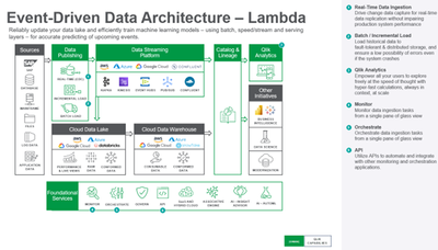
The architecture comprises the following components:Data is ingested in real-time using change data capture for real-time data replication without imp... Show MoreThe architecture comprises the following components:
Data is ingested in real-time using change data capture for real-time data replication without impairing production system performance.
Analytics is used to discover, interpret, and communicate meaningful patterns in data to apply toward effective decision-making.
Monitor data ingestion tasks with a single pane of glass view.
Orchestrate data ingestion tasks based on pre-set conditions or calculations.
APIs to automate and integrate with other monitoring and orchestration applications.
Event-Driven Architecture - Kappa
-
Qlik Use Case Reference Architecture - #4: Event-Driven Reference Architecture -...
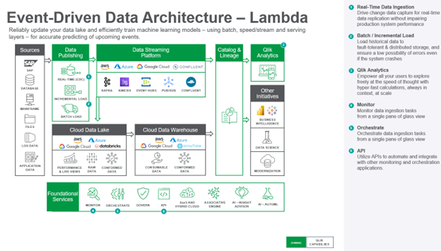
The architecture comprises the following components:Data is ingested in real-time using change data capture for real-time data replication without imp... Show MoreThe architecture comprises the following components:
Data is ingested in real-time using change data capture for real-time data replication without impairing production system performance.
Batch / Incremental Load is used for historical data with fault-tolerant, distributed storage, ensuring a low possibility of errors even if the system crashes.
Analytics is used to discover, interpret, and communicate meaningful patterns in data to apply toward effective decision-making.
Monitor data ingestion tasks with a single pane of glass view.
Orchestrate data ingestion tasks based on pre-set conditions or calculations.
APIs to automate and integrate with other monitoring and orchestration applications.
-
Use Case Reference Architecture - #3: Data Lakehouse Reference Architecture
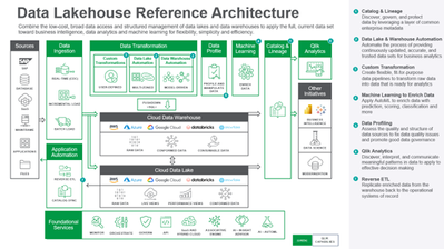
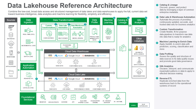
The architecture comprises the following components:Data is ingested from transactional systems with low latency. Change data capture for real-time da... Show MoreThe architecture comprises the following components:
Data is ingested from transactional systems with low latency. Change data capture for real-time data replication ingests data without impairing production system performance.
Data Warehouse Automation accelerates the availability of analytics-ready data by automating the entire data warehouse lifecycle.
Data Lake Automation powers the process of providing continuously updated, accurate, and trusted data sets for business analytics.
Custom Transformation allows users to create flexible, fit-for-purpose data pipelines to transform raw data into data that is ready for analytics.
Data Profiling enables users to assess the quality and structure of data sources to fix data quality issues and promote good data governance.
Machine Learning enriches data with prediction, scoring, classification, and more.
Catalog & Lineage capabilities empower users to discover, govern, and protect data using AI and machine learning built on a layer of common enterprise metadata.
Analytics is used to discover, interpret, and communicate meaningful patterns in data to apply toward effective decision making
Reverse ETL replicates enriched data from the warehouse back to the operational systems of record.
-
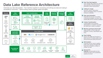
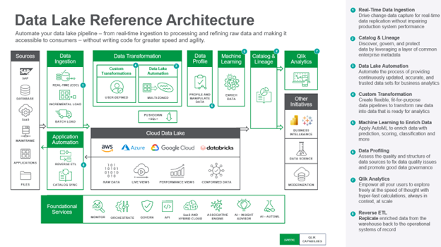
Use Case Reference Architecture - #2: Data Lake Reference Architecture
The architecture comprises the following components:Data is ingested from transactional systems with low latency. Change data capture for real-time da... Show MoreThe architecture comprises the following components:
Data is ingested from transactional systems with low latency. Change data capture for real-time data replication ingests data without impairing production system performance.
Data Lake Automation powers the process of providing continuously updated, accurate, and trusted data sets for business analytics.
Custom Transformation allows users to create flexible, fit-for-purpose data pipelines to transform raw data into data that is ready for analytics.
Data Profiling enables users to assess the quality and structure of data sources to fix data quality issues and promote good data governance.
Machine Learning enriches data with prediction, scoring, classification, and more.
Catalog & Lineage capabilities empower users to discover, govern, and protect data using AI and machine learning built on a layer of common enterprise metadata.
Analytics is used to discover, interpret, and communicate meaningful patterns in data to apply toward effective decision making
Reverse ETL replicates enriched data from the warehouse back to the operational systems of record.
-
Reduce Costs by 75% With Data Warehouse Automation
Data Warehouse ChallengesWhen an organization needs real-time data to feed the warehouse, they typically hire a third-party consultancy to create a ma... Show MoreData Warehouse Challenges
When an organization needs real-time data to feed the warehouse, they typically hire a third-party consultancy to create a manual change data capture (CDC) process and a data vault. However, after initial implementation, errors in this manual CDC process take many months to uncover and rectify. Adding new tables to the data warehouse will take many days since administrators make updates in a limited time window off business hours.Hence an organization should develop and configure its CDC and DWA processes without depending on third-party integrators or consultants. This way, they can increase the scalability to accommodate new data sources with minimal downtime and not be forced to choose between database availability and development effort.
An Ideal Data Warehouse Automation (DWA) Solution
The principal component of a DWA solution is the metadata repository. The development team uses metadata to describe and generate all data structures, data flows, and presentation data objects. They can use a client tool or a web portal to edit the metadata, thus saving a lot of manual coding effort.
The DWA solution will read a source database's data definition language (DDL) and import it into its repository. The DWA solution can also generate unique code to transition from one state to another, i.e., to unload the data mart, reshape it and then merge and reload the data in its new form. The same applies to generating test code harnesses.
Most DWA tools assist with data vault data modeling, which needs a well-disciplined approach as it uses many physical tables. A data vault sits on top of a data warehouse storing all changes made to the data warehouse and outlining the facts and dimensions of the data model.
Qlik's DWA Solution
Qlik's DWA automatically creates data vault-like structures with a data history, addressing one of the primary goals of a modernization project. Another critical benefit is eliminating reporting issues caused by missing rows in tables with compensating records for late-arriving dimensions.
Qlik's data replication automatically copies data table structures and data description language (DDL) to build the data pipelines and automatically update to changes. The Qlik solution is straightforward to use compared to legacy systems, helping to deliver the time savings described above.
Qlik's DWA Benefits
Qlik's DWA solution reduces development costs for data warehouse and data vault construction, resulting in cost savings from retired legacy systems and support. It increases business agility and future proofs with modernized data architecture. It also serves as a valuable tool for risk reduction, governance, and adoption of best practices.
Customers, on average, achieve 75 percent cost reduction in creating CDC processes and data vaults and 75 percent on data warehouse development. The time required to add new source systems to the data warehouse also shrinks by 4x - 20 days to 5 days. Additionally, the time to create new data mart facts and dimensions reduces, resulting in delivering a new data mart from scratch within a couple of weeks, an increase in speed of 400 percent on average.
Data and analytics teams can handle incoming new and ad-hoc BI requests for reports as they pop up and incorporate new data sources as needed. Also, with the new, flexible architecture, they are not dependent on outside database administrators or integrators, and organizations typically recoup deployment costs midway through a license subscription period.
Self-Service Click-Through Experience
Get a hands-on experience on Qlik's DWA solution here. Also, read here about a Qlik customer who experienced the results.
-
Inner and Outer Set Expressions
Today I am going to blog about inner and outer set expressions. If you have ever used set analysis in your measure expressions, then you will like thi... Show MoreToday I am going to blog about inner and outer set expressions. If you have ever used set analysis in your measure expressions, then you will like this new capability. Set analysis is a very powerful feature often used to define a scope that may differ from the scope that is defined by making selections in an app. For example, in the set expression below the sales are summed where the product line is camping equipment. This is considered an inner set expression and probably familiar to those who use set analysis. The set expression is in the aggregate function which is sum in this case.
If this expression was written as an outer set expression, the set expression would be outside of the aggregate function as seen below. When using an outer set expression, it must be before the scope. In this example, both the inner and outer expressions return the same result.
Now, where the outer set expression is helpful is when you have more than one aggregate function in your expression. For example, in the inner set expression below, there are three sum aggregate functions and in each one, set analysis is being used to set the scope to camping equipment.
Using an outer set expression, this expression can be written like this:
Notice that the set expression sits outside of the expression and at the beginning of the scope. Written this way, [Product Line]={'Camping Equipment'} is applied to all the aggregate functions. This is a cleaner way to write the expression and ensures that it is applied to all the aggregate functions. The outer set expression can also be used with a master measure. Assume I have master measures named Sales and Margin %. I can use outer set expressions like the ones below.
A set expression, like the outer set expressions above, are applied to the entire expression. If the set expressions were in brackets, then the set expression applies only to the aggregate functions within the brackets. For example, the set expression below is in parentheses which means that it only applies to the aggregate functions within the parentheses and not to the aggregate function that sits outside of the parentheses. Written this way, the resulting value will differ from the set expression without any brackets/parentheses.
A few things to remember about set expressions. Inner set expressions have precedence over outer set expressions and if the inner set expression has a set identifier, it replaces the context. Otherwise, the inner set expression is merged with the outer set expression. Check out Qlik Help for more examples and rules around inner and outer set expressions and try it for yourself in your next app.
Thanks,
Jennell
-
Qlik’s Response to March 2022 Spring Framework Vulnerabilities (CVE-2022-22965 "...
Qlik is aware that a set of well publicized vulnerabilities have been identified in the popular Java Spring Framework. These vulnerabilities have been... Show MoreQlik is aware that a set of well publicized vulnerabilities have been identified in the popular Java Spring Framework. These vulnerabilities have been assigned references CVE-2022-22965 (also known as "Spring4Shell"), CVE-2022-22947, CVE-2022-22950 and CVE-2022-22963.
- CVE-2022-22965: Spring Framework RCE via Data Binding on JDK 9+ (Critical)
CVE-2022-22947: Spring Cloud Gateway Code Injection Vulnerability (Critical) - CVE-2022-22963: Remote code execution in Spring Cloud Function by malicious Spring Expression (Critical)
- CVE-2022-22950: Spring Expression DoS Vulnerability (Medium)
Qlik has been diligently reviewing our product suite since we’ve become aware of these issues. We want to ensure Qlik users that your security is our upmost priority. As always, we recommend customers stay up-to-date on the most recent releases available for your product.
Products Not Impacted
The following products are NOT affected:
- Qlik Cloud
- Client-Managed Qlik Sense Enterprise and QlikView (all versions)
- GeoAnalytics (all versions)
- Qlik Compose (all versions)
- Qlik Compose for Data Lakes (all versions)
- Qlik Compose for Data Warehouses (all versions)
- Qlik Enterprise Manager (all versions)
- Qlik NPrinting
- Qlik Replicate (all versions) **
** Qlik Replicate contains libraries that contain the affected code, but they are not used in a way that is exploitable. These will be removed in a upcoming patch.
Products ImpactedOur testing shows only client-managed versions of Qlik Catalog are directly impacted (by CVE-2022-22965 and CVE-2022-22950) and a patch will be available as Feb 2022 SR2 and for the May 2022 release. Mitigation steps for earlier releases are linked in this knowledge base article.
Update 4/04/2022 8:15p.m EST
Qlik Catalog Feb 2022 SR2 is now available on the Downloads Site. Please be sure to be logged into Qlik Community with your Qlik ID to access.
Please subscribe to our Support Updates blog for continued updates as they become available.
Thank you for choosing Qlik,
Qlik Global Support
- CVE-2022-22965: Spring Framework RCE via Data Binding on JDK 9+ (Critical)
-
Content Highlights: QlikView to Qlik Sense Transition
As we settle into Q4, we know 2023 planning is underway. At this point, you’re likely evaluating your KPIs to determine whether they will continue in ... Show MoreAs we settle into Q4, we know 2023 planning is underway. At this point, you’re likely evaluating your KPIs to determine whether they will continue in the new year or be adjusted to meet new business requirements. As your business evolves, whether through modernization, operational cost reduction, or to maintain competitiveness, so too must your analytics initiatives and the metrics upon which you gauge organizational health in your market.
This year, we made a tremendous amount of progress helping QlikView customers get up to speed on Qlik Sense through the Analytics Modernization Program, but we realize you may still have some questions about modernizing and the transition process. We’ve built out several resources to reduce your concerns and have compiled some of the most popular ones here.
We recommend you review following:
OnDemand Webinars (Qlik login required):
- Demystifying Your Analytics Modernization with Qlik Sense SaaS
- Modernize Your Analytics on the Cloud with Qlik Sense SaaS
Technical Briefs:
- Analytics Modernization Best Practices for Qlik Sense SaaS
- Analytics Modernization Best Practices for Qlik Sense Client-Managed
eBook (Qlik login required): Top 3 Reasons to Modernize Your QlikView Analytics
Strategy Datasheet: Modernize Your Analytics Experience
The Analytics Modernization Program entitles QlikView users to Qlik Sense SaaS for a modest uplift on your annual maintenance rate, which converts to an annual subscription. With Qlik Sense SaaS, you’ll gain more options and control over your analytics leading to a competitive advantage and lower total cost of ownership for analytics.
For more information, contact EMEA: q2cemea@qlik.com; Americas: q2camericas@qlik.com; APAC: q2capac@qlik.com.
-
【オンデマンド配信】7 つの動向 - 優れた効果をもたらすデータ分析部門とは
分析がもたらす組織全体への効果は、データ分析部門次第です。優れた効果を得ている組織は、どのように分析を活用して成功しているのか。 本 Web セミナーでは、TDWI 社の最新レポート「データと分析を支援して組織を刷新」を基に、ディスカッションを交えてご説明します。 ※ 参加費無料。パソコン・タブレ... Show More分析がもたらす組織全体への効果は、データ分析部門次第です。優れた効果を得ている組織は、どのように分析を活用して成功しているのか。
本 Web セミナーでは、TDWI 社の最新レポート「データと分析を支援して組織を刷新」を基に、ディスカッションを交えてご説明します。
※ 参加費無料。パソコン・タブレット・スマートフォンで、どこからでもご視聴いただけます。日本語字幕付きでお届けします。
- 最新の組織体制とテクノロジーの導入
- 統制されたセルフサービスの実現
- データリテラシープログラムの導入
- データを資産として活用し、組織を統率する方法
- 最新の組織体制とテクノロジーの導入
-
Qlik reaches milestone with FedRAMP Moderate Authorization for Qlik Cloud Govern...
Qlik announced our authorization under the US Federal Risk and Authorization Management Program (FedRAMP) has been approved, with the sponsorship of t... Show MoreQlik announced our authorization under the US Federal Risk and Authorization Management Program (FedRAMP) has been approved, with the sponsorship of the US Environmental Protection Agency (EPA). This authorization allows US Federal, State, and local agencies to use Qlik Cloud Government safely and securely for data integration, analytics, machine learning, and more!
FedRAMP is a U.S. government program that approves cloud products and services for the U.S. Public sector. The goal of FedRAMP is to accelerate the adoption of cloud solutions for agencies and support their transition from older legacy infrastructures to mission-critical, secure, and cost-effective cloud-based technology.
“As federal agencies and organizations rapidly modernize and migrate to the cloud, they must ensure the transition is protected under the strictest secure protocols and authorizations,” said Andrew Churchill, Vice President of Federal at Qlik. “Achieving this FedRAMP milestone validates Qlik's ability and commitment to meet the unique and ever-changing needs of our government clients and equips them with greater access to state-of-the-art solutions to reach their mission goals.”
Qlik worked closely with their sponsoring agency, the EPA, who implemented Qlik Cloud Government to ignite innovation and evolve their current analytics program. The EPA leveraged Qlik Cloud Government to unlock more value out of their data in addition to improving operational efficiencies and reducing costs across the agency.
“Working with Qlik in their pursuit of FedRAMP authorization allowed EPA to shift resources to delivering analytics to protect human health and the environment rather than IT administration,” said Arthur Zuco, Program Manager at EPA. “Our world is moving to the cloud and, by adopting SaaS, we are setting ourselves up to take advantage of the kinds of new capabilities that will be delivered by the SaaS market in general for years to come.”
Federal, state, and local agencies worldwide trust Qlik for data integration and superior analytics capabilities through a state-of-the-art platform built to enable end-to-end data analytics pipelines that close the gaps between insights and action. Now our US Public Sector customers can take advantage of that vision in a FedRAMP-compliant cloud environment.
Qlik’s FedRAMP Moderate authorization is also recognized by the Department of Defense (DoD) at IL2 and has started uplift certification for IL4.
To read the press release, see here.
To learn more about Qlik Cloud Government, link here (already linked 2x above)
To speak with someone from our Public Sector team, click here.
-
Mini Charts
With the June 2020 release of Qlik Sense came many chart enhancements. My favorite is the addition of mini charts to a table. In a table, a measure c... Show MoreWith the June 2020 release of Qlik Sense came many chart enhancements. My favorite is the addition of mini charts to a table. In a table, a measure can be visualized via a mini chart as either bars, dots, sparklines, or positive/negative.
This enhancement not only makes a table more appealing to look at, but it can easily point out changes and trends in the data. To add a mini chart to a table, follow these simple steps:
- Add a measure to the table. In the example above, Sum(Sales) is the measure.
- In the Properties window of the table, change Representation to Mini chart.
- Select the dimension to indicate what data to view. In the table above, Month was the selected dimension.
- Select the Type of mini chart to add (bars, dots, sparklines or positive/negative).
That is it, the mini chart is added to the table. There are other options that can be adjusted to change the look and feel of the mini chart. In the Colors area, there is the option to select the color of the bar/dot/line as well as the option to select the color of the max value, min value, first value and last value. If showing a sparkline mini chart, you also have the option to show dots on the line for each data point of the selected dimension. The y-axis can also be adjusted for the mini chart. There is the option to use local or global so you can decide if the y-axis range is based on the specific row or all rows. There is also the choice to select auto, zero as baseline or zero as center for the y-axis. Read more about mini chart in Qlik Help.
Mini charts are eye candy for your table. Dress up the measures in your table with mini charts to provide another layer of information in an easy to digest manner. Learn more about the Qlik Sense June 2020 release by checking the links below:
- Qlik Sense App - What’s New App
- Video – What’s New – Qlik Sense June 2020
- Video – June 2020 Feature Demonstration
- Blog – Qlik Product Innovation Blog – Qlik Sense June 2020
Thanks,
Jennell
-
Qlik Digest - October 2022
What’s New at Qlik?Are you familiar with the many Lineage and Impact Analytics capabilities in Qlik Sense SaaS? If not, now’s a great time to check th... Show MoreWhat’s New at Qlik?
Are you familiar with the many Lineage and Impact Analytics capabilities in Qlik Sense SaaS? If not, now’s a great time to check them out as these features have been made available to all Qlik Sense Enterprise SaaS users. Learn More
Qlik Cloud Data Integration is coming soon! Designed to quickly deliver, transform, and unify enterprise data with automated and governed pipelines, our latest innovation is not to be missed. Stay tuned for more details!
Active Intelligence Executive Insights
The second issue of our Active Intelligence Executive Insights is now available. Learn from industry experts like Hannah Fry, on how we should rethink our approach to human vs machines and Sally Eaves, on how to inform smarter actions in a constantly changing world. Read Now
7 Habits of Highly Effective Data and Analytics Teams
Join Qlik's Josh Good and Joe DosSantos on October 26 as they discuss the findings from the new Transforming Data with Intelligence report and explore what highly effective organizations do to drive analytical success. Register Now
Your Feedback Matters
We take customer input seriously, and it factors into key business decisions we make. In October we will invite you to participate in Qlik’s Customer Survey. Please look out for an email invite from feedback@qlik.com, or a pop-up inside your Qlik Sense Hub.
Additional Featured Content
Check out our new blended learning – Instructor-led training that’s ready when you are!
How Qlik is helping SodaStream fight plastic pollution
Qlik Sense SaaS Simplified Authoring is now live
Workshop Wednesdays - Get a hands-on with our Data Analytics and Integration Portfolio
-
Penn State Great Valley Giving Society
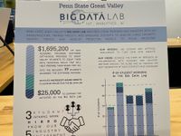
This month the Qlik Academic Program was honored to be invited as a guest and sponsor of the Penn State Great Valley Giving Society . Every year the... Show MoreThis month the Qlik Academic Program was honored to be invited as a guest and sponsor of the Penn State Great Valley Giving Society . Every year the society's mission is to raise money to support graduate students attending the campus to obtain masters degrees ranging in studies from Business Administration to Software Engineering.
Many of the philanthropists that support Penn State Great Valley are former graduates but some include local businesses. In Qlik's case, we are considered a partner to the campus as we provide the students at the Big Data Lab with the opportunity to gain access to our software, training, certificates, and technical workshops at no charge. The campus considers this a gift in kind and as a result, we are acknowledged in their annual dinner.
It was a pleasure to attend the dinner and we look forward to many more years of supporting the students on campus!
Learn more about how the Qlik Academic Program can support you and apply today by visiting https://www.qlik.com/us/company/academic-program

-
【オンデマンド配信】いま企業に必要なクラウドデータ分析基盤とは
パンデミックや紛争、自然災害といった不透明な時代において、リアルタイムのデータ分析・将来の予測・俊敏な行動が求められています。また、働き方の変化や TCO 削減の観点からクラウドへの移行が増加し、クラウドで完結するデータ分析基盤が求められています。本 Web セミナーでは、データ分析やダッシュボード... Show Moreパンデミックや紛争、自然災害といった不透明な時代において、リアルタイムのデータ分析・将来の予測・俊敏な行動が求められています。また、働き方の変化や TCO 削減の観点からクラウドへの移行が増加し、クラウドで完結するデータ分析基盤が求められています。
本 Web セミナーでは、データ分析やダッシュボード超えた自動化を促進するクラウドアプリケーションとの連携、AI / 機械学習を駆使した予測分析、オンプレのデータをクラウド上で安全に利用できるデータ統合機能を備えた Qlik Cloud をデモを交えてご紹介します。※ 参加費無料。パソコン・タブレット・スマートフォンで、どこからでもご視聴いただけます。
-
Introducting Partner ID to Qlik SaaS offering
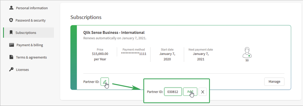
This feature can be found in My Qlik, another recently added tool that provides a single location for users to manage their Qlik identity and their Ql... Show MoreThis feature can be found in My Qlik, another recently added tool that provides a single location for users to manage their Qlik identity and their Qlik Sense subscriptions. As part of this management, users can now associate a Partner ID with their subscription.
The Partner ID is a six-digit number that uniquely identifies a partner to Qlik. To associate the Partner ID to your subscription, the first step is to talk to your Partner and ask them what number you should use. Once you have that number, you can log into My Qlik (https://myqlik.qlik.com/portal/). Then, by clicking on the Subscriptions tab, you will be able to see your subscriptions.
Within the subscription tile you can click on the edit button and add the Partner ID.
If a Partner ID has already been entered, you can also change it, or delete it entirely.
It’s all about improving your experience with Qlik! The My Qlik Portal is an area where Qlik Sense users will have the ability to digitally purchase and manage Qlik Sense Business Subscriptions and their own information among many other things.
More to come in the near future around the My Qlik Portal - stay tuned!
-
Qlik Academic Program workshop at Sunway University Malaysia
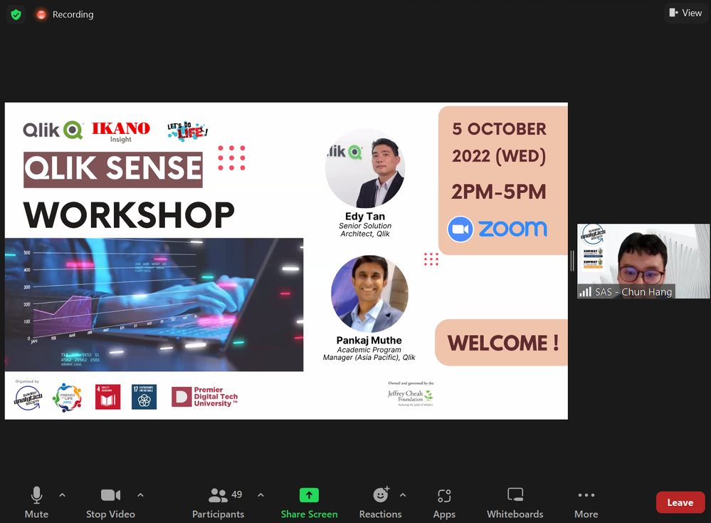
On October 5th, the Qlik Academic Program organized a workshop for students of Sunway University, Malaysia. Qlik's customer Ikano Insights supported t... Show MoreOn October 5th, the Qlik Academic Program organized a workshop for students of Sunway University, Malaysia. Qlik's customer Ikano Insights supported this event since they have an existing relationship with the University and they are encouraging students to learn from the academic program in view of potential internship and job opportunities at Ikano Insights for those trained in Qlik. In attendance was Mr ST Chua, Regional Director South East Asia at Ikano Insights who shared his thoughts on data analytics and the Qlik-Ikano relationship. Sunil Aman, Director Commercial Accounts, ASEAN, who manages the Ikano account at Qlik was also present and helped in answering queries of students.
Qlik's technical expert and Senior Solution Architect, Edy Tan conducted this workshop and explained the features of Qlik Sense Business. He guided students on using the features of Qlik Sense during his 2.5 hour session. Students had the opportunity to build dashboards and visualise data and get a first hand feel of analysing data. Close to 50 students attended this workshop and it was a truly engaging experience for the audience.
Apply to the program today, qlik.com/us/company/academic-program
-
Qvd Tracker
Qvd Tracker Team Computers It extracts all qvds from qvs file and fetches its reload time. Suitable for Backtracking activities. Discoveri... Show More
Qvd TrackerTeam Computers It extracts all qvds from qvs file and fetches its reload time. Suitable for Backtracking activities.
Discoveries
Saves time and manual intervention
Impact
Automated Backtracking, saved time, and Manual force.
Audience
BI Analyst, Tech Lead.
Data and advanced analytics
Saved Time and Increased efficiency by delivering accuracy in output.
-
Interacting with data using Enigma.js PT 2: Creating Filters with List Objects a...
On Part 1 of this blog post, we went through Generic Objects, learned about definitions of the ListObject and Hypercube structures, and explored some ... Show MoreOn Part 1 of this blog post, we went through Generic Objects, learned about definitions of the ListObject and Hypercube structures, and explored some of the settings that they offer in order to interact with data when communicating with the Qlik Associative Engine through Enigma.js.
In this second part, we will see actual implementations of ListObjects and Hypercubes and learn how they can be used as part of your next web application to create filters and charts.
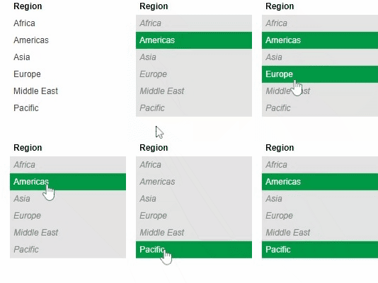
Creating Filters with ListObjects
First, let’s create a filter that corresponds to a single field in our data model that we can use to make selections and filter in.
The ListObject structure is best suited in this case since it contains one dimension. It lists all the values in a single field and provides metadata about the current state of each field value (either selected, excluded, or possible)
In order to create a ListObject, we create a dynamic property for it in a generic object, we then add the appropriate JSON definition for a list object via the “qListObjectDef” property. The engine will know how to properly parse this definiton in order to produce a ListObject.
In our case, we define a list object for our “Region” field by using the dimension definition based on the field name via the “qDef/qFieldDefs” property.
All is left if to fetch the data, we do that by defining the “qInitialDataFetch” property to grab the initial data set. In our case, we have 1 column and we know that the number of rows to be pulled is less than 10. So, we define it with “qWidth” 1 and “qHeight” 10.
{
    "qInfo": {
        "qType": "filter"
    },
    "qListObjectDef": {
        "qDef": {
            "qFieldDefs": ["Region"]
        },
        "qInitialDataFetch": [
            {
                "qLeft": 0,
                "qWidth": 1,
                "qTop": 0,
                "qHeight": 10
            }
        ]
    }
}
After connecting to enigma and getting our app object, we create a session object and pass it the ListObject definition above. A session object is a generic object that is only active for the current session and is not persisted in the model.
const regionObj = await enigmaApp.createSessionObject(regionListDef);
const regionLayout = await regionObj.getLayout();

renderFilter(regionListElem, regionLayout, regionObj)
After getting the ListObject layout, we call the function below that takes care of retrieving the data we want to display on our filter via the “layout.qListObject.qDataPages[0].qMatrix” which consists of an array of arrays, each corresponding to 1 row of data.
The JSON object we get by looping through the "qMatrix" includes the following properties:
- qText: a text representation of the cell value
- qNum: a numeric representation of the cell value
- qElemNumber: a rank number of the cell value.
- qState: the selection state of the field value.
We use both qText and qState in our front end. First to display the value name, and to add a CSS class that will allows to differentiate between different states:
- S for selected
- X for excluded
- O for possible
We also listen to click events on the list and call “genericObject.selectListObjectValues("/qListObjectDef", [e[0].qElemNumber], true)” which is a Generic Object method. It takes the path that describes where our ListObject is defined in our Generic Object as a 1st parameter, and the Element Number that we want to select as the 2nd parameter. The 3rd argument is the toggle mode (whether a selection is added to an already existing set of selections or overrides them).
const renderFilter = (element, layout, genericObject) => {
    var titleDiv = element.querySelector(".filter-title");
    var ul = element.querySelector("ul");
    ul.innerHTML = "";

    // Get the data from the List Object
    var data = layout.qListObject.qDataPages[0].qMatrix;

    // Loop through the data and create the filter list
    data.forEach(function(e) {
        var li = document.createElement("li");
        li.innerHTML = e[0].qText;
        li.setAttribute("class", e[0].qState);

        // Click function to select
        li.addEventListener("click", function(evt) {
            genericObject.selectListObjectValues("/qListObjectDef", [e[0].qElemNumber], true);
        });

        ul.appendChild(li);
    });
};
Creating Charts with HyperCubes
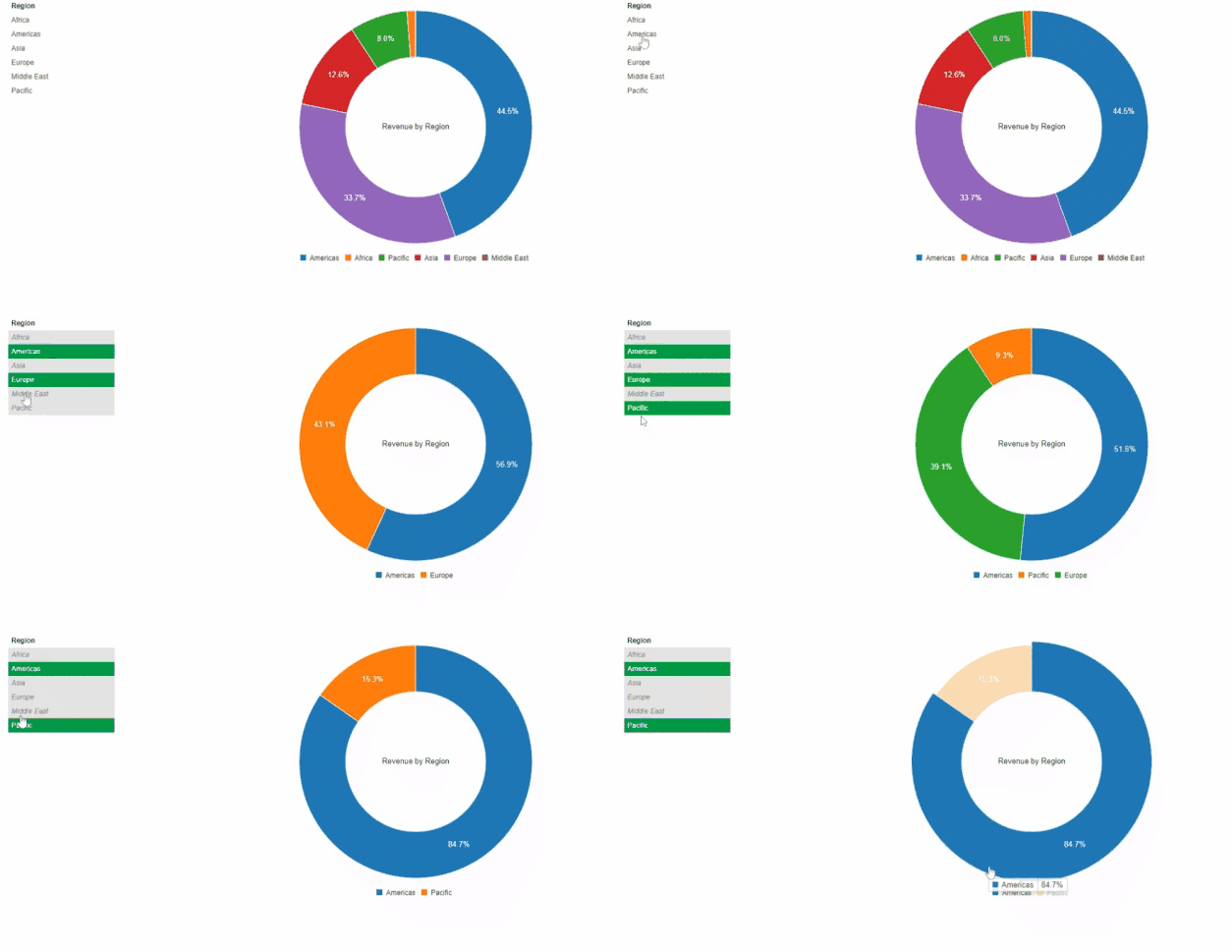
When creating visualizations, we make use of Hypercubes which allow us to define a combination of both dimensions and measures in order to get a calculated data set.
Let’s create a Pie Chart that shows the Sum of Revenues by Region.
The Generic Object definition for this includes 1 Dimension and 1 Measure that we define via the “qHyperCubeDef” property
We then define the initial data fetch, in this case we need 2 columns (one for the Region, and one for the calculated Revenue) and we don’t expect to have more than 1000 rows. Thus we set “qWidth” 2 and “qHeight” 1000.
{
    "qInfo": {
        "qType": "chart"
    },
    "qHyperCubeDef": {
        "qDimensions": [
            {
                "qDef": {
                    "qFieldDefs": ["Region"],
                    "qSortCriterias": [
                        {
                            "qSortByNumeric": 1
                        }
                    ]
                },
                "qNullSuppression": true
            }
        ],
        "qMeasures": [
            {
                "qDef":{
                    "qDef": "=Sum([Sales Quantity]*[Sales Price])"
                }
            }
        ],
        "qInitialDataFetch": [
            {
                "qLeft": 0,
                "qWidth": 2,
                "qTop": 0,
                "qHeight": 1000
            }
        ]
    }
}
Similar to what we have done on the ListObject, we create a Generic Object (session object), and then get its layout. Next we call the “renderChart” method to create the Pie chart visualization.
const chartObj = await enigmaApp.createSessionObject(chartDef);
const chartLayout = await chartObj.getLayout();

renderChart(chartLayout);
Our function is simple, we start by accessing the qMatrix array which contains all of our rows which in turn contain a group of cells.
We refine this array using the map function to only grab a pair of values consisting of the Region (via the qText property of the 1st cell) and the Revenue (via the qNum property of the 2nd cell).
You can then render the chart using your visualization tool of choice. In this case, we use C3.js.
const renderChart = (layout) => {
    var qMatrix = layout.qHyperCube.qDataPages[0].qMatrix;

    // Map through qMatrix to format it as array of arrays: [[region1, revenue1], [region2, revenue2] ...]
    const columnsArray = qMatrix.map((arr) => [arr[0].qText, arr[1].qNum]);

    c3.generate({
      bindTo: "#chart",
      data: {
        columns: columnsArray,
        type: 'donut'
      },
      donut: {
          title: "Revenue by Region"
      }
    });
  }
I hope this post helps you further understand the notion of Generic Objects in the form of ListObjects and HyperCubes. Let me know how you are leveraging these concepts to build your custom solutions!
The full code can be found on my Github Repo.
-
Qlik Sense Incremental Load using Merge
Since the introduction of the new MERGE prefix (https://help.qlik.com/en-US/sense/May2022/Subsystems/Hub/Content/Sense_Hub/Scripting/ScriptPrefixes/M... Show MoreSince the introduction of the new MERGE prefix (https://help.qlik.com/en-US/sense/May2022/Subsystems/Hub/Content/Sense_Hub/Scripting/ScriptPrefixes/Merge.htm) has become much easier to create an incremental load using a Qlik script. This command receives a table with insert, update, and delete operations and can change a table already loaded in memory.
For the examples below we have two assumptions:
- OrderID is the table's primary key (if you have a composite key, you need to adjust it)
- update_dt stores the date/time of the last record insert/change
Let's see the examples:
1 -"Insert Only Case
QVDFile='lib://DataFiles/NW.Orders_InsertOnly.qvd';
if FileSize('$(QVDFile)') > 0 then //If there is already extracted data
[NW.Orders]:
Load
OrderID,
CustomerID,
EmployeeID,
OrderDate,
RequiredDate,
ShippedDate,
ShipVia,
Freight,
ShipName,
ShipAddress,
ShipCity,
ShipRegion,
ShipPostalCode,
ShipCountry
from [$(QVDFile)](qvd);
t:load Max(OrderID) as MaxOrderID Resident [NW.Orders];
LastOrderID=Peek('MaxOrderID'); // Retrieves the last OrderID
Drop Table t;
else
LastOrderID = '0';
[NW.Orders]:load null() as OrderID AutoGenerate 0; // fake table
endif

Merge(updated_dt) on OrderID Concatenate([NW.Orders])
Load If(Exists(OrderID),'U','I') as Operation, *; // New record? based on OrderID
SELECT
OrderID,
CustomerID,
EmployeeID,
OrderDate,
RequiredDate,
ShippedDate,
ShipVia,
Freight,
ShipName,
ShipAddress,
ShipCity,
ShipRegion,
ShipPostalCode,
ShipCountry,
updated_dt
FROM northwind.orders
Where OrderID > '$(LastOrderID)';

Store [NW.Orders] into [$(QVDFile)](qvd);
2 - "Insert" & "Update" Case
QVDFile='lib://DataFiles/NW.Orders_InsertUpdate.qvd';
if FileSize('$(QVDFile)') > 0 then //If there is already extracted data
[NW.Orders]:Load
OrderID,
CustomerID,
EmployeeID,
OrderDate,
RequiredDate,
ShippedDate,
ShipVia,
Freight,
ShipName,
ShipAddress,
ShipCity,
ShipRegion,
ShipPostalCode,
ShipCountry,
updated_dt
from [$(QVDFile)](qvd);
t:load Max(updated_dt) as updated_dt Resident [NW.Orders];
updated_dt=Timestamp(Peek('updated_dt'),'YYYY-MM-DD hh:mm:ss.fff'); // Retrieves the last udpate
Drop Table t;
else
updated_dt = '2000-01-01';
[NW.Orders]:load null() as OrderID AutoGenerate 0; // fake table
endif
Merge(updated_dt) on OrderID Concatenate([NW.Orders])
Load If(Exists(OrderID),'U','I') as Operation, *; // New record? based on OrderID
SELECT
OrderID,
CustomerID,
EmployeeID,
OrderDate,
RequiredDate,
ShippedDate,
ShipVia,
Freight,
ShipName,
ShipAddress,
ShipCity,
ShipRegion,
ShipPostalCode,
ShipCountry,
updated_dt
FROM northwind.orders
Where updated_dt > '$(updated_dt)';
Store [NW.Orders] into [$(QVDFile)](qvd);3 – Insert / Update / Delete Case
QVDFile='lib://DataFiles/NW.Orders_InsertUpdateDelete.qvd';
if FileSize('$(QVDFile)') > 0 then //If there is already extracted data
[NW.Orders]:Load
OrderID,
CustomerID,
EmployeeID,
OrderDate,
RequiredDate,
ShippedDate,
ShipVia,
Freight,
ShipName,
ShipAddress,
ShipCity,
ShipRegion,
ShipPostalCode,
ShipCountry,
updated_dt
from [$(QVDFile)](qvd);
t:load Max(updated_dt) as updated_dt Resident [NW.Orders];
updated_dt=Timestamp(Peek('updated_dt'),'YYYY-MM-DD hh:mm:ss.fff'); // Retrieves the last udpate
Drop Table t;
else
updated_dt = '2000-01-01';
[NW.Orders]:load null() as OrderID AutoGenerate 0; // fake table
endif
Merge(updated_dt) on OrderID Concatenate([NW.Orders])
Load If(Exists(OrderID),'U','I') as Operation, *; // New record? based on OrderID
SQL SELECT OrderID,
CustomerID,
EmployeeID,
OrderDate,
RequiredDate,
ShippedDate,
ShipVia,
Freight,
ShipName,
ShipAddress,
ShipCity,
ShipRegion,
ShipPostalCode,
ShipCountry,
updated_dt
FROM northwind.orders
Where updated_dt > '$(updated_dt)';
//Keeping only records which OrderID is still in database
Inner Keep([NW.Orders])
SQL SELECT DISTINCT OrderID
FROM northwind.orders;
Store [NW.Orders] into [$(QVDFile)](qvd); -
New Data Visualization Capabilities Now Live in Qlik Sense SaaS
At Qlik, we take customer feedback seriously and routinely incorporate customer recommendations into product delivery. The new features support both a... Show MoreAt Qlik, we take customer feedback seriously and routinely incorporate customer recommendations into product delivery. The new features support both analytics creators and consumers, with more customization options and improved usability to help you make data-driven decisions and take action in the business moment.
Application Chaining
Application developers can now connect applications together through a new navigation option on the action button. When the target application shares fields and current values with the source, utilize the button option to specify the app and sheet ID, and the selection will be applied to the target. Application Chaining makes it easier to split functionality across applications for faster load time, accelerated response time, and simplified governance.
Font Styling
An ongoing initiative of ours is to provide you with the most modern components to satisfy use cases and solve today’s business challenges. Over the past 18-months, we’ve worked toward modernizing visualization capabilities utilizing the Nebula framework. We recently launched font styling updates for Bar and Pie charts covering titles, subtitles, and footnotes, and including options for font size, color, and family. Within the next week, Map charts and Combo charts will offer those options, giving you more power and flexibility to customize as you wish or conform to your organization’s standards. Font styling will be added to more charts soon.
Note: Chart creation via Simplified Authoring, offers font styling on all charts.
Custom KPI Tooltip
Over the past year, we added custom tooltips as options to bar, combo and map charts. Now, the ability to create a custom tooltip for the KPI object is available with Qlik Sense SaaS. This is the first tooltip added to a dimension-less object. The tooltip is conveniently displayed upon hovering over the object, adding context to your KPIs.
Coming Soon: Set Analysis outer scoping
Together with the new Simplified Authoring in Qlik Sense SaaS, we are enhancing set analysis. Previously, you could only place set analysis expressions within another expression. Soon, you’ll be able to build compound statements and support Master Measures by placing the set analysis expression at the beginning of measures to provide outer set scoping. This is particularly helpful when working with complex master measures that come in different flavors of one base measure; and you will be able to set expressions to tweak the base master measure.
For example:
{<Year={2021}>} [Master Measure]
More information on this can be found here.
Join the “Do more with Qlik” webinar on October 26 to see these features and others in action.