Unlock a world of possibilities! Login now and discover the exclusive benefits awaiting you.
Analytics & AI
Forums for Qlik Analytic solutions. Ask questions, join discussions, find solutions, and access documentation and resources.
Data Integration & Quality
Forums for Qlik Data Integration solutions. Ask questions, join discussions, find solutions, and access documentation and resources
Explore Qlik Gallery
Qlik Gallery is meant to encourage Qlikkies everywhere to share their progress – from a first Qlik app – to a favorite Qlik app – and everything in-between.
Qlik Community
Get started on Qlik Community, find How-To documents, and join general non-product related discussions.
Qlik Resources
Direct links to other resources within the Qlik ecosystem. We suggest you bookmark this page.
Qlik Academic Program
Qlik gives qualified university students, educators, and researchers free Qlik software and resources to prepare students for the data-driven workplace.
Recent Blog Posts
-
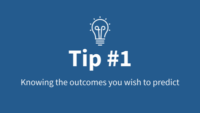
Qlik AutoML Tips - Tip #1 - Know the outcomes you wish to predict
Can't see the video? Watch on the Qlik video site here.Tip #1 – covers knowing the outcomes you wish to predict, as well as the questions you want to ... Show MoreCan't see the video? Watch on the Qlik video site here.
Tip #1 – covers knowing the outcomes you wish to predict, as well as the questions you want to ask based off your current findings from your historical analytical data. Let’s say when analyzing your sales and order data you have noticed a number of orders that have been cancelled. Further investigation shows those cancelled orders have gone unfulfilled for a specific period of time since being placed. This may be due to the sheer volume of orders and the number employees you have available to process them. You may want to get a better handle on understanding the pattern of cancellation and create some predictions to answer questions like:
- Will a customer cancel their order before it is fulfilled? - Or -
- How many days pass before a customer cancels their unfulfilled order?
Answering these questions will enable you to be proactive with certain customer orders and possibly direct your employees to give those order priority and fulfill them sooner to avoid cancellation. Now that we have our predictive question, we need to architect a data set that will support it so Qlik AutoML can use it effectively. Stay tuned for Tip #2 where I will cover the data you should be using to train machine learning models with Qlik AutoML.
Qlik AutoML Helpful Resources:

-
Analytics in Tennis Has Been an Evolution, Not a Revolution
The New York Times recently shared an interesting story about how analytics now plays an important part into the world of tennis, check it out, https:... Show MoreThe New York Times recently shared an interesting story about how analytics now plays an important part into the world of tennis, check it out, https://lnkd.in/eCcW7qrD
The article got me thinking about sports analytics in general and in my research I found the demand is on the rise. According to a Forbes article published this spring, "sports analytics market is expected to grow from $2.5 billion in 2021 to $8.4 billion by 2026." Now is the time to jump on board and cash in on this opportunity. Students can now begin studying sports analytics and many universities have already begun offering degrees such as Columbia University and New York University Sports Masters Programs.
However, you do not have to join those program for access to analytics! University students and educators/professors can join the @Anonymous #academicprogram for access to FREE #qliksense data analytics software, training, and certificate opportunities themselves! Simply visit https://www.qlik.com/us/company/academic-program and apply as a student or educator.
And check out just a small portion of app examples you can use for sports analytics, https://demos.qlik.com/qliksense?industry=Non-business&tags=Sports

-
How to create a Butterfly (Tornado) Chart in Qlik Sense
My previous post versed about what I think it is a very interesting use case of Set analysis element function P() to create dynamic sets and how to op... Show MoreMy previous post versed about what I think it is a very interesting use case of Set analysis element function P() to create dynamic sets and how to operate with those sets to solve really complex analysis scenarios in an easy and elegant way.
In the comments section of that post, I got a couple of questions regarding one of the charts we used in our web app, the so-called Tornado Chart. This post goes to answer that question by showing how to create a Tornado/Butterfly Chart.
Step by step guide:
Note: For the following example I got a sample data containing Population by Age data from the US census. It has 3 columns, Age Range, Male population and Female population.
- Drag and drop a bar chart to your sheet.
- Add a dimension. I’ll add Age Range to mine.
- Add two expressions. I need one expression to display female’s population and a second one for males.
At this point, my chart looks like this: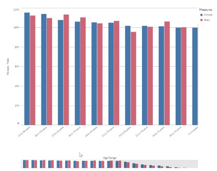
- Next, we will adjust the bar chart sorting and appearance.
Sort the chart according to your data. For this data set my best option is to sort Age Range using load order, to do so, move Age Range to the top and then uncheck all the sorting options to sort on load order.
In the Appearance section of the chart property panel, switch Presentation to Horizontal and Stacked and set Value labels to Auto.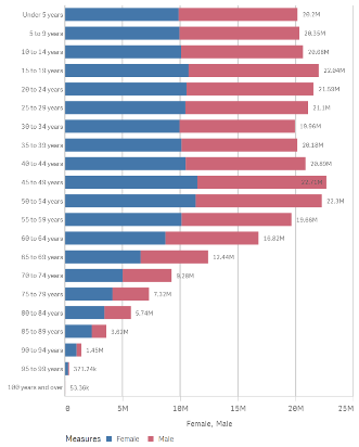
- Now we need to figure out how to “move the y axis to the center of the chart". To do so I’ll transform the data to make Female population negative by changing my expression to: Sum(FemalePopulation)*-1
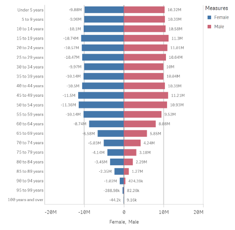
- My chart looks almost right but there’s still a detail that doesn't fits well in the picture above. Note that the value labels for Female Population are displayed as negative numbers. While technically correct, it doesn't work for this chart, I need it to be displayed as positive vales as well.
As a general note remember we can set up the format for positive and negative values for any expression. Format argument in the Num function can take 2 parameters, first one indicates how to format the number if it is >0 and the second piece if number <0.
=num(sum(x), 'postivenumberFormat;negativenumberFormat')As I want negative and positive number to look exactly the same I could use the following format arguments:
num(sum(FemalePopulation)*-1,’#,##0;#,##0’)
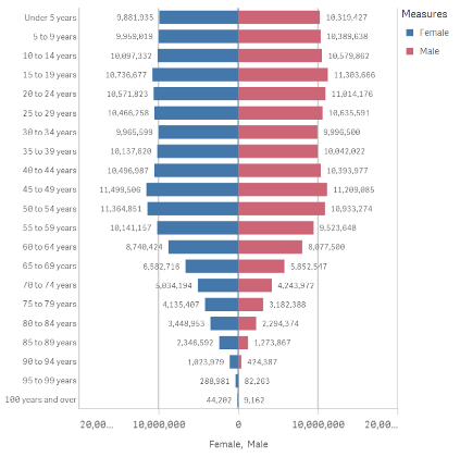
Note: Please be aware of some potential issues when exporting the chart as data since the resulting file could contain negative values.
Enjoy it.

-
【オンデマンド配信】達人に学ぶ、「本当にわかりやすいデータビジュアライゼーション」の極意
BI ツールを導入したものの、「社内に浸透しない、活用されない」といった課題を抱える企業は多いと思います。実はデータビジュアライゼーションには体系化された手法があり、これを学ぶことで、誰もが効果的なデータ視覚化が行えるようになります。学研グループでは、Qlik 導入後 1 年でデータドリブン文化が急... Show MoreBI ツールを導入したものの、「社内に浸透しない、活用されない」といった課題を抱える企業は多いと思います。実はデータビジュアライゼーションには体系化された手法があり、これを学ぶことで、誰もが効果的なデータ視覚化が行えるようになります。
学研グループでは、Qlik 導入後 1 年でデータドリブン文化が急速に浸透し始めています。その成功の極意とは?(株)学研ホールディングスのご担当者様より、「学研式データリテラシー講座」からの超抜粋で、データビジュアライゼーション手法のエッセンスを基に、企業内のデータ利活用高度化のヒントをご紹介いたします。※ 参加費無料。パソコン・タブレット・スマートフォンで、どこからでもご視聴いただけます。
-
ValueList() – For those tricky situations
Have you ever been asked to create a table that has several independent calculations over different metrics? Mixing aggregation formulas and counts in... Show MoreHave you ever been asked to create a table that has several independent calculations over different metrics?
Mixing aggregation formulas and counts in the same table?
Did you end up creating different tables for every view point on the same information?
Or did you create a table like the one below?
If not, let me introduce you to ValueList() and its number oriented big brother ValueLoop().
ValueList
ValueList (value {, value })ValueList allows us to specify a set of arbitrary values within the function, when used as a calculated dimension in a chart this will act as a synthetic dimension.
We can later restate the same function, with the same parameters, in our expression to reference the corresponding value in our newly created synthetic dimension.
And it is as simple as creating a straight table with following dimension and expression
Calculated Dimension:
=ValueList('My First KPI','My Second KPI')
Expression:
=IF( ValueList('My First KPI','My Second KPI')='My First KPI',
Sum([My First KPI Field],
Count([My Second KPI Field])
)
And voila we have created a table/chart with a dimension that does not exist in our data model and with an expression that has the possibility to mix and match aggregation functions over each dimension.
Matthew Crowther has also created an excellent Explosion Chart that also leverages ValueList, you can read more on his blog
ValueLoop
ValueLoop(from [, to [, step = 1 ]])ValueLoop shares the same characteristics as it’s little brother ValueList with the exception that it will create a series of numbers as the synthetic dimension.
To create a dimension with values that spans between 1-100 we would create a calculated dimension with
=ValueLoop(1,100,1)
which we can reference from our expression with the expression
IF( ValueLoop(1,100,1)=3,
'Almost Pi',
'Not Pi'
)
ValueLoop also allows us to create the, not so useful but fun to make, square pie chart which you can read more on in this technical brief.

-
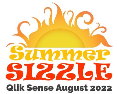
Summer Sizzle. What’s Hot with Qlik Sense August 2022 - (on premise, Windows Ent...
Visualizations & Dashboards Developers now have more control of a sheet’s appearance to better guide users for a more desirable and easy to use interf... Show MoreVisualizations & Dashboards
- Developers now have more control of a sheet’s appearance to better guide users for a more desirable and easy to use interface. With Distinguishable Sheet Style Titling, a sheet’s background color and gradient for its titles will help users to tell the difference between public, private, and community sheets. By default, the background is transparent.
- Chart level scripting is a powerful new feature that allows users to modify the dynamic data set behind a chart using Qlik scripting language, with techniques such as variables and loops. Rows and columns can be added or modified that were not in the original data set. With the ability to edit HyperCube modifiers within visualizations, this enables calculations that have previously not been possible in chart expressions, such as simulations, goal seeking, etc.
- A react styling panel is now available that will include general and chart specific styling options, allowing for more settings and visual fluidity when editing your bar and pie charts. More charts will follow in future releases to assist in increasing the ease of use for developers across other available chart objects as well.
Connectivity
- You can now enjoy more of the same data connections already in Qlik Cloud with the addition of support for the Office 365 SharePoint Metadata Connector. Two new tables are now included within the connector - ‘Views’ and ‘ItemsFromList’. Now having access to Sharepoint lists and views will enhance team’s ability for collaboration and tracking within Qlik Sense.
- Also, since our standalone web connectors will be deprecated, the following (4) new connectors will now become available as part of the installed versions of Qlik Windows products: GitHub, Google Analytics Connector, Jira and Twitter Connectors.
Platform
- Self-service task management capabilities have been enhanced where we have now added the ability to add, edit, and delete scheduled reload tasks from directly within the hub! This will allow users to run numerous self-service scenarios from one location at scale, both more efficiently and intuitively.
We hope you enjoy the value these new capabilities bring to your organization this August. As the summer continues to heat up, Qlik will continue to deliver capabilities you’ve been waiting for; along with some surprises.
Be sure to subscribe to this Qlik Innovation Blog to be informed as we release new features and capabilities.
For a more in-depth review of Qlik’s latest innovations, subscribe to the quarterly Qlik Insider webinar to be in the know of what’s new and what’s next!
Resources
Check out the Qlik Help documentation site for more information on these and other new features
- Developers now have more control of a sheet’s appearance to better guide users for a more desirable and easy to use interface. With Distinguishable Sheet Style Titling, a sheet’s background color and gradient for its titles will help users to tell the difference between public, private, and community sheets. By default, the background is transparent.
-
Qlik Cloudの自動機械学習機能 Qlik AutoMLのご紹介
この記事は下記の英語版記事の翻訳です。Introducing Qlik AutoML on Qlik Cloud 予測分析機能を提供するQlik AutoMLが、Qlik Sense Enterprise SaaSの全顧客に提供されました。 Qlik AutoMLは、AIのサブセットを使用して過去... Show Moreこの記事は下記の英語版記事の翻訳です。
Introducing Qlik AutoML on Qlik Cloud
予測分析機能を提供するQlik AutoMLが、Qlik Sense Enterprise SaaSの全顧客に提供されました。 Qlik AutoMLは、AIのサブセットを使用して過去のデータから学習し、予測を作成して、将来の結果を分析するのに役立ちます。
Qlik AutoMLは、Qlik Cloud完全に統合されて使用可能となりました。 これにより、ビジネスアナリストや分析チームが直接、機械学習の力を利用することができ、機械学習モデルの生成、予測、計画決定を、すべて直感的にコード不要でユーザー体験の中で簡単に行うことができます。 Qlik Sense Enterprise SaaSをご利用のお客様は、すべてのサブスクリプションに無制限の実験と2つのモデルのデプロイが含まれているため、すぐにQlik AutoMLを使い始めることができます。
Qlik AutoMLを使用すると、以下のことが可能になります。
- ML実験を簡単に作成し、データセットのキードライバーを特定し、モデルをトレーニングすることができます。
- レコードレベルでの予測インフルエンサーデータ(シャープレイ値)を使って、現在のデータで将来予測を行うことができます。
- データを簡単に公開し、モデルをQlik Senseに統合して、探索やwhat-ifシナリオによるプランニングを行うことができます。
こちらの動画をご参照ください。(英語)
Qlik AutoML - What you should knowQlik AutoML - Basic Walkthrough Creating a Qlik Sense Predictive Analytics App
下記は学習のためのコンテンツです。(英語)

-
Gartner® データ統合ツールの Magic Quadrant™ - Qlik が企業におけるデータ移行をどのように変革しているのか。(Qlik Blog ...
ブログ著者:Dan Potter 本ブログは Gartner’s Magic Quadrant for Data Integration Tools Highlights how Qlik Is Transforming The Way Data Moves in the Enterprise の翻... Show Moreブログ著者:Dan Potter 本ブログは Gartner’s Magic Quadrant for Data Integration Tools Highlights how Qlik Is Transforming The Way Data Moves in the Enterprise の翻訳になります。
本レポートの重要な部分の 1 つである Gartner 社の「戦略的計画の予測」は、市場の方向性を示すのに役立ちます。今年、Gartner 社が示している 3 つの予測は、Qlik のデータ統合戦略と非常に合致しています。
“2024年までに、拡張データ統合をサポートするデータファブリックデザインパターンの導入で、手動によるデータ統合作業が最大 50% 削減される”
“2024年までに、AI を活用した拡張型のデータ管理・データ統合で、IT 専門家の必要性が最大30% 削減される”
拡張化は再び大きなテーマとなります。Gartner 社は、Qlik における最近の買収が、この分野の主な機能を大幅に向上したと評価しました。具体的には、メタデータとデータ系統の Nodegraph 社、AutoML および拡張データ統合の Big Squid 社、アプリケーションおよび API 統合の Blendr.io 社の買収です。また、手作業を低減する上で大きな役割を果たす自動化において、データウェアハウスの自動化における Qlik の成熟度を特に高く評価しています。
“2025年までに、PaaS モデルによるマルチクラウドハイブリッドのデータ統合機能を備えていないデータ統合ツールは、この機能を備えている事業者に市場シェアの50% を奪われるだろう”
この予測は、Qlik Cloud が提供する新たな PaaSと非常に合致しています。マルチクラウドへの対応はもちろん、各ハイパースケーラープラットフォーム上のあらゆるデータソースとターゲットに対して、手厚く幅広いサポートも必要です。また、「ハイブリッドデータ統合」の予測を見逃さないでください。ほとんどのデータは未だにオンプレミスに存在し、クラウドにアクセスしてデータを移行するための大規模かつ安全な方法が必要です。そこで、Qlik の変更データキャプチャとローカルゲートウェイのアプローチの出番です。
Qlik の今後の展開は?Qlik はここ数年、最も急速に成長しています。Qlik のデータ統合は、最も評価の高いデータ統合ソリューションの 1 つであり、企業の変化する課題に対応できる体制を整えています。
次の四半期には、Qlik Cloud データ統合の一部として、重要な新しい PaaS 機能を提供できる予定です。このサービスは、既存のデータ移行サービスと連携して SQL ベースの変換とデータマートの自動化を定義し、最も普及しているクラウドデータウェアハウスプラットフォーム(Snowflake、Azure Synapse、Google BigQuery、Databricks)にプッシュダウンすることができます。
また、新しい Qlik Gateway for Data Movement は、ファイアウォールの背後に設置して、企業のすべてのオンプレミスデータへのアクセスを促進。安全で拡張性の高い変更データキャプチャ機能で、クラウドへのリアルタイムのデータ提供を支援します。
今週、米国オーランドで開催予定の Gartner Data and Analytics Summit の Qlik ブースでお待ちしています。データ統合の未来についてご紹介する Qlik の講演に、ぜひご参加ください。
-
Introducing Qlik AutoML on Qlik Cloud
Qlik AutoML is now available and fully integrated into Qlik Cloud. This brings the power of machine learning directly to business analysts and analyt... Show MoreQlik AutoML is now available and fully integrated into Qlik Cloud. This brings the power of machine learning directly to business analysts and analytics teams, allowing you to easily generate machine learning models, make predictions, and plan decisions – all within an intuitive, code-free user experience. All Qlik Sense Enterprise SaaS customers can begin using Qlik AutoML immediately, as we have included unlimited experimentation and 2 deployed models with every subscription.
With Qlik AutoML, you can:
- Easily create ML experiments, identifying key drivers in the dataset and training models.
- Make future predictions on current data, complete with prediction influencer data (Shapley values) at the record-level.
- Easily publish data and integrate models into Qlik Sense for exploration and what-if scenario planning.
Before you get started with Qlik AutoML please watch these videos to learn more:
Qlik AutoML - What you need to know before you get started
Qlik AutoML - Basic Walkthrough Creating a Qlik Sense Predictive Analytics App
We encourage you to take advantage of the included capacity in Qlik Sense Enterprise SaaS, and to educate yourself with the large variety of training material available. This includes educational content available on continuous classroom, online help, and sample data files to get you started. It’s very important to get up to speed on the data science concepts you need to properly define your business problem and craft an ML-ready data set.
REGISTER FOR THE UPCOMING "DO MORE WITH QLIK " SESSION IN SEPTEMBER ON AUTOML ON CLOUD
And of course, we’re here to help. Please reach out to sales and services as you begin your Qlik AutoML journey.
Helpful Resources:
-
What you need to know about a career in analytics
In an article in siliconrepublic.com , KPMG’s Jitesh Goyal shares the traits and skills needed for an analytics career and gives his top tips for some... Show MoreIn an article in siliconrepublic.com , KPMG’s Jitesh Goyal shares the traits and skills needed for an analytics career and gives his top tips for someone starting out.
Jitesh Goyal leads the data and analytics strategy capability in the applied intelligence practice of KPMG Ireland.
He has been working in the data and analytics domain for 16 years and has delivered solutions to complex problems across a number of sectors and geographies. His first job involved working with large datasets to derive business metrics for reporting.
To read more about this interesting article and how one can explore a career in analytics, visit: https://www.siliconrepublic.com/people/data-analytics-career-skills-kpmg
To know more about you can start your analytics learning and get certified, if you are a student or educator, please visit: qlik.com/academicprogram
Article source: siliconrepublic.com
Image source: educba.com
-
【開催レポート】親子向け「データリテラシー」ワークショップ
夏休み最後の日曜日、銀座伊東屋さんの会場に 3 年生から 6 年生の親子連れにお集まりいただきました。前半は、学研ホールディングス株式会社マーケティング戦略室シニアマネージャーで Qlik アドボケイトでもある横尾 聡様を「データ博士」としてお招きし、ご講演いただきました。データリテラシーの説明から... Show More夏休み最後の日曜日、銀座伊東屋さんの会場に 3 年生から 6 年生の親子連れにお集まりいただきました。
前半は、学研ホールディングス株式会社マーケティング戦略室シニアマネージャーで Qlik アドボケイトでもある横尾 聡様を「データ博士」としてお招きし、ご講演いただきました。データリテラシーの説明から、データ活用の流れ、「データを理解するための 5 つの武器」、コロナ感染に関する実際のデータの分析など、データ博士(横尾様)による、とてもわかりやすい講演に参加されたみなさんは熱心に聞き入っていました。
後半はそれぞれが学習のまとめを作るセッションとし、自信を持ってデータに基づいた行動や意思決定をするための基礎を身に付けるため、夏休みの自由研究課題としてポスター制作に取り組みました。Qlik Sense と実際のコロナ感染状況のデータを使って、自分の住んでいる地域はどうか?おばあちゃんの住んでいる地域は?など、さまざまな視点からデータ分析を実際に行い、発見したことをポスターとしてまとめました。
全体で 2 時間と時間も短かったため、完成まではいかなかったものの、会場である伊東屋さんからプレゼントされた画用紙とペン、そして自宅からでも Qlik Sense アプリへアクセスできるので、今頃はきっと素晴らしい自由研究を完成させていることでしょう。
データリテラシーに対する関心は高いようで、募集直後に予想以上のお申し込みいただき、実は多くの方をお断りせざるを得ませんでした。アンケートでも「おもったよりもたのしい」「子供向けに易しく説明いていただけました」「大人が勉強できました!」「親のリテラシーが上がったと思います」などお子さんにも親御さんにもご満足いただけた内容になったかと思います。
Qlik では今後もこのような取り組みを続け、データリテラシー向上に貢献していければと思います。
なお、今回の横尾様の講演内容をビジネスパーソン向けにアレンジして「達人に学ぶ本当にわかりやすいデータビジュアライゼーションの極意」として配信いたします。詳細はこちらをご覧ください。
-
【新着レポート】 2022年 Gartner® データ統合ツールの Magic Quadrant™
Gartner® データ統合ツールの Magic Quadrant™ が公開され、Qlik は 7 年連続で評価されました。本レポートは、データ統合市場の全容とツールの簡単比較、各企業が Gartner® 社の定める「ビジョンの完全性」と「実行能力」の基準に、どの程度適合しているのかをご確認いただけ... Show More
Gartner® データ統合ツールの Magic Quadrant™ が公開され、Qlik は 7 年連続で評価されました。本レポートは、データ統合市場の全容とツールの簡単比較、各企業が Gartner® 社の定める「ビジョンの完全性」と「実行能力」の基準に、どの程度適合しているのかをご確認いただけます。データ統合市場の全容と Qlik の最新の取り組みについて、2022年のレポートをご確認ください。
- より迅速に有効なインサイトを得られるリアルタイムのデータ:
あらゆるシステムから最新のデータを継続的に提供 - データ提供の高速化:
データウェアハウスおよびデータレイクを自動化し、迅速なアクションにつながる分析に適したデータを提供 - 信頼できるエンタープライズ対応データ:
データの取り込みから公開まで、すべてのデータを正確かつ安全にカタログ化
- より迅速に有効なインサイトを得られるリアルタイムのデータ:
-
Don't miss the Exclusive 10% summer discount for public courses during August!
Take advantage of the best instructor-led training at the best price. We have a 10% discount on our public courses!Check the discounted courses & Book... Show MoreTake advantage of the best instructor-led training at the best price. We have a 10% discount on our public courses!
Check the discounted courses & Book a seat
Business Analyst and Data Architect
Data Architect
Qlik Sense Server
Advanced
Qlik Sense:
Create Visualizations with Qlik SenseQlik Sense:
Data Modeling for Qlik SenseQlik Sense / QlikView:
Advanced topics in Design and DevelopmentQlikView:
QlikView DesignerQlikView:
QlikView DeveloperHappy Learning!

-
Take Qlik Sense SaaS Training Anytime!
Qlik Education is excited to announce Create Visualizations with Qlik Sense SaaS and Data Modeling for Qlik Sense SaaS blended courses are now live. C... Show MoreQlik Education is excited to announce Create Visualizations with Qlik Sense SaaS and Data Modeling for Qlik Sense SaaS blended courses are now live. Course content access is immediate. No need to wait for an upcoming class schedule!
Create Visualizations with Qlik Sense Saas, a scenario-based course, addresses the fundamentals required to enable you for self-service visualization and discovery. The course combines demonstrations and hands-on exercises to teach the essential concepts for designing beautiful and effective Qlik Sense visualizations and guided stories. Additionally, you will look in depth at the different visualizations and select the appropriate one for your data and the type of questions you need to answer.
Data Modeling for Qlik Sense SaaS is a technical course for you to learn to develop a coherent data model in Qlik Sense by loading and transforming multiple data sources. With information, tools, techniques, and exercises, this course includes topics dealing with: maintaining data connections, transforming source data, architecting data models, optimizing for performance, and application development.
These blended learning courses include self-paced learning with theory and hands-on exercises as well as biweekly instructor-led, live webinars. Once enrolled in the course (within 48 hours of registration), access to the course content is immediate. You can watch the recorded sessions and attend a live instructor webinar to get answers to questions. You will have 12-month access to course materials and live instructor webinars from the enrollment date.
Register to the blended Courses via our Training Registration Page.
Happy Learning!
-
Key Insights from the Qlik Data Literacy Report
Within the next couple of months students will start returning to university to finish their final years of study. It is normally at this time that st... Show MoreWithin the next couple of months students will start returning to university to finish their final years of study. It is normally at this time that students start to consider what it is they might want from a career. As many university educators know, regardless of the industry students are considering, data skills will be vital for graduate success and employability. However, it can be difficult to engage students in taking on additional work to study and strengthen these skills. Our Qlik Academic Program can give them everything they need to become data literate, but it requires the students to be motivated enough to participate. Some of the key takeaways from our most recent Data Literacy report might help in convincing students that investing time now, will pay off for them later.
The below insights can demonstrate to students the expectations employers will have of them:
85% of executives believe data literacy will become as vital in the future as the ability to use a computer is today.
89% of C-level executives expect team members to explain how data has informed their decisions.
US workers who can demonstrate their data literacy skills can expect a 20% salary increase.
The below insights are useful for communicating to students the importance of being prepared and upskilling now, rather than later:
But only 11% of employees are fully confident in their ability to read, analyze, work with and communicate with data.
45% of global employees would change jobs if they felt they could get better preparation for the future workplace elsewhere.
35% of global employees left their jobs in the last 12 months to seek employers that value learning and preparation for the future workplace.
78% of global employees are spending time every month investing in their own personal development, an average of nearly seven hours on personal upskilling each month at an average cost of $2,800 over the last 12 months.
If you're interested in gaining access to free data literacy training and resources to use in your classes, follow this link to learn more and apply today: qlik.com/academicprogram
-
DAR methodology
Nobody likes to constantly reinvent the wheel. Completely starting from scratch on something you work on all of the time is a waste of time. People re... Show MoreNobody likes to constantly reinvent the wheel. Completely starting from scratch on something you work on all of the time is a waste of time. People reuse parts of old QVWs all the time to save the time & effort of redoing the same things over and over again.
The Dashboard, Analysis, Reporting (DAR) methodology is a foundation you can build all of your applications on while still having room to be creative and meet the varying requirements of individual clients / prospects.
In a nutshell you lead with a Dashboard page, followed by Analysis pages, and finish with Reporting pages. The Dashboard gives the high level overview of the business, the Analysis pages give interactive user-driven controls to filter the data, while the Reporting pages give the most granular details. The system works on a few levels but to understand some of why it works we have to discuss how people interact with computers and how we perceive information. The attached technical paper gives an introduction into Human Computer Interaction (HCI), about Top Down versus Bottom Up perception, and how all of this comes into play in QlikView.

-
Summer is winding down but Community Enhancements are full steam ahead!
Hello Qlik Community! Summer is winding down here in the States, but our Community enhancements are full steam ahead! We are prepping for some BIG cha... Show MoreHello Qlik Community!
Summer is winding down here in the States, but our Community enhancements are full steam ahead! We are prepping for some BIG changes coming up. (hint hint) Stay tuned!
Now, for our August enhancements:
New Partner Ranks
Our amazing Partners deserve to be recognized for all their Community contributions so we expanded the Partner ranks!
The ranks follow the same structure as for other Community members:
Partner - New Member
Partner - Newbie
Partner - Explorer (levels I, II)
Partner - Enthusiast (levels I, II, III)
Partner - Contributor (levels I, II, III)
Partner - Creator (levels I, II, III)
Partner - Specialist (levels I, II, III)
Partner - Master (levels I, II, III)
Partner - Champion (levels I, II, III)
Lumiaries and MVPs – you’re up next!
Orange Outage Notification
Previously, the orange outage notification was only on the Homepage. Now it will display on all on Qlik Community pages!
(Peep the new page that is coming very soon!)
New Badges
Calling all Qlik MVP and Partner Ambassadors! Check your profile for your new badge(s)!
Meet us at the Water Cooler!
We renamed the ‘Community Corner’ to ‘Water Cooler’! Don’t forget - we’re here to answer your Qlik Community questions. You will also see posts about the latest featured member (congratulations, @MayilVahanan !) and our newest video series: Suzy’s Tips.
Come chat with us and let’s get to know each other! We started an introduction post where you can meet some of our fur babies 😊 Comment and share your fur babies as well!
Next month we would typically be on a freeze, but as I said, we're full steam ahead! Check back next month for some BIG updates!
You Qlik Community team,
Melissa, Sue, Jamie, Nicole and Emma
@Melissa_Potvin @Sue_Macaluso @Jamie_Gregory @nicole_ulloa @emmaspickerman
-
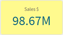
KPI Color and Map Label Enhancements
In this blog post, I will discuss some of the color enhancements that have been added to the KPI chart and the Map chart in Qlik Sense SaaS. Both allo... Show MoreIn this blog post, I will discuss some of the color enhancements that have been added to the KPI chart and the Map chart in Qlik Sense SaaS. Both allow you to further customize the visualizations in an app. Let’s begin with the KPI chart. A KPI is a key performance indicator and is often used to highlight an important metric. In Qlik Sense SaaS, you can now change the background color of a KPI. In the past, KPIs always had a white background and users had the ability to change the color of the metric.
Now, users can also change the background color of the KPI. In the Presentation section of the Properties Panel, in Styling, the background color can be set. The background can be set to a single color, or an expression can be used to set the color. This is nice if you want to make the KPI stand out on the sheet based on a condition or an expression.
Here is what the KPI looks like with a background color.
Notice that the label of the KPI color cannot be changed so make sure you select a background color that does not hide the label. In the KPIs above, the label of the KPI on the right is easier to read than the one on the left. Also keep in mind that you have the option to hide the KPI label. I would recommend doing this only if the KPI metric being displayed is clear to the user without the label.
Another new color related feature added to Qlik Sense SaaS is the color of the labels used in a Map. Users can now change the label coloring to Light or Dark or they keep it set to Auto. This setting is found in the Presentation section of the Properties Panel. To use this feature, the map must be showing the labels.
When set to Auto, the labels will change depending on the base map being used. If the base map is darker, then a light label tends to be used and if the base map is lighter, a dark label color tends to be used. Users now have the option to set this regardless of the base map color. So depending on the map and the coloring you are using in the map; you may prefer a light label even if the background is light like in the map below. The key is to go with the option that is best read by the user. Usually that is this the option with the most contrast.
This is just a few of the visualization enhancements that have been made in Qlik Sense SaaS. Learn more about the KPI background color enhancements as well as other KPI improvements in Michael Tarallo’s SaaS in 60 video. You can check out the entire SaaS in 60 video series here to learn more about new product features.
Thanks,
Jennell
-
【オンデマンド配信】 クラウドデータファブリックに投資すべき 7 つの兆候
データ需要とデータの複雑性の高まりは、データ主導のイノベーションを制限する要因になっていますが、他にも要因があります。データリーダーは警告の兆候をを認識できないといったことです。 本 Web セミナーでは、データアーキテクチャの警告サインと、データ分析の成功に向けた競合要件を管理する方法について、... Show Moreデータ需要とデータの複雑性の高まりは、データ主導のイノベーションを制限する要因になっていますが、他にも要因があります。データリーダーは警告の兆候をを認識できないといったことです。
本 Web セミナーでは、データアーキテクチャの警告サインと、データ分析の成功に向けた競合要件を管理する方法について、ご説明します。
※ 参加費無料。パソコン・タブレット・スマートフォンで、どこからでもご視聴いただけます。日本語字幕付きでお届けします。
- データウェアハウスとデータレイクにおけるデータエンジニアリングの重要性の変化
- クラウド / IoT / 機械学習からの新たな要件に対応するデータファブリックアーキテクチャを設計する方法
- 分析データパイプラインを提供する包括的なエンドツーエンドのアプローチでイノベーションを推進する方法
- データウェアハウスとデータレイクにおけるデータエンジニアリングの重要性の変化