Unlock a world of possibilities! Login now and discover the exclusive benefits awaiting you.
- Qlik Community
- :
- All Forums
- :
- Visualization and Usability
- :
- Re: colouring a negative value that is positive in...
- Subscribe to RSS Feed
- Mark Topic as New
- Mark Topic as Read
- Float this Topic for Current User
- Bookmark
- Subscribe
- Mute
- Printer Friendly Page
- Mark as New
- Bookmark
- Subscribe
- Mute
- Subscribe to RSS Feed
- Permalink
- Report Inappropriate Content
colouring a negative value that is positive in red
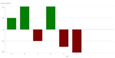
Hi I am new to qlik, I am trying to make a graph that represents negative and positive values, I have achieved this with the expression:
= if(count(product) > 0, green(),
if(Fabs(count(product) > 0) * -1, red())))
My problem is that I don't know how to paint the negative values, since they are not negative values as such, because I have forced them with the Fabs() *-1 function.
Does anyone know how to colour those positive values converted to negative values? as shown in the image.
- Tags:
- qliksense
- Subscribe by Topic:
-
Chart
-
Client Managed
-
Developers
-
dimension
-
expression
-
filter
-
General Question
-
Set Analysis
-
Variables
-
Visualization
Accepted Solutions
- Mark as New
- Bookmark
- Subscribe
- Mute
- Subscribe to RSS Feed
- Permalink
- Report Inappropriate Content
If ther eare 2 different measures, one positive and one negative, you can create a master item for each and assign the measure color in the master item, then on chart use the master items as measures and select the option to use library colors on Layout -> presentation ->colors and legend
- Mark as New
- Bookmark
- Subscribe
- Mute
- Subscribe to RSS Feed
- Permalink
- Report Inappropriate Content
Hi, I don't know why you use the fabs, have you tried this?:
= if(count(product) > 0, green(),
if(count(product) < 0, red()))
Or just: = if(count(product) > 0, green(), red())
- Mark as New
- Bookmark
- Subscribe
- Mute
- Subscribe to RSS Feed
- Permalink
- Report Inappropriate Content
Hello Ruben, thank you for your reply.
I was using Fabs, because I don't have negative values, I convert positive values into negative, that's why I can't use those 'false negatives' when colouring the < 0, because they are not really less than 0, but a multiplication by -1.
- Mark as New
- Bookmark
- Subscribe
- Mute
- Subscribe to RSS Feed
- Permalink
- Report Inappropriate Content
can you post the Chart Expression instead?
If a post helps to resolve your issue, please accept it as a Solution.
- Mark as New
- Bookmark
- Subscribe
- Mute
- Subscribe to RSS Feed
- Permalink
- Report Inappropriate Content
If count(product) is higher than zero it will go with the first condition and there will be only green bars or zero bars, so something else is creating that negative bars. Use the same expression that gives values to the bars to color the bars.
- Mark as New
- Bookmark
- Subscribe
- Mute
- Subscribe to RSS Feed
- Permalink
- Report Inappropriate Content
I am using two measures, one for positive values: count(if(product >0,customers))
for negative values, its measure is: Fabs(count(if(product<0,customers))) *-1
In this expression I convert the positive values in negative, I have tried to put the same expressions in the colour section, but it paints everything in green because it detects that they are all positive, when I force the negatives I don't know how to make it detect the 'false negatives' and paint them in red.
- Mark as New
- Bookmark
- Subscribe
- Mute
- Subscribe to RSS Feed
- Permalink
- Report Inappropriate Content
If ther eare 2 different measures, one positive and one negative, you can create a master item for each and assign the measure color in the master item, then on chart use the master items as measures and select the option to use library colors on Layout -> presentation ->colors and legend
