Unlock a world of possibilities! Login now and discover the exclusive benefits awaiting you.
- Qlik Community
- :
- All Forums
- :
- QlikView App Dev
- :
- Working with a Risk Map
- Subscribe to RSS Feed
- Mark Topic as New
- Mark Topic as Read
- Float this Topic for Current User
- Bookmark
- Subscribe
- Mute
- Printer Friendly Page
- Mark as New
- Bookmark
- Subscribe
- Mute
- Subscribe to RSS Feed
- Permalink
- Report Inappropriate Content
Working with a Risk Map
Hello everyone,
I have a requirement to build a Risk Map, and i am not sure if it is possible to build something similar in QlikView, see below:
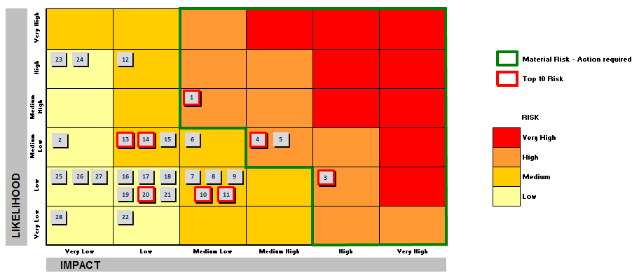
The data base is a spreadsheet and the IMPACT (X axis) is a column and the LIKELIHOOD (Y axis) is other column. I know i can use both columns as a dimension to build the chart, but i don´t know what type of chart i can use to build something similar. The yellow squares represents the low risks, orange squares represtens Medium risks, and red squares represents the High Risks.
The Numbers inside the squares represents where the Risk is qualified.
Anyone built something similar in QlikView? Tips?
Regards!!
- « Previous Replies
-
- 1
- 2
- Next Replies »
Accepted Solutions
- Mark as New
- Bookmark
- Subscribe
- Mute
- Subscribe to RSS Feed
- Permalink
- Report Inappropriate Content
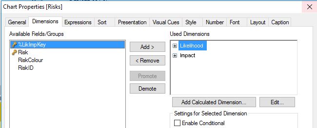
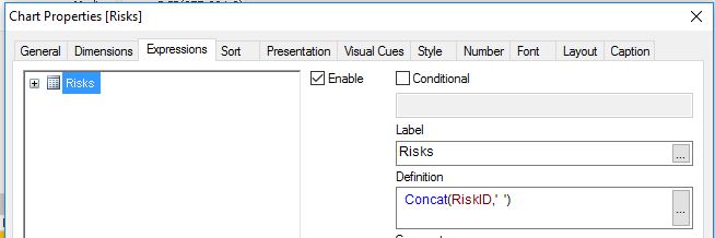
Hi,
maybe one solution could be a pivot table with background colours:


tabRiskColours:
LOAD Dual(Risk,AutoNumber(Risk,'Risk')) as Risk,
    RGB(R,G,B) as RiskColour
Inline [
Risk,R,G,B
Very High,255,  0,  0
High     ,255,153, 51
Medium   ,255,204,  0
Low      ,255,255,153
];

tabTemp:
LOAD Dual(Likelihood,AutoNumber(Likelihood,'Likelihood')) as Likelihood,
    Dual(Impact,AutoNumber(Impact,'Impact')) as Impact
Inline [
Likelihood,Impact
Very High,Very High
High,High
Medium High,Medium High
Medium Low,Medium Low
Low,Low
Very Low,Very Low
];

tabLikImpRisk:
LOAD *,
    AutoNumber(Likelihood&'/'&Impact,'LikImp') as %LikImpKey
Inline [
Likelihood,Impact,Risk
1,1,1
1,2,1
1,3,1
1,4,2
1,5,3
1,6,3
2,1,1
2,2,1
2,3,2
2,4,2
2,5,3
2,6,4
3,1,1
3,2,1
3,3,2
3,4,2
3,5,3
3,6,4
4,1,1
4,2,2
4,3,2
4,4,3
4,5,3
4,6,4
5,1,1
5,2,2
5,3,3
5,4,3
5,5,4
5,6,4
6,1,2
6,2,2
6,3,3
6,4,3
6,5,4
6,6,4
];

DROP Table tabTemp;

tabRisks:
LOAD RecNo() as RiskID,
    AutoNumber(Likelihood&'/'&Impact,'LikImp') as %LikImpKey
Inline [
Likelihood,Impact
3,4
4,6
5,2
4,3
4,3
4,4
5,4
5,4
5,4
5,4
5,4
2,5
4,5
4,5
4,5
];
hope this helps
regards
Marco
- Mark as New
- Bookmark
- Subscribe
- Mute
- Subscribe to RSS Feed
- Permalink
- Report Inappropriate Content
Hi Rogrigo,
I think that you can do it with a Scatter Chart, I don't know any Extension like this or similar.
Your risk colours and zones may be an image, and you need to locate your tasks with calculations.
Regards!
- Mark as New
- Bookmark
- Subscribe
- Mute
- Subscribe to RSS Feed
- Permalink
- Report Inappropriate Content
Hi Manuel!!
Thanks for your suggestion!
Do you have or know where i can find a sample example to apply that solution?
I have no idea how to use an image into a Scatter Chart.
Regards!
- Mark as New
- Bookmark
- Subscribe
- Mute
- Subscribe to RSS Feed
- Permalink
- Report Inappropriate Content
Hi,
maybe one solution could be a pivot table with background colours:
tabRiskColours:
LOAD Dual(Risk,AutoNumber(Risk,'Risk')) as Risk,
    RGB(R,G,B) as RiskColour
Inline [
Risk,R,G,B
Very High,255,  0,  0
High     ,255,153, 51
Medium   ,255,204,  0
Low      ,255,255,153
];

tabTemp:
LOAD Dual(Likelihood,AutoNumber(Likelihood,'Likelihood')) as Likelihood,
    Dual(Impact,AutoNumber(Impact,'Impact')) as Impact
Inline [
Likelihood,Impact
Very High,Very High
High,High
Medium High,Medium High
Medium Low,Medium Low
Low,Low
Very Low,Very Low
];

tabLikImpRisk:
LOAD *,
    AutoNumber(Likelihood&'/'&Impact,'LikImp') as %LikImpKey
Inline [
Likelihood,Impact,Risk
1,1,1
1,2,1
1,3,1
1,4,2
1,5,3
1,6,3
2,1,1
2,2,1
2,3,2
2,4,2
2,5,3
2,6,4
3,1,1
3,2,1
3,3,2
3,4,2
3,5,3
3,6,4
4,1,1
4,2,2
4,3,2
4,4,3
4,5,3
4,6,4
5,1,1
5,2,2
5,3,3
5,4,3
5,5,4
5,6,4
6,1,2
6,2,2
6,3,3
6,4,3
6,5,4
6,6,4
];

DROP Table tabTemp;

tabRisks:
LOAD RecNo() as RiskID,
    AutoNumber(Likelihood&'/'&Impact,'LikImp') as %LikImpKey
Inline [
Likelihood,Impact
3,4
4,6
5,2
4,3
4,3
4,4
5,4
5,4
5,4
5,4
5,4
2,5
4,5
4,5
4,5
];
hope this helps
regards
Marco
- Mark as New
- Bookmark
- Subscribe
- Mute
- Subscribe to RSS Feed
- Permalink
- Report Inappropriate Content
- Mark as New
- Bookmark
- Subscribe
- Mute
- Subscribe to RSS Feed
- Permalink
- Report Inappropriate Content
Hi Marco,
Thats a very interesting solution! Thank you very much for your contribution.
One of the requeriments suggests a Risk table like that, which displays the position of the Risk on the Map, when one of the risk is selected in the filter, something like that:

In the solution you proposed, when i select a Risk in the filter, the table is resized:
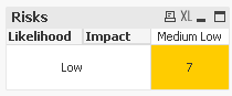
It displays the correct position, but i would need to display the entire table, with only the value selected in the filter, in that case Risk 7.
Can you imagine a solution for that?
I tryied to find something in the table properties, but i was not able to do something similar to the requirement.
Thanks
Thank you
- Mark as New
- Bookmark
- Subscribe
- Mute
- Subscribe to RSS Feed
- Permalink
- Report Inappropriate Content
it is a pivot table, by nature, when you have selected a column in pivot table, it wil only display that specified column.
- Mark as New
- Bookmark
- Subscribe
- Mute
- Subscribe to RSS Feed
- Permalink
- Report Inappropriate Content
Hi,
maybe like this:


hope this helps
regards
Marco
- Mark as New
- Bookmark
- Subscribe
- Mute
- Subscribe to RSS Feed
- Permalink
- Report Inappropriate Content
ok thanks Marco!
- Mark as New
- Bookmark
- Subscribe
- Mute
- Subscribe to RSS Feed
- Permalink
- Report Inappropriate Content
Very Nice Visualization Macro !!!
Thanks you sharing
Vikas
If the issue is solved please mark the answer with Accept as Solution & like it.
If you want to go quickly, go alone. If you want to go far, go together.
- « Previous Replies
-
- 1
- 2
- Next Replies »